Rivian Design System
Rivian's design system as a DESIGN.md file. Adventure typeface, Rivian Yellow #ffac00, 22 colors, 19 components. For React, Next.js, and AI tools.
Add shadcn.io to your AI agent. · Pro It installs blocks, icons and templates in your design system from a prompt, with Pro.
Set up MCP- Primary
- #ffac00
- Typeface
- Adventure
- Shape
- Soft
- Base radius
- 0px
- Colors
- 22
- Type tokens
- 12
- Components
- 19
- Spacing values
- 9
About
About Rivian DESIGN.md
Curated by Dov Azencot · Updated May 13, 2026 · Source rivian.com (opens in a new tab)
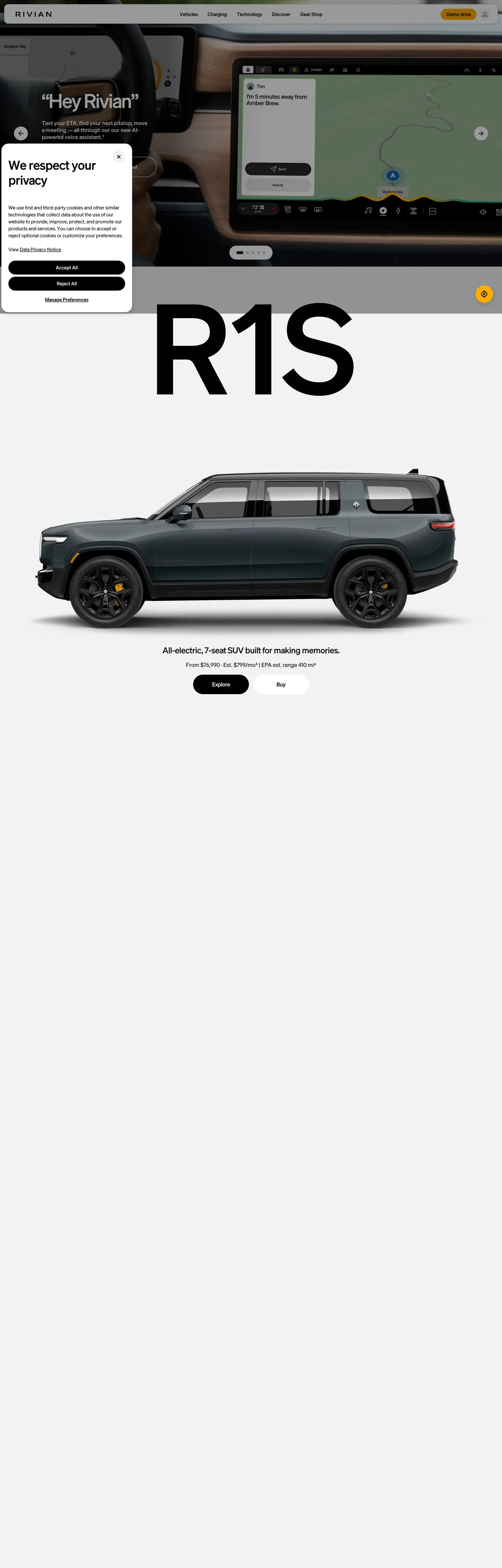
Rivian's marketing surface is the inverse of Tesla's. Where Palo Alto stages an unbroken white canvas with a single Electric Blue voltage, Irvine opens with a dark cinema band — the R1S center console rendered against a #151515 dashboard interior, a passenger map UI floating in the right third, and a #ffac00 Yellow "Demo drive" pill anchored to the top-right corner. Scroll one viewport and the canvas inverts to pure white for an oversized 120px R1S marquee in Adventure, the brand's proprietary face, set in weight 600 with -3px letter-spacing. The dual canvas is the brand's signature move: dark hero for the in-cabin technology story, white product band for the truck itself. The single yellow pill rides both bands without changing color.
This page packages the system into a single DESIGN.md file using the Google Labs open spec. Inside: 22 colors tokens grouped into a deep-ink ladder (#151515 / #212121 / #494949 / #616161), an off-photo invert tier (#ffffff / #f2f2f2 / #cbcbcb / #e5e7eb), the single Rivian Yellow voltage at #ffac00, and four declared adventure accents (sage / ember / sky / tan) that surface only inside `--semantic-*` tokens; 12 typography tokens running through Adventure at weight 400/500/600 across a 10px-to-120px range with -0.025em display tracking; a four-step radius ladder (4 / 12 / 20 / 40) plus a 9999px pill; 9 spacing tokens; and 19 components covering the demo-drive pill, infotainment hero, R1S marquee, product card, top nav, cookie consent gate, and the dark voice-assistant chat overlay.
Hand the file to Claude, Cursor, or GitHub Copilot and the agent writes React surfaces that read as Rivian — Adventure at 600 with negative tracking, dark cinema heroes stacked over white product bands, yellow pill CTAs that ride both backgrounds, 40px mega tiles softening the photography — rather than a generic EV marketing template. The spec is worth studying because Rivian commits harder than almost any other automotive brand to the principle that the chromatic voltage should be scarce enough to count: three instances on the entire landing page, all the same pill, all the same color.
What makes it distinct
5
- Single-CTA voltageRivian Yellow (#ffac00) appears 3 times on the page, every instance the Demo drive pill, never decoratively
- Adventure typeface across the entire scalea proprietary face that runs at weight 600 from the 120px R1S marquee down to 14px button labels
- Four-step radius ladder4px nano / 12px micro / 20px macro / 40px mega, plus a 9999px pill reserved for the yellow CTA alone
- Cinema dark over product whitea #151515 dashboard hero stacks above an unbroken white R1S band, the cars carry every saturated moment
- Adventure-palette accents held off-pagesage (#629b5c), ember (#e84826), sky (#77afd8), tan (#bc9c8a) are declared but never surface as chrome
rivian.com
Live at rivian.com
A snapshot of the brand in production. Scroll the frame to see the whole page.
Colors
22 colors
Rivian's system runs on #ffac00 as its primary voltage, used in 1 of 19 components. Type is set in Adventure across 12 tokens from 10px to 120px, weights 400–600. Shape language is soft — components average 15px corner radius, with no sharp interactive edges.
Brand & Accent
Sparing, CTA-only voltage · 6
Surface
Page and card backgrounds · 5
Text
Headlines, body, captions · 6
Borders & Hairlines
Dividers, outlines, rules · 1
Semantic
Status, errors, success, links · 4
Typography
12 type tokens
Set in Adventure across 12 tokens, from 10px to 120px, weights 400–600. Shown in its own stack: where the font isn't installed, the fallback the file names stands in.
- display-marquee120px · weight 600 · lh 112px · tracking -3pxThe quick brown fox jumps over the lazy dog
- display-xl72px · weight 600 · lh 72px · tracking -1.8pxThe quick brown fox jumps over the lazy dog
- display-lg56px · weight 600 · lh 60px · tracking -2.5pxThe quick brown fox jumps over the lazy dog
- heading-md32px · weight 600 · lh 36px · tracking -0.68pxThe quick brown fox jumps over the lazy dog
- heading-sm24px · weight 600 · lh 28px · tracking -0.5pxThe quick brown fox jumps over the lazy dog
- body-lg20px · weight 400 · lh 28pxThe quick brown fox jumps over the lazy dog
- body-md16px · weight 400 · lh 24pxThe quick brown fox jumps over the lazy dog
- body-sm14px · weight 400 · lh 20px · tracking -0.14pxThe quick brown fox jumps over the lazy dog
- link-md16px · weight 500 · lh 20px · tracking -0.5pxThe quick brown fox jumps over the lazy dog
- button-label14px · weight 600 · lh 16px · tracking -0.14pxThe quick brown fox jumps over the lazy dog
- nav-link14px · weight 500 · lh 16px · tracking -0.5pxThe quick brown fox jumps over the lazy dog
- caption10px · weight 400 · lh 14pxThe quick brown fox jumps over the lazy dog
Layout
Radii and spacing
6 corner radii and 9 spacing values. Shape language: soft.
Radii
- none0px
- nano4px
- micro12px
- macro20px
- mega40px
- full9999px
Spacing
- xxs4px
- xs8px
- sm12px
- md16px
- base20px
- lg32px
- xl40px
- 2xl48px
- 3xl80px
Components
19 components
Each rendered from its tokens (color, type, radius, padding) on Rivian's own canvas.
- Button Primarybutton-primaryButton Primary
- Button Primary Hoverbutton-primary-hoverButton Primary Hover
- Button Secondary On Photobutton-secondary-on-photoButton Secondary On Photo
- Button Tertiary Textbutton-tertiary-textButton Tertiary Text
- Top Navtop-navTop Nav
- Nav Linknav-linkNav Link
- Hero Cinemahero-cinemaHero Cinema
- Hero Headline On Darkhero-headline-on-darkHero Headline On Dark
- Marquee Headlinemarquee-headlineMarquee Headline
- Product Cardproduct-cardProduct Card
- Product Card Darkproduct-card-darkProduct Card Dark
- Voice Assistant Bubblevoice-assistant-bubbleVoice Assistant Bubble
- Type here…text-inputText Input
- Cookie Bannercookie-bannerCookie Banner
- Cookie Action Primarycookie-action-primaryCookie Action Primary
- Carousel Arrowcarousel-arrowCarousel Arrow
- Carousel Dotcarousel-dotCarousel Dot
- Pagination Active Dotpagination-active-dotPagination Active Dot
- Modal Scrimmodal-scrimModal Scrim
In use
The system, in use
Rivian's tokens on the kind of product it builds.
Build something people actually use.
A short paragraph of marketing copy that previews how the brand's display tier and body tier read together. Two sentences is usually enough.
FAQ
Rivian design system FAQ
Common questions about Rivian's tokens, components, and how to use this DESIGN.md in your project.
Read next
Related reading
Specs, directories, and component libraries that pair with this design system.
- Browse all design systemsThe full directory of DESIGN.md files on shadcn.io, with live mockups for each.shadcn.io
- Rivian — official siteThe live brand site for the U.S. market — see the R1S marquee, the dark infotainment hero, and the Rivian Yellow Demo drive pill in production.rivian.com (opens in a new tab)
- The DESIGN.md specificationGoogle Labs' open spec for machine-readable design system files — the format this page is built on.github.com (opens in a new tab)
Use it
Use Rivian in your project
One machine-readable file. Drop it into Claude, Cursor, or any AI tool that reads DESIGN.md.
Download the DESIGN.md
One machine-readable file: every color, type, radius, spacing, and component token of Rivian.
Feed it to your AI tool
Drop it into Claude, Cursor, or GitHub Copilot. The agent writes React components and Tailwind classes that match Rivian's visual language.
Reference the tokens directly
Or paste the values into your Tailwind config, CSS variables, or component library: every color, size and radius is a quoted, ready-to-copy value.
Read the full DESIGN.md: overview, rationale, do’s and don’ts
Overview
Rivian's marketing surface stages an inversion the rest of the EV category avoids. The hero band opens on {colors.ink} (#151515) — a wide-angle photograph of the R1S center console with the passenger map UI rendered against the dashboard interior — and then, one viewport down, the canvas flips to {colors.canvas} (#ffffff) for the oversized R1S marquee. The model name lands at 120px in Adventure, the brand's proprietary face, set at weight 600 with -3px letter-spacing. There is exactly one piece of chromatic voltage on the entire page: Rivian Yellow ({colors.primary} — #ffac00) on the Demo drive pill in the persistent top nav. The pill rides both bands without changing color, shape, or position.
Single-pill voltage: where most automotive systems decorate hero text and section labels with brand color, Rivian holds yellow inside one component — the Demo drive CTA at 9999px radius — and lets every other surface stay grayscale. The extracted page renders the yellow 3 times total. Tesla makes the same restraint move with Electric Blue, but at a different radius vocabulary: Tesla rounds every CTA to 4px, while Rivian goes full pill for the yellow and holds every other element at 4 / 12 / 20 / 40px rectangles. The contrast is the load-bearing interaction signal.
The shape language is adventure-rectangular. The radius ladder runs in four named steps — {rounded.nano} 4px, {rounded.micro} 12px, {rounded.macro} 20px, {rounded.mega} 40px — plus a {rounded.full} 9999px pill reserved for the yellow CTA. The 40px mega corner softens the R1S product card and the voice-assistant chat bubble; the 12px micro corner sits under nav-link hover backgrounds; the 4px nano corner shows up only on the dark email input. Unlike the convention of pill-everything in current EV branding, Rivian uses the pill scarce-on-purpose.
Key Characteristics:
- Single-CTA voltage:
{colors.primary}(#ffac00 — "Rivian Yellow") is the only chromatic color in the captured render, used exclusively on the Demo drive pill. Every other surface is grayscale. - Proprietary face: Adventure across the entire scale, declared as
Adventure, HelveticaNeue, "Helvetica Neue", Helvetica, Arial, sans-serif. Weight 600 carries display; 400 carries body; 500 carries links and nav. - Dark cinema over white product band: the page opens on a #151515 infotainment hero, then inverts to a #ffffff R1S marquee one viewport down. Two narratives — technology, then vehicle — on one scroll.
- 120px hero marquee with -3px letter-spacing: the R1S model name reads as architectural signage, not page heading. Display tracking holds at -0.025em across every display tier.
- Four-step radius ladder plus one pill: 4 / 12 / 20 / 40px named rectangles, plus a 9999px pill that surfaces only on the Demo drive CTA. Photo tiles soften to 40px mega.
- Adventure-palette accents declared but unused: sage (#629b5c), ember (#e84826), sky (#77afd8), tan (#bc9c8a) sit inside
--semantic-*tokens but never surface on the homepage — the chromatic discipline is deliberate. - Demo drive pill height of 32px: under-sized against the 56px input fields and 40px nav links, which makes the pill read as a precision target rather than a hero CTA.
- Persistent top nav at 48px height with a chat-icon and account icon flush right — the Demo drive pill sits between them, never collapses to a hamburger on desktop.
- Voice-assistant bubble rendered as a
{colors.canvas-mid}(#9fa1b8) chat scrim with 20px macro corners, floating over the dashboard hero — the "Hey Rivian" overlay is the only mid-tone neutral on the entire page. - Cookie consent banner is sharp-cornered (0px) and bottom-left anchored, with a
{colors.canvas-dark}(#000000) Accept All button — the only square button on the page sits inside the consent gate.
Colors
Brand & Accent
- Rivian Yellow (
{colors.primary}— #ffac00) — frequency 3. Used as background (3). The single chromatic voltage on the homepage, declared in CSS as--brand: 40 100% 50%. Reserved entirely for the Demo drive pill — the brand never uses it decoratively or as a text color. - Yellow Hover (
{colors.primary-hover}— #ffc733) — declared as--brand-accent: 41 100% 59%. The lighter hover tone for the Demo drive pill; not captured in the resting render. - On Primary (
{colors.on-primary}— #000000) — pure black text on the yellow pill. Yellow at this saturation needs ink, not white.
Surface
- Canvas (
{colors.canvas}— #ffffff) — frequency 168. Used as text (145), background (21), border (2). The dominant product-band surface and the inverse text color on every dark band. - Canvas Soft (
{colors.canvas-soft}— #f2f2f2) — frequency 6. Used as background (5), gradient (1). The carousel-arrow fill and the--surface-secondarytoken; appears where two adjacent white bands need separation without a visible hairline. - Canvas Elevated (
{colors.canvas-elevated}— #cbcbcb) — frequency 14. Used as background (13), border (1). Inactive carousel-dot fill and the consent-gate switch-button-off background. - Canvas Mid (
{colors.canvas-mid}— #9fa1b8) — frequency 7. Used as background (3), gradient (3), shadow (1). The voice-assistant chat-bubble scrim — the only mid-tone neutral on the page, and the only color carrying a subtle hue (cool gray at oklch 71% / 281°). - Canvas Dark (
{colors.canvas-dark}— #000000) — frequency 85. Used as text (57), background (18), border (7). The cookie-consent Accept All fill and the--surface-invertPrimarytoken; the page's anchor black sits on consent gates and dark inverts, not on the hero.
Ink Ladder
- Ink (
{colors.ink}— #151515) — frequency 324. Used as text (323), border (1). The default heading and body text color on light backgrounds, and the cinema hero background — a near-black that holds slightly more depth than pure #000000. Rivian uses this as the load-bearing dark voltage, not pure black. - Ink Soft (
{colors.ink-soft}— #212121) — frequency 7. Used as background (4), gradient (3). The email input background and the--surface-invertSecondarytoken — a one-step-lighter dark surface for nested dark UI on dark hero bands. - Ink Muted (
{colors.ink-muted}— #494949). The--text-secondarytoken, used for nested body copy when a slightly softer hierarchy is needed. Rare on the homepage — the system prefers the binary contrast of #151515 on #ffffff. - Ink Tertiary (
{colors.ink-tertiary}— #616161). The--text-tertiarytoken, used inside the consent gate for form hints and dividers. Even rarer on the marketing surface.
Hairlines
- Hairline (
{colors.hairline}— #e5e7eb) — frequency 526. Used as border (525), background (1). The dominant border tone — every form field, every carousel cell, every divider lands on this value. Declared as--surface-tertiaryand--k-modal-*-coloracross the consent-gate tokens.
Adventure Accents (declared, off-page)
- Sage (
{colors.accent-sage}— #629b5c) — frequency 1. Layer: brand. Captured asbgon one element; intended for outdoor-adventure / off-road product theming but does not surface as page chrome. - Ember (
{colors.accent-ember}— #e84826) — frequency 1. Layer: brand. The warm orange-red of a campfire — declared for product accent but not rendered in the home build. - Sky (
{colors.accent-sky}— #77afd8) — frequency 1. Layer: brand. A pale cool blue, presumably tied to charging or trip-planning surfaces. - Tan (
{colors.accent-tan}— #bc9c8a) — frequency 1. Layer: brand. A desert-tan neutral; appears in gradient declarations but not in resting chrome.
Semantic
- Success (
{colors.semantic-success}— #4a8231) — bound to--semantic-success. A muted forest green that matches the adventure-palette voice rather than a generic flat-green. - Error (
{colors.semantic-error}— #dc3127). A red with slightly orange undertone — closer to ember than to a generic UI red. - Warning (
{colors.semantic-warning}— #d58103). A burnt amber, distinct from the Rivian Yellow brand voltage so users never confuse a warning toast with a CTA. - Info (
{colors.semantic-info}— #005e7d). A deep teal — the only chromatic token in the entire system that leans toward cyan rather than warm-yellow.
Scrim
- Modal Scrim (
rgba(0, 0, 0, 0.4)) — the cookie-banner and modal backdrop. 40% black holds the dimmed page readable through the scrim.
Typography
Font Family
The system runs Adventure, a proprietary face declared as Adventure, HelveticaNeue, "Helvetica Neue", Helvetica, Arial, sans-serif. The same family carries every text role on the page — the 120px R1S marquee, the 56px hero headline, the 16px body paragraph, and the 10px footnote caption. No alternative families surface anywhere in the captured render. A companion --font-adventure-mono token is declared but does not render on the homepage.
Fallbacks walk Helvetica Neue → Helvetica → Arial. There are no italic variants in the marketing chrome and no OpenType features detected. The typography reads as engineered uniformity, not stylistic variety.
Hierarchy
| Token | Size | Weight | Line Height | Letter Spacing | Use |
|---|---|---|---|---|---|
{typography.display-marquee} | 120px | 600 | 112px | -3px | Oversized model-name marquee — "R1S", "R1T" on the white product band |
{typography.display-xl} | 72px | 600 | 72px | -1.8px | Section h2 on hero overlays — "Meet R2" type |
{typography.display-lg} | 56px | 600 | 60px | -2.5px | Hero h2 on the dark cinema band — "Hey Rivian" voice-assistant title |
{typography.heading-md} | 32px | 600 | 36px | -0.68px | Mid-section h3 — feature group titles |
{typography.heading-sm} | 24px | 600 | 28px | -0.5px | Card titles on product tiles |
{typography.body-lg} | 20px | 400 | 28px | 0 | Hero body paragraph and section subtitle |
{typography.body-md} | 16px | 400 | 24px | 0 | Default paragraph body |
{typography.body-sm} | 14px | 400 | 20px | -0.14px | Secondary body, footnotes, voice-assistant chat |
{typography.link-md} | 16px | 500 | 20px | -0.5px | Inline links and breadcrumbs |
{typography.button-label} | 14px | 600 | 16px | -0.14px | Demo drive pill and secondary button labels |
{typography.nav-link} | 14px | 500 | 16px | -0.5px | Top-nav primary links (Vehicles, Charging, Technology, Discover, Gear Shop) |
{typography.caption} | 10px | 400 | 14px | 0 | Footer microcopy, image captions, legal footnotes |
Principles
Display weight held at 600. Where Tesla holds display at weight 500 and Porsche at weight 400, Rivian commits to weight 600 across every display tier — heavier than the luxury-auto convention, lighter than the bold-700 default of most consumer-tech marketing. The 600 weight reads as confident without being aggressive.
Negative tracking scales with size. Display tracking runs -3px at 120px, -2.5px at 56px, -1.8px at 72px, -0.68px at 32px, and -0.5px at 24px. The --tracking-display variable holds at -0.025em across the scale, which means every display tier inherits the same relative tightness. Body text returns to neutral or -0.14px micro-tracking — the negative tracking is a display-only signal.
Single family, three weights only. 400 for body, 500 for links and nav, 600 for display and button labels. No 700 bold, no 300 light, no italic. The variation comes from size and tracking, not from weight.
Note on Font Substitutes
Adventure is a proprietary Rivian face not available for public licensing. The closest substitutes: Inter at weight 600 with -2.5% display letter-spacing reproduces the proportions at smaller sizes but drifts at 120px. Söhne is the closest paid alternative — it shares Adventure's slightly condensed geometric construction. Founders Grotesk is the next-closest paid option. For brand-accurate fallback, the system's declared HelveticaNeue is acceptable but lacks the negative display tracking that gives Adventure its architectural marquee feel.
Layout
Spacing System
- Base unit: 4px.
- Tokens:
{spacing.xxs}4px ·{spacing.xs}8px ·{spacing.sm}12px ·{spacing.md}16px ·{spacing.base}20px ·{spacing.lg}32px ·{spacing.xl}40px ·{spacing.2xl}48px ·{spacing.3xl}80px. - Button padding: 8px 16px (Demo drive pill) — the smallest button padding on the page, which makes the 32px pill height feel precise rather than chunky.
- Card padding: 32px (
{spacing.lg}) around the R1S product card content; 12px 16px for the voice-assistant chat bubble. - Section gap: approximately 80px (
{spacing.3xl}) between major bands; the cinema hero and the R1S marquee are separated by a single full-height gap.
Grid & Container
- Max width: approximately 1440px — the page renders edge-to-edge on the photography bands and constrains the cookie banner to a 320px modal-card width in the bottom-left.
- Hero band: full-bleed, edge-to-edge — the infotainment photograph reaches the viewport edges with no horizontal padding.
- Product band: centered single-column — the R1S marquee, the truck render, the price line, and the Explore / Buy CTA pair all stack on the page center axis.
- Top nav: 5-item centered horizontal layout with the RIVIAN wordmark flush left, five primary links centered, and the Demo drive pill + account icon flush right.
Whitespace Philosophy
The dual-canvas structure means the page reads as two galleries stacked. The dark hero is a low-density compositional band — one photograph, one overlay h2, one body paragraph, one set of carousel dots. The white product band is even lower density — one wordmark marquee, one vehicle render, one price line, two CTAs. There is no continuous-feed content. Each band breathes for a full viewport before the next begins.
Border Radius Scale
| Token | Value | Context |
|---|---|---|
{rounded.none} | 0px | Hero band, cookie banner, dark input field — the sharp default |
{rounded.nano} | 4px | Text inputs on dark surfaces (--radius-nano) |
{rounded.micro} | 12px | Nav-link hover backgrounds (--radius-micro) |
{rounded.macro} | 20px | Voice-assistant chat bubbles (--radius-macro) |
{rounded.mega} | 40px | Product cards and photo tiles (--radius-mega) |
{rounded.full} | 9999px | Demo drive pill, carousel arrows, pagination dots |
Elevation
The system has essentially two shadow tiers, both declared as CSS variables and rarely exercised in the resting render.
- Drop Shadow Hero (
--drop-shadow-hero):0 6px 20px rgba(0,0,0,.08)— applied to elevated cards floating over photography. 8% opacity black with a 20px blur — barely perceptible, but enough to lift a card off a busy hero image. - Drop Shadow Nav (
--drop-shadow-nav):0 2px 8px rgba(0,0,0,.15)— applied to the top nav after scroll, when the white nav band needs separation from a light product band below it. 15% opacity, 8px blur, 2px offset — a tighter, more visible shadow than the hero variant.
Shadow Philosophy
Rivian's elevation model is deliberately minimal. The cinema hero needs no shadow because it sits on photography; the white product band needs no shadow because it stops at the viewport edge; the cookie banner has no shadow at all (its 0px-radius card sits flat on the page). Where shadows do appear, they communicate one of two things: a card is floating over a photograph, or the nav is detaching from the content it sits on. The two-tier model echoes Tesla's near-zero approach but allows a single hairline of depth.
Decorative Depth
No gradients render on the homepage chrome — every captured gradient count sits in the 0-3 range and traces to the dashboard photograph rather than to UI surfaces. The system uses the binary canvas inversion (dark over light) as its primary depth strategy, with photography handling all atmospheric work.
Shapes
The radius vocabulary is named and intentional. Where Tesla holds every interactive surface at 4px and Porsche softens photo tiles to 32px, Rivian runs four named rectangles plus one pill: {rounded.nano} 4px, {rounded.micro} 12px, {rounded.macro} 20px, {rounded.mega} 40px, {rounded.full} 9999px. The 40px mega corner does the heaviest lifting — every product photo tile, every card on a content band uses it. The 9999px pill is scarce by design: Demo drive CTA, carousel arrows, pagination dots. Square 0px corners survive only on the cookie-consent gate and the dark email input field.
This is not a single-radius system; it is a radius ladder with one pill kicker. Each step has a job: nano for dark form inputs, micro for hover-state nav backgrounds, macro for chat scrims, mega for photo tiles, full for the one yellow voltage CTA.
Components
Buttons
button-primary — Rivian Yellow (#ffac00) fill, black (#000000) text, 9999px pill radius, 8px 16px padding, 32px height, Adventure 14px weight 600 with -0.14px tracking. The Demo drive pill — the single chromatic moment on the entire page. Width is content-driven; the rendered button measures roughly 103px wide. Border is set to "0" (no stroke); the pill earns its presence from color alone.
button-primary-hover — Background steps from #ffac00 to #ffc733 (declared as --brand-accent: 41 100% 59%). Text color and geometry remain identical. The hover state lightens the yellow rather than darkening it, which keeps the pill readable against either canvas.
button-secondary-on-photo — Transparent fill, white (#ffffff) text, 1px white border, 9999px pill, 32px height. Used as the alternate CTA inside dark hero photography — "Explore" or "Learn more" beside the Demo drive pill. Adopts the same pill geometry but inverts the contrast.
button-tertiary-text — Plain Ink (#151515) text on transparent, no background, no border. Adventure 16px weight 500 with -0.5px tracking. Used for inline links and breadcrumb-style navigation.
Navigation
top-nav — White (#ffffff) surface, 48px height, 0px 16px horizontal padding. RIVIAN wordmark flush left, five primary links centered (Vehicles, Charging, Technology, Discover, Gear Shop), Demo drive pill + account icon flush right. No bottom border at rest; the --drop-shadow-nav activates on scroll over light content.
nav-link — Transparent background, Ink (#151515) text, Adventure 14px weight 500 with -0.5px tracking. 0px 12px padding, 40px height, 12px micro corner radius for hover-state backgrounds. The smallest text tier on the nav — Rivian deliberately under-sizes nav labels against the 14px button text so the Demo drive pill reads as the primary action.
Hero
hero-cinema — Full-bleed Ink (#151515) section dominated by an in-cabin photograph. White (#ffffff) overlay text in {typography.display-lg} (56px / 600 / -2.5px) carries the headline ("Hey Rivian"). The infotainment photograph reaches all four viewport edges; the text overlay sits in the left third with a body paragraph beneath.
hero-headline-on-dark — Transparent fill, white text, 56px Adventure weight 600 with -2.5px letter-spacing. The display tier that introduces the voice-assistant story on the dark band. Sibling token display-xl at 72px is used on smaller hero bands and section heads.
Product Band
marquee-headline — Transparent fill, Ink (#151515) text on white, 120px Adventure weight 600 with -3px letter-spacing. The R1S model name renders as architectural signage at the band center, larger than any other text on the page by a factor of two. The line-height of 112px (smaller than the font-size of 120px) tightens the vertical compactness to a single-line marquee.
product-card — White (#ffffff) fill, Ink (#151515) text, 40px mega corner radius, 32px padding. Carries the transparent-PNG R1S render, the description sentence ("All-electric, 7-seat SUV built for making memories."), the price line ("From $76,990 · Est. $799/mo | EPA est. range 410 mi"), and the Explore / Buy CTA pair. The 40px corner is the most generous radius on the page outside of pills.
product-card-dark — The dark inverse — Ink fill, white text, identical 40px corner and 32px padding. Used for the R1T pickup band and other dark-background product cells (not visible on the captured render but declared in the system).
Voice Assistant Overlay
voice-assistant-bubble — {colors.canvas-mid} (#9fa1b8) cool-gray fill, Ink (#151515) text, 20px macro corner radius, 12px 16px padding. The "Hey Rivian" chat overlay that floats over the dashboard hero. The cool-gray scrim is the only mid-tone neutral on the entire page — it sits visually between the dark hero and the white text, soft enough to disappear into either band.
Forms
text-input — Ink Soft (#212121) fill, white text, 1px white (#ffffff) border, 4px nano corner radius, 20px 16px 0px padding (top-aligned label inside), 56px height. The email-capture input from the footer. The fill color is one step lighter than the cinema hero (#151515 → #212121), which lets the input subtly emerge from the dark background without a heavy border.
Cookie Consent Gate
cookie-banner — White (#ffffff) card, Ink (#151515) text, sharp 0px corners (the only square-cornered card on the page), 20px 24px padding. Bottom-left anchored 320px modal-card containing the data privacy preference flow.
cookie-action-primary — Canvas Dark (#000000) fill, white text, sharp 0px corners, 12px 16px padding, 40px height, Adventure 14px weight 600. The Accept All button — the only square button on the entire page. The consent gate deliberately breaks the rest of the system's rounded vocabulary as a visual signal that consent is a non-decorative transaction.
Carousel
carousel-arrow — Canvas Soft (#f2f2f2) fill, Ink (#151515) icon, 9999px pill (full circle), 32px diameter. Positioned at viewport edges on hero-band carousels. The full-circle radius matches the Demo drive pill but renders monochrome.
carousel-dot — Canvas Elevated (#cbcbcb) fill, 9999px circle. Inactive carousel-position indicator.
pagination-active-dot — Ink (#151515) fill, 9999px circle. The active indicator, two-tier contrast with the inactive #cbcbcb sibling.
Modal
modal-scrim — rgba(0, 0, 0, 0.4) background applied behind cookie banners and full-screen overlays. 40% black holds the dimmed page readable through the scrim.
Do's and Don'ts
Do
- Use
{colors.primary}(#ffac00) exclusively on the Demo drive pill or its functional equivalent (single primary CTA per page). The yellow earns its presence by scarcity. - Render display headings in
{typography.display-marquee}(120px / 600 / -3px) for model names only — R1S, R1T, R2, R3. Do not use the marquee size for marketing copy. - Hold the radius vocabulary inside the four-step ladder (4 / 12 / 20 / 40) plus the 9999px pill. Avoid intermediate values like 8px, 16px, 24px, 28px.
- Use
{colors.ink}(#151515) as the load-bearing dark surface — not pure #000000. The slight near-black warmth holds depth that pure black flattens. - Pair every dark cinema band with a white product band one viewport down. The inversion is the brand's signature scroll event.
Don't
- Don't use
{colors.primary}(#ffac00) as a text color or decorative accent. The token appears 3 times in the captured render, all asbgon the Demo drive pill. Using it for icon fills, link underlines, or hero headlines breaks the single-CTA voltage contract. - Don't use pure
#000000for body text or hero ink. The system reserves#000000for two roles only — the cookie-banner Accept All button background and the on-primary text inside the yellow pill. Use{colors.ink}(#151515) for headings and body instead. - Don't apply the 9999px pill radius to anything other than the Demo drive pill, carousel arrows, and pagination dots. Pill-shaped secondary buttons, pill-shaped tags, and pill-shaped badges all break the contract. Use
{rounded.micro}12px for nav-link hover states and{rounded.mega}40px for cards. - Don't surface the four declared adventure accents (sage / ember / sky / tan) as page chrome. They live inside
--semantic-*tokens for product-line theming, not as homepage hue. Adding ember as a CTA hover or sky as a section background unbalances the strict-yellow voltage. - Don't size nav links above 14px. The system deliberately under-sizes nav text against the 14px button-label tier so the Demo drive pill earns visual primacy. Pushing nav to 16px makes the page read as two competing CTAs.
- Don't add box-shadows beyond the two declared tiers (
--drop-shadow-heroand--drop-shadow-nav). The system avoids decorative depth — photography and canvas inversion do the work.
Known Gaps
- R1T pickup, R2, R3 bands: the extractor captured the R1S landing slot only. The product-card-dark token and the R1T / R2 / R3 marquee surfaces are inferred from the system's declared structure rather than rendered chrome.
- Charging and Gear Shop sub-routes: the nav links exist, but the destination surfaces (charging-station map, gear product grid) were not captured. The four adventure accents (sage, ember, sky, tan) likely surface here.
- Configurator surface: Rivian's vehicle configurator (paint pickers, wheel options, interior swatches, motor / battery / range toggles) sits behind the Buy CTA and holds dozens of color and component tokens not visible on the marketing surface. Out of scope.
- In-vehicle infotainment UI: the dashboard hero photograph shows the in-cabin touch interface, which shares Adventure but uses its own touch-optimized component palette. Handled by a separate spec.
- Motion easing tokens:
--ease-attract-standardcubic-bezier(.4,0,.2,1),--ease-attract-emphasizedcubic-bezier(.2,0,0,1),--ease-shift-magnetic-70cubic-bezier(.7,0,.3,1) are declared as CSS variables but only resting states were captured. Hover and scroll transitions are inferred. - Adventure Mono companion face: the system declares
--font-adventure-monoas"Adventure Mono"for tabular numerals and code-style microcopy, but the homepage does not render any monospace text. Out of scope for the marketing surface. - Light / dark mode pairs: the cinema hero and product band are baked as fixed canvases rather than a runtime light/dark switch. The system does not declare a
light-dark()adaptive layer the way Porsche's tokens do.
Automotive
More systems like this
More DESIGN.md files in Automotive.
Pricing
Build it with Pro
The DESIGN.md files are free. Pro adds 6,000+ blocks, premium templates and the MCP server, so your AI editor builds in your system for you.
4.9/5 out of 5 · 150+ reviewsfrom 150+ founders and developers.
Billing
Billed once a year in USD. Cancel anytime.
- How many people can use the license.
- Client work, SaaS products and anything you charge for.
- Production-ready React sections: hero, pricing, features, dashboards and more.
- Complete multi-page sites you can ship as they are.
- React icons from every major library, installable with one command.
- Presets that restyle every block, in light and dark.
- Lets your AI editor search, preview and install blocks for you.
- Priority requests are answered first.
Individual
For personal projects & open source
$32instead of $49/mo
$389 billed yearly
- Seats: 1 seat
- Commercial use: Personal & open source only
- Pro blocks: 6,000+ blocks
- Templates: All 14 templates
- React icons: 294k+ icons
- Themes: All 59 themes
- MCP server: Basic usage
- Support: Standard
Team
Most popularFor freelancers, agencies & startups
$66instead of $99/mo
$789 billed yearly · ≈ $13/dev/mo
- Seats: Up to 5 seats
- Commercial use: Included
- Pro blocks: 6,000+ blocks
- Templates: All 14 templates
- React icons: 294k+ icons
- Themes: All 59 themes
- MCP server: High usage
- Support: Priority
Organization
For companies with larger teams
$132instead of $199/mo
$1,589 billed yearly
- Seats: Unlimited seats
- Commercial use: Included
- Pro blocks: 6,000+ blocks
- Templates: All 14 templates
- React icons: 294k+ icons
- Themes: All 59 themes
- MCP server: Unlimited usage
- Support: Priority
Billed once a year in USD. Cancel anytime.
Individual
For personal projects & open source
$32instead of $49/mo
$389 billed yearly
- How many people can use the license.Seats: 1 seat
- Client work, SaaS products and anything you charge for.Commercial use: Personal & open source only
- Production-ready React sections: hero, pricing, features, dashboards and more.Pro blocks: 6,000+ blocks
- Complete multi-page sites you can ship as they are.Templates: All 14 templates
- React icons from every major library, installable with one command.React icons: 294k+ icons
- Presets that restyle every block, in light and dark.Themes: All 59 themes
- Lets your AI editor search, preview and install blocks for you.MCP server: Basic usage
- Priority requests are answered first.Support: Standard
Team
Most popularFor freelancers, agencies & startups
$66instead of $99/mo
$789 billed yearly · ≈ $13/dev/mo
Everything in Individual, plus
- How many people can use the license.Seats: Up to 5 seats
- Client work, SaaS products and anything you charge for.Commercial use: Included
- Lets your AI editor search, preview and install blocks for you.MCP server: High usage
- Priority requests are answered first.Support: Priority
Organization
For companies with larger teams
$132instead of $199/mo
$1,589 billed yearly
Everything in Team, plus
- How many people can use the license.Seats: Unlimited seats
- Lets your AI editor search, preview and install blocks for you.MCP server: Unlimited usage
- Secure checkout via Stripe
- Code lives in your repo
- Keep what you've shipped if you cancel
- License terms
Your system, built for you
Every block, template and icon, installed by your AI agent in your design system. The DESIGN.md files stay free.