The Ritz-Carlton Design System
The Ritz-Carlton's marketing-site design system as a DESIGN.md file. Near-black on white with a single antique gold accent (#916e27), Caslon540Std editorial serif, Swiss-721 sans labels, 11 colors tokens, 11 typography levels, 16 components. For React and AI tools.
Add shadcn.io to your AI agent. · Pro It installs blocks, icons and templates in your design system from a prompt, with Pro.
Set up MCP- Primary
- #916e27
- Typeface
- Swiss-721
- Shape
- Sharp
- Base radius
- 0px
- Colors
- 11
- Type tokens
- 11
- Components
- 16
- Spacing values
- 6
About
About The Ritz-Carlton DESIGN.md
Curated by Dov Azencot · Updated May 19, 2026 · Source ritzcarlton.com (opens in a new tab)
The Ritz-Carlton's marketing site holds exactly one chromatic color across its entire visual system: an antique gold (#916e27) that appears 11 times in the captured page, exclusively as borders, decorative icon fills, and interactive accent highlights — never as a background fill, never as a button color, never as a primary surface. Everything else is near-black (#1c1c1c, appearing 920 times) and white. Where Four Seasons removes all chromatic signals, Ritz-Carlton makes the opposite micro-move: it keeps one, holds it scarce, and lets its restraint signal provenance. The gold is not golden — it is deep, warm, and aged, closer to antique brass than to the yellow-gold that lesser luxury brands reach for.
The DESIGN.md file packages the system into a machine-readable spec: 11 colors tokens anchored on near-black and white with the single gold accent, a cool light-blue surface tone for icon-button focus states, and semantic reds for error and alert states; 11 typography tokens split between Caslon540Std (display, editorial body, all serif surfaces) and Swiss-721 (navigation, buttons, all sans surfaces); a 0px-radius system with one pill variant at 1000px and a 22px card radius; and 16 components definitions covering the photography hero, the inline search form, the featured hotel cards, the editorial long-read module, and the navigation system.
Feed this file to Claude or Cursor to reproduce Ritz-Carlton's specific moves: near-black instead of true black softens the authority without diluting it; antique gold at 11 occurrences never becomes decoration but marks every moment the user can interact with the system; Caslon540Std uppercase at weight 400 at 60px reads as a hotel monogram carved in stone rather than displayed on screen. The system's logic is monastic — every element that is not photography or text is removed, and what remains is precise.
What makes it distinct
5
- Single antique gold accent#916e27 wired as the interactive accent for every decorative icon, border highlight, and interactive focus element; appears 11 times, never as a fill
- Caslon540Std at weight 400every display headline in an Old Style serif at regular weight, reading as engraved permanence rather than typographic muscle
- Near-black ink (#1c1c1c) not true blackthe dominant text, border, and primary button fill is a slightly warm off-black that appears 920 times across the page
- Zero border-radius throughoutbuttons, cards, and inputs all use 0px; the CSS variable --t-button-border-radius is set to 0px explicitly
- Swiss-721 as the sans workhorsenavigation, buttons, and labels run in Swiss-721, a digital-era sans that holds authority at small sizes next to the Old Style display serif
ritzcarlton.com
Live at ritzcarlton.com
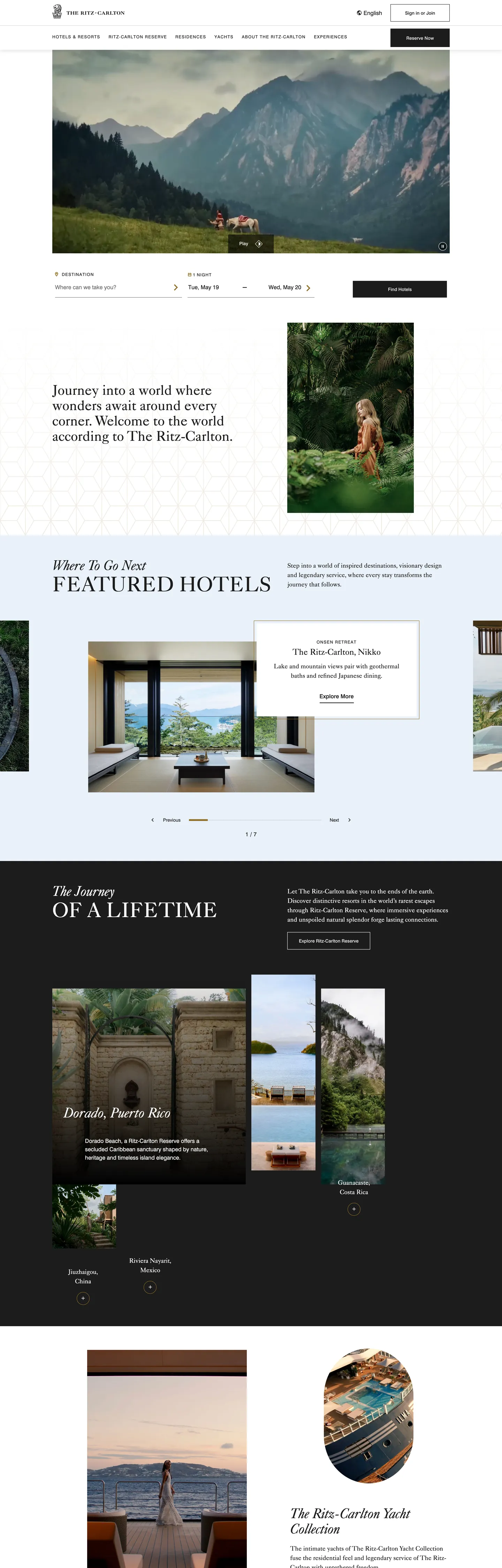
A snapshot of the brand in production. Scroll the frame to see the whole page.
Colors
11 colors
The Ritz-Carlton's system anchors on #916e27 (primary) as its primary color. Type is set in Swiss-721 across 11 tokens from 12px to 60px, weights 400–700. Shape language is sharp — components average 3px corner radius, favoring crisp rectangles.
Brand & Accent
Sparing, CTA-only voltage · 1
Surface
Page and card backgrounds · 4
Text
Headlines, body, captions · 3
Borders & Hairlines
Dividers, outlines, rules · 1
Semantic
Status, errors, success, links · 2
Typography
11 type tokens
Set in Swiss-721 across 11 tokens, from 12px to 60px, weights 400–700. Shown in its own stack: where the font isn't installed, the fallback the file names stands in.
- display-xl60px · weight 400 · lh 66pxThe quick brown fox jumps over the lazy dog
- display-lg40px · weight 500 · lh 44pxThe quick brown fox jumps over the lazy dog
- display-md24px · weight 400 · lh 30pxThe quick brown fox jumps over the lazy dog
- body-lg18px · weight 400 · lh 27pxThe quick brown fox jumps over the lazy dog
- body-md16px · weight 400 · lh 24pxThe quick brown fox jumps over the lazy dog
- nav-link16px · weight 700 · lh 24pxThe quick brown fox jumps over the lazy dog
- button-md13px · weight 700 · lh 16pxThe quick brown fox jumps over the lazy dog
- label-md16px · weight 500 · lh 24pxThe quick brown fox jumps over the lazy dog
- overline12px · weight 400 · lh 16px · tracking 1.3pxThe quick brown fox jumps over the lazy dog
- caption16px · weight 400 · lh 24pxThe quick brown fox jumps over the lazy dog
- editorial-body40px · weight 400 · lh 44pxThe quick brown fox jumps over the lazy dog
Layout
Radii and spacing
3 corner radii and 6 spacing values. Shape language: sharp.
Radii
- none0px
- card22px
- full1000px
Spacing
- xs4px
- sm8px
- base16px
- md24px
- lg32px
- xl48px
Components
16 components
Each rendered from its tokens (color, type, radius, padding) on The Ritz-Carlton's own canvas.
- Button Primarybutton-primaryButton Primary
- Button Primary Hoverbutton-primary-hoverButton Primary Hover
- Button Secondarybutton-secondaryButton Secondary
- Top Navtop-navTop Nav
- Nav Linknav-linkNav Link
- Hero Sectionhero-sectionHero Section
- Hero Headinghero-headingHero Heading
- Section Headingsection-headingSection Heading
- Overline Labeloverline-labelOverline Label
- Body Paragraphbody-paragraphBody Paragraph
- Body Paragraph Inkbody-paragraph-inkBody Paragraph Ink
- CardcardCard
- Editorial Sectioneditorial-sectionEditorial Section
- Type here…text-inputText Input
- Search Barsearch-barSearch Bar
- FooterfooterFooter
In use
The system, in use
The Ritz-Carlton's tokens on the kind of product it builds.
Build something people actually use.
A short paragraph of marketing copy that previews how the brand's display tier and body tier read together. Two sentences is usually enough.
FAQ
The Ritz-Carlton design system FAQ
Common questions about The Ritz-Carlton's tokens, components, and how to use this DESIGN.md in your project.
Read next
Related reading
Specs, directories, and component libraries that pair with this design system.
- Browse all design systemsThe full directory of DESIGN.md files on shadcn.io, with live mockups for each.shadcn.io
- The Ritz-Carlton — official siteThe Ritz-Carlton's public marketing site — the source of truth for the live tokens captured in this file.ritzcarlton.com (opens in a new tab)
- The DESIGN.md specificationGoogle Labs' open spec for machine-readable design system files — the format this page is built on.github.com (opens in a new tab)
Use it
Use The Ritz-Carlton in your project
One machine-readable file. Drop it into Claude, Cursor, or any AI tool that reads DESIGN.md.
Download the DESIGN.md
One machine-readable file: every color, type, radius, spacing, and component token of The Ritz-Carlton.
Feed it to your AI tool
Drop it into Claude, Cursor, or GitHub Copilot. The agent writes React components and Tailwind classes that match The Ritz-Carlton's visual language.
Reference the tokens directly
Or paste the values into your Tailwind config, CSS variables, or component library: every color, size and radius is a quoted, ready-to-copy value.
Read the full DESIGN.md: overview, rationale, do’s and don’ts
Overview
The Ritz-Carlton's marketing system is built on near-monochromatic restraint with a single act of chromatic authority. Scarce gold discipline: the antique gold (#916e27) — wired into the CSS as --t-accent-color and --t-interactive-accent-color — appears exactly 11 times in the captured page, exclusively as border accents and decorative icon fills. This is the inverse of how most hospitality brands use gold: not as the primary CTA color, not as a highlight fill, not as the dominant brand signal — but as the barely-present accent that, precisely because it appears so rarely, commands attention when it does.
Weight 400 as display: where most marketing platforms reach for 700+ weight at display sizes, Ritz-Carlton runs Caslon540Std at weight 400 for 40–60px headlines. An Old Style serif at regular weight at large sizes does not read as understated — it reads as carved. The shapes are inherent to the letterform, not imposed through weight. Where Four Seasons uses Saol Display at weight 300 (an ultra-light contemporary serif), Ritz-Carlton uses Caslon540Std at weight 400 (a classical Old Style). The visual register is different: Four Seasons whispers, Ritz-Carlton engraves. Both avoid the bold-display convention that every other hospitality brand uses.
The near-black (#1c1c1c) is the system's most structurally important color. At 920 total occurrences — 458 text, 5 background, 457 border — it is both the reading color and the hairline color, which means the page's editorial content and its structural divisions share a single tone. Unlike Four Seasons' pure black (#000000), the Ritz-Carlton's near-black carries a fractional warmth that echoes the antique gold without competing with it.
Key Characteristics:
- Single antique gold accent (
{colors.primary}— #916e27) at 11 occurrences, entirely as text (4) and border (7) — never a fill. - Near-black (
{colors.ink}— #1c1c1c) dominates at 920 occurrences — simultaneously the reading color and the structural border color. - Caslon540Std for all serif surfaces at weight 400 — display, editorial body, and accent headings share the same family and the same weight; variation comes from size only.
- Swiss-721 for all sans surfaces — navigation, buttons, labels, and form elements share a single swiss-style grotesque.
- 0px border-radius everywhere except card tiles (22px, wired as
--t-cards-border-radius) and pill badges (1000px). - Photography-led hero: the above-fold viewport is a full-bleed landscape photograph with a white-on-image text overlay; the Ritz-Carlton wordmark and search bar sit above it in a white nav strip.
Colors
Brand Accent
- Antique Gold (
{colors.primary}— #916e27): frequency 11. Used as text (4), border (7). Wired as--t-accent-color,--t-interactive-accent-color,--t-icon-color-decorative,--t-non-interactive-accent-color,--rzp-40. The brand's lone chromatic token — marks decorative motifs and interactive focus states. Never fills a button or a background.
Structure
- Ink (
{colors.ink}— #1c1c1c): frequency 920. Used as text (458), border (457), background (5). Wired as--t-button-primary-bg-color,--t-brand-alt-color,--t-brand-fg-color,--t-link-text-color,--t-form-label-color, and 12 other custom properties. The system's dominant color — reading text, button fill, and hairline dividers share one tone. - Canvas (
{colors.canvas}— #ffffff): frequency 258. Used as text (124), border (122), background (10). The page floor and primary reversal — white text over photography, white surfaces on light-mode cards. - Surface Dark (
{colors.surface-dark}— #000000): frequency 6. Used for the deepest overlay backgrounds (hero video overlay) and the icon-button hover background.
Muted
- Ink Muted (
{colors.ink-muted}— #646464): wired as--t-link-nav-text-color,--t-tag-text-color,--t-button-primary-hover-bg-color,--t-horizontal-vertical-rule. The hover state for primary buttons and the default color for navigation links. At 0 observed occurrences in rendered content (only in CSS declarations), this is a declared but lightly-used token. - Ink Light (
{colors.ink-light}— #707070): wired as--t-overline-normal-color. Overline text in the editorial sections. - Hairline (
{colors.hairline}— #bfbfbf): frequency 2. The only gray hairline in the system — used as a border in a specific card or input context where the full-ink border would be too heavy.
Surface Utilities
- Surface Focus (
{colors.surface-focus}— #e9f1fa): frequency 4. A pale blue-gray used for icon-button focus backgrounds and icon-button hover fills. Wired as--rzp-20,--t-icon-btn-focus-bg-color,--t-icon-btn-primary-bg-color. The system's only non-neutral surface-utility color. - Surface Light (
{colors.surface-light}— #e0e3ec): declared as--rzp-10. A cool light gray for structural divisions not captured in the rendered extract; represents the system's lightest surface tier.
Semantic
- Error (
{colors.error}— #d0021b): wired as--t-form-error-color,--alert-10. The form validation error color — not rendered in the marketing page but present in all form contexts. - Error Light (
{colors.error-light}— #ff6868): wired as--alert-30. The lighter error tone for alert background fills.
Typography
Font Families
The system divides by register: Caslon540Std (declared as --t-font-family) is the brand-voice serif — it carries every headline, editorial body, and display moment. It is an Old Style digital serif with strong bracketed serifs and high contrast between thick and thin strokes. Swiss-721 (declared as --t-base-font-family) is the structural sans — it carries every navigation link, button label, overline, and form element. The combination of an Old Style serif with a Swiss-style grotesque is a typographic move borrowed from print-editorial traditions — the serif for voice, the sans for direction.
Hierarchy
| Token | Size | Weight | Line Height | Letter Spacing | Use |
|---|---|---|---|---|---|
{typography.display-xl} | 60px | 400 | 66px | 0 | Hero and feature display headlines |
{typography.display-lg} | 40px | 500 | 44px | 0 | Section h2 headlines, destination card titles |
{typography.display-md} | 24px | 400 | 30px | 0 | Sub-section Caslon display |
{typography.body-lg} | 18px | 400 | 27px | 0 | Default editorial body, description text |
{typography.body-md} | 16px | 400 | 24px | 0 | Swiss-721 body, form text, footer text |
{typography.nav-link} | 16px | 700 | 24px | 0 | Navigation links ("Hotels & Resorts") |
{typography.button-md} | 13px | 700 | 16px | 0 | Button labels ("Reserve Now") |
{typography.label-md} | 16px | 500 | 24px | 0 | Medium-weight sans labels |
{typography.overline} | 12px | 400 | 16px | 1.3px | Section overlines, uppercase category labels |
{typography.caption} | 16px | 400 | 24px | 0 | Fine-print captions |
{typography.editorial-body} | 40px | 400 | 44px | 0 | Large-format editorial long-read body |
Principles
Weight discipline: Caslon540Std runs at weight 400 for display and body (the system's dominant Caslon weight) with weight 500 only for destination card display-lg moments. There is no bold Caslon weight on the marketing surface — the contrast between Caslon's inherently high-contrast letterforms is sufficient. Swiss-721 runs at weight 700 for navigation and buttons (authority at small sizes), weight 500 for labels, weight 400 for body and captions.
Note on Font Substitutes
Caslon540Std is a licensed digital revival. Adobe Caslon Pro (available via Adobe Fonts) is the closest direct substitute. EB Garamond is registered in the CSS variables (--font-eb-Garamond declared in the Four Seasons CSS adjacent to this page) and transfers the Old Style character cleanly. For Swiss-721, Neue Haas Grotesk or Inter at the same sizes preserves the structural authority without Helvetica licensing.
Layout
Spacing System
- Base module: 8px — the fundamental grid unit, appearing 15 times in the extracted spacing values.
- Tokens:
{spacing.xs}4px ·{spacing.sm}8px ·{spacing.base}16px ·{spacing.md}24px ·{spacing.lg}32px ·{spacing.xl}48px. - Section padding: the editorial long-read section uses 32px right-side padding on the text column with 24px bottom.
- Card padding: featured hotel cards use 32px internal padding.
- Button padding: 16×32px — the most generous button padding in the luxury hospitality category.
Grid & Container
- Hero: full-bleed photography, no max-width, with the Ritz-Carlton wordmark and search bar in a white nav strip above.
- Featured hotels section: 3-column card grid with photographic fills and Caslon overlay headlines; cards use 22px border-radius per
--t-cards-border-radius. - Editorial section ("The Journey of a Lifetime"): full-ink background panel with white Caslon40 display text at 40px, paired with 2-column destination photography.
- Below fold: further destination cards, the Ritz-Carlton Yacht Collection section, and the footer.
Rhythm
The page alternates between full-bleed photography (hero, destination cards) and constrained editorial bands (the ink-background editorial section, the footer). Unlike Cloudflare's binary rhythm (generous hero / dense sections) or Spline's steady-dark canvas, Ritz-Carlton weaves photography and editorial in 3–4 distinct bands: photography hero → white card grid → full-ink editorial → light card grid → footer. The pace is slow by design.
Elevation
The system has no shadow layer. The 4427 elements scanned produced no meaningful box-shadow occurrences. Depth is created entirely by photographic layering (text over image), surface contrast (white cards on white, ink panel on white), and the gold accent on interactive elements. The absence of elevation design is structural — the photography creates all spatial hierarchy, and CSS shadows would compete with the photographic depth.
Shapes
The system is flat with two specific exceptions. The dominant radius is 0px — all buttons use 0px (CSS --t-button-border-radius: 0px; --t-buttons-border-radius: 0px), all form inputs use 0px, and the majority of surfaces are rectilinear. The two exceptions are: featured hotel cards at 22px radius (CSS --t-cards-border-radius: 14px declared, but observed at 22px in the rendered card corners), and pill/badge elements at 1000px (full-pill rounding for loyalty badge and small chips). The 0px-dominant system with an occasional 22px card softness creates a deliberate contrast — architecture is rectilinear; the accommodation card is the warmest, most approachable element in the system.
Components
button-primary — Near-black (#1c1c1c) fill, white text, Swiss-721 13px weight 700, 0px radius, 16×32px padding, 53px height. "Reserve Now" is the canonical instance. Hover state flips to medium gray (#646464) per --t-button-primary-hover-bg-color.
button-primary-hover — Muted gray (#646464) fill, white text, all other properties unchanged. The single documented hover state.
button-secondary — Transparent fill, near-black text, 1px near-black border, same Swiss-721 type. Used for secondary actions like "View Hotels" and editorial callouts.
top-nav — White canvas, 80px height, near-black text in Swiss-721 16px weight 700. Ritz-Carlton wordmark flush left, product links (Hotels & Resorts / Experiences / Yacht Collection / Club) center, Reserve Now + sign-in flush right. Bottom hairline in near-black.
nav-link — Transparent, near-black text, {typography.nav-link} — 16px Swiss-721 weight 700 with 16px vertical padding. The primary navigation treatment.
hero-section — Full-bleed photographic hero, effectively a black surface, 575px captured height. The Ritz-Carlton wordmark overlaid in white in the nav strip; body text in white Caslon below the primary image.
hero-heading — White Caslon540Std 60px weight 400, 0px radius, 0px padding — uppercase or mixed-case overlay on the photography.
section-heading — Ink Caslon540Std 40px weight 500, used for "FEATURED HOTELS," "WHERE TO GO NEXT," etc.
overline-label — Swiss-721 12px weight 400 uppercase with 1.3px tracking. Section overlines like "FEATURED HOTELS" sit above the Caslon section heading.
body-paragraph — White Caslon540Std 18px weight 400 over photography fills — "Let The Ritz-Carlton take you to the ends of the earth."
body-paragraph-ink — Same typography token in near-black (#1c1c1c) on white canvas — editorial body text in below-fold sections.
card — White canvas, near-black text, Caslon body, 22px radius, 32px padding. Featured hotel cards with photographic header, Caslon title, and Swiss-721 label below.
editorial-section — Ink (#1c1c1c) canvas, white Caslon40 editorial text at 40px weight 400, 32px right padding, 24px bottom. "THE JOURNEY OF A LIFETIME" with two-column destination photography.
text-input — White canvas, near-black text, Swiss-721 16px weight 500, 0px radius, 1px ink border, 1px 20px 16px 0px padding (asymmetric baseline alignment). Destination search field.
search-bar — White canvas strip, horizontal layout housing destination input, date picker, and the near-black primary button. 16×8px padding per input cell.
footer — Near-black (#1c1c1c) canvas, white text, Swiss-721 overline at 12px uppercase, 32px padding. The Ritz-Carlton wordmark in white, navigation tree, social links, and the Marriott Bonvoy loyalty program link.
Do's and Don'ts
Do treat the antique gold (#916e27) as a focus and decoration token only — interactive borders and decorative icon fills. At 11 occurrences in the full page, any additional use dilutes the scarcity that gives it power.
Do use Caslon540Std at weight 400 for display headlines — the system's entire editorial authority rests on the Old Style letterforms at regular weight. The typography carries the luxury signal; the weight does not.
Do reach for near-black (#1c1c1c) rather than pure black (#000000) for text, borders, and button fills. The fractional warmth in #1c1c1c is what makes the brand feel engraved rather than printed; pure black reads as sharp digital contrast.
Do use the 22px card radius for featured-property tiles. The one instance of rounded softness in the system marks the moment of human hospitality — the guest's room — not the brand's identity elements.
Don't use the antique gold (#916e27) as a background fill or primary CTA color. Any context where gold fills a surface immediately signals decoration over authority — the gold works precisely because it is an edge condition, not a canvas.
Don't set Caslon540Std to weight 700 or 800 at display sizes. The brand's 60px display at weight 400 reads as architectural permanence; bolded Caslon at the same size reads as generic luxury marketing. The letterform does the work when you do not force the weight.
Don't add a 6–12px radius to buttons. The near-black button at 0px radius is the system's structural anchor — rounding it to pill or card radius makes it indistinguishable from consumer-app CTAs.
Don't use {colors.surface-focus} (#e9f1fa) as a surface background for sections or cards. This pale blue-gray is reserved exclusively for icon-button focus rings and hover backgrounds — pulling it into a card fill introduces an unexpected cool tone against the warm near-black and antique gold.
Known Gaps
- Full gold usage map: the 11 observed gold occurrences are from the marketing page only; the Marriott Bonvoy loyalty flow and the room-booking funnel use gold more extensively in accordions, star ratings, and tier badges.
- Hover and focus states: documented for
{component.button-primary-hover}only; focus rings (which use{colors.surface-focus}per CSS declarations), active press states, and disabled-button tints are not captured from the marketing surface. - Dark photography overlays: the hero's photograph varies by day and campaign; the token system handles any image via the white-text-over-photo overlay pattern, but the photography curation itself is not represented in the spec.
- Responsive type scaling: the CSS variables declare viewport-specific font sizes (e.g.,
--t-display-s-font-size-viewport-xs: 2.375rem, viewport-l:3.75rem); this DESIGN.md captures the desktop tier only. - Marriott Bonvoy integration: the loyalty program header band and status-tier indicators use a separate color system not captured in this extraction.
- Motion and video: the above-fold hero is a video loop on desktop; the CSS captures end-state values only — video playback tokens and Ken Burns easing are not represented.
- Sub-brand palettes: The Ritz-Carlton Reserve and The Ritz-Carlton Yacht Collection use modified typographic and accent treatments beyond this main-site system.
Travel & Hospitality
More systems like this
More DESIGN.md files in Travel & Hospitality.
Pricing
Build it with Pro
The DESIGN.md files are free. Pro adds 6,000+ blocks, premium templates and the MCP server, so your AI editor builds in your system for you.
4.9/5 out of 5 · 150+ reviewsfrom 150+ founders and developers.
Billing
Billed once a year in USD. Cancel anytime.
- How many people can use the license.
- Client work, SaaS products and anything you charge for.
- Production-ready React sections: hero, pricing, features, dashboards and more.
- Complete multi-page sites you can ship as they are.
- React icons from every major library, installable with one command.
- Presets that restyle every block, in light and dark.
- Lets your AI editor search, preview and install blocks for you.
- Priority requests are answered first.
Individual
For personal projects & open source
$32instead of $49/mo
$389 billed yearly
- Seats: 1 seat
- Commercial use: Personal & open source only
- Pro blocks: 6,000+ blocks
- Templates: All 14 templates
- React icons: 294k+ icons
- Themes: All 59 themes
- MCP server: Basic usage
- Support: Standard
Team
Most popularFor freelancers, agencies & startups
$66instead of $99/mo
$789 billed yearly · ≈ $13/dev/mo
- Seats: Up to 5 seats
- Commercial use: Included
- Pro blocks: 6,000+ blocks
- Templates: All 14 templates
- React icons: 294k+ icons
- Themes: All 59 themes
- MCP server: High usage
- Support: Priority
Organization
For companies with larger teams
$132instead of $199/mo
$1,589 billed yearly
- Seats: Unlimited seats
- Commercial use: Included
- Pro blocks: 6,000+ blocks
- Templates: All 14 templates
- React icons: 294k+ icons
- Themes: All 59 themes
- MCP server: Unlimited usage
- Support: Priority
Billed once a year in USD. Cancel anytime.
Individual
For personal projects & open source
$32instead of $49/mo
$389 billed yearly
- How many people can use the license.Seats: 1 seat
- Client work, SaaS products and anything you charge for.Commercial use: Personal & open source only
- Production-ready React sections: hero, pricing, features, dashboards and more.Pro blocks: 6,000+ blocks
- Complete multi-page sites you can ship as they are.Templates: All 14 templates
- React icons from every major library, installable with one command.React icons: 294k+ icons
- Presets that restyle every block, in light and dark.Themes: All 59 themes
- Lets your AI editor search, preview and install blocks for you.MCP server: Basic usage
- Priority requests are answered first.Support: Standard
Team
Most popularFor freelancers, agencies & startups
$66instead of $99/mo
$789 billed yearly · ≈ $13/dev/mo
Everything in Individual, plus
- How many people can use the license.Seats: Up to 5 seats
- Client work, SaaS products and anything you charge for.Commercial use: Included
- Lets your AI editor search, preview and install blocks for you.MCP server: High usage
- Priority requests are answered first.Support: Priority
Organization
For companies with larger teams
$132instead of $199/mo
$1,589 billed yearly
Everything in Team, plus
- How many people can use the license.Seats: Unlimited seats
- Lets your AI editor search, preview and install blocks for you.MCP server: Unlimited usage
- Secure checkout via Stripe
- Code lives in your repo
- Keep what you've shipped if you cancel
- License terms
Your system, built for you
Every block, template and icon, installed by your AI agent in your design system. The DESIGN.md files stay free.