Qantas Design System
Qantas' marketing and booking design system as a DESIGN.md file. Qantas Red #df0000 brand voltage, Qantas Sans three-weight stack, 17 colors tokens, 17 components. For React, Next.js, and AI tools.
Add shadcn.io to your AI agent. · Pro It installs blocks, icons and templates in your design system from a prompt, with Pro.
Set up MCP- Primary
- #df0000
- Typeface
- Qantas Sans
- Shape
- Soft
- Base radius
- 12px
- Colors
- 17
- Type tokens
- 11
- Components
- 17
- Spacing values
- 8
About
About Qantas DESIGN.md
Curated by Dov Azencot · Updated May 19, 2026 · Source qantas.com (opens in a new tab)
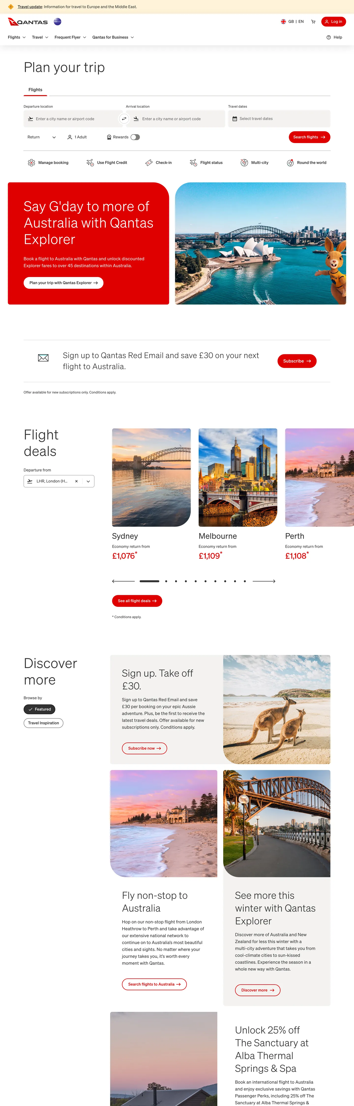
Qantas' marketing page resolves the airline design problem differently than its competitors. The page opens with a full-bleed photography hero for a Qantas Explorer promotion — red text on an aerial harbor shot — followed immediately by a booking search widget on a white canvas, then a section heading ("Flight deals") in 56px Qantas Sans at weight 300, and then a horizontal scroll of destination photography cards with price callouts. The visual hierarchy is: photography first, function second, brand color as annotation. Where British Airways uses Midnight Blue as architectural canvas and Virgin Atlantic uses dark purple as a dramatic hero fill, Qantas trusts the destination photography to carry emotional weight and reserves the red (#df0000) for text links, secondary-button outlines, and price highlights — never as a background canvas on the standard marketing page.
The DESIGN.md file packages the system into a machine-readable spec for React and AI tools. Inside: 17 colors tokens drawn from the 81 clustered CSS custom properties on `:root` — organized into a Qantas Red brand tier (wired as `--color-alias-brand-primary` and 17 components-level aliases), a charcoal ink tier at #323232 carrying 1052 page occurrences, warm-grey surface tokens at #f3f2f1 and #e5e3e1, and the loyalty-tier palette (bronze, gold, platinum, Chairman's Lounge). Eleven typography tokens run Qantas Sans from 56px display at weight 300 to 14px captions at weight 400. Seven radius tokens establish the binary 800px pill / 8px card split. 17 components definitions cover the red-outlined secondary button, the pill-shaped nav link, the photography destination card, the booking search form, and the loyalty tier badge.
Feed this file to Claude or Cursor and it will reproduce Qantas' specific moves: charcoal-not-black ink throughout, photography-over-text composition for destination sections, Qantas Red as annotation color rather than canvas fill, three-weight typographic stack with a 300-to-700 jump, and the binary pill/card radius split. The system is worth studying for its restraint — 85 red occurrences against 1052 charcoal in a brand that is synonymous with its red color demonstrates that frequency is not how brand color signals identity.
What makes it distinct
5
- Qantas Red as secondary-button voltage#df0000 wired as --color-alias-brand-primary outlines secondary buttons, underlines links, and fills the primary CTA; charcoal carries 1052 occurrences as the actual dominant tone
- Qantas Sans at three weightsdisplay at 56px/weight 300, section heads at 40px/weight 300, and buttons/nav at weight 700; the gap between 300 and 700 with nothing in between is the system's typographic signature
- Binary radius language800px pill on nav links and chips against 8px on cards and inputs; no 12/16/24px middle tier
- Photography-first destination gridthe booking search widget sits above a 3-column destination photography card grid where the only text on images is price callouts in Qantas Red
- Charcoal-not-black ink#323232 replaces pure black for all text and border rendering; the system has no pure #000000 text occurrences outside disabled-state overlays
qantas.com
Live at qantas.com
A snapshot of the brand in production. Scroll the frame to see the whole page.
Colors
17 colors
Qantas's system runs on #df0000 as its primary voltage, used in 4 of 17 components. Type is set in Qantas Sans across 11 tokens from 14px to 56px, weights 300–700. Shape language is soft — components average 439px corner radius, with no sharp interactive edges.
Brand & Accent
Sparing, CTA-only voltage · 3
Surface
Page and card backgrounds · 3
Text
Headlines, body, captions · 3
Borders & Hairlines
Dividers, outlines, rules · 1
Semantic
Status, errors, success, links · 2
Other
Specialty colors · 5
Typography
11 type tokens
Set in Qantas Sans across 11 tokens, from 14px to 56px, weights 300–700. Shown in its own stack: where the font isn't installed, the fallback the file names stands in.
- display-xl56px · weight 300 · lh 67px · tracking -0.496pxThe quick brown fox jumps over the lazy dog
- display-lg40px · weight 300 · lh 52px · tracking -0.496pxThe quick brown fox jumps over the lazy dog
- display-md32px · weight 500 · lh 45px · tracking -0.256pxThe quick brown fox jumps over the lazy dog
- heading-md18px · weight 500 · lh 28pxThe quick brown fox jumps over the lazy dog
- heading-sm18px · weight 700 · lh 28pxThe quick brown fox jumps over the lazy dog
- body-lg18px · weight 400 · lh 28pxThe quick brown fox jumps over the lazy dog
- body-md16px · weight 400 · lh 24pxThe quick brown fox jumps over the lazy dog
- body-sm14px · weight 400 · lh 20pxThe quick brown fox jumps over the lazy dog
- label-md14px · weight 400 · lh 21pxThe quick brown fox jumps over the lazy dog
- button-md16px · weight 700 · lh 24pxThe quick brown fox jumps over the lazy dog
- nav-link16px · weight 500 · lh 18pxThe quick brown fox jumps over the lazy dog
Layout
Radii and spacing
7 corner radii and 8 spacing values. Shape language: soft.
Radii
- none0px
- xs4px
- sm8px
- md12px
- lg24px
- pill800px
- full9999px
Spacing
- xs4px
- sm8px
- md12px
- base16px
- lg24px
- xl32px
- 2xl48px
- 3xl96px
Components
17 components
Each rendered from its tokens (color, type, radius, padding) on Qantas's own canvas.
- Button Primarybutton-primaryButton Primary
- Button Primary Hoverbutton-primary-hoverButton Primary Hover
- Button Secondarybutton-secondaryButton Secondary
- Button Supplementarybutton-supplementaryButton Supplementary
- Top Navtop-navTop Nav
- Nav Linknav-linkNav Link
- Hero Headinghero-headingHero Heading
- Body Paragraphbody-paragraphBody Paragraph
- Body Paragraph Mutedbody-paragraph-mutedBody Paragraph Muted
- Card Destinationcard-destinationCard Destination
- Price Calloutprice-calloutPrice Callout
- Type here…text-inputText Input
- Type here…text-input-focusedText Input Focused
- Section Headingsection-headingSection Heading
- Editorial Tileeditorial-tileEditorial Tile
- Tier Badgetier-badgeTier Badge
- FooterfooterFooter
In use
The system, in use
Qantas's tokens on the kind of product it builds.
Build something people actually use.
A short paragraph of marketing copy that previews how the brand's display tier and body tier read together. Two sentences is usually enough.
FAQ
Qantas design system FAQ
Common questions about Qantas's tokens, components, and how to use this DESIGN.md in your project.
Read next
Related reading
Specs, directories, and component libraries that pair with this design system.
- Browse all design systemsThe full directory of DESIGN.md files on shadcn.io, with live mockups for each.shadcn.io
- Qantas — official siteQantas' public marketing and booking site — the source of truth for the live tokens captured in this file.qantas.com (opens in a new tab)
- The DESIGN.md specificationGoogle Labs' open spec for machine-readable design system files — the format this page is built on.github.com (opens in a new tab)
Use it
Use Qantas in your project
One machine-readable file. Drop it into Claude, Cursor, or any AI tool that reads DESIGN.md.
Download the DESIGN.md
One machine-readable file: every color, type, radius, spacing, and component token of Qantas.
Feed it to your AI tool
Drop it into Claude, Cursor, or GitHub Copilot. The agent writes React components and Tailwind classes that match Qantas's visual language.
Reference the tokens directly
Or paste the values into your Tailwind config, CSS variables, or component library: every color, size and radius is a quoted, ready-to-copy value.
Read the full DESIGN.md: overview, rationale, do’s and don’ts
Overview
Qantas' digital surface is built on a paradox: the brand is synonymous with red, but the page is predominantly charcoal. Red as annotation: where Virgin Atlantic fills hero sections with deep purple canvas and Air New Zealand commits black and red as co-equal structural tones, Qantas treats Qantas Red (#df0000) as annotation — it underlines links, outlines secondary buttons, marks price callouts, and fills the primary CTA — while charcoal (#323232) at 1052 page occurrences carries the actual structural weight of text, borders, and hairlines. The 85 red occurrences against 1052 charcoal on a brand that names its airline after its color inverts every expectation about how a brand deploys its voltage color.
Photography does the emotional work that brand color fills would do on a less visually rich brand. The hero shows Sydney Harbour from the air on a Qantas Explorer campaign tile. Below that, a "Flight deals" section renders Melbourne, Sydney, and Perth as photography cards with city names and from-price callouts in red. The "Discover more" editorial band runs full-bleed kangaroo photography and Harbour Bridge sunset tiles. The red appears in the photography sections as text annotation on images — never as a background fill competing with the photography.
Typography runs Qantas Sans across every tier — a proprietary grotesk with a notably sparse weight stack: 300 for display and body-light, 400 for running text and labels, 700 for buttons and nav links. The weight-300 display at 56px gives the "Plan your trip" section heading a considered, lightweight openness; the weight-700 button labels ("Search flights," "Sign up") shift to assertive without an intermediate semibold tier. Light display, heavy action is the principle — the 300-to-700 gap with no weight in between is the sharpest typographic decision in the system.
Key Characteristics:
- Qantas Red (#df0000) at 85 occurrences — annotation voltage, not canvas fill; 40 as text, 40 as border, 5 as background.
- Charcoal ink (#323232) at 1052 occurrences — the dominant structural tone for all text, borders, and hairlines; the page reads charcoal-and-white, with red as highlight.
- Qantas Sans at three weights only: 300 (display, body-light), 400 (running text), 700 (buttons, nav); no 500 or 600 in the system.
- Binary radius — 800px pill for nav links and chips, 8px for cards and inputs; no middle tier.
- 70px tall booking search inputs — the date picker and airport-selector fields are unusually tall (70px) compared to the 44–48px standard; the height makes them tappable on mobile without explicit mobile handling.
- Photography-first editorial bands — destination content runs as photography cards with price annotations, not text-and-icon layouts.
- Teal focus ring (#237271) — the
--color-alias-text-field-focusedand--color-comp-web-text-field-focused-borderuse teal rather than the brand red for keyboard focus states.
Colors
Brand
- Qantas Red (
{colors.primary}— #df0000): frequency 85. Used as text (40), border (40), background (5). Wired as--color-alias-brand-primary,--color-comp-web-button-primary-enabled-background,--color-comp-web-button-secondary-enabled-border. The brand voltage — 30 CSS component aliases, present in interactive surfaces across the system. - Primary Hover (
{colors.primary-hover}— #bc0b07): frequency 0 on base page; wired as--color-alias-interactive-primary-hover,--color-comp-web-button-primary-hover-background. A one-step darker red for hover and active states on the primary CTA. - Primary Pressed (
{colors.primary-pressed}— #99110b): frequency 0; wired as--color-alias-interactive-primary-pressed,--color-comp-web-button-primary-pressed-background. The deepest red for press confirmation.
Structural (Text / Border)
- Ink (
{colors.ink}— #323232): frequency 1052. Used as text (526), border (522), background (4). The dominant structural tone — every heading, body paragraph, nav label, hairline rule, and input border is charcoal. Wired across 100+ CSS custom properties. Not black; the slight lift reduces contrast harshness against white at small text sizes. - Ink Secondary (
{colors.ink-secondary}— #666564): frequency 72. Used as text (36), border (36). The secondary text tone for body captions, overline labels, placeholder text, and muted button text. Wired as--color-alias-text-secondary,--color-comp-web-teaser-body-text. - Ink Tertiary (
{colors.ink-tertiary}— #7f7e7d): frequency 2. A lighter text muted for disabled labels and the--color-alias-icon-secondarycontext.
Surface
- Canvas (
{colors.canvas}— #ffffff): frequency 60. The page floor — used as background across the booking form, content sections, and card surfaces. Wired as--color-alias-surface-background-primary,--color-alias-text-field-background-primary. - Surface 1 (
{colors.surface-1}— #f3f2f1): frequency 10. The warm-grey secondary surface for the booking search form background, input field fills, and secondary section backgrounds. Wired as--color-alias-surface-background-secondary,--background-grey. - Surface 2 (
{colors.surface-2}— #e5e3e1): frequency 12. A slightly darker warm grey for disabled states, hover backgrounds on tertiary buttons, and divider-subtle rules. Wired as--color-alias-surface-background-tertiary,--color-alias-border-subtle.
Hairline
- Hairline (
{colors.hairline}— #cccac8): frequency 1. Border tone for card outlines, divider rules, and the inactive page-indicator dot. Wired as--color-alias-page-indicator-inactive,--color-alias-text-secondary-on-dark.
Interactive
- Focus (
{colors.focus}— #237271): frequency 0 on resting state; wired as--color-alias-text-field-focused,--color-comp-web-text-field-focused-border. The teal focus ring — deliberately not the brand red, preventing focus rings from reading as error or brand states.
Loyalty Tiers
- Tier Bronze (
{colors.tier-bronze}— #df0000): shares the brand primary; wired as--color-base-qff-status-bronze. Bronze tier is the entry level, using the open brand red. - Tier Gold (
{colors.tier-gold}— #c3a56e): frequency 0 in marketing chrome; wired as--color-base-qff-status-gold,--color-alias-tiers-qff-status-gold-primary. A warm amber-gold for the QFF Gold membership indicator. - Tier Platinum One (
{colors.tier-platinum-one}— #0f2e4d): frequency 0; wired as--color-base-navy-80. A deep navy for the Platinum One tier — the highest QFF status outside Chairman's Lounge. - Tier Chairman's (
{colors.tier-chairmans}— #191919): frequency 0; wired as--color-base-qff-status-chairmans-lounge. Near-black for Chairman's Lounge — the darkest, most exclusive tier color signal.
Semantic
- Error (
{colors.error}— #bc0b07): wired as--color-alias-validation-error,--color-comp-web-text-field-error-border. A slightly darker red than the brand primary — distinct enough from #df0000 to read as a different semantic state. - Success (
{colors.success}— #208204): wired as--color-alias-validation-success,--color-alias-text-positive.
Typography
Font Family
The system runs Qantas Sans (declared as "Qantas Sans", Helvetica, sans-serif) across every tier without a secondary voice. No serif, no monospace, no secondary sans — one family does every typographic job from the 56px display heading to the 14px form label. The weight range is intentionally sparse: 300, 400, and 700 only — the intermediate semibold (500/600) tier is absent from the captured surfaces entirely.
Hierarchy
| Token | Size | Weight | Line Height | Letter Spacing | Use |
|---|---|---|---|---|---|
{typography.display-xl} | 56px | 300 | 67px | -0.496px | h2 "Plan your trip," "Flight deals" section headings |
{typography.display-lg} | 40px | 300 | 52px | -0.496px | Sub-section h3 headings, "Discover more" |
{typography.display-md} | 32px | 500 | 45px | -0.256px | Featured promotional price headings, deep display |
{typography.heading-md} | 18px | 500 | 28px | 0 | Card titles, h2/h3 sub-section headings |
{typography.heading-sm} | 18px | 700 | 28px | 0 | Strong card titles, prominent h3 instances |
{typography.body-lg} | 18px | 400 | 28px | 0 | Body paragraph — editorial descriptions |
{typography.body-md} | 16px | 400 | 24px | 0 | Default running text, form labels, standard body |
{typography.body-sm} | 14px | 400 | 20px | 0 | Captions, footnotes, overline labels |
{typography.label-md} | 14px | 400 | 21px | 0 | Form field labels |
{typography.button-md} | 16px | 700 | 24px | 0 | Primary and secondary button labels |
{typography.nav-link} | 16px | 500 | 18px | 0 | Top-nav link labels |
Principles
The weight-300 display at 56px is the most distinctive typographic decision in the system. Where most airline booking sites run section headings at weight 600–700 to assert authority, Qantas runs "Plan your trip" at weight 300 — the same weight as a light body paragraph at 6x the size. The openness of light-weight display at 56px creates a browsing-forward, unhurried character that contrasts with the transactional weight-700 buttons ("Search flights"). Light display, heavy action — the weight jump from 300 (heading) to 700 (button) with no intermediate tier is the typographic signature.
Font Substitutes
Qantas Sans is proprietary. Nunito Sans at weights 300/400/700 is the closest open-source substitute for the rounded-grotesk character; Figtree at the same weights captures the slightly warmer counter shapes more faithfully. For the display tier, either substitute must use the tight -0.5px tracking that the extracted samples show — without it, the 56px heading feels too open.
Layout
Spacing System
- Base unit: 8px — the dominant gap value at 65 occurrences in the extracted spacing.
- Tokens:
{spacing.xs}4px ·{spacing.sm}8px ·{spacing.md}12px ·{spacing.base}16px ·{spacing.lg}24px ·{spacing.xl}32px ·{spacing.2xl}48px ·{spacing.3xl}96px. - Booking form:
{spacing.3xl}(96px) internal section padding in the booking area; the search input fields are 70px tall — 26px taller than the booking-site category standard. - Card internal padding:
{spacing.lg}24px for editorial tiles; destination photography cards run 0 internal padding (photography bleeds to edge, text sits below the image).
Grid and Container
- Max content width: ~1040px for the booking search widget; the flight-deals destination grid runs at full page width with 3 columns.
- Hero band: the promotional banner (Qantas Explorer, "Say G'day to more of Australia") runs full-bleed with photography on the right half and red text + CTA on the left half.
- Flight deals grid: 3-column horizontal scroll on desktop, showing destination photography cards with city name, "from £X" price callout, and a flight indicator.
- Discover more: 2-column editorial grid with full-bleed photography tiles, alternating text placement.
Rhythm
The page alternates between utility (white booking widget sections, form inputs) and editorial (full-bleed photography bands). The booking search widget and the flight-deals section are white-canvas functional zones. The Qantas Explorer hero band and the "Discover more" editorial band are photography-led atmospheric zones. The rhythm is: utility / photography / utility / photography, with the charcoal section headings acting as the only transitional typographic signal.
Elevation
The system uses minimal shadow. The extracted page has no significant box-shadow occurrences on the marketing surface. Elevation is created through surface-color contrast — white cards on the warm-grey surface-1 booking widget background, photography tiles that bleed to card edges with no border, and the charcoal footer on white. The booking search form inputs use a {colors.surface-1} fill rather than a white fill — the warm-grey inverts the card-on-canvas relationship: the input is darker than the page, not lighter. The teal focus border ({colors.focus}) on focused inputs is the most visually active elevation signal on the page.
Shapes
The radius language is binary — tight form controls versus generous pills:
{rounded.none}0px — section bands, footer, full-bleed photography tiles.{rounded.xs}4px — secondary chip surfaces, the smallest interactive elements.{rounded.sm}8px (46 occurrences — dominant) — cards, input fields, the booking search container. The workhorse radius.{rounded.md}12px — 1 occurrence; a single transitional surface.{rounded.lg}24px — 1 occurrence; large feature card variant.{rounded.pill}800px (22 occurrences) — nav links, chip buttons, primary and secondary CTA buttons. The nav link component was captured at 40px height with 800px radius, rendering as a full pill.{rounded.full}9999px — circular avatar badges, loyalty tier chip pills at 50% radius.
No 16px or 32px radius exists in the system. The binary structure is deliberate: utility surfaces are tight (8px), navigational and action surfaces are fully rounded (800px). The contrast between the form-precision of the booking input fields and the warmth of the pill nav links is the shape language's personality.
Components
button-primary — Qantas Red {colors.primary} fill, white text, weight-700 label, 800px pill radius, 12×24px padding, 48px height. The "Search flights" and "Sign up" CTAs are the canonical instances. Red fill on white is the only background application of the brand color.
button-primary-hover — Darkens to {colors.primary-hover} (#bc0b07) on hover — a visibly darker red confirming interactivity.
button-secondary — White {colors.canvas} fill with 1px Qantas Red border and red text, 800px pill radius. The "View all" and supplementary action buttons. The red border gives secondary buttons as much brand presence as the primary CTA — the two-button pairing appears frequently side by side.
button-supplementary — Transparent fill, red text, no border, 800px pill radius, 8×20px padding. The "Read more" and tertiary link-style actions.
top-nav — White {colors.canvas} surface, charcoal text, 56px height, 1px {colors.surface-2} bottom rule. Qantas wordmark (the flying kangaroo icon + logotype) at left; primary nav links center; search, login, and the "Book" red CTA pill at right.
nav-link — White background, charcoal {colors.ink} text at {typography.nav-link} 16px / 500, 800px pill radius, 8×16px padding captured from extraction. Hover state applies a {colors.surface-2} background fill — the pill shape makes the hover fill read as an enclosed zone rather than a boxy rectangle.
hero-heading — Charcoal ink {colors.ink} text, {typography.display-xl} 56px / 300, -0.5px tracking. The "Plan your trip" section heading — weight 300 at this size reads as considered, not timid.
section-heading — Same {typography.display-xl} token; applied to "Flight deals," "Discover more." Charcoal text throughout; the red never appears as a section heading color.
body-paragraph — Charcoal ink at {typography.body-lg} 18px / 400. The editorial body text for destination descriptions and promotional copy.
body-paragraph-muted — Secondary charcoal {colors.ink-secondary} (#666564) at {typography.body-md} for overline labels, teaser sub-text, and form hints.
card-destination — White {colors.canvas} fill, {rounded.sm} 8px radius, 0 internal padding (photography bleeds to edge). Used in the 3-column flight-deals grid. Photography occupies the upper 2/3 of the card; city name and price callout sit in a text zone below with 16×16px padding.
price-callout — Transparent background, Qantas Red {colors.primary} text at {typography.body-md}. The "from £107" and "from £199" price labels on destination cards. The red text is the primary brand signal on the photography grid.
text-input — {colors.surface-1} fill (warm grey), charcoal text, {rounded.sm} 8px radius, 0×24px padding (horizontal) with 48px icon indent on the left, 70px height. The booking search fields (Where from, Where to, Travel dates) use this unusually tall format.
text-input-focused — Same as text-input but {colors.focus} (#237271) teal border replaces the hairline. The teal focus ring distinguishes focus from error (red) and from the brand primary — a deliberate three-way color split for accessibility.
editorial-tile — {colors.surface-1} fill, {rounded.sm} 8px radius, 24px padding. The "Sign up: Take off £30" and "Fly non-stop to Australia" editorial cards in the "Discover more" section.
tier-badge — Gold {colors.tier-gold} fill, white text, {typography.label-md}, pill radius. The QFF Gold tier indicator. Bronze tier shares the brand red; Platinum One uses the deep navy.
footer — Charcoal ink {colors.ink} fill (not pure black), white text at {typography.body-sm}, 48×32px padding. The footer mirrors the nav in using charcoal as the dark structural tone — the deep-navy footer that most airline brands use appears here as charcoal.
Do's and Don'ts
Do keep Qantas Red as annotation and action color, not canvas fill. The system's defining move is 85 red occurrences against 1052 charcoal — the red reads as signal precisely because it is scarce. Filling section backgrounds, editorial tiles, or hero bands in red would collapse the signal-to-noise ratio.
Do use weight 300 for display headings at 40px and above. The 56px weight-300 section headings invert the expected airline display convention. Bumping to weight 400 or 500 at this size shifts from "considered" to "generic airline booking."
Do run booking form inputs at 70px height. The tall input fields are not a mistake — they are extracted from the live page (height: 70px on #departurePort-input). They create a generous, tap-friendly affordance that reads as high-spec against the 44px-standard inputs most booking sites use.
Do use the teal {colors.focus} (#237271) for focus rings rather than the brand red. The three-way color split — red for brand/interactive, teal for focus, dark-red #bc0b07 for error — keeps keyboard navigation visually distinct from brand and error states.
Don't add a weight-500 or weight-600 intermediate tier to the typography stack. The 300-to-700 jump is the system's signature; introducing a middle weight softens the contrast between the considered display tone and the assertive action label.
Don't use {colors.surface-1} (#f3f2f1) for text or border roles — it is a background-only token (10 occurrences, all background fills). For light borders use {colors.surface-2} (#e5e3e1) or {colors.hairline} (#cccac8).
Don't apply a 16px or 24px corner radius to the navigation pill surfaces. The nav link component runs at 800px radius — effectively maximum. Switching to a more conservative 16px or 24px radius would make the nav links read as pill-ish rather than fully pill, losing the binary contrast with the tight 8px card radius.
Don't use the loyalty tier colors ({colors.tier-gold}, {colors.tier-platinum-one}, {colors.tier-chairmans}) outside QFF loyalty contexts. The status escalation from red bronze to near-black Chairman's Lounge is a deliberate status signal; decorating marketing content with gold or navy tier tones dilutes the exclusivity reading.
Known Gaps
- Hero photography tokens: the full-bleed destination photography bands use specific photography art-direction guidelines (subject placement, color temperature, altitude framing for cities) that are not expressible as design tokens — the visual identity of photography selection is absent from this spec.
- Hover states: documented for
{component.button-primary-hover}only; the secondary button hover, the nav-link pill hover fill, and the card hover state are wired in CSS but not represented as named components. - Mobile booking form: at mobile widths the 3-column flight-deals grid collapses and the booking form tabs (Return / One-way / Multi-city) change layout; the responsive breakpoints are not captured.
- QFF tier full palette: Silver (#b2b2b2) and the Chairman's Lounge full visual system (including special check-in signage) are declared in CSS variables but not represented as components in this spec.
- Motion: the Qantas Explorer promotional banner uses an auto-playing carousel; the page-indicator dots (captured as
--color-alias-page-indicator-activeand--color-alias-page-indicator-inactive) imply slide animation that is not reflected in the static token spec. - In-flight and product branding: Qantas' cabin interiors, Business Suite styling, and the Business Rewards sub-brand carry separate visual identities not captured on the public marketing page.
Travel & Hospitality
More systems like this
More DESIGN.md files in Travel & Hospitality.
Pricing
Build it with Pro
The DESIGN.md files are free. Pro adds 6,000+ blocks, premium templates and the MCP server, so your AI editor builds in your system for you.
4.9/5 out of 5 · 150+ reviewsfrom 150+ founders and developers.
Billing
Billed once a year in USD. Cancel anytime.
- How many people can use the license.
- Client work, SaaS products and anything you charge for.
- Production-ready React sections: hero, pricing, features, dashboards and more.
- Complete multi-page sites you can ship as they are.
- React icons from every major library, installable with one command.
- Presets that restyle every block, in light and dark.
- Lets your AI editor search, preview and install blocks for you.
- Priority requests are answered first.
Individual
For personal projects & open source
$32instead of $49/mo
$389 billed yearly
- Seats: 1 seat
- Commercial use: Personal & open source only
- Pro blocks: 6,000+ blocks
- Templates: All 14 templates
- React icons: 294k+ icons
- Themes: All 59 themes
- MCP server: Basic usage
- Support: Standard
Team
Most popularFor freelancers, agencies & startups
$66instead of $99/mo
$789 billed yearly · ≈ $13/dev/mo
- Seats: Up to 5 seats
- Commercial use: Included
- Pro blocks: 6,000+ blocks
- Templates: All 14 templates
- React icons: 294k+ icons
- Themes: All 59 themes
- MCP server: High usage
- Support: Priority
Organization
For companies with larger teams
$132instead of $199/mo
$1,589 billed yearly
- Seats: Unlimited seats
- Commercial use: Included
- Pro blocks: 6,000+ blocks
- Templates: All 14 templates
- React icons: 294k+ icons
- Themes: All 59 themes
- MCP server: Unlimited usage
- Support: Priority
Billed once a year in USD. Cancel anytime.
Individual
For personal projects & open source
$32instead of $49/mo
$389 billed yearly
- How many people can use the license.Seats: 1 seat
- Client work, SaaS products and anything you charge for.Commercial use: Personal & open source only
- Production-ready React sections: hero, pricing, features, dashboards and more.Pro blocks: 6,000+ blocks
- Complete multi-page sites you can ship as they are.Templates: All 14 templates
- React icons from every major library, installable with one command.React icons: 294k+ icons
- Presets that restyle every block, in light and dark.Themes: All 59 themes
- Lets your AI editor search, preview and install blocks for you.MCP server: Basic usage
- Priority requests are answered first.Support: Standard
Team
Most popularFor freelancers, agencies & startups
$66instead of $99/mo
$789 billed yearly · ≈ $13/dev/mo
Everything in Individual, plus
- How many people can use the license.Seats: Up to 5 seats
- Client work, SaaS products and anything you charge for.Commercial use: Included
- Lets your AI editor search, preview and install blocks for you.MCP server: High usage
- Priority requests are answered first.Support: Priority
Organization
For companies with larger teams
$132instead of $199/mo
$1,589 billed yearly
Everything in Team, plus
- How many people can use the license.Seats: Unlimited seats
- Lets your AI editor search, preview and install blocks for you.MCP server: Unlimited usage
- Secure checkout via Stripe
- Code lives in your repo
- Keep what you've shipped if you cancel
- License terms
Your system, built for you
Every block, template and icon, installed by your AI agent in your design system. The DESIGN.md files stay free.