Polestar Design System
Polestar's Swedish minimalist EV system as a DESIGN.md file. Polestar Unica typeface, #000000 ink, single weight 400, 19 components. For React and AI tools.
Add shadcn.io to your AI agent. · Pro It installs blocks, icons and templates in your design system from a prompt, with Pro.
Set up MCP- Primary
- #ffffff
- Typeface
- Polestar Unica
- Shape
- Sharp
- Base radius
- 0px
- Colors
- 19
- Type tokens
- 10
- Components
- 19
- Spacing values
- 9
About
About Polestar DESIGN.md
Curated by Dov Azencot · Updated May 13, 2026 · Source polestar.com (opens in a new tab)
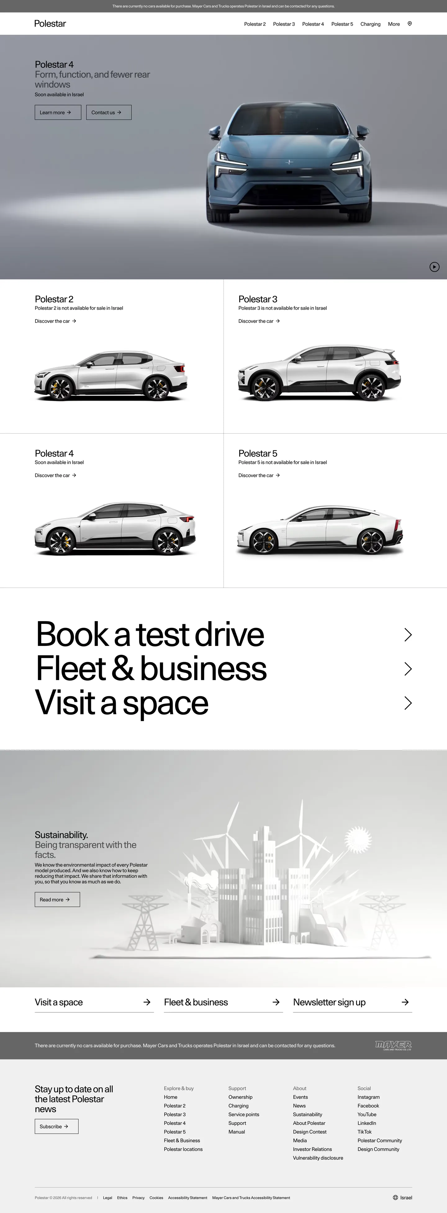
Polestar's site reads as a Stockholm gallery rather than an automotive marketing page. The hero band is a pale studio-gray stage (a near-#efefef wash) holding one car in three-quarter view — no driver, no road, no motion. The model name sits above the photograph at 30px in Polestar Unica weight 400 with -1.2px letter-spacing, and two stacked link CTAs ("Learn more →", "Contact →") read as plain anchored text rather than filled buttons. Below the hero, a 2×2 grid of product cards repeats the same studio treatment on white surfaces, and the page closes with a dark anthracite footer that inverts ink from black to white. The chrome refuses to compete with the cars.
This DESIGN.md captures the full Polestar system in machine-readable form: 19 colors tokens spanning a single ink + canvas pair plus structural grays and the dark-footer inversion, 10 typography tokens all running Polestar Unica at weight 400 (the family has no other weight in production use), 9 spacing tokens on a 4px base, a two-step radius scale (0px and 50%), and 19 components definitions covering the hero stage, product card, link-CTA, top nav, footer, and the persistent legal-strip. The file follows the Google Labs DESIGN.md specification so AI coding tools can parse the tokens directly.
Feed it to Claude, Cursor, or GitHub Copilot and the agent reproduces Polestar's restraint — single-weight type, hard-edged rectangles, link-style CTAs, studio-still photography on gray — rather than a generic EV theme. You can also paste the tokens directly into Tailwind config or CSS variables. The system is worth studying because it commits harder than almost any other car brand to the idea that the typeface, not the color, is the brand voice — confidence by typographic monoculture rather than chromatic noise.
What makes it distinct
5
- Single-weight typographyPolestar Unica runs only at weight 400 across every size from 12px legal to 110px hero numerals
- Tracked-tight negative letterspacingdisplay sits at -1.2px and the hero numeral at -4.95px, so cap-heights nearly touch
- Studio-still photographyevery car sits centered on the same pale-gray no-horizon backdrop, no tracks, no drivers, no motion
- Binary radius0px on every rectangular surface, 50% on exactly one element (the video play circle); nothing in between
- Pale-gray stage canvasthe hero band uses a soft #efefef studio backdrop rather than the white that paginates the rest of the site
polestar.com
Live at polestar.com
A snapshot of the brand in production. Scroll the frame to see the whole page.
Colors
19 colors
Polestar's system runs on #ffffff as its primary voltage, used in 4 of 19 components. Type is set in Polestar Unica across 10 tokens from 12px to 110px, weights 400–400. Shape language is sharp — components average 0px corner radius, favoring crisp rectangles.
Surface
Page and card backgrounds · 3
Text
Headlines, body, captions · 9
Borders & Hairlines
Dividers, outlines, rules · 3
Other
Specialty colors · 4
Typography
10 type tokens
Set in Polestar Unica across 10 tokens, from 12px to 110px, weights 400–400. Shown in its own stack: where the font isn't installed, the fallback the file names stands in.
- hero-numeral110px · weight 400 · lh 1 · tracking -4.95pxThe quick brown fox jumps over the lazy dog
- display-lg56px · weight 400 · lh 1.05 · tracking -2pxThe quick brown fox jumps over the lazy dog
- display-md30px · weight 400 · lh 1.07 · tracking -1.2pxThe quick brown fox jumps over the lazy dog
- title-md20px · weight 400 · lh 1.3 · tracking -0.5pxThe quick brown fox jumps over the lazy dog
- body-lg16px · weight 400 · lh 2 · tracking -0.3pxThe quick brown fox jumps over the lazy dog
- body-md16px · weight 400 · lh 1.125 · tracking -0.3pxThe quick brown fox jumps over the lazy dog
- link-md16px · weight 400 · lh 1.125 · tracking -0.3pxThe quick brown fox jumps over the lazy dog
- caption-md12px · weight 400 · lh 1.17 · tracking -0.3pxThe quick brown fox jumps over the lazy dog
- caption-sm12px · weight 400 · lh 1.17 · tracking -0.1pxThe quick brown fox jumps over the lazy dog
- nav-link16px · weight 400 · lh 1.125 · tracking -0.3pxThe quick brown fox jumps over the lazy dog
Layout
Radii and spacing
2 corner radii and 9 spacing values. Shape language: sharp.
Radii
- none0px
- full50%
Spacing
- xxs2px
- xs4px
- sm8px
- md16px
- lg24px
- xl32px
- xxl48px
- xxxl64px
- gutter-wide112px
Components
19 components
Each rendered from its tokens (color, type, radius, padding) on Polestar's own canvas.
- Top Navtop-navTop Nav
- Nav Linknav-linkNav Link
- Hero Stagehero-stageHero Stage
- Hero Numeral Blockhero-numeral-blockHero Numeral Block
- Link Ctalink-ctaLink Cta
- Link Cta Invertedlink-cta-invertedLink Cta Inverted
- Product Cardproduct-cardProduct Card
- Product Card Availabilityproduct-card-availabilityProduct Card Availability
- Row Link Bandrow-link-bandRow Link Band
- Video Play Circlevideo-play-circleVideo Play Circle
- Sustainability Bandsustainability-bandSustainability Band
- FooterfooterFooter
- Footer Column Headingfooter-column-headingFooter Column Heading
- Footer Linkfooter-linkFooter Link
- Newsletter Ctanewsletter-ctaNewsletter Cta
- Type here…text-inputText Input
- Legal Striplegal-stripLegal Strip
- Region Toggleregion-toggleRegion Toggle
- ScrimscrimScrim
In use
The system, in use
Polestar's tokens on the kind of product it builds.
Build something people actually use.
A short paragraph of marketing copy that previews how the brand's display tier and body tier read together. Two sentences is usually enough.
FAQ
Polestar design system FAQ
Common questions about Polestar's tokens, components, and how to use this DESIGN.md in your project.
Read next
Related reading
Specs, directories, and component libraries that pair with this design system.
- Browse all design systemsThe full directory of DESIGN.md files on shadcn.io, with live mockups for each.shadcn.io
- Polestar — official siteThe Swedish electric-performance brand's global marketing site.polestar.com (opens in a new tab)
- The DESIGN.md specificationGoogle Labs' open spec for machine-readable design system files.github.com (opens in a new tab)
Use it
Use Polestar in your project
One machine-readable file. Drop it into Claude, Cursor, or any AI tool that reads DESIGN.md.
Download the DESIGN.md
One machine-readable file: every color, type, radius, spacing, and component token of Polestar.
Feed it to your AI tool
Drop it into Claude, Cursor, or GitHub Copilot. The agent writes React components and Tailwind classes that match Polestar's visual language.
Reference the tokens directly
Or paste the values into your Tailwind config, CSS variables, or component library: every color, size and radius is a quoted, ready-to-copy value.
Read the full DESIGN.md: overview, rationale, do’s and don’ts
Overview
Polestar's marketing surface is a Stockholm gallery rather than a car configurator — a pale studio-gray stage ({colors.stage} — #efefef) holding one vehicle in three-quarter view, with the model name floating above at 30px in Polestar Unica weight 400. There is no chromatic brand voltage in the system. The page runs black ink ({colors.ink} — #000000) on light surfaces, inverts to white ink on the dark anthracite footer ({colors.footer-canvas} — #1a1a1a), and reserves a 50% radius for exactly one element — the circular video play button — while every other corner is a hard 0px.
Typographic monoculture: where most automotive sites pair a heavy display weight against a light body cut, Polestar runs one weight everywhere — 400 — at sizes spanning 12px legal text to a 110px hero numeral. The chassis of the brand is the typeface itself, with negative letter-spacing that tightens cap-heights together so headlines read as engineered rather than typed. Display sits at -1.2px, the 110px numeral pushes to -4.95px, and even 16px body carries -0.3px tracking. This monoweight stance is the brand's confidence signal — no bolding, no italics, no uppercase tricks.
Studio-still photography: every car sits centered on the same pale-gray no-horizon backdrop, in three-quarter front view, with no driver, no road, no motion blur. This is not Tesla's cinematic landscape work, not BMW M's track photography — it is product photography in the IKEA-catalog tradition, with each vehicle isolated and measured. The cars carry the page through composition, not action.
Key Characteristics:
- Single-weight typography — Polestar Unica at 400 across every tier; the family has no production-weight variation on the web surface.
- Negative letter-spacing scale — -0.1px to -4.95px tracking pulls cap-heights tight; the larger the size, the tighter the spacing.
- Stage canvas vs page canvas —
{colors.stage}(#efefef) under the hero photograph,{colors.canvas}(#ffffff) for the rest of the page. Two near-identical tones with a deliberate purpose split. - Binary radius —
{rounded.none}0px on every rectangle (cards, inputs, photo containers, legal strip),{rounded.full}50% on exactly one element (the video play circle). - Link-style CTAs — primary actions render as anchored text with a trailing
→glyph ("Learn more →", "Discover the car →") rather than filled buttons. No background, no border, no hover fill. - Dark-canvas footer inversion — the page closes with
{colors.footer-canvas}(#1a1a1a) holding white type, the only major surface that flips the ink relationship. - 2×2 product grid — all four model bands (Polestar 2/3/4/5) sit in an unbroken 2×2 layout where every card uses the same internal composition: model name top, availability line, three-quarter photo.
- Generous vertical rhythm —
{spacing.xxxl}64px between editorial bands,{spacing.gutter-wide}112px gutters around the sustainability strip. - Anchor-only nav — the top bar carries the Polestar wordmark left, six text links centered/right ("Polestar 2", "Polestar 3", "Polestar 4", "More", "Charging"), no icons, no badges, no decoration.
- Zero gradient surfaces — every band is a flat fill. The stage gray, page white, sustainability gray, and footer black are all uniform color fields.
Colors
Ink & Inversion
- Ink (
{colors.ink}— #000000): frequency 896. Used as text (445) and border (445), shadow (6). The single dominant chromatic value across the system — every headline, body paragraph, nav link, and footer-column heading on light surfaces resolves to pure black. Reserved for type and 1px borders; never a fill on a button. - Ink Inverted (
{colors.ink-inverted}— #ffffff): frequency 17. Used as text (7), background (3), border (7). The footer ink and the type color on dark photography overlays. Carries the same role as black ink in the inverted half of the system.
Canvas & Stage
- Canvas (
{colors.canvas}— #ffffff): The default page floor for everything outside the hero stage and the footer — product card surfaces, the row-link band ("Book a test drive", "Fleet & business", "Visit a space"), the newsletter input field. Pure white; the typeface and photography do the visual work. - Stage (
{colors.stage}— #efefef): The pale studio-gray no-horizon backdrop under the hero photograph. Inferred from the screenshot (the extractor's chroma-zero structural cluster places it adjacent to{colors.surface-soft}— #f0f0f0). The stage is the brand's defining surface — every model launch image uses this same neutral wash. - Surface Soft (
{colors.surface-soft}— #f0f0f0): frequency 2. Used as background (2). A near-identical companion to{colors.stage}for the sustainability band and footer-adjacent strips. The two grays read as one continuous stage in print but distinguish in dark-mode renderings. - Surface Card (
{colors.surface-card}— #ffffff): Same hex as{colors.canvas}— declared as a distinct token because the 2×2 product cards are conceptually different surfaces from the underlying page even though they share the white fill.
Hairlines & Borders
- Hairline (
{colors.hairline}— #e5e5e5): The default 1px divider between rows in the footer link list and the legal-strip top edge. Inferred from screenshot — the extractor missed it because the lines are sub-pixel at 1440 capture. - Hairline Strong (
{colors.hairline-strong}— #d0d0d0): The 1px border on the row-link band ("Book a test drive →", "Fleet & business →", "Visit a space →"). Slightly darker than{colors.hairline}so the row separators read on white.
Body
- Body (
{colors.body}— #000000): Same hex as{colors.ink}— declared separately because Polestar uses pure black for both 30px display and 16px body. There is no body-gray softening; the type stays maximum-contrast on white. - Body Muted (
{colors.body-muted}— #666666): frequency 2. Used as background (2). The product-card availability line ("Polestar 2 is not available for sale in Israel") and similar tertiary copy. Inferred as text role from the screenshot — the extractor caught it as background in a button context. - Placeholder (
{colors.placeholder}— #8a8a8a): The input-field placeholder text and disabled state text. Lighter than{colors.body-muted}so unfilled fields read as inactive.
Footer Inversion
- Footer Canvas (
{colors.footer-canvas}— #1a1a1a): The dark anthracite floor under the closing footer band. Inferred from screenshot — the band is a deep near-black with a slight warm cast that distinguishes it from pure{colors.ink}. The only major surface in the system that inverts the ink relationship. - Footer Body (
{colors.footer-body}— #bbbbbb): The footer link color and body text on dark. A neutral mid-gray that reads as ink on{colors.footer-canvas}without burning to pure white. - Footer Muted (
{colors.footer-muted}— #7a7a7a): The legal-strip text ("Polestar © 2026 All rights reserved. Privacy · Cookies · Accessibility Statement"). - Footer Hairline (
{colors.footer-hairline}— #2b2b2b): The 1px divider between the link grid and the legal strip at the bottom of the footer.
Links
- Link (
{colors.link}— #000000): Same hex as{colors.ink}— link-style CTAs ("Learn more →", "Discover the car →") render in pure black with no underline. The arrow glyph is the affordance signal. - Link Inverted (
{colors.link-inverted}— #ffffff): The same role inside the dark footer. - Legacy Link (
{colors.legacy-link}— #0000ee): frequency 10. Used as text (5) and border (5). A residual browser-default blue caught on unstyled anchor elements inside cookie-consent UI and similar embedded surfaces. Treated as a legacy token to override, not a brand color.
Scrim
- Scrim (
{colors.scrim}— rgba(0, 0, 0, 0.45)): The semi-transparent backdrop behind the circular video play button overlaid on the hero photograph. Also used as a modal scrim on region-picker overlays.
Gradient System
No gradients appear anywhere in the marketing surface. Every band — hero stage, product cards, sustainability strip, footer — is a flat uniform fill. Depth comes from the photography (studio lighting on the cars) and the contrast between the four near-neutral surfaces ({colors.stage}, {colors.canvas}, {colors.surface-soft}, {colors.footer-canvas}), not from chrome.
Typography
Font Family
Polestar Unica is the brand's proprietary geometric sans-serif, declared as the first family in every font-family declaration on the site with a fallback stack of "Helvetica Neue", Helvetica, Arial, sans-serif. The face was custom-cut for Polestar and is not available for public licensing. Unica reads as a humanist-leaning geometric — closer to Brown or Suisse than to Helvetica — with mild ink-traps and a noticeably tight cap-height that suits the system's aggressive negative letter-spacing.
The defining trait is single-weight production use: every token across the system runs at weight 400. The family may carry Light or Bold cuts in print collateral, but the web surface never deviates from regular. The closest open-source substitute is Inter at 400 with display-tier tracking pulled toward -0.04em, or Suisse Int'l at 400 if a paid license is acceptable.
Hierarchy
| Token | Size | Weight | Line Height | Letter Spacing | Use |
|---|---|---|---|---|---|
{typography.hero-numeral} | 110px | 400 | 1 | -4.95px | Hero numerals on model-launch pages ("4", "5") — extreme negative tracking |
{typography.display-lg} | 56px | 400 | 1.05 | -2px | Sub-launch headlines on landing pages |
{typography.display-md} | 30px | 400 | 1.07 | -1.2px | Homepage hero name ("Polestar 4"), section heads ("Book a test drive"), product-card titles |
{typography.title-md} | 20px | 400 | 1.3 | -0.5px | Card sub-titles, lead paragraphs in sustainability strip |
{typography.body-lg} | 16px | 400 | 2 | -0.3px | Generous-line-height body in the sustainability band — paragraphs that ask for slow reading |
{typography.body-md} | 16px | 400 | 1.125 | -0.3px | Default running-text body in nav, footer columns, product-card availability lines |
{typography.link-md} | 16px | 400 | 1.125 | -0.3px | Link-CTAs ("Learn more →", "Discover the car →") — same metrics as body, the arrow glyph is the affordance |
{typography.caption-md} | 12px | 400 | 1.17 | -0.3px | Photo captions, image-credit lines, region-toggle text |
{typography.caption-sm} | 12px | 400 | 1.17 | -0.1px | Legal-strip text — slightly looser tracking than {typography.caption-md} for very small sizes |
{typography.nav-link} | 16px | 400 | 1.125 | -0.3px | Top-nav menu items — same metrics as body, no underline at rest |
Principles
Single-weight discipline. Polestar runs weight 400 across the entire hierarchy. No bold for headlines, no light for body, no italics. Where most brands lean on weight contrast for hierarchy, Polestar leans on size + letter-spacing — the 110px hero numeral and the 12px legal line use the same weight, separated by 90+ points of size and 4.85px of tracking.
Negative letter-spacing as a scale. Tracking tightens monotonically with size: -0.1px on the smallest caption, -0.3px on body, -0.5px on titles, -1.2px on display, -2px on display-lg, and -4.95px on the 110px hero numeral. The rule is "the bigger the size, the tighter the spacing" — a measured response to the optical inflation of cap-heights at large sizes.
Sentence-case everywhere. No uppercase headlines, no SMALL CAPS, no title-case display. Even the nav reads as flat sentence ("Polestar 2", "Polestar 3", "Polestar 4", "Charging") rather than "POLESTAR 2".
Line-height as a context signal. Most body sits at line-height 1.125 — tight, almost set-flush. Generous reading paragraphs in the sustainability band switch to line-height 2 ({typography.body-lg}). The 2× line-height is the system's only "slow-reading" affordance.
Note on Font Substitutes
Polestar Unica is proprietary. The closest open-source substitute is Inter at weight 400 with letter-spacing: -0.04em on display sizes and -0.02em on body. Söhne or Suisse Int'l at 400 are paid alternatives if a closer geometric match is desired. Helvetica Neue at 45 Light gives the visual register of the face but inverts the brand's weight discipline — avoid it if possible.
Layout
Spacing System
- Base unit: 4px.
- Tokens:
{spacing.xxs}2px ·{spacing.xs}4px ·{spacing.sm}8px ·{spacing.md}16px ·{spacing.lg}24px ·{spacing.xl}32px ·{spacing.xxl}48px ·{spacing.xxxl}64px ·{spacing.gutter-wide}112px. - Page horizontal padding:
{spacing.xl}32px on most bands;{spacing.gutter-wide}112px around the sustainability strip for editorial gravity. - Hero stage padding:
{spacing.xxl}48px vertical with the photograph anchored to the bottom edge of the stage. - Section vertical rhythm:
{spacing.xxxl}64px between major bands; the row-link band runs{spacing.xl}32px internal padding per row. - Product card padding:
{spacing.lg}24px around the photograph + title + availability + link triplet. - Footer:
{spacing.xxxl}64px vertical,{spacing.xl}32px horizontal, with the legal strip getting its own{spacing.xl}32px inset.
Grid & Container
- Max content width: approximately 1440px centered — full viewport on most bands, with the sustainability strip respecting the 112px inset.
- Hero stage: full-bleed horizontal with the photograph anchored bottom-center of the gray band.
- Product grid: 2×2 (Polestar 2, Polestar 3, Polestar 4, Polestar 5) on desktop, 1-up stack on mobile. Each cell is approximately equal width with a single hairline separating columns and rows.
- Row-link band: 3-up at desktop, 1-up at mobile. Three text rows ("Book a test drive →", "Fleet & business →", "Visit a space →") separated by hairlines.
- Footer: 4-column link list at desktop (Explore & buy, Support, About, Social), 2-up at tablet, 1-up at mobile.
Whitespace Philosophy
Polestar treats whitespace as the frame around each car. The vertical rhythm between bands is uniform {spacing.xxxl} (64px), and horizontal page padding scales from {spacing.xl} (32px) on standard bands to {spacing.gutter-wide} (112px) around the sustainability strip. The hero stage has no max-width — the photograph fills the band horizontally so the car commands the viewport. The system never adds decorative panels, sidebars, or floating chrome; empty space stays as empty stage gray or page white.
Elevation & Depth
| Level | Treatment | Use |
|---|---|---|
| Flat | No shadow, no border | Hero stage, product cards, footer, sustainability band |
| Hairline | 1px {colors.hairline} or {colors.hairline-strong} border | Row-link band separators, footer link-list dividers |
| Photographic depth | Studio lighting under the cars on {colors.stage} | Hero photograph and product-card photographs |
| Stage gradient (none) | Flat #efefef wash without gradient | The stage backdrop reads as soft only because the car is lit against it |
The system uses no drop shadows anywhere. There is no shadow tier in the extracted CSS, and the screenshot confirms zero box-shadow on cards, buttons, inputs, or the footer. Depth comes from three alternative strategies:
- Studio lighting on the cars — the photographer's softbox + ground reflection does the elevation work that a CSS shadow would do in a SaaS system.
- Stage gray vs page white — the
{colors.stage}(#efefef) hero backdrop is just dark enough that white cards beneath it read as elevated. - Footer canvas inversion — the dark
{colors.footer-canvas}(#1a1a1a) reads as a deeper layer not because of shadow but because of the chromatic flip.
Decorative Depth
No glows, no atmospheric backdrops, no gradients on UI elements. The video play circle ({component.video-play-circle}) uses a 45% black scrim — the only translucent surface in the system.
Shapes
Border Radius Scale
| Token | Value | Use |
|---|---|---|
{rounded.none} | "0px" | Every rectangular surface — cards, link-CTAs, photo containers, inputs, footer cells, legal strip, top nav. The dominant radius. |
{rounded.full} | "50%" | Exactly one element — the circular video play button overlaid on the hero photograph. |
The radius rule is binary: 0 or 50%. There is no 4px, 8px, 12px middle ground. Sharp rectangles read as Scandinavian-furniture geometry (an Eero Saarinen tabletop, an Arne Jacobsen chair frame); the lone circle reads as the one operable affordance on a page of static information. Adding mid-scale radii would push the system toward consumer-electronics aesthetics and break the gallery framing.
Photography Geometry
Hero photography fills the stage band edge-to-edge with no rounding. Product-card photographs sit inside a {rounded.none} (0px) container with overflow: hidden and use a consistent three-quarter front view at approximately 16:10 aspect. Sustainability-band photography (the cityscape with wind turbines) extends 16:9 across the right two-thirds of the band. No vehicle photo is ever clipped to a soft corner.
Components
Top Navigation
top-nav — White nav bar pinned to the top. {colors.canvas} background, no shadow, no border. 64px height, {spacing.xl} 32px horizontal padding. The Polestar wordmark sits flush left in {typography.nav-link} (16px / 400); six text labels run centered/right ("Polestar 2", "Polestar 3", "Polestar 4", "More", "Charging", "Sign In") with no icons.
nav-link — Transparent background, {colors.ink} text, {typography.nav-link} (16px / 400 / -0.3px). 5px vertical / 0px horizontal padding. No underline at rest; active or expanded state shows a subtle 1px underline.
Hero
hero-stage — The pale studio band that opens the page. Background {colors.stage} (#efefef), {rounded.none} (0px), padding {spacing.xxl} 48px vertical and {spacing.xl} 32px horizontal. The model name ("Polestar 4") sits at the top-left of the stage in {typography.display-md} with a one-line description below ("Form, function, and fewer rear windows") and two link-CTAs stacked beneath ("Learn more →", "Contact →"). The car photograph anchors bottom-center.
hero-numeral-block — The model-detail page variant that swaps the 30px name for a 110px numeral. Same {colors.stage} background, {typography.hero-numeral} (110px / 400 / -4.95px). The numeral often overlaps the photograph edge — the cap-height extends below the baseline of the visible car silhouette.
Link CTAs
link-cta — The signature primary "action" on the site. Transparent background, {colors.ink} text, {typography.link-md} (16px / 400 / -0.3px), {rounded.none} (0px), 5px top / 0px horizontal / 1px bottom padding. The trailing → glyph is the affordance — there is no fill, no outline, no hover background. Used for "Learn more →", "Discover the car →", "Book a test drive →".
link-cta-inverted — The footer / dark-surface variant. Same metrics with {colors.ink-inverted} text.
Product Grid
product-card — One of the four 2×2 model cards (Polestar 2/3/4/5). {colors.surface-card} background, {rounded.none} (0px), {spacing.lg} 24px padding. Each card holds: model name at top in {typography.display-md} (30px), availability line ("Polestar 2 is not available for sale in Israel") in {typography.body-md} with {colors.body-muted} text, three-quarter product photograph, and a {component.link-cta} ("Discover the car →") below.
product-card-availability — The secondary text row inside the product card. Same surface, {typography.body-md} (16px / 400) in {colors.body-muted} (#666666). 0px top / 0px horizontal / 16px bottom padding — sits flush below the model name.
Editorial Bands
row-link-band — The three-row text section between the product grid and the sustainability strip ("Book a test drive →", "Fleet & business →", "Visit a space →"). {colors.canvas} background, {rounded.none} (0px), {spacing.xl} 32px vertical padding per row. Each row uses {typography.display-md} (30px / 400 / -1.2px) with a right-aligned → glyph. 1px {colors.hairline-strong} divider between rows.
sustainability-band — The editorial strip with the lead paragraph + cityscape illustration. Background {colors.surface-soft} (#f0f0f0), {rounded.none} (0px), padding {spacing.xxxl} 64px vertical, {spacing.gutter-wide} 112px horizontal. Title ("Sustainability. Being transparent with the facts.") in {typography.title-md}, body in {typography.body-lg} (16px / 400 / line-height 2), and a {component.link-cta} to "Read more →".
video-play-circle — The one element in the system with a non-zero radius. 56 × 56px circle ({rounded.full} / 50%), {colors.scrim} (rgba(0,0,0,0.45)) background, white play-glyph icon centered. Overlaid bottom-right on a sustainability-band still image to launch a fullscreen video.
Footer
footer — Dark anthracite band that closes the page. {colors.footer-canvas} (#1a1a1a) background, {colors.footer-body} (#bbbbbb) text, {typography.body-md} (16px / 400), {rounded.none} (0px), padding {spacing.xxxl} 64px vertical and {spacing.xl} 32px horizontal. 4-column link list (Explore & buy, Support, About, Social). The footer never inverts back to light — even on light-theme browser settings it stays anthracite.
footer-column-heading — Column titles ("Explore & buy", "Support", "About", "Social") in {colors.ink-inverted} (white) at {typography.body-md} (16px / 400). 0px top / 0px horizontal / 16px bottom padding — visually anchors the column.
footer-link — Individual link rows under each column. Transparent background, {colors.footer-body} text, {typography.body-md} (16px / 400), 5px vertical / 0px horizontal padding. No underline at rest, no hover fill.
newsletter-cta — The "Subscribe →" link-CTA in the bottom-left of the footer. Same metrics as {component.link-cta-inverted}.
Inputs & Forms
text-input — Transparent / {colors.canvas} background, {colors.ink} text, {typography.body-md} (16px / 400), {rounded.none} (0px). Height 44px, 12px vertical padding, 1px bottom-edge hairline. Polestar inputs read as underlined fields rather than filled boxes — the form chrome refuses to compete with the page.
Legal Strip
legal-strip — The bottom-most strip inside the footer carrying the copyright line ("Polestar © 2026 All rights reserved. Privacy · Cookies · Accessibility Statement Mayer Cars and Trucks Accessibility Statement"). {colors.footer-canvas} background, {colors.footer-muted} text, {typography.caption-sm} (12px / 400 / -0.1px). {spacing.xl} 32px padding all sides. 1px {colors.footer-hairline} top edge.
Region Toggle
region-toggle — The "IL" / region selector flush right inside the legal strip. Transparent background, {colors.footer-body} text, {typography.caption-md} (12px / 400 / -0.3px). Click opens a modal scrim with the region list — the only modal in the system.
Scrim
scrim — The translucent backdrop behind the video play circle and the region-picker modal. rgba(0, 0, 0, 0.45) fill, opacity "0.45". No blur, no animation timing in scope.
Responsive Behavior
Breakpoints
| Name | Width | Key Changes |
|---|---|---|
| Mobile | < 768px | Hamburger replaces nav labels; hero name scales 30→24px; product grid collapses 2×2 → 1-up; footer 4 cols → 1; sustainability gutter drops 112→32px |
| Tablet | 768–1024px | Nav stays horizontal with tightened spacing; product grid stays 2×2 but card width narrows; sustainability gutter drops to 64px |
| Desktop | 1024–1440px | Full horizontal nav, 2×2 product grid, full 112px sustainability gutter |
| Wide | > 1440px | Same as desktop with content centered to 1440px max-width; stage backdrop extends edge-to-edge |
Touch Targets
{component.link-cta}carries 5px / 0px / 1px padding — effective tap area extends to surrounding line-height (≈22px total height). Adequate at 16px type but tight on edge cases.{component.text-input}height is 44px — meets WCAG minimum.{component.video-play-circle}is 56 × 56px — comfortably above the 44 × 44 minimum.{component.nav-link}runs 5px vertical padding with 16px type — effective tap area approximately 26px tall.
Collapsing Strategy
- The 2×2 product grid stacks to single-column at mobile; each card retains its internal composition (name → availability → photo → link).
- The sustainability strip's photograph wraps under the text at narrow widths; the gutter drops from 112px to 32px.
- The footer's 4-column link list collapses to single-column. Column headings ("Explore & buy", "Support") stay 16px / 400; link rows stay 16px / 400 — no scaling.
- The hero numeral on model-detail pages scales 110→64px on mobile to keep the cap-height inside the visible viewport.
Image Behavior
- Hero photography crops responsively — wider three-quarter framing at desktop, tighter framing on mobile. The stage backdrop extends edge-to-edge regardless of viewport.
- Product-card photographs maintain their 16:10 aspect with
object-fit: cover. - The sustainability-band illustration retains its native aspect; on mobile it sits under the lead paragraph rather than beside it.
Do's and Don'ts
Do
- Use Polestar Unica at weight 400 for every tier. Body, display, hero numeral — same weight, different sizes and tracking.
- Apply negative letter-spacing on a monotonic scale: -0.1px for 12px captions, -0.3px for body, -1.2px for display, -4.95px for the 110px hero numeral. Tracking tightens with size.
- Render primary actions as
{component.link-cta}("Learn more →") rather than filled buttons. The trailing→glyph is the affordance signal. - Anchor every model page with a studio-still photograph on the
{colors.stage}(#efefef) backdrop. Three-quarter front view, centered, no driver, no road. - Use
{rounded.none}(0px) by default. Reserve{rounded.full}(50%) for the video play circle only. - Invert ink to white on
{colors.footer-canvas}(#1a1a1a) for the closing footer band. Never invert back to light below the footer. - Use
{spacing.xxxl}(64px) between editorial bands and{spacing.gutter-wide}(112px) around the sustainability strip.
Don't
- Don't bold Polestar Unica. The system has zero weight variation in production — bumping a headline to 700 or a body line to 500 breaks the typographic monoculture. If you need emphasis, increase size, not weight.
- Don't introduce a brand color. There is no Polestar red, blue, or accent — the system is ink + canvas + stage + footer-canvas. Adding even one chromatic token (a brand-blue CTA, a green sustainability tag) breaks the gallery framing.
- Don't soften the radius. Buttons, cards, inputs all stay at
{rounded.none}(0px). Don't reach for 4px or 8px corners — the binary 0-or-50% rule is the brand's geometry signature. - Don't render primary CTAs as filled buttons. The link-style "Learn more →" treatment is non-negotiable on the marketing surface; filled buttons read as configurator-flow chrome and break the editorial register.
- Don't put a gradient under the hero. The stage is a flat
{colors.stage}(#efefef) wash — no radial fade, no vignette. The studio-light gradient comes from the photograph itself, not the page. - Don't use positive letter-spacing. Polestar Unica is cut with assumed negative tracking — even captions at 12px carry -0.1px. Default
letter-spacing: 0makes the face read as Helvetica. - Don't fill the row-link band with cards. The "Book a test drive →" / "Fleet & business →" / "Visit a space →" rows are text-only with 1px
{colors.hairline-strong}separators. Wrapping each row in a card with a 0px-radius border doubles the visual weight and breaks the editorial rhythm. - Don't substitute Helvetica directly. Helvetica at default tracking reads as a generic corporate site; if Polestar Unica is unavailable, use Inter at 400 with
letter-spacing: -0.04emon display sizes.
Known Gaps
- Vehicle configurator: the color, wheel, and interior pickers behind the "Order Now" flow were not in the analyzed pages — swatch grids, comparison panels, and the price-summary card are not captured here.
- Polestar Spaces locator: the retail-location finder and test-drive booking form use denser layout patterns that this marketing-focused spec does not document.
- Font weight axis: Polestar Unica may carry Light or Bold cuts in print collateral, but only weight 400 was observed across every web token. If alternate weights exist on the web they are not in this spec.
- Animation timings: hero photo crossfades, model-card hover-reveal, and video-play scrim transitions are out of scope. The extracted CSS surfaced no
transitiondeclarations on the homepage hero. - Hover, focus, disabled states: link-CTA hover (likely a subtle underline) and input focus (likely a 1px bottom-edge bump from
{colors.hairline}to{colors.ink}) are inferred rather than extracted. - Dark-mode marketing: the site has no dark-mode counterpart —
prefers-color-scheme: darkis ignored. The footer's anthracite band is the only dark surface, and it appears regardless of system theme. - Localization: the captured page was the Israel locale (
/en-il/), which carries "not available for sale" status across all models. Global regions (Sweden, US, UK) show order CTAs that may differ from the link-style treatment documented here — specifically, an "Order Now" flow may use a filled button variant not captured.
Automotive
More systems like this
More DESIGN.md files in Automotive.
Pricing
Build it with Pro
The DESIGN.md files are free. Pro adds 6,000+ blocks, premium templates and the MCP server, so your AI editor builds in your system for you.
4.9/5 out of 5 · 150+ reviewsfrom 150+ founders and developers.
Billing
Billed once a year in USD. Cancel anytime.
- How many people can use the license.
- Client work, SaaS products and anything you charge for.
- Production-ready React sections: hero, pricing, features, dashboards and more.
- Complete multi-page sites you can ship as they are.
- React icons from every major library, installable with one command.
- Presets that restyle every block, in light and dark.
- Lets your AI editor search, preview and install blocks for you.
- Priority requests are answered first.
Individual
For personal projects & open source
$32instead of $49/mo
$389 billed yearly
- Seats: 1 seat
- Commercial use: Personal & open source only
- Pro blocks: 6,000+ blocks
- Templates: All 14 templates
- React icons: 294k+ icons
- Themes: All 59 themes
- MCP server: Basic usage
- Support: Standard
Team
Most popularFor freelancers, agencies & startups
$66instead of $99/mo
$789 billed yearly · ≈ $13/dev/mo
- Seats: Up to 5 seats
- Commercial use: Included
- Pro blocks: 6,000+ blocks
- Templates: All 14 templates
- React icons: 294k+ icons
- Themes: All 59 themes
- MCP server: High usage
- Support: Priority
Organization
For companies with larger teams
$132instead of $199/mo
$1,589 billed yearly
- Seats: Unlimited seats
- Commercial use: Included
- Pro blocks: 6,000+ blocks
- Templates: All 14 templates
- React icons: 294k+ icons
- Themes: All 59 themes
- MCP server: Unlimited usage
- Support: Priority
Billed once a year in USD. Cancel anytime.
Individual
For personal projects & open source
$32instead of $49/mo
$389 billed yearly
- How many people can use the license.Seats: 1 seat
- Client work, SaaS products and anything you charge for.Commercial use: Personal & open source only
- Production-ready React sections: hero, pricing, features, dashboards and more.Pro blocks: 6,000+ blocks
- Complete multi-page sites you can ship as they are.Templates: All 14 templates
- React icons from every major library, installable with one command.React icons: 294k+ icons
- Presets that restyle every block, in light and dark.Themes: All 59 themes
- Lets your AI editor search, preview and install blocks for you.MCP server: Basic usage
- Priority requests are answered first.Support: Standard
Team
Most popularFor freelancers, agencies & startups
$66instead of $99/mo
$789 billed yearly · ≈ $13/dev/mo
Everything in Individual, plus
- How many people can use the license.Seats: Up to 5 seats
- Client work, SaaS products and anything you charge for.Commercial use: Included
- Lets your AI editor search, preview and install blocks for you.MCP server: High usage
- Priority requests are answered first.Support: Priority
Organization
For companies with larger teams
$132instead of $199/mo
$1,589 billed yearly
Everything in Team, plus
- How many people can use the license.Seats: Unlimited seats
- Lets your AI editor search, preview and install blocks for you.MCP server: Unlimited usage
- Secure checkout via Stripe
- Code lives in your repo
- Keep what you've shipped if you cancel
- License terms
Your system, built for you
Every block, template and icon, installed by your AI agent in your design system. The DESIGN.md files stay free.