Skip to content

Pagani Design System

Pagani's marketing site as a DESIGN.md file — full-bleed hypercar photography, white-on-black chrome, Istok Web at weight 100 with wide tracking. Tokens for React, Next.js, and AI coding tools.

Add shadcn.io to your AI agent. · Pro It installs blocks, icons and templates in your design system from a prompt, with Pro.

Set up MCP
Primary
#000000
Typeface
Istok Web
Shape
Sharp
Base radius
0px
Colors
3
Type tokens
11
Components
14
Spacing values
9

About

About Pagani DESIGN.md

Curated by Dov Azencot · Updated May 18, 2026 · Source pagani.com (opens in a new tab)

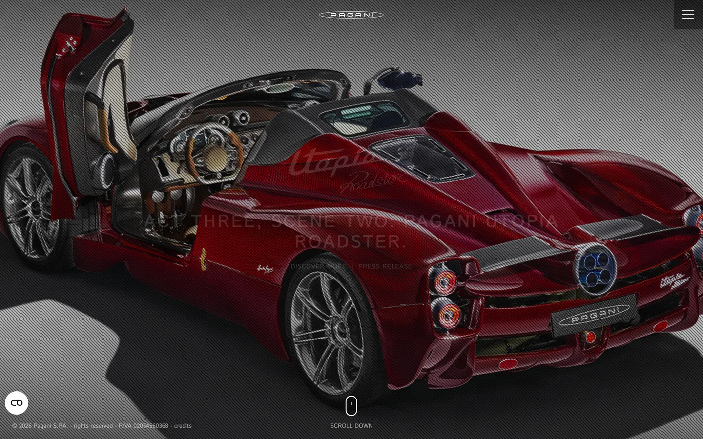
Pagani's homepage looks more like a Milan fashion-house lookbook than a car-manufacturer site. A single deep-oxblood Utopia Roadster sits dead-centre on a near-black studio plate, photographed at three-quarter front with the gullwing door raised; the script "Act Three, Scene Two" is painted in white directly across the bodywork as if etched on the metal. The Pagani wordmark hovers at top-centre in weight-100 small-caps. No CTA pill, no hero gradient, no scrolling-news ticker — just one photograph, one wordmark, one inline caption. Where Ferrari leans on a bright red brand band and McLaren on papaya-orange voltage chips, Pagani refuses to put any colour at all between the visitor and the car. The site IS the press still.

The DESIGN.md packages this restraint into a machine-readable spec. Inside: a three-token monochrome palette of canvas black, ink white, and a single deep-charcoal alt-black for emphasis bands; an Istok Web type stack running at weight 100 across every display tier, with 3.6px tracking on the h1 and 4px tracking on h3, plus Arial as a fallback button face; a near-empty radius scale where only one surface — the cookie-modal button — uses a 40px rounding; an extra-airy spacing system whose dominant tokens are 60px (top section), 25px (block padding), and 200px (horizontal gutter). Roughly 14 components cover the wordmark nav, the inline-caption headline ("Discover more | Press release"), the full-bleed photo hero, and a single white-text footer line.

Feed this file to Claude or Cursor and it reproduces moves no other automotive system in this directory uses: the photograph occupies the entire above-fold canvas, no CTA competes with the car, the typography stays at weight 100 instead of the usual 700 supercar-shout, and the colour palette stays at three structural values. Borrow the spec only when your product is itself photogenic enough to carry the page — Pagani gets away with the silence because the Utopia is the headline.

What makes it distinct

5

  1. Photograph as canvasthe Utopia Roadster fills the full viewport, with chrome stamped directly over the metal rather than framed beside it
  2. Ultra-light Istok Webdisplay sits at 36px in weight 100 with 3.6px tracking and uppercase casing, an editorial-fashion treatment foreign to the supercar category
  3. Zero brand voltageno orange, no red badge, no chrome-blue accent; the only color anywhere on the page is whatever the metallic paintwork reflects
  4. Wide letter-spacing as identityheadlines run at 3.6px, h3 at 4px, h4 at 1.3px tracking; the tracking IS the brand
  5. One radius, used oncea single 40px rounding sits on the cookie modal button, and nothing else on the page bends a corner

pagani.com

Live at pagani.com

A snapshot of the brand in production. Scroll the frame to see the whole page.

Pagani's website at pagani.com

Colors

3 colors

Pagani's system runs on #000000 as its primary voltage, used in 3 of 14 components. Type is set in Istok Web across 11 tokens from 10px to 36px, weights 100–400. Shape language is sharp — components average 3px corner radius, favoring crisp rectangles.

Surface

Page and card backgrounds · 2

Text

Headlines, body, captions · 1

Typography

11 type tokens

Set in Istok Web across 11 tokens, from 10px to 36px, weights 100–400. Shown in its own stack: where the font isn't installed, the fallback the file names stands in.

  • display-xl36px · weight 100 · lh 42px · tracking 3.6pxThe quick brown fox jumps over the lazy dog
  • heading-md20px · weight 100 · lh 28px · tracking 4pxThe quick brown fox jumps over the lazy dog
  • heading-sm13px · weight 100 · lh 23px · tracking 1.3pxThe quick brown fox jumps over the lazy dog
  • body-md16px · weight 400 · lh 20pxThe quick brown fox jumps over the lazy dog
  • body-sm13px · weight 100 · lh 20px · tracking 0.65pxThe quick brown fox jumps over the lazy dog
  • caption12px · weight 400 · lh 12pxThe quick brown fox jumps over the lazy dog
  • quote16px · weight 400 · lh 23pxThe quick brown fox jumps over the lazy dog
  • nav-link16px · weight 400 · lh 20pxThe quick brown fox jumps over the lazy dog
  • micro-label12px · weight 400 · lh 20pxThe quick brown fox jumps over the lazy dog
  • button-md20px · weight 400 · lh 24pxThe quick brown fox jumps over the lazy dog
  • button-sm10px · weight 400 · lh 60px · tracking 1.2pxThe quick brown fox jumps over the lazy dog

Layout

Radii and spacing

2 corner radii and 9 spacing values. Shape language: sharp.

Radii

  • none0px
  • pill40px

Spacing

  • xs8px
  • sm10px
  • md18px
  • base25px
  • lg30px
  • xl35px
  • 2xl40px
  • 3xl60px
  • hero-gutter200px

Components

14 components

Each rendered from its tokens (color, type, radius, padding) on Pagani's own canvas.

  • Button Primary
    button-primaryButton Primary
  • Button Secondary
    button-secondaryButton Secondary
  • Top Nav
    top-navTop Nav
  • Nav Link
    nav-linkNav Link
  • Wordmark
    wordmarkWordmark
  • Hero Section
    hero-sectionHero Section
  • Hero Heading
    hero-headingHero Heading
  • Inline Caption
    inline-captionInline Caption
  • Body Paragraph
    body-paragraphBody Paragraph
  • Pull Quote
    pull-quotePull Quote
  • Emphasis Band
    emphasis-bandEmphasis Band
  • Card
    cardCard
  • Type here…
    text-inputText Input
  • Footer
    footerFooter

In use

The system, in use

Pagani's tokens on the kind of product it builds.

Build something people actually use.

A short paragraph of marketing copy that previews how the brand's display tier and body tier read together. Two sentences is usually enough.

Get startedLearn more
Marketing heroHeadline, sub-copy, primary CTA — the universal homepage opener.
Reporting · 14 min read

The quiet collapse of an old idea

For decades the consensus held that the system would correct itself. Then it didn't. This is the inside story of what changed, told by the people who watched it unravel.

"Nobody noticed because the failure was indistinguishable from progress."

By Sam Reporter · Updated 2 hours ago

Editorial articleMagazine-style longform with display headline.

FAQ

Pagani design system FAQ

Common questions about Pagani's tokens, components, and how to use this DESIGN.md in your project.

Read next

Specs, directories, and component libraries that pair with this design system.

Use it

Use Pagani in your project

One machine-readable file. Drop it into Claude, Cursor, or any AI tool that reads DESIGN.md.

Download DESIGN.md
  1. Download the DESIGN.md

    One machine-readable file: every color, type, radius, spacing, and component token of Pagani.

  2. Feed it to your AI tool

    Drop it into Claude, Cursor, or GitHub Copilot. The agent writes React components and Tailwind classes that match Pagani's visual language.

  3. Reference the tokens directly

    Or paste the values into your Tailwind config, CSS variables, or component library: every color, size and radius is a quoted, ready-to-copy value.

Read the full DESIGN.md: overview, rationale, do’s and don’ts

Overview

Pagani's marketing surface refuses every convention of the supercar category. Photograph as canvas. A single deep-oxblood Utopia Roadster fills the full viewport, photographed against a near-black studio plate, with the Pagani wordmark stamped at top-centre in weight-100 small-caps and the script "Act Three, Scene Two" painted across the bodywork. There is no hero CTA, no chrome strip of brand colour, no scrolling-news rail. Where Ferrari runs its homepage on a saturated brand red and McLaren on a papaya-orange voltage block, Pagani holds the page in pure monochrome and lets the photograph do every chromatic and emotional job. The site reads more like a Milan fashion-house lookbook than an automotive product page.

The chromatic discipline is total. The captured palette is three structural tokens — pure white ink ({colors.ink} — #ffffff, frequency 210), pure black canvas ({colors.canvas} — #000000, frequency 23), and a near-black {colors.surface-1} (#141414) used only on emphasis bands. There is no brand red, no logo gold, no metallic-silver accent token. Every chromatic note visible on the homepage is borrowed from the photographed car itself: the oxblood paintwork, the brushed-silver wheels, the warm tan stitching of the cabin. This is the inverse of single-voltage discipline elsewhere in the directory — instead of holding one brand colour against a neutral floor, Pagani holds zero brand colours and lets the subject carry the palette.

Typography is ultralight Istok Web with wide tracking at every display tier. The h1 sits at 36px / 100 with 3.6px letter-spacing; h3 at 20px / 100 with 4px tracking; h4 at 13px / 100 with 1.3px tracking. There is no weight 400+ moment in the display stack — even body small-caps stay at weight 100. The closest neighbour in the directory is the editorial display weight at Cloudflare (500), but Cloudflare looks downright bold next to this. Istok Web at 100 is closer to the fashion-house masthead grades used on Yves Saint Laurent or Bottega Veneta product pages than to any other automotive site.

Key Characteristics:

  • Three-token monochrome palette ({colors.canvas}, {colors.surface-1}, {colors.ink}) — no brand voltage anywhere; chromatic interest comes from the photograph alone.
  • Full-bleed photographic hero — the Utopia Roadster fills the viewport, with chrome stamped directly across the metal rather than framed beside it.
  • Istok Web at weight 100 across every display tier — the editorial-fashion silhouette is unprecedented in the supercar category.
  • Wide letter-spacing as identity — {typography.display-xl} runs at 3.6px tracking, {typography.heading-md} at 4px, {typography.heading-sm} at 1.3px.
  • Hard 0px corners on every surface except one — the only rounded value in the system is the 40px cookie-modal button.
  • Uppercase casing on every display, heading, and nav-link tier — the body stays mixed-case for legibility but the chrome is small-caps end-to-end.
  • Generous gutter spacing — the hero uses 200px horizontal padding ({spacing.hero-gutter}) and 60px top padding, leaving the photograph to occupy nearly the entire viewport.
  • Arial as the button face — the only non-Istok type token in the system, used at 10–20px for the cookie button and any modal CTA.

Colors

Surface

  • Canvas ({colors.canvas} — #000000): frequency 23 — used as background (20), text (1), border (1), and shadow (1). The page floor; the studio plate behind the Utopia photograph; the footer band. Pure pixel-black, deliberately not softened to charcoal because the metallic paintwork needs maximum contrast to register as colour rather than as flat illustration.
  • Surface-1 ({colors.surface-1} — #141414): frequency 4 — used as text (2) and border (2). The single elevated dark tone, reserved for emphasis bands below the fold where a vehicle-spec strip needs to separate itself from the canvas without breaking the monochrome scheme. The 8-point lightness lift reads as a panel without ever being a fill.

Text

  • Ink ({colors.ink} — #ffffff): frequency 210 — used as text (113), border (97), background (0). The dominant ink across every tier: hero h1, wordmark, nav links, inline caption, footer attribution, button text on the cookie-modal CTA. Also carries the entire border budget on the page — 97 of the 99 captured borders are white-on-black hairlines. Pure white, never softened to bone or cream; the contrast with the studio plate is uncompromising.

Note on the Absence of a Brand Hex

The system captures zero colour tokens at the brand layer. The page exposes a WordPress preset palette (vivid amber, vivid red, vivid cyan-blue, vivid purple, pale pink, luminous orange) inherited from the platform's default theme.json, but none of those values render anywhere on the captured homepage — they are theme defaults left unused. Pagani's identity colour, in any meaningful sense, is whatever the next vehicle's paintwork happens to be. The Utopia Roadster currently on the homepage carries the page in deep oxblood; the previous Huayra Codalunga carried it in silver-pearl.

Typography

Font Family

The system runs Istok Web for every display, heading, body, and nav tier — a free Latin/Cyrillic sans designed by Andrey V. Panov. Fallback walks straight to sans-serif; no system-ui safety stack is declared. Arial appears as a second face on exactly two surfaces: the cookie-modal button (20px / 400) and a small-caps in-page caption (10px / 400 / 1.2px tracking). The pairing — Istok Web ultralight for everything spoken, Arial regular for the modal-button vernacular — is unusual but mechanical: the modal HTML is injected by a third-party cookie banner that ships its own Arial fallback.

Hierarchy

TokenSizeWeightLine HeightLetter SpacingUse
{typography.display-xl}36px10042px3.6pxHero h1 ("Act Three, Scene Two: Pagani Utopia Roadster.")
{typography.heading-md}20px10028px4pxSection h3 — sub-headlines and product titles
{typography.heading-sm}13px10023px1.3pxh4 labels above feature rows
{typography.body-md}16px40020px0Default running text, nav-link rest state
{typography.body-sm}13px10020px0.65pxInline caption ("Discover more | Press release")
{typography.caption}12px40012px0Footer attribution, legal-copy strip
{typography.quote}16px40023px0Pull-quotes inside editorial bands
{typography.nav-link}16px40020px0Top-nav link labels
{typography.micro-label}12px40020px0Small spans inside the inline caption row
{typography.button-md}20px40024px0Cookie-modal CTA label (Arial)
{typography.button-sm}10px40060px1.2pxSmall-caps inline caption span (Arial)

Principles

The display stack lives at weight 100 — the loudest type on the page is also the thinnest. The wide letter-spacing across {typography.display-xl} (3.6px), {typography.heading-md} (4px), and {typography.heading-sm} (1.3px) is the typographic signature: confidence by tracking, not by weight or by size. Uppercase casing carries every chrome-tier surface (wordmark, nav, hero h1, h3, h4); the only mixed-case tiers are the body, caption, and quote, which run at weight 400 for legibility. There is no weight 500 or 700 anywhere on the captured surface — even the cookie-button face stays at weight 400.

Note on Font Substitutes

Istok Web is free and ships on Google Fonts under the SIL Open Font License — you can pull it directly. If you need a tighter alternative, Barlow Condensed at weight 100 has a similar editorial silhouette; Inter at weight 100 with manual letter-spacing added is the closest geometric substitute but reads noticeably less editorial. Avoid bumping past weight 300 — the fashion-house feel collapses the moment the strokes thicken.

Layout

Spacing System

  • Base unit: there is no single base unit; the system uses a non-modular set built around 25px (the dominant block padding, appearing 11 times in the captured page).
  • Tokens: {spacing.xs} 8px · {spacing.sm} 10px · {spacing.md} 18px · {spacing.base} 25px · {spacing.lg} 30px · {spacing.xl} 35px · {spacing.2xl} 40px · {spacing.3xl} 60px · {spacing.hero-gutter} 200px.
  • Section padding (vertical): 60px top, 0px bottom — the dominant section opener ("60px 0px 0px") appears 17 times in the captured page.
  • Hero horizontal gutter: 200px on each side, leaving the photograph to occupy the centre of the viewport surrounded by deep margin.
  • Footer padding: 20px / 25px — the only place 20px appears.

Grid & Container

  • Max content width: the hero photograph stretches edge-to-edge of the viewport (1440px in the captured render); typographic content sits inside a centred ~1040px column.
  • Hero: full-bleed photograph behind a centred 1040px text column; the h1 floats over the bodywork at roughly the centreline of the car.
  • Nav strip: 296px-wide centred wordmark cluster at top, with link items at 0px / 15px horizontal padding.
  • Footer: single 1440px-wide attribution line — no columns, no sitemap, no link grid.

Rhythm

The page is a sequence of single full-bleed plates rather than a stacked feature catalogue. The hero is one photograph. Section 2 is another photograph with a single h3 caption. Section 3 is another photograph. There is no 3-up feature row, no logo wall, no pricing strip — every band is one image plus one line of type, with 60px of black between. The vertical rhythm is set by the photographs themselves, not by a measured baseline grid.

Elevation

The system has no shadow tier at all. The captured page has 1 occurrence of #000000 used as shadow ink, and it sits on a single low-priority modal — the cookie consent panel. Everywhere else, depth comes from the photographic perspective inside the hero plates, not from any layered UI elevation. Hairlines ({colors.ink} at low opacity, 97 occurrences) carry the work that shadows would carry on a dashboard product: dividing the nav from the photograph, separating the footer band from the canvas, outlining the cookie-button border.

  • Flat (no shadow): hero, nav, footer, editorial bands — 99% of surfaces.
  • Photographic depth: the Utopia Roadster sits in three-quarter perspective with the gullwing door raised, casting its own studio shadow on the floor of the plate — the only "shadow" visible on the page is inside the image, not under any UI element.
  • Hairline outlines: 1px white-on-black rules separate the nav strip from the photograph and the footer from the canvas.

Shapes

The radius scale is essentially a single value — and that value is used exactly once.

  • {rounded.none} 0px — every surface in the captured render: wordmark, nav links, inline caption, h1, h3, h4, footer, body, editorial bands. Sharp corners end-to-end.
  • {rounded.pill} 40px — the only rounded value in the system. Used on a single surface: the cookie-consent modal button at the bottom of the page. The 40px rounding is large enough to render as a full pill at the button's 44px height.

There is no 4px / 6px / 8px small-step ladder, no 12px / 16px / 24px middle tier. The system is binary: 0px or pill, and the pill appears once. The hard-corner discipline reinforces the photographic-studio feel of the page; soft chrome would interrupt the cinematic plate.

Components

button-primary — White {colors.ink} fill, black text, 40px pill rounding, Arial 20px / 400, 10×25 padding, 44px height. Appears only on the cookie-consent modal; there is no primary CTA elsewhere on the page.

button-secondary — Transparent fill with white text, 0px corners, Arial 10px / 400 with 1.2px tracking, 0×15 padding, 60px height. The small-caps inline caption span used inside the "Discover more | Press release" row.

top-nav — Transparent background, white text in {typography.nav-link} (16px / 400), 0×15 padding, 20px height. Floats above the photograph rather than sitting on a coloured surface. The wordmark sits centred; nav items align around it at 296px container width.

nav-link — Identical to {component.top-nav} at the item level — transparent background, white text, 0×15 padding, no hover background visible in the captured surface.

wordmark — White text on the transparent nav, {typography.heading-md} (20px / 100) with 4px tracking, uppercase. The brand mark itself; the only typographic surface that consistently anchors the top of every plate.

hero-section — Pure-black {colors.canvas} floor, 60px top / 200px horizontal padding, 0 bottom. Holds the full-bleed photograph and the centred h1 stamped across the bodywork.

hero-heading — White text on the transparent hero, {typography.display-xl} (36px / 100) with 3.6px tracking, uppercase. The only display moment on the page; deliberately measured so the photograph remains visually dominant.

inline-caption — White text in {typography.body-sm} (13px / 100 / 0.65px tracking). The "Discover more | Press release" row that sits beneath the h1 — Pagani's substitute for a conventional CTA pair.

body-paragraph — Default white text at {typography.body-md} (16px / 400). Used inside editorial bands below the fold where descriptive copy explains a vehicle or programme.

pull-quote — White text at {typography.quote} (16px / 400 / 23px line-height). The only mixed-case display moment in the system, used for owner-and-designer quotes inside editorial sections.

emphasis-band — {colors.surface-1} (#141414) fill, white text, 25×60 padding, 0px corners. A subtle elevation strip used to separate a vehicle-spec table from the surrounding photograph; reads as a panel without ever competing with the image.

card — {colors.surface-1} fill, white text, 25px padding, 0px corners, 1px white hairline. The default content card for spec rows; the hairline carries the elevation work.

text-input — Transparent fill, white text, white bottom-hairline border, 0px corners, 44px height. Used inside the contact/newsletter strip on inner pages — a single underlined line, not a boxed field.

footer — Pure-black canvas, white text at {typography.caption} (12px / 400 / 12px line-height), 20×25 padding, single 52px-tall band carrying the legal attribution ("© 2026 Pagani S.P.A. — rights reserved — credits"). No columns, no sitemap.

Do's and Don'ts

Do keep the chrome at three monochrome tokens ({colors.canvas}, {colors.surface-1}, {colors.ink}). Adding any brand-coloured accent — even a single red stripe — collapses the entire "page IS the photo booth" premise.

Do hold display weight at 100 with wide letter-spacing. The hero h1 at 36px / 100 / 3.6px tracking is the system's editorial signature; reaching for weight 400 to "fix the contrast" replaces the fashion-house silhouette with a generic supercar shout.

Do let the photograph fill the full viewport at the hero. The 60px top padding and 200px horizontal gutter ({spacing.hero-gutter}) are designed so the photograph occupies almost the entire frame — chrome lives at the edges, never beside the subject.

Do keep every surface at 0px corners except the single cookie-modal button. The hard-corner discipline is what holds the page reading as a photographic plate rather than as a UI layout.

Don't insert a CTA pill below the hero h1. The page has no primary CTA — the "Discover more | Press release" inline caption ({component.inline-caption}) is the entire substitute. Dropping a 56px filled button into the hero would betray the editorial reading of the layout.

Don't swap {colors.canvas} from pure #000000 to a softer charcoal. The pure-black studio plate is calibrated to make the photographed paint colours read as colour — softening it tints the perceived bodywork hue.

Don't introduce a middle-radius tier (8px / 12px / 16px) on cards or inputs. The system is binary — 0px everywhere or a single 40px pill on one button. Adding a 12px softness to cards reads as an Airbnb / Stripe import and breaks the photographic feel.

Don't add a brand-coloured nav underline or active-state pill. The captured nav ({component.nav-link}) has no fill, no underline, no chip — the only indicator of the current page is the wordmark position. Adding a coloured active state would put a chromatic accent where the system has deliberately refused one.

Known Gaps

  • Brand colour: the system exposes no brand-layer hex at all. If you need to surface a vehicle-specific accent (oxblood for Utopia, silver for Huayra Codalunga), you'll have to pull it from the photograph itself rather than from the captured tokens.
  • Primary CTA: there is no captured filled-button primary action — only the inline-caption row and the cookie-modal button. State variants (hover, active, focus, disabled) for any primary CTA are not exposed.
  • Form input states: {component.text-input} carries only the resting underlined state. Error, focus-ring, disabled, and password-field variants are not represented on the marketing surfaces.
  • Dark / light variants: the captured surfaces are dark-only. A light-on-light press-kit layout exists on inner pages but is not represented in the homepage extraction.
  • Motion: the hero photograph fades and parallaxes on scroll, but the spec captures static end-state values only. Easing curves, duration, and crossfade timing live in the live runtime.
  • Configurator and dealer surfaces: this DESIGN.md captures the public homepage only. The vehicle configurator (utopia.pagani.com) and the dealer-locator screens carry richer surface tokens and component sets that are not represented here.
  • Inner editorial pages: the homepage is the single-photograph plate; vehicle detail pages add long-form spec tables, multi-column gallery grids, and PDF-download chips that are not captured in the homepage tokens.

Automotive

More systems like this

More DESIGN.md files in Automotive.

Pricing

Build it with Pro

The DESIGN.md files are free. Pro adds 6,000+ blocks, premium templates and the MCP server, so your AI editor builds in your system for you.

4.9/5 out of 5 · 150+ reviewsfrom 150+ founders and developers.

Billed once a year in USD. Cancel anytime.

Individual

For personal projects & open source

$32instead of $49/mo

$389 billed yearly

  • How many people can use the license.Seats: 1 seat
  • Client work, SaaS products and anything you charge for.Commercial use: Personal & open source only
  • Production-ready React sections: hero, pricing, features, dashboards and more.Pro blocks: 6,000+ blocks
  • Complete multi-page sites you can ship as they are.Templates: All 14 templates
  • React icons from every major library, installable with one command.React icons: 294k+ icons
  • Presets that restyle every block, in light and dark.Themes: All 59 themes
  • Lets your AI editor search, preview and install blocks for you.MCP server: Basic usage
  • Priority requests are answered first.Support: Standard

Team

Most popular

For freelancers, agencies & startups

$66instead of $99/mo

$789 billed yearly · ≈ $13/dev/mo

Everything in Individual, plus

  • How many people can use the license.Seats: Up to 5 seats
  • Client work, SaaS products and anything you charge for.Commercial use: Included
  • Lets your AI editor search, preview and install blocks for you.MCP server: High usage
  • Priority requests are answered first.Support: Priority

Organization

For companies with larger teams

$132instead of $199/mo

$1,589 billed yearly

Everything in Team, plus

  • How many people can use the license.Seats: Unlimited seats
  • Lets your AI editor search, preview and install blocks for you.MCP server: Unlimited usage
  • Secure checkout via Stripe
  • Code lives in your repo
  • Keep what you've shipped if you cancel
  • License terms

Your system, built for you

Every block, template and icon, installed by your AI agent in your design system. The DESIGN.md files stay free.

Get Pro