Nissan Design System
Nissan USA's marketing-site design system as a DESIGN.md file. Monochrome charcoal-on-white canvas with no brand color in the UI chrome, Nissan Regular/Light typefaces, 40px pill buttons, uppercase-tracked labels. For React, Next.js, and AI coding tools.
Add shadcn.io to your AI agent. · Pro It installs blocks, icons and templates in your design system from a prompt, with Pro.
Set up MCP- Primary
- #c1c1c1
- Typeface
- Nissan Regular
- Shape
- Soft
- Base radius
- 22px
- Colors
- 10
- Type tokens
- 12
- Components
- 13
- Spacing values
- 8
About
About Nissan DESIGN.md
Curated by Dov Azencot · Updated May 19, 2026 · Source nissanusa.com (opens in a new tab)
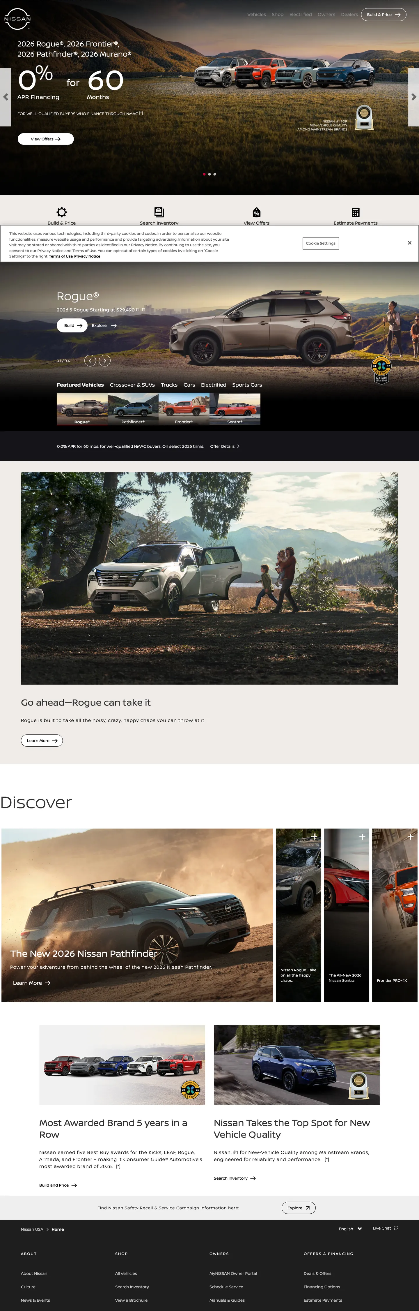
Nissan's US marketing site opens with a white page, a thin black logo, a navigation bar in charcoal, and a full-bleed hero photograph of a current offer. The brand's recent 2020 logo rebrand — from the bulky chrome three-dimensional mark to a flat circular ring — is visible in the top-left corner, but the UI chrome around it offers no color signal at all. Charcoal text, charcoal borders, light-gray dividers, white canvas: the entire interactive layer is monochrome. Honda, Toyota, and Hyundai all inject at least one brand accent (Honda's red, Toyota's red, Hyundai's blue) into their button fills; Nissan holds every surface in the achromatic register.
The typography is equally restrained. Nissan Regular and Nissan Light — proprietary typefaces designed for the 2020 rebrand — run at weight 400 throughout; there is no bold display variant on the marketing site. The hero h1 captured in extraction is 60px Nissan Light at weight 400. Section h2s run at 50px Nissan Light. The 32px h2/h3 tier and 20px body fill out the scale, all in the same family at the same weight. The single texture moment is the 13px uppercase label at 2–2.4px letter-spacing, used for navigation category chips and section pre-headers. This is closer to a luxury-adjacent Japanese aesthetic (think Muji or Uniqlo's UI conventions) than to the heavy-weight American truck brand posture.
The 40px border-radius pill on buttons is the system's warmest element and its most distinctive shape move. Where GMC's buttons are sharp-cornered rectangles and Ford's are small-radius chips, Nissan fully rounds every standard-height button into a pill, and the extraction confirms 13 occurrences of exactly 40px across interactive surfaces. Feed this file to an AI coding tool and it will reproduce the specific Nissan combination: achromatic UI chrome with photography carrying color, Nissan Light at weight 400 for every display moment, and fully-rounded pill buttons as the signature interactive affordance.
What makes it distinct
5
- Zero brand color in UI chromethe entire navigation, button, card, and label system uses only charcoal, mid-gray, light gray, and white; photography carries all color
- Pill-dominant button shape40px border-radius on every CTA makes buttons fully rounded at standard heights, the softest shape in the truck-and-SUV competitive set
- Weight-400 across all tiersneither Nissan Regular nor Nissan Light goes above weight 400 in the marketing surface; no bold heading tier exists
- Uppercase spaced tracking as decoration13px / 2–2.4px letter-spacing uppercase labels appear for nav categories and section labels, the system's only typographic texture
- Alternating photography bandshero, model-feature, and lifestyle sections each run as full-bleed photography panels with text overlaid in white or charcoal depending on background
nissanusa.com
Live at nissanusa.com
A snapshot of the brand in production. Scroll the frame to see the whole page.
Colors
10 colors
Nissan's system runs on #c1c1c1 as its primary voltage, used in 1 of 13 components. Type is set in Nissan Regular across 12 tokens from 13px to 60px, weights 400–400. Shape language is soft — components average 27px corner radius, with no sharp interactive edges.
Surface
Page and card backgrounds · 5
Text
Headlines, body, captions · 3
Borders & Hairlines
Dividers, outlines, rules · 1
Other
Specialty colors · 1
Typography
12 type tokens
Set in Nissan Regular across 12 tokens, from 13px to 60px, weights 400–400. Shown in its own stack: where the font isn't installed, the fallback the file names stands in.
- display-xl60px · weight 400 · lh 96pxThe quick brown fox jumps over the lazy dog
- display-lg50px · weight 400 · lh 64px · tracking 0.1pxThe quick brown fox jumps over the lazy dog
- display-md32px · weight 400 · lh 40pxThe quick brown fox jumps over the lazy dog
- body-lg20px · weight 400 · lh 25px · tracking 0.32pxThe quick brown fox jumps over the lazy dog
- body-md16px · weight 400 · lh 24pxThe quick brown fox jumps over the lazy dog
- body-sm14px · weight 400 · lh 22pxThe quick brown fox jumps over the lazy dog
- body-xs13px · weight 400 · lh 18px · tracking 0.1pxThe quick brown fox jumps over the lazy dog
- label-spaced13px · weight 400 · lh 20.4286px · tracking 2.4pxThe quick brown fox jumps over the lazy dog
- label-spaced-alt13px · weight 400 · lh 18.5714px · tracking 2pxThe quick brown fox jumps over the lazy dog
- button-lg18px · weight 400 · lh 18pxThe quick brown fox jumps over the lazy dog
- button-md16px · weight 400 · lh 25.1429pxThe quick brown fox jumps over the lazy dog
- nav-link14px · weight 400 · lh 22pxThe quick brown fox jumps over the lazy dog
Layout
Radii and spacing
6 corner radii and 8 spacing values. Shape language: soft.
Radii
- none0px
- xs2px
- sm16px
- md22px
- pill40px
- full50%
Spacing
- xs5px
- sm10px
- md15px
- base16px
- lg20px
- xl30px
- 2xl48px
- 3xl64px
Components
13 components
Each rendered from its tokens (color, type, radius, padding) on Nissan's own canvas.
- Button Primarybutton-primaryButton Primary
- Button Secondarybutton-secondaryButton Secondary
- Button Outline Whitebutton-outline-whiteButton Outline White
- Top Navtop-navTop Nav
- Nav Linknav-linkNav Link
- Hero Headinghero-headingHero Heading
- Section Headingsection-headingSection Heading
- Section Heading Inksection-heading-inkSection Heading Ink
- Body Paragraphbody-paragraphBody Paragraph
- Body Paragraph Inkbody-paragraph-inkBody Paragraph Ink
- Label Taglabel-tagLabel Tag
- CardcardCard
- FooterfooterFooter
In use
The system, in use
Nissan's tokens on the kind of product it builds.
Build something people actually use.
A short paragraph of marketing copy that previews how the brand's display tier and body tier read together. Two sentences is usually enough.
FAQ
Nissan design system FAQ
Common questions about Nissan's tokens, components, and how to use this DESIGN.md in your project.
Read next
Related reading
Specs, directories, and component libraries that pair with this design system.
- Browse all design systemsThe full directory of DESIGN.md files on shadcn.io, with live mockups for each.shadcn.io
- Nissan — official siteNissan USA's public marketing site — the source of truth for the live tokens captured in this file.nissanusa.com (opens in a new tab)
- The DESIGN.md specificationGoogle Labs' open spec for machine-readable design system files — the format this page is built on.github.com (opens in a new tab)
Use it
Use Nissan in your project
One machine-readable file. Drop it into Claude, Cursor, or any AI tool that reads DESIGN.md.
Download the DESIGN.md
One machine-readable file: every color, type, radius, spacing, and component token of Nissan.
Feed it to your AI tool
Drop it into Claude, Cursor, or GitHub Copilot. The agent writes React components and Tailwind classes that match Nissan's visual language.
Reference the tokens directly
Or paste the values into your Tailwind config, CSS variables, or component library: every color, size and radius is a quoted, ready-to-copy value.
Read the full DESIGN.md: overview, rationale, do’s and don’ts
Overview
Nissan's US marketing site makes the achromatic commitment quietly. Zero-color discipline. The entire interactive layer — navigation, buttons, cards, labels, dividers — runs in charcoal, mid-gray, and white, with zero brand-color occurrences in the UI chrome. Honda and Toyota both use their brand red in CTA fills; Hyundai uses a vivid electric blue; GMC marks edges in crimson. Nissan holds the entire interactive register monochrome and delegates all color to vehicle photography. The 2020 logo rebrand from a bulky chrome mark to a flat circular ring sits at the top left of a page that is otherwise indistinguishable in palette from a luxury goods site.
Where the palette is absent, shape speaks. The 40px border-radius pill — 13 occurrences in the extraction — is the warmest and most distinctive element on the page. At the standard 44px button height, a 40px radius renders as a near-complete circle on the left and right ends; the button reads as a stadium oval. No other major US automotive brand in the competitive set (GMC, Ford, Toyota) uses a full-pill button at this scale. The typographic counterpart to the pill is the 13px / 2.4px-tracked uppercase label, which appears on nav category chips and section pre-headers and gives the system its only textural moment.
Key Characteristics:
- Zero brand-color occurrences in the UI chrome — no accent color in any button fill, nav active state, or link underline.
- Charcoal (
{colors.ink}— #343434) carries 535 total occurrences as the primary text and border tone; dominant across every UI surface. - Full-pill buttons (
{rounded.pill}— 40px radius) as the signature interactive shape — 13 occurrences in the extraction, more than any other radius. - Nissan Light and Nissan Regular at weight 400 throughout; no bold display weight exists in the marketing surface.
- 13px uppercase spaced-track labels (2–2.4px letter-spacing) as the system's primary typographic texture.
- Photography carries every color moment — model photographs, lifestyle scenes, and interior shots are the only chromatic elements on the page.
- Five-step gray scale from near-white (#efefef) through mid-gray (#c1c1c1) to near-black (#1e1e1e) covers every surface transition.
- No extracted drop shadows; surface separation comes entirely from canvas-color alternation.
Colors
Surface
- Ink (
{colors.ink}— #343434): frequency 535. Used as text (271), border (264). The dominant charcoal — the single most-used color across the marketing surface. Wires every nav link, card border, button fill, body paragraph, and label. - Canvas (
{colors.canvas}— #ffffff): frequency 359. Used as text (169), border (175), background (15). The page floor and primary card surface. The white text/border occurrences are inverse uses on dark photography sections. - Mid-Gray (
{colors.mid-gray}— #c1c1c1): frequency 134. Used as text (67), border (67). The system's hairline tone for card outlines, divider rules, and secondary text below model tiles. - Canvas Dark (
{colors.canvas-dark}— #000000): frequency 62. Used as text (26), background (7), border (25), shadow (1), gradient (3). The overlay on full-bleed photography sections and gradient backgrounds at the base of hero images. - Surface-1 (
{colors.surface-1}— #efefef): frequency 28. Used as text (12), background (5), border (11). Merged from #efefef, #eeeeee, and #f0ece8 — a near-white warm tint used for section background alternation and light separator bands. - Ink Soft (
{colors.ink-soft}— #5c5c5c): frequency 6. Merged from two nearby mid-dark tones in the extraction. Secondary text in body paragraphs and card meta-labels. - Ink Muted (
{colors.ink-muted}— #666666): frequency 4. Tertiary text — footnote copy and very secondary labels. - Canvas Near-Black (
{colors.canvas-near-black}— #1e1e1e): frequency 3, all as backgrounds. The footer and deep-dark section backgrounds. - Canvas Deep (
{colors.canvas-deep}— #151519): frequency 2. A very slightly blue-tinted near-black appearing on the footer's darkest band. Wired similarly to the near-black used in dark-theme product pages.
Hairline
- Hairline (
{colors.hairline}— #d2d2d2): frequency 2. A supplemental light border tone for finer card outlines.
Typography
Font Families
The system runs two proprietary typefaces: Nissan Regular (with Nissan Bold as a declared weight variant but largely absent from the captured surface) for body text, buttons, and labels; and Nissan Light for display headings. Both were designed for the 2020 brand rebrand and fall back to Verdana, Arial, sans-serif. Both run exclusively at weight 400 across all captured sizes — the "Bold" variant appears only in certain financial figures, not in heading or display type.
The mono-weight approach at every tier — 60px Nissan Light at weight 400, 14px Nissan Regular at weight 400 — is the rarest typographic choice in the automotive segment. Every competitor except perhaps Lexus and Infiniti uses a bold or heavy weight for model name headers.
Hierarchy
| Token | Size | Weight | Line Height | Letter Spacing | Use |
|---|---|---|---|---|---|
{typography.display-xl} | 60px | 400 | 96px | 0 | Hero h1 ("Discover") |
{typography.display-lg} | 50px | 400 | 64px | 0.1px | Section h2 ("Go the Distance") |
{typography.display-md} | 32px | 400 | 40px | 0 | Sub-section h2 / h3 |
{typography.body-lg} | 20px | 400 | 25px | 0.32px | Lead paragraph, model tagline spans |
{typography.body-md} | 16px | 400 | 24px | 0 | Default running text, button labels |
{typography.body-sm} | 14px | 400 | 22px | 0 | Nav links, card captions |
{typography.body-xs} | 13px | 400 | 18px | 0.1px | Section sub-labels, h2 eyebrow markers |
{typography.label-spaced} | 13px | 400 | 20.43px | 2.4px | Uppercase nav category chips |
{typography.label-spaced-alt} | 13px | 400 | 18.57px | 2px | Uppercase section pre-header labels |
{typography.button-lg} | 18px | 400 | 18px | 0 | Primary pill button labels |
{typography.button-md} | 16px | 400 | 25.14px | 0 | Secondary button and link-style CTA |
{typography.nav-link} | 14px | 400 | 22px | 0 | Top-nav link items |
Principles
The single weight (400) across all sizes means that size alone creates hierarchy — 60px vs 50px vs 32px vs 16px in the same weight and family. There is no bold-to-regular contrast between heading and body. This requires the display sizes to work harder: a 60px / weight 400 heading commands attention through scale, not emphasis. Nissan Light's slightly thinner stroke makes this readable at 60px where a heavier variant would feel over-declared.
Note on Font Substitutes
Both Nissan Regular and Nissan Light are proprietary typefaces not publicly available. DM Sans at weight 300–400 approximates the Nissan Regular humanist proportions; Plus Jakarta Sans at weight 300 is closer to Nissan Light's thinner display cut. For the tracked uppercase labels, use letter-spacing: 0.2em with any humanist sans at 13px to match the visual behavior.
Layout
Spacing System
- Base unit: approximately 15px — the single most common padding value (10 occurrences) in the extracted spacing data.
- Tokens:
{spacing.xs}5px ·{spacing.sm}10px ·{spacing.md}15px ·{spacing.base}16px ·{spacing.lg}20px ·{spacing.xl}30px ·{spacing.2xl}48px ·{spacing.3xl}64px. - Hero and section padding: the primary horizontal padding for nav content is 20px; hero content sections pad to roughly 30px.
- Button padding:
{spacing.md}(15px) top/bottom on pill buttons; horizontal padding varies by button width (pill shape auto-adjusts).
Grid & Container
- Max content width: approximately 1440px on the hero; ~1280px on the model carousel and editorial grid.
- Hero: full-bleed photography, financing offer text overlaid white on dark section of image.
- Model selector band: horizontal tab strip with model names in uppercase-tracked Nissan Regular; tab selection reveals model photography, specs, and pill CTA.
- Lifestyle feature: 2-column split — full-bleed photography left, text panel right, stacked on mobile.
- Discover grid: 3-column editorial card grid ("The New 2024 Nissan Pathfinder", "Most Awarded Brand", etc.) — the page's densest content moment.
Rhythm
The page layers photography-first bands (hero, model feature, lifestyle) with information-density bands (model selector, discover grid, financing). The photography bands feel generous — full-bleed, tall, white text with minimal overlay chrome. The information bands feel compact — model chips, card grids, narrow text columns. The alternation creates pacing without requiring section-color contrast (unlike GMC which hard-alternates dark/light bands).
Elevation
The Nissan marketing surface shows no captured shadow values. Surface separation is handled by photography-vs-white contrast: the dark imagery creates visual depth against the white UI chrome without any drawn elevation. Cards in the discover grid are separated from the white page canvas by the mid-gray {colors.mid-gray} border — 1px rule at 67 border occurrences.
- Flat (no shadow): all declared surfaces.
- Card separation: 1px
{colors.mid-gray}(#c1c1c1) border on cards; no shadow or surface-color lift.
Shapes
The radius scale is pill-dominant with sharp exceptions.
{rounded.none}0px — hero sections, full-bleed photography panels, text areas.{rounded.xs}2px — very subtle rounding on specific small utility elements (2 occurrences).{rounded.sm}16px — a larger button variant observed once.{rounded.md}22px — a mid-size chip button used for certain model-selector contexts (1 occurrence).{rounded.pill}40px — the dominant button shape, 13 occurrences, applied to all primary and secondary CTAs.{rounded.full}50% — circular icon buttons and the Nissan logo mark.
The 40px pill is the shape that defines this brand's interactive identity. At a 44px button height, a 40px radius renders as effectively a stadium pill shape. No other US automotive brand uses a full pill at this scale — it reads as considerably softer and more approachable than the rectilinear (GMC) or small-radius (Ford) button shapes in the competitive set.
Components
button-primary — Charcoal {colors.ink} fill, white text, {rounded.pill} 40px radius, 13px top/bottom padding, 44px height, 1px charcoal border. The dominant CTA shape across the marketing surface — used for "Build & Price," "Explore Models," and financing inquiry actions.
button-secondary — Transparent fill, charcoal text, same {rounded.pill} radius, same dimensions, 1px charcoal border. Used for secondary model-exploration actions.
button-outline-white — Transparent fill, white text and 1px white border, {rounded.pill} radius. Applied over dark photography sections where charcoal buttons would disappear.
top-nav — White {colors.canvas} surface, charcoal text, 60px height, 20px horizontal padding. Nissan logo mark flush left (circular flat mark), model navigation center, search/account cluster right.
nav-link — White border pill, white text, {rounded.pill} radius, 10x50x10x20px padding, 44px height. The captured nav link style renders as a pill outline over the dark hero photography.
hero-heading — Charcoal text, {typography.display-xl} (60px / 400), 0 padding. The captured hero h1 "Discover" — minimal, large, light weight.
section-heading — White text at {typography.display-lg} (50px / 400) on photography sections. "Go the Distance," "Wherever the Road Takes You."
section-heading-ink — Charcoal text at {typography.display-md} (32px / 400) on white canvas sections.
body-paragraph — White text at {typography.body-md} (16px / 400) on photography sections.
body-paragraph-ink — Charcoal text at {typography.body-md} on white canvas sections.
label-tag — Uppercase tracked label at {typography.label-spaced} (13px / 400 / 2.4px tracking) in charcoal. The system's primary categorical label — nav chip text, section pre-header eyebrows.
card — White canvas fill, charcoal text, no border-radius, 15px padding, 1px mid-gray border. Used in the discover editorial grid for article and news cards.
footer — Near-black {colors.canvas-near-black} canvas, white text at {typography.body-sm}, 30x20px padding. Multi-column footer with Nissan logo, site-map category columns, and social icon cluster.
Do's and Don'ts
Do let vehicle photography carry the color. The system's achromatic UI chrome only works because the photography panels provide rich chromatic variety — a brand with less compelling product photography cannot adopt this approach without feeling sterile.
Do use {rounded.pill} (40px) on every button regardless of text length. The pill treatment is the warmest and most distinctive interactive element in the system; mixing pill and sharp-corner buttons in the same layout breaks the shape consistency.
Do use {typography.label-spaced} (13px / uppercase / 2.4px tracking) for any categorical or section-header label. This is the system's only typographic texture moment — it should appear consistently wherever a label distinguishes a section from body copy.
Do render section headings at weight 400 (never 700). The brand's mono-weight commitment means a display headline at weight 700 would immediately read as out of brand — it would look like Toyota's type treatment, not Nissan's.
Don't introduce a brand accent color into button fills or link underlines. The system has zero UI-chrome color for a reason — adding even a muted accent would break the achromatic discipline that makes the photography surfaces pop.
Don't use tight-zero border-radius on buttons. The {rounded.none} 0px treatment belongs to photography panels and hero sections only; sharp-cornered buttons would read as borrowed from GMC or a developer-tool brand.
Don't use the {colors.canvas-deep} (#151519) near-black for anything other than the deepest footer band. It has a very slight blue-violet cast that conflicts with the pure charcoal {colors.ink} used throughout the page — mixing them in adjacent surfaces creates an unintended warm/cool clash.
Don't use bold or heavy weights in display type. Nissan Regular Bold exists as a declared font but does not appear in any heading context in the captured surface. Reaching for weight 700 at 50–60px size destroys the light-weight identity established by Nissan Light.
Known Gaps
- Brand accent state: no active-state, hover-state, or focus-ring color is declared in the captured marketing surface; it is unknown whether Nissan injects a color accent at interaction time or maintains the achromatic discipline through hover states.
- EV-specific surface: Nissan's ARIYA EV sub-site and model pages likely carry additional tokens (the EV badge color, the ARIYA-specific gradient treatment) not represented here.
- Dark-mode surface: the marketing site does not expose a dark-mode toggle; the near-black surfaces (
{colors.canvas-near-black},{colors.canvas-deep}) are structural section colors, not a full-system dark theme. - Form fields: no input, select, or form element was captured in the marketing surface extraction; form styling for the Build & Price configurator is not represented.
- Icon system: the nav and CTA chevron icons and social media icons are not captured as design tokens.
- Model-page tokens: individual model detail pages (Rogue, Frontier, ARIYA) may carry model-specific color accents for brand differentiation within the lineup.
Automotive
More systems like this
More DESIGN.md files in Automotive.
Pricing
Build it with Pro
The DESIGN.md files are free. Pro adds 6,000+ blocks, premium templates and the MCP server, so your AI editor builds in your system for you.
4.9/5 out of 5 · 150+ reviewsfrom 150+ founders and developers.
Billing
Billed once a year in USD. Cancel anytime.
- How many people can use the license.
- Client work, SaaS products and anything you charge for.
- Production-ready React sections: hero, pricing, features, dashboards and more.
- Complete multi-page sites you can ship as they are.
- React icons from every major library, installable with one command.
- Presets that restyle every block, in light and dark.
- Lets your AI editor search, preview and install blocks for you.
- Priority requests are answered first.
Individual
For personal projects & open source
$32instead of $49/mo
$389 billed yearly
- Seats: 1 seat
- Commercial use: Personal & open source only
- Pro blocks: 6,000+ blocks
- Templates: All 14 templates
- React icons: 294k+ icons
- Themes: All 59 themes
- MCP server: Basic usage
- Support: Standard
Team
Most popularFor freelancers, agencies & startups
$66instead of $99/mo
$789 billed yearly · ≈ $13/dev/mo
- Seats: Up to 5 seats
- Commercial use: Included
- Pro blocks: 6,000+ blocks
- Templates: All 14 templates
- React icons: 294k+ icons
- Themes: All 59 themes
- MCP server: High usage
- Support: Priority
Organization
For companies with larger teams
$132instead of $199/mo
$1,589 billed yearly
- Seats: Unlimited seats
- Commercial use: Included
- Pro blocks: 6,000+ blocks
- Templates: All 14 templates
- React icons: 294k+ icons
- Themes: All 59 themes
- MCP server: Unlimited usage
- Support: Priority
Billed once a year in USD. Cancel anytime.
Individual
For personal projects & open source
$32instead of $49/mo
$389 billed yearly
- How many people can use the license.Seats: 1 seat
- Client work, SaaS products and anything you charge for.Commercial use: Personal & open source only
- Production-ready React sections: hero, pricing, features, dashboards and more.Pro blocks: 6,000+ blocks
- Complete multi-page sites you can ship as they are.Templates: All 14 templates
- React icons from every major library, installable with one command.React icons: 294k+ icons
- Presets that restyle every block, in light and dark.Themes: All 59 themes
- Lets your AI editor search, preview and install blocks for you.MCP server: Basic usage
- Priority requests are answered first.Support: Standard
Team
Most popularFor freelancers, agencies & startups
$66instead of $99/mo
$789 billed yearly · ≈ $13/dev/mo
Everything in Individual, plus
- How many people can use the license.Seats: Up to 5 seats
- Client work, SaaS products and anything you charge for.Commercial use: Included
- Lets your AI editor search, preview and install blocks for you.MCP server: High usage
- Priority requests are answered first.Support: Priority
Organization
For companies with larger teams
$132instead of $199/mo
$1,589 billed yearly
Everything in Team, plus
- How many people can use the license.Seats: Unlimited seats
- Lets your AI editor search, preview and install blocks for you.MCP server: Unlimited usage
- Secure checkout via Stripe
- Code lives in your repo
- Keep what you've shipped if you cancel
- License terms
Your system, built for you
Every block, template and icon, installed by your AI agent in your design system. The DESIGN.md files stay free.