Mercedes-Benz Design System
Mercedes-Benz brand experience as a DESIGN.md file. MBCorpo Title serif headlines, MBCorpo Text body, theme blue #0260ab, 19 components.
Add shadcn.io to your AI agent. · Pro It installs blocks, icons and templates in your design system from a prompt, with Pro.
Set up MCP- Primary
- #0260ab
- Typeface
- MBCorpo Text
- Shape
- Sharp
- Base radius
- 4px
- Colors
- 19
- Type tokens
- 9
- Components
- 19
- Spacing values
- 8
About
About Mercedes-Benz DESIGN.md
Curated by Dov Azencot · Updated May 13, 2026 · Source mercedes-benz.com (opens in a new tab)
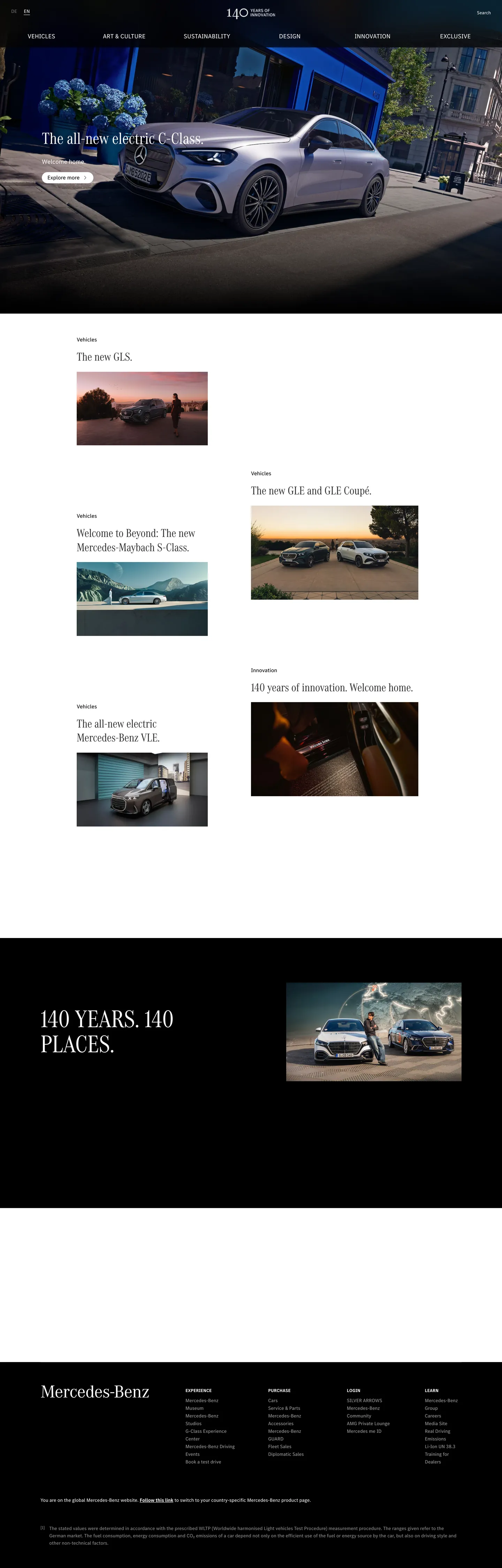
Mercedes-Benz's brand-experience site reads as an automotive magazine — not a configurator funnel, not a dealer inventory grid. The page opens on a black cinema band (`#000000`) holding a single CLA render, then drops to a white canvas (`#ffffff`) where two-column editorial article cards stack with small thumbnails and a lowercase "Editorial" eyebrow above each. A black band reading "140 YEARS. 140 PLACES." punctuates the middle. Type runs the brand's licensed pair: MBCorpo Title, a licensed serif declared as `"MBCorpo Title", "DaimlerCAC-Regular", "DaimlerCACArab-Regular", serif`, carries every display headline; MBCorpo Text, the sans companion, carries body at 14px / weight 400 / 22px line-height. The serif-on-sans split is the editorial signature — where BMW and Porsche hold a single sans across every text role, Stuttgart's other luxury-automotive icon splits the family at the display/body seam.
This page packages the system into a single DESIGN.md file following the Google Labs open spec. Inside: 19 colors tokens drawn from the brand's `--wb-*` palette (an 11-step grey ladder, 18-step blue scale, parallel red/green/yellow accent ladders, and the single theme voltage at `--theme-primary` #0260ab); 9 typography tokens running through MBCorpo Title for display and MBCorpo Text for body; 4 corner-radius values (0px, 2px, 4px, 8px) plus a 50% circle for avatars; the brand's `--wb-spacing-*` scale from 0.25rem (4px) through 6rem (96px); and 19 components covering top nav, hero band, editorial article card, model thumbnail, editorial eyebrow label, footnote paragraph, and the 140-year black editorial band.
Feed the file to Claude, Cursor, or GitHub Copilot and the agent writes React surfaces that read as Mercedes-Benz brand experience — MBCorpo serif headlines over white canvas, rectangular thumbnail cards, theme blue scoped tight to `--theme-primary`, editorial eyebrow above every article — rather than a generic dark-luxury automotive template. Reference the `{token.refs}` directly in Tailwind config, or use the spec as an audit lens: most luxury-auto sites borrow Mercedes's serif display but miss the strict 14px body weight and the magazine-band rhythm that make it work.
What makes it distinct
5
- Serif-on-sans typographic splitMBCorpo Title licensed serif for display, MBCorpo Text sans for 14px body, where BMW and Porsche stay monospaced-sans across the whole scale
- Single voltage scoped to themeMercedes Blue (#0260ab) is bound to `--theme-primary` for buttons and active states only, never as a CTA fill over photography
- Editorial magazine band rhythmalternating white article-card grid and a 140-year black editorial band, photography handles the visual weight
- Rectangular by defaultevery thumbnail, card, and editorial tile uses 0px corners; only avatar circles break the geometry
- Eleven-step grey ladder`--wb-grey-05` through `--wb-grey-95` give the system 11 graded neutrals before any chromatic accent enters
mercedes-benz.com
Live at mercedes-benz.com
A snapshot of the brand in production. Scroll the frame to see the whole page.
Colors
19 colors
Mercedes-Benz's system anchors on #0260ab (primary) as its primary color. Type is set in MBCorpo Text across 9 tokens from 12px to 64px, weights 400–400. Shape language is sharp — components average 2px corner radius, favoring crisp rectangles.
Brand & Accent
Sparing, CTA-only voltage · 5
Surface
Page and card backgrounds · 3
Text
Headlines, body, captions · 6
Borders & Hairlines
Dividers, outlines, rules · 2
Semantic
Status, errors, success, links · 3
Typography
9 type tokens
Set in MBCorpo Text across 9 tokens, from 12px to 64px, weights 400–400. Shown in its own stack: where the font isn't installed, the fallback the file names stands in.
- display-xl64px · weight 400 · lh 1.1The quick brown fox jumps over the lazy dog
- display-lg48px · weight 400 · lh 1.15The quick brown fox jumps over the lazy dog
- display-md32px · weight 400 · lh 1.2The quick brown fox jumps over the lazy dog
- display-sm24px · weight 400 · lh 1.25The quick brown fox jumps over the lazy dog
- body-lg16px · weight 400 · lh 1.5The quick brown fox jumps over the lazy dog
- body-md14px · weight 400 · lh 22pxThe quick brown fox jumps over the lazy dog
- body-footnote14px · weight 400 · lh 21pxThe quick brown fox jumps over the lazy dog
- caption-sup12px · weight 400 · lh 17.5pxThe quick brown fox jumps over the lazy dog
- eyebrow12px · weight 400 · lh 1.4The quick brown fox jumps over the lazy dog
Layout
Radii and spacing
5 corner radii and 8 spacing values. Shape language: sharp.
Radii
- none0px
- sm2px
- md4px
- lg8px
- circle50%
Spacing
- 3xs4px
- xxs8px
- xs24px
- sm32px
- md48px
- base72px
- lg88px
- xl96px
Components
19 components
Each rendered from its tokens (color, type, radius, padding) on Mercedes-Benz's own canvas.
- Top Navtop-navTop Nav
- Top Nav Linktop-nav-linkTop Nav Link
- Hero Band Cinemahero-band-cinemaHero Band Cinema
- Hero Overlay Headlinehero-overlay-headlineHero Overlay Headline
- Editorial Band Anniversaryeditorial-band-anniversaryEditorial Band Anniversary
- Article Card Small Thumbarticle-card-small-thumbArticle Card Small Thumb
- Article Card Featurearticle-card-featureArticle Card Feature
- Article Card Side Photoarticle-card-side-photoArticle Card Side Photo
- Article Thumbnailarticle-thumbnailArticle Thumbnail
- Eyebrow Editorialeyebrow-editorialEyebrow Editorial
- Button Primarybutton-primaryButton Primary
- Button Primary Activebutton-primary-activeButton Primary Active
- Button Primary Disabledbutton-primary-disabledButton Primary Disabled
- Button Secondary On Darkbutton-secondary-on-darkButton Secondary On Dark
- Type here…text-inputText Input
- Type here…text-input-focusText Input Focus
- Footnote Blockfootnote-blockFootnote Block
- Wordmark Footerwordmark-footerWordmark Footer
- Footer Linkfooter-linkFooter Link
In use
The system, in use
Mercedes-Benz's tokens on the kind of product it builds.
Build something people actually use.
A short paragraph of marketing copy that previews how the brand's display tier and body tier read together. Two sentences is usually enough.
FAQ
Mercedes-Benz design system FAQ
Common questions about Mercedes-Benz's tokens, components, and how to use this DESIGN.md in your project.
Read next
Related reading
Specs, directories, and component libraries that pair with this design system.
- Browse all design systemsThe full directory of DESIGN.md files on shadcn.io, with live mockups for each.shadcn.io
- Mercedes-Benz Brand ExperienceThe live brand-experience site — see the MBCorpo serif headlines, theme-blue active states, and the 140-year black editorial band in production.mercedes-benz.com (opens in a new tab)
- The DESIGN.md specificationGoogle Labs' open spec for machine-readable design system files — the format this page is built on.github.com (opens in a new tab)
Use it
Use Mercedes-Benz in your project
One machine-readable file. Drop it into Claude, Cursor, or any AI tool that reads DESIGN.md.
Download the DESIGN.md
One machine-readable file: every color, type, radius, spacing, and component token of Mercedes-Benz.
Feed it to your AI tool
Drop it into Claude, Cursor, or GitHub Copilot. The agent writes React components and Tailwind classes that match Mercedes-Benz's visual language.
Reference the tokens directly
Or paste the values into your Tailwind config, CSS variables, or component library: every color, size and radius is a quoted, ready-to-copy value.
Read the full DESIGN.md: overview, rationale, do’s and don’ts
Overview
Mercedes-Benz's brand-experience site reads as a luxury automotive magazine — not a configurator funnel, not a dealer inventory grid. Where BMW corporate stages dark-navy hero bands and rectangular Corporate Blue CTAs across an engineered card grid, and where Porsche softens every photo tile to 32px on a white canvas, Stuttgart's other automotive icon runs an editorial magazine layout: a single black cinema hero ({colors.canvas-dark} — #000000) at the top, a white canvas ({colors.canvas} — #ffffff) holding two-column article cards with small thumbnails and a lowercase "Editorial" eyebrow, then a single black anniversary band ("140 YEARS. 140 PLACES.") punctuating the middle, then back to the white grid.
Serif as signature: where most luxury-auto brands stay sans-only across every text role — BMW's BMW Type Next Latin, Porsche's Porsche Next, Ferrari's Ferrari Sans — Mercedes-Benz splits the family at the display/body seam. MBCorpo Title carries every display headline as a licensed serif (declared "MBCorpo Title", "DaimlerCAC-Regular", "DaimlerCACArab-Regular", serif); MBCorpo Text carries every body and caption role at 14px / 400 / 22px line-height. The serif-on-sans contrast is the editorial voice — it reads as automotive magazine, not configurator.
Theme blue scoped tight: the brand holds a single saturated voltage at {colors.primary} (#0260ab — --theme-primary), with {colors.primary-active} (#014880 — --theme-active) for press and {colors.primary-disabled} (#80c6ff — --theme-disabled) for the inactive state. Theme blue surfaces only on button fills, active link states, and inline anchor hovers — never as a CTA fill over the cinema hero photography. The hero CTAs are transparent-with-white-outline; the photograph carries the chromatic moment.
Rectangular magazine geometry: every article card, thumbnail, and editorial tile uses {rounded.none} (0px). The brand's --wb-radius-* scale declares only s (2px), m (4px), l (8px), and full (50% for avatars) — the named radii surface inside utility chrome only. The default is rectangular.
Key Characteristics:
- Black cinema hero band over the model render, then white canvas magazine grid below.
- MBCorpo Title licensed serif for display, MBCorpo Text sans for body — the editorial signature.
- Body locked at 14px / 400 / 22px line-height across span, paragraph, footnote, anchor.
- Theme blue (
{colors.primary}— #0260ab) bound to--theme-primary, scoped to buttons and active states only. - Rectangular 0px corners on every card; circles only for avatars.
- Eleven-step grey ladder (
--wb-grey-05through--wb-grey-95) before any chromatic accent enters. - Editorial "Editorial" eyebrow above every article card — lowercase, body-muted #9f9f9f.
- 140-year black editorial band punctuates the white-canvas rhythm — magazine pattern, not CTA band.
Colors
Brand & Accent
- Theme Primary (Mercedes Blue) (
{colors.primary}— #0260ab) — bound to--theme-primaryand--wb-blue-35. Used as bg onbutton-primary-active, as text on inline anchor hovers, and as the focus border ontext-input-focus. The brand's single saturated voltage. Layer: brand. - Theme Active (
{colors.primary-active}— #014880) — bound to--theme-activeand--wb-blue-25. Used as bg on pressed primary button. - Theme Disabled (
{colors.primary-disabled}— #80c6ff) — bound to--theme-disabledand--wb-blue-75. Used as bg on inactive primary CTA. - Button Theme (
{colors.primary-button}— #0078d6) — frequency 0 raw, bound to--button-theme-colorand--wb-blue-45. Used as bg on default primary button — a slightly brighter cousin of theme primary. Layer: brand. - Hover on Theme Primary (
{colors.primary-hover}— #bbbbbb) — bound to--hover-on-theme-primaryand--wb-grey-70. Used as text on theme-primary surfaces during hover.
Surface
- Canvas (
{colors.canvas}— #ffffff) — frequency 522. Used as text (261), border (261). The dominant page floor under the article-card grid. Bound to seven CSS variables including--text-on-base-color,--wb-white,--campaign-text,--campaign-light. - Canvas Dark (
{colors.canvas-dark}— #000000) — frequency 5. Used as bg (3), text (1), border (1). The cinema hero band and the 140-year anniversary editorial band backdrop. Bound to--base-color,--wb-black,--campaign-gradient,--campaign-primary. - Surface Dark Elevated (
{colors.surface-dark-elevated}— #141414) — bound to--bg-on-base-colorand--wb-grey-10. Used as bg on dark-mode elevated cards (top-nav overlays, modals over the cinema hero).
Ink & Text
- Ink (
{colors.ink}— #000000) — frequency 5 (same cluster as canvas-dark). Display headline color over the white canvas — MBCorpo Title sits as deep black ink. - Ink Soft (
{colors.ink-soft}— #1a1a1a) — bound to--wb-grey-10. Used on emphasized body paragraphs and eyebrow-strong contexts. - Ink Muted (
{colors.ink-muted}— #262626) — bound to--wb-grey-15. Used on footer links and tertiary copy. - Body Muted (
{colors.body-muted}— #9f9f9f) — frequency 42. Used as text (21), border (21). Bound to--wb-grey-60,--hover-on-base-color,--link-on-base-color. The lowercase "Editorial" eyebrow and most secondary anchor copy ride this color — the magazine eyebrow tone. - Body Fine (
{colors.body-fine}— #919191) — frequency 10. Used as text (5), border (5). Bound to--wb-grey-55. The fine-print body color — WLTP-disclosure paragraphs render at this tone.
Hairlines
- Hairline (
{colors.hairline}— #e8e8e8) — bound to--wb-grey-85. 1px dividers below editorial eyebrows, thumbnail bottom edge. - Hairline Strong (
{colors.hairline-strong}— #dbdbdb) — bound to--wb-grey-80. Text-input 1px border, configurator option border.
Photo-overlay
- On Dark (
{colors.on-dark}— #ffffff) — same cluster as canvas. Display text and CTA outline color over the cinema hero photograph.
Semantic (from CSS variables)
- Error (
{colors.error}— #c31e1e): Bound to--wb-red-40. Form validation errors. - Success (
{colors.success}— #21a330): Bound to--wb-green-50. Confirmation, "available" indicators. - Warning (
{colors.warning}— #d1aa00): Bound to--wb-yellow-40. Validation warnings.
Typography
Font Family
The system runs a licensed pair: MBCorpo Title for display, MBCorpo Text for body. Declared in CSS as:
--wb-font-title:"MBCorpo Title", "DaimlerCAC-Regular", "DaimlerCACArab-Regular", serif--wb-font-text:"MBCorpo Text", "DaimlerCS-Regular", "DaimlerCSArab-Regular", sans-serif--wb-font-text-bold: same stack as text — bold cuts of MBCorpo Text
The CJK fallbacks (DaimlerCAC-Regular, DaimlerCACArab-Regular, DaimlerCS-Regular, DaimlerCSArab-Regular) ship the typography to the Chinese and Arabic markets without family swaps. Both faces are licensed to Daimler.
Hierarchy
| Token | Family | Size | Weight | Line Height | Letter Spacing | Use |
|---|---|---|---|---|---|---|
{typography.display-xl} | Title (serif) | 64px | 400 | 1.1 | 0 | Cinema hero h1, 140-year band |
{typography.display-lg} | Title (serif) | 48px | 400 | 1.15 | 0 | Section heads, hero overlay |
{typography.display-md} | Title (serif) | 32px | 400 | 1.2 | 0 | Featured article card headline |
{typography.display-sm} | Title (serif) | 24px | 400 | 1.25 | 0 | Small-thumbnail article card title |
{typography.body-lg} | Text (sans) | 16px | 400 | 1.5 | 0 | Editorial body, lead paragraphs |
{typography.body-md} | Text (sans) | 14px | 400 | 22px | 0 | Default body — captured 92 times across span / a |
{typography.body-footnote} | Text (sans) | 14px | 400 | 21px | 0 | WLTP footnote, legal disclosure |
{typography.caption-sup} | Text (sans) | 11.67px | 400 | 17.5px | 0 | Superscript footnote markers |
{typography.eyebrow} | Text (sans) | 12px | 400 | 1.4 | 0 | Lowercase "Editorial" label above article cards |
Principles
- Serif-on-sans display/body split. MBCorpo Title for display, MBCorpo Text for body — non-negotiable. The split is the editorial voice.
- Body locked at 14px. The most-captured signature was 14px / weight 400 / 22px line-height — 92 occurrences across
<span>and<a>on the captured surface. Body never promotes to 16px on this page. - Weight 400 everywhere. Display does not promote to 500 or 700; emphasis comes from family swap (serif Title) and size, not weight.
- Letter-spacing is
normaleverywhere. The MBCorpo pair works on a natural body — no tracking on display, no uppercase tracking on nav. - Lowercase eyebrow. Article eyebrows render lowercase "Editorial" rather than UPPERCASE TRACKED — counter to the BMW corporate "LEARN MORE" inline-link convention.
Note on Font Substitutes
MBCorpo Title and MBCorpo Text are licensed to Daimler. Documented fallbacks (DaimlerCAC-Regular, DaimlerCS-Regular) are also licensed. Open-source approximations:
- Display (serif): Source Serif 4 or Tinos at weight 400 — closest free serif with similar x-height.
- Body (sans): Inter at weight 400 with
tracking: normal— closest open-source humanist. - Paid alternative: Söhne for closer body proportions on paid licenses.
Layout
Spacing System
The brand declares a --wb-spacing-* scale on root:
--wb-spacing-3xs: 0.25rem (4px)--wb-spacing-xxs: 0.5rem (8px)--wb-spacing-xs: 1.5rem (24px)--wb-spacing-s: 2rem (32px)--wb-spacing-m: 3rem (48px)--wb-spacing-l: 4.5rem (72px)--wb-spacing-xl: 5.5rem (88px)--wb-spacing-xxl: 6rem (96px)
Section padding on the editorial band lands at 96px 140px (captured). Article-card row padding lands at 0px 116px 64px (captured). The brand uses the bigger tokens (l 72px, xl 88px, xxl 96px) for section rhythm rather than a tight 80px corporate cadence.
Grid & Container
The brand declares a fluid 12-column grid:
--wb-grid-content-width:86vw--wb-grid-width:min(86vw, 1680px)— content caps at 1680px wide--wb-grid-column-width:min(calc((86vw - 11 * 2.5rem) / 12), 103.33px)--wb-grid-gutter-width:2.5rem(40px)
Article cards run as 2-up at desktop with small-thumb and side-photo variants alternating. The cinema hero and the 140-year editorial band run full-bleed.
Whitespace Philosophy
The page is editorial-paced: dense article rows separated by 64px vertical gaps, then a 96-tall padded black band, then back to the white grid. Cards breathe; the eye reads across rows. Whitespace is the editorial signature — not the dense dealership grid BMW corporate uses.
Elevation & Depth
The system uses photographic depth + color-block contrast elevation. The brand declares three shadow tokens but uses them rarely on the brand-experience surface:
--wb-shadow-s:0 0 2px 0 rgba(0, 0, 0, .1), 0 2px 4px 0 rgba(0, 0, 0, .1)--wb-shadow-m:0 0 2px 0 rgba(0, 0, 0, .1), 0 4px 8px 0 rgba(0, 0, 0, .1)--wb-shadow-l:0 0 4px 0 rgba(0, 0, 0, .1), 0 16px 24px 0 rgba(0, 0, 0, .1)
| Level | Treatment | Use |
|---|---|---|
| Flat (canvas) | {colors.canvas} (#ffffff) | Article-card grid, footer |
| Cinema | {colors.canvas-dark} (#000000) + photograph | Hero band, 140-year editorial band |
| Hairline | 1px {colors.hairline} (#e8e8e8) | Article-card bottom edge, divider |
| Soft drop | --wb-shadow-s (rare) | Mini-toast, dropdown menu |
| Mid drop | --wb-shadow-m (rare) | Hover-lifted card (not used on landing) |
| Heavy drop | --wb-shadow-l (rare) | Modal, overlay menu |
| Photographic | Full-bleed model + lifestyle imagery | Hero band, anniversary band, article thumbnails |
Decorative Depth
- Full-bleed model photography is the brand's primary depth treatment — the cinema hero renders the CLA as a photograph filling the band edge-to-edge.
- Editorial article thumbnail sits flush against the white canvas — no shadow, no border ring, edge-to-edge photograph with the headline below.
Shapes
Border Radius Scale
The brand declares a sparse radius scale on root:
--wb-radius-s: 2px--wb-radius-m: 4px--wb-radius-l: 8px--wb-radius-full: 50% (circle, not pill)
| Token | Value | Use |
|---|---|---|
{rounded.none} | "0px" | Dominant — every article card, thumbnail, editorial tile, hero band |
{rounded.sm} | "2px" | --wb-radius-s — tight inline chip |
{rounded.md} | "4px" | --wb-radius-m — primary CTA button, text input, dropdown |
{rounded.lg} | "8px" | --wb-radius-l — larger panel, mini-toast |
{rounded.circle} | "50%" | --wb-radius-full — avatar, dot indicator |
The default radius is rectangular 0px. Buttons sit at 4px ({rounded.md}); inputs sit at 4px; only avatars take the full circle. Note: the brand declares --wb-radius-full: 50% rather than the 9999px pill — circular geometry only, never a pilled button. This is the divergence from Porsche (which pills every CTA at 9999px) and from BMW corporate (which holds 0px on every CTA).
Components
Top Navigation
top-nav — Dark cinema bar pinned to the top of the page. Background {colors.canvas-dark} (#000000 — sits flush against the hero photograph), text {colors.on-dark} (#ffffff), height 56px, padding 0px × 32px. Left: Mercedes star wordmark; center-right: primary menu (Brand, Innovation, Magazine, Cars, Sustainability); far right: search + utilities. Menu items render in {typography.body-md} (14px / 400 / 22px line-height).
top-nav-link — Background transparent, text {colors.on-dark}, {typography.body-md}, padding 0 × 16px horizontal.
Hero Bands
hero-band-cinema — Full-bleed black cinema band. Background {colors.canvas-dark}, holds the CLA model photograph; display h1 in {typography.display-xl} (MBCorpo Title 64px / 400) renders white over the photograph. Zero padding — photograph fills edge-to-edge.
hero-overlay-headline — Transparent overlay headline on the cinema photograph. Text {colors.on-dark}, typography {typography.display-lg} (MBCorpo Title 48px / 400). "The all-new electric CLA" reads in serif over the dark band.
Editorial Bands
editorial-band-anniversary — The brand's magazine signature. Background {colors.canvas-dark} (#000000), text {colors.on-dark}, typography {typography.display-xl} (MBCorpo Title 64px / 400). Padding 96px × 140px. Reads "140 YEARS. 140 PLACES." with an accompanying lifestyle photograph at right. Punctuates the white-canvas article grid without selling a model. Where BMW corporate uses a cta-band-photo and Porsche uses a locator-card, Mercedes uses an editorial anniversary band.
Article Cards
article-card-small-thumb — The dominant magazine pattern. Background {colors.canvas} (#ffffff), text {colors.ink}, {rounded.none} 0px corners, zero padding. Composition: small thumbnail at left (~160px wide), eyebrow + headline at right. Eyebrow in {typography.eyebrow} (12px / 400 / lowercase "Editorial") tinted {colors.body-muted} (#9f9f9f); headline in {typography.display-sm} (MBCorpo Title 24px / 400) in {colors.ink} (#000000).
article-card-feature — A larger feature variant for primary editorial content. Background {colors.canvas}, text {colors.ink}, {typography.display-md} (32px / 400) headline. Larger thumbnail (~50% of card width), feature image takes top, headline below.
article-card-side-photo — Side-by-side article card — photograph on one side, eyebrow + headline + 1-line dek on the other. Same {rounded.none}, same {typography.display-sm} headline, same eyebrow treatment.
article-thumbnail — The card's photo plate. Background {colors.hairline} (#e8e8e8 — soft grey before the image renders), {rounded.none} 0px corners. Holds the photograph edge-to-edge.
eyebrow-editorial — The lowercase "Editorial" label above every article card. Background transparent, text {colors.body-muted} (#9f9f9f), typography {typography.eyebrow} (12px / 400 / no tracking). The magazine signature — lowercase, not UPPERCASE TRACKED.
Buttons
button-primary — Standard primary CTA. Background {colors.primary-button} (#0078d6 — --button-theme-color), text {colors.on-dark} (#ffffff), typography {typography.body-md} (14px / 400 / no tracking), padding 12px × 24px, height 48px, rounded {rounded.md} (4px — --wb-radius-m). Where BMW corporate's button is a sharp 0px rectangle and Porsche's is a fully pilled white slug, Mercedes-Benz's CTA holds a soft 4px radius — closer to magazine-pull-quote than racing-precision.
button-primary-active — Press state. Background shifts to {colors.primary-active} (#014880 — --theme-active).
button-primary-disabled — Inactive state. Background {colors.primary-disabled} (#80c6ff — --theme-disabled), opacity 0.6.
button-secondary-on-dark — Transparent pill with 1px white outline over the cinema photograph. Background transparent, text {colors.on-dark}, 1px white border, {rounded.md} 4px radius. The hero CTA pattern.
Forms
text-input — Background {colors.canvas}, text {colors.ink}, {typography.body-md}, rounded {rounded.md} (4px), padding 13px × 16px, height 48px, 1px {colors.hairline-strong} border (#dbdbdb).
text-input-focus — Focus state. 1px {colors.primary} (#0260ab — Mercedes Blue) border. The only place chromatic voltage surfaces in the form chrome.
Misc
footnote-block — WLTP-disclosure paragraph. Background transparent, text {colors.body-fine} (#919191), typography {typography.body-footnote} (14px / 400 / 21px line-height). 63px tall captured.
wordmark-footer — Closing white footer with the Mercedes-Benz wordmark. Background {colors.canvas}, text {colors.ink}, body-md typography, padding 72px × 32px. Multi-column link list below.
footer-link — Background transparent, text {colors.ink-muted} (#262626), body-md typography.
Do's and Don'ts
Do
- Split typography at the display/body seam: MBCorpo Title serif for headlines, MBCorpo Text sans for body. The serif-on-sans contrast is the editorial voice.
- Lock body at 14px / weight 400 / 22px line-height — the captured signature (92 occurrences). Body never promotes to 16px on this surface.
- Render eyebrow labels lowercase ("Editorial") tinted
{colors.body-muted}(#9f9f9f), not UPPERCASE TRACKED. - Hold article cards at
{rounded.none}(0px) — rectangular magazine geometry is the default. - Use a 4px
{rounded.md}(--wb-radius-m) on every button and text input — never 0px on buttons, never pill. - Reserve
{colors.primary}(#0260ab Mercedes Blue) for--theme-primarybutton fills and active states only. - Use the 140-year black editorial band pattern to punctuate the white-canvas grid — it replaces the cta-band-photo convention.
Don't
- Don't paint the cinema hero CTA in
{colors.primary}(#0260ab Mercedes Blue). Theme blue is bound to--theme-primaryfor button fills against light surfaces and active states — the hero CTA is transparent-with-white-outline over the photograph. - Don't promote body to 16px on the magazine surface. The captured body signature is 14px / 400 / 22px line-height — 16px belongs to lead paragraphs only and breaks the editorial-row rhythm.
- Don't bold the eyebrow or uppercase-track it. The lowercase "Editorial" tinted
{colors.body-muted}is the brand's magazine signature; UPPERCASE TRACKED reads as BMW corporate "LEARN MORE", not Mercedes editorial. - Don't add a brand color other than theme blue. The brand's
--wb-*palette holds 80+ red/green/yellow tokens scoped to semantic chart states only — never as decorative accents on the magazine surface. - Don't promote any display token to weight 500 or 700. MBCorpo Title sits at 400 across every display tier; the family swap (Title vs Text) carries the emphasis, not weight.
- Don't pill the primary button at 9999px. The brand's
--wb-radius-fullis 50% (circle for avatars), not pill — and--wb-radius-m(4px) is the canonical button radius. A pill reads as Porsche, not Mercedes. - Don't use the article-thumbnail grey (
{colors.hairline}— #e8e8e8) as a body text or bg fill. It's the placeholder-before-image color for thumbnails, not a surface token. - Don't dump every
--wb-grey-*value into the spec. The brand declares 11 grey steps, but the brand-experience surface uses 5 of them — promote the captured set, not the full palette.
Known Gaps
- The extractor captured the mercedes-benz.com brand-experience landing page (magazine format). The configurator (paint pickers, interior swatches, wheel options, EQ-class electric-range simulator), the dealer locator, the inventory grids, and the Mercedes me account surface live on separate sub-domains and hold many more model-specific tokens.
- MBCorpo Title and MBCorpo Text are licensed to Daimler; documented fallbacks (DaimlerCAC-Regular, DaimlerCS-Regular) are also licensed and not publicly available.
- Animation easing tokens (
--wb-movecubic-bezier(.3, 0, 0, 1),--wb-fadecubic-bezier(0, 0, .3, 1),--wb-opencubic-bezier(.25, .1, .25, 1)) are captured on root but not exercised on the magazine landing surface. - The full
--wb-*palette holds 80+ red/green/yellow ladders that surface in semantic charts and validation states elsewhere; this spec captures the structural subset visible on the landing page. - Form validation states beyond
text-input-focus, the Mercedes me account surface, and the in-product configurator are out of scope. - A cookie-consent overlay can occlude part of the hero band on first visit; the lead band content may not be fully represented in the captured screenshot.
- Drop shadow tokens (
--wb-shadow-s,--wb-shadow-m,--wb-shadow-l) are declared on root but rarely surface on the captured magazine surface — photography and color-block contrast carry the depth.
Automotive
More systems like this
More DESIGN.md files in Automotive.
Pricing
Build it with Pro
The DESIGN.md files are free. Pro adds 6,000+ blocks, premium templates and the MCP server, so your AI editor builds in your system for you.
4.9/5 out of 5 · 150+ reviewsfrom 150+ founders and developers.
Billing
Billed once a year in USD. Cancel anytime.
- How many people can use the license.
- Client work, SaaS products and anything you charge for.
- Production-ready React sections: hero, pricing, features, dashboards and more.
- Complete multi-page sites you can ship as they are.
- React icons from every major library, installable with one command.
- Presets that restyle every block, in light and dark.
- Lets your AI editor search, preview and install blocks for you.
- Priority requests are answered first.
Individual
For personal projects & open source
$32instead of $49/mo
$389 billed yearly
- Seats: 1 seat
- Commercial use: Personal & open source only
- Pro blocks: 6,000+ blocks
- Templates: All 14 templates
- React icons: 294k+ icons
- Themes: All 59 themes
- MCP server: Basic usage
- Support: Standard
Team
Most popularFor freelancers, agencies & startups
$66instead of $99/mo
$789 billed yearly · ≈ $13/dev/mo
- Seats: Up to 5 seats
- Commercial use: Included
- Pro blocks: 6,000+ blocks
- Templates: All 14 templates
- React icons: 294k+ icons
- Themes: All 59 themes
- MCP server: High usage
- Support: Priority
Organization
For companies with larger teams
$132instead of $199/mo
$1,589 billed yearly
- Seats: Unlimited seats
- Commercial use: Included
- Pro blocks: 6,000+ blocks
- Templates: All 14 templates
- React icons: 294k+ icons
- Themes: All 59 themes
- MCP server: Unlimited usage
- Support: Priority
Billed once a year in USD. Cancel anytime.
Individual
For personal projects & open source
$32instead of $49/mo
$389 billed yearly
- How many people can use the license.Seats: 1 seat
- Client work, SaaS products and anything you charge for.Commercial use: Personal & open source only
- Production-ready React sections: hero, pricing, features, dashboards and more.Pro blocks: 6,000+ blocks
- Complete multi-page sites you can ship as they are.Templates: All 14 templates
- React icons from every major library, installable with one command.React icons: 294k+ icons
- Presets that restyle every block, in light and dark.Themes: All 59 themes
- Lets your AI editor search, preview and install blocks for you.MCP server: Basic usage
- Priority requests are answered first.Support: Standard
Team
Most popularFor freelancers, agencies & startups
$66instead of $99/mo
$789 billed yearly · ≈ $13/dev/mo
Everything in Individual, plus
- How many people can use the license.Seats: Up to 5 seats
- Client work, SaaS products and anything you charge for.Commercial use: Included
- Lets your AI editor search, preview and install blocks for you.MCP server: High usage
- Priority requests are answered first.Support: Priority
Organization
For companies with larger teams
$132instead of $199/mo
$1,589 billed yearly
Everything in Team, plus
- How many people can use the license.Seats: Unlimited seats
- Lets your AI editor search, preview and install blocks for you.MCP server: Unlimited usage
- Secure checkout via Stripe
- Code lives in your repo
- Keep what you've shipped if you cancel
- License terms
Your system, built for you
Every block, template and icon, installed by your AI agent in your design system. The DESIGN.md files stay free.