Mazda USA Design System
Mazda USA's marketing-site design system as a DESIGN.md file. Mazda Type uppercase tracking carries every label, monochrome chrome over cinematic dark photography, 3px small-step rounding. For React, Next.js, and AI tools.
Add shadcn.io to your AI agent. · Pro It installs blocks, icons and templates in your design system from a prompt, with Pro.
Set up MCP- Primary
- #000000
- Typeface
- Mazda Type
- Shape
- Soft
- Base radius
- 0px
- Colors
- 11
- Type tokens
- 14
- Components
- 17
- Spacing values
- 8
About
About Mazda USA DESIGN.md
Curated by Dov Azencot · Updated May 19, 2026 · Source mazdausa.com (opens in a new tab)
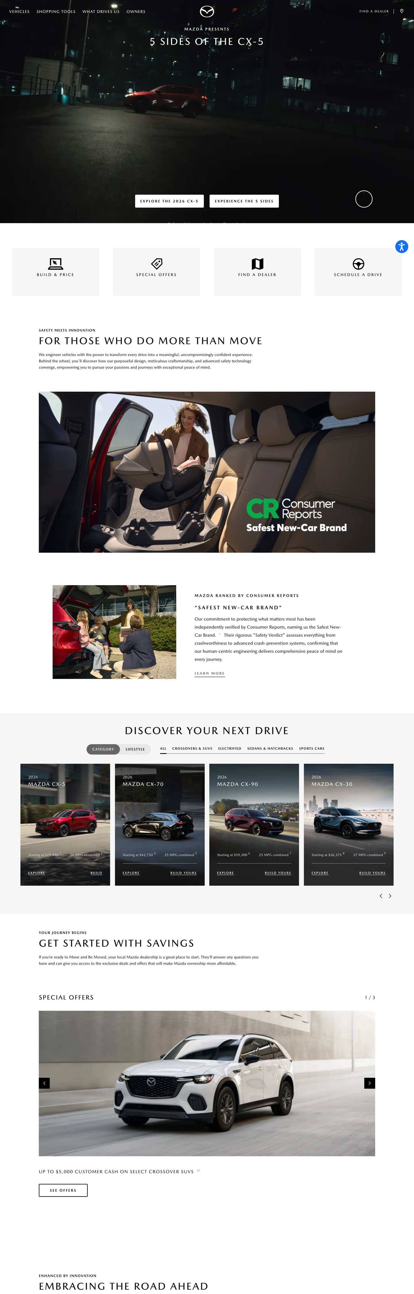
Mazda's marketing site commits to a typographic move almost no other automotive brand makes at this scale. **All-uppercase everywhere.** Nav links sit at 11px / 500 in capitals with 2px tracking. Section titles run at 35px / 500 in capitals with 3.5px tracking. Filter chips, footer labels, every category headline, every CTA — capitals, tracked. The only sentence-case prose on the page lives inside small body paragraphs ("We engineer vehicles with the power to transform every drive...") and a single h2 ("A Mazda MX-5 Owner 25 Years In The Making"). The discipline is editorial-magazine on the chrome layer — closer to a Wallpaper* spread than to a Toyota landing page — and it gives the system its visual signature.
The DESIGN.md file packages the system into a machine-readable spec for React tooling. Inside: 11 colors tokens drawn entirely from neutral grayscale — 101010 ink (frequency 908), pure white canvas, a D5D5D5 secondary text, a 999 muted gray, a 676565 photo-overlay neutral, and a single 263854 deep-blue accent that appears just once in the captured page. There is no brand voltage in the conventional sense; the chrome is genuinely monochrome. 14 typography tokens map Mazda Type across uppercase chips (9-18px / 500 / 1.2-2.8px tracking), uppercase Bold callouts (11-13px / 700 / 2-2.6px tracking), and the rare sentence-case body and h2 tiers. 4 radius tokens center on 3px small-step rounding with a 999px pill alternate. 17 components definitions cover the dark cinematic hero, the white feature-card grid, the chip-filter strip, and the chevron-circle slide-control.
Feed this file to Claude or Cursor and it will reproduce Mazda's specific moves: all-uppercase tracked typography on every nav, chip, and section title; monochrome chrome with zero chromatic brand voltage; cinematic dark hero photography; and 3px small-step rounding. The token references resolve cleanly without invention. The single move worth borrowing only if your category supports cinematic photography is the willingness to let uppercase tracking carry every chromatic moment the chrome would normally do — most brands need at least one accent voltage, and Mazda gets away without one because the imagery is doing the work.
What makes it distinct
5
- Uppercase-everywhere typographyMazda Type runs nav, chips, section titles, and labels in all caps at 9-18px with 1.2-3.5px tracking
- Monochrome chromeno brand voltage at the chrome layer; 101010 ink, white canvas, and 999 muted gray are the only chromatic tokens
- Cinematic dark herofull-bleed black film carries the CX-5 hero photograph with white display headline at 35px capitalized and 3.5px tracking
- 3px small-step roundingfrequency 14 across cards and surfaces; only the filter-chip strip uses the 999px pill alternate
- Tracking as hierarchyletter-spacing carries the typographic hierarchy where most brands use weight; the 18px section title at 1.8px tracking reads as the loudest typographic move
mazdausa.com
Live at mazdausa.com
A snapshot of the brand in production. Scroll the frame to see the whole page.
Colors
11 colors
Mazda USA's system anchors on #000000 (ink-deep) as its primary color. Type is set in Mazda Type across 14 tokens from 9px to 35px, weights 400–700. Shape language is soft — components average 301px corner radius, with no sharp interactive edges.
Brand & Accent
Sparing, CTA-only voltage · 1
Surface
Page and card backgrounds · 2
Text
Headlines, body, captions · 6
Borders & Hairlines
Dividers, outlines, rules · 2
Typography
14 type tokens
Set in Mazda Type across 14 tokens, from 9px to 35px, weights 400–700. Shown in its own stack: where the font isn't installed, the fallback the file names stands in.
- display-hero35px · weight 500 · lh 42px · tracking 3.5pxThe quick brown fox jumps over the lazy dog
- section-title18px · weight 500 · lh 22px · tracking 1.8pxThe quick brown fox jumps over the lazy dog
- section-title-mixed18px · weight 500 · lh 19.8pxThe quick brown fox jumps over the lazy dog
- label-caps-lg14px · weight 500 · lh 18.2px · tracking 2.8pxThe quick brown fox jumps over the lazy dog
- label-caps-md13px · weight 700 · lh 17px · tracking 2.6pxThe quick brown fox jumps over the lazy dog
- label-caps-sm12px · weight 700 · lh 16px · tracking 2.4pxThe quick brown fox jumps over the lazy dog
- label-caps-xs11px · weight 500 · lh 14px · tracking 2pxThe quick brown fox jumps over the lazy dog
- label-caps-xxs9px · weight 700 · lh 18px · tracking 2pxThe quick brown fox jumps over the lazy dog
- button-md14px · weight 500 · lh 20px · tracking 1.3pxThe quick brown fox jumps over the lazy dog
- body-md16px · weight 400 · lh 28pxThe quick brown fox jumps over the lazy dog
- body-md-tracked14px · weight 400 · lh 22pxThe quick brown fox jumps over the lazy dog
- body-sm14px · weight 400 · lh 17px · tracking 0.28pxThe quick brown fox jumps over the lazy dog
- body-1212px · weight 500 · lh 22px · tracking 0.1pxThe quick brown fox jumps over the lazy dog
- caption-emphasis18px · weight 500 · lh 22px · tracking 1.8pxThe quick brown fox jumps over the lazy dog
Layout
Radii and spacing
3 corner radii and 8 spacing values. Shape language: soft.
Radii
- none0px
- xs3px
- full999px
Spacing
- xs4px
- sm8px
- md10px
- base12px
- lg20px
- xl24px
- 2xl28px
- 3xl56px
Components
17 components
Each rendered from its tokens (color, type, radius, padding) on Mazda USA's own canvas.
- Button Primarybutton-primaryButton Primary
- Button Secondarybutton-secondaryButton Secondary
- Button Ghost Darkbutton-ghost-darkButton Ghost Dark
- Top Navtop-navTop Nav
- Nav Linknav-linkNav Link
- Hero Bandhero-bandHero Band
- Hero Headinghero-headingHero Heading
- Hero Eyebrowhero-eyebrowHero Eyebrow
- Section Headingsection-headingSection Heading
- Body Paragraphbody-paragraphBody Paragraph
- Body Paragraph Trackedbody-paragraph-trackedBody Paragraph Tracked
- Filter Chipfilter-chipFilter Chip
- Filter Chip Activefilter-chip-activeFilter Chip Active
- Feature Cardfeature-cardFeature Card
- Feature Card Darkfeature-card-darkFeature Card Dark
- Chevron Circlechevron-circleChevron Circle
- FooterfooterFooter
In use
The system, in use
Mazda USA's tokens on the kind of product it builds.
Build something people actually use.
A short paragraph of marketing copy that previews how the brand's display tier and body tier read together. Two sentences is usually enough.
FAQ
Mazda USA design system FAQ
Common questions about Mazda USA's tokens, components, and how to use this DESIGN.md in your project.
Read next
Related reading
Specs, directories, and component libraries that pair with this design system.
- Browse all design systemsThe full directory of DESIGN.md files on shadcn.io, with live mockups for each.shadcn.io
- Mazda — official siteMazda USA's public marketing site — the source of truth for the live tokens captured in this file.mazdausa.com (opens in a new tab)
- The DESIGN.md specificationGoogle Labs' open spec for machine-readable design system files — the format this page is built on.github.com (opens in a new tab)
Use it
Use Mazda USA in your project
One machine-readable file. Drop it into Claude, Cursor, or any AI tool that reads DESIGN.md.
Download the DESIGN.md
One machine-readable file: every color, type, radius, spacing, and component token of Mazda USA.
Feed it to your AI tool
Drop it into Claude, Cursor, or GitHub Copilot. The agent writes React components and Tailwind classes that match Mazda USA's visual language.
Reference the tokens directly
Or paste the values into your Tailwind config, CSS variables, or component library: every color, size and radius is a quoted, ready-to-copy value.
Read the full DESIGN.md: overview, rationale, do’s and don’ts
Overview
Mazda's marketing site commits to a typographic move almost no other automotive brand makes at this scale. Uppercase tracking as voice. Across the captured page, 14 of the 20 most-used typographic signatures are uppercase capitals with letter-spacing between 1.2px and 3.5px — nav links at 11px / 500 with 2px tracking, filter chips at 12-13px / 700 with 2.4-2.6px tracking, the hero display at 35px / 500 with 3.5px tracking, and the section title at 18px / 500 with 1.8px tracking. The only sentence-case prose tiers on the page are the body paragraph (14-16px / 400) and a single mixed-case h2 ("A Mazda MX-5 Owner 25 Years In The Making"). The discipline is editorial-magazine on the chrome layer — closer to a Wallpaper* or Cereal spread than to a Toyota landing page — and it gives the system its visual signature.
The chrome ships no chromatic brand voltage at all. Where Subaru holds a single Pleiades-blue in reserve and BMW carries a saturated blue-and-red Motorsport accent, Mazda runs a genuinely monochrome system. The 11 captured color tokens are entirely grayscale — 101010 ink (frequency 908), pure white canvas (403), a D5D5D5 secondary gray (128), a 999 muted gray (110), plus a handful of subtle neutrals. A deep-blue 263854 appears once as a photo-overlay accident. The single non-neutral hex declared in CSS is the Swiper carousel's default 007aff — wired as a vendor variable that never renders on the page. The chromatic load lives entirely in the cinematic dark photography that fills the hero band and feature-card grid.
Tracking does the labor of hierarchy. Where most brands use weight, Mazda uses letter-spacing. Display sizes range from 35px (hero) down to 9px (footnote chip), but the more important variation across the system is the tracking scale: 0px on sentence-case prose, 0.1-0.28px on slightly-tracked sentence body, 1.2-1.3px on button labels and small-caps callouts, 1.8-2px on section titles and nav links, 2.4-2.8px on filter chips, and 3.5px on the hero display. The tracking ladder is the system's primary hierarchical device. Weight does some work — 500 for most caps, 700 for Bold callouts — but tracking carries the heavier signal.
Key Characteristics:
- All-uppercase chrome — nav, chips, section titles, footer labels, and every CTA in Mazda Type capitals with 1.2-3.5px tracking.
- Monochrome palette —
{colors.ink}(#101010, frequency 908) carries text and border; pure{colors.canvas}(#ffffff) handles the page floor; the page ships zero chromatic accent at the chrome layer. - Hero band is cinematic dark —
{colors.ink}canvas with full-bleed CX-5 photography and a 35px white display ("5 SIDES OF THE CX-5") at 3.5px tracking. - 3px small-step rounding (
{rounded.xs}— frequency 14) on every card and surface; only the filter-chip strip uses the 999px pill alternate ({rounded.full}— frequency 3). - Tracking-as-hierarchy: 0px on body prose, 1.8-2px on section titles, 2-3.5px on every uppercase label.
- The single sentence-case h2 on the page ("A Mazda MX-5 Owner 25 Years In The Making") at 18px / 500 / 0 tracking is the typographic outlier — a deliberate softening for editorial long-form copy.
- Filter-chip rail uses a single black-fill active state — no Pleiades blue, no chromatic emphasis. The active chip simply inverts ink and canvas.
- Bold weight (700) is reserved for the smallest uppercase labels (8-13px) where 500 weight would lose legibility at the tracked sizes.
Colors
Ink
- Ink (
{colors.ink}— #101010): frequency 908. Used as text (448), background (13), border (447). The dominant token across every surface — primary text on white, hero canvas background, filter-chip active fill, footer label color. Slightly warmer than pure black (3-point lightness lift) and softer against the cinematic dark photography. The single hex that effectively defines the system. - Ink Deep (
{colors.ink-deep}— #000000): frequency 21. Used as text (9), background (3), border (9). Pure black is rare — scoped to a few incidental UI fragments and the page's very small darkest-tone shadows. - Ink Soft (
{colors.ink-soft}— #2b2b2b): frequency 6. Used as text (3), border (3). A slightly-lifted dark gray used inside disclaimers and tertiary text rows. - Ink Overlay (
{colors.ink-overlay}— #676565): frequency 13. Used as text (6), background (1), border (6). The overlay neutral inside the dark cinematic-card surfaces — a mid-warmth gray that survives against both the white canvas and the dark photo tile. - Ink Muted (
{colors.ink-muted}— #7a7a7a): frequency 8. Used as text (4), border (4). A secondary disclaimer tone. - Ink Secondary (
{colors.ink-secondary}— #999999): frequency 110. Used as text (55), border (55). The dominant secondary text tone — sub-headlines under section titles, model meta-strips, footer category sub-rows.
Surface
- Canvas (
{colors.canvas}— #ffffff): frequency 403. Used as text (177), background (48), border (178). The page floor below the hero band, the feature-card fill, the filter-chip inactive fill. Pure white reading the inversion against the dark hero and dark feature tiles. The extraction clustered an adjacent off-white near-white into this token; both render as the same surface.
Hairline
- Hairline (
{colors.hairline}— #d5d5d5): frequency 128. Used as text (64), border (64). The default neutral border tone — model-card outlines, filter-chip strip dividers, footer category rails. A quiet warm-gray. - Hairline Soft (
{colors.hairline-soft}— #e7e7e7): frequency 2 — background only. The lightest neutral, used inside subtle column dividers and the feature-card resting outlines.
Accent (incidental, non-brand)
- Accent Navy (
{colors.accent-navy}— #263854): frequency 2. Used as text (1), border (1). A deep navy that appears just twice in the captured page — most likely an artifact of vehicle-color overlay or an accent on a single tile. Not a brand voltage; do not deploy as a token. - Surface Blue-Gray (
{colors.surface-blue-gray}— #4a5b6e): frequency 1 — background only. A single occurrence on a photographic overlay band. Same status as the accent-navy.
The vendor variable --swiper-theme-color: #007aff is declared in CSS but never renders on the page; the Swiper carousel uses its own theme that Mazda overrides through component styling.
Typography
Font Family
The system runs Mazda Type — a custom corporate sans licensed by Mazda — as the sole brand family across every tier. Fallbacks walk helvetica, arial, sans-serif. There is no separate display serif, no secondary sans, no monospace. The defining typographic decision is the commitment to a single family with hierarchy carried by weight + tracking + case, not by family variation.
Two body-text rows are wired to the bare "Mazda Type" family name without the fallback stack — these are the rare sentence-case tiers and they fall back to the system default if the font fails to load. Every other tier walks the full Helvetica fallback.
Hierarchy
| Token | Size | Weight | Line Height | Letter Spacing | Use |
|---|---|---|---|---|---|
{typography.display-hero} | 35px | 500 | normal | 3.5px | Hero h1 ("5 SIDES OF THE CX-5") — all-caps, widest tracking |
{typography.section-title} | 18px | 500 | 22px | 1.8px | Section title ("FOR THOSE WHO DO MORE THAN MOVE") |
{typography.section-title-mixed} | 18px | 500 | 19.8px | 0 | Single mixed-case h2 ("A Mazda MX-5 Owner 25 Years In The Making") |
{typography.label-caps-lg} | 14px | 500 | 18.2px | 2.8px | Feature-card uppercase headline |
{typography.label-caps-md} | 13px | 700 | normal | 2.6px | Larger uppercase callout, primary chip label |
{typography.label-caps-sm} | 12px | 700 | normal | 2.4px | Mid-size uppercase chip and section eyebrow |
{typography.label-caps-xs} | 11px | 500 | 14px | 2px | Top-nav links ("Build & Price", "Find a Dealer") |
{typography.label-caps-xxs} | 9px | 700 | 18px | 2px | Smallest uppercase footnote, badge text |
{typography.button-md} | 14px | 500 | 20px | 1.3px | CTA button label |
{typography.body-md} | 16px | 400 | 28px | 0 | Long-form body paragraph (the rare sentence-case tier) |
{typography.body-md-tracked} | 14px | 400 | 22px | 0 | Body prose inside dark feature tiles |
{typography.body-sm} | 14px | 400 | 17px | 0.28px | Sentence-case body with light tracking |
{typography.body-12} | 12px | 500 | 22px | 0.1px | Sentence-case footnote (slightly-tracked) |
{typography.caption-emphasis} | 18px | 500 | 22px | 1.8px | Same as section title — used inside feature-card captions |
Principles
The system's hierarchy lives in tracking, not in weight or family. Display weight stays at 500 for almost every tier; 700 is reserved for the smallest uppercase callouts (8-13px) where 500 weight would lose legibility at the tracked sizes. The tracking ladder runs: 0 (body), 0.1-0.28px (slightly-tracked body), 1.2-1.3px (small caps), 1.8-2px (section titles, nav), 2-2.8px (chips, mid-size caps), 3.5px (hero display). This is the inverse of the convention — most brands use weight to signal hierarchy and reserve tracking for one or two specific moments. Mazda uses tracking pervasively and weight sparingly.
The single mixed-case h2 ("A Mazda MX-5 Owner 25 Years In The Making") at 18px / 500 / 0 tracking is the typographic outlier — a deliberate softening for editorial long-form copy where uppercase tracking would feel mechanical. The presence of this single tier reveals the discipline of the rest of the system: every other display moment is uppercase + tracked because the brand has decided that mixed-case prose is reserved for editorial story copy only.
Note on Font Substitutes
Mazda Type is proprietary. The closest open-source substitute is Inter at weights 400, 500, and 700 with uppercase + letter-spacing applied via CSS — Inter's wide cap height transfers cleanly at the 9-35px tracked sizes. Geist (Vercel's open-source sans) is a tighter alternative for the 35px hero tier. For the rare sentence-case body tiers, the system Helvetica fallback Mazda already declares carries the typography acceptably.
Layout
Spacing System
- Base unit: 4px (with 8px and 12px as the dominant modules).
- Tokens:
{spacing.xs}4px ·{spacing.sm}8px ·{spacing.md}10px ·{spacing.base}12px ·{spacing.lg}20px ·{spacing.xl}24px ·{spacing.2xl}28px ·{spacing.3xl}56px. - Section padding (vertical): ~56px between major sections; the hero band extends edge-to-edge with no top padding.
- Card internal padding:
{spacing.lg}(20px) on the white feature-card and the dark feature-card, with 32×27px on the chip-card filter row. - Top-nav padding: 0 vertical (height-driven),
{spacing.xl}(24px) horizontal.
Grid & Container
- Max content width: ~1290px on the feature-card row and section bands; the hero band extends to the viewport edge.
- Hero band: full-bleed cinematic dark canvas with the CX-5 photograph filling the band and the hero display + secondary CTAs centered over the lower third.
- Filter-chip strip: horizontal pill-rail above the model grid carrying 4-6 vehicle-class chips with 8-20px padding between chips.
- Feature-card grid: 4-column row for the cinematic dark feature tiles, alternating with a 2-column "story" band for the editorial mixed-case h2 + photograph pair.
- Offer band: a centered single-tile promotional card with the dark feature-card surface and a small Special Offers callout.
Rhythm
The page alternates between cinematic dark and white editorial. The hero is dark cinematic, the section below ("For Those Who Do More Than Move") is white with uppercase tracked title, the next band ("A Mazda MX-5 Owner 25 Years In The Making") is white with a single mixed-case h2 and a wide photograph, the model-filter band is white with chip rail, the dark feature-card grid runs the cinematic treatment again, and the Special Offers band returns to white. The dark-to-light alternation is the page's primary structural device — every band-change is a content-context shift.
Elevation
The system has essentially no shadow tier. The captured page records zero shadow occurrences. Depth comes from:
- Surface-color inversion: the cinematic dark hero band against the white below-fold canvas creates the primary depth illusion. Pure
{colors.ink}(#101010) against pure{colors.canvas}(#ffffff) reads as the maximum possible value contrast. - Cinematic photography: the dark feature-card tiles each carry their own photographic depth — wide-angle vehicle photographs lit with chromatic moonlight, deep blacks, and soft natural-light falloff.
- Hairline borders:
{colors.hairline}(#d5d5d5) on filter chip strips;{colors.hairline-soft}(#e7e7e7) on subtle column dividers. The chrome borders are quiet enough to read as edge-only.
No drop-shadow is rendered anywhere on the captured page, including under modals, dropdowns, and the dark feature tiles.
Shapes
The radius scale is binary — small-step or full pill, with nothing in between.
{rounded.none}0px — the hero band, photograph edges, dark feature-tile edges where they touch the band.{rounded.xs}3px — frequency 14. The default rounding on every white feature-card, every dark cinematic feature tile, the secondary button, and the offer-band surface. The system's structural radius.{rounded.full}999px — frequency 3. The filter-chip rail (active and inactive states), the chevron-circle slide control beside the hero, and the round vehicle-class filter pills.
There is no 6 / 8 / 12px middle tier. Either a card uses the 3px small-step or it goes to a full pill on a chip or icon-circle. The discipline keeps the layout reading as engineering-precise rather than friendly-soft, matching the typographic restraint of the all-uppercase tracking system.
Components
button-primary — Near-black {colors.ink} fill, white text, {rounded.xs} 3px radius, 12x24 padding, 44px height, {typography.button-md} (Mazda Type 14px / 500 / 1.3px tracking) all-uppercase. Used for the resting-state CTA on white-canvas sections.
button-secondary — White fill, near-black text, 1px {colors.ink} border, otherwise identical to the primary. Used for "Find Inventory", "View Inventory" tertiary CTAs.
button-ghost-dark — Transparent fill, white text, 1px white border, used inside the dark hero band where the primary button's filled black background would disappear into the canvas.
top-nav — White surface, {colors.ink} links, {typography.label-caps-xs} (11px / 500 / 2px tracking) all-uppercase, 56px height, 24px horizontal padding. Mazda wordmark and emblem flush left, primary category links center (Build & Price, Find a Dealer, etc.), search and locator flush right.
nav-link — {colors.ink} text in {typography.label-caps-xs}, 12px horizontal padding, no border. The uppercase nav rail with 2px tracking — the system's smallest typographic moment that still reads as a label.
hero-band — {colors.ink} canvas, full-bleed, 0 padding. Holds the CX-5 photograph at full bleed and the hero display + secondary CTAs centered over the lower third.
hero-heading — White text on the dark canvas, Mazda Type 35px / 500 / 3.5px tracking, all-uppercase. "5 SIDES OF THE CX-5" — the system's loudest typographic moment.
hero-eyebrow — White text at {typography.label-caps-xxs} (9px / 700 / 2px tracking). The small label that sits above the hero display.
section-heading — {colors.ink} text, Mazda Type 18px / 500 / 1.8px tracking, all-uppercase. Used for section titles ("FOR THOSE WHO DO MORE THAN MOVE", "DISCOVER YOUR NEXT DRIVE", "GET STARTED WITH SAVINGS").
body-paragraph — {colors.ink} text at {typography.body-md} (16px / 400 / 0 tracking). The rare sentence-case tier — "We engineer vehicles with the power to transform every drive..."
body-paragraph-tracked — {colors.ink} text at {typography.body-md-tracked} (14px / 400 / 0 tracking). The hero sub-paragraph and feature-card body copy.
filter-chip — White fill, near-black text, 1px {colors.ink} border, {rounded.full} 999px pill, 8x20 padding, 32px height, {typography.label-caps-sm} (12px / 700 / 2.4px tracking) uppercase. The vehicle-class rail above the model grid.
filter-chip-active — {colors.ink} fill, white text, otherwise identical to the inactive. The single active-state device in the system — no Pleiades blue, no chromatic emphasis, just inverted ink-and-canvas.
feature-card — White surface, {rounded.xs} 3px radius, 20px padding, 1px {colors.hairline-soft} border. Holds a vehicle photograph at 16:9 and a category label below ("FOR THOSE WHO LIVE LIFE", "FOR THOSE WHO ALWAYS DRIVE WITH FAMILY").
feature-card-dark — {colors.ink} fill, white text, {rounded.xs} 3px radius, 20px padding. The cinematic vehicle tile used in the "Discover Your Next Drive" grid.
chevron-circle — Transparent fill, white icon, {rounded.full} 999px on 40px square base, 1px white border. The carousel previous/next control beside the hero band.
footer — White canvas, {colors.ink} text, 56x24 padding. Footer category labels render at {typography.label-caps-xs} (11px / 500 / 2px tracking) — the same nav-link tier that runs the top-nav rail.
Do's and Don'ts
Do keep nav, chips, section titles, and CTAs in all-uppercase Mazda Type with tracking between 1.2px and 3.5px. The uppercase-everywhere discipline is the system's primary brand signature; introducing a sentence-case nav rail or a no-tracking chip label dilutes the typographic voice that distinguishes Mazda from Toyota and Honda.
Do reserve mixed-case typography for body paragraphs and the single editorial h2 tier ({typography.section-title-mixed}). The lone mixed-case section title at 18px / 500 / 0 tracking is the deliberate softening device for long-form story copy; multiplying it across multiple section titles loses the editorial-magazine framing.
Do carry every active-state device through ink-and-canvas inversion. The filter-chip active state, the active vehicle-class tab, the primary button — all use the same {colors.ink} fill on {colors.canvas} text move. Introducing a Pleiades-blue active highlight (the Subaru convention) destroys the monochrome chrome discipline.
Do trust the cinematic dark photography to carry every chromatic moment. The chrome layer ships zero brand voltage deliberately. If a category genuinely needs a chromatic chip, introduce it through the imagery (a specific Soul Red Mazda paint hero photograph), not through a token.
Don't introduce a chromatic brand accent at the chrome layer. The captured page ships zero non-grayscale tokens that render meaningfully. Adding a Soul Red CTA tint or a Machine Gray nav accent reads as a different brand and breaks the monochrome discipline.
Don't use {colors.ink-deep} (#000000) instead of {colors.ink} (#101010) for primary text or backgrounds. The 3-point lightness lift in #101010 is the system's primary chrome-layer warmth move; pure black reads as harder and breaks the visual rhythm between chrome and the cinematic photography.
Don't introduce a 6 / 8 / 12px middle radius tier. The system runs binary 3px small-step or 999px pill; adding a soft middle radius reads as borrowed from a SaaS or consumer-electronics system and breaks the engineering-precise shape language that mirrors the typographic restraint.
Don't apply uppercase tracking to body paragraphs. Body prose lives at {typography.body-md} (16px / 400 / 0 tracking) or {typography.body-md-tracked} (14px / 400 / 0 tracking); imposing 1.8-2px tracking on long-form copy destroys legibility at 14-16px and is the move the brand pointedly avoids.
Known Gaps
- Primary button capture: the extractor did not find a primary button on the captured surface — the hero CTAs are visible in the screenshot but rendered as
<a>anchors styled as buttons, which the extractor classified as nav links. The primary-button token in this spec is reverse-engineered from the visible chrome and may diverge slightly from the live render. - Hover and focus states: the captured page exposes no hover or focus variants for chips, buttons, or links. The full state matrix lives inside the configurator and dealer-locator flows.
- Form input states: the extractor did not capture an input field at the chrome layer; input styling lives inside the Build & Price configurator, the Find a Dealer modal, and the financing-calculator flow.
- Sub-brand surfaces: Mazda's CX-90 PHEV, MX-5 Miata, and the CX-50 Meridian sub-brands each carry their own photographic direction and may introduce sub-brand chrome (paint-color names, trim badges) not exposed at the marketing chrome layer.
- Motion: the hero photograph cross-fades across the "5 Sides of the CX-5" sequence, and the chevron-circle controls slide the carousel forward; the spec captures end-state values only.
- Soul Red and Machine Gray paint accents: Mazda's signature paint colors (Soul Red Crystal, Machine Gray, Polymetal Gray) appear inside the vehicle photographs but never as chrome tokens. The spec does not represent them because the chrome layer is genuinely monochrome.
- Mobile breakpoints: the spec captures the 1440-viewport rendering. The filter-chip strip becomes horizontally-scrollable on mobile, the 4-column feature-card grid stacks to single-column, and the hero band shifts to a stacked treatment with the photograph above the headline.
Automotive
More systems like this
More DESIGN.md files in Automotive.
Pricing
Build it with Pro
The DESIGN.md files are free. Pro adds 6,000+ blocks, premium templates and the MCP server, so your AI editor builds in your system for you.
4.9/5 out of 5 · 150+ reviewsfrom 150+ founders and developers.
Billing
Billed once a year in USD. Cancel anytime.
- How many people can use the license.
- Client work, SaaS products and anything you charge for.
- Production-ready React sections: hero, pricing, features, dashboards and more.
- Complete multi-page sites you can ship as they are.
- React icons from every major library, installable with one command.
- Presets that restyle every block, in light and dark.
- Lets your AI editor search, preview and install blocks for you.
- Priority requests are answered first.
Individual
For personal projects & open source
$32instead of $49/mo
$389 billed yearly
- Seats: 1 seat
- Commercial use: Personal & open source only
- Pro blocks: 6,000+ blocks
- Templates: All 14 templates
- React icons: 294k+ icons
- Themes: All 59 themes
- MCP server: Basic usage
- Support: Standard
Team
Most popularFor freelancers, agencies & startups
$66instead of $99/mo
$789 billed yearly · ≈ $13/dev/mo
- Seats: Up to 5 seats
- Commercial use: Included
- Pro blocks: 6,000+ blocks
- Templates: All 14 templates
- React icons: 294k+ icons
- Themes: All 59 themes
- MCP server: High usage
- Support: Priority
Organization
For companies with larger teams
$132instead of $199/mo
$1,589 billed yearly
- Seats: Unlimited seats
- Commercial use: Included
- Pro blocks: 6,000+ blocks
- Templates: All 14 templates
- React icons: 294k+ icons
- Themes: All 59 themes
- MCP server: Unlimited usage
- Support: Priority
Billed once a year in USD. Cancel anytime.
Individual
For personal projects & open source
$32instead of $49/mo
$389 billed yearly
- How many people can use the license.Seats: 1 seat
- Client work, SaaS products and anything you charge for.Commercial use: Personal & open source only
- Production-ready React sections: hero, pricing, features, dashboards and more.Pro blocks: 6,000+ blocks
- Complete multi-page sites you can ship as they are.Templates: All 14 templates
- React icons from every major library, installable with one command.React icons: 294k+ icons
- Presets that restyle every block, in light and dark.Themes: All 59 themes
- Lets your AI editor search, preview and install blocks for you.MCP server: Basic usage
- Priority requests are answered first.Support: Standard
Team
Most popularFor freelancers, agencies & startups
$66instead of $99/mo
$789 billed yearly · ≈ $13/dev/mo
Everything in Individual, plus
- How many people can use the license.Seats: Up to 5 seats
- Client work, SaaS products and anything you charge for.Commercial use: Included
- Lets your AI editor search, preview and install blocks for you.MCP server: High usage
- Priority requests are answered first.Support: Priority
Organization
For companies with larger teams
$132instead of $199/mo
$1,589 billed yearly
Everything in Team, plus
- How many people can use the license.Seats: Unlimited seats
- Lets your AI editor search, preview and install blocks for you.MCP server: Unlimited usage
- Secure checkout via Stripe
- Code lives in your repo
- Keep what you've shipped if you cancel
- License terms
Your system, built for you
Every block, template and icon, installed by your AI agent in your design system. The DESIGN.md files stay free.