Maserati Design System
Maserati's marketing design system as DESIGN.md. Amber gold #ffc845 on near-black #02070d, Everett-Light at 64-92px, two-canvas dark/white inversion, 15 colors tokens, 12 components. For React, Next.js, AI tools.
Add shadcn.io to your AI agent. · Pro It installs blocks, icons and templates in your design system from a prompt, with Pro.
Set up MCP- Primary
- #ffc845
- Typeface
- Everett
- Shape
- Sharp
- Base radius
- 0px
- Colors
- 15
- Type tokens
- 12
- Components
- 12
- Spacing values
- 7
About
About Maserati DESIGN.md
Curated by Dov Azencot · Updated May 19, 2026 · Source maserati.com (opens in a new tab)
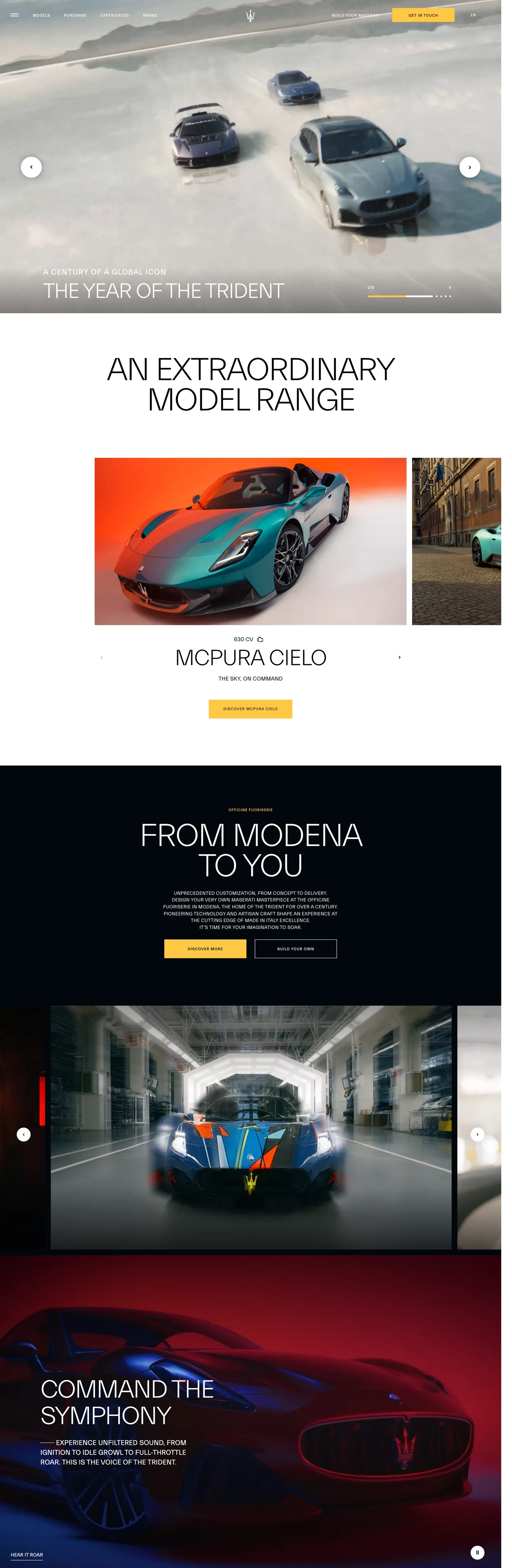
Maserati's marketing site is built as a two-canvas film: a near-black (#02070d) opening section carries full-bleed car photography with white Everett-Light headlines at 64-92px in uppercase — the trident-badge hero sequence — and then the page cuts to pure white for the model-range reveal, where large mixed-case headlines in the same Everett-Light family render in black ink at 92px / -3.68px tracking. The inversion is not a mode-toggle or a decorative band — it is a structural act, the dark section representing night-time performance and the white section representing the day-lit "extraordinary model range" gallery. Where Ferrari keeps its marketing in a single near-black register and Alfa Romeo stays in charcoal, Maserati treats the two canvases as a cinematic cut.
This DESIGN.md packages Maserati's marketing system into a machine-readable spec. Inside: 15 colors tokens drawn from the two-canvas system (near-black family for the dark sections, pure white and near-black ink for the light sections), a single amber-gold voltage at #ffc845 (wired as --c-accent and --yellow) appearing 12 times as accent borders and underlines, three Everett optical-weight cuts (Light at 64-92px for display, regular at 11-22px for labels, Medium for the smallest caps), a near-zero radius scale (only 2px for subtle surface edge-softening), and 12 components definitions covering the dark hero, model-card gallery, amber-gold CTA link, and the light-canvas section.
Feed this file to Claude or Cursor and it reproduces Maserati's specific moves: two-canvas dark-to-light inversion rather than a single surface, amber-gold reserved as a perimeter accent rather than a fill, Everett-Light with extreme -3.68px tracking at 92px for the full-bleed uppercase moment, and sharp 0px corners throughout. The most transferable pattern for other luxury brands is the two-canvas inversion: it lets a dark-photography hero section coexist with an editorial product-range section without either feeling like a compromise.
What makes it distinct
5
- Two-canvas inversionthe hero section runs near-black (#02070d) with white text; the model-range reveal section flips to pure white with black ink; no other luxury automotive brand in this directory uses the full inversion on the same page
- Amber gold as perimeter accent#ffc845 (wired as --c-accent) appears at section underlines, model badge borders, and CTA link decorations, never as a filled button surface
- Everett-Light at 92px uppercasethe dominant display moment, with -3.68px letter-spacing on full-bleed section headlines; smaller section headings drop to 60-64px with similar tracking
- Uppercase typography at every scalefrom 92px Everett-Light headlines to 11px Everett label caps, the system uses uppercase tracking as a design-language constant across every tier
- Sharp 0px rounding throughoutno rounded corners anywhere in the captured component set; the surface geometry references the trident emblem's angular precision
maserati.com
Live at maserati.com
A snapshot of the brand in production. Scroll the frame to see the whole page.
Colors
15 colors
Maserati's system runs on #ffc845 as its primary voltage, used in 2 of 12 components. Type is set in Everett across 12 tokens from 11px to 92px, weights 300–500. Shape language is sharp — components average 0px corner radius, favoring crisp rectangles.
Brand & Accent
Sparing, CTA-only voltage · 1
Surface
Page and card backgrounds · 4
Text
Headlines, body, captions · 3
Borders & Hairlines
Dividers, outlines, rules · 3
Semantic
Status, errors, success, links · 2
Other
Specialty colors · 2
Typography
12 type tokens
Set in Everett across 12 tokens, from 11px to 92px, weights 300–500. Shown in its own stack: where the font isn't installed, the fallback the file names stands in.
- display-xl92px · weight 300 · lh 87.4px · tracking -3.68pxThe quick brown fox jumps over the lazy dog
- display-lg64px · weight 300 · lh 64px · tracking -1.92pxThe quick brown fox jumps over the lazy dog
- display-md60px · weight 500 · lh 64px · tracking -2pxThe quick brown fox jumps over the lazy dog
- display-sm72px · weight 500 · lh 76px · tracking -3pxThe quick brown fox jumps over the lazy dog
- heading-md22px · weight 500 · lh 30px · tracking 1.45pxThe quick brown fox jumps over the lazy dog
- body-md14px · weight 400 · lh 19.6px · tracking 0.14pxThe quick brown fox jumps over the lazy dog
- body-sm14px · weight 400 · lh 24px · tracking -0.4pxThe quick brown fox jumps over the lazy dog
- label-md11px · weight 500 · lh 15px · tracking 1pxThe quick brown fox jumps over the lazy dog
- label-sm11px · weight 400 · lh 15.4px · tracking normalThe quick brown fox jumps over the lazy dog
- nav-link11px · weight 400 · lh 15px · tracking 1pxThe quick brown fox jumps over the lazy dog
- caption11px · weight 500 · lh 15.4px · tracking 0.75pxThe quick brown fox jumps over the lazy dog
- body-lg20px · weight 400 · lh 28px · tracking normalThe quick brown fox jumps over the lazy dog
Layout
Radii and spacing
3 corner radii and 7 spacing values. Shape language: sharp.
Radii
- none0px
- xs2px
- full9999px
Spacing
- xs4px
- sm8px
- md16px
- base24px
- lg40px
- xl120px
- section120px
Components
12 components
Each rendered from its tokens (color, type, radius, padding) on Maserati's own canvas.
- Button Primarybutton-primaryButton Primary
- Button Secondarybutton-secondaryButton Secondary
- Top Navtop-navTop Nav
- Nav Linknav-linkNav Link
- Hero Headinghero-headingHero Heading
- Hero Heading Darkhero-heading-darkHero Heading Dark
- Section Labelsection-labelSection Label
- Model Cardmodel-cardModel Card
- Body Paragraphbody-paragraphBody Paragraph
- Body Paragraph Lightbody-paragraph-lightBody Paragraph Light
- Dark Sectiondark-sectionDark Section
- Light Sectionlight-sectionLight Section
In use
The system, in use
Maserati's tokens on the kind of product it builds.
Build something people actually use.
A short paragraph of marketing copy that previews how the brand's display tier and body tier read together. Two sentences is usually enough.
FAQ
Maserati design system FAQ
Common questions about Maserati's tokens, components, and how to use this DESIGN.md in your project.
Read next
Related reading
Specs, directories, and component libraries that pair with this design system.
- Browse all design systemsThe full directory of DESIGN.md files on shadcn.io, with live mockups for each.shadcn.io
- Maserati — official siteMaserati's public marketing site — the source of truth for the live tokens captured in this file.maserati.com (opens in a new tab)
- The DESIGN.md specificationGoogle Labs' open spec for machine-readable design system files — the format this page is built on.github.com (opens in a new tab)
Use it
Use Maserati in your project
One machine-readable file. Drop it into Claude, Cursor, or any AI tool that reads DESIGN.md.
Download the DESIGN.md
One machine-readable file: every color, type, radius, spacing, and component token of Maserati.
Feed it to your AI tool
Drop it into Claude, Cursor, or GitHub Copilot. The agent writes React components and Tailwind classes that match Maserati's visual language.
Reference the tokens directly
Or paste the values into your Tailwind config, CSS variables, or component library: every color, size and radius is a quoted, ready-to-copy value.
Read the full DESIGN.md: overview, rationale, do’s and don’ts
Overview
Maserati's marketing site is structured as an alternating sequence of two canvases — dark and light — that cut between each other like film frames rather than blending at a gradient. Two-canvas inversion. The dark sections ({colors.canvas} — #02070d, wired as --c-bg) carry full-bleed automotive photography with white Everett-Light text; the light sections use pure white ground ({colors.canvas-light} — #ffffff) with near-black ink at 92px Everett-Light to present the model lineup as a gallery catalog. Where Ferrari sustains its near-black register for the full marketing scroll and Alfa Romeo modulates within a two-tone charcoal, Maserati makes the inversion a structural device — the darkness represents the performance identity, the white represents the product clarity. The two canvases share the same type family at the same extreme sizes; only the figure-ground relationship changes.
The amber-gold voltage ({colors.primary} — #ffc845, --c-accent) is strictly a perimeter accent: it appears on underline decorations beneath CTA links, on divider lines between sections, and on model-badge borders — never as a button fill. This restraint is a function of the brand's register: the trident emblem's gold finish reads as craft, not interface. Filling a button with it would reduce it from a material signal to a color assignment. The 12 captured occurrences (4 text, 3 bg, 5 border) confirm the scarcity.
Typography is the Everett family in three weights (Light, regular, Medium), all treated as uppercase instruments. The largest display moment is Everett-Light at 92px / weight 300 / -3.68px tracking — an extreme compression at this scale that gives headlines the tight-set quality of condensed display type without actually using a condensed cut. At 11px / weight 500 / +1px tracking, the label tier runs at the opposite pole: the same uppercase convention applied to the smallest chrome, giving the system a single typographic discipline from 11px to 92px.
Key Characteristics:
- Two-canvas inversion: near-black #02070d (dark hero / performance sections) and pure white (model-range gallery) alternate as hard structural cuts, not gradients.
- Amber gold
{colors.primary}(#ffc845) at 12 total occurrences, all as perimeter accents (underlines, dividers, badge borders) — never as a CTA fill. - Everett-Light at 64-92px / weight 300 / -1.92 to -3.68px tracking — the tightest display tracking in the automotive directory; the compressed setting at 92px is the brand's single strongest typographic statement.
- Uppercase typography at every scale from 11px to 92px — the discipline runs from the smallest nav cap to the largest hero headline.
- Sharp 0px rounding universally on structural surfaces — no rounded buttons, no rounded cards, no rounded image frames.
- Deep navy ink (#0c2340) appears at 116 occurrences — likely the section heading and navigation ink on intermediate backgrounds, suggesting a third surface tone between the near-black canvas and pure white.
- 120px vertical padding on major section bands — generous breathing room around each content cluster.
Colors
Brand
- Amber Gold (
{colors.primary}— #ffc845): frequency 12. Used as text (4), bg (3), border (5). Wired as --c-accent, --yellow, --warning. The single brand voltage — appears as CTA underlines, section dividers, and model-badge border accents. Never as a button fill.
Dark Canvas
- Canvas (
{colors.canvas}— #02070d): frequency 8. Used as bg (8). The near-black page floor for dark hero and performance sections. Wired as --c-bg, --c-bg-surface. Not pure black — a very deep blue-black with OKLCH lightness ~0.12. - Canvas Surface (
{colors.canvas-surface}— #0d0d0d): frequency 1. Used as bg (1). A slightly lighter near-black wired as --c-ui-100 — used for overlaid UI panels on the dark sections. - Canvas Navy (
{colors.canvas-navy}— #0c2340): frequency 116. Used as text (58), border (58). A deep navy tone with OKLCH hue ~255 — appears extensively as ink on intermediate sections and as border color on structural elements. Not a surface color but a text-and-border tone between the near-black canvas and the white section.
Light Canvas
- Canvas Light (
{colors.canvas-light}— #ffffff): frequency as bg/text: dominant in the model-range section. The pure-white surface for the daylight gallery sections.
Text
- Ink (
{colors.ink}— #ffffff): frequency 360. Used as text (174), bg (10), border (173), gradient (3). The dominant white — carries all typography on the dark canvas sections. Wired as --light, --white, --c-white. - Ink Dark (
{colors.ink-dark}— #212529): frequency 346. Used as text (173), border (173). The near-black ink for the light-canvas sections — Bootstrap's gray-900, running all body copy and structural borders on the white ground. - Ink Black (
{colors.ink-black}— #000000): frequency 144. Used as text (55), bg (1), border (55), shadow (5), gradient (28). Pure black — the display-headline ink on the white sections and the base color of the page gradient-overlays on photography. Wired as --gradient.
Hairlines
- Hairline (
{colors.hairline}— #ffffff): a border at low opacity on the dark canvas — card and section separators. - Hairline Dark (
{colors.hairline-dark}— #212529): structural borders on the light-canvas sections. - Hairline Black (
{colors.hairline-black}— #000000): the sharpest border tone, used on photography frames and section edges.
Semantic
- Gradient Dark (
{colors.gradient-dark}— #000000): the gradient-overlay base for photography sections. Wired as --gradient (rgba(0,0,0,0.7) in CSS variable). Used to darken hero photography so white text reads against it. - Semantic Success (
{colors.semantic-success}— #28a745): declared as --green, --success. Not rendered in the captured marketing surface; part of the Bootstrap-derived semantic palette in the base CSS. - Semantic Error (
{colors.semantic-error}— #dc3545): declared as --danger, --red. Same as above — semantic state token, not rendered in marketing chrome. - Semantic Label (
{colors.semantic-label}— #6c757d): declared as --gray, --c-label, --secondary. Not rendered in the captured marketing surface; the Bootstrap gray for secondary UI states.
Typography
Font Families
The system runs Everett in three optical-weight variants loaded as separate font-face declarations: Everett-Light (CSS font-weight 300 or 500 depending on context) for the largest display sizes (60-92px); Everett (weight 400 for body, weight 500 for labels) for body copy, section labels, and sub-headings at 11-22px; and Everett-Medium (weight 400-500, separate font-face) for the smallest nav and link caps at 11px. The distinction between Everett and Everett-Medium at 11px is subtle but consistent — the Medium cut adds optical density at very small sizes for legibility on the dark canvas. No system stack beyond sans-serif is declared beyond the Bootstrap fallback (-apple-system, BlinkMacSystemFont, "Segoe UI", Roboto, "Helvetica Neue", Arial, sans-serif).
Hierarchy
| Token | Family | Size | Weight | Line Height | Letter Spacing | Transform | Use |
|---|---|---|---|---|---|---|---|
{typography.display-xl} | Everett-Light | 92px | 300 | 87.4px | -3.68px | uppercase | Full-bleed section headline ("An extraordinary model range") |
{typography.display-lg} | Everett-Light | 64px | 300 | 64px | -1.92px | uppercase | Dark-section h1/h2/h3 hero headline |
{typography.display-md} | Everett-Light | 60px | 500 | 64px | -2px | none | Mixed-case section headline variant |
{typography.display-sm} | Everett-Light | 72px | 500 | 76px | -3px | none | Section headline alternate |
{typography.heading-md} | Everett | 22px | 500 | 30px | 1.45px | uppercase | Sub-section headings, category labels |
{typography.body-lg} | Everett | 20px | 400 | 28px | normal | none | Lead paragraph body copy |
{typography.body-md} | Everett | 14px | 400 | 19.6px | 0.14px | none | Default body copy, card descriptions |
{typography.body-sm} | Everett | 14px | 400 | 24px | -0.4px | capitalize | CTA link labels with capitalized transforms |
{typography.label-md} | Everett | 11px | 500 | 15px | 1px | uppercase | The dominant small-cap label — badge text, section labels, CTA underline text |
{typography.label-sm} | Everett | 11px | 400 | 15.4px | normal | none | Fine-print metadata |
{typography.caption} | Everett | 11px | 500 | 15.4px | 0.75px | uppercase | Model-year caption, spec labels |
{typography.nav-link} | Everett-Medium | 11px | 400 | 15px | 1px | uppercase | Top-nav link labels |
Principles
The system operates at two extreme ends of the typographic scale — 92px display and 11px labels — with very little in between. The display tier uses the Light weight at extreme sizes with negative tracking (-1.92 to -3.68px), creating a headline that reads tight and cinematic rather than open and editorial. The label tier uses positive tracking (+0.75 to +1px) at uppercase, creating the classic luxury-caps convention of spaced-out small type. The body sizes (14-20px) are neutral — positive tracking at 0.14px, normal weight, no transformation.
Note on Font Substitutes
Everett is a licensed typeface by Lettermatic. The closest open-source substitute for the Light display tier is Neue Haas Grotesk Display at weight 300; for standard weight, Helvetica Neue at the same settings is a standard commercial alternative. For the open-source path, Satoshi (Fontshare) at weight 300 transfers well at the 60-92px display sizes. The tight negative tracking is the essential property to preserve — any substitute run without the -2 to -3.68px tracking will feel loose by comparison.
Layout
Spacing System
- Base unit: the dominant module is 16px (9 occurrences) and 8px (8 occurrences), but the section-level padding is 120px — a jump that gives each content band maximum breathing room.
- Tokens:
{spacing.xs}4px ·{spacing.sm}8px ·{spacing.md}16px ·{spacing.base}24px ·{spacing.lg}40px ·{spacing.xl}120px ·{spacing.section}120px. - Section padding: 120px vertical on major content bands (the value appears 3 times at "120px 0px" and 2 times at "120px" in the extraction). This is the most generous section padding in the automotive directory — Ferrari and Alfa Romeo use approximately 64-80px.
- CTA padding: 12×40px on the amber-gold link CTA — generous horizontal padding that gives the underlined link-button the visual mass of a conventional filled CTA.
Grid & Container
- Max content width: approximately 997px on the largest headline (extracted from heroHeading widthPx: 997).
- Hero sections (dark): full-bleed photography with gradient overlay, centered headline, centered amber-gold CTA link below.
- Model-range gallery (white): multi-column model card grid, one model per column, each with photography + model name + CTA link.
- Performance section: full-bleed dark section with headline and body copy alongside a performance-spec readout.
- The page: alternates dark → white → dark → white as hard structural cuts with 120px vertical padding on each band.
Rhythm
The page uses a single rhythm device: hard full-bleed bands with generous vertical padding, alternating between dark and white. There is no constrained-width editorial band in the middle; every section uses the full 1440px viewport. The only non-full-bleed content is the model-card grid in the white section, which constrains model cards to a centered multi-column layout within the full-bleed white canvas.
Elevation
The system has no shadow tier visible in the captured marketing surfaces. The 5 captured shadow occurrences all belong to {colors.ink-black} (rgba shadow overlay) on photography — page-level gradient overlays rather than component elevation. Cards, sections, and CTAs use no drop shadow.
- Flat (no shadow): all structural surfaces — 100% of components.
- Photography gradient overlay: the dark hero sections use a gradient (
rgba(0,0,0,0.7)— wired as --gradient) over full-bleed photography to ensure white text reads against any car color. Not a UI shadow — a photography treatment. - No card elevation: the model cards in the white section have no border, no shadow, no surface lift — the photography inside each card carries the visual weight; the card boundary is defined only by the spacing grid.
Shapes
The radius scale is near-zero — consistent with the performance-hardware precision that luxury automotive brands reference:
{rounded.none}0px — the universal component radius. Hero headings, CTA links, model cards, and nav elements all use sharp 0px geometry.{rounded.xs}2px — one captured occurrence; a hairline edge-softening on a small badge surface. Functionally invisible at production scales.{rounded.full}9999px — circular elements (the audio-play button, icon badges using the 50% border-radius value captured at 6 occurrences). The 66.67px captured value is a specific badge element approximating a pill at a fixed height.
There is no 4px, 8px, or 16px tier. The system is binary: sharp or circular, nothing between. The trident emblem's geometry is pointed and angular — rounded-corner UI surfaces would contradict the badge's visual language.
Components
button-primary — The CTA link convention: transparent fill, white text on dark sections, amber-gold {colors.primary} underline decoration, {typography.label-md} (11px / 500 / uppercase / +1px tracking), 12×40px padding, 0px radius. "Discover more" and "Configure" are the canonical instances. The underline is the brand accent, not the fill.
button-secondary — Same transparent fill on the light-canvas sections, dark ink text, dark {colors.hairline-dark} underline, identical padding. The secondary CTA reads as editorial rather than interactive — a link-style UI convention consistent with the luxury-magazine reference.
top-nav — Transparent background (overlaid on full-bleed photography in the hero), white text at {typography.nav-link} (11px / 400 / uppercase / Everett-Medium), 60px height, 0px 24px padding. Houses the trident wordmark, model names, and the amber-gold "Year of the Trident" campaign badge.
nav-link — Transparent, white text in {typography.nav-link}, 1×6px padding. No hover fill visible in the captured surface — the convention is underline-on-hover consistent with the CTA link treatment.
hero-heading — The primary white-canvas headline. Black {colors.ink-black} text, {typography.display-xl} (92px / Everett-Light / uppercase / -3.68px tracking). Zero padding (the heading spans the content column). This is the loudest typographic moment in the system.
hero-heading-dark — The dark-section counterpart. White {colors.ink} text, {typography.display-lg} (64px / Everett-Light / uppercase / -1.92px tracking). Full-bleed over photography gradient.
section-label — Amber-gold {colors.primary} text at {typography.label-md} (11px / 500 / uppercase / +1px tracking). Used as the section category label above each headline — "Maserati GranCabrio," "Mcpura Cielo," "From Modena to You." The gold color signals brand-level labeling, not navigation.
model-card — White {colors.canvas-light} surface, black {colors.ink-dark} text, {typography.body-md}, 0px radius, 16px top/bottom padding. The model-range gallery card — holds a full-bleed model photograph above the fold and a model name + CTA link below. No border, no shadow — the card boundary is implicit from the grid gap.
body-paragraph — Transparent, white {colors.ink} text on dark sections, {typography.body-md} (14px / 400 / 0.14px tracking). The primary body copy style for the dark performance sections.
body-paragraph-light — Transparent, dark {colors.ink-dark} text on the white-canvas sections, same {typography.body-md}. The light-canvas body copy variant.
dark-section — Near-black {colors.canvas} fill, 120×24px padding, carrying full-bleed photography + gradient overlay + centered headline + CTA link. The structural dark band.
light-section — Pure white {colors.canvas-light} fill, 120×24px padding, carrying the model-range gallery headlines and card grid. The structural light band.
Do's and Don'ts
Do treat the amber gold {colors.primary} as a material-craft signal, not a CTA fill. Every amber-gold occurrence on the page is a perimeter accent — an underline, a divider, a border highlight. Filling a button with it would reduce the trident's gold to a generic interface color, the same category error as filling a Ferrari button with Rosso Corsa.
Do apply the -3.68px tracking to Everett-Light only at 92px and above. At smaller display sizes (60-72px), pull back to -2 to -3px tracking. The extreme negative tracking at 92px works because the glyph spacing at that scale can absorb the compression; at 40px the same tracking value would make headlines illegible.
Do use the two-canvas inversion as the primary structural device: dark sections for performance and technology content, white sections for model-range and product-catalog content. The alternation creates the cinematic rhythm — interrupting it with a third surface color (gray, cream) would dilute the visual statement.
Do use uppercase transformation at every typographic tier. The system runs uppercase from 11px nav caps to 92px display headlines. A mixed-case label at 11px would import a different typographic register (editorial, tech-startup) into a system where the caps are a brand constant.
Don't introduce rounded corners at any radius between 0px and fully circular. The system is binary: 0px for structural surfaces, full circle for icon elements. A 4px or 8px rounded button would look borrowed from a different brand entirely — the sharp 0px geometry is the physical-world reference to machined aluminum and the trident badge's hard edges.
Don't use {colors.canvas-navy} (#0c2340) as a surface fill. Despite its 116-occurrence frequency (second only to white and near-black), it appears only as text and border color — a deep navy ink for intermediate content over lighter photography bands, not a background fill. Using it as a card fill would create a third canvas color that breaks the two-canvas inversion.
Don't set body copy in {colors.ink} (white) on the {colors.canvas-light} (white) sections. The two-canvas system is strict: white ink belongs on near-black surfaces and dark ink belongs on white surfaces. Mixing them (white text on white canvas) is a non-issue in practice but worth stating because the {colors.ink} token is the highest-frequency color in the system and would be the natural default import.
Don't substitute a conventional pill CTA for the amber-gold underline CTA. The link-style CTA (transparent fill + {colors.primary} underline) is the brand's interaction convention at 40px+ horizontal padding. Replacing it with a background-color: {colors.primary}; border-radius: 9999px pill would invert the brand signal from craft-restraint to conventional-SaaS.
Known Gaps
- Primary button capture: the extractor returned
nullfor the primaryButton component — no standard HTML button element matching the heuristic was detected on the captured surface. The amber-gold CTA is rendered as an anchor link (<a>) rather than a<button>, which the extractor does not capture as a primary-button component. - Hover and focus states: no hover states are captured. The amber-gold underline likely intensifies or expands on hover; the link-style CTAs probably show an amber-gold fill or border on focus. Not documented here.
- Navigation expanded state: the top-nav mobile hamburger and the mega-menu dropdowns (model-selector panels) are not captured in the extracted marketing surface.
- Dark mode / light mode: the page's own two-canvas system is its version of dark/light alternation, but a user-level OS dark-mode preference is not addressed by the captured token set.
- Configurator surface: the "Configure" CTA on model cards leads to the Maserati configurator product (
configurator.maserati.com), which carries its own token system — color pickers, trim selectors, 3D viewer — not captured here. - Motion and scroll transitions: the page uses parallax scroll effects on photography sections and entrance animations on section headlines. Easing curves and timing are not captured.
- Sub-brand and regional variation: the extraction URL resolved to
/global/en. Regional market sub-sites (IT, US, CN) may carry different campaign imagery and model availability that affect which components appear above the fold.
Automotive
More systems like this
More DESIGN.md files in Automotive.
Pricing
Build it with Pro
The DESIGN.md files are free. Pro adds 6,000+ blocks, premium templates and the MCP server, so your AI editor builds in your system for you.
4.9/5 out of 5 · 150+ reviewsfrom 150+ founders and developers.
Billing
Billed once a year in USD. Cancel anytime.
- How many people can use the license.
- Client work, SaaS products and anything you charge for.
- Production-ready React sections: hero, pricing, features, dashboards and more.
- Complete multi-page sites you can ship as they are.
- React icons from every major library, installable with one command.
- Presets that restyle every block, in light and dark.
- Lets your AI editor search, preview and install blocks for you.
- Priority requests are answered first.
Individual
For personal projects & open source
$32instead of $49/mo
$389 billed yearly
- Seats: 1 seat
- Commercial use: Personal & open source only
- Pro blocks: 6,000+ blocks
- Templates: All 14 templates
- React icons: 294k+ icons
- Themes: All 59 themes
- MCP server: Basic usage
- Support: Standard
Team
Most popularFor freelancers, agencies & startups
$66instead of $99/mo
$789 billed yearly · ≈ $13/dev/mo
- Seats: Up to 5 seats
- Commercial use: Included
- Pro blocks: 6,000+ blocks
- Templates: All 14 templates
- React icons: 294k+ icons
- Themes: All 59 themes
- MCP server: High usage
- Support: Priority
Organization
For companies with larger teams
$132instead of $199/mo
$1,589 billed yearly
- Seats: Unlimited seats
- Commercial use: Included
- Pro blocks: 6,000+ blocks
- Templates: All 14 templates
- React icons: 294k+ icons
- Themes: All 59 themes
- MCP server: Unlimited usage
- Support: Priority
Billed once a year in USD. Cancel anytime.
Individual
For personal projects & open source
$32instead of $49/mo
$389 billed yearly
- How many people can use the license.Seats: 1 seat
- Client work, SaaS products and anything you charge for.Commercial use: Personal & open source only
- Production-ready React sections: hero, pricing, features, dashboards and more.Pro blocks: 6,000+ blocks
- Complete multi-page sites you can ship as they are.Templates: All 14 templates
- React icons from every major library, installable with one command.React icons: 294k+ icons
- Presets that restyle every block, in light and dark.Themes: All 59 themes
- Lets your AI editor search, preview and install blocks for you.MCP server: Basic usage
- Priority requests are answered first.Support: Standard
Team
Most popularFor freelancers, agencies & startups
$66instead of $99/mo
$789 billed yearly · ≈ $13/dev/mo
Everything in Individual, plus
- How many people can use the license.Seats: Up to 5 seats
- Client work, SaaS products and anything you charge for.Commercial use: Included
- Lets your AI editor search, preview and install blocks for you.MCP server: High usage
- Priority requests are answered first.Support: Priority
Organization
For companies with larger teams
$132instead of $199/mo
$1,589 billed yearly
Everything in Team, plus
- How many people can use the license.Seats: Unlimited seats
- Lets your AI editor search, preview and install blocks for you.MCP server: Unlimited usage
- Secure checkout via Stripe
- Code lives in your repo
- Keep what you've shipped if you cancel
- License terms
Your system, built for you
Every block, template and icon, installed by your AI agent in your design system. The DESIGN.md files stay free.