Marriott Bonvoy Design System
Marriott Bonvoy's hospitality design system as a DESIGN.md file. Swiss-721, near-black ink #1c1c1c, coral #ff8d6b accent, 52px pill CTAs. For React and AI tools.
Add shadcn.io to your AI agent. · Pro It installs blocks, icons and templates in your design system from a prompt, with Pro.
Set up MCP- Primary
- #1c1c1c
- Typeface
- Swiss-721
- Shape
- Soft
- Base radius
- 0px
- Colors
- 21
- Type tokens
- 13
- Components
- 20
- Spacing values
- 8
About
About Marriott Bonvoy DESIGN.md
Curated by Dov Azencot · Updated May 13, 2026 · Source marriott.com (opens in a new tab)
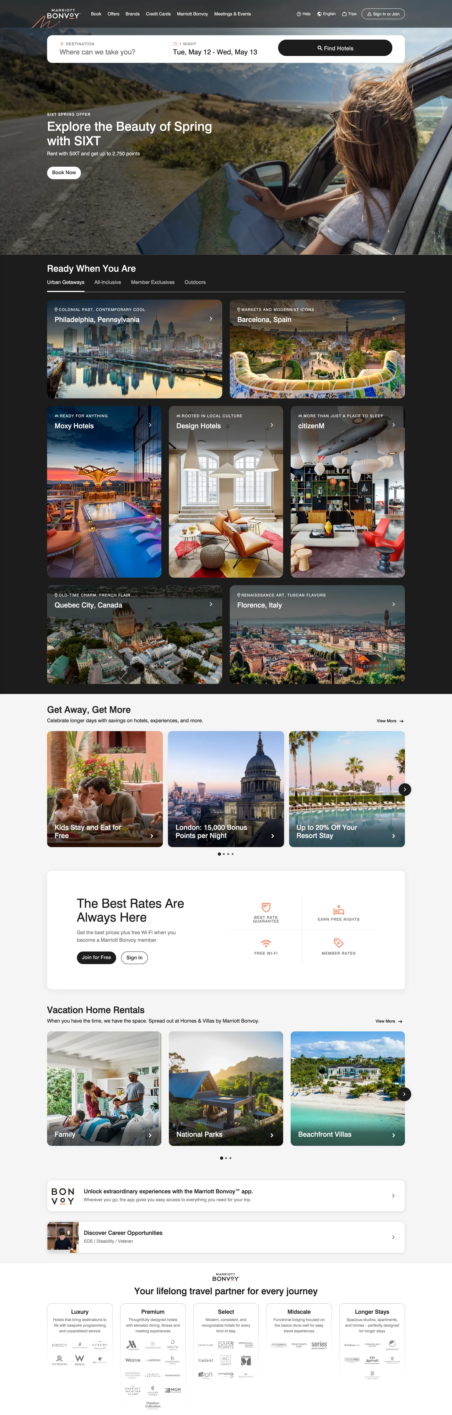
Marriott Bonvoy's homepage is built around an inversion most hospitality brands resist: the primary action button ("Find Hotels") renders dark-on-dark — #1c1c1c fill, #ffffff text, 52px pill radius — not the bright coral the brand owns. Coral (#ff8d6b) appears in only 12 page occurrences and is declared in just two CSS custom properties: `--t-accent-color` and `--t-icon-color-decorative`. The voltage is a decorative ornament, not a load-bearing CTA color. The system trusts destination photography (alternating amber sunsets, navy oceans, palm-shaded resort decks) to do the marketing work that competitors hand to colored CTAs.
This page captures the Bonvoy chrome as a DESIGN.md file — Google Labs' open spec for machine-readable design tokens. Inside: 21 colors tokens covering the inverted CTA fill, the cool-gray hairline rule (#c4c4c4), form label gray (#707070), the scarce coral accent, plus alpha-overlay scrim tokens lifted from `--t-color-scrim-100` and `--t-color-control-background-overlay`. 13 typography tokens run entirely on Swiss-721 across 12–40px with the only humanist tracking move reserved for 12px uppercase overlines at 1.296px. The radius scale resolves to two anchors — 52px pill for every button, 16px card corner appearing 23 times — and 20 components covering the dark CTA, search dropdown, property tile, vacation-rental card, points stat block, and the editorial logo-strip footer.
Drop this file into Claude, Cursor, or any AI assistant that reads structured design tokens. The agent reproduces Marriott's hospitality discipline — inverted primary CTAs, 52px pill geometry, decorative-only accent voltage, photography-first tiles — instead of a generic travel theme. Reference tokens directly in Tailwind config or CSS variables, audit an existing hospitality storefront against this baseline, or use the file as a teaching artifact for what restraint looks like when the brand's color owner is asked to recede in favor of the destination.
What makes it distinct
5
- Inverted primary CTAFind Hotels renders #1c1c1c fill with white text at 52px pill radius, the opposite of the bright-accent CTA convention
- Coral as decorative scarcityBonvoy #ff8d6b lives in only 2 CSS variables (`--t-accent-color`, `--t-icon-color-decorative`) and 12 page occurrences, never load-bearing
- Single-typeface systemSwiss-721 carries every tier from 12px uppercase overline (1.296px tracking) to 40px hero h2, only weight 400/500/700 changes
- Two-radius rhythm52px pill on every button and 16px card corner (23 occurrences); the rest of the page is 0px right-angle
- Inverted form fieldsthe search dropdown input renders #1c1c1c background with white foreground, mirroring the CTA so search reads as a primary action band
marriott.com
Live at marriott.com
A snapshot of the brand in production. Scroll the frame to see the whole page.
Colors
21 colors
Marriott Bonvoy's system runs on #1c1c1c as its primary voltage, used in 2 of 20 components. Type is set in Swiss-721 across 13 tokens from 12px to 40px, weights 400–700. Shape language is soft — components average 19px corner radius, with no sharp interactive edges.
Brand & Accent
Sparing, CTA-only voltage · 4
Surface
Page and card backgrounds · 4
Text
Headlines, body, captions · 6
Borders & Hairlines
Dividers, outlines, rules · 2
Semantic
Status, errors, success, links · 1
Other
Specialty colors · 4
Typography
13 type tokens
Set in Swiss-721 across 13 tokens, from 12px to 40px, weights 400–700. Shown in its own stack: where the font isn't installed, the fallback the file names stands in.
- display-hero40px · weight 700 · lh 1.15The quick brown fox jumps over the lazy dog
- heading-xl29px · weight 700 · lh 1.2The quick brown fox jumps over the lazy dog
- heading-lg22px · weight 700 · lh 1.2The quick brown fox jumps over the lazy dog
- heading-md18px · weight 700 · lh 1.25The quick brown fox jumps over the lazy dog
- heading-sm16px · weight 700 · lh 1.375The quick brown fox jumps over the lazy dog
- input-display22px · weight 400 · lh 1.09The quick brown fox jumps over the lazy dog
- body-md16px · weight 500 · lh 1.375The quick brown fox jumps over the lazy dog
- body-sm14px · weight 500 · lh 1.5The quick brown fox jumps over the lazy dog
- caption12px · weight 500 · lh 1.5The quick brown fox jumps over the lazy dog
- overline-md12px · weight 500 · lh 1.33 · tracking 1.296pxThe quick brown fox jumps over the lazy dog
- overline-sm12px · weight 700 · lh 1 · tracking 1.2pxThe quick brown fox jumps over the lazy dog
- button-primary18px · weight 700 · lh 1.33The quick brown fox jumps over the lazy dog
- nav-link14px · weight 400 · lh 1.14The quick brown fox jumps over the lazy dog
Layout
Radii and spacing
7 corner radii and 8 spacing values. Shape language: soft.
Radii
- none0px
- card-inset14px
- card-md15px
- card-lg16px
- pill-md22px
- pill-cta52px
- full9999px
Spacing
- xxs4px
- xs8px
- sm12px
- base16px
- md24px
- lg32px
- xl40px
- xxl52px
Components
20 components
Each rendered from its tokens (color, type, radius, padding) on Marriott Bonvoy's own canvas.
- Button Primarybutton-primaryButton Primary
- Button Primary Hoverbutton-primary-hoverButton Primary Hover
- Button Secondarybutton-secondaryButton Secondary
- Button Secondary Hoverbutton-secondary-hoverButton Secondary Hover
- Button Tertiary Textbutton-tertiary-textButton Tertiary Text
- Top Navtop-navTop Nav
- Nav Linknav-linkNav Link
- Search Input Dropdownsearch-input-dropdownSearch Input Dropdown
- Type here…text-inputText Input
- Form Labelform-labelForm Label
- Hero Bannerhero-bannerHero Banner
- Destination Tiledestination-tileDestination Tile
- Property Cardproperty-cardProperty Card
- Vacation Rental Cardvacation-rental-cardVacation Rental Card
- Rate Stat Blockrate-stat-blockRate Stat Block
- Overline Tagoverline-tagOverline Tag
- Brand Strip Logobrand-strip-logoBrand Strip Logo
- Divider Ruledivider-ruleDivider Rule
- icon-button-circleIcon Button Circle
- Carousel Dot Activecarousel-dot-activeCarousel Dot Active
In use
The system, in use
Marriott Bonvoy's tokens on the kind of product it builds.
Build something people actually use.
A short paragraph of marketing copy that previews how the brand's display tier and body tier read together. Two sentences is usually enough.
FAQ
Marriott Bonvoy design system FAQ
Common questions about Marriott Bonvoy's tokens, components, and how to use this DESIGN.md in your project.
Read next
Related reading
Specs, directories, and component libraries that pair with this design system.
- Browse all design systemsThe full directory of DESIGN.md files on shadcn.io, with live mockups for each.shadcn.io
- Marriott Bonvoy — official siteThe global hospitality brand's booking interface — the source for this design system.marriott.com (opens in a new tab)
- The DESIGN.md specificationGoogle Labs' open spec for machine-readable design system files.github.com (opens in a new tab)
Use it
Use Marriott Bonvoy in your project
One machine-readable file. Drop it into Claude, Cursor, or any AI tool that reads DESIGN.md.
Download the DESIGN.md
One machine-readable file: every color, type, radius, spacing, and component token of Marriott Bonvoy.
Feed it to your AI tool
Drop it into Claude, Cursor, or GitHub Copilot. The agent writes React components and Tailwind classes that match Marriott Bonvoy's visual language.
Reference the tokens directly
Or paste the values into your Tailwind config, CSS variables, or component library: every color, size and radius is a quoted, ready-to-copy value.
Read the full DESIGN.md: overview, rationale, do’s and don’ts
Overview
Marriott Bonvoy's homepage is an inversion of the hospitality-booking convention. Inverted primary: the load-bearing CTA ("Find Hotels") renders #1c1c1c fill with #ffffff text at 52px pill radius ({rounded.pill-cta}) and 18px / 700 Swiss-721 — the opposite of the bright-accent CTAs Booking, Expedia, and Airbnb use to anchor their search bars. The coral that most people associate with Bonvoy ({colors.accent-coral} — #ff8d6b) is scoped to just two CSS custom properties — --t-accent-color and --t-icon-color-decorative — and renders only 12 times across the page, used as small icon strokes and decorative ornaments rather than on any button surface.
Type runs Swiss-721 for everything — display, body, navigation, captions, microcopy. There is no separate display family. The variable comes from three weight steps (400, 500, 700) and one tracking departure: the 12px uppercase overline at letterSpacing: 1.296px (the next-most-tracked label sits at 1.2px). The hero h2 at 40px / 700 ("Explore the Beauty of Spring with SIXT") works because the photography behind it — sunset desert highway, woman driving with hair in the wind — is doing the persuasion. The chrome stays quiet.
The geometric language resolves to two corner anchors. Every button — primary, secondary, tertiary — uses the 52px pill ({rounded.pill-cta}) declared as --t-button-border-radius. Cards and tiles sit at 16px (23 occurrences) with a 14px sibling (20 occurrences) for inset image plates inside cards. Where most travel marketplaces lean on rounded-rectangle CTAs at 8–12px, Marriott picks a fully-capsule pill and pairs it with squarer 14–16px cards — the contrast reads as hotel-lobby signage paired with editorial property tiles.
Key Characteristics:
- Inverted primary CTA:
{component.button-primary}is #1c1c1c fill, white text — declared by--t-button-primary-bg-color: #1c1c1cand used across "Find Hotels", "Book Now", "Search Rates". - Single-typeface system: Swiss-721 carries every tier; weight 400/500/700 and tracking (normal, 1.2px, 1.296px) are the only voice levers.
- Scarcity coral:
{colors.accent-coral}(#ff8d6b) appears in 12 page occurrences as decorative icon strokes — never as a CTA background, never as link text. - Two-radius rhythm: 52px pill on every button, 16px card corner across destination tiles, property cards, and vacation-rental tiles.
- Inverted search dropdown:
{component.search-input-dropdown}uses #1c1c1c background with #ffffff foreground — the search field reads as a primary action band rather than a passive form input. - Hairline-led rules: a single 1px #c4c4c4 line (
--t-horizontal-vertical-rule) carries every section separator and form-field underline — no shadow, no card border, no gradient. - Photography-first tiles: destination cards present a full-bleed image with a 16px corner, a 16px label band beneath, no overlay text, no shadow — the image alone carries the visual weight.
- 16px base spacing rhythm: 23 occurrences of 16px gaps, 19 of 8px, 17 of 4px; section bands run 32px vertical, generous-but-tight for a marketplace that wants density per scroll.
Colors
Brand & Accent
- Accent Coral (
{colors.accent-coral}— #ff8d6b): frequency 12. Used as text (6), border (6). Declared in--t-accent-colorand--t-icon-color-decorative. The Bonvoy voltage — scoped to icon strokes and small ornament moments, never a CTA background. - Accent Icon (
{colors.accent-icon}— #ff8d6b): same hex, semantic alias for icon-color-decorative usage in the points-icon, the Bonvoy ribbon glyph, and the rate-promo asterisk.
Surface
- Canvas (
{colors.canvas}— #ffffff): frequency 828. Used as text-on-dark (405), border (403), gradient (10), background (10). The dominant surface — the homepage is 80%+ white, with--t-brand-bg-colordeclared as pure white globally. - Surface Card (
{colors.surface-card}— #ffffff): same hex, semantic alias for the destination tile, property card, and vacation-rental tile base. - Surface Soft (
{colors.surface-soft}— #eeeeee): frequency 3. Used as background (1), border (2). Scoped to--t-icon-btn-focus-bg-colorand--t-icon-btn-primary-bg-color— the circular icon-button rest state. - On Primary / On Dark (
{colors.on-primary}/{colors.on-dark}— #ffffff): white text on every dark surface — the inverted CTA, the search dropdown input, the hero overlay text.
Ink & Surface-Control
- Primary / Ink (
{colors.primary}— #1c1c1c): frequency 757. Used as text (366), border (356), background (35). Declared in 18 CSS variables including--t-button-primary-bg-color,--t-brand-fg-color,--t-interactive-accent-color,--t-link-text-color. The load-bearing color of the system — not coral. - Surface Control Dark (
{colors.surface-control-dark}— #1c1c1c): same hex, semantic alias for--t-color-control-background— the dark fill of the search input dropdown and the inverted CTA backplate. - Ink Overlay (
{colors.ink-overlay}— #1c1c1c): same hex, semantic alias for the 52% scrim declared at--t-color-control-background-overlay: rgba(28,28,28,.52)— applied as a dark wash over hero photography to keep white headlines readable.
Hairlines & Borders
- Hairline (
{colors.hairline}— #c4c4c4): frequency 71. Used as text (33), border (33), gradient (5). Declared in--t-horizontal-vertical-rule— the single hairline tone for section separators, form-field underlines, and card 1px borders. - Border Rule (
{colors.border-rule}— #c4c4c4): same hex, semantic alias for the divider-rule component.
Text
- Ink Muted (
{colors.ink-muted}— #707070): frequency 64. Used as text (32), border (32). Declared in--t-form-label-color,--t-brand-alt-color,--t-overline-normal-color. Form labels, overline meta text, "View all" links. - Form Label (
{colors.form-label}— #707070): same hex, semantic alias for the uppercase 12px form-label component above input fields.
Scrim & Shadow
- Scrim Overlay (
{colors.scrim-overlay}— #000000): frequency 40. Used as shadow (14), gradient (22), text (2), border (2). The black-base for the 52% dark scrim wash applied over hero photography, declared asrgba(28,28,28,.52)at render time. - Shadow Base (
{colors.shadow-base}— #000000): same hex, semantic alias for the rare drop-shadow on dropdown menus (--t-icon-btn-hover-bg-colorresolves to pure black).
Semantic
- Error (
{colors.error}— #d0021b): zero page occurrences in the captured surfaces. Declared in--t-form-error-color; reserved for form-validation messages on the booking flow. - Carousel Blue (
{colors.carousel-blue}— #007aff): zero page occurrences. Declared in--swiper-theme-color; reserved for active-dot color in the destination-tile carousel. Not part of the brand voltage — it inherits from the Swiper.js default.
Typography
Font Family
The system runs Swiss-721 for everything — display, body, navigation, captions, microcopy. The CSS declares it as --t-title-font-family, --t-font-family, and --t-base-font-family, all pointing at the same family. Fallbacks walk Helvetica, Arial, sans-serif. There is no separate display face; the variable comes from weight and tracking, not from family swap.
Hierarchy
| Token | Size | Weight | Line Height | Letter Spacing | Use |
|---|---|---|---|---|---|
{typography.display-hero} | 40px | 700 | 1.15 | 0 | Hero h2 ("Explore the Beauty of Spring with SIXT") over destination photography |
{typography.heading-xl} | 29px | 700 | 1.2 | 0 | Section heads ("Get Away, Get More", "Vacation Home Rentals") |
{typography.heading-lg} | 22px | 700 | 1.2 | 0 | Destination-tile headlines, property-card titles |
{typography.input-display} | 22px | 400 | 1.09 | 0 | The search dropdown input value at rest |
{typography.heading-md} | 18px | 700 | 1.25 | 0 | Sub-section heads, "Best Rates" card title |
{typography.heading-sm} | 16px | 700 | 1.375 | 0 | Card meta strong labels, "Discover" link emphasis |
{typography.body-md} | 16px | 500 | 1.375 | 0 | Default running-text inside body bands and card descriptions |
{typography.button-primary} | 18px | 700 | 1.33 | 0 | Primary CTA button labels ("Find Hotels", "Book Now") |
{typography.body-sm} | 14px | 500 | 1.5 | 0 | Card meta lines, dates, "Member rates from" prefixes |
{typography.nav-link} | 14px | 400 | 1.14 | 0 | Top-nav labels (Book, Shop, My Trips, Find a Reservation) |
{typography.caption} | 12px | 500 | 1.5 | 0 | Footer copyright, micro-help text, brand-strip captions |
{typography.overline-md} | 12px | 500 | 1.33 | 1.296px (uppercase) | Section overlines ("OUR DESTINATIONS", "MEMBER BENEFITS") |
{typography.overline-sm} | 12px | 700 | 1.0 | 1.2px (uppercase) | Form labels above input fields ("DESTINATION", "CHECK-IN") |
Principles
Weight as voice: Marriott runs only three weights — 400, 500, 700 — and skips the 600 that most type ladders include. The result is a visible step from body (500) to heading (700) with no soft middle tier. Where most marketplaces use a 500/600/700 ladder for hierarchical comfort, Marriott picks the contrast move — body recedes, headings declare.
Tracking as overline: the only place tracking departs from normal is the 12px uppercase overline at 1.296px ({typography.overline-md}) and the 12px form label at 1.2px ({typography.overline-sm}). Both function as small-caps substitutes — the Swiss-721 grotesque doesn't ship a small-caps cut, so tracking carries the typographic role that a serif system would hand to small caps.
Note on Font Substitutes
If Swiss-721 is unavailable, Helvetica Now is the closest licensed match (it's the contemporary Swiss-721 sibling) and Inter at weight 400/500/700 is the closest open-source substitute. Akzidenz-Grotesk is a closer historical match but is a licensed face. Never substitute Roboto or Open Sans — both are humanist grotesques and will shift the brand from Swiss-modernist hospitality to generic SaaS.
Layout
Spacing System
- Base unit: 4px (with 8px micro-step).
- Tokens:
{spacing.xxs}4px ·{spacing.xs}8px ·{spacing.sm}12px ·{spacing.base}16px ·{spacing.md}24px ·{spacing.lg}32px ·{spacing.xl}40px ·{spacing.xxl}52px. - Dominant rhythm: 16px (23 occurrences) for card internal padding and inter-tile gutters; 8px (19 occurrences) for inline element gaps; 4px (17 occurrences) for chip and tag micro-padding.
- Property-card padding: the asymmetric
24px 0px 24px 24px(11 occurrences in the extraction) — top-bottom-left padding on the content panel, with the right edge flush so the image plate can run edge-to-edge inside the card's 16px rounded clip.
Grid & Container
- Max content width: the homepage centers a ~1280px container with full-bleed hero photography behind it; the hero h2 and search dropdown sit on a 770px reading column inside the 1440px viewport.
- Destination-tile grid: 4-column at desktop with a 16px gutter; each cell holds a full-bleed photo, a 22px h3 destination label, and a single-line rate caption.
- Property-card grid: 3-up at desktop, 2-up at tablet, 1-up at mobile; the asymmetric card padding (24px on three sides, 0px right) keeps the rounded photo plate visually connected to the card edge.
- Vacation-rental rail: horizontal scroll with 3 tiles visible above the fold; each tile carries a 16px rounded photo, a 22px destination name, and a "from $X / night" line.
Whitespace Philosophy
Marriott runs 32px section bands (10 occurrences) between major content rails — tighter than the 64–80px most SaaS marketing pages use, but wider than the 16–24px most marketplace listing pages use. The result is a hybrid: the homepage reads like editorial (generous between sections) but the property grids inside each section read like a marketplace (dense, with 16px gutters).
Elevation & Depth
The system has no shadow tier. Depth comes from three moves:
- Inversion — the dark CTA (
{component.button-primary}) on a white canvas reads as elevated through pure tonal contrast. - Hairline borders — 1px
{colors.hairline}rules separate sections and underline form fields, doing the work that drop shadows handle in shadow-heavy systems. - Photography overlay — hero bands apply a 52%
{colors.ink-overlay}scrim wash (--t-color-control-background-overlay: rgba(28,28,28,.52)) over destination photography so that white headlines ({typography.display-hero}at 40px / 700) remain readable. The scrim is the only "elevation" device in the homepage chrome.
There is essentially no box-shadow on cards, on buttons, or on dropdowns. The single shadow-base hex ({colors.shadow-base} — #000000, 14 shadow occurrences) is reserved for the icon-button hover state (--t-icon-btn-hover-bg-color resolves to pure black), which is a fill, not a shadow.
Shapes
The corner-radius scale resolves to two anchors and a pill:
- 0px (
{rounded.none}): the hero band, the search dropdown input, every divider rule, the brand-strip footer logo cells. - 14px (
{rounded.card-inset}): inset image plates inside cards (20 occurrences) — when a property card holds a rounded photo within a larger rounded card edge. - 15–16px (
{rounded.card-md},{rounded.card-lg}): the dominant card corner — 23 occurrences of 16px on destination tiles, vacation-rental tiles, and the "Best Rates" card; 7 occurrences of 15px on micro-card variants. - 22px (
{rounded.pill-md}): the secondary-pill corner on small chip buttons (2 occurrences). - 52px (
{rounded.pill-cta}): the brand's signature — every CTA button via--t-button-border-radius: 52px. At typical button heights (44–52px), this renders as a fully-rounded capsule. - 9999px (
{rounded.full}): avatar dots, the circular icon buttons, the carousel-dot indicators.
The 14/16/52 ladder is the system's typographic geometry — squarer cards, fully pill buttons, with the rest of the page held at right-angle 0px corners.
Components
Buttons
button-primary — #1c1c1c fill, white text, 52px pill radius, 0×24px padding, 52px height, 18px / 700 Swiss-721. The most common CTA across the site: "Find Hotels", "Book Now", "Search Rates", "View Hotel". The inverted move is load-bearing — copying this token onto a light-coral background defeats the brand's restraint.
button-primary-hover — same dark fill, 92% opacity. No transform, no shadow change, no color shift.
button-secondary — Transparent fill with #1c1c1c text and a 1px #1c1c1c outline. 52px pill radius. Used for "Cancel", "Continue browsing", and inverse CTAs on dark surfaces.
button-secondary-hover — flips to a #1c1c1c fill with white text — the same dark look as {component.button-primary} but reached through state, not default.
button-tertiary-text — Plain ink text, no surface, no border. Underlined on hover. Used for "Show more" and "View all" links in card rails.
Navigation
top-nav — White surface, 64px height, 0×24px horizontal padding. The Marriott Bonvoy wordmark sits flush left, the four top-level utility links (Book, Shop, My Trips, Find a Reservation) sit center-right, and the sign-in / register dropdown sits flush right. No bottom border at rest; a 1px {colors.hairline} rule appears on scroll.
nav-link — 14px / 400 Swiss-721 in ink (or white on dark backgrounds). 4px vertical padding. Active state is underline-only, no color shift.
Search
search-input-dropdown — The signature inverted form field. #1c1c1c background, #ffffff text, 22px / 500 Swiss-721, 52px height. The "Where to?" combobox sits at the center of the hero photo band — the dark fill on top of dimmed destination photography is the visual moment that signals "you are about to book a hotel."
text-input — White fill, 1px {colors.hairline} outline, 14px rounded corner, 52px height, 16×16px padding. Used inside the booking-detail accordion on property pages. Stacked above with a {component.form-label} in {typography.overline-sm}.
form-label — Uppercase 12px / 700 Swiss-721 in #707070, 1.2px tracking. The grotesque-doesn't-ship-small-caps move — tracking carries the small-caps role.
Hero
hero-banner — #1c1c1c surface (visually muted via 52% {colors.ink-overlay} scrim over destination photography), white text, 0px corners, 32×24px padding. Holds the hero h2 ({typography.display-hero} — 40px / 700) and a one-line tagline beneath. No CTA inside the hero band — the search dropdown carries the action.
Tiles & Cards
destination-tile — White card surface, 16px {rounded.card-lg} corner, 16px internal padding. Full-bleed photo above, a single-line {typography.heading-md} destination label below, no shadow, no border. Used in the "Ready When You Are" and "Get Away, Get More" rails.
property-card — White surface, 16px rounded corner, 1px {colors.hairline} border, asymmetric 24px 0px 24px 24px padding. The right edge runs flush so the image plate inside (rounded at 14px via {rounded.card-inset}) reaches the card's 16px outer corner — a 2px corner-stack visible at the photo edge. Used for the featured property tiles ("The Best Rates Are Always Here").
vacation-rental-card — Similar to property card but without the 1px border — the photo plate carries the visual edge. Used in the "Vacation Home Rentals" horizontal scroll rail.
rate-stat-block — Plain text, no surface — a 29px / 700 rate number ("$199") above a 12px overline label ("AVG NIGHTLY"). Used inside the "Best Rates Are Always Here" card.
overline-tag — Uppercase 12px / 500 Swiss-721 at 1.296px tracking, #707070. The category label above section heads — "OUR DESTINATIONS", "MEMBER BENEFITS".
brand-strip-logo — A footer band cell holding a sub-brand wordmark (Ritz-Carlton, JW Marriott, Westin, etc.) at {typography.caption}. 8×16px padding, no border, no surface — the wordmarks rest directly on the white canvas.
divider-rule — A 1px {colors.hairline} line. Section separator, form-field underline, footer column splitter. The single elevation alternative in the system.
icon-button-circle — A 40×40px circular button at {rounded.full} with a #eeeeee fill — the only place {colors.surface-soft} appears. Used for the search-suggest close icon, the carousel control arrows, and the dropdown caret triggers.
carousel-dot-active — The Swiper.js inherited carousel indicator at #007aff. Sits in the destination-tile rail beneath the photo strip. Not part of the brand voltage — it inherits from the library default and was not overridden.
Do's and Don'ts
Do use #1c1c1c ({colors.primary}) on every primary CTA background. The dark-on-white inversion is the brand's load-bearing chrome move. Switching this to coral ({colors.accent-coral}) reads as a generic travel marketplace, not Marriott.
Do preserve the 52px pill radius ({rounded.pill-cta}) on every button regardless of size. At small buttons (32–40px height), 52px renders as fully rounded; at 52px height the corner reaches the height itself. Substituting {rounded.full} (9999px) is visually identical but breaks the token-trace audit.
Do scope the coral accent ({colors.accent-coral} — #ff8d6b) to icon strokes and decorative ornaments only. It is declared in only two CSS variables (--t-accent-color, --t-icon-color-decorative) — keep that semantic boundary in your component code.
Do use uppercase overlines ({typography.overline-md}, {typography.overline-sm}) with their respective tracking values (1.296px and 1.2px). The tracking is the small-caps substitute — without it, the overlines collapse into ordinary 12px captions.
Don't use {colors.accent-coral} as a button background. It has 0 background occurrences in the extracted CSS — every coral instance is a text or border color. For a CTA, use {colors.primary} (#1c1c1c).
Don't use {colors.carousel-blue} (#007aff) anywhere outside the destination-tile carousel dots. It is inherited from --swiper-theme-color and is not a Marriott brand color — putting it on a link or button breaks the monochrome chrome.
Don't add a box-shadow on cards, buttons, or dropdowns. The system runs zero shadow tiers — depth comes from the dark CTA on white canvas, 1px {colors.hairline} rules, and the 52% ink overlay ({colors.ink-overlay}) over hero photography. Adding shadow reads as Material Design contamination.
Don't use weight 600 anywhere. The system runs only 400 / 500 / 700; the visible gap between body (500) and heading (700) is intentional. Filling that gap with 600 softens the typographic step the brand owns.
Don't use #c4c4c4 ({colors.hairline}) as a background or text fill. It is a 1px border-only token (33 border occurrences, 33 text occurrences as the same hairline glyph color on icon strokes). For a light surface fill, use {colors.surface-soft} (#eeeeee).
Known Gaps
- Authenticated dashboard: the signed-in Bonvoy member chrome (points-balance hero, stay-history calendar, status-tier badges, member-rate strikethrough) is gated and not captured.
- Property detail pages: the room-type stepper, rate-comparison grid, amenity matrix, and review module live one click below the homepage; not extracted.
- Sub-brand overrides: Ritz-Carlton, St. Regis, JW, Edition, Westin, W, Sheraton, and Aloft each carry typographic and color overrides on their dedicated property pages. Only the parent Bonvoy chrome is captured.
- Booking flow: rate-quote, payment, and confirmation pages carry form-error states (
{colors.error}— #d0021b) that were not visible in the homepage extraction. - Motion: the destination-tile carousel auto-advance, search-dropdown reveal, and mobile booking widget collapse are undocumented.
- Mobile breakpoint: the mobile booking widget renders as a sticky bottom bar with a different CTA layout; only the desktop chrome at 1440px is captured here.
Travel & Hospitality
More systems like this
More DESIGN.md files in Travel & Hospitality.
Pricing
Build it with Pro
The DESIGN.md files are free. Pro adds 6,000+ blocks, premium templates and the MCP server, so your AI editor builds in your system for you.
4.9/5 out of 5 · 150+ reviewsfrom 150+ founders and developers.
Billing
Billed once a year in USD. Cancel anytime.
- How many people can use the license.
- Client work, SaaS products and anything you charge for.
- Production-ready React sections: hero, pricing, features, dashboards and more.
- Complete multi-page sites you can ship as they are.
- React icons from every major library, installable with one command.
- Presets that restyle every block, in light and dark.
- Lets your AI editor search, preview and install blocks for you.
- Priority requests are answered first.
Individual
For personal projects & open source
$32instead of $49/mo
$389 billed yearly
- Seats: 1 seat
- Commercial use: Personal & open source only
- Pro blocks: 6,000+ blocks
- Templates: All 14 templates
- React icons: 294k+ icons
- Themes: All 59 themes
- MCP server: Basic usage
- Support: Standard
Team
Most popularFor freelancers, agencies & startups
$66instead of $99/mo
$789 billed yearly · ≈ $13/dev/mo
- Seats: Up to 5 seats
- Commercial use: Included
- Pro blocks: 6,000+ blocks
- Templates: All 14 templates
- React icons: 294k+ icons
- Themes: All 59 themes
- MCP server: High usage
- Support: Priority
Organization
For companies with larger teams
$132instead of $199/mo
$1,589 billed yearly
- Seats: Unlimited seats
- Commercial use: Included
- Pro blocks: 6,000+ blocks
- Templates: All 14 templates
- React icons: 294k+ icons
- Themes: All 59 themes
- MCP server: Unlimited usage
- Support: Priority
Billed once a year in USD. Cancel anytime.
Individual
For personal projects & open source
$32instead of $49/mo
$389 billed yearly
- How many people can use the license.Seats: 1 seat
- Client work, SaaS products and anything you charge for.Commercial use: Personal & open source only
- Production-ready React sections: hero, pricing, features, dashboards and more.Pro blocks: 6,000+ blocks
- Complete multi-page sites you can ship as they are.Templates: All 14 templates
- React icons from every major library, installable with one command.React icons: 294k+ icons
- Presets that restyle every block, in light and dark.Themes: All 59 themes
- Lets your AI editor search, preview and install blocks for you.MCP server: Basic usage
- Priority requests are answered first.Support: Standard
Team
Most popularFor freelancers, agencies & startups
$66instead of $99/mo
$789 billed yearly · ≈ $13/dev/mo
Everything in Individual, plus
- How many people can use the license.Seats: Up to 5 seats
- Client work, SaaS products and anything you charge for.Commercial use: Included
- Lets your AI editor search, preview and install blocks for you.MCP server: High usage
- Priority requests are answered first.Support: Priority
Organization
For companies with larger teams
$132instead of $199/mo
$1,589 billed yearly
Everything in Team, plus
- How many people can use the license.Seats: Unlimited seats
- Lets your AI editor search, preview and install blocks for you.MCP server: Unlimited usage
- Secure checkout via Stripe
- Code lives in your repo
- Keep what you've shipped if you cancel
- License terms
Your system, built for you
Every block, template and icon, installed by your AI agent in your design system. The DESIGN.md files stay free.