Lyft Design System
Lyft's design system as a DESIGN.md file. Purple-magenta #820076, RebelSans display + text, 20 colors, 18 components. For React, Next.js, and AI tools.
Add shadcn.io to your AI agent. · Pro It installs blocks, icons and templates in your design system from a prompt, with Pro.
Set up MCP- Primary
- #820076
- Typeface
- RebelSansText
- Shape
- Soft
- Base radius
- 0px
- Colors
- 20
- Type tokens
- 8
- Components
- 18
- Spacing values
- 9
About
About Lyft DESIGN.md
Curated by Dov Azencot · Updated May 13, 2026 · Source lyft.com (opens in a new tab)
Lyft's web surface runs on a magenta-over-cordovan duet. Where most ride-hailing marketing leans on either pure black ink or a flat consumer blue, Lyft anchors every CTA in a saturated purple-magenta (#820076) and lets a deep cordovan text colour (#1d0c17) carry headings and paragraph body — a colour that reads as black at a glance but warms toward wine when you look closer. The hotter Lyft Pink (#ff00bf) is treated as eyebrow voltage rather than a primary, surfacing only on the lyft-pink subscription wordmark and inside one or two highlight icons. The rest of the page is a soft off-white (#f1f0ec) and a strict 48px capsule shape on every interactive element.
This page packages Lyft's marketing surface into a single DESIGN.md file following the Google Labs spec. Inside: 20 colour tokens grouped into brand, surface, text, and highlight roles; 8 typography tokens spanning RebelSansDisplay 60px headlines down to RebelSansText 14px captions in weights 400, 500, 600, and 700; 9 spacing values on an 8px base; 4 corner radii anchored on the 48px capsule and the 16px card; and 18 components covering buttons, cards, the nav row, FAQ accordions, and the bordered category tile grid.
Feed the file to Claude, Cursor, or GitHub Copilot and the agent renders React components that match Lyft's specific restraint — magenta capsule CTAs on warm off-white, 36px section heads in weight 600, paired-photo cards inside 16px chrome. Or use the tokens directly: every hex, every font stack, every padding value is a quoted string you can paste into Tailwind config or CSS variables. The system is worth studying because it proves a rideshare brand can hold attention with a single magenta voltage and one capsule shape — no gradient, no secondary accent, no chromatic load-bearing beyond the one purple and one pink.
What makes it distinct
5
- Magenta-over-cordovan duetpurple-magenta #820076 carries every primary CTA against a deep #1d0c17 ink that reads warmer than black
- Two-radius geometry48px capsule on every pill button and 16px on every card; the system declares only two radii in production CSS
- Lyft Pink as eyebrow voltage#ff00bf appears only on the lyft-pink subscription wordmark, the rare moment the brand permits a hotter pink
- Twin custom facesRebelSansDisplay reserved for the 60px hero h1, RebelSansText carries 14px through 36px for every other tier
- Photography over decoration4:3 rider, driver, and bike-rack frames inside 16px cards do the work gradients do elsewhere
lyft.com
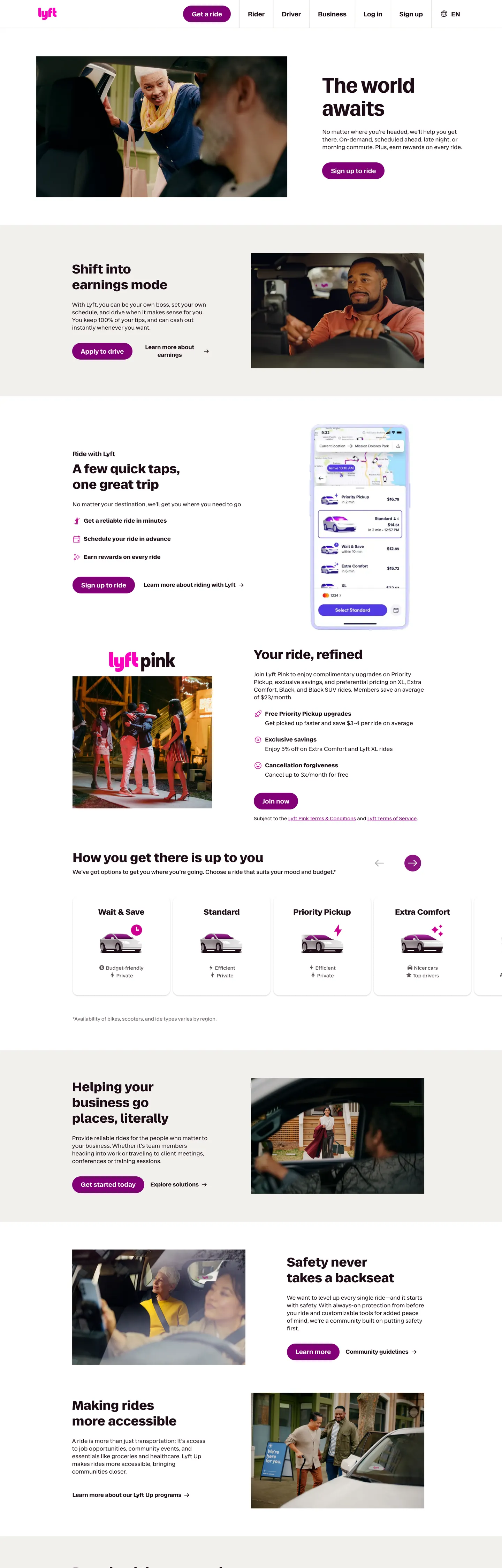
Live at lyft.com
A snapshot of the brand in production. Scroll the frame to see the whole page.
Colors
20 colors
Lyft's system runs on #820076 as its primary voltage, used in 2 of 18 components. Type is set in RebelSansText across 8 tokens from 14px to 60px, weights 400–700. Shape language is soft — components average 34px corner radius, with no sharp interactive edges.
Brand & Accent
Sparing, CTA-only voltage · 3
Surface
Page and card backgrounds · 3
Text
Headlines, body, captions · 6
Borders & Hairlines
Dividers, outlines, rules · 2
Other
Specialty colors · 6
Typography
8 type tokens
Set in RebelSansText across 8 tokens, from 14px to 60px, weights 400–700. Shown in its own stack: where the font isn't installed, the fallback the file names stands in.
- display-xl60px · weight 600 · lh 66pxThe quick brown fox jumps over the lazy dog
- display-lg36px · weight 600 · lh 45pxThe quick brown fox jumps over the lazy dog
- display-md22px · weight 600 · lh 28pxThe quick brown fox jumps over the lazy dog
- body-lg18px · weight 500 · lh 25pxThe quick brown fox jumps over the lazy dog
- body-md16px · weight 400 · lh 22pxThe quick brown fox jumps over the lazy dog
- body-md-strong16px · weight 500 · lh 22pxThe quick brown fox jumps over the lazy dog
- body-strong16px · weight 700 · lh 22pxThe quick brown fox jumps over the lazy dog
- body-sm14px · weight 400 · lh 20pxThe quick brown fox jumps over the lazy dog
Layout
Radii and spacing
4 corner radii and 9 spacing values. Shape language: soft.
Radii
- none0px
- card16px
- capsule48px
- full9999px
Spacing
- xxs2px
- xs4px
- sm8px
- md12px
- base16px
- lg24px
- xl32px
- 2xl48px
- 3xl80px
Components
18 components
Each rendered from its tokens (color, type, radius, padding) on Lyft's own canvas.
- Nav Barnav-barNav Bar
- Nav Linknav-linkNav Link
- Button Primarybutton-primaryButton Primary
- Button Primary Hoverbutton-primary-hoverButton Primary Hover
- Button Secondarybutton-secondaryButton Secondary
- Button Sign Inbutton-sign-inButton Sign In
- Hero Headlinehero-headlineHero Headline
- Section Headingsection-headingSection Heading
- Body Textbody-textBody Text
- Card Promocard-promoCard Promo
- Card Warmcard-warmCard Warm
- Card Bordered Tilecard-bordered-tileCard Bordered Tile
- Category Pillcategory-pillCategory Pill
- Faq Rowfaq-rowFaq Row
- Link Inlinelink-inlineLink Inline
- Highlight Markhighlight-markHighlight Mark
- Lyft Pink Wordmarklyft-pink-wordmarkLyft Pink Wordmark
- FooterfooterFooter
In use
The system, in use
Lyft's tokens on the kind of product it builds.
Build something people actually use.
A short paragraph of marketing copy that previews how the brand's display tier and body tier read together. Two sentences is usually enough.
FAQ
Lyft design system FAQ
Common questions about Lyft's tokens, components, and how to use this DESIGN.md in your project.
Read next
Related reading
Specs, directories, and component libraries that pair with this design system.
- Browse all design systemsThe full directory of DESIGN.md files on shadcn.io, with live mockups for each.shadcn.io
- Lyft — official siteThe marketing surface this spec was extracted from.lyft.com (opens in a new tab)
- The DESIGN.md specificationGoogle Labs' open spec for machine-readable design system files.github.com (opens in a new tab)
Use it
Use Lyft in your project
One machine-readable file. Drop it into Claude, Cursor, or any AI tool that reads DESIGN.md.
Download the DESIGN.md
One machine-readable file: every color, type, radius, spacing, and component token of Lyft.
Feed it to your AI tool
Drop it into Claude, Cursor, or GitHub Copilot. The agent writes React components and Tailwind classes that match Lyft's visual language.
Reference the tokens directly
Or paste the values into your Tailwind config, CSS variables, or component library: every color, size and radius is a quoted, ready-to-copy value.
Read the full DESIGN.md: overview, rationale, do’s and don’ts
Overview
Lyft's marketing surface is the warmest two-magenta system in rideshare — the conversion CTA is a saturated purple-magenta ({colors.primary} #820076), the highlight role one notch hotter at #cf0090, and the brand reserves a pure Lyft Pink ({colors.lyft-pink} #ff00bf) for a single wordmark moment. Where most rideshare and on-demand marketing pages anchor on either a pure black (Uber) or a flat consumer blue (Curb, Bolt), Lyft commits to magenta and lets the entire interface read warm.
Magenta-as-conversion: every primary CTA — "Get a ride", "Apply to drive", "Sign up to ride" — is a 48px capsule filled with #820076 over white text. The hotter #cf0090 shows up only on stroke-and-icon highlight roles (--core-ui-color-stroke-highlight, --core-ui-color-icon-highlight), and the brand's signature #ff00bf is reserved for the lyft-pink subscription wordmark inside its dedicated promo band. The discipline mirrors Uber's two-colour duet — same restraint, different voltage.
Cordovan-not-black: text and borders run on {colors.ink} #1d0c17, a near-black with measurable cordovan in the hue channel (OKLCH hue 341°). At a glance it reads as black; against a #000000 swatch it warms toward wine. The choice carries through every CSS variable mapped to text, stroke, and icon roles. Pure #000000 exists in the system but is reserved for --core-ui-color-alwaysBlack — the rare component-specific override, never the body text.
Key Characteristics:
- A single-magenta CTA hierarchy:
{colors.primary}#820076capsule for every primary;{colors.canvas}#ffffffcapsule with{colors.ink}border for secondary; no third tier. - Two radii only —
{rounded.capsule}48px on every interactive surface and{rounded.card}16px on every card. No 8px or 12px intermediate tier. - Twin custom faces, twin roles:
RebelSansDisplayreserved for the 60px hero h1;RebelSansTextcarries everything from 14px body up to 36px section heads. - Editorial 4:3 photography of riders, drivers, and bikes inside 16px card chrome is the only consistent decoration — no gradients, no atmospheric backdrops.
- A warm off-white
{colors.canvas-warm}#f1f0ec(--core-ui-color-brand-off-white) breaks up white-on-white bands; the polarity is the rhythm, not shadow tiers. - A signature category tile row ("Wait & Save / Standard / Priority Pickup / Extra Comfort") rendered as 16px bordered tiles with a thumbnail and one-line label.
Colors
Brand & Accent
- Lyft Magenta (
{colors.primary}—#820076): frequency 12. Used as bg (8), text (2), border (2). The conversion colour — exposed in CSS as--core-ui-color-brand-interactive,--core-ui-color-purple80,--core-ui-color-surface-selected. Every primary CTA pill, every active category tile. The brand's load-bearing voltage. - Highlight Pink (
{colors.highlight}—#cf0090): frequency 12. Used as text (6), border (6). The stroke-and-icon highlight role (--core-ui-color-stroke-highlight,--core-ui-color-text-highlight,--core-ui-color-pink60). Reserved for accent strokes and icon highlights — never as a CTA background. - Lyft Pink (
{colors.lyft-pink}—#ff00bf): frequency 6. Used as text (3), border (3). The brand's purest pink, exposed only as--core-ui-color-lyftPink. Appears on the lyft-pink subscription wordmark and one or two adjacent marks. Treated as eyebrow voltage, not a CTA colour. - Primary Active (
{colors.primary-active}—#9e006d): the darker pressed-state magenta —--core-ui-color-pink70,--core-ui-color-pink80. Used on hover and pressed states of the primary capsule. - Primary Soft (
{colors.primary-soft}—#ecb1f7): the pastel tint —--core-ui-color-purple20. A backdrop wash used inside data visualisation and rare disabled states.
Surface
- Canvas (
{colors.canvas}—#ffffff): frequency 67. Used as bg (11), text (31), border (23). The dominant page background —--core-ui-color-background-primary,--core-ui-color-surface-primary. Carries roughly two-thirds of the visible page. - Canvas Warm (
{colors.canvas-warm}—#f1f0ec): frequency 3. Used as bg (3). The brand's off-white —--core-ui-color-brand-off-white,--core-ui-color-background-neutral. The polarity-flip surface that breaks white-on-white rhythm. - Hairline Soft (
{colors.hairline-soft}—#e7e5e5): frequency 1. The border tone for category tile chrome —--core-ui-color-brand-pastel-gray,--core-ui-color-gray10. - Hairline (
{colors.hairline}—#b9b2b4): frequency 1. The mid-gray border on category pills —--core-ui-color-brand-gray300,--core-ui-color-gray30. - Surface Pastel (
{colors.surface-pastel}—#e7e2ff): the indigo-tinted pastel reserved for data-visualisation backdrops —--core-ui-color-brand-pastel-purple.
Text
- Cordovan Ink (
{colors.ink}—#1d0c17): frequency 1131. Used as text (571), border (560). Not black, not gray — a very dark cordovan that adds warmth to every heading, paragraph, and hairline. Exposed across 50+ CSS variables including--core-ui-color-text-primary,--core-ui-color-stroke-primary,--core-ui-color-icon-primary,--core-ui-color-brand-midnight,--core-ui-color-brand-black-cherry. Carries the entire text layer. - Ink Deeper (
{colors.ink-deeper}—#000000): frequency 72. Used as text (31), border (31), shadow (10). The system's true black —--core-ui-color-alwaysBlack. Reserved for component-specific overrides; never the body text. - Ink Secondary (
{colors.ink-secondary}—#473a40): the inverse-surface tone —--core-ui-color-surface-primary-inverse,--core-ui-color-gray80. Used on the rare dark band footer or inverse component.
Data Visualisation
- Data Amber (
{colors.data-amber}—#362201), Data Blue ({colors.data-blue}—#00567d), Data Mint ({colors.data-mint}—#002c16), Data Purple ({colors.data-purple}—#42003b), Data Orange ({colors.data-orange}—#ffc999): the data-intensity scale exposed under--core-ui-color-data-intensity-*. Reserved for charting components in the authenticated business portal — not used on the marketing page surface captured here.
Typography
Font Family
Two custom faces carry the marketing surface:
- RebelSansDisplay — reserved exclusively for the 60px hero h1 ("The world awaits"). Weight 600 only; never appears below 60px; never carries body copy.
- RebelSansText — the working text family. Covers 14px captions through 36px section heads in weights 400, 500, 600, 700. Line-heights are explicit pixel values (22, 25, 28, 45) rather than unitless multipliers.
The two faces share family DNA but never overlap roles — the display face never carries a section head; the text face never carries the hero.
Hierarchy
| Token | Size | Weight | Line Height | Use |
|---|---|---|---|---|
{typography.display-xl} | 60px | 600 | 66px | Hero h1 ("The world awaits") — the single RebelSansDisplay moment. |
{typography.display-lg} | 36px | 600 | 45px | Section heads ("Shift into earnings mode", "How you get there matters"). |
{typography.display-md} | 22px | 600 | 28px | Sub-card headings, large pull-quotes. |
{typography.body-lg} | 18px | 500 | 25px | Card titles, medium-emphasis label. |
{typography.body-md} | 16px | 400 | 22px | Default paragraph body, button labels. |
{typography.body-md-strong} | 16px | 500 | 22px | Bold inline body, FAQ question labels. |
{typography.body-strong} | 16px | 700 | 22px | Strong-tag emphasis inside paragraph copy. |
{typography.body-sm} | 14px | 400 | 20px | Captions, secondary metadata, footer body. |
Principles
- Sentence-case voice. No all-caps headlines anywhere on the marketing surface.
- Weight 600 is the heaviest display weight. The system never reaches 700 at display sizes — that weight is scoped to inline
<strong>at 16px body. - Pixel line-heights, not unitless. Lyft declares lineHeight in absolute px values across the type stack, which keeps headlines visually anchored to the 8px spacing grid.
- Two faces, two roles. RebelSansDisplay for the single hero h1; RebelSansText for everything else.
Note on Font Substitutes
Both faces are proprietary. Open-source substitutes:
- Display — Inter weight 600 with letter-spacing held at 0 is the closest. Geist weight 600 is the second-best option.
- Text — Inter weights 400, 500, 600, 700 match the geometric width and x-height. Plus Jakarta Sans is a softer alternative if the brand wants a less neutral feel.
Layout
Spacing System
- Base unit: 8px. Most captured values are direct multiples (8, 16, 24, 32, 48, 80), with one 2px micro-token for hairline offsets.
- Tokens:
{spacing.xxs}2px ·{spacing.xs}4px ·{spacing.sm}8px ·{spacing.md}12px ·{spacing.base}16px ·{spacing.lg}24px ·{spacing.xl}32px ·{spacing.2xl}48px ·{spacing.3xl}80px. - Section padding: marketing bands sit at
{spacing.3xl}80px top/bottom (the most-frequent capture at count 4), with inner content insetting at{spacing.lg}24px horizontal. - Card interior padding: promo cards inset at
{spacing.xl}32px; bordered category tiles at{spacing.base}16px. - Inline gap: 8px (
{spacing.sm}) is the most-frequent spacing value on the page (count 40); used between sibling chips, label rows, and inline icon-plus-text pairs.
Grid & Container
- Max width: ~1200px container, centred with horizontal gutters of
{spacing.lg}24px on desktop. - Column patterns:
- Promo cards: image-left + content-right (alternating sides between bands) at desktop, image-above + content-below at mobile.
- Category tiles ("Wait & Save / Standard / Priority Pickup / Extra Comfort"): 4-up bordered tile row at desktop, 2-up at mobile.
- FAQ rows: full-width single-column, divider between rows.
Whitespace Philosophy
Card-to-card spacing carries the rhythm. Between two stacked promo cards there is roughly an {spacing.3xl} 80px gutter; inside a card the headline + paragraph + CTA stack is tight at {spacing.sm} 8px between siblings. Warm off-white bands {colors.canvas-warm} #f1f0ec punctuate the white-canvas rhythm — the polarity shift carries depth where the system has no progressive shadow tiers.
Elevation & Depth
| Level | Treatment | Use |
|---|---|---|
| Level 0 — Flat | No shadow, no border. | Default — most cards rely on hairline-of-canvas contrast against the warm off-white. |
| Level 1 — Hairline | 1px {colors.hairline-soft} #e7e5e5 border. | The four bordered category tiles in the "How you get there matters" row. |
| Level 2 — Pill outline | 1px {colors.hairline} #b9b2b4 border. | Category pills, secondary capsule buttons. |
Decorative Depth
- Warm-band polarity flip: the brand shifts from
{colors.canvas}#ffffffto{colors.canvas-warm}#f1f0ecbetween bands. The polarity flip is the depth cue. - Photography as in-card depth: every promo card has a single 4:3 editorial photograph anchoring one column. The image's visual weight reads as the card's elevation.
- Capsule geometry as micro-depth:
{rounded.capsule}48px applied at varying button heights creates a stack of nested capsules that reads as visual hierarchy without shadow.
Shapes
Border Radius Scale
| Token | Value | Use |
|---|---|---|
{rounded.none} | 0px | Full-bleed bands, raw image edges, hero text. |
{rounded.card} | 16px | Every card — promo cards, FAQ rows when wrapped, bordered category tiles. |
{rounded.capsule} | 48px | Every interactive element — primary CTA, secondary outline pill, sign-in chip, category pill. |
{rounded.full} | 9999px | Circular icon containers and avatar frames. |
The system declares only two production radii — 48px and 16px. There is no 8px or 12px intermediate tier. The binary scale gives the page a strong rhythm between sharp tiled grids and capsule buttons.
Photography Geometry
- Editorial photography: 4:3 landscape inside promo cards; 16:9 for full-width showcase frames. Hard-edge rectangles; never tilted.
- Rider / driver portraits: 4:5 portrait crop; framed inside
{rounded.card}16px card chrome. - Map tiles: not captured on the marketing surface; live inside the authenticated ride-request flow.
Components
Buttons
button-primary — the canonical magenta capsule, the brand's conversion target.
- Background
{colors.primary}#820076, text{colors.on-primary}#ffffff, label set in{typography.body-md}16px / 400, padding0 {spacing.lg}(24px horizontal), height 48px, shape{rounded.capsule}48px. Ground truth: the "Get a ride" CTA on the hero.
button-primary-hover — the darker pressed-state magenta.
- Background
{colors.primary-active}#9e006d(--core-ui-color-pink70), text{colors.on-primary}. Only the background changes; geometry inherits frombutton-primary.
button-secondary — the white-fill outline capsule paired with the magenta primary.
- Background
{colors.canvas}#ffffff, text{colors.ink}#1d0c17, 1px border{colors.ink}, label in{typography.body-md}, height 48px, shape{rounded.capsule}.
button-sign-in — the smaller header sign-in capsule.
- Background
{colors.canvas}, text{colors.ink}, label in{typography.body-md-strong}, padding{spacing.sm} {spacing.base}, shape{rounded.capsule}.
Cards & Containers
card-promo — the canonical 2-column promo card with photography on one side and copy on the other.
- Background
{colors.canvas}, text{colors.ink}, padding{spacing.xl}32px, shape{rounded.card}16px. Headline in{typography.display-lg}36px.
card-warm — the warm-off-white promo card used inside {colors.canvas-warm} bands.
- Background
{colors.canvas-warm}#f1f0ec, text{colors.ink}, padding{spacing.xl}, shape{rounded.card}. Same chrome ascard-promo, just polarity-flipped to warm.
card-bordered-tile — the bordered category tile ("Wait & Save", "Standard", "Priority Pickup", "Extra Comfort").
- Background
{colors.canvas}, text{colors.ink}, 1px border{colors.hairline-soft}#e7e5e5, padding{spacing.base}, shape{rounded.card}. Each tile carries a thumbnail icon plus a one-line label in{typography.body-md-strong}.
Typography Surfaces
hero-headline — the single RebelSansDisplay moment.
- Text
{colors.ink},{typography.display-xl}60px / 600 / 66px line-height. Only used once per page on the hero h1.
section-heading — the recurring 36px section head.
- Text
{colors.ink},{typography.display-lg}36px / 600 / 45px. Used on every band heading ("Shift into earnings mode", "How you get there matters").
body-text — the default paragraph.
- Text
{colors.ink},{typography.body-md}16px / 400 / 22px.
Navigation
nav-bar — the sticky top nav row.
- Background
{colors.canvas}, text{colors.ink}, padding{spacing.base} {spacing.lg}. Body labels in{typography.body-md}.
nav-link — the link row inside nav-bar.
- Text
{colors.ink}, set in{typography.body-md}16px / 400. Lyft does not bold its nav row.
Marketing Surfaces
category-pill — the standalone outlined pill used in product chooser rows.
- Background
{colors.canvas}, text{colors.ink}, 1px border{colors.hairline}#b9b2b4, label in{typography.body-md-strong}, padding{spacing.sm} {spacing.base}, shape{rounded.capsule}.
faq-row — the FAQ accordion row.
- Background
{colors.canvas}, text{colors.ink}, question label in{typography.body-md-strong}, padding{spacing.lg} 0. No card chrome — hairline dividers between rows.
link-inline — the magenta inline link inside paragraph copy.
- Text
{colors.primary}#820076, body in{typography.body-md}. The only place the brand magenta carries text rather than fill.
highlight-mark — the highlight-pink emphasis mark on icons and strokes.
- Text
{colors.highlight}#cf0090, label in{typography.body-md-strong}. Reserved for accent strokes and icon highlight roles.
lyft-pink-wordmark — the Lyft Pink subscription wordmark.
- Text
{colors.lyft-pink}#ff00bf, set in{typography.display-md}22px / 600. The single moment the brand's purest pink surfaces.
footer — the deep cordovan footer band.
- Background
{colors.canvas}, text{colors.ink}, padding{spacing.xl} {spacing.lg}. Body in{typography.body-sm}; column eyebrows in{typography.body-md-strong}.
Do's and Don'ts
Do
- Reserve
{colors.primary}#820076for every primary CTA capsule. One magenta capsule per visible viewport is the brand's whole conversion story. - Use
{rounded.capsule}48px on every interactive element. The 48px capsule is the brand's geometric signature. - Render cards in
{rounded.card}16px. Promo cards, FAQ rows, bordered category tiles share this single radius. - Set the hero h1 in RebelSansDisplay 60px weight 600 — and only the hero h1. Every other headline uses RebelSansText.
- Use
{colors.canvas-warm}#f1f0ecbands to break up white-on-white rhythm. The polarity shift is the depth cue. - Anchor every promo card with a 4:3 editorial photograph; never use generic stock illustration.
Don't
- Don't use Lyft Pink
#ff00bfas a CTA fill. It is reserved for the lyft-pink subscription wordmark only — using it on a button breaks the three-tier magenta hierarchy (#820076primary →#cf0090highlight →#ff00bfwordmark). - Don't drop the cordovan ink
#1d0c17in favour of pure#000000for body text. The#000000token (--core-ui-color-alwaysBlack) is a component-specific override at 72 occurrences —#1d0c17carries the 1131-occurrence text layer. - Don't introduce an 8px or 12px corner radius. The brand declares only 48px and 16px in production; intermediate radii flatten the binary rhythm.
- Don't set any headline at weight 700. Display sizes top out at weight 600; weight 700 is scoped to inline
<strong>at 16px body. - Don't add letter-spacing to RebelSansDisplay or RebelSansText. The brand holds
letter-spacing: normalacross every captured signature. - Don't render the secondary capsule without a 1px
{colors.ink}border. The outline-only state is what separatesbutton-secondaryfrombutton-sign-in. - Don't reach for the data-intensity hexes (
#00567d,#002c16,#42003b) on the marketing surface — they belong to the authenticated business portal chart palette.
Known Gaps
- Hover & focus states: full focus-ring colour combinations on the magenta capsule and the outline capsule are partially captured via
{colors.primary-active}#9e006dbut the dashed-vs-filled focus ring is not extracted. - Loading skeletons: no skeleton patterns are visible on the marketing surface.
- Live map tiles: the ride-request flow's map background uses Lyft's custom map style with magenta route lines; tile colours not captured here.
- In-app post-pickup states: rider tracking, driver dashboard, and the business portal screens live on the native iOS / Android surfaces and the authenticated web rather than the public marketing page.
- Form validation states: error / success / warning combinations for the sign-up and ride-request forms were not visible on the captured surface.
Travel & Hospitality
More systems like this
More DESIGN.md files in Travel & Hospitality.
Pricing
Build it with Pro
The DESIGN.md files are free. Pro adds 6,000+ blocks, premium templates and the MCP server, so your AI editor builds in your system for you.
4.9/5 out of 5 · 150+ reviewsfrom 150+ founders and developers.
Billing
Billed once a year in USD. Cancel anytime.
- How many people can use the license.
- Client work, SaaS products and anything you charge for.
- Production-ready React sections: hero, pricing, features, dashboards and more.
- Complete multi-page sites you can ship as they are.
- React icons from every major library, installable with one command.
- Presets that restyle every block, in light and dark.
- Lets your AI editor search, preview and install blocks for you.
- Priority requests are answered first.
Individual
For personal projects & open source
$32instead of $49/mo
$389 billed yearly
- Seats: 1 seat
- Commercial use: Personal & open source only
- Pro blocks: 6,000+ blocks
- Templates: All 14 templates
- React icons: 294k+ icons
- Themes: All 59 themes
- MCP server: Basic usage
- Support: Standard
Team
Most popularFor freelancers, agencies & startups
$66instead of $99/mo
$789 billed yearly · ≈ $13/dev/mo
- Seats: Up to 5 seats
- Commercial use: Included
- Pro blocks: 6,000+ blocks
- Templates: All 14 templates
- React icons: 294k+ icons
- Themes: All 59 themes
- MCP server: High usage
- Support: Priority
Organization
For companies with larger teams
$132instead of $199/mo
$1,589 billed yearly
- Seats: Unlimited seats
- Commercial use: Included
- Pro blocks: 6,000+ blocks
- Templates: All 14 templates
- React icons: 294k+ icons
- Themes: All 59 themes
- MCP server: Unlimited usage
- Support: Priority
Billed once a year in USD. Cancel anytime.
Individual
For personal projects & open source
$32instead of $49/mo
$389 billed yearly
- How many people can use the license.Seats: 1 seat
- Client work, SaaS products and anything you charge for.Commercial use: Personal & open source only
- Production-ready React sections: hero, pricing, features, dashboards and more.Pro blocks: 6,000+ blocks
- Complete multi-page sites you can ship as they are.Templates: All 14 templates
- React icons from every major library, installable with one command.React icons: 294k+ icons
- Presets that restyle every block, in light and dark.Themes: All 59 themes
- Lets your AI editor search, preview and install blocks for you.MCP server: Basic usage
- Priority requests are answered first.Support: Standard
Team
Most popularFor freelancers, agencies & startups
$66instead of $99/mo
$789 billed yearly · ≈ $13/dev/mo
Everything in Individual, plus
- How many people can use the license.Seats: Up to 5 seats
- Client work, SaaS products and anything you charge for.Commercial use: Included
- Lets your AI editor search, preview and install blocks for you.MCP server: High usage
- Priority requests are answered first.Support: Priority
Organization
For companies with larger teams
$132instead of $199/mo
$1,589 billed yearly
Everything in Team, plus
- How many people can use the license.Seats: Unlimited seats
- Lets your AI editor search, preview and install blocks for you.MCP server: Unlimited usage
- Secure checkout via Stripe
- Code lives in your repo
- Keep what you've shipped if you cancel
- License terms
Your system, built for you
Every block, template and icon, installed by your AI agent in your design system. The DESIGN.md files stay free.