Lufthansa Design System
Lufthansa's marketing-site design tokens as a DESIGN.md spec. Deep navy #05164d structural base, yellow #ffad00 CTA accent, LufthansaHead + LufthansaText type system, 13 colors, 13 typography levels, 15 components. For React, Next.js, and AI tools.
Add shadcn.io to your AI agent. · Pro It installs blocks, icons and templates in your design system from a prompt, with Pro.
Set up MCP- Primary
- #ffad00
- Typeface
- LufthansaText
- Shape
- Sharp
- Base radius
- 4px
- Colors
- 13
- Type tokens
- 13
- Components
- 15
- Spacing values
- 8
About
About Lufthansa DESIGN.md
Curated by Dov Azencot · Updated May 19, 2026 · Source lufthansa.com (opens in a new tab)
Lufthansa's marketing site arrives at a typographic move that almost no other airline attempts: the display headlines run at weight 300. LufthansaHead at 36px / weight 300 carries the editorial identity — a condensed, spare letterform that reads like the cover of a European travel magazine rather than a booking engine. Where JetBlue shouts its deals in weight 700 and Delta anchors institutional trust in DIN Pro at the same weight, Lufthansa uses typographic restraint as its signal of self-assured positioning. The lighter the headline, the more self-assured the brand appears.
This DESIGN.md file packages 13 colors tokens — a deep-navy primary that dominates 556 occurrences, a single yellow accent reserved for the primary CTA, and a five-step gray ladder — plus 13 typography tokens across both LufthansaHead and LufthansaText. The file includes 8 spacing values centered on a 20px dominant module (unusual in web design but consistent with Lufthansa's wider-girthed layout), 5 corner-radius tokens, and 15 components definitions covering the yellow-button CTA, the search-input row, the consent modal, and the photographic news carousel.
Feed this file to an AI coding tool and it will reproduce Lufthansa's specific moves: deep navy as both text and border ink (not a canvas color), yellow as a single sharp accent on the most important button, LufthansaHead at the light display weight for all editorial moments, and a 20px module spacing that gives content noticeably more room than an 8-16px grid. The system is worth studying for travel brands or financial institutions that communicate authority through typographic restraint rather than through photography scale or gradient intensity.
What makes it distinct
5
- Dual proprietary typefaceLufthansaHead (condensed display, weight 300 for headlines) paired with LufthansaText (humanist body, weight 300/400/700)
- Yellow as scalpel#ffad00 appears on exactly one component (primary CTA button); the system earns its restraint by never repeating the accent
- Deep navy as total infrastructure#05164d runs 556 occurrences, split nearly equally between text (275) and border (265); it is the skeleton of the page
- Weight 300 for displayLufthansaHead headlines sit at 36px weight 300, inverting the common 700-at-large-size convention
- 20px dominant modulespacing at 20px (47 occurrences) drives a noticeably wider-girthed layout than the 8/16px convention most web systems use
lufthansa.com
Live at lufthansa.com
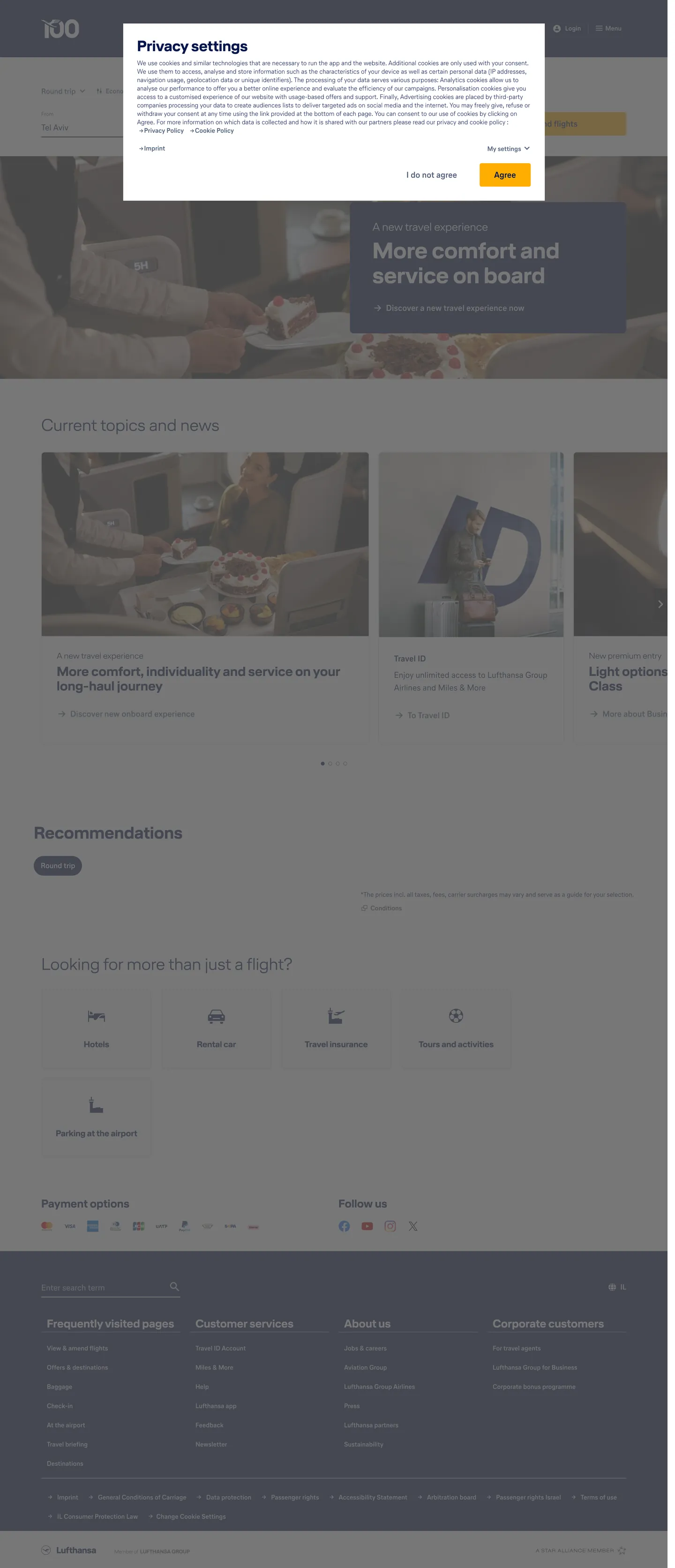
A snapshot of the brand in production. Scroll the frame to see the whole page.
Colors
13 colors
Lufthansa's system runs on #ffad00 as its primary voltage, used in 1 of 15 components. Type is set in LufthansaText across 13 tokens from 10px to 36px, weights 300–700. Shape language is sharp — components average 3px corner radius, favoring crisp rectangles.
Brand & Accent
Sparing, CTA-only voltage · 1
Surface
Page and card backgrounds · 2
Text
Headlines, body, captions · 3
Borders & Hairlines
Dividers, outlines, rules · 4
Other
Specialty colors · 3
Typography
13 type tokens
Set in LufthansaText across 13 tokens, from 10px to 36px, weights 300–700. Shown in its own stack: where the font isn't installed, the fallback the file names stands in.
- display-xl36px · weight 300 · lh 39.6px · tracking 0The quick brown fox jumps over the lazy dog
- display-lg28px · weight 700 · lh 30.8px · tracking 0The quick brown fox jumps over the lazy dog
- heading-md24px · weight 700 · lh 26.4px · tracking 0The quick brown fox jumps over the lazy dog
- heading-sm18px · weight 700 · lh 19.8px · tracking 0The quick brown fox jumps over the lazy dog
- heading-xs18px · weight 300 · lh 19.8px · tracking 0The quick brown fox jumps over the lazy dog
- body-lg18px · weight 400 · lh 27px · tracking 0The quick brown fox jumps over the lazy dog
- body-md18px · weight 700 · lh 27px · tracking 0The quick brown fox jumps over the lazy dog
- body-sm14px · weight 300 · lh 18px · tracking 0The quick brown fox jumps over the lazy dog
- label-md14px · weight 700 · lh 21px · tracking 0The quick brown fox jumps over the lazy dog
- label-sm14px · weight 700 · lh 18px · tracking 0The quick brown fox jumps over the lazy dog
- caption10px · weight 400 · lh 10px · tracking 0The quick brown fox jumps over the lazy dog
- button-md18px · weight 700 · lh 24px · tracking 0The quick brown fox jumps over the lazy dog
- nav-link14px · weight 700 · lh 21px · tracking 0The quick brown fox jumps over the lazy dog
Layout
Radii and spacing
6 corner radii and 8 spacing values. Shape language: sharp.
Radii
- none0px
- sm3px
- md4px
- lg6px
- xl8px
- full50%
Spacing
- xs5px
- sm8px
- md10px
- base20px
- lg24px
- xl30px
- 2xl32px
- 3xl40px
Components
15 components
Each rendered from its tokens (color, type, radius, padding) on Lufthansa's own canvas.
- Button Primarybutton-primaryButton Primary
- Button Secondarybutton-secondaryButton Secondary
- Top Navtop-navTop Nav
- Nav Linknav-linkNav Link
- Hero Headinghero-headingHero Heading
- Section Headingsection-headingSection Heading
- Body Paragraphbody-paragraphBody Paragraph
- Body Paragraph Mutedbody-paragraph-mutedBody Paragraph Muted
- CardcardCard
- News Cardnews-cardNews Card
- Type here…text-inputText Input
- Recommendation Chiprecommendation-chipRecommendation Chip
- Service Icon Cardservice-icon-cardService Icon Card
- FooterfooterFooter
- Footer Linkfooter-linkFooter Link
In use
The system, in use
Lufthansa's tokens on the kind of product it builds.
Build something people actually use.
A short paragraph of marketing copy that previews how the brand's display tier and body tier read together. Two sentences is usually enough.
FAQ
Lufthansa design system FAQ
Common questions about Lufthansa's tokens, components, and how to use this DESIGN.md in your project.
Read next
Related reading
Specs, directories, and component libraries that pair with this design system.
- Browse all design systemsThe full directory of DESIGN.md files on shadcn.io, with live mockups for each.shadcn.io
- Lufthansa — official siteLufthansa's public marketing site — the source of truth for the live tokens captured in this file.lufthansa.com (opens in a new tab)
- The DESIGN.md specificationGoogle Labs' open spec for machine-readable design system files — the format this page is built on.github.com (opens in a new tab)
Use it
Use Lufthansa in your project
One machine-readable file. Drop it into Claude, Cursor, or any AI tool that reads DESIGN.md.
Download the DESIGN.md
One machine-readable file: every color, type, radius, spacing, and component token of Lufthansa.
Feed it to your AI tool
Drop it into Claude, Cursor, or GitHub Copilot. The agent writes React components and Tailwind classes that match Lufthansa's visual language.
Reference the tokens directly
Or paste the values into your Tailwind config, CSS variables, or component library: every color, size and radius is a quoted, ready-to-copy value.
Read the full DESIGN.md: overview, rationale, do’s and don’ts
Overview
Lufthansa's marketing surface makes a typographic wager almost no other airline accepts. Weight as confidence signal: the editorial display headlines run LufthansaHead at weight 300 — the same condensed sans-serif used on departures boards and airline livery, but drawn as light as possible at 36px. This is the inverse of the category default. JetBlue, Delta, and United all reach for weight 700 at their largest display sizes, telegraphing urgency or authority. Lufthansa, by contrast, uses lightness as its signal of confidence: when the words are spare enough to hold at weight 300, the brand trusts itself.
The chromatic system reinforces the move. Deep navy (#05164d) runs 556 total occurrences — 275 as text, 265 as border, 11 as shadow — making it the structural skeleton of the page, not an accent. On this predominantly white-and-navy surface, Lufthansa yellow (#ffad00) appears exactly once as a background: the primary CTA button ("Find flights," "Agree"). The yellow does not reappear on headings, section bands, or icons. This is not a secondary color — it is an action color, used so sparingly that any element carrying it immediately reads as the most important thing on the page.
Key Characteristics:
- Deep navy (#05164d) as total infrastructure — 556 occurrences split nearly equally between text (275) and border (265); the page is built in navy and white.
- Lufthansa yellow (#ffad00) reserved for the primary CTA button only — a background layer with navy text on top; no other element in the captured surface uses it as a fill.
- Two proprietary typefaces: LufthansaHead (condensed display, weight 300 editorial / weight 700 card) + LufthansaText (humanist body, weight 300-700).
- Display headline at weight 300 — LufthansaHead 36px / 300 for section h2 headings; this is the most counter-conventional typographic choice in the airline category.
- 20px dominant spacing module (47 occurrences) — a wider-girthed rhythm than the 8/16px systems most airlines use.
- Corner radius is moderate-conservative: 3-8px across most surfaces, 50% (full circle) on recommendation chips.
- Nav height declared at 122px via CSS custom property — notably taller than the 56-64px standard, giving the top-nav significant visual weight.
Colors
Brand
- Lufthansa Yellow (
{colors.primary}— #ffad00): frequency 2. Used as background fill (1) and border (1). The singular CTA voltage — appears on the primary action button and nowhere else in the captured marketing surface. Layer: brand. The system earns its scarcity discipline by refusing to repeat the yellow even once more.
Surface
- Canvas (
{colors.canvas}— #ffffff): frequency 104. Used as text (43), background (18), border (43). The primary page canvas, merged from #ffffff and #f5f5f5 in the extraction cluster. All card surfaces and input fields. - Surface-1 (
{colors.surface-1}— #f5f5f5): declared in the merged cluster above. The lightly-tinted alternating section background.
Text
- Navy (
{colors.navy}— #05164d): frequency 556. Used as text (275), border (265), shadow (11), background (5). The structural identity of the page. Not black — a very dark indigo navy that adds a cold undertone to text without approaching the neutrality of charcoal. The dominant ink, hairline, and surface-shadow color. - Navy Mid (
{colors.navy-mid}— #52627c): frequency 194. Used as text (103), border (91). A secondary desaturated navy — used for secondary nav text, card sub-labels, and form-field border tones at a slightly lighter saturation than the primary navy. - Navy Deep (
{colors.navy-deep}— #000245): frequency 8. Used as text (4), border (4). An almost-black navy, declared for the darkest accent contexts in the below-fold content. - Ink (
{colors.ink}— #000000): frequency 9. Used as text (3), background (1), border (5). Pure black, rare in the system — appears on the footer boundary and a few structural dividers. - Ink Muted (
{colors.ink-muted}— #4d4d4d): frequency 3. Used across form-field text and secondary metadata captions. - Ink Soft (
{colors.ink-soft}— #666666): frequency 8, all as border. Section dividers at a medium gray.
Hairlines
- Hairline (
{colors.hairline}— #ebebeb): frequency 122. Used as text (62), border (60). The primary hairline tone — card borders, input field outlines, section dividers. The most-used border tone after navy-mid. - Hairline Mid (
{colors.hairline-mid}— #b4b4b4): frequency 142. Used as text (71), border (71). A medium gray hairline used for input field borders and structural dividers. - Hairline Dark (
{colors.hairline-dark}— #dcdcdc): frequency 11, all as border. A slightly lighter-than-mid hairline for secondary card outlines. - Hairline Strong (
{colors.hairline-strong}— #333333): frequency 3, all as border. A near-black hairline for the strongest section boundary marks.
Typography
Font Families
The system runs two proprietary voices: LufthansaHead for display and heading surfaces, and LufthansaText for body, navigation, button, and form contexts. Both families share the same Arial / Helvetica fallback stack, and LufthansaText includes Roboto as a secondary fallback in some declarations.
The pairing is the system's most distinctive typographic move — not the presence of two families (many systems do this) but the specific combination of a condensed, light display face with a humanist, heavier-body companion. LufthansaHead at 36px / weight 300 for section headings would look unmoored in Inter or DIN at the same weight; it works because the condensed geometry of LufthansaHead holds legibility at low weight in a way that broader sans-serifs cannot.
Hierarchy
| Token | Size | Weight | Line Height | Use |
|---|---|---|---|---|
{typography.display-xl} | 36px | 300 | 39.6px | Section h2 ("Current topics and news") — LufthansaHead |
{typography.display-lg} | 28px | 700 | 30.8px | Feature card headings — LufthansaHead |
{typography.heading-md} | 24px | 700 | 26.4px | Sub-section h3 / h4 titles — LufthansaHead |
{typography.heading-sm} | 18px | 700 | 19.8px | Card titles and highlighted links — LufthansaHead |
{typography.heading-xs} | 18px | 300 | 19.8px | Light-weight sub-headings — LufthansaHead |
{typography.body-lg} | 18px | 400 | 27px | Form field labels, lead paragraphs — LufthansaText |
{typography.body-md} | 18px | 700 | 27px | Button labels, bold inline text — LufthansaText |
{typography.body-sm} | 14px | 300 | 18px | Default body paragraphs, list items — LufthansaText |
{typography.label-md} | 14px | 700 | 21px | Navigation links, card category labels — LufthansaText |
{typography.label-sm} | 14px | 700 | 18px | Secondary nav labels, bold inline spans — LufthansaText |
{typography.caption} | 10px | 400 | 10px | Micro captions, navigation icons — LufthansaText |
{typography.button-md} | 18px | 700 | 24px | CTA button labels — LufthansaText |
{typography.nav-link} | 14px | 700 | 21px | Top-nav anchor text — LufthansaText |
Weight 300 as Editorial Signature
The most unusual typographic decision: LufthansaHead at weight 300 for section display headlines. This weight is rarely used for display text in any consumer product; it requires that the condensed letterform be legible at low weight at 36px, which only works because of LufthansaHead's proportional compression. The practical effect is that section headings feel annotational rather than declarative — a sensibility that runs through the entire system.
Note on Font Substitutes
LufthansaHead is proprietary. Barlow Condensed at the same weights is the closest open-source substitute — the proportional compression, cap height, and low-weight legibility transfer closely. For LufthansaText, Source Sans Pro (weight 300 for body, 700 for headings) or IBM Plex Sans are strong equivalents. Do not substitute both with a single family — the condensed/humanist pairing is the identity.
Layout
Spacing System
- Base module: 20px — the dominant padding value (47 occurrences), appearing on card internal padding, nav-link horizontal padding (10px per side = 20px total), and section-row gaps.
- Tokens:
{spacing.xs}5px ·{spacing.sm}8px ·{spacing.md}10px ·{spacing.base}20px ·{spacing.lg}24px ·{spacing.xl}30px ·{spacing.2xl}32px ·{spacing.3xl}40px. - Section padding: footer uses 32px vertical + 88px horizontal (the CSS
--container-offset: 8.8rem); this is the widest horizontal padding in the extraction. - Card internal padding: 20px on most content cards; news-carousel items use 0 horizontal padding (photography fills edge-to-edge, title overlays at 20px from the image bottom).
Grid & Container
- Max content width: implied ~1280px from the 88px horizontal padding convention.
- Hero: a full-bleed photography panel with a consent modal overlay on capture; the hero carries large type ("More comfort and service on board") in a navy-on-photo treatment.
- News carousel: a 3-up card grid of news photography tiles with article category label (LufthansaText 10px / 400), headline (LufthansaHead 18px / 700), and arrow link.
- Recommendations section: a tab-strip ("Round trip") above an implied fare-grid; tabs use a pill radius on the active state.
- Services grid: 5 service icons (Hotels, Rental car, Travel insurance, Tours and activities, Parking) in a horizontal row at 20px padding per icon-label unit.
Rhythm
The page alternates between a photographic editorial band (hero + news carousel) and a functional information band (flight search, services grid). The 20px module makes each band feel noticeably wider in its internal rhythm than, say, a 16px-module system would; the effect is that individual content items are given more surrounding space, which reads as a confidence signal: the system is not optimizing for density.
Elevation
The system uses minimal shadow, primarily the navy itself as depth via border contrast. The consent modal carries a subtle drop shadow (box-shadow with navy-based ink at low opacity); card surfaces at rest rely on {colors.hairline} borders. The 122px nav sits flat against the page without a shadow. Shadow ink uses the declared navy (#05164d) as the base rather than pure black — giving any shadow on the page a slight blue-cold tint.
Shapes
The radius philosophy is moderate-conservative, with a single circular exception:
{rounded.none}0px — the search-input fields (extracted at borderRadius 0px), the footer, and the full-width hero band.{rounded.sm}3px — fine-element rounding (captured in the extraction's 3px / 1 occurrence tier).{rounded.md}4px — the primary CTA button (borderRadius: 4pxextracted from the consent button); card borders in content areas.{rounded.lg}6px — nav-link hover states and secondary surface rounding (6px / 14 occurrences in extraction).{rounded.xl}8px — the dominant card radius (8px / 20 occurrences); used on news cards, service cards, and feature panels.{rounded.full}50% — the recommendation-type chip ("Round trip" active state) and circular icon buttons.
The scale skips the 12-16-24px generous-soft tier that consumer brands favor. Lufthansa's surfaces are either moderate (3-8px) or fully circular — never the in-between softness that would read as casual.
Components
button-primary — Lufthansa yellow (#ffad00) fill, deep navy text, LufthansaText 18px / 700, 4px radius, 11×30px padding, 50px height, 1px yellow border. The singular yellow element on the page — extracted from the cookie-consent "Agree" button, which mirrors the flight-search primary CTA. No secondary color competes with it.
button-secondary — White canvas fill, deep navy text and border, identical dimensions to the primary. Used for secondary actions like "I do not agree" in the consent modal and secondary booking actions.
top-nav — White canvas, 122px height (declared as --header-height), no border. The nav is notably tall — the Lufthansa wordmark and symbol occupy significant vertical space. Navigation links sit at 14px / 700 LufthansaText with 0px × 10px padding.
nav-link — Transparent background, navy text, {typography.nav-link} (14px / 700), 0×10px padding. No hover background — the cursor change is the only hover signal captured.
hero-heading — White canvas text on the photographic hero, LufthansaHead 36px / 300 ({typography.display-xl}). The editorial-weight headline renders over the full-bleed photography.
section-heading — Navy text on white canvas, same {typography.display-xl} token. Used for "Current topics and news," "Recommendations," "Looking for more than just a flight?" The lightness of weight 300 at this size is the system's defining typographic moment.
body-paragraph — Navy text, LufthansaText 14px / 300 ({typography.body-sm}). Default body copy for card descriptions and page paragraphs.
body-paragraph-muted — Ink-muted (#4d4d4d) text, same {typography.body-sm}. Secondary metadata captions.
card — White canvas, 1px hairline border (#ebebeb), 8px radius, 20px padding. Default content card.
news-card — White canvas, 1px hairline border, 8px radius, 0 padding (photography fills edge-to-edge). Holds a 10px / 400 category caption at the top, an 18px / 700 LufthansaHead headline beneath the image, and an arrow nav-link. The primary below-fold content unit.
text-input — White canvas, navy text (#05164d), 0px radius, 6px 0px padding, 39px height. The flight search origin/destination input — the zero radius creates a flush-stroke field row consistent with Lufthansa's utilitarian form aesthetic.
recommendation-chip — Navy fill, white text, LufthansaText 14px / 700, 50% radius (full circle/pill), 5×10px padding. The "Round trip" active trip-type selector beneath the flight search.
service-icon-card — Transparent background, navy text, 0px radius, 20×10px padding. The 5-icon horizontal row (Hotels, Car rental, etc.) — no visible card border, just the icon + label stack.
footer — Navy (#05164d) surface, white text, LufthansaText 14px / 300, 32×88px padding. Four column groups: Frequently visited pages, Customer services, About us, Corporate customers. A search field sits at the top-left of the footer in an inverted style.
footer-link — Transparent background on the navy footer, white text, {typography.label-sm}, 6px top padding.
Do's and Don'ts
Do use Lufthansa yellow (#ffad00) for exactly one primary action per page view. The system derives its CTA clarity entirely from yellow's scarcity — the moment a second yellow element appears (a yellow badge, a yellow heading accent), the primary action loses its signal supremacy.
Do render display headlines in LufthansaHead at weight 300, not weight 700. The weight-300 display is the system's single most distinctive design choice. Promoting headlines to 700 at 36px makes the system read like any other airline — the editorial restraint disappears.
Do use {colors.navy} (#05164d) for both text and borders throughout the system. The navy is a two-role color — it carries ink and hairline duty simultaneously. Introducing a separate charcoal for text (as JetBlue and Delta do) would soften the monochrome-navy discipline.
Do size the top-nav to 122px (the declared --header-height). The tall nav is a visual weight statement — it reserves above-fold real estate for the wordmark and horizontal navigation before the hero image loads. Shrinking it to 64px imports the value-carrier aesthetic.
Don't use {colors.navy} (#05164d) as a background canvas for full sections. The nav sits on white; the page sits on white; the footer is the one exception. Navy-on-navy section bands would destroy the page's white-breathing-room rhythm.
Don't render {typography.display-xl} (36px / weight 300) with LufthansaText instead of LufthansaHead. The weight-300 display only holds visual legibility at 36px because LufthansaHead is a condensed face — the tighter letterform at low weight creates enough density to read. LufthansaText at 36px / 300 would dissolve into the page.
Don't introduce a 12 or 16px radius tier between {rounded.xl} (8px) and {rounded.full} (50%). The binary structure — moderate rounding on cards, full-circle on chips — is the shape identity. A 12px card radius reads as a softer consumer brand register (Airbnb, JetBlue) rather than the utilitarian-editorial register Lufthansa occupies.
Don't use {colors.hairline} (#ebebeb) as a text color. It is a border-only token (60 of 62 occurrences are borders). For light muted text, use {colors.ink-muted} (#4d4d4d) or {colors.navy-mid} (#52627c).
Known Gaps
- Hero obscured by consent modal: the captured screenshot shows a cookie-consent modal overlaying the hero image. Below-fold sections (Recommendations, Services) are visible; the hero and above-fold booking widget are only partially captured.
- Dark mode: no dark-mode marketing surface is exposed; the footer is the only dark band.
- Hover and focus states: the system declares nav-link active states via CSS but the captured static render does not show hover backgrounds or focus rings.
- Miles & More loyalty surfaces: the loyalty program (Miles & More) carries its own color tier — a rose/pink accent and a distinct typeface weight — that is not represented in the marketing-homepage tokens.
- Cabin-class sub-brands: Business Class, First Class, and Economy Light each have distinct visual treatments in booking flows that are not captured here.
- Motion: the hero carousel animates (slide transitions, Swiper.js) — animation curves and timing are not represented in this spec.
- LufthansaHead weight variants: the extraction captured weights 300 and 700; the font file may include additional weights (400, 500) not observed on the marketing surface.
Travel & Hospitality
More systems like this
More DESIGN.md files in Travel & Hospitality.
Pricing
Build it with Pro
The DESIGN.md files are free. Pro adds 6,000+ blocks, premium templates and the MCP server, so your AI editor builds in your system for you.
4.9/5 out of 5 · 150+ reviewsfrom 150+ founders and developers.
Billing
Billed once a year in USD. Cancel anytime.
- How many people can use the license.
- Client work, SaaS products and anything you charge for.
- Production-ready React sections: hero, pricing, features, dashboards and more.
- Complete multi-page sites you can ship as they are.
- React icons from every major library, installable with one command.
- Presets that restyle every block, in light and dark.
- Lets your AI editor search, preview and install blocks for you.
- Priority requests are answered first.
Individual
For personal projects & open source
$32instead of $49/mo
$389 billed yearly
- Seats: 1 seat
- Commercial use: Personal & open source only
- Pro blocks: 6,000+ blocks
- Templates: All 14 templates
- React icons: 294k+ icons
- Themes: All 59 themes
- MCP server: Basic usage
- Support: Standard
Team
Most popularFor freelancers, agencies & startups
$66instead of $99/mo
$789 billed yearly · ≈ $13/dev/mo
- Seats: Up to 5 seats
- Commercial use: Included
- Pro blocks: 6,000+ blocks
- Templates: All 14 templates
- React icons: 294k+ icons
- Themes: All 59 themes
- MCP server: High usage
- Support: Priority
Organization
For companies with larger teams
$132instead of $199/mo
$1,589 billed yearly
- Seats: Unlimited seats
- Commercial use: Included
- Pro blocks: 6,000+ blocks
- Templates: All 14 templates
- React icons: 294k+ icons
- Themes: All 59 themes
- MCP server: Unlimited usage
- Support: Priority
Billed once a year in USD. Cancel anytime.
Individual
For personal projects & open source
$32instead of $49/mo
$389 billed yearly
- How many people can use the license.Seats: 1 seat
- Client work, SaaS products and anything you charge for.Commercial use: Personal & open source only
- Production-ready React sections: hero, pricing, features, dashboards and more.Pro blocks: 6,000+ blocks
- Complete multi-page sites you can ship as they are.Templates: All 14 templates
- React icons from every major library, installable with one command.React icons: 294k+ icons
- Presets that restyle every block, in light and dark.Themes: All 59 themes
- Lets your AI editor search, preview and install blocks for you.MCP server: Basic usage
- Priority requests are answered first.Support: Standard
Team
Most popularFor freelancers, agencies & startups
$66instead of $99/mo
$789 billed yearly · ≈ $13/dev/mo
Everything in Individual, plus
- How many people can use the license.Seats: Up to 5 seats
- Client work, SaaS products and anything you charge for.Commercial use: Included
- Lets your AI editor search, preview and install blocks for you.MCP server: High usage
- Priority requests are answered first.Support: Priority
Organization
For companies with larger teams
$132instead of $199/mo
$1,589 billed yearly
Everything in Team, plus
- How many people can use the license.Seats: Unlimited seats
- Lets your AI editor search, preview and install blocks for you.MCP server: Unlimited usage
- Secure checkout via Stripe
- Code lives in your repo
- Keep what you've shipped if you cancel
- License terms
Your system, built for you
Every block, template and icon, installed by your AI agent in your design system. The DESIGN.md files stay free.