Lucid Motors Design System
Lucid Motors' design system as a DESIGN.md file. Brand Gold #d7be96, Lucid Serif VF + Sans VF, 20 colors, 19 components. For React, Next.js, and AI tools.
Add shadcn.io to your AI agent. · Pro It installs blocks, icons and templates in your design system from a prompt, with Pro.
Set up MCP- Primary
- #d7be96
- Typeface
- Lucid Sans VF
- Shape
- Sharp
- Base radius
- 8px
- Colors
- 20
- Type tokens
- 12
- Components
- 19
- Spacing values
- 12
About
About Lucid Motors DESIGN.md
Curated by Dov Azencot · Updated May 13, 2026 · Source lucidmotors.com (opens in a new tab)
Lucid Motors' marketing surface is the inverse of Tesla's. Where Fremont commits to a near-pure white canvas with a single Electric Blue voltage on every CTA, Newark holds a pure-black canvas ("#000000") with white Lucid Serif VF display type and one champagne accent — Brand Gold ("#d7be96") — used as the primary CTA fill, the hairline brand border, and the announcement strip pinned to the top of the page. The brand voltage shows up only eight times in the captured render, but it surfaces as `--color-primary-colors-gold`, `--border-brand-gold`, `--text-brand-gold`, and `--surface-brand-gold` in the production CSS, which is the strongest possible signal that the low frequency is deliberate rather than incidental. Lucid's photography carries the rest: desert sky behind the Lucid Gravity, two-lane blacktop behind the Lucid Air Pure, an atelier-floor shot under "A New Standard of Electric Excellence." There is no decorative chrome, no gradient, no shadow tier, no secondary chromatic accent anywhere on the marketing site.
This page packages the full Lucid system into a single DESIGN.md file. Inside the spec: 20 colors tokens spanning one brand gold, two text inks, six structural neutrals, a champagne-on-black announcement surface, and the dark theme-paragraph swatch; 11 typography tokens built on four custom families — Lucid Serif VF (h1 at 72px / 400 / -0.5px, h2 at 64px / 400 / -0.5px, h2-md at 48px / 400 / normal), Lucid Sans VF (body 16/24, label 12/16 uppercase with 2px tracking, micro-caption 10/16 with 2px tracking), Schnyder S, Schnyder M, and Lucid Serif Italic VF (accent spans at 48px / 400); a four-step radius scale dominated by 4px (20 occurrences) and 50% (14 occurrences); a 4/8/16/24/32/48/64/72/96/120/160px spacing ladder; and 19 components definitions including the gold demo-drive CTA, the announcement strip, the configurator finance row, and the dual photo tile that opens the page.
Feed the file to Claude, Cursor, or GitHub Copilot and the agent writes React surfaces that hold Lucid's discipline — serif h1 at weight 400 with -0.5px tracking, champagne-gold scoped to the announcement strip and primary CTA only, pure black canvas with no dark-gray ladder, 4px radius across every interactive surface — rather than defaulting to a generic dark-luxury template that fills the page with gold accents and a Helvetica geometric sans. Where most American EV marketing sites lean on chromed-out hero gradients and aggressive negative-space asymmetry, Newark stages a centered serif headline over a single desert photograph and lets the typeface do the work.
What makes it distinct
5
- Single brand voltageBrand Gold (#d7be96) is the only chromatic token in the entire system, scoped to CTA fills, the announcement strip, and the brand-border hairline
- Serif-led heroLucid Serif VF runs the h1 at 72px / weight 400 / -0.5px tracking, where every other American EV brand defaults to a geometric sans
- Four custom families on one pageLucid Serif VF, Lucid Sans VF, Schnyder S, Schnyder M, plus Lucid Serif Italic VF; bold weight does not appear anywhere
- Pure black canvas (#000000)no dark-gray surface ladder; depth comes from full-bleed desert and atelier photography, not from elevated panels
- 4px radius repeated across 20 surfacesbuttons, inputs, and form chips share one corner value; 50% appears only on dot indicators
lucidmotors.com
Live at lucidmotors.com
A snapshot of the brand in production. Scroll the frame to see the whole page.
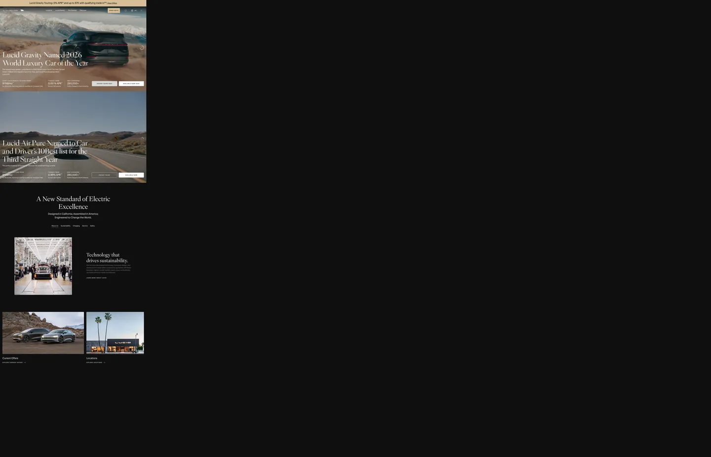
Colors
20 colors
Lucid Motors's system runs on #d7be96 as its primary voltage, used in 2 of 19 components. Type is set in Lucid Sans VF across 12 tokens from 10px to 72px, weights 400–500. Shape language is sharp — components average 2px corner radius, favoring crisp rectangles.
Brand & Accent
Sparing, CTA-only voltage · 1
Surface
Page and card backgrounds · 6
Text
Headlines, body, captions · 8
Borders & Hairlines
Dividers, outlines, rules · 2
Semantic
Status, errors, success, links · 1
Other
Specialty colors · 2
Typography
12 type tokens
Set in Lucid Sans VF across 12 tokens, from 10px to 72px, weights 400–500. Shown in its own stack: where the font isn't installed, the fallback the file names stands in.
- display-xl72px · weight 400 · lh 80px · tracking -0.5pxThe quick brown fox jumps over the lazy dog
- display-lg64px · weight 400 · lh 76px · tracking -0.5pxThe quick brown fox jumps over the lazy dog
- display-md48px · weight 400 · lh 56px · tracking normalThe quick brown fox jumps over the lazy dog
- display-italic48px · weight 400 · lh 56px · tracking normalThe quick brown fox jumps over the lazy dog
- heading-md24px · weight 400 · lh 36px · tracking normalThe quick brown fox jumps over the lazy dog
- heading-sm20px · weight 400 · lh 32px · tracking normalThe quick brown fox jumps over the lazy dog
- body-lg18px · weight 400 · lh 28px · tracking normalThe quick brown fox jumps over the lazy dog
- body-md16px · weight 400 · lh 24px · tracking normalThe quick brown fox jumps over the lazy dog
- body-sm14px · weight 400 · lh 20px · tracking normalThe quick brown fox jumps over the lazy dog
- caption12px · weight 400 · lh 18px · tracking normalThe quick brown fox jumps over the lazy dog
- label-eyebrow12px · weight 500 · lh 16px · tracking 2pxThe quick brown fox jumps over the lazy dog
- label-micro10px · weight 500 · lh 16px · tracking 2pxThe quick brown fox jumps over the lazy dog
Layout
Radii and spacing
5 corner radii and 12 spacing values. Shape language: sharp.
Radii
- none0px
- inset3px
- sm4px
- md8px
- full9999px
Spacing
- xs4px
- sm8px
- base12px
- md16px
- lg24px
- xl32px
- 2xl48px
- 3xl64px
- 4xl72px
- 5xl96px
- 6xl120px
- 7xl160px
Components
19 components
Each rendered from its tokens (color, type, radius, padding) on Lucid Motors's own canvas.
- Announcement Stripannouncement-stripAnnouncement Strip
- Top Navtop-navTop Nav
- Top Nav Narrowtop-nav-narrowTop Nav Narrow
- Nav Linknav-linkNav Link
- Button Primarybutton-primaryButton Primary
- Button Secondarybutton-secondaryButton Secondary
- Button Tertiary Linkbutton-tertiary-linkButton Tertiary Link
- Hero Bandhero-bandHero Band
- Hero H1hero-h1Hero H1
- Section H2section-h2Section H2
- Eyebrow Labeleyebrow-labelEyebrow Label
- Configurator Rowconfigurator-rowConfigurator Row
- Photo Tilephoto-tilePhoto Tile
- Type here…text-inputText Input
- Inline Linkinline-linkInline Link
- Carousel Dotcarousel-dotCarousel Dot
- Pricing Metapricing-metaPricing Meta
- Hairline Dividerhairline-dividerHairline Divider
- Modal Scrimmodal-scrimModal Scrim
In use
The system, in use
Lucid Motors's tokens on the kind of product it builds.
Build something people actually use.
A short paragraph of marketing copy that previews how the brand's display tier and body tier read together. Two sentences is usually enough.
FAQ
Lucid Motors design system FAQ
Common questions about Lucid Motors's tokens, components, and how to use this DESIGN.md in your project.
Read next
Related reading
Specs, directories, and component libraries that pair with this design system.
- Browse all design systemsThe full directory of DESIGN.md files on shadcn.io, with live mockups for each brand.shadcn.io
- Lucid Motors — official siteThe live marketing site for Lucid Air and Lucid Gravity — see Brand Gold, Lucid Serif VF, and the announcement strip in production.lucidmotors.com (opens in a new tab)
- The DESIGN.md specificationGoogle Labs' open spec for machine-readable design system files — the format this page is built on.github.com (opens in a new tab)
Use it
Use Lucid Motors in your project
One machine-readable file. Drop it into Claude, Cursor, or any AI tool that reads DESIGN.md.
Download the DESIGN.md
One machine-readable file: every color, type, radius, spacing, and component token of Lucid Motors.
Feed it to your AI tool
Drop it into Claude, Cursor, or GitHub Copilot. The agent writes React components and Tailwind classes that match Lucid Motors's visual language.
Reference the tokens directly
Or paste the values into your Tailwind config, CSS variables, or component library: every color, size and radius is a quoted, ready-to-copy value.
Read the full DESIGN.md: overview, rationale, do’s and don’ts
Overview
Lucid Motors' marketing surface stages California luxury against pure-black studio chrome — not the white-canvas restraint of Tesla, not the cinema-black of Bugatti or Ferrari, but a third position that uses photography for warmth and a single champagne accent for civic signal. The canvas is {colors.canvas} (#000000), the hero h1 runs {typography.display-xl} (Lucid Serif VF at 72px / weight 400 / -0.5px tracking), and the only chromatic voltage in the entire system is {colors.primary} (#d7be96) — Brand Gold — bound to --color-primary-colors-gold, --border-brand-gold, --text-brand-gold, and --surface-brand-gold in the production CSS. The gold surfaces three places: the announcement strip pinned to the top of the page ("Lucid Gravity Touring: 0% APR..."), the DEMO DRIVE primary CTA fill, and a hairline brand border on configurator chips. Nowhere else.
Champagne scarcity: where most luxury-automotive marketing sites splash a heritage accent across every hover state, gradient stop, and chart-line stroke, Lucid scopes Brand Gold to exactly three surfaces and counts only eight occurrences in the captured render. The scarcity is the discipline — the same way Tesla's Electric Blue appears only on primary CTAs, Lucid's gold is reserved for the one civic announcement and the one demo-drive action. Promoting it to hover-fill or hairline-overlay would dilute the brand voltage. The CSS variable names (--color-primary-colors-gold, four token aliases pointing at one hex) make the deliberate scoping explicit.
Type runs Lucid Serif VF for display and Lucid Sans VF for UI, declared on the page through --font-lucid-serif and --font-lucid-sans respectively. The hero h1 sits at 72px / 400 / -0.5px tracking with an 80px line-height; the section h2 drops to 64px / 400 / -0.5px or 48px / 400 / normal depending on band; body copy holds at 16px / 400 / 24px line-height. The brand also declares Lucid Serif Italic VF (an accent span face at 48px / 400), Schnyder S and Schnyder M (editorial display reserves), GTAmerica, Amiri (Arabic), and IBM Plex Sans (the sans-fallback origin). Bold weight does not appear anywhere on the page captured — every typographic role sits at weight 400 except the eyebrow labels at 500 with 2px tracking. Visual emphasis comes from family contrast (serif display vs sans UI), size jump (72px hero vs 16px body), and tracking (-0.5px on display vs normal on body), never from weight promotion.
Serif as luxury signal: Lucid is the only American EV brand running a serif on its hero — Rivian, Tesla, Polestar, and Fisker all default to a geometric sans. Where most American EV brands borrow Detroit's chrome-and-grid vocabulary, Newark borrows from editorial fashion and California atelier print. The serif reframes the company from EV manufacturer to luxury house that happens to manufacture EVs.
The radius vocabulary is binary-with-a-dot. The dominant value is {rounded.sm} (4px, 20 occurrences) repeated across the gold DEMO DRIVE button, the email input, the configurator chips, and the announcement strip; {rounded.full} (50%) appears 14 times scoped to the carousel dot indicators and a few avatar masks; {rounded.inset} (3px) appears three times on inset hairlines; and {rounded.md} (8px) appears once. There is no 12px / 16px / 24px tier — Lucid does not soften photo tiles the way Porsche softens to 32px. The corner vocabulary reads engineered rather than soft-consumer, which matches the brand's California-engineering positioning.
Key Characteristics:
- Single brand voltage
{colors.primary}(#d7be96 — Brand Gold) scoped to the announcement strip, the DEMO DRIVE CTA, and brand-border hairlines only. No secondary chromatic accent anywhere. - Pure black canvas
{colors.canvas}(#000000) — the page has no dark-gray surface ladder. Depth comes from full-bleed desert and atelier photography, not from elevated panels. - Serif-led h1
{typography.display-xl}(Lucid Serif VF, 72px / 400 / -0.5px / 80px line-height) over photography. The h2 drops to 64px / 400 / -0.5px or 48px / 400 / normal. - Sans-led UI
{typography.body-md}(Lucid Sans VF, 16px / 400 / 24px line-height) for every non-display role. - Weight 400 across every type token captured, except eyebrow labels at weight 500 with 2px uppercase tracking.
- 4px radius repeated 20 times across buttons, inputs, and chips. 50% only on carousel dots. No 12/16/24px tier.
- The announcement strip is the brand's signature header pattern — gold fill, black text, 40px height, financing copy plus an inline View Offers link.
- Full-bleed photography over black does the chromatic work: champagne desert sky behind the Gravity, dusty pavement under the Air Pure, mirrored factory floor under "Technology that drives sustainability."
- No box-shadow tier — every surface is flat. The only elevation move is the 65% opacity scrim behind modals.
- Four custom families on one page: Lucid Serif VF, Lucid Sans VF, Lucid Serif Italic VF, Schnyder S/M. Bold weight does not exist in the system.
Colors
Brand & Accent
- Brand Gold (
{colors.primary}—"#d7be96") — frequency 8. Used as text (3), background (2), border (3). The system's only chromatic voltage — a warm champagne tone bound to--color-primary-colors-gold,--border-brand-gold,--text-brand-gold, and--surface-brand-gold. Scoped to the announcement strip fill, the DEMO DRIVE CTA, and hairline brand borders on configurator chips. The scarcity is the discipline.
Canvas & Surfaces
- Canvas (
{colors.canvas}—"#000000") — frequency 539. Used as text (270), border (266), background (2), gradient (1). The dominant surface and the dominant text color simultaneously, bound to--color-pure-black,--theme-black-background,--surface-neutral-black-100,--text-neutral-black. The page has no dark-gray base; pure black carries every section. - Off-Black (
{colors.surface-off-black}—"#0f0f0f") — frequency 9. Used as background (9). The barely-perceptible alternate surface for inset bands, bound to--greyscale-colors-off-blackand--color-black-2. - Dark (
{colors.surface-dark}—"#1b1b1b") — appears in--theme-dark-backgroundand--surface-neutral-gray-80. A near-black warm tone reserved for dark-theme inset panels and the theme-light-paragraph color when the system inverts. - Light (
{colors.surface-light}—"#dbd4c5") — bound to--theme-light-backgroundand--color-brown-light. A warm putty tone used when the system inverts to a light theme — not visible on the home view but documented for the configurator and finance surfaces. - Sand (
{colors.surface-sand}—"#e1e0dc") — bound to--color-sand,--color-snow,--theme-black-paragraph,--theme-dark-paragraph. A near-white sand surface that doubles as the body-paragraph ink on dark themes. - Broken White (
{colors.surface-broken-white}—"#f0f0f0") — bound to--color-broken-white,--surface-neutral-gray-5,--color-grey-light,--color-fossil-light. The lightest neutral, reserved for light-theme card backgrounds.
Text
- White Ink (
{colors.ink}—"#ffffff") — frequency 149. Used as text (72), border (72), background (5). The dominant text color on the black canvas, bound to--color-off-white,--border-neutral-white,--text-neutral-white,--color-white,--surface-neutral-white. Hero h1, section h2, body copy on dark, and nav labels all render in white. - Black Ink (
{colors.ink-dark}—"#000000") — text color inside the gold CTA fill and inside the announcement strip. The same#000000as the canvas, repurposed as foreground over Brand Gold. - Paragraph-Dark (
{colors.ink-paragraph-dark}—"#e1e0dc") — appears in--theme-black-paragraphand--theme-dark-paragraph. The body-paragraph swatch on the black theme — slightly warmer than white, which keeps long-form body copy from feeling harsh against pure black. - Body Gray-70 (
{colors.body}—"#323232") — frequency 182. Used as text (91), border (91). The mid-gray secondary text and hairline-border color on light surfaces, bound to--border-neutral-gray-70,--border-neutral-gray-80, and--color-greyscale-charcoal. - Muted Gray-50 (
{colors.muted}—"#7f7f7f") — frequency 32. Used as text (16), border (16). Tertiary text on light theme, bound to--color-greyand--text-neutral-gray-50. - Muted Soft (
{colors.muted-soft}—"#999999") — frequency 4. Used as text (2), border (2). A lighter mid-gray used for very subtle hairlines and disabled-state text. - Muted Light (
{colors.muted-light}—"#8e8e8e") — bound to--text-neutral-gray-40. The eyebrow-label color above section h2 headlines, reserved for uppercase 2px-tracked labels.
Hairlines
- Hairline Dark (
{colors.hairline-dark}—"#323232") — the default 1px stroke between configurator rows and table cells. Same hex as the body-gray token; the role is structural rather than text. - Hairline Gold (
{colors.hairline-gold}—"#d7be96") — the brand-gold border bound to--border-brand-gold. Reserved for chips and configurator rows that need to signal the active gold state without filling the surface.
Heritage Reserves
- Heritage Brown (
{colors.heritage-brown}—"#c2b299") — bound to--theme-dark-heading,--theme-black-heading, and--color-brown. A muted heritage tone reserved for h2 headings on inverted dark themes; not surfaced on the home view but available as a Schnyder display color. - Heritage Bronze (
{colors.heritage-bronze}—"#8a6e33") — bound to--color-yellow-light. A deeper bronze reserved for charts and infographic accent strokes; not surfaced on the marketing home.
Interactive
- Classic Link (
{colors.link-classic}—"#0000ee") — frequency 176. Used as text (88), border (88). The browser-default blue, scoped to inline anchor links inside long-form legal and disclosure copy. Lucid deliberately does not restyle the default link blue inside legal disclaimers — the system readslegaleserather thanbrand-styled prosein those bands.
Semantic
- Alert Error (
{colors.alert-error}—"#ff202b") — bound to--text-alert-error. Reserved for form validation error states, never used decoratively.
Typography
Font Family
The system declares four custom families on the page through --font-* CSS variables:
- Lucid Serif VF — the brand's load-bearing display face. Runs the hero h1 at 72px / 400 / -0.5px tracking with 80px line-height and the section h2 at 64px / 400 / -0.5px or 48px / 400 / normal. Declared as
"Lucid Serif VF", Georgia, Times, serif. - Lucid Sans VF — the UI face for body, button labels, navigation, captions, and form inputs. Always at weight 400 except the eyebrow labels at weight 500. Declared as
"Lucid Sans VF", "IBM Plex Sans", -apple-system, sans-serif. - Lucid Serif Italic VF — accent spans at 48px / 400, reserved for editorial pull-quotes and italic emphasis inside Schnyder display layouts.
- Schnyder S and Schnyder M — editorial display reserves declared in
--font-schnyder-sand--font-schnyder-m. Did not surface on the home view but documented for inner pages.
Additional declared families: GTAmerica (--font-gt-america), IBM Plex Sans (--font-lucid-ibm-plex-sans), Amiri (--font-lucid-amiri, Arabic), and dirham-symbol (--font-lucid-saudi-riyal, currency glyphs). The page localizes for the Saudi market.
Hierarchy
| Token | Family | Size | Weight | Line | Tracking | Use |
|---|---|---|---|---|---|---|
{typography.display-xl} | Lucid Serif VF | 72px | 400 | 80px | -0.5px | Hero h1 ("Lucid Gravity Named 2026 World Luxury Car of the Year") |
{typography.display-lg} | Lucid Serif VF | 64px | 400 | 76px | -0.5px | Section h2 ("A New Standard of Electric Excellence") |
{typography.display-md} | Lucid Serif VF | 48px | 400 | 56px | normal | Mid-section h2 over photography |
{typography.display-italic} | Lucid Serif Italic VF | 48px | 400 | 56px | normal | Accent italic span inside display |
{typography.heading-md} | Lucid Sans VF | 24px | 400 | 36px | normal | Photo-tile heading ("Technology that drives sustainability.") |
{typography.heading-sm} | Lucid Sans VF | 20px | 400 | 32px | normal | Sub-section heading |
{typography.body-lg} | Lucid Sans VF | 18px | 400 | 28px | normal | View Offers and primary inline link |
{typography.body-md} | Lucid Sans VF | 16px | 400 | 24px | normal | Body paragraph and button label |
{typography.body-sm} | Lucid Sans VF | 14px | 400 | 20px | normal | Secondary body and disclosure copy |
{typography.caption} | Lucid Sans VF | 12px | 400 | 18px | normal | Fine-print caption inside configurator rows |
{typography.label-eyebrow} | Lucid Sans VF | 12px | 500 | 16px | 2px | Uppercase eyebrow above h2 |
{typography.label-micro} | Lucid Sans VF | 10px | 500 | 16px | 2px | Micro-label inside chips and badges |
Principles
Held-at-400 typography. Every display and body role sits at weight 400. The only exceptions are eyebrow and micro labels at weight 500. Promoting any display token to 700 breaks the editorial-luxury voice and makes Lucid read like a generic American auto template.
Family contrast as emphasis. The display/UI split is loud: Lucid Serif VF is a transitional serif with -0.5px display tracking, and Lucid Sans VF is a humanist sans at normal tracking. Switching families inside one band signals hierarchy more strongly than a 2x size jump alone.
Negative tracking only on display. Display tokens at 48–72px sit at -0.5px; everything 24px and under stays at normal. The label tokens at 10–12px push out to 2px uppercase. The tracking scale is non-monotonic on purpose — large display compresses, small caps expands.
Note on Font Substitutes
Lucid Serif VF, Lucid Sans VF, and Lucid Serif Italic VF are commissioned variable fonts unavailable for public licensing. Open-source approximations: Lora at weight 400 with -0.5px tracking for Lucid Serif VF, IBM Plex Sans at weight 400 for Lucid Sans VF (it is also the documented fallback in the system's CSS), and Lora Italic for Lucid Serif Italic VF. Schnyder S and Schnyder M are commercially licensed by Commercial Type. Either substitute set should run at the same captured sizes (72 / 64 / 48 / 24 / 20 / 18 / 16 / 14 / 12 / 10) without further adjustment.
Layout
Spacing System
- Base unit: 4px. The system declares an explicit ladder via
--space-size-*CSS variables. - Tokens:
{spacing.xs}4px ·{spacing.sm}8px ·{spacing.base}12px ·{spacing.md}16px ·{spacing.lg}24px ·{spacing.xl}32px ·{spacing.2xl}48px ·{spacing.3xl}64px ·{spacing.4xl}72px ·{spacing.5xl}96px ·{spacing.6xl}120px ·{spacing.7xl}160px. - Button padding: 12px outer on the gold CTA with flexbox centering, height 48px.
- Section rhythm: vertical bands at
{spacing.5xl}96px or{spacing.6xl}120px on desktop, with horizontal gutters declared as--spacing-regular-horizontal250px or--spacing-regular-horizontal-wide174px. - Nav heights:
--main-navigation-height-regular80px on desktop,--main-navigation-height-narrow50px on mobile.
Grid & Container
- Max width: the inner column respects a roughly 1200px reading width with 250px horizontal gutters on desktop.
- Hero band: full-bleed, edge-to-edge photography with a left-aligned headline and four-cell finance row below the hero card.
- Photo grid: a 2-up tile layout pairing the Air or Gravity vehicle photo with a Locations atelier photo at equal width.
- Configurator row: 4-column horizontal grid (Lucid Air monthly price · 0% APR · Order Yours Now CTA · Available Now CTA), repeating identically across Air and Gravity hero cards.
Whitespace Philosophy
The page treats whitespace as the chrome itself. Vertical rhythm between hero cards is {spacing.6xl} 120px, and the photo-tile band below "A New Standard of Electric Excellence" sits in 96px of vertical padding. Horizontal gutters at 250px on desktop pull every section into a centered column. The two photo tiles in the locator grid use no shadow, no border, no overlay gradient — only the photograph and the small Lucid Sans VF label below at {typography.label-eyebrow}.
Border Radius Scale
| Token | Value | Context |
|---|---|---|
{rounded.none} | "0px" | Photo tiles and full-bleed bands — sharp edges by default |
{rounded.inset} | "3px" | Inset hairlines on configurator chips (3 occurrences) |
{rounded.sm} | "4px" | The dominant interactive radius — gold CTA, email input, announcement strip, configurator chips (20 occurrences). Bound to --radius-small and --border-radius-regular |
{rounded.md} | "8px" | Single occurrence on a secondary chip |
{rounded.full} | "9999px" | Carousel dot indicators and avatar masks (14 occurrences) |
Elevation & Depth
The system has essentially zero shadow tiers. Lucid commits to a flat surface model and lets photography carry the depth.
- Flat (Level 0): no shadow, no border. The default state for cards, buttons at rest, and photo tiles. 95%+ of surfaces.
- Photography as depth: every hero card uses a full-bleed photograph that handles atmospheric depth — sky gradient, ground shadow, perspective lines. The UI dissolves into the image.
- Brand-gold hairline: the only structural depth move is a 1px Brand Gold border on configurator chips, signaling active state without a fill.
- Modal scrim:
rgba(0, 0, 0, 0.65)behind region popups and the cookie banner — a true black scrim, not a mid-gray.
Shadow Philosophy
Lucid avoids box-shadows entirely on the marketing surface. Depth comes from three alternative strategies: z-index layering (the announcement strip and nav sit above hero content through positioning), full-bleed photography (desert sky, atelier floor, two-lane blacktop), and brand-gold hairlines as the only structural elevation cue. Adding UI shadows on a pure-black canvas would create grey halos that compete with the photography, so the system treats them as forbidden.
Shapes
Lucid's corner vocabulary is binary-with-a-dot. The dominant interactive radius is {rounded.sm} (4px), repeated 20 times across the gold DEMO DRIVE button, the email input, the announcement strip, and the configurator chips. The radius is bound to two CSS variables that resolve to the same value — --radius-small: 4px and --border-radius-regular: 4px — which makes the constant explicit in production.
The only other captured radii are {rounded.full} (50%, 14 occurrences) scoped to carousel dot indicators and avatar masks, {rounded.inset} (3px, 3 occurrences) on inset hairlines, and {rounded.md} (8px, 1 occurrence) on a single secondary chip. There is no 12px / 16px / 24px tier — Lucid does not soften photo tiles the way Porsche softens to 32px or BMW softens to 16px. The chrome reads engineered rather than soft-consumer, which mirrors the brand's California-engineering positioning over the consumer-tech radius vocabulary of Apple and Google.
Components
Announcement Strip
announcement-strip — Brand Gold fill ({colors.primary}), black text on gold ({colors.ink-dark}), 40px height, 8px / 24px padding, no radius (or 4px on rounded chips inside), no shadow. Carries a single financing message ("Lucid Gravity Touring: 0% APR... View Offers"). The brand's signature header pattern — gold scarcity surfaces here.
Navigation
top-nav — Pure black canvas, white wordmark and nav labels in Lucid Sans VF 16px, 80px height on desktop and 50px on mobile (--main-navigation-height-regular / -narrow). No border, no shadow.
top-nav-narrow — The 50px collapsed variant for mobile and narrow viewports. Same color tokens, reduced height.
nav-link — Transparent background, white text ({colors.ink}), Lucid Sans VF 16px / 400, 34px height, 4px / 0px padding. Used for Lucid Air, Lucid Gravity, Pre-Owned, Discover.
Buttons
button-primary — The gold DEMO DRIVE CTA. Brand Gold fill ({colors.primary}), black text ({colors.ink-dark}), Lucid Sans VF 16px / 400, 4px radius ({rounded.sm}), 12px padding, 48px height. The only button on the page with a chromatic fill.
button-secondary — Transparent fill, white text, white 1px outline, 4px radius, 12px padding, 48px height. Sits alongside the primary CTA for ORDER YOURS NEXT and AVAILABLE NOW.
button-tertiary-link — Plain white text, no background, no border, 12px / 500 uppercase with 2px tracking. Used for LEARN MORE ABOUT LUCID and EXPLORE LOCATIONS — the brand's text-link voice as a label.
Hero
hero-band — Full-bleed black canvas with a hero photograph extending edge-to-edge, the h1 left-aligned in white Lucid Serif VF 72px / 400, and a 4-cell configurator row below ($729/mo · 0% APR · Order Yours Next · Available Now).
hero-h1 — White Lucid Serif VF 72px / 400 / -0.5px / 80px line-height over photography. Transparent background.
section-h2 — Centered white Lucid Serif VF 64px / 400 / -0.5px or 48px / 400 / normal depending on band. Used for "A New Standard of Electric Excellence."
Labels & Eyebrows
eyebrow-label — Muted-light text ({colors.muted-light}), Lucid Sans VF 12px / 500 with 2px uppercase tracking. Used above h2 sections as the editorial label voice (DESIGNED IN CALIFORNIA, ASSEMBLED IN AMERICA · ENGINEERED TO CHANGE THE WORLD).
Configurator
configurator-row — 4-cell horizontal row inside the hero card carrying monthly price, APR, primary CTA, secondary CTA. Black canvas, white ink, Lucid Sans VF 14px / 400, 16px / 24px padding.
Cards & Photos
photo-tile — Full-bleed photograph with the Lucid Sans VF 24px heading and Lucid Sans VF 12px eyebrow below. No radius, no shadow, no border — the photograph is the entire visual.
pricing-meta — Black canvas, paragraph-dark ink ({colors.ink-paragraph-dark} — #e1e0dc), Lucid Sans VF 14px / 400. The small "$/mo" and "0% APR" copy inside the configurator row.
Forms
text-input — White surface ({colors.ink}), black text, black 1px outline, Lucid Sans VF 16px / 400, 48px height, 0 / 0 / 0 / 8px padding. No radius — sharp corners. The email field on the dealer-locator surface.
inline-link — Classic-blue ({colors.link-classic} — #0000ee) text inside legal and disclosure copy. The system deliberately does not restyle the browser-default blue inside legalese.
Indicators
carousel-dot — White 8x8px circle ({rounded.full}). Three dots indicate carousel position; the active dot is fully opaque, inactive dots are 40% opacity.
Structural
hairline-divider — 1px Hairline Dark ({colors.hairline-dark} — #323232) stroke between configurator rows.
modal-scrim — rgba(0, 0, 0, 0.65) backdrop behind region popups and the cookie banner.
Do's and Don'ts
Do's
- Reserve Brand Gold (
#d7be96) for the announcement strip, the DEMO DRIVE CTA, and brand hairline borders. These three surfaces are the only places the brand voltage should appear. - Run hero h1 as Lucid Serif VF at 72px / 400 / -0.5px tracking with 80px line-height. The serif-on-EV signature is the brand identity move.
- Hold every display and body role at weight 400. Promote to weight 500 only for the 10–12px eyebrow labels with 2px uppercase tracking.
- Pair full-bleed photography with white serif headlines on pure black. The photograph carries the chromatic weight; the typography carries the voice.
- Use 4px (
{rounded.sm}) for every interactive radius — buttons, inputs, chips, announcement strip. Reserve 50% ({rounded.full}) for carousel dots only. - Use the paragraph-dark swatch (
#e1e0dc) instead of pure white for long-form body copy on black. The slight warmth keeps disclosure copy from feeling harsh against#000000.
Don'ts
- Don't fill hover states with Brand Gold. The 8 captured gold occurrences are the cap — promoting gold to hover-fill or hairline-overlay dilutes the brand voltage from a scarcity signal to decoration.
- Don't use
#0000eefor navigation labels or button text. It is a legal-disclosure inline-link color (88 text + 88 border occurrences across legalese paragraphs); promoting it to UI chrome breaks Lucid's monochrome-plus-gold rule. - Don't promote any Lucid Serif VF token to weight 700. The face never appears in bold on the captured page. A 700 hero headline reads as Detroit-American rather than California-luxury — the visual identity inverts.
- Don't substitute Lucid Serif VF with a geometric sans like Inter or Helvetica. The serif-on-EV move is what separates Newark from Fremont (Tesla), Plymouth (Rivian), and Gothenburg (Polestar). Open-source substitute is Lora at -0.5px tracking, not Inter.
- Don't soften photo tiles to 16px / 24px / 32px radius. The captured
{rounded.sm}4px is the cap on interactive surfaces and photo tiles run at{rounded.none}0px. Adding consumer-tech radius vocabulary makes the system read as Apple-adjacent rather than California-engineering. - Don't add box-shadows on any surface against the
#000000canvas. Shadows on pure black create grey halos that compete with the photography. The system's elevation model is "none plus one hairline." - Don't use
#323232for body paragraph text on the dark canvas. It is a border-and-secondary-text token (91 text + 91 border occurrences, both on light surfaces). For dark-canvas body copy, use{colors.ink-paragraph-dark}(#e1e0dc) instead.
Known Gaps
- Below-the-fold lazy load: the headless extractor captured the home view as a 1440x926 frame because the page lazy-loads its dealer-locator and footer bands on scroll. The captured token set is fully accurate but covers the home view rather than the full page rhythm. The
:rootCSS variable map (92 entries) was used to backfill the inferred tokens. - Configurator surface: the paint pickers, interior pickers, wheel pickers, and range simulator use a denser form pattern with their own button and toggle states. Out of scope for this marketing-focused spec.
- Schnyder display reserves: Schnyder S and Schnyder M are declared in
--font-schnyder-sand--font-schnyder-mbut did not surface on the home view. Their captured roles are reserve display rather than confirmed h1/h2 — inner brand pages and the press kit likely surface them. - Animation timings: the exact slide-in curve for the announcement strip, the carousel auto-advance interval, and the hover transition for the gold CTA were not captured by the static extractor.
- In-car infotainment UI: Lucid's vehicle infotainment shares the brand voltage and the Lucid Sans VF family but uses its own touch-optimized component palette — handled by a separate Lucid spec.
- Localized variants: the site declares
--font-lucid-amiri(Arabic) and--font-lucid-saudi-riyal(currency symbol). The Saudi-market variant's typographic rhythm is not captured here.
Automotive
More systems like this
More DESIGN.md files in Automotive.
Pricing
Build it with Pro
The DESIGN.md files are free. Pro adds 6,000+ blocks, premium templates and the MCP server, so your AI editor builds in your system for you.
4.9/5 out of 5 · 150+ reviewsfrom 150+ founders and developers.
Billing
Billed once a year in USD. Cancel anytime.
- How many people can use the license.
- Client work, SaaS products and anything you charge for.
- Production-ready React sections: hero, pricing, features, dashboards and more.
- Complete multi-page sites you can ship as they are.
- React icons from every major library, installable with one command.
- Presets that restyle every block, in light and dark.
- Lets your AI editor search, preview and install blocks for you.
- Priority requests are answered first.
Individual
For personal projects & open source
$32instead of $49/mo
$389 billed yearly
- Seats: 1 seat
- Commercial use: Personal & open source only
- Pro blocks: 6,000+ blocks
- Templates: All 14 templates
- React icons: 294k+ icons
- Themes: All 59 themes
- MCP server: Basic usage
- Support: Standard
Team
Most popularFor freelancers, agencies & startups
$66instead of $99/mo
$789 billed yearly · ≈ $13/dev/mo
- Seats: Up to 5 seats
- Commercial use: Included
- Pro blocks: 6,000+ blocks
- Templates: All 14 templates
- React icons: 294k+ icons
- Themes: All 59 themes
- MCP server: High usage
- Support: Priority
Organization
For companies with larger teams
$132instead of $199/mo
$1,589 billed yearly
- Seats: Unlimited seats
- Commercial use: Included
- Pro blocks: 6,000+ blocks
- Templates: All 14 templates
- React icons: 294k+ icons
- Themes: All 59 themes
- MCP server: Unlimited usage
- Support: Priority
Billed once a year in USD. Cancel anytime.
Individual
For personal projects & open source
$32instead of $49/mo
$389 billed yearly
- How many people can use the license.Seats: 1 seat
- Client work, SaaS products and anything you charge for.Commercial use: Personal & open source only
- Production-ready React sections: hero, pricing, features, dashboards and more.Pro blocks: 6,000+ blocks
- Complete multi-page sites you can ship as they are.Templates: All 14 templates
- React icons from every major library, installable with one command.React icons: 294k+ icons
- Presets that restyle every block, in light and dark.Themes: All 59 themes
- Lets your AI editor search, preview and install blocks for you.MCP server: Basic usage
- Priority requests are answered first.Support: Standard
Team
Most popularFor freelancers, agencies & startups
$66instead of $99/mo
$789 billed yearly · ≈ $13/dev/mo
Everything in Individual, plus
- How many people can use the license.Seats: Up to 5 seats
- Client work, SaaS products and anything you charge for.Commercial use: Included
- Lets your AI editor search, preview and install blocks for you.MCP server: High usage
- Priority requests are answered first.Support: Priority
Organization
For companies with larger teams
$132instead of $199/mo
$1,589 billed yearly
Everything in Team, plus
- How many people can use the license.Seats: Unlimited seats
- Lets your AI editor search, preview and install blocks for you.MCP server: Unlimited usage
- Secure checkout via Stripe
- Code lives in your repo
- Keep what you've shipped if you cancel
- License terms
Your system, built for you
Every block, template and icon, installed by your AI agent in your design system. The DESIGN.md files stay free.