Lamborghini Design System
Lamborghini's design system as a DESIGN.md file. Absolute black #000000, Lamborghini Gold #ffc000, LamboType, 5 button variants. For React, Next.js, and AI tools.
Add shadcn.io to your AI agent. · Pro It installs blocks, icons and templates in your design system from a prompt, with Pro.
Set up MCP- Primary
- #ffc000
- Typeface
- LamboType
- Shape
- Sharp
- Base radius
- 0px
- Colors
- 20
- Type tokens
- 14
- Components
- 20
- Spacing values
- 14
About
About Lamborghini DESIGN.md
Curated by Dov Azencot · Updated May 12, 2026 · Source lamborghini.com (opens in a new tab)
Lamborghini's website is a cathedral of darkness. The canvas is true black ("#000000") — not dark gray, not near-black — saturating the viewport edge to edge, with white and Lamborghini Gold ("#ffc000") as the only relief. Headlines SHOUT in uppercase LamboType at 120px with 0.92 line-height, stamped from steel rather than typeset. The hero is full-viewport cinematic video; navigation is a centered bull logo, a "MENU" hamburger, and search and bookmark icons floating in the void with no visible header background. There are no gradients on buttons, no glows on cards, no decorative bling. Zero border-radius runs through every CTA and container; the only rounded element in the system is a 20px toggle switch. The mood is nocturnal motorsport — exclusive, theatrical, intimidating.
This page packages all of that into a single DESIGN.md file. Inside: roughly 20 colors split into Gold accents, six surface tones, and an eight-step achromatic gray ramp; 14 type styles built on a custom Neo-Grotesk called LamboType (by Character Type and Strichpunkt) with 12-degree angled terminals derived from aerodynamic vehicle geometry; five button variants from Gold Accent CTA to Transparent Ghost; and elevation handled through five surface tiers from "#000000" up to "#494949" rather than drop shadows. The format follows the Google Labs DESIGN.md specification — one machine-readable file per system.
Feed the file to Claude, Cursor, or GitHub Copilot. The agent will reproduce Lamborghini's restraint — absolute black canvas, single Gold accent, sharp corners, uppercase LamboType discipline — rather than a generic dark theme that gets dark gray surfaces and rounded buttons wrong. Or reference the tokens directly: every hex, font weight, and component padding is a quoted value ready for Tailwind config or CSS variables. The reason this system rewards study is the discipline of subtraction — Lamborghini proves that one chromatic color plus aggressive typography on a true-black canvas outperforms most multi-accent palettes.
What makes it distinct
5
- True black ('#000000') dominatesnever dark gray as a substitute, with white and gold as the only relief tones
- Single accent voltageLamborghini Gold ('#ffc000') reserved exclusively for primary CTAs, never decorative
- Zero border-radius everywheresharp angular rectangles echo the aggressive lines of the vehicles
- Custom LamboType Neo-Grotesk12-degree angled terminals, weight 400 carries 120px display headlines
- Darkness as whitespaceelevation comes from '#000000' to '#202020' surface layering, not shadows
lamborghini.com
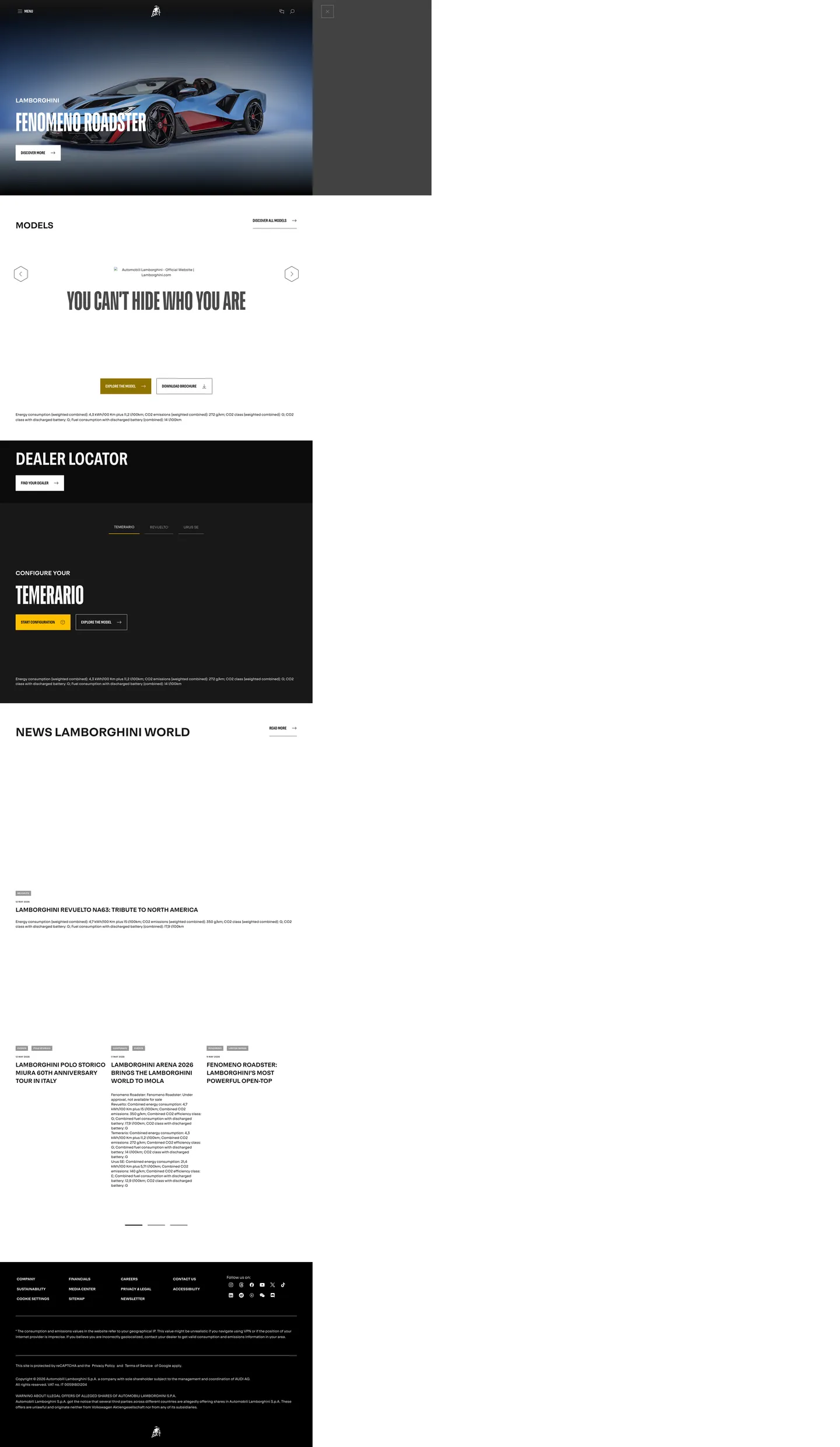
Live at lamborghini.com
A snapshot of the brand in production. Scroll the frame to see the whole page.
Colors
20 colors
Lamborghini's system runs on #ffc000 as its primary voltage, used in 1 of 20 components. Type is set in LamboType across 14 tokens from 10px to 120px, weights 400–700. Shape language is sharp — components average 2px corner radius, favoring crisp rectangles.
Brand & Accent
Sparing, CTA-only voltage · 2
Text
Headlines, body, captions · 2
Other
Specialty colors · 16
Typography
14 type tokens
Set in LamboType across 14 tokens, from 10px to 120px, weights 400–700. Shown in its own stack: where the font isn't installed, the fallback the file names stands in.
- hero-display120px · weight 400 · lh 0.92 · tracking normalThe quick brown fox jumps over the lazy dog
- display-280px · weight 400 · lh 1.13 · tracking normalThe quick brown fox jumps over the lazy dog
- section-title54px · weight 400 · lh 1.19 · tracking normalThe quick brown fox jumps over the lazy dog
- sub-section40px · weight 400 · lh 1.15 · tracking normalThe quick brown fox jumps over the lazy dog
- feature-heading27px · weight 400 · lh 1.37 · tracking normalThe quick brown fox jumps over the lazy dog
- card-title24px · weight 400 · tracking normalThe quick brown fox jumps over the lazy dog
- body-large18px · weight 400 · lh 1.56 · tracking normalThe quick brown fox jumps over the lazy dog
- body16px · weight 400 · lh 1.5 · tracking normalThe quick brown fox jumps over the lazy dog
- button-large16px · weight 400 · lh 1.5 · tracking normalThe quick brown fox jumps over the lazy dog
- button-standard14.4px · weight 700 · lh 1 · tracking 0.2pxThe quick brown fox jumps over the lazy dog
- button-small13px · weight 500 · lh 1.2 · tracking 0.2pxThe quick brown fox jumps over the lazy dog
- caption14px · weight 700 · lh 1.14 · tracking -0.42pxThe quick brown fox jumps over the lazy dog
- label12px · weight 500 · lh 1.83 · tracking 0.96pxThe quick brown fox jumps over the lazy dog
- micro10px · weight 400 · lh 1 · tracking 0.225pxThe quick brown fox jumps over the lazy dog
Layout
Radii and spacing
4 corner radii and 14 spacing values. Shape language: sharp.
Radii
- none0px
- hairline1px
- xs2px
- switch20px
Spacing
- xxs2px
- xs4px
- micro5px
- sm8px
- base10px
- md12px
- lg15px
- base-1616px
- xl20px
- xxl24px
- section-sm32px
- section40px
- section-lg48px
- section-xl56px
Components
20 components
Each rendered from its tokens (color, type, radius, padding) on Lamborghini's own canvas.
- Button Gold Ctabutton-gold-ctaButton Gold Cta
- Button Gold Cta Hoverbutton-gold-cta-hoverButton Gold Cta Hover
- Button Transparent Ghostbutton-transparent-ghostButton Transparent Ghost
- Button Transparent Ghost Hoverbutton-transparent-ghost-hoverButton Transparent Ghost Hover
- Button White Filledbutton-white-filledButton White Filled
- Button Black Filledbutton-black-filledButton Black Filled
- Button Gray Neutralbutton-gray-neutralButton Gray Neutral
- Card Charcoalcard-charcoalCard Charcoal
- Card Dark Ironcard-dark-ironCard Dark Iron
- Top Navtop-navTop Nav
- Nav Menu Labelnav-menu-labelNav Menu Label
- Hero Sectionhero-sectionHero Section
- Hexagonal Pause Buttonhexagonal-pause-buttonHexagonal Pause Button
- Progress Barprogress-barProgress Bar
- Badge Tagbadge-tagBadge Tag
- Switch Toggleswitch-toggleSwitch Toggle
- FooterfooterFooter
- Modal Overlaymodal-overlayModal Overlay
- Link Defaultlink-defaultLink Default
- Link Hoverlink-hoverLink Hover
In use
The system, in use
Lamborghini's tokens on the kind of product it builds.
Build something people actually use.
A short paragraph of marketing copy that previews how the brand's display tier and body tier read together. Two sentences is usually enough.
FAQ
Lamborghini design system FAQ
Common questions about Lamborghini's tokens, components, and how to use this DESIGN.md in your project.
Read next
Related reading
Specs, directories, and component libraries that pair with this design system.
- Browse all design systemsThe full directory of DESIGN.md files on shadcn.io, with live mockups for each.shadcn.io
- Lamborghini official siteThe reference experience — full-viewport video heroes, LamboType in production, the Gold CTA pattern.lamborghini.com (opens in a new tab)
- The DESIGN.md specificationGoogle Labs' open spec for machine-readable design system files — the format this page is built on.github.com (opens in a new tab)
Use it
Use Lamborghini in your project
One machine-readable file. Drop it into Claude, Cursor, or any AI tool that reads DESIGN.md.
Download the DESIGN.md
One machine-readable file: every color, type, radius, spacing, and component token of Lamborghini.
Feed it to your AI tool
Drop it into Claude, Cursor, or GitHub Copilot. The agent writes React components and Tailwind classes that match Lamborghini's visual language.
Reference the tokens directly
Or paste the values into your Tailwind config, CSS variables, or component library: every color, size and radius is a quoted, ready-to-copy value.
Read the full DESIGN.md: overview, rationale, do’s and don’ts
Overview
Lamborghini's website is a cathedral of darkness — a digital stage where jet-black surfaces stretch infinitely and every element emerges from the void like a machine under a spotlight. The page is almost entirely black. Not dark gray, not near-black — true, uncompromising black ({colors.black} — "#000000") that saturates the viewport and refuses to yield. Into this abyss, white type and Lamborghini Gold ({colors.primary} — "#ffc000") are deployed with surgical precision, creating a visual language that feels like walking through a nighttime motorsport event where every surface absorbs light except the things that matter.
The hero is a full-viewport video — dark, cinematic, immersive — showing event footage or vehicle reveals with the Lamborghini bull logo floating ethereally above. The navigation is minimal: a centered bull logo, a "MENU" hamburger on the left, and search/bookmark icons on the right, all rendered in white against the black canvas. There are no borders, no visible nav containers, no background color on the header — just white marks floating in darkness. The overall mood is nocturnal luxury: exclusive, theatrical, and deliberately intimidating. Each section transition is a scroll through darkness into the next revelation.
Typography is the voice of this darkness. LamboType — a custom Neo-Grotesk typeface created by Character Type and design agency Strichpunkt — is used for everything from 120px uppercase display headlines to 10px micro labels. Its distinctive 12-degree angled terminals are inspired by the aerodynamic lines of Lamborghini's super sports cars, and its proportions range from Normal to Ultracompressed width. Headlines SHOUT in uppercase at enormous scales with tight line-heights (0.92 at 120px), creating dense blocks of text that feel stamped from steel. The typeface carries hexagonal geometric DNA — constructed from hexagons, three-armed stars, and circles — that echoes throughout the interface in the hexagonal pause button and UI icons. Built on Bootstrap grid with 68 Element Plus/UI components, the technical infrastructure is substantial beneath the theatrical surface.
Key Characteristics:
- True black (
{colors.black}— "#000000") dominant surfaces with white and gold as the only relief colors. - LamboType custom Neo-Grotesk font with 12-degree angled terminals inspired by aerodynamic car lines.
- Lamborghini Gold (
{colors.primary}— "#ffc000") as the sole accent color — used exclusively for primary CTA buttons. - All-uppercase display typography at extreme scales (120px, 80px, 54px) with tight line-heights (0.92–1.19).
- Full-viewport video heroes with cinematic event/vehicle content.
- Zero border-radius on buttons — sharp, angular, uncompromising rectangles.
- Hexagonal motifs in UI elements (pause button, icon system) echoing brand geometry.
- Bootstrap grid system with Element Plus/UI 68 components underneath.
- Transparent ghost buttons with white borders at 50% opacity as the secondary CTA pattern.
Colors
Primary & Accent
- Lamborghini Gold (
{colors.primary}— "#ffc000"): The signature accent — a warm, saturated amber-gold at rgb(255, 192, 0) used exclusively for primary action buttons ("Discover More", "Tickets", "Start Configuration"). The only chromatic color in the entire interface. - Dark Gold (
{colors.primary-hover}— "#917300"): Hover and pressed state for Gold buttons — rgb(145, 115, 0) that darkens the Gold to signal interaction. - Gold Text (
{colors.gold-text}— "#ffce3e"): A slightly lighter Gold variant at rgb(255, 206, 62) used for inline text accents and highlighted labels. - Pure White (
{colors.white}— "#ffffff"): Primary text color on dark surfaces, logo rendering, nav elements, and light-mode button fills.
Surface & Background
- Absolute Black (
{colors.black}— "#000000"): The dominant surface — page background, hero sections, header, footer, most containers. - Charcoal (
{colors.charcoal}— "#202020"): Elevated dark surface at rgb(32, 32, 32) for cards, panels, and text containers sitting above the black canvas. - Dark Iron (
{colors.dark-iron}— "#181818"): Subtle surface variant at rgb(24, 24, 24) — barely distinguishable from black, used for footer and deep sections. - Overlay Black (
{colors.overlay-black}— "rgba(0,0,0,0.7)"): Semi-transparent overlay for modals and video dimming. - Near White (
{colors.near-white}— "#f8f8f8"): Rare light surface at rgb(248, 248, 248) for content blocks in white-mode sections. - Mist (
{colors.mist}— "#e6e6e6"): Light gray surface for secondary light-mode containers.
Neutrals & Text
- Smoke (
{colors.smoke}— "#f5f5f5"): Secondary text on dark surfaces — slightly softer than pure white. - Graphite (
{colors.graphite}— "#494949"): Dark gray text on light surfaces at rgb(73, 73, 73). - Ash (
{colors.ash}— "#7d7d7d"): Mid-range gray at rgb(125, 125, 125) for muted text, timestamps, and metadata. - Steel (
{colors.steel}— "#969696"): Lighter gray at rgb(150, 150, 150) for disabled text and subtle labels. - Slate (
{colors.slate}— "#666666"): Alternative mid-gray for secondary content. - Iron (
{colors.iron}— "#555555"): Dark mid-gray for body text variants. - Shadow (
{colors.shadow}— "#313131"): Very dark gray for text on dark surfaces where pure white is too strong.
Semantic & Accent
- Cyan Pulse (
{colors.cyan-pulse}— "#29abe2"): Electric blue-cyan at rgb(41, 171, 226) used for informational highlights and interactive feedback. - Link Blue (
{colors.link-blue}— "#3860be"): Medium blue at rgb(56, 96, 190) used as the universal hover state for hyperlinks. - Teal Action (
{colors.teal-action}— "#1eaedb"): Button hover background for transparent/ghost variants at rgb(30, 174, 219).
Gradient System
There are no explicit gradients in the color palette. The dark-to-light progression is achieved through surface layering: "#000000" -> "#181818" -> "#202020" -> "#494949" -> "#7d7d7d". Video heroes use natural atmospheric gradients from the content itself, and the top of full-bleed imagery uses a subtle dark-to-darker edge fade.
Typography
Font Family
The system runs LamboType for everything — a custom Neo-Grotesk typeface by Character Type for Lamborghini's 2024 brand refresh, available in widths from Normal to Ultracompressed and weights from Light (300) to Black. It features 12-degree angled terminals inspired by aerodynamic car geometry, hexagonal construction logic, and support for 200+ languages including Latin, Cyrillic, and Greek. Fallback stack walks Roboto, Helvetica Neue, Arial, sans-serif. Open Sans appears as a system fallback for some button and form contexts. There are no italic variants on the marketing site — the brand voice is always upright.
Hierarchy
| Token | Size | Weight | Line Height | Letter Spacing | Use |
|---|---|---|---|---|---|
{typography.hero-display} | 120px (7.50rem) | 400 | 0.92 | normal | LamboType uppercase, maximum impact |
{typography.display-2} | 80px (5.00rem) | 400 | 1.13 | normal | LamboType uppercase, major section titles |
{typography.section-title} | 54px (3.38rem) | 400 | 1.19 | normal | LamboType uppercase |
{typography.sub-section} | 40px (2.50rem) | 400 | 1.15 | normal | LamboType uppercase |
{typography.feature-heading} | 27px (1.69rem) | 400 | 1.37 | normal | LamboType uppercase |
{typography.card-title} | 24px (1.50rem) | 400 | — | normal | LamboType card titles |
{typography.body-large} | 18px (1.13rem) | 400 | 1.56 | normal | LamboType body, mixed case and uppercase variants |
{typography.body} | 16px (1.00rem) | 400/700 | 1.50 | normal/0.16px | LamboType primary body text |
{typography.button-large} | 16px (1.00rem) | 400 | 1.50 | normal | Gold CTA buttons |
{typography.button-standard} | 14.4px (0.90rem) | 300/700 | 1.00 | 0.14–0.2px | LamboType uppercase, ghost buttons |
{typography.button-small} | 13px (0.81rem) | 300/500 | 1.20 | 0.13–0.2px | LamboType compact button variant |
{typography.caption} | 14px (0.88rem) | 600/700 | 1.14–1.50 | -0.42px | LamboType uppercase, negative tracking |
{typography.label} | 12px (0.75rem) | 400/500 | 1.83 | 0.96px | LamboType uppercase badges and micro labels |
{typography.micro} | 10px (0.63rem) | 400 | 1.00–2.00 | 0.225px | LamboType uppercase, smallest text |
Principles
- ALL-CAPS is the default voice: Display and feature headings are universally uppercase. This creates a shouting, commanding tone that matches the brand's aggression.
- Extreme scale range: From 120px heroes to 10px micro labels — a 12:1 ratio that creates dramatic visual hierarchy.
- Tight line-heights at scale: Display sizes use 0.92–1.19 line-height, creating dense, compressed blocks of type that feel stamped rather than typeset.
- Weight 400 dominates: Unlike many design systems that use bold for emphasis, Lamborghini's regular weight carries the headlines — the typeface itself is so distinctive it doesn't need weight variation.
- Negative tracking on captions: -0.42px letter-spacing on 14px captions creates a compressed, technical aesthetic.
- Positive tracking on micro text: +0.225px at 10px ensures legibility at the smallest sizes.
- Single typeface discipline: LamboType handles everything — the 12-degree angled terminals and hexagonal geometry provide visual coherence across all sizes.
Layout
Spacing System
- Base unit: 8px.
- Tokens:
{spacing.xxs}2px ·{spacing.xs}4px ·{spacing.micro}5px ·{spacing.sm}8px ·{spacing.base}10px ·{spacing.md}12px ·{spacing.lg}15px ·{spacing.base-16}16px ·{spacing.xl}20px ·{spacing.xxl}24px ·{spacing.section-sm}32px ·{spacing.section}40px ·{spacing.section-lg}48px ·{spacing.section-xl}56px. - Button padding: 16px on ghost buttons; 24px on Gold accent CTAs.
- Section padding: 48–56px vertical, 40px horizontal.
- Small spacing: 2–5px for fine adjustments — badge padding and border spacing.
Grid & Container
- Framework: Bootstrap grid system (container + row + col).
- Max width: 1440px at the largest breakpoint.
- Columns: Standard 12-column Bootstrap grid.
- Full-bleed: Hero sections break out of the grid to fill viewport edge to edge.
- Content areas: Centered within 1200px max-width containers.
Whitespace Philosophy
Lamborghini uses darkness as whitespace. The generous black expanses between content blocks serve the same function as white space in a light design — creating breathing room that elevates each element to the status of exhibit. A model name floating in the middle of a black viewport has the same visual weight as a gallery piece on a white wall. The absence of color IS the design.
Border Radius Scale
| Value | Context |
|---|---|
| 0px | Default for everything — buttons, cards, containers, images |
| 1px | Subtle span elements |
| 2px | Badges, close buttons, cookie elements — barely perceptible |
| 20px | Toggle switches only — the sole rounded element |
Elevation
The system has no traditional shadow stack. On a black canvas, drop shadows are invisible — instead, elevation is achieved through surface color layering.
| Level | Treatment | Use |
|---|---|---|
| Level 0 (Abyss) | {colors.black} — "#000000" flat | Page background, deepest layer |
| Level 1 (Surface) | {colors.dark-iron} — "#181818" or {colors.charcoal} — "#202020" | Cards, content panels, elevated sections |
| Level 2 (Overlay) | {colors.overlay-black} — "rgba(0,0,0,0.7)" | Modal backdrops, video dimming |
| Level 3 (Fog) | rgba(0,0,0,0.5) | Lighter overlays, hover states |
| Level 4 (Mist) | rgba(0,0,0,0.25) | Subtle depth hints |
Shadow Philosophy
Lamborghini achieves depth through surface color layering rather than shadows. On a black canvas, traditional drop shadows are invisible — instead, the system creates elevation by shifting from absolute black to progressively lighter dark grays: "#000000" -> "#181818" -> "#202020" -> "#494949". This "darkness gradient" approach inverts the traditional shadow model — elevated elements are literally lighter than their surroundings.
Decorative Depth
- Full-bleed video provides atmospheric depth through cinematic lighting.
- The hexagonal pause button floats with a thin white outline stroke.
- Progress bars at hero section bottoms create a subtle horizon line.
- No gradients, glows, or blur effects on UI elements — the photography provides all visual richness.
Components
Buttons
All buttons use zero border-radius — sharp, angular rectangles that echo the aggressive lines of Lamborghini vehicles.
button-gold-cta — The primary action. Gold fill ({colors.primary} — "#ffc000"), black text, 24px padding, 16px label at weight 400, 0px radius, no border. Hover flips to Dark Gold ({colors.primary-hover} — "#917300"). Used for "Discover More", "Tickets", "Start Configuration".
button-transparent-ghost — The secondary action on dark backgrounds. Transparent fill, white text, 1px white border, 16px padding, 50% opacity at rest. Hover state shifts to Teal Action ({colors.teal-action} — "#1eaedb") background at 70% opacity. Focus adds a 1px black inner border and 2px black outline.
button-white-filled — Light-mode primary. White fill, Charcoal text ({colors.charcoal} — "#202020"), no border. Used for CTAs on dark sections where Gold isn't appropriate.
button-black-filled — Inverted CTA on light sections. Black fill, Charcoal text. Used sparingly.
button-gray-neutral — Subtle action. Steel fill ({colors.steel} — "#969696"), Charcoal text. Used for secondary/tertiary actions and badge-like buttons.
Cards & Containers
card-charcoal — Background at {colors.charcoal} ("#202020") on the black canvas, 0px radius, completely sharp corners. Bottom border 0px 1px {colors.charcoal} for section dividers. Minimal shadow — uses overlay opacity for depth. Content is full-bleed photography plus overlaid text in white.
card-dark-iron — Subtler variant on {colors.dark-iron} ("#181818"), used for footer-adjacent sections where the elevation lift should be barely perceptible.
Navigation
top-nav — Transparent background (inherits black page background), fixed to top, floats above content. No visible borders or shadows — elements float in the darkness. Centered bull logo, "MENU" hamburger with icon on the left, search icon and bookmarks icon on the right, all in white.
nav-menu-label — The "MENU" text label in {typography.button-standard} (14.4px uppercase weight 400) accompanies the hamburger icon.
Hero
hero-section — Full-viewport video sections at 100vh with cinematic event/vehicle footage. Background is {colors.black} while the video loads. Display headlines render in {typography.hero-display} (120px uppercase weight 400).
hexagonal-pause-button — Video control with a hexagonal outline shape (matching the brand's geometric DNA from the typeface), positioned bottom-right of hero sections, 1px white border, transparent fill, approximately 48px diameter.
progress-bar — Thin 1px white line at the bottom of hero sections indicating video/slide progress.
Badges
badge-tag — Background {colors.steel} ("#969696"), white text, 8px padding, 10px font size, 2px border-radius — tiny metallic pills.
Inputs & Forms
Minimal form presence on the marketing site. switch-toggle is the only rounded element — 20px border-radius, 1px "#dddddd" border. Cookie banner inputs use white text on black with {colors.ash} borders.
Footer
footer — Background {colors.dark-iron} ("#181818"), white text, full-width section sitting at the bottom of the page. No visible top border — separation is achieved through the surface tone shift from "#000000" to "#181818".
Image Treatment
- Hero: Full-viewport video sections (100vh) with cinematic event/vehicle footage.
- Event photography: Full-bleed aerial shots of Lamborghini Arena events.
- Vehicle imagery: High-contrast studio shots on dark backgrounds, full width.
- Aspect ratios: Predominantly 16:9 and wider for cinematic feel.
- Dark gradient overlays: Subtle darkening at top and bottom edges of video to ensure text legibility.
Links
link-default — White text on dark surfaces, no underline. link-hover flips text to {colors.link-blue} ("#3860be") — the universal hover state across all text colors.
Responsive Behavior
| Name | Width | Key Changes |
|---|---|---|
| Mobile Small | < 425px | Single column, reduced type scale, stacked buttons |
| Mobile | 425–576px | Single column, hamburger nav, hero text approximately 40px |
| Tablet Small | 576–768px | 2-column grid begins, padding adjusts |
| Tablet | 768–1024px | 2-column layout, expanded hero, vehicle cards side by side |
| Desktop | 1024–1280px | Full navigation, 3+ column grids, display text at 80px |
| Desktop Large | 1280–1440px | Full layout, hero at 120px display, max-width containers |
| Wide | > 1440px | Content centered, margins expand, hero fills viewport |
Touch Targets
- Gold CTA buttons: 48px+ minimum height with 24px padding (exceeds WCAG 44×44px).
- Ghost buttons: 48px+ height with 16px padding.
- Hamburger menu: large touch target, approximately 48px square.
- Hexagonal pause button: approximately 48px diameter.
Collapsing Strategy
- Navigation: Always hamburger-based ("MENU" + icon) — no horizontal nav expansion on any breakpoint.
- Hero video: Maintains full-viewport height across all breakpoints, adjusting
object-fit. - Display type: Scales from 120px (desktop) to 80px (tablet) to 54px/40px (mobile).
- Button layout: Side by side on desktop, stacks vertically on mobile.
- Grid columns: 3-column to 2-column to 1-column progression.
- Section spacing: Reduces from 56px to 40px to 24px vertical padding.
Image Behavior
- Hero videos use
object-fit: coverto maintain cinematic framing at all sizes. - Vehicle images scale within their containers with maintained aspect ratios.
- Event photography crops to viewport width on narrow screens.
- Background images darken at edges to maintain text contrast on all viewports.
Known Gaps
- Hover micro-interactions: Lamborghini's interactions are strictly color-only (background and opacity shifts) with no scale or translate animations — exact easing curves and durations were not captured.
- Form input states: The marketing site has minimal forms; full input error states, focus rings, and validation styling are not documented beyond the cookie banner input pattern.
- Loading and skeleton states: Not visible on the extracted surfaces — the system leans on full-viewport video heroes that mask any loading indicators.
- Light-mode coverage: The "white-mode" sections using
{colors.near-white}and{colors.mist}appear rarely and were not exhaustively documented — the dominant pattern is dark-on-dark. - Configurator UI: The vehicle configurator surface (Start Configuration flow) carries additional component patterns — color swatches, option pickers, summary cards — that are not captured in this DESIGN.md.
- Sub-brand surfaces: Squadra Corse (racing), Lamborghini Arena (events), and Collezione (lifestyle) sub-brands may carry palette or typography overrides not captured here.
Automotive
More systems like this
More DESIGN.md files in Automotive.
Pricing
Build it with Pro
The DESIGN.md files are free. Pro adds 6,000+ blocks, premium templates and the MCP server, so your AI editor builds in your system for you.
4.9/5 out of 5 · 150+ reviewsfrom 150+ founders and developers.
Billing
Billed once a year in USD. Cancel anytime.
- How many people can use the license.
- Client work, SaaS products and anything you charge for.
- Production-ready React sections: hero, pricing, features, dashboards and more.
- Complete multi-page sites you can ship as they are.
- React icons from every major library, installable with one command.
- Presets that restyle every block, in light and dark.
- Lets your AI editor search, preview and install blocks for you.
- Priority requests are answered first.
Individual
For personal projects & open source
$32instead of $49/mo
$389 billed yearly
- Seats: 1 seat
- Commercial use: Personal & open source only
- Pro blocks: 6,000+ blocks
- Templates: All 14 templates
- React icons: 294k+ icons
- Themes: All 59 themes
- MCP server: Basic usage
- Support: Standard
Team
Most popularFor freelancers, agencies & startups
$66instead of $99/mo
$789 billed yearly · ≈ $13/dev/mo
- Seats: Up to 5 seats
- Commercial use: Included
- Pro blocks: 6,000+ blocks
- Templates: All 14 templates
- React icons: 294k+ icons
- Themes: All 59 themes
- MCP server: High usage
- Support: Priority
Organization
For companies with larger teams
$132instead of $199/mo
$1,589 billed yearly
- Seats: Unlimited seats
- Commercial use: Included
- Pro blocks: 6,000+ blocks
- Templates: All 14 templates
- React icons: 294k+ icons
- Themes: All 59 themes
- MCP server: Unlimited usage
- Support: Priority
Billed once a year in USD. Cancel anytime.
Individual
For personal projects & open source
$32instead of $49/mo
$389 billed yearly
- How many people can use the license.Seats: 1 seat
- Client work, SaaS products and anything you charge for.Commercial use: Personal & open source only
- Production-ready React sections: hero, pricing, features, dashboards and more.Pro blocks: 6,000+ blocks
- Complete multi-page sites you can ship as they are.Templates: All 14 templates
- React icons from every major library, installable with one command.React icons: 294k+ icons
- Presets that restyle every block, in light and dark.Themes: All 59 themes
- Lets your AI editor search, preview and install blocks for you.MCP server: Basic usage
- Priority requests are answered first.Support: Standard
Team
Most popularFor freelancers, agencies & startups
$66instead of $99/mo
$789 billed yearly · ≈ $13/dev/mo
Everything in Individual, plus
- How many people can use the license.Seats: Up to 5 seats
- Client work, SaaS products and anything you charge for.Commercial use: Included
- Lets your AI editor search, preview and install blocks for you.MCP server: High usage
- Priority requests are answered first.Support: Priority
Organization
For companies with larger teams
$132instead of $199/mo
$1,589 billed yearly
Everything in Team, plus
- How many people can use the license.Seats: Unlimited seats
- Lets your AI editor search, preview and install blocks for you.MCP server: Unlimited usage
- Secure checkout via Stripe
- Code lives in your repo
- Keep what you've shipped if you cancel
- License terms
Your system, built for you
Every block, template and icon, installed by your AI agent in your design system. The DESIGN.md files stay free.