Kia Design System
Kia's marketing system as a DESIGN.md file. Near-black ink and KiaSignatureBold display from the post-2021 rebrand, square radii, monochromatic chrome, 15 components. For React, Next.js, and AI coding tools.
Add shadcn.io to your AI agent. · Pro It installs blocks, icons and templates in your design system from a prompt, with Pro.
Set up MCP- Primary
- #000000
- Typeface
- Almoni
- Shape
- Sharp
- Base radius
- 0px
- Colors
- 5
- Type tokens
- 12
- Components
- 15
- Spacing values
- 10
About
About Kia DESIGN.md
Curated by Dov Azencot · Updated May 19, 2026 · Source kia.com (opens in a new tab)
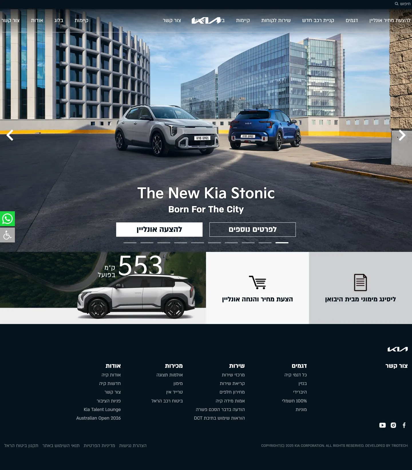
Kia's marketing site shows what a complete brand reset looks like in the automotive category. The 2021 rebrand — new angular wordmark, new sans-serif display family (KiaSignatureBold), new philosophy ("Movement that inspires") — runs all the way through to the chrome on kia-israel.co.il. The captured page is monochromatic by design: a near-black ink color and pure white carry the entire surface, with zero accent voltage above the fold. The hero is a full-bleed photograph of two new Kia vehicles on an urban-rooftop carpark with the building's grid as the visual rhythm; a 24px KiaSignatureBold "The New Kia Stonic" headline sits in white over the lower-left, with a single 1px-outline CTA pill beneath. Below that, a 50px range-counter "553" reads as an oversize editorial pull-quote — the largest typographic moment in the system.
The DESIGN.md file packages the post-rebrand system into a machine-readable spec for React and AI tools. Inside: 5 colors tokens dominated by the near-black ink (290 occurrences) and white (121), with a hairline gray and an active-state aaa-gray rounding out the palette. The full extraction surfaces 14 additional WordPress-preset colors that the Kia template inherits but never renders. Typography pairs KiaSignatureBold (the proprietary geometric display family from the rebrand) with Almoni (the regional Hebrew/Latin sans used for body) at modest sizes — 16-18px body, 24px hero, 50px range-counter editorial. The radius scale is essentially zero: every surface in the captured chrome renders square corners. 15 components cover the hero photograph band, the range-counter overlay, the outline CTA, the dropdown chip, the dark footer, and the accessibility-tool floating button.
Feed this file to Claude or Cursor and it reproduces Kia's specific moves: near-black instead of pure black, square corners across every surface, monochromatic chrome without an accent CTA, KiaSignatureBold for Latin display, oversize editorial range-counter as the loudest typographic moment. The token references resolve cleanly. The one move worth borrowing only if your brand has reset its identity toward design-forward positioning: the zero-radius shape language. Most automotive sites soften every corner to read "approachable." Kia post-2021 rejects that convention — the squared corners read as graphic-design-led rather than dealership-friendly, and the brand voice shifts toward Bauhaus-poster instead of family-brochure.
What makes it distinct
5
- Near-black instead of pure blackevery text and border tone is #05141f, a deep slate-navy that softens the high-contrast chrome
- KiaSignatureBold for displaythe proprietary geometric display family from the 2021 rebrand, paired with Almoni for regional body type
- Zero-radius shape languagesquare cards, square buttons, square photograph crops; the post-rebrand identity rejects the soft-corner conventions of friendly automotive
- Monochromatic chromeink and white carry the entire system, no accent voltage, no chromatic CTA above the fold
- Asymmetric photograph + range-counter bandfull-bleed vehicle photograph paired with an oversize 50px range-counter overlay drives the rhythm
kia.com
Live at kia.com
A snapshot of the brand in production. Scroll the frame to see the whole page.
Colors
5 colors
Kia's system anchors on #000000 (pure-black) as its primary color. Type is set in Almoni across 12 tokens from 12.8px to 50px, weights 400–700. Shape language is sharp — components average 0px corner radius, favoring crisp rectangles.
Surface
Page and card backgrounds · 1
Text
Headlines, body, captions · 2
Borders & Hairlines
Dividers, outlines, rules · 1
Other
Specialty colors · 1
Typography
12 type tokens
Set in Almoni across 12 tokens, from 12.8px to 50px, weights 400–700. Shown in its own stack: where the font isn't installed, the fallback the file names stands in.
- display-xl50px · weight 700 · lh 56pxThe quick brown fox jumps over the lazy dog
- display-md36px · weight 400 · lh 50.4pxThe quick brown fox jumps over the lazy dog
- hero-heading24px · weight 700 · lh 32pxThe quick brown fox jumps over the lazy dog
- heading-md30px · weight 400 · lh 36pxThe quick brown fox jumps over the lazy dog
- heading-sm26px · weight 400 · lh 32pxThe quick brown fox jumps over the lazy dog
- body-lg24px · weight 400 · lh 18pxThe quick brown fox jumps over the lazy dog
- body-md20px · weight 400 · lh 18pxThe quick brown fox jumps over the lazy dog
- body-sm18px · weight 400 · lh 25.2pxThe quick brown fox jumps over the lazy dog
- body-xs16px · weight 400 · lh 18pxThe quick brown fox jumps over the lazy dog
- body-emphasis16px · weight 700 · lh 32pxThe quick brown fox jumps over the lazy dog
- caption12.8px · weight 400 · lh 12.8pxThe quick brown fox jumps over the lazy dog
- label-uppercase14px · weight 400 · lh 14pxThe quick brown fox jumps over the lazy dog
Layout
Radii and spacing
2 corner radii and 10 spacing values. Shape language: sharp.
Radii
- none0px
- full9999px
Spacing
- xxs3px
- xs5px
- sm10px
- base15px
- md20px
- lg21px
- xl30px
- 2xl40px
- 3xl45px
- 4xl80px
Components
15 components
Each rendered from its tokens (color, type, radius, padding) on Kia's own canvas.
- Button Primarybutton-primaryButton Primary
- Button Primary Hoverbutton-primary-hoverButton Primary Hover
- Button Outlinebutton-outlineButton Outline
- Top Navtop-navTop Nav
- Nav Linknav-linkNav Link
- Brand Markbrand-markBrand Mark
- Hero Bandhero-bandHero Band
- Hero Headinghero-headingHero Heading
- Range Counterrange-counterRange Counter
- Section Headingsection-headingSection Heading
- Body Paragraphbody-paragraphBody Paragraph
- Card Actioncard-actionCard Action
- Pagination Dotpagination-dotPagination Dot
- Accessibility Toggleaccessibility-toggleAccessibility Toggle
- FooterfooterFooter
In use
The system, in use
Kia's tokens on the kind of product it builds.
Build something people actually use.
A short paragraph of marketing copy that previews how the brand's display tier and body tier read together. Two sentences is usually enough.
FAQ
Kia design system FAQ
Common questions about Kia's tokens, components, and how to use this DESIGN.md in your project.
Read next
Related reading
Specs, directories, and component libraries that pair with this design system.
- Browse all design systemsThe full directory of DESIGN.md files on shadcn.io, with live mockups for each.shadcn.io
- Kia — official siteKia's public marketing site — the source of truth for the live tokens captured in this file.kia.com (opens in a new tab)
- The DESIGN.md specificationGoogle Labs' open spec for machine-readable design system files — the format this page is built on.github.com (opens in a new tab)
Use it
Use Kia in your project
One machine-readable file. Drop it into Claude, Cursor, or any AI tool that reads DESIGN.md.
Download the DESIGN.md
One machine-readable file: every color, type, radius, spacing, and component token of Kia.
Feed it to your AI tool
Drop it into Claude, Cursor, or GitHub Copilot. The agent writes React components and Tailwind classes that match Kia's visual language.
Reference the tokens directly
Or paste the values into your Tailwind config, CSS variables, or component library: every color, size and radius is a quoted, ready-to-copy value.
Read the full DESIGN.md: overview, rationale, do’s and don’ts
Overview
Kia's marketing site shows what a complete brand reset looks like. Monochromatic by design. Where Toyota holds its signature red as a hairline-and-text accent and Honda carries a deep navy as the load-bearing chrome with a sky-blue accent in the footer, Kia post-2021 omits accent voltage entirely. The dominant chrome color is a near-black slate-navy ({colors.ink} — #05141f) that appears 290 times across the captured page (144 as text, 141 as border, 5 as background). The only other surface color is white. There is no brand-red, no brand-blue, no chromatic CTA pill anywhere above the fold. The hero CTA is a 1px white outline on photograph; the secondary CTAs sit as near-black text on white with hairline outlines.
The system's shape language reinforces the reset. Zero-radius geometry. Every surface in the captured chrome — vehicle cards, CTA pills, photograph crops, footer tiles, dropdown chrome — renders square corners. The pre-2021 Kia chrome used soft-corner conventions typical of friendly family-automotive marketing; the 2021 rebrand reset the brand toward design-forward, graphic-led positioning, and the square corners signal that shift directly. Compared to Toyota's binary 8px-card / 50px-pill scale, Honda's softer 4px-card / 33px-pill scale, and even Tesla's slightly-softened industrial corners, Kia's zero-radius treatment reads as Bauhaus-poster — the corners do real semantic work, telling the visitor this is not the same Kia.
Typography pairs KiaSignatureBold (the proprietary geometric display family from the rebrand, the same letterforms that built the new angular wordmark) with Almoni (the regional Hebrew/Latin sans used for body and utility text on the Israel marketplace site). The hero h2 "The New Kia Stonic" sits at 24px in KiaSignatureBold over a photograph; the oversize range-counter "553" sits at 50px in KiaSignatureBold and is the loudest typographic moment in the system — an editorial pull-quote rendered as a vehicle range specification. The pairing — graphic-led display + utility body — does the work that a Bauhaus poster does on a museum-shop wall: it tells you the brand is taking itself seriously as a designed object.
Key Characteristics:
- Near-black ink
{colors.ink}(#05141f) carries 290 occurrences as text and border — the load-bearing chrome color. - Monochromatic chrome — ink and white only above the fold, with no accent voltage and no chromatic CTA pill.
- KiaSignatureBold for Latin display (the proprietary geometric family from the 2021 rebrand) paired with Almoni for body.
- Zero-radius shape language — every card, button, photograph crop, and footer tile sits at
{rounded.none}0px. - Oversize range-counter "553" at 50px / KiaSignatureBold is the loudest typographic moment — an editorial pull-quote treatment for a vehicle specification.
- Hero band is a full-bleed urban-rooftop photograph of two new Kia vehicles; the building grid behind drives the visual rhythm.
- WordPress-preset colors leak into the extraction (vivid red, vivid green, vivid orange, vivid purple) but render zero times on the captured chrome — they ship with the block editor template, not the Kia rebrand palette.
- Hairline gray
{colors.hairline}(#aaaaaa) appears only on the accessibility-toggle floating button — there is no second border tone in the chrome.
Colors
Brand
The captured chrome has no brand-layer chromatic accent. The post-2021 Kia identity treats the brand mark itself (the new angular wordmark) and KiaSignatureBold display type as the entire brand signal, with ink and white doing every chromatic job. This is the system's strongest distinguishing move.
Surface
- Canvas (
{colors.canvas}— #ffffff): frequency 121 (57 text, 6 bg, 58 border). Wired as--wp--preset--color--white. The page floor between the dark hero band and the dark footer — every editorial section below the hero sits on pure white. - Pure Black (
{colors.pure-black}— #000000): frequency 3. Wired as--wp--preset--color--black. A rare third tone used only on the privacy-banner border. The chrome uses{colors.ink}rather than pure black for the dark surfaces.
Text
- Ink (
{colors.ink}— #05141f): frequency 290 (144 text, 141 border, 5 background). The load-bearing chrome color — vehicle-card text, footer link rows, hairline outlines on cards and dropdowns, the hero-band background fill, and the footer background fill. A deep slate-navy with a faint blue cast that ties to the photographic blue-hour sky tones in the hero band; never pure black. - Ink Soft (
{colors.ink-soft}— #333333): frequency 62 (31 text, 31 border). A secondary text tone one step softer than the ink — used for body paragraphs that need to read slightly recessed against the white canvas.
Hairline
- Hairline (
{colors.hairline}— #aaaaaa): frequency 3 (1 bg, 2 border). Used only on the accessibility-toggle floating button as the fill. There is no second border tone in the captured chrome; structural hairline duty falls entirely to{colors.ink}(#05141f) at 1px.
Inherited WordPress presets (absent from chrome)
The page CSS exposes 14 WordPress block-editor preset colors via --wp--preset--color--* variables — vivid red, vivid green, vivid orange, vivid purple, pale pink, pale cyan blue, luminous vivid amber, and several others. None of them render a single pixel on the captured chrome. They ship with the WordPress block editor template Kia's marketing site is built on, not with the Kia rebrand palette. Listing them here helps the extraction reader understand why the JSON shows 19 clustered colors when the visual chrome has 5.
Typography
Font Family
The system runs two families. KiaSignatureBold is the proprietary geometric display family released with the 2021 rebrand — the same letterforms that built the new angular Kia wordmark. Almoni (and AlmoniBold) is the regional Hebrew/Latin sans used for body and utility text on the Israel marketplace surface. Fallbacks walk sans-serif.
The pairing is the post-rebrand brand voice: graphic-led display family carrying every "look at me" typographic moment, neutral utility sans carrying the body work. There is no monospace tier, no serif tier, and no third sans.
Hierarchy
| Token | Size | Weight | Line Height | Use |
|---|---|---|---|---|
{typography.display-xl} | 50px | 700 (KiaSignatureBold) | 56px | Oversize range-counter ("553") |
{typography.display-md} | 36px | 400 (AlmoniBold) | 50.4px | Major section displays |
{typography.heading-md} | 30px | 400 (AlmoniBold) | 36px | Section h2 headings |
{typography.heading-sm} | 26px | 400 (AlmoniBold) | 32px | h3 sub-section emphasis |
{typography.hero-heading} | 24px | 700 (KiaSignatureBold) | 32px | Hero h2 ("The New Kia Stonic") |
{typography.body-lg} | 24px | 400 (AlmoniBold) | 18px | Promotional emphasis blocks |
{typography.body-md} | 20px | 400 (Almoni) | 18px | Default running text |
{typography.body-sm} | 18px | 400 (Almoni) | 25.2px | Nav links, card body |
{typography.body-xs} | 16px | 400 (Almoni) | 18px | Secondary captions, button labels |
{typography.body-emphasis} | 16px | 700 (Almoni) | 32px | Emphasized body callouts |
{typography.caption} | 12.8px | 400 (Almoni) | 12.8px | Legal disclaimers, footnotes |
{typography.label-uppercase} | 14px | 400 (Almoni) | 14px (uppercase) | Eyebrow labels above section headings |
Principles
The 50px range-counter is the largest typographic moment in the system and the only token that uses KiaSignatureBold at display tier. The 24px hero h2 — much smaller than a conventional automotive hero — is also KiaSignatureBold, treating the headline as a graphic element rather than a marketing shout. Every other tier sits in Almoni, reading as neutral utility chrome that lets the KiaSignatureBold moments carry the brand voice on their own.
Almoni-on-AlmoniBold is the binary inside the utility tier. Body sits at AlmoniBold for the slightly heavier promotional callouts and at Almoni Regular for default running text. There is no Demi or Medium intermediate weight — the system runs on two utility weights plus the two KiaSignatureBold display moments.
Note on Font Substitutes
KiaSignatureBold is proprietary to the post-2021 Kia brand identity and is not licensed for outside use. The closest open-source substitutes are Industry (a contemporary geometric grotesk) and Eurostile (a classic squared geometric). Manrope at weight 800 transfers reasonably for editorial display moments at the 50px tier. For Almoni, Heebo handles Hebrew + Latin pairings; Frank Ruhl Libre offers a similar humanist character. Avoid Helvetica as a substitute — the neo-grotesque proportions read distinctly different from Almoni's slightly-warmer letterforms.
Layout
Spacing System
- Base unit: 5px (with 10px and 20px as the dominant module steps).
- Tokens:
{spacing.xxs}3px ·{spacing.xs}5px ·{spacing.sm}10px ·{spacing.base}15px ·{spacing.md}20px ·{spacing.lg}21px ·{spacing.xl}30px ·{spacing.2xl}40px ·{spacing.3xl}45px ·{spacing.4xl}80px. - Hero band padding:
80px 0px 45px(1 occurrence) — generous vertical breathing room around the hero h2 and the range-counter overlay. - Card padding:
{spacing.md}(20px) and15px 30pxfor buttons (2 occurrences). - Footer padding:
40px 0px 21pxand0px 0px 40pxdivide the footer link rows from the legal-disclaimer band.
Grid & Container
- Max content width: ~1280px on the editorial sections; the hero photograph runs full-bleed.
- Hero band: edge-to-edge urban-rooftop photograph of two new Kia vehicles (Stonic and Sportage) with the 24px hero h2 and 1px outline CTA overlaid on the lower-center.
- Range-counter band: an asymmetric 2-column layout pairing the photograph of a single Kia hybrid with the oversize 50px range-counter "553" rendered as a graphic element rather than a headline.
- Vehicle cards: 3-column grid below the fold showing model categories (Cars, EVs, Hybrid, SUVs) with each card a square-cropped vehicle photograph plus a near-black label.
- Footer: 5-column grid for site navigation columns, with the brand mark anchoring the right side (RTL layout).
Rhythm
The page alternates between dark photographic bands and light editorial bands but with much less negotiation than Toyota or Honda — the contrast is hard, the transitions are abrupt, and the absence of accent voltage means each band has to carry its tonal job alone. The hero is dark photograph + white text. The range-counter band is dark photograph + oversize white display. The vehicle-category grid is white + near-black text. The footer is dark + white text. The rhythm reads as graphic-design layout rather than marketing scroll — square crops, hard transitions, no softening.
Elevation
The system has essentially no shadow tier. The captured page has 1 shadow occurrence (a soft drop on the accessibility-toggle floating button). Every other surface depends on the hard ink-on-white or white-on-ink contrast for figure-ground. There are no hairline borders softening the card edges; cards either sit hard against the white canvas or sit hard inside the dark hero band.
- Flat (no shadow): hero, range-counter band, vehicle-category grid, footer — 99.9% of surfaces.
- Single shadow: the accessibility-toggle floating button carries a 2px soft drop, the only elevation effect in the chrome.
- Hard-contrast layering: the system uses
{colors.ink}(#05141f) vs{colors.canvas}(#ffffff) full-luminance contrast everywhere a depth signal is needed.
Shapes
The radius scale is essentially zero:
{rounded.none}0px — every card, every button, every photograph crop, every footer tile, every dropdown chrome surface. The dominant value across the entire captured chrome.{rounded.full}9999px — the pagination dots and the accessibility-toggle floating button (50% radius rendered as full circle on square elements).
There is no 4px tier, no 8px tier, no pill tier. The system is binary: either a surface is fully square (every content surface and CTA) or it is a circle (pagination dots and the accessibility toggle). The square-corner discipline is the post-rebrand identity's most-visible chrome decision and the one that most-clearly distinguishes Kia from its mainstream-automotive peers.
Components
button-primary — White {colors.canvas} fill, near-black text, {rounded.none} 0px radius, 15x30px padding, 48px height. The primary action below the fold ("הצעת מחיר והנחה אונליין" / "Online Price Quote & Discount") sits as a square white block on white with a 1px ink border. No corner softening anywhere.
button-primary-hover — Background flips to {colors.ink} with white text — full luminance inversion. The single chromatic moment when the user reaches for the action.
button-outline — Transparent fill with white text and a 1px white border, {rounded.none} 0px radius. The hero CTA — sits over the photograph as a white-on-image outline. The post-rebrand identity's signature CTA treatment.
top-nav — Dark {colors.ink} surface, white text, 60px height. Houses the new angular Kia wordmark centered ({component.brand-mark}), the section links flanking it ("דגמים", "קניית רכב חדש", "שירות לקוחות", "קיימות", "בלוג", "אודות"), and the "צור קשר" Contact link on the right. The dark nav-on-dark-photograph treatment is unusual — most automotive sites use a light nav floating over dark photography.
nav-link — Transparent background, white text in {typography.body-sm} (18px / Almoni Regular). 10x15px padding. The active link gets a 2px white underline.
brand-mark — The new 2021 Kia angular wordmark rendered in white on the dark nav band. The single most-prominent appearance of the brand signal on the page.
hero-band — Edge-to-edge urban-rooftop photograph showing two new Kia vehicles on a carpark with the building grid behind. 80px top, 45px bottom, full-width padding. Holds the hero h2 in {typography.hero-heading} (24px / KiaSignatureBold) and a single 1px-outline CTA pill overlaid on the lower-center.
hero-heading — White text on the transparent hero photograph, {typography.hero-heading} (24px / KiaSignatureBold / 32px line-height). Notably small for an automotive hero — the system treats the headline as a graphic element rather than a marketing shout.
range-counter — White text on the photographic band, {typography.display-xl} (50px / KiaSignatureBold). The oversize "553" range-counter is the loudest typographic moment in the system — an editorial pull-quote treatment for a vehicle specification (kilometers of range per charge).
section-heading — Near-black text on white, {typography.heading-md} (30px / AlmoniBold). Used for vehicle-category section labels below the fold.
body-paragraph — Default near-black running-text at {typography.body-sm} (18px / Almoni Regular / 25.2px line-height).
card-action — White surface with a 1px near-black border, {rounded.none} 0px radius, 20px padding. Holds the secondary CTAs below the range-counter band ("הצעת מחיר והנחה אונליין" with a shopping-cart icon and "ליסינג מימוני מבית היבוא" with a document icon). The cards read as square graphic blocks rather than soft action surfaces.
pagination-dot — White {colors.canvas} circle, {rounded.full} radius. Sits in a row below the hero photograph and marks the active slide. The inactive dots use a lower-opacity white fill.
accessibility-toggle — {colors.hairline} (#aaaaaa) circular floating button positioned bottom-left, holding the accessibility-tools icon. The single non-monochromatic element in the captured chrome and the single rounded shape (besides pagination dots).
footer — Dark {colors.ink} band — the second dark surface besides the hero photograph. White text in {typography.body-xs} (16px / Almoni Regular), 40x0x21 vertical padding. Houses 5 navigation columns and the legal-disclaimer row.
Do's and Don'ts
Do carry the entire chrome with {colors.ink} (#05141f) and {colors.canvas} (#ffffff). The system's strongest move is the monochromatic chrome — adding an accent CTA pill in red, blue, or any chromatic tone collapses the post-rebrand identity back toward the pre-2021 friendly-family voice the brand explicitly moved away from.
Do use {rounded.none} 0px on every content and action surface. The square corners are doing real semantic work — they tell the visitor this is the post-2021 Kia, not the previous generation. Softening to 4px or 8px reads as a regression to the pre-rebrand chrome.
Do sit display headings in KiaSignatureBold. The proprietary geometric family carries the brand voice on its own — the 24px hero h2 and the 50px range-counter are both KiaSignatureBold, and they are the two typographic moments that signal "rebranded Kia" most-clearly.
Do use the oversize range-counter treatment as an editorial pull-quote. The 50px "553" rendered as a graphic element rather than a headline is the system's most-distinctive typographic move; pairing a numeric specification with display-tier KiaSignatureBold lets the chrome read as graphic-design layout rather than marketing copy.
Don't introduce a chromatic CTA pill. The captured chrome has zero accent voltage above the fold, and that decision is the system's signature. Adding even a single ink-blue or rebrand-orange CTA on the homepage breaks the discipline that distinguishes post-2021 Kia from every other family-automotive brand.
Don't soften corners to a 4px or 8px middle tier. The system is binary — {rounded.none} 0px on every content / action surface, {rounded.full} on the two circular moments (pagination dots, accessibility toggle). A middle tier collapses the square-corner discipline.
Don't use the WordPress-preset colors (--wp--preset--color--vivid-red, --wp--preset--color--vivid-green, etc.) that leak into the extraction. They ship with the WordPress block editor template and are not part of the Kia rebrand palette — using them on Kia chrome will look like a configuration mistake rather than a brand decision.
Don't swap {colors.ink} (#05141f) for pure black {colors.pure-black} (#000000). The near-black ink has a faint blue cast that ties to the hero-band photographic blue-hour sky tones; pure black reads colder and breaks the chromatic continuity between chrome and photograph.
Known Gaps
- Global Kia chrome: the captured surface is the Kia Israel marketplace site (RTL Hebrew), which inherits the global Kia rebrand chrome but uses regional type (Almoni) and content. The Kia US, Kia Korea, and Kia Europe sites carry the same monochromatic + KiaSignatureBold + zero-radius discipline but with different body font pairings (Latin sans variants instead of Almoni).
- Dark mode: the captured chrome is light-only below the hero / footer dark bands. A full dark variant is not represented.
- Hover and focus states: documented for
{component.button-primary-hover}only; the full state matrix (focus rings, active press, disabled tints) is not exposed on the captured surfaces. - Form input states: the captured page has no text-input component above the fold (the contact form lives on a separate page); error / validation styling is not represented.
- Motion: the hero photograph cross-fades between Kia models on a slow auto-rotate loop; the spec captures end-state values only. Easing curves and rotation rate live in the live page JavaScript.
- WordPress chrome inheritance: the marketing site is built on a WordPress block editor template that leaks 14 preset colors (vivid red, vivid green, etc.) into the CSS without rendering them. The extraction includes these for completeness, but they are not part of the Kia brand palette.
- EV9 / EV6 product chrome: Kia's EV-specific marketing surfaces (EV9, EV6, EV3) carry a more graphic-led design treatment with additional typographic moments and the new angular wordmark used at much larger sizes; those product-specific surfaces are not captured here.
- Sub-brand chrome: Kia's Genesis luxury sub-brand (technically a separate Hyundai-Kia Motor Group brand) sits on a completely separate marketing system with serif display type and a different color palette; it is not represented in this file.
Automotive
More systems like this
More DESIGN.md files in Automotive.
Pricing
Build it with Pro
The DESIGN.md files are free. Pro adds 6,000+ blocks, premium templates and the MCP server, so your AI editor builds in your system for you.
4.9/5 out of 5 · 150+ reviewsfrom 150+ founders and developers.
Billing
Billed once a year in USD. Cancel anytime.
- How many people can use the license.
- Client work, SaaS products and anything you charge for.
- Production-ready React sections: hero, pricing, features, dashboards and more.
- Complete multi-page sites you can ship as they are.
- React icons from every major library, installable with one command.
- Presets that restyle every block, in light and dark.
- Lets your AI editor search, preview and install blocks for you.
- Priority requests are answered first.
Individual
For personal projects & open source
$32instead of $49/mo
$389 billed yearly
- Seats: 1 seat
- Commercial use: Personal & open source only
- Pro blocks: 6,000+ blocks
- Templates: All 14 templates
- React icons: 294k+ icons
- Themes: All 59 themes
- MCP server: Basic usage
- Support: Standard
Team
Most popularFor freelancers, agencies & startups
$66instead of $99/mo
$789 billed yearly · ≈ $13/dev/mo
- Seats: Up to 5 seats
- Commercial use: Included
- Pro blocks: 6,000+ blocks
- Templates: All 14 templates
- React icons: 294k+ icons
- Themes: All 59 themes
- MCP server: High usage
- Support: Priority
Organization
For companies with larger teams
$132instead of $199/mo
$1,589 billed yearly
- Seats: Unlimited seats
- Commercial use: Included
- Pro blocks: 6,000+ blocks
- Templates: All 14 templates
- React icons: 294k+ icons
- Themes: All 59 themes
- MCP server: Unlimited usage
- Support: Priority
Billed once a year in USD. Cancel anytime.
Individual
For personal projects & open source
$32instead of $49/mo
$389 billed yearly
- How many people can use the license.Seats: 1 seat
- Client work, SaaS products and anything you charge for.Commercial use: Personal & open source only
- Production-ready React sections: hero, pricing, features, dashboards and more.Pro blocks: 6,000+ blocks
- Complete multi-page sites you can ship as they are.Templates: All 14 templates
- React icons from every major library, installable with one command.React icons: 294k+ icons
- Presets that restyle every block, in light and dark.Themes: All 59 themes
- Lets your AI editor search, preview and install blocks for you.MCP server: Basic usage
- Priority requests are answered first.Support: Standard
Team
Most popularFor freelancers, agencies & startups
$66instead of $99/mo
$789 billed yearly · ≈ $13/dev/mo
Everything in Individual, plus
- How many people can use the license.Seats: Up to 5 seats
- Client work, SaaS products and anything you charge for.Commercial use: Included
- Lets your AI editor search, preview and install blocks for you.MCP server: High usage
- Priority requests are answered first.Support: Priority
Organization
For companies with larger teams
$132instead of $199/mo
$1,589 billed yearly
Everything in Team, plus
- How many people can use the license.Seats: Unlimited seats
- Lets your AI editor search, preview and install blocks for you.MCP server: Unlimited usage
- Secure checkout via Stripe
- Code lives in your repo
- Keep what you've shipped if you cancel
- License terms
Your system, built for you
Every block, template and icon, installed by your AI agent in your design system. The DESIGN.md files stay free.