JetBlue Design System
JetBlue's marketing-site design tokens as a DESIGN.md spec. Royal blue #0033a0 primary, jbklarheit typeface, sky blue accent, 15 colors tokens, 14 typography levels, 17 components. For React, Next.js, and AI coding tools.
Add shadcn.io to your AI agent. · Pro It installs blocks, icons and templates in your design system from a prompt, with Pro.
Set up MCP- Primary
- #0033a0
- Typeface
- jbklarheit
- Shape
- Mixed
- Base radius
- 8px
- Colors
- 15
- Type tokens
- 14
- Components
- 17
- Spacing values
- 8
About
About JetBlue DESIGN.md
Curated by Dov Azencot · Updated May 19, 2026 · Source jetblue.com (opens in a new tab)
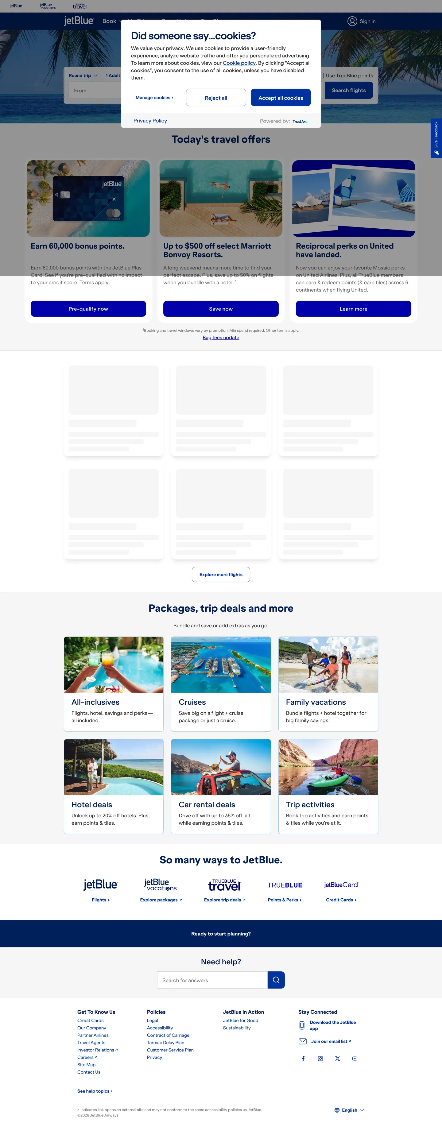
JetBlue's homepage opens with a cookie consent banner over a photography hero, but the structural logic underneath is clear from the first scroll: royal blue (#0033a0) is not an accent held in reserve — it is the page's load-bearing color. The extraction captured 470 total occurrences of this single hex, split across text (234), border (233), and background (3). Every interactive element, every link, every input focus ring in the system traces back to the same royal blue. Where United's blue is dark and institutional and American's blue is a softer cobalt, JetBlue's sits in a middle register: saturated enough to signal brand, light enough to read on a white canvas without feeling heavy.
This DESIGN.md file packages 15 colors tokens drawn from 105 clustered CSS custom properties, 14 typography tokens across the proprietary jbklarheit typeface from 32px display to 12px legal caption, 5 corner-radius tokens anchored at 4px, 8 spacing values on a 4px base, and 17 components definitions covering the zero-radius search CTA, the sky-blue-bordered deal card, the deep-navy footer, and the standard flight-booking widget. The CSS exposes a rich brand color vocabulary — orange (#ff8200, --color-secondary --color-brand-evenmore), sky blue, and mint green alongside the primary royal blue — but on the captured marketing surface only the blue family actually renders.
Feed this file to an AI coding tool and it will produce JetBlue's specific moves: royal blue as a structural spine rather than a decorative accent, a zero-radius CTA button that anchors the page's interactive identity, jbklarheit-equivalent typography at weight 500 for headings and 400 for body without ever touching 700 display territory, and a generous 8px module spacing rhythm. The system is worth borrowing for travel-booking, scheduling, and value-brand interfaces that need to feel accessible and direct without reaching for the institutional weight of legacy airlines.
What makes it distinct
5
- Royal blue as structural spine#0033a0 (--color-primary) dominates 470 occurrences as text, border, and CTA background simultaneously
- jbklarheitJetBlue's proprietary humanist sans across every tier; Inter is the open-source equivalent
- Sky blue secondary accent#8dc8e8 (--color-sky-blue) used for hover states, card borders, and section dividers; never as a CTA background
- 4px grid, 8px dominant modulespacing at 8px (85 occurrences) and 16px (36) drives a dense-but-airy information layout
- Zero-radius primary buttonthe search CTA sits at 0px border-radius while cards run 4-16px; the angular CTA is the deliberate identity anchor
jetblue.com
Live at jetblue.com
A snapshot of the brand in production. Scroll the frame to see the whole page.
Colors
15 colors
JetBlue's system runs on #0033a0 as its primary voltage, used in 4 of 17 components. Type is set in jbklarheit across 14 tokens from 12px to 40px, weights 400–700. Shape language is mixed across 17 components, blending pills, soft rounds, and squarer corners.
Brand & Accent
Sparing, CTA-only voltage · 3
Surface
Page and card backgrounds · 2
Text
Headlines, body, captions · 3
Borders & Hairlines
Dividers, outlines, rules · 2
Semantic
Status, errors, success, links · 2
Other
Specialty colors · 3
Typography
14 type tokens
Set in jbklarheit across 14 tokens, from 12px to 40px, weights 400–700. Shown in its own stack: where the font isn't installed, the fallback the file names stands in.
- display-xl40px · weight 700 · lh 50px · tracking 0The quick brown fox jumps over the lazy dog
- display-lg32px · weight 700 · lh 40px · tracking 0The quick brown fox jumps over the lazy dog
- heading-md24px · weight 500 · lh 30px · tracking 0The quick brown fox jumps over the lazy dog
- heading-sm18px · weight 500 · lh 22.5px · tracking -0.1pxThe quick brown fox jumps over the lazy dog
- heading-xs16px · weight 700 · lh 24px · tracking -0.1pxThe quick brown fox jumps over the lazy dog
- body-lg18px · weight 400 · lh 27px · tracking 0The quick brown fox jumps over the lazy dog
- body-md16px · weight 400 · lh 24px · tracking 0The quick brown fox jumps over the lazy dog
- body-sm14px · weight 400 · lh 20px · tracking -0.1pxThe quick brown fox jumps over the lazy dog
- label-md14px · weight 700 · lh 20px · tracking -0.1pxThe quick brown fox jumps over the lazy dog
- caption12px · weight 400 · lh 18px · tracking 0The quick brown fox jumps over the lazy dog
- button-md16px · weight 700 · lh 24px · tracking 0The quick brown fox jumps over the lazy dog
- nav-link16px · weight 600 · lh 24px · tracking 0.3pxThe quick brown fox jumps over the lazy dog
- link-emphasis16px · weight 600 · lh 24px · tracking 0.3pxThe quick brown fox jumps over the lazy dog
- legal12px · weight 400 · lh 18px · tracking 0The quick brown fox jumps over the lazy dog
Layout
Radii and spacing
6 corner radii and 8 spacing values. Shape language: mixed.
Radii
- none0px
- sm4px
- md8px
- lg12px
- xl16px
- full9999px
Spacing
- xs4px
- sm8px
- md12px
- base16px
- lg24px
- xl32px
- 2xl40px
- 3xl48px
Components
17 components
Each rendered from its tokens (color, type, radius, padding) on JetBlue's own canvas.
- Button Primarybutton-primaryButton Primary
- Button Primary Hoverbutton-primary-hoverButton Primary Hover
- Button Secondarybutton-secondaryButton Secondary
- Top Navtop-navTop Nav
- Nav Linknav-linkNav Link
- Hero Headinghero-headingHero Heading
- Section Headingsection-headingSection Heading
- Body Paragraphbody-paragraphBody Paragraph
- Deal Carddeal-cardDeal Card
- CardcardCard
- Search Widgetsearch-widgetSearch Widget
- Type here…text-inputText Input
- Destination Carddestination-cardDestination Card
- Package Cardpackage-cardPackage Card
- Loyalty Logoloyalty-logoLoyalty Logo
- FooterfooterFooter
- Footer Linkfooter-linkFooter Link
In use
The system, in use
JetBlue's tokens on the kind of product it builds.
Build something people actually use.
A short paragraph of marketing copy that previews how the brand's display tier and body tier read together. Two sentences is usually enough.
FAQ
JetBlue design system FAQ
Common questions about JetBlue's tokens, components, and how to use this DESIGN.md in your project.
Read next
Related reading
Specs, directories, and component libraries that pair with this design system.
- Browse all design systemsThe full directory of DESIGN.md files on shadcn.io, with live mockups for each.shadcn.io
- JetBlue — official siteJetBlue's public marketing site — the source of truth for the live tokens captured in this file.jetblue.com (opens in a new tab)
- The DESIGN.md specificationGoogle Labs' open spec for machine-readable design system files — the format this page is built on.github.com (opens in a new tab)
Use it
Use JetBlue in your project
One machine-readable file. Drop it into Claude, Cursor, or any AI tool that reads DESIGN.md.
Download the DESIGN.md
One machine-readable file: every color, type, radius, spacing, and component token of JetBlue.
Feed it to your AI tool
Drop it into Claude, Cursor, or GitHub Copilot. The agent writes React components and Tailwind classes that match JetBlue's visual language.
Reference the tokens directly
Or paste the values into your Tailwind config, CSS variables, or component library: every color, size and radius is a quoted, ready-to-copy value.
Read the full DESIGN.md: overview, rationale, do’s and don’ts
Overview
JetBlue's web system commits to an unusual relationship between its brand color and its function. Blue as infrastructure: unlike airlines that hold their brand blue for CTA buttons and let photography carry the page, JetBlue's royal blue (#0033a0) appears 470 times in the captured surface — 234 as text, 233 as border, 3 as background. The color is the skeleton of every interactive element, every link underline, every input focus ring, every card outline. The button itself is one of the three background occurrences. Where United runs a similar royal blue but uses dark gray for most body text, JetBlue keeps blue on everything that can be clicked, bordered, or focused.
The typographic system runs jbklarheit — JetBlue's proprietary humanist sans — without a second family. Unlike the geometric sans that Delta and older airline systems favor, jbklarheit has rounded apertures and a slightly warmer feel; it sits closer to Inter than to DIN. The weight range is 400 / 500 / 600 / 700, with the 500 weight handling section headings and the 700 carrying button labels and bold display. The CSS variable --text-editorial is declared at 2rem / 700, suggesting an intended 32px display tier that the captured marketing surface largely replaces with h2 headlines at the same size.
Key Characteristics:
- Royal blue (#0033a0) dominates 470 occurrences — text-and-border-first, button-background-second; the primary color is structural, not decorative.
- Deep navy (#00205b, --color-brand-core) is the pressed state and hover for primary interactive elements; it also colors section headings.
- Sky blue (#8dc8e8, --color-sky-blue) renders on deal-card borders and hover-state fills as the secondary accent — 6 occurrences, all border.
- Zero-radius primary CTA: the "Search flights" button sits at 0px corner-radius, creating a deliberate square anchor against the 4-16px radius cards on the same page.
- jbklarheit runs every tier without a secondary display or serif; the single family does the work through weight and size variation alone.
- 8px spacing is the dominant module (85 occurrences), with 16px second (36); the 4px base grid drives the search-widget field layout.
- The footer renders in deep navy (#00205b), the only dark surface on an otherwise white-canvas page.
Colors
Brand
- Primary (
{colors.primary}— #0033a0): frequency 470. Used as text (234), border (233), background (3). Wired as --color-royal-blue and --color-primary. The structural spine of the system — not a CTA accent held in reserve, but the literal color of every interactive surface element. - Primary Core (
{colors.primary-core}— #00205b): frequency 89. Used as text (44), border (42), background (3). Wired as --color-brand-core, --color-core-blue, --color-state-primary-hover, --color-state-primary-pressed. The pressed state, the section heading color, and the footer background. - Sky Blue (
{colors.sky-blue}— #8dc8e8): frequency 6, all as border. Wired as --color-sky-blue, --color-brand-accent-1, --color-state-surface-container-hover-variant. Used on deal-card borders and hover-state fills; the secondary blue accent.
Surface
- Canvas (
{colors.canvas}— #ffffff): frequency 139 — the page body, all card surfaces, input backgrounds. Merged cluster includes the off-white near-white tone (--color-off-white, --color-neutral-95). The primary white surface. - Surface-1 (
{colors.surface-1}— #f5f7fa): declared as --color-surface, --color-blue-98. The light tinted background for off-white section bands.
Text
- Ink (
{colors.ink}— #000000): frequency 446 as text/border/shadow. Structural page ink — primary text color for headings and body where blue is not used. - Ink Charcoal (
{colors.ink-charcoal}— #303234): frequency 27. Wired as --color-on-surface, --color-charcoal, --color-neutral-20. The input-field text color and card body text. - Ink Muted (
{colors.ink-muted}— #757575): frequency 24. Wired as --color-slate-gray, --color-on-surface-variant-medium. Secondary body copy, promotional card sub-text, footer captions.
Hairlines
- Hairline (
{colors.hairline}— #d3d3d3): frequency 20, all as border. Wired as --color-outline, --color-medium-gray. Card and input field borders at rest. - Hairline Light (
{colors.hairline-light}— #e8e8e9): frequency 3. Wired as --color-disabled, --color-light-gray. The subtle surface-level divider between page sections and disabled input states.
Semantic
- Status Error (
{colors.status-error}— #d50f0f): wired as --color-error, --color-status-negative. Form validation errors and system alerts. - Status Success (
{colors.status-success}— #438443): wired as --color-status-positive. Booking-confirmed states. - Status Attention (
{colors.status-attention}— #e4cd4d): wired as --color-status-attention. Fare-expiry and seat-availability warnings. - Shadow (
{colors.shadow}— #000000): frequency 12 as shadow ink. Used in rgba form (rgba(0,0,0,*)) for modal overlays and card hover shadows.
Typography
Font Family
The system runs jbklarheit for every surface — a proprietary humanist sans-serif JetBlue ships as --font-sans and --font-jbklarheit. Fallbacks walk "jbklarheit Fallback", ui-sans-serif, system-ui, and the full system-emoji stack. There is no serif, no mono, no second display family. The weight scale is 400 / 500 / 600 / 700; the CSS declares --font-weight-normal: 400, --font-weight-medium: 500, --font-weight-semibold: 600, --font-weight-bold: 700, --font-weight-extrabold: 800.
Unlike the squared-shoulder geometry of DIN (Delta) or the tight condensed forms of LufthansaHead (Lufthansa), jbklarheit reads as humanist — it has rounded apertures, open counters, and a warmth that aligns with JetBlue's consumer-value positioning.
Hierarchy
| Token | Size | Weight | Line Height | Letter Spacing | Use |
|---|---|---|---|---|---|
{typography.display-xl} | 40px | 700 | 50px | 0 | Campaign hero headline |
{typography.display-lg} | 32px | 700 | 40px | 0 | Section h2 ("Today's travel offers") |
{typography.heading-md} | 24px | 500 | 30px | 0 | Section titles, card group headings |
{typography.heading-sm} | 18px | 500 | 22.5px | -0.1px | Card titles, widget section labels |
{typography.heading-xs} | 16px | 700 | 24px | -0.1px | Sub-headings in data-dense contexts |
{typography.body-lg} | 18px | 400 | 27px | 0 | Lead paragraphs |
{typography.body-md} | 16px | 400 | 24px | 0 | Default body copy, input text |
{typography.body-sm} | 14px | 400 | 20px | -0.1px | Secondary copy, card metadata |
{typography.label-md} | 14px | 700 | 20px | -0.1px | Loyalty badge labels, status indicators |
{typography.caption} | 12px | 400 | 18px | 0 | Fine print, fare footnotes |
{typography.button-md} | 16px | 700 | 24px | 0 | CTA button labels |
{typography.nav-link} | 16px | 600 | 24px | 0.3px | Top-nav links |
{typography.link-emphasis} | 16px | 600 | 24px | 0.3px | Inline emphasized links ("Learn more") |
{typography.legal} | 12px | 400 | 18px | 0 | Legal disclaimers, fare conditions |
Note on Font Substitutes
jbklarheit is proprietary. Inter is the closest open-source substitute — comparable x-height, rounded apertures, and weight distribution. For the 600-weight nav links, Inter Semi-Bold (600) matches closely. Avoid DIN or Futura as substitutes; their geometric angularity imports the wrong register. Nunito Sans is a softer alternative if Inter feels too neutral.
Layout
Spacing System
- Base unit: 4px.
- Dominant module: 8px (85 occurrences); 16px is second (36).
- Tokens:
{spacing.xs}4px ·{spacing.sm}8px ·{spacing.md}12px ·{spacing.base}16px ·{spacing.lg}24px ·{spacing.xl}32px ·{spacing.2xl}40px ·{spacing.3xl}48px. - Card internal padding:
{spacing.base}16px on smaller deal cards;{spacing.xl}32px +{spacing.lg}40px on package cards. - Search widget: the flight-search widget uses complex padding (
24px 8px 8px 16px) — a top-label offset pattern placing the input label at 24px from the top and the input text at 8px from the bottom.
Grid & Container
- Max content width: ~1312px; the deal cards in the "Today's travel offers" grid sit at a 4-column grid within that container.
- Hero: a full-bleed photography or video hero with the flight-search widget floating on a white card panel overlaid at the bottom of the hero band.
- Deal card grid: 3-4 column grid with photography thumbnails, destination name (heading-sm), price in royal blue (heading-md), and a secondary CTA button.
- Packages section: a 3-column grid of category tiles (All-inclusives, Cruises, Family Vacations, Hotel deals, Car rentals, Trip activities).
- Footer: single-column company logo + 4-column link-category grid in deep navy, white text.
Rhythm
The page alternates between a deals surface (deal cards in a white grid, sky-blue-bordered) and a features surface (JetBlue logo partner cards, category packages). The transitions are flat — no gradient bands, no section-background shifts — just white canvas from the hero to the footer navy, with 48-64px vertical padding between sections.
Elevation
The system uses minimal shadow. Deal cards hover with a subtle rgba(0,0,0,0.12) shadow; at rest they rely on the 1px {colors.hairline} border or the 1px {colors.sky-blue} border for definition. The search-widget panel at the base of the hero carries a visible elevation shadow. Modal overlays use rgba(0,0,0,0.5) (--color-modal-overlay is declared as a semi-transparent black). No tinted or colored shadows exist in the system.
Shapes
The radius scale reflects a deliberate split between the search interaction (angular, zero-radius) and content surfaces (moderate rounding):
{rounded.none}0px — the primary "Search flights" button (extracted at 0px radius), and the flight-search input fields.{rounded.sm}4px — default card radius; the most common surface rounding (24 occurrences in extraction).{rounded.md}8px — deal-card image containers and larger card surfaces (6 occurrences).{rounded.lg}12px — package-category tiles and promotional banners (10 occurrences).{rounded.xl}16px — media thumbnails and marketing image cards (6 occurrences).{rounded.full}9999px — loyalty-badge chips, notification indicators.
The zero-radius CTA button is the system's most deliberate shape choice. The search widget becomes a single contiguous form strip — input, input, input, button — because there is no visible gap or rounding break between the last field and the CTA.
Components
button-primary — Royal blue (#0033a0) fill, white text, jbklarheit 16px / 700, 0px radius, 16×24px padding, 56px height. "Search flights" is the canonical instance inside the booking widget. Zero border-radius creates a flush-join with the adjacent input fields.
button-primary-hover — Shifts to deep navy (#00205b, --color-state-primary-pressed) on hover; same dimensions and no-radius treatment.
button-secondary — White canvas fill, royal blue border (1px), royal blue text. 4px radius. Used for "Book now" on deal cards and "Explore destinations" CTAs.
top-nav — White canvas surface, 64px height, 1px bottom hairline border, no border-radius. JetBlue logo flush left; link cluster (Book, Manage, Check-in, JetBlue for Business, TrueBlue) center-left; MosaicPlus + Sign in flush right.
nav-link — Transparent background, royal blue text (#0033a0) in {typography.nav-link} (16px / 600), 8×12px padding.
hero-heading — Deep navy (#00205b) text, jbklarheit 32px / 700 ({typography.display-lg}). Section headings below the hero ("Today's travel offers," "Packages, trip deals and more," "So many ways to JetBlue").
section-heading — Same token as hero-heading. Section-level h2 elements on the white canvas.
body-paragraph — Ink-muted (#757575) text at {typography.body-md} (16px / 400). Secondary promotional copy and deal card descriptions.
deal-card — White canvas, 1px sky-blue (#8dc8e8) border, 8px radius, 16px 24px 24px padding. Photography thumbnail top, destination + route label in deep navy, price in royal blue, secondary button below. The signature card variant — sky-blue border distinguishes these deal cards from the standard hairline-bordered content cards.
card — White canvas, 1px hairline border (#d3d3d3), 8px radius, 16px padding. Default content card for package tiles and partner cards.
search-widget — White canvas, the full booking search form. Inputs have 0px radius and the primary CTA at the right end. Complex padding 24px 8px 8px 16px to accommodate floating labels above each field.
text-input — White canvas fill, ink-charcoal text (#303234), 0px radius (matching the widget's flush-join pattern), 24px 8px 8px 16px padding, 54px height, 1px hairline border. Border shifts to royal blue on focus.
destination-card — White canvas, 1px hairline border, 12px radius, 0 padding (photography fills the card). Used in the grid of destination thumbnails below the deal cards.
package-card — White canvas, 1px hairline border, 12px radius, 16px padding. Holds category icon, title, and brief description for the packages grid.
loyalty-logo — Transparent background, royal blue text, 0px radius. Renders the partner loyalty logos (JetBlue, JetBlue Travel Products, JetBlue Vacations, Hotels + More, JetBlue Card) in a 5-item horizontal strip.
footer — Deep navy (#00205b) surface, white text, jbklarheit 14px / 400, 48×24px padding. 4-column link grid: Get Travel, Business Travel, JetBlue in the Community, Stay Connected. White wordmark flush left at top.
footer-link — Transparent background on the deep navy footer, white text in {typography.body-sm}, 4px top padding.
Do's and Don'ts
Do use royal blue (#0033a0) for all interactive text, borders, and button fills. The system's legibility depends on blue as a consistent interactivity signal — when every clickable element is blue and only blue, users learn the language instantly.
Do keep the primary button at 0px radius inside the search-widget context. The zero-radius CTA creates the flush-join with input fields that makes the booking widget read as a single form element. Rounding the button by 8px visually separates it from the fields and increases perceived friction.
Do use {colors.sky-blue} (#8dc8e8) exclusively for deal-card borders and hover-fill backgrounds. The sky blue reads as a lighter, secondary blue at a perceptual distance from the primary royal — placing it on CTAs or headings would read as a second blue brand color and introduce ambiguity.
Do use {colors.primary-core} (#00205b) for section headings and the footer background rather than the primary royal blue. The extracted section headings render in this darker navy, not in the CTA blue — the distinction creates a subtle hierarchy where content headings sit darker than interactive chrome.
Don't apply border-radius to the search-CTA button independently. Changing {rounded.none} to {rounded.sm} or higher on button-primary breaks the widget's strip-form identity — if radius is needed, it must be applied uniformly to both the inputs and the button.
Don't use {colors.sky-blue} (#8dc8e8) as a button background or CTA fill. Its 6 occurrences in the captured surface are all border-color — it reads as an ambient brand accent, not a primary action color. A button in sky blue would be mistaken for a secondary or tertiary action at best, or a decorative chip at worst.
Don't introduce a second typeface. jbklarheit handles every tier including nav, buttons, legal, and caption — adding a serif or mono voice for emphasis or code would break the single-family discipline and require an additional font-load that the system does not currently carry.
Don't render deal-card price labels in any color other than royal blue (#0033a0). Prices in ink-charcoal or ink-muted would lose the interactivity signal — the blue price on a white card is a subtle CTA in itself, training the user's eye toward the fare before they reach the secondary button.
Known Gaps
- Hover and focus states: documented for
button-primary-hoveronly. The full state matrix — input focus rings (royal blue 2px outline), disabled field opacity, datepicker hover, dropdown active — is not captured from the marketing surface. - Cookie banner override: the captured screenshot shows a privacy-consent banner overlaying the hero; some below-the-fold content was obscured. The booking widget and deal-card grid are partially visible; the full hero photography and video are not captured.
- Orange product accent: JetBlue's orange (#ff8200, --color-secondary, --color-brand-evenmore) appears as a declared CSS var but does not render on the captured page. It is scoped to the "Even More Space" and "Even More Speed" upsell product badge — a paid upgrade marker that only appears in fare-selection contexts, not on the marketing homepage.
- Dark mode: no dark-mode marketing surface is exposed; the footer's deep-navy band is the closest dark surface.
- Motion: the hero content carousel and datepicker transitions are not captured; animation curves and durations live in the booking widget JavaScript.
- App surfaces: the JetBlue iOS/Android app carries a separate bottom-navigation component, boarding-pass card, and seat-selection map that are not included here.
Travel & Hospitality
More systems like this
More DESIGN.md files in Travel & Hospitality.
Pricing
Build it with Pro
The DESIGN.md files are free. Pro adds 6,000+ blocks, premium templates and the MCP server, so your AI editor builds in your system for you.
4.9/5 out of 5 · 150+ reviewsfrom 150+ founders and developers.
Billing
Billed once a year in USD. Cancel anytime.
- How many people can use the license.
- Client work, SaaS products and anything you charge for.
- Production-ready React sections: hero, pricing, features, dashboards and more.
- Complete multi-page sites you can ship as they are.
- React icons from every major library, installable with one command.
- Presets that restyle every block, in light and dark.
- Lets your AI editor search, preview and install blocks for you.
- Priority requests are answered first.
Individual
For personal projects & open source
$32instead of $49/mo
$389 billed yearly
- Seats: 1 seat
- Commercial use: Personal & open source only
- Pro blocks: 6,000+ blocks
- Templates: All 14 templates
- React icons: 294k+ icons
- Themes: All 59 themes
- MCP server: Basic usage
- Support: Standard
Team
Most popularFor freelancers, agencies & startups
$66instead of $99/mo
$789 billed yearly · ≈ $13/dev/mo
- Seats: Up to 5 seats
- Commercial use: Included
- Pro blocks: 6,000+ blocks
- Templates: All 14 templates
- React icons: 294k+ icons
- Themes: All 59 themes
- MCP server: High usage
- Support: Priority
Organization
For companies with larger teams
$132instead of $199/mo
$1,589 billed yearly
- Seats: Unlimited seats
- Commercial use: Included
- Pro blocks: 6,000+ blocks
- Templates: All 14 templates
- React icons: 294k+ icons
- Themes: All 59 themes
- MCP server: Unlimited usage
- Support: Priority
Billed once a year in USD. Cancel anytime.
Individual
For personal projects & open source
$32instead of $49/mo
$389 billed yearly
- How many people can use the license.Seats: 1 seat
- Client work, SaaS products and anything you charge for.Commercial use: Personal & open source only
- Production-ready React sections: hero, pricing, features, dashboards and more.Pro blocks: 6,000+ blocks
- Complete multi-page sites you can ship as they are.Templates: All 14 templates
- React icons from every major library, installable with one command.React icons: 294k+ icons
- Presets that restyle every block, in light and dark.Themes: All 59 themes
- Lets your AI editor search, preview and install blocks for you.MCP server: Basic usage
- Priority requests are answered first.Support: Standard
Team
Most popularFor freelancers, agencies & startups
$66instead of $99/mo
$789 billed yearly · ≈ $13/dev/mo
Everything in Individual, plus
- How many people can use the license.Seats: Up to 5 seats
- Client work, SaaS products and anything you charge for.Commercial use: Included
- Lets your AI editor search, preview and install blocks for you.MCP server: High usage
- Priority requests are answered first.Support: Priority
Organization
For companies with larger teams
$132instead of $199/mo
$1,589 billed yearly
Everything in Team, plus
- How many people can use the license.Seats: Unlimited seats
- Lets your AI editor search, preview and install blocks for you.MCP server: Unlimited usage
- Secure checkout via Stripe
- Code lives in your repo
- Keep what you've shipped if you cancel
- License terms
Your system, built for you
Every block, template and icon, installed by your AI agent in your design system. The DESIGN.md files stay free.