Jaguar Design System
Jaguar's post-rebrand design system captured as a DESIGN.md file. Near-black canvas, ProximaNova type, all-caps wide-tracked labels, zero-radius sharp forms. For React, Next.js, and AI tools.
Add shadcn.io to your AI agent. · Pro It installs blocks, icons and templates in your design system from a prompt, with Pro.
Set up MCP- Primary
- #e4e4e4
- Typeface
- ProximaNova
- Shape
- Sharp
- Base radius
- 0px
- Colors
- 8
- Type tokens
- 7
- Components
- 12
- Spacing values
- 6
About
About Jaguar DESIGN.md
Curated by Dov Azencot · Updated May 19, 2026 · Source jaguar.com (opens in a new tab)
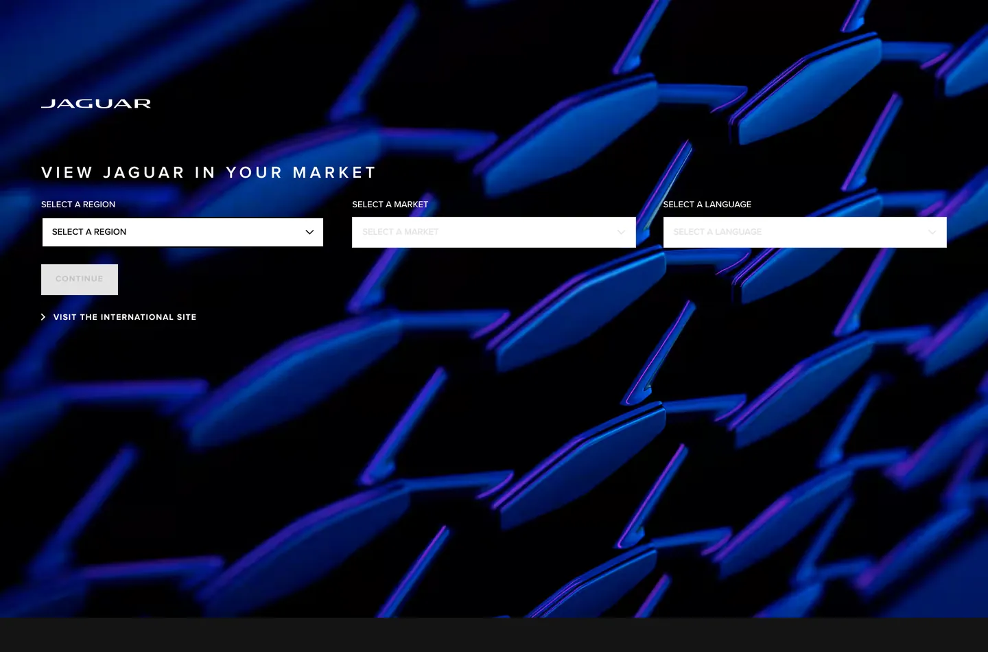
Jaguar's market-selector page is the first glimpse of a brand in deliberate rupture. Gone is the leaping cat; the wordmark is now flat uppercase JAGUAR in a low-contrast sans. The entire chromatic identity is delegated to a single full-bleed background photograph: an abstract field of deep violet-blue metallic lens fragments, rendered so close-up that the source object is unrecognizable. No hero headline, no product photography, no color accent in the chrome — just the image and a three-column form sitting in the lower-left quadrant of a near-black canvas. It is the most restraint any luxury automotive brand has committed to at the point-of-entry screen.
The DESIGN.md file packages this system for React tooling. Inside: 8 colors tokens spanning a near-black canvas (#141414), a slate mid-tone (#4a4f54), and white for all text and borders — no hue anywhere in the structural palette. ProximaNova carries every label and body surface; AvenirNext appears only on the primary button and a small navigation link. Every component uses 0px corner radius: buttons, dropdowns, inputs — all hard rectangles. Where BMW uses a gentle 4px radius and Mercedes uses 2px, Jaguar commits to zero and lets the sharpness read as the luxury statement. Letter-spacing at 5.2px on the hero wordmark and 1.2px on form labels is the typographic substitute for decorative ornamentation.
Feed this file to an AI coding tool and it will reproduce Jaguar's specific moves: midnight canvas instead of pure black, white-only UI chrome against photographic color, zero-radius forms at 45px height, and ProximaNova running all label tiers with the aggressive letter-spacing that substitutes for the decorative flourishes the brand has discarded. The one thing to borrow carefully: the "photography does all chromatic work" move only lands when the photo is this controlled. Substitute a less resolved image and the page collapses into an empty dark form.
What makes it distinct
5
- Photography-as-brandthe only chromatic voltage on the page is the abstract violet-blue background render; every UI element sits in stark monochrome on top
- All-caps wide-tracked labelsProximaNova at 5.2px letter-spacing for the hero wordmark and 1.2px for form labels, never sentence-case in the chrome
- Zero border-radiusevery button, dropdown, and input uses 0px corners, the sharpest radius commitment in any luxury automotive brand captured here
- Dual sans familiesProximaNova carries UI labels and body, AvenirNext carries the primary button and navigation link accent
- Near-black not pure blackthe canvas reads as midnight charcoal (#141414) against which white-only text creates maximum contrast without the cold shock of true black
jaguar.com
Live at jaguar.com
A snapshot of the brand in production. Scroll the frame to see the whole page.
Colors
8 colors
Jaguar's system anchors on #e4e4e4 (hairline-light) as its primary color. Type is set in ProximaNova across 7 tokens from 10px to 24px, weights 400–700. Shape language is sharp — components average 0px corner radius, favoring crisp rectangles.
Surface
Page and card backgrounds · 2
Text
Headlines, body, captions · 2
Borders & Hairlines
Dividers, outlines, rules · 2
Other
Specialty colors · 2
Typography
7 type tokens
Set in ProximaNova across 7 tokens, from 10px to 24px, weights 400–700. Shown in its own stack: where the font isn't installed, the fallback the file names stands in.
- display-xl24px · weight 600 · lh 26px · tracking 5.2pxThe quick brown fox jumps over the lazy dog
- label-lg12px · weight 600 · lh 13px · tracking 1.2pxThe quick brown fox jumps over the lazy dog
- label-md12px · weight 600 · lh 18px · tracking 1.2pxThe quick brown fox jumps over the lazy dog
- body-md13px · weight 500 · lh 19pxThe quick brown fox jumps over the lazy dog
- body-sm13px · weight 400 · lh 19pxThe quick brown fox jumps over the lazy dog
- button-md10px · weight 700 · lh 12px · tracking 3pxThe quick brown fox jumps over the lazy dog
- nav-link10px · weight 700 · lh 12px · tracking 3pxThe quick brown fox jumps over the lazy dog
Layout
Radii and spacing
1 corner radii and 6 spacing values. Shape language: sharp.
Radii
- none0px
Spacing
- xs8px
- sm14px
- md20px
- lg24px
- xl40px
- 2xl60px
Components
12 components
Each rendered from its tokens (color, type, radius, padding) on Jaguar's own canvas.
- Button Primarybutton-primaryButton Primary
- Button Secondarybutton-secondaryButton Secondary
- Top Navtop-navTop Nav
- Nav Linknav-linkNav Link
- Hero Headinghero-headingHero Heading
- Body Paragraphbody-paragraphBody Paragraph
- Form Labelform-labelForm Label
- CardcardCard
- Type here…text-inputText Input
- Select Dropdownselect-dropdownSelect Dropdown
- Skeleton Loaderskeleton-loaderSkeleton Loader
- FooterfooterFooter
In use
The system, in use
Jaguar's tokens on the kind of product it builds.
Build something people actually use.
A short paragraph of marketing copy that previews how the brand's display tier and body tier read together. Two sentences is usually enough.
FAQ
Jaguar design system FAQ
Common questions about Jaguar's tokens, components, and how to use this DESIGN.md in your project.
Read next
Related reading
Specs, directories, and component libraries that pair with this design system.
- Browse all design systemsThe full directory of DESIGN.md files on shadcn.io, with live mockups for each.shadcn.io
- Jaguar — official siteJaguar's public marketing site — the source of truth for the live tokens captured in this file.jaguar.com (opens in a new tab)
- The DESIGN.md specificationGoogle Labs' open spec for machine-readable design system files — the format this page is built on.github.com (opens in a new tab)
Use it
Use Jaguar in your project
One machine-readable file. Drop it into Claude, Cursor, or any AI tool that reads DESIGN.md.
Download the DESIGN.md
One machine-readable file: every color, type, radius, spacing, and component token of Jaguar.
Feed it to your AI tool
Drop it into Claude, Cursor, or GitHub Copilot. The agent writes React components and Tailwind classes that match Jaguar's visual language.
Reference the tokens directly
Or paste the values into your Tailwind config, CSS variables, or component library: every color, size and radius is a quoted, ready-to-copy value.
Read the full DESIGN.md: overview, rationale, do’s and don’ts
Overview
Jaguar's market-selector page is the sharpest expression of a brand in deliberate self-overhaul. Monochrome Chrome, Photographic Color. Where BMW places a single accent on white and Mercedes deploys a fine silver gradient, Jaguar removes all structural color from its UI entirely and delegates every chromatic statement to a single full-bleed background image — a swirling field of deep violet-blue metallic lens shapes that fills the canvas and frames a near-black form interface in the lower left. The brand name sits in flat uppercase at the top: JAGUAR, no leaping cat, no serifs.
The system's commitment to 0px border-radius on every component is the most resolved shape statement in any luxury automotive brand captured in this directory — harder than BMW's 4px, harder than Mercedes's 2px, and matching the JLR corporate sibling Land Rover at zero. ProximaNova carries the label and body tier; AvenirNext handles the button CTA and the skip link at 10px / weight 700 with 3px letter-spacing, the widest CTA tracking in the group.
Key Characteristics:
- Near-black canvas (
{colors.canvas}— #141414) rather than pure black — maintains tonal continuity with the dark zones of the background photograph. - Zero radius on every interactive element — buttons, dropdowns, inputs all at 0px — the sharpest shape commitment of any automotive brand here.
- White-only text and border chrome (
{colors.ink}— #ffffff) against the near-black and slate palette; no hue in the structural layer. - Slate mid-tone (
{colors.surface-1}— #4a4f54) carries both border and secondary text — one tone doing two jobs, 26 combined occurrences. - ProximaNova for all UI labels with letter-spacing at 1.2–5.2px — the typographic substitute for decorative flourishes the rebrand has removed.
- AvenirNext exclusively for the primary button and nav link at 10px / weight 700 — a secondary voice reserved for the action tier.
- No brand-layer accent color at all — the extraction shows zero CSS custom properties for a brand hex.
Colors
Surface
- Canvas (
{colors.canvas}— #141414): frequency 20. Used as background (3), text (9), border (8). The page floor and button background. Near-black rather than pure black — sits as a tone the photograph's dark zones can register against. - Pure Black (
{colors.pure-black}— #000000): frequency 3. Used as border (2), text (1). Appears in the footer strip and a handful of rule elements below the main chrome.
Text & Border
- Ink (
{colors.ink}— #ffffff): frequency 51. Used as text (24), border (23), background (4). The dominant and only text color across the entire UI. White on near-black, no tinting. - Ink Muted (
{colors.ink-muted}/{colors.surface-1}— #4a4f54): frequency 26. Used as text (13), border (13). The slate mid-tone serving both secondary text labels and the structural border on form elements. One tone doing two jobs efficiently. - Hairline Light (
{colors.hairline-light}— #e4e4e4): frequency 5. Used as text (2), background (1), border (2). Appears on placeholder text in the disabled/unselected dropdown states.
Utility
- Skeleton (
{colors.skeleton}— #f0f0f0): frequency 2. Used as background only — the CSS skeleton loader background wired as--_dxskeleton-background. Not rendered in the visible capture.
Typography
Font Families
The system runs two sans families: ProximaNova (with "Arial Unicode MS" as the first fallback) carries every label, body, and heading tier. AvenirNext carries the action tier — the primary CTA button and the skip-to-content navigation anchor. The split is function-driven: ProximaNova is the editorial voice, AvenirNext is the action voice.
Hierarchy
| Token | Size | Weight | Line Height | Letter Spacing | Use |
|---|---|---|---|---|---|
{typography.display-xl} | 24px | 600 | 26px | 5.2px | Hero wordmark "JAGUAR" |
{typography.label-lg} | 12px | 600 | 13px | 1.2px | Form field labels (SELECT A REGION) |
{typography.label-md} | 12px | 600 | 18px | 1.2px | Secondary all-caps labels |
{typography.body-md} | 13px | 500 | 19px | 0 | Dropdown option text, running UI body |
{typography.body-sm} | 13px | 400 | 19px | 0 | Secondary spans |
{typography.button-md} | 10px | 700 | 12px | 3px | Primary button (CONTINUE) |
{typography.nav-link} | 10px | 700 | 12px | 3px | Skip-to-content link accent |
Principles
The letter-spacing on the hero wordmark (5.2px at 24px — approximately 0.22em) is the system's loudest typographic moment. The 1.2px tracking on form labels is the second. Both choices substitute typographic tension for the decorative ornaments the rebrand has discarded. Display weight peaks at 600 on the wordmark and drops to 500 on body copy; the AvenirNext button tier runs at 700 but the small 10px size means it reads lighter than the numbers suggest.
Note on Font Substitutes
ProximaNova is a licensed family. Inter at the same weights is the closest open-source substitute; to match the wide-tracking on the hero wordmark, add letter-spacing: 0.22em explicitly at display sizes. DM Sans is a slightly softer alternative. For AvenirNext in the button tier, Outfit at weight 700 with 0.3em letter-spacing reads closest.
Layout
Spacing System
- Base module: 8px.
- Tokens:
{spacing.xs}8px ·{spacing.sm}14px ·{spacing.md}20px ·{spacing.lg}24px ·{spacing.xl}40px ·{spacing.2xl}60px. - Form dropdowns:
{spacing.2xl}(60px) horizontal page margin; form sits flush left starting at approximately 60px from the left edge. - Internal padding (form elements):
10px 34px 10px 14px— right-heavy to accommodate the chevron icon without overlap. - Section spacing: The 60px top padding, with the navigation bar at 72px height, places the heading at approximately one-third down the viewport.
Grid & Container
- Layout: no explicit max-width container — the background image fills 100vw. The form sits in the left half of the viewport in a three-column horizontal arrangement.
- Form grid: three equal-width dropdowns arranged horizontally, each approximately 430px wide at 1440px viewport.
- Heading: left-aligned, appears directly above the form at the same left margin.
Rhythm
The page is a single-band layout: background image, wordmark top-left, heading and form in the lower left quadrant, footer strip at the base. There is no section rhythm — the only vertical beat is the spacing between the heading, the label row, the dropdown row, and the button row below.
Elevation
The system carries no shadow tier. The photography provides all depth cues; the UI chrome sits flat against the near-black canvas with hairline borders doing the only structural work. No box-shadow, no blur backdrop — the form elements read as precisely-cut apertures in the dark surface rather than elevated panels above it.
Shapes
The radius philosophy is absolute zero:
{rounded.none}0px — every element on the page, without exception.
No softening at any surface size. Buttons, dropdowns, inputs, and form containers all use hard right angles. This is the defining shape commitment of the post-2024 rebrand and the clearest departure from Jaguar's previous identity. Among luxury automotive brands, only Land Rover matches this severity; BMW, Mercedes, Audi, and Porsche all carry at least 2px.
Components
button-primary — Near-black {colors.canvas} fill, white text, AvenirNext 10px / weight 700, 3px letter-spacing, 0px radius, 1px 24px 0px padding, 45px height, slate {colors.surface-1} border. The "CONTINUE" CTA in the market-selector form.
button-secondary — Transparent fill, white text, same AvenirNext specs, hairline-white border, 0px radius. Used for "VISIT THE INTERNATIONAL SITE" with a chevron prefix.
top-nav — Transparent background, white wordmark (JAGUAR in display-xl tracking), 72px height. No filled background bar — the nav floats over the image.
nav-link — Transparent, white text, AvenirNext 10px / 700 / 3px tracking. The skip-to-content link and any secondary navigation anchor.
hero-heading — White text, ProximaNova 24px / weight 600 / 5.2px letter-spacing. "VIEW JAGUAR IN YOUR MARKET" — the single heading on the market-selector page.
form-label — White text, ProximaNova 12px / weight 600 / 1.2px tracking. "SELECT A REGION", "SELECT A MARKET", "SELECT A LANGUAGE" all-caps labels above each dropdown.
select-dropdown — Near-black fill, white text, ProximaNova 13px / weight 500, 0px radius, 10px 34px 10px 14px padding, 45px height, slate {colors.surface-1} border. The three region/market/language pickers.
text-input — Same spec as select-dropdown — near-black fill, white text, 0px radius, 45px height, slate border.
card — Near-black fill, white text, 0px radius, 24px padding, hairline border. The content card pattern for any surfaced information panels.
body-paragraph — White text, ProximaNova 13px / weight 500.
skeleton-loader — Light gray {colors.skeleton} fill with no radius. The CSS-variable-driven loading state for dynamic content.
footer — Near-black canvas, slate muted text, 24px padding. The narrow strip at the base of the viewport.
Do's and Don'ts
Do delegate all chromatic energy to a single, intentionally-chosen background image. The system has zero hue in its structural layer; the photograph IS the brand color. Choosing an image without strong chromatic direction — a grey environmental shot, for example — would leave the page visually inert.
Do maintain 5.2px letter-spacing on the hero wordmark. The wide tracking is the system's loudest design statement and the primary vehicle for luxury signaling in the absence of decorative elements. Collapsing it to 2–3px reads as a consumer-brand label, not an automotive identity.
Do use {colors.surface-1} (#4a4f54) for all form borders and secondary labels simultaneously. The system is efficient: one mid-tone does both structural and textual work, keeping the palette count at a monochrome minimum.
Do run form elements at exactly 45px height. The dropdowns and button share the same height, creating a horizontal rhythm across the selector row that reads as deliberate alignment rather than approximate sizing.
Don't introduce any border-radius. The 0px commitment is the sharpest shape signal in the rebrand — adding even 2px to the form elements would soften it into a generic digital form. Use {rounded.none} on every surface.
Don't use hue in the UI chrome. No blue link states, no orange hover accents, no green success feedback. The only color permitted in the structural layer is the monochrome stack: #ffffff, #4a4f54, #141414. Semantic states (error, success) belong in form-level microcopy, not in border or fill changes.
Don't substitute AvenirNext-tier button labels with a geometric sans at normal tracking. The 3px letter-spacing at 10px — approximately 0.3em — is what makes the button feel automotive-precision rather than app-store default. Substitutes need explicit tracking applied.
Don't use the skeleton loader color ({colors.skeleton} — #f0f0f0) as a page surface or card background. It is a loading-state token only; used as a card fill it would read as a design error against the near-black canvas.
Known Gaps
- Full product site tokens: the extraction captured the market-selector landing page, not the full jaguar.com vehicle configurator or model pages, which carry a more complete token set including vehicle color swatches and spec-table formatting.
- Type 00 rebrand palette: the controversial new pink, yellow, and chartreuse accents visible in Type 00 campaign photography do not appear in the captured marketing surface — they may be exclusive to campaign creative assets rather than wired into the web system.
- Hover and focus states: no hover or focus state is captured; the CSS
--nav-default-animation-duration: 0.2sand--x-axis-fade-animation-name: fadeInFromLeftsuggest animated transitions exist but are not represented in the extracted static snapshot. - Dark vs. light variants: the page is dark-only; no light-mode token set is exposed on this surface.
- Vehicle configurator components: color picker swatches, trim-level selectors, and 3D vehicle rotators are core to the Jaguar product experience but belong to a different surface not captured here.
- Mobile navigation: the full nav bar with product links (models, EV, configurator) is not present on the market-selector page and thus not captured in the component definitions.
Automotive
More systems like this
More DESIGN.md files in Automotive.
Pricing
Build it with Pro
The DESIGN.md files are free. Pro adds 6,000+ blocks, premium templates and the MCP server, so your AI editor builds in your system for you.
4.9/5 out of 5 · 150+ reviewsfrom 150+ founders and developers.
Billing
Billed once a year in USD. Cancel anytime.
- How many people can use the license.
- Client work, SaaS products and anything you charge for.
- Production-ready React sections: hero, pricing, features, dashboards and more.
- Complete multi-page sites you can ship as they are.
- React icons from every major library, installable with one command.
- Presets that restyle every block, in light and dark.
- Lets your AI editor search, preview and install blocks for you.
- Priority requests are answered first.
Individual
For personal projects & open source
$32instead of $49/mo
$389 billed yearly
- Seats: 1 seat
- Commercial use: Personal & open source only
- Pro blocks: 6,000+ blocks
- Templates: All 14 templates
- React icons: 294k+ icons
- Themes: All 59 themes
- MCP server: Basic usage
- Support: Standard
Team
Most popularFor freelancers, agencies & startups
$66instead of $99/mo
$789 billed yearly · ≈ $13/dev/mo
- Seats: Up to 5 seats
- Commercial use: Included
- Pro blocks: 6,000+ blocks
- Templates: All 14 templates
- React icons: 294k+ icons
- Themes: All 59 themes
- MCP server: High usage
- Support: Priority
Organization
For companies with larger teams
$132instead of $199/mo
$1,589 billed yearly
- Seats: Unlimited seats
- Commercial use: Included
- Pro blocks: 6,000+ blocks
- Templates: All 14 templates
- React icons: 294k+ icons
- Themes: All 59 themes
- MCP server: Unlimited usage
- Support: Priority
Billed once a year in USD. Cancel anytime.
Individual
For personal projects & open source
$32instead of $49/mo
$389 billed yearly
- How many people can use the license.Seats: 1 seat
- Client work, SaaS products and anything you charge for.Commercial use: Personal & open source only
- Production-ready React sections: hero, pricing, features, dashboards and more.Pro blocks: 6,000+ blocks
- Complete multi-page sites you can ship as they are.Templates: All 14 templates
- React icons from every major library, installable with one command.React icons: 294k+ icons
- Presets that restyle every block, in light and dark.Themes: All 59 themes
- Lets your AI editor search, preview and install blocks for you.MCP server: Basic usage
- Priority requests are answered first.Support: Standard
Team
Most popularFor freelancers, agencies & startups
$66instead of $99/mo
$789 billed yearly · ≈ $13/dev/mo
Everything in Individual, plus
- How many people can use the license.Seats: Up to 5 seats
- Client work, SaaS products and anything you charge for.Commercial use: Included
- Lets your AI editor search, preview and install blocks for you.MCP server: High usage
- Priority requests are answered first.Support: Priority
Organization
For companies with larger teams
$132instead of $199/mo
$1,589 billed yearly
Everything in Team, plus
- How many people can use the license.Seats: Unlimited seats
- Lets your AI editor search, preview and install blocks for you.MCP server: Unlimited usage
- Secure checkout via Stripe
- Code lives in your repo
- Keep what you've shipped if you cancel
- License terms
Your system, built for you
Every block, template and icon, installed by your AI agent in your design system. The DESIGN.md files stay free.