Hyundai USA Design System
Hyundai USA's marketing-site design tokens packaged for React, Next.js, and AI coding tools. Navy #002c5e on white, custom Hyundai Sans Head + Text, 18 colors, 16 components.
Add shadcn.io to your AI agent. · Pro It installs blocks, icons and templates in your design system from a prompt, with Pro.
Set up MCP- Primary
- #002c5e
- Typeface
- Hyundai Sans Head
- Shape
- Mixed
- Base radius
- 12px
- Colors
- 18
- Type tokens
- 13
- Components
- 16
- Spacing values
- 8
About
About Hyundai USA DESIGN.md
Curated by Dov Azencot · Updated May 19, 2026 · Source hyundaiusa.com (opens in a new tab)
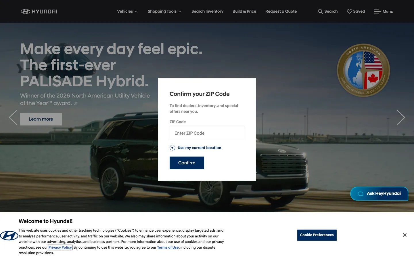
Hyundai's USA site is one of the strictest grayscale systems in the automotive category. The hero is a full-bleed video plate of a Palisade Hybrid driving toward the camera at golden hour, headline set in white Hyundai Sans Head at 54px / weight 500 ("Make every day feel epic. The first-ever PALISADE Hybrid."), and a floating white inset card asks for a ZIP code before any inventory will surface. Above the photography, a near-black masthead carries the wordmark and a five-item product nav. Below the fold, the page returns to pure white canvas with charcoal ink — and the only color that breaks the grayscale anywhere on the chrome is deep navy at the primary CTA fill.
Where Lexus stages its luxury chrome on dark backgrounds and Ferrari hard-cuts to pure black, Hyundai sits in the editorial-magazine half of the automotive category: white floor, square text columns, photography doing the chromatic labor. The DESIGN.md file packages this into a machine-readable spec for React tooling. Inside: 18 colors tokens (with deep navy as the only true brand voltage), 13 typography tokens running the two-family proprietary Hyundai Sans set, 4 corner-radius values centered on 2px square edges and 50% circles, an 8 spacing scale anchored on a 4px module, and 16 components definitions covering the navy primary button, the white ZIP-card, the dark masthead, and the cyan conversational pill.
Feed this file to Claude or Cursor and the AI reproduces Hyundai's specific moves: navy CTA only, square-edged corners on buttons, photography as the chromatic source, and the two-family proprietary type stack. The one move worth borrowing only if you're in a category where photography genuinely carries the story is the willingness to let the only color be the brand voltage. For most SaaS teams, the same restraint reads as undercooked; for a vehicle marketer where the car is the hero, it forces the chrome out of the way.
What makes it distinct
5
- Single navy voltageHyundai navy #002c5e appears 148 times as the only chromatic note in an otherwise pure-grayscale system
- Two-family proprietary typeHyundai Sans Head for display, Hyundai Sans Text for body, both at weight 500 max
- Square-edge buttons2px corner radius on primary CTAs, a deliberate choice against the 8/12px SaaS default
- Cinematic photography canvasfull-bleed vehicle imagery occupies the hero, with the ZIP-code lookup card floating as a white inset on top
- Modal ZIP-gate as front doorthe page assumes a localized dealer experience and surfaces inventory only after ZIP confirmation
hyundaiusa.com
Live at hyundaiusa.com
A snapshot of the brand in production. Scroll the frame to see the whole page.
Colors
18 colors
Hyundai USA's system runs on #002c5e as its primary voltage, used in 2 of 16 components. Type is set in Hyundai Sans Head across 13 tokens from 14px to 54px, weights 400–700. Shape language is mixed across 16 components, blending pills, soft rounds, and squarer corners.
Brand & Accent
Sparing, CTA-only voltage · 2
Surface
Page and card backgrounds · 2
Text
Headlines, body, captions · 7
Borders & Hairlines
Dividers, outlines, rules · 2
Other
Specialty colors · 5
Typography
13 type tokens
Set in Hyundai Sans Head across 13 tokens, from 14px to 54px, weights 400–700. Shown in its own stack: where the font isn't installed, the fallback the file names stands in.
- display-xl54px · weight 500 · lh 56pxThe quick brown fox jumps over the lazy dog
- display-lg40px · weight 500 · lh 42pxThe quick brown fox jumps over the lazy dog
- display-md30px · weight 500 · lh 36pxThe quick brown fox jumps over the lazy dog
- heading-lg24px · weight 500 · lh 30pxThe quick brown fox jumps over the lazy dog
- heading-md18px · weight 500 · lh 24pxThe quick brown fox jumps over the lazy dog
- heading-sm16px · weight 500 · lh 22pxThe quick brown fox jumps over the lazy dog
- body-lg20px · weight 400 · lh 24pxThe quick brown fox jumps over the lazy dog
- body-md16px · weight 500 · lh 22pxThe quick brown fox jumps over the lazy dog
- body-sm14px · weight 400 · lh 20pxThe quick brown fox jumps over the lazy dog
- body-input16px · weight 400 · lh 18.4pxThe quick brown fox jumps over the lazy dog
- label-md14px · weight 700 · lh 20pxThe quick brown fox jumps over the lazy dog
- label-sm14px · weight 700 · lh 16pxThe quick brown fox jumps over the lazy dog
- button-md24px · weight 500 · lh 30pxThe quick brown fox jumps over the lazy dog
Layout
Radii and spacing
5 corner radii and 8 spacing values. Shape language: mixed.
Radii
- none0px
- sharp2px
- md12px
- pill32px
- full9999px
Spacing
- xs2px
- sm4px
- base8px
- md12px
- lg16px
- xl20px
- 2xl24px
- 3xl28px
Components
16 components
Each rendered from its tokens (color, type, radius, padding) on Hyundai USA's own canvas.
- Button Primarybutton-primaryButton Primary
- Button Secondarybutton-secondaryButton Secondary
- Button Ghostbutton-ghostButton Ghost
- Assistant Pillassistant-pillAssistant Pill
- Top Navtop-navTop Nav
- Nav Linknav-linkNav Link
- Hero Headinghero-headingHero Heading
- Hero Subtitlehero-subtitleHero Subtitle
- Section Headingsection-headingSection Heading
- Body Paragraphbody-paragraphBody Paragraph
- Body Paragraph Mutedbody-paragraph-mutedBody Paragraph Muted
- Card Floatingcard-floatingCard Floating
- Card Surfacecard-surfaceCard Surface
- Type here…text-inputText Input
- Link Inlinelink-inlineLink Inline
- Footer Linkfooter-linkFooter Link
In use
The system, in use
Hyundai USA's tokens on the kind of product it builds.
Build something people actually use.
A short paragraph of marketing copy that previews how the brand's display tier and body tier read together. Two sentences is usually enough.
- · 1 project
- · Community support
- · 10k req/mo
- · 10 projects
- · Priority support
- · 1M req/mo
- · Custom domains
- · Unlimited
- · SLA
- · Audit log
- · SSO
FAQ
Hyundai USA design system FAQ
Common questions about Hyundai USA's tokens, components, and how to use this DESIGN.md in your project.
Read next
Related reading
Specs, directories, and component libraries that pair with this design system.
- Browse all design systemsThe full directory of DESIGN.md files on shadcn.io, with live mockups for each.shadcn.io
- Hyundai USA — official siteHyundai's public US marketing site — the source of truth for the live tokens captured in this file.hyundaiusa.com (opens in a new tab)
- The DESIGN.md specificationGoogle Labs' open spec for machine-readable design system files — the format this page is built on.github.com (opens in a new tab)
Use it
Use Hyundai USA in your project
One machine-readable file. Drop it into Claude, Cursor, or any AI tool that reads DESIGN.md.
Download the DESIGN.md
One machine-readable file: every color, type, radius, spacing, and component token of Hyundai USA.
Feed it to your AI tool
Drop it into Claude, Cursor, or GitHub Copilot. The agent writes React components and Tailwind classes that match Hyundai USA's visual language.
Reference the tokens directly
Or paste the values into your Tailwind config, CSS variables, or component library: every color, size and radius is a quoted, ready-to-copy value.
Read the full DESIGN.md: overview, rationale, do’s and don’ts
Overview
Hyundai's USA marketing site is one of the strictest grayscale automotive systems on the public web. Photography as voltage. Where Lexus stages its chrome over a dark canvas and Ferrari hard-cuts to pure black, Hyundai chooses the editorial-magazine end of the category — a near-black masthead, a white below-the-fold floor, charcoal {colors.ink} (#333333) ink, and full-bleed video photography occupying the hero. The only chromatic moment anywhere on the chrome is deep navy {colors.primary} (#002c5e), reserved for the primary CTA fill and a few inline link affordances. Across the captured page the navy registers 148 times — and every other surface is pure grayscale.
The hero treatment is the system's signature move. A cinematic shot of the new Palisade Hybrid driving away from camera at sunset fills the entire viewport. A 54px Hyundai Sans Head h1 in white sits left-aligned over the photograph; a white floating inset card asks for a ZIP code before any inventory surfaces. This is the ZIP-as-front-door convention shared with Ford and Toyota — but Hyundai pushes it further: the modal is structural, not dismissible without explicit action. The same restraint runs through the type stack. Hyundai Sans Head at weight 500 (never 700) for every display tier; Hyundai Sans Text at 400 and 700 for body. The 700-weight is reserved for the all-caps nav and small labels, not for display headlines — a different distribution from the auto-industry norm.
The radius scale is binary plus pill. The square-edge 2px treatment on buttons and inputs reads as deliberately corporate — closer to a 2000s editorial layout than to the 8-12px SaaS default. The only outlier is a 32px pill on the floating cyan {colors.cyan-assistant} (#00aad2) "Ask HeyHyundai" conversational widget, which signals via shape and color that the assistant is not part of the inventory flow.
Key Characteristics:
- Single navy voltage (
{colors.primary}— #002c5e) carries 148 occurrences as the only chromatic note in an otherwise pure-grayscale chrome — 72 as text, 70 as border, 3 as background. - Pure white canvas (
{colors.canvas}— #ffffff) handles the below-fold floor; the masthead ({colors.masthead}— #000000) is the only truly dark surface in the system. - Two-family proprietary type — Hyundai Sans Head for display / headings, Hyundai Sans Text for body / nav / labels — both topping at weight 500 with one 700 tier on small labels and uppercase navigation.
- Charcoal
{colors.ink}(#333333) is the dominant text color at 1465 occurrences, never pure black for running copy. - Square-edged 2px corners on buttons and inputs, 50% circles for icons, no 8 / 12px middle tier on body chrome.
- Single 32px pill outlier — the cyan
{colors.cyan-assistant}"Ask HeyHyundai" floater — geometrically separated from the rest of the system. - Vehicle photography occupies the chromatic role that a brand color would carry on a SaaS site — every chromatic interest above the fold belongs to the car.
- 4px base spacing module with 16px as the dominant gap value at 122 captured occurrences.
Colors
Brand
- Hyundai Navy (
{colors.primary}— #002c5e): frequency 148. Used as text (72), border (70), background (3), gradient (3). The only brand voltage on the page — the Confirm CTA in the ZIP modal, the inline arrow icon next to Use my current location, and an{colors.primary}outline on small chips. The chrome's single chromatic note. - Navy Deep (
{colors.primary-deep}— #142946): frequency 4, all inside gradients. Used as the deeper end-stop on hero overlay gradients that protect the headline legibility over photography. - Navy Soft (
{colors.navy-soft}— #1a4a74): frequency 2, gradient-only. The lighter intermediate stop on the same hero overlay gradient. - Cyan Assistant (
{colors.cyan-assistant}— #00aad2): frequency 5 — 1 text, 1 background, 2 border, 1 gradient. Reserved for the floating Ask HeyHyundai pill in the bottom-right corner, geometrically and chromatically separated from the rest of the chrome. - Teal Deep (
{colors.teal-deep}— #00a8ba): frequency 2 — gradient end-stop on the assistant pill's outline gradient. - Link Blue (
{colors.link-blue}— #0000ee): frequency 395 — 199 text, 196 border. The unstyled browser-default blue used on legal footer links and any non-overridden inline anchor. Often left untouched on long-form policy pages rather than re-skinned to navy.
Surface
- Canvas (
{colors.canvas}— #ffffff): frequency 2137 — 1053 text, 1055 border, 17 background. The dominant floor below the fold and the fill on the ZIP modal floating card. - Surface Muted (
{colors.surface-muted}— #f3f3f3): frequency 3, mostly background. A near-white tone used for the alternating section bands on the inventory grid. - Masthead (
{colors.masthead}— #000000): frequency 70 — 15 text, 7 background, 13 border, 33 gradient. The full-width near-black bar at the page top holding the wordmark and nav. - Ink Darker (
{colors.ink-darker}— #1f1e21): frequency 8, background-only. A near-black secondary that handles dropdown menu surfaces lifting off the masthead.
Text
- Ink (
{colors.ink}— #333333): frequency 1465 — 729 text, 728 border. The dominant running-text color across the page — h2s on the white floor, paragraph body, nav labels. Never pure black. - Ink Deep (
{colors.ink-deep}— #0d0d0d): frequency 4, used inside input field text and the strongest emphasis treatments. - Ink Soft (
{colors.ink-soft}— #555555): frequency 2, used in secondary captions where charcoal would feel too heavy. - Muted (
{colors.muted}— #666666): frequency 32. Secondary text in feature descriptions and footer category sub-labels. - Muted Light (
{colors.muted-light}— #888888): frequency 151 — 70 text, 70 border, 11 background. The lightest readable text tone, used on tertiary labels and disabled states.
Hairlines
- Hairline (
{colors.hairline}— #bababa): frequency 176 — 86 text, 87 border, 3 background. The default border tone for input outlines and form-element rules. Also doubles as the nav link inactive text color on the masthead. - Hairline Soft (
{colors.hairline-soft}— #e6e6e6): frequency 1, border-only. A lighter hairline reserved for divider rules between footer columns.
Utility
- Swiper Blue (
{colors.swiper-blue}— #007aff): frequency 5 — wired as--swiper-theme-color. The default Swiper.js carousel dot color; appears only inside the carousel controls and is not part of the brand palette proper.
Typography
Font Families
The system runs a two-family proprietary set: Hyundai Sans Head for every display headline, section h2, and high-emphasis button label, and Hyundai Sans Text for body paragraphs, nav links, captions, and form labels. Both families fall back to Arial, sans-serif — there is no Inter or system-ui in the declared stack. The split is structural: anything spoken loud is Head, anything spoken neutral is Text. The Head family carries weight 500 across every display tier and never goes heavier; the Text family runs weight 400 for body and weight 700 for nav and small labels.
Hierarchy
| Token | Family | Size | Weight | Line Height | Use |
|---|---|---|---|---|---|
{typography.display-xl} | Sans Head | 54px | 500 | 56px | Hero h1 ("Make every day feel epic. The first-ever PALISADE Hybrid.") |
{typography.display-lg} | Sans Head | 40px | 500 | 42px | Secondary display headlines on feature bands |
{typography.display-md} | Sans Head | 30px | 500 | 36px | Section h2 ("2026 IONIQ 5") |
{typography.heading-lg} | Sans Head | 24px | 500 | 30px | Primary CTA labels, large feature titles |
{typography.heading-md} | Sans Head | 18px | 500 | 24px | Sub-section titles, feature card heads |
{typography.heading-sm} | Sans Head | 16px | 500 | 22px | h3 / small feature titles, modal headers |
{typography.body-lg} | Sans Text | 20px | 400 | 24px | Lead paragraphs under section h2s |
{typography.body-md} | Sans Text | 16px | 500 | 22px | Default body ("Go the distance with an EPA-estimated range of 318 miles") |
{typography.body-sm} | Sans Text | 14px | 400 | 20px | Workhorse running text, secondary copy |
{typography.body-input} | Sans Text | 16px | 400 | 18.4px | Text-input value text |
{typography.label-md} | Sans Text | 14px | 700 | 20px | Nav link labels, button text, uppercase chips |
{typography.label-sm} | Sans Text | 14px | 700 | 16px | Small button labels, badges |
{typography.button-md} | Sans Head | 24px | 500 | 30px | Large primary-CTA hero labels |
Principles
Display weight tops out at 500. The hero h1 at 54px / 500 is the loudest typographic moment — Head family, weight 500 with no letter-spacing adjustment. Most auto-industry hero h1s run weight 700+ or use display-cut italics; Hyundai holds the line at 500 and lets the photography carry the volume. The 700 weight is reserved for the Text family on labels and nav links — small, dense, and uppercase by visual treatment rather than CSS text-transform. There is no italic or oblique tier anywhere in the captured page.
Note on Font Substitutes
Both Hyundai Sans families are proprietary. For Hyundai Sans Head, the closest open-source substitute is Manrope at weight 500 for the 30-54px display sizes — the proportions transfer cleanly and the slightly tighter cap-height matches Hyundai Sans Head's restrained corporate cadence. For Hyundai Sans Text, Inter at weights 400/700 is the closest fit at body sizes; Noto Sans is an alternative if you need a flatter neutral grotesk.
Layout
Spacing System
- Base unit: 4px (138 occurrences captured) — the dominant micro-gap value.
- Tokens:
{spacing.xs}2px ·{spacing.sm}4px ·{spacing.base}8px ·{spacing.md}12px ·{spacing.lg}16px ·{spacing.xl}20px ·{spacing.2xl}24px ·{spacing.3xl}28px. - Section padding (vertical): the hero is full-viewport height; below the fold, sections sit at ~64-96px vertical rhythm with the masthead
{spacing.lg}(16px) padding above. - Card internal padding:
{spacing.2xl}(24px) on the floating ZIP modal and feature cards; tight 12px padding on small chip elements. - Nav padding:
{spacing.lg}(16px) vertical,{spacing.2xl}(24px) horizontal in the masthead.
Grid & Container
- Max content width: ~1440px viewport with the hero photograph extending edge-to-edge; below-fold content centers at ~1200px.
- Hero block: full-bleed video / photograph canvas with the headline left-aligned at ~635px width and the ZIP-confirmation modal centered as a ~370px floating inset.
- Below-fold sections: 3- or 4-column grids of vehicle thumbnail cards on a
{colors.canvas}floor, each card carrying a vehicle render, name, starting price, and inline link. - Footer: multi-column link grid in
{colors.muted}text at{typography.body-sm}, with legal links rendered in the unstyled{colors.link-blue}default.
Rhythm
The page alternates between edge-to-edge cinematic and constrained editorial-grid bands. The hero photograph is generous (full-viewport, single sentence). Section 2 (Featured Models carousel) is densely packed (3-up thumbnails, Swiper-driven). Section 3 (Shopping Tools) returns to a 4-column hairline-divided grid. The masthead and the ZIP-floater modal break the rhythm vertically — both sit as floating chromes on top of the photography rather than pushing the photograph down. There is no breathing whitespace between the masthead and the hero plate; the bands butt directly.
Elevation
The system has essentially no shadow tier outside the floating modal. Of the 70 black-color occurrences, only 2 are used as shadow ink, both faint elevations on the ZIP-confirmation card. Below-fold cards use hairline borders or surface-tone contrast ({colors.surface-muted} over {colors.canvas}) for separation. The masthead doesn't carry a shadow under it either — the contrast between near-black bar and white floor is enough.
- Flat (no shadow): hero, body bands, feature cells, footer — 99% of surfaces.
- Modal elevation: the floating ZIP-confirmation card sits with a soft
rgba(0,0,0,0.08)shadow at ~8px blur — readable as the only elevated element on the page. - Tonal lift: alternating
{colors.surface-muted}(#f3f3f3) bands lift visually off the{colors.canvas}floor without any shadow draw.
Shapes
The radius scale is binary plus one pill outlier:
{rounded.none}0px — the dominant treatment on body surfaces, modal cards, and the hero crop.{rounded.sharp}2px — the signature button corner, used on the primary{component.button-primary}, secondary{component.button-secondary}, and on small chips and form elements. 36 captured occurrences.{rounded.md}12px — a single appearance on a small icon affordance; effectively an outlier.{rounded.pill}32px — only on the floating cyan{component.assistant-pill}Ask HeyHyundai conversational widget.{rounded.full}50% — 15 occurrences, all on icon buttons, arrow indicators, and the emblem badge.
The scale is deliberately corporate-square. There is no 8 / 16 / 20px middle tier; every body chrome is either sharp 2px or geometrically uninflected. The single 32px pill is a signal that the conversational assistant is not part of the standard flow.
Components
button-primary — The signature CTA. Navy {colors.primary} fill, white text, {rounded.sharp} 2px corners, 12x10 padding, 42px height. "Confirm" on the ZIP modal is the canonical instance. Weight 700 label in {typography.label-md}.
button-secondary — White {colors.canvas} fill, charcoal text, 1px charcoal border, {rounded.sharp} 2px corners. Used for "Learn more" tertiary actions over the hero photography.
button-ghost — Transparent fill with white text and a 1px white border, {rounded.sharp} 2px. Reserved for ghost actions placed over dark photography in the hero band.
assistant-pill — Cyan {colors.cyan-assistant} fill, white text, {rounded.pill} 32px radius, 12x20 padding, 44px height. The floating Ask HeyHyundai conversational widget. The only {rounded.pill} surface in the entire system, geometrically separated from the rest of the chrome.
top-nav — Near-black {colors.masthead} surface, white wordmark and nav labels, 72px height, 16x24 padding. Houses the Hyundai wordmark flush left, the five-item product nav center (Vehicles, Shopping Tools, Search Inventory, Build & Price, Request a Quote), and the right-aligned Search / Saved / Menu cluster.
nav-link — Transparent background, light-gray {colors.hairline} text in {typography.label-md} (14px / 700) — the labels sit dim against the masthead until hover. No persistent underline; no hover surface fill captured.
hero-heading — White text on transparent over the photography, Hyundai Sans Head at 54px / 500. 0 padding because the photograph extends edge-to-edge.
hero-subtitle — White Sans Text at {typography.body-md} (16px / 500), used for the award-callout sub-paragraph beneath the h1 ("Winner of the 2026 North American Utility Vehicle of the Year award").
section-heading — Charcoal {colors.ink} text on the below-fold white floor, Sans Head at {typography.display-md} (30px / 500). Used for the model strip h2s ("2026 IONIQ 5", "Featured Models").
body-paragraph — Default charcoal running text at {typography.body-sm} (14px / 400). The workhorse paragraph treatment on the editorial floor.
body-paragraph-muted — Muted-light {colors.muted-light} (#888888) variant of the body paragraph for secondary captions.
card-floating — White {colors.canvas} fill, charcoal text, {rounded.none} square corners, 24px internal padding. The ZIP-confirmation modal that floats over the hero photography — the only elevated surface in the captured chrome.
card-surface — Pale {colors.surface-muted} (#f3f3f3) fill, charcoal text, square corners, 24px padding. Used for the alternating-band feature blocks in the Shopping Tools section.
text-input — White fill, deep-ink text, 1px {colors.hairline} border, {rounded.none} 0px corners, 9x12 padding, 38px height. The Enter ZIP Code field is the canonical instance.
link-inline — Navy {colors.primary} text in {typography.body-md} weight 500. Used for Use my current location and similar inline action affordances next to icons.
footer-link — Muted {colors.muted} (#666666) text at {typography.body-sm}, used in the footer category lists. Legal links in the footer often fall back to the unstyled {colors.link-blue} browser default rather than being re-skinned.
Do's and Don'ts
Do reserve {colors.primary} (#002c5e) for the single CTA fill above the fold and a small set of inline icon affordances. The system has one navy moment per viewport — multiplying it into multiple navy elements dilutes the only chromatic signal in an otherwise grayscale chrome.
Do let vehicle photography do the chromatic work the brand color would normally do on a SaaS surface. The hero plate is full-viewport video for a reason — the colors of the car are the page's chromatic interest.
Do keep button corners at {rounded.sharp} 2px. The square edge is the system's signature — softening to 8 / 12px makes the chrome read as a generic SaaS template rather than as Hyundai's corporate-editorial cadence.
Do keep display weight at 500 across both Hyundai Sans Head and Text. The 700 weight is reserved for small labels and nav links; bumping a hero h1 to 700 turns the magazine-restraint treatment into an automotive-industry shout.
Don't use {colors.hairline} (#bababa) for body text — it is a border and nav-inactive token (87 of 176 occurrences are borders). For dim text, use {colors.muted} (#666666) or {colors.muted-light} (#888888) instead.
Don't use the {colors.cyan-assistant} (#00aad2) outside the conversational pill. The cyan reads as a chat affordance by convention — placing it on a non-conversational CTA confuses the system's geometric and chromatic signal.
Don't swap the masthead from near-black {colors.masthead} (#000000) to charcoal {colors.ink} (#333333). The maximum contrast against the cream-toned vehicle photography is intentional; charcoal masthead reduces the visual division between nav chrome and hero plate.
Don't introduce a 12 or 16px middle radius tier on buttons. The system is binary — square 2px or full pill. Adding a middle radius softens the contrast between the corporate body chrome and the single conversational outlier.
Known Gaps
- Hover and focus states: the captured marketing chrome shows resting states only. The full state matrix (button hover, focus rings, active press, disabled tints) is not exposed.
- Form input error states:
{component.text-input}carries the resting state; error / validation styling is not visible on the captured page. - Dark mode: the captured marketing surface is light-only. A dark variant likely exists in the Hyundai dealer-portal product but is not represented here.
- Motion: the hero video plays a continuous loop; the spec captures end-state values only. Easing curves, loop duration, and crossfade timing live in the live page runtime.
- Localized inventory experience: the page assumes a ZIP-code lookup as the front door. The inventory and pricing chrome that surfaces post-ZIP is gated and not captured in this extraction.
- Sub-brand surfaces: Genesis (Hyundai's luxury arm) and the IONIQ EV sub-brand carry distinct token systems on their own marketing sites that are not included here.
- The full Hyundai blue-on-white inventory grid: the Build & Price / Search Inventory flows render after the ZIP gate and use a richer chip and filter set that is not visible in the captured marketing surface.
Automotive
More systems like this
More DESIGN.md files in Automotive.
Pricing
Build it with Pro
The DESIGN.md files are free. Pro adds 6,000+ blocks, premium templates and the MCP server, so your AI editor builds in your system for you.
4.9/5 out of 5 · 150+ reviewsfrom 150+ founders and developers.
Billing
Billed once a year in USD. Cancel anytime.
- How many people can use the license.
- Client work, SaaS products and anything you charge for.
- Production-ready React sections: hero, pricing, features, dashboards and more.
- Complete multi-page sites you can ship as they are.
- React icons from every major library, installable with one command.
- Presets that restyle every block, in light and dark.
- Lets your AI editor search, preview and install blocks for you.
- Priority requests are answered first.
Individual
For personal projects & open source
$32instead of $49/mo
$389 billed yearly
- Seats: 1 seat
- Commercial use: Personal & open source only
- Pro blocks: 6,000+ blocks
- Templates: All 14 templates
- React icons: 294k+ icons
- Themes: All 59 themes
- MCP server: Basic usage
- Support: Standard
Team
Most popularFor freelancers, agencies & startups
$66instead of $99/mo
$789 billed yearly · ≈ $13/dev/mo
- Seats: Up to 5 seats
- Commercial use: Included
- Pro blocks: 6,000+ blocks
- Templates: All 14 templates
- React icons: 294k+ icons
- Themes: All 59 themes
- MCP server: High usage
- Support: Priority
Organization
For companies with larger teams
$132instead of $199/mo
$1,589 billed yearly
- Seats: Unlimited seats
- Commercial use: Included
- Pro blocks: 6,000+ blocks
- Templates: All 14 templates
- React icons: 294k+ icons
- Themes: All 59 themes
- MCP server: Unlimited usage
- Support: Priority
Billed once a year in USD. Cancel anytime.
Individual
For personal projects & open source
$32instead of $49/mo
$389 billed yearly
- How many people can use the license.Seats: 1 seat
- Client work, SaaS products and anything you charge for.Commercial use: Personal & open source only
- Production-ready React sections: hero, pricing, features, dashboards and more.Pro blocks: 6,000+ blocks
- Complete multi-page sites you can ship as they are.Templates: All 14 templates
- React icons from every major library, installable with one command.React icons: 294k+ icons
- Presets that restyle every block, in light and dark.Themes: All 59 themes
- Lets your AI editor search, preview and install blocks for you.MCP server: Basic usage
- Priority requests are answered first.Support: Standard
Team
Most popularFor freelancers, agencies & startups
$66instead of $99/mo
$789 billed yearly · ≈ $13/dev/mo
Everything in Individual, plus
- How many people can use the license.Seats: Up to 5 seats
- Client work, SaaS products and anything you charge for.Commercial use: Included
- Lets your AI editor search, preview and install blocks for you.MCP server: High usage
- Priority requests are answered first.Support: Priority
Organization
For companies with larger teams
$132instead of $199/mo
$1,589 billed yearly
Everything in Team, plus
- How many people can use the license.Seats: Unlimited seats
- Lets your AI editor search, preview and install blocks for you.MCP server: Unlimited usage
- Secure checkout via Stripe
- Code lives in your repo
- Keep what you've shipped if you cancel
- License terms
Your system, built for you
Every block, template and icon, installed by your AI agent in your design system. The DESIGN.md files stay free.