Honda Design System
Honda's marketing system as a DESIGN.md file. Deep navy as the load-bearing chrome (not the famous Honda red), Avenir Next at four weights, binary 4px-or-pill radius scale, 10 colors, 15 components. For React, Next.js, and AI coding tools.
Add shadcn.io to your AI agent. · Pro It installs blocks, icons and templates in your design system from a prompt, with Pro.
Set up MCP- Primary
- #0077c0
- Typeface
- AvenirNextMedium
- Shape
- Mixed
- Base radius
- 8px
- Colors
- 10
- Type tokens
- 11
- Components
- 15
- Spacing values
- 9
About
About Honda DESIGN.md
Curated by Dov Azencot · Updated May 19, 2026 · Source automobiles.honda.com (opens in a new tab)
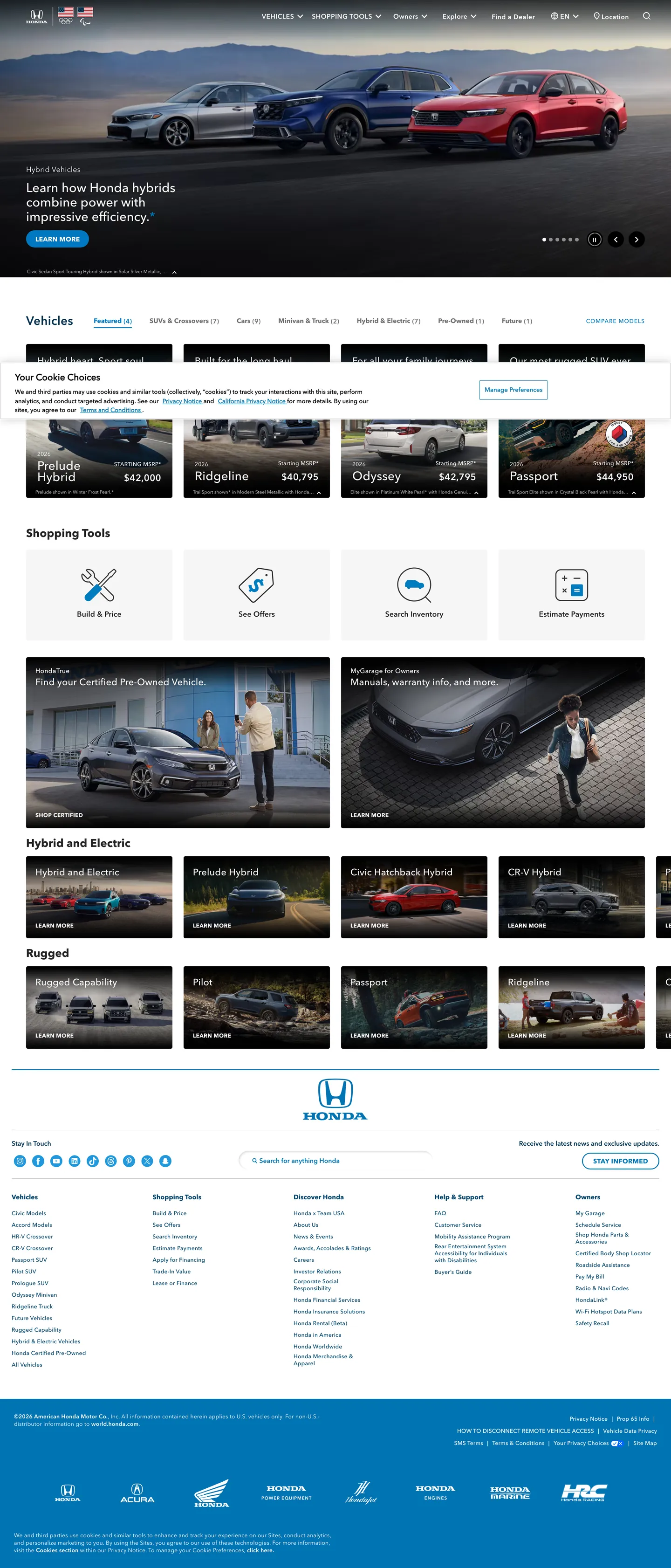
Honda's marketing site does something almost no other family-automotive brand attempts: it leaves the iconic brand color out of the chrome entirely. The Honda red that you find on every dealership sign, every TV ad, and every model badge is absent from the captured marketing surface. The load-bearing chrome color is a deep navy — the color appears 898 times across the page as the text-and-border tone, the model-name lockup, the vehicle-card body, the footer link rows. The single chromatic accent on the homepage is a quiet sky blue that does social-icon and pagination duty about 36 times. The hero band itself is a black photographic strip with a 27px white h2 overlaid; the only colored CTA pill in the captured frame is light-gray with navy text.
The DESIGN.md file packages the system into a machine-readable spec for React and AI tools. Inside: 10 colors tokens dominated by deep navy (898 occurrences) and white (661), with hairline gray (210), pure black (121), and a darker navy for body links (108) doing the rest of the structural work. Typography is a four-weight Avenir Next stack — Regular, Medium, Demi, Bold — all sitting at CSS weight 400, with visual hierarchy built from font-family swap rather than from font-weight. Display tops out at 27px on the hero h2; section heads sit at 20-26px; body at 12-14px. The radius scale is binary: 4px on every card and 33px pill on every CTA. 15 components cover the hairline filter chip, the vehicle-card grid, the pagination dot, the dark hero band, and the search-input pill.
Feed this file to Claude or Cursor and it reproduces Honda's specific moves: navy-as-chrome rather than brand-color-as-chrome, four-weight Avenir Next at uniform CSS weight 400, binary 4px-or-pill radius, and the deliberate absence of red. The token references resolve cleanly. The one move worth borrowing only if you sell a high-volume family product: holding the iconic brand color back from the chrome entirely — keeping it reserved for the model badge, the dealership signage, and the TV ad. The marketing site becomes a calm browser instead of a sales pitch, and the brand color reads louder when the user finally encounters it on a vehicle.
What makes it distinct
5
- Navy carries the system, not reddeep navy carries 898 occurrences while the famous Honda red is absent from the captured marketing chrome
- Four-weight Avenir NextRegular, Medium, Demi, Bold all at CSS weight 400; visual hierarchy comes from font-family swap, not from font-weight
- Binary radius scale4px on every card (60 occurrences) and 33px pill on every CTA (10 occurrences), with no middle tier
- Sky blue as the single chromatic accentwired as social-icon and pagination color, used 36 times total
- 27px hero h2 in white on photographthe loudest typographic moment in the system runs at weight 400, not 700
automobiles.honda.com
Live at automobiles.honda.com
A snapshot of the brand in production. Scroll the frame to see the whole page.
Colors
10 colors
Honda's system runs on #0077c0 as its primary voltage, used in 3 of 15 components. Type is set in AvenirNextMedium across 11 tokens from 10px to 27px, weights 400–400. Shape language is mixed across 15 components, blending pills, soft rounds, and squarer corners.
Brand & Accent
Sparing, CTA-only voltage · 1
Surface
Page and card backgrounds · 1
Text
Headlines, body, captions · 4
Borders & Hairlines
Dividers, outlines, rules · 1
Other
Specialty colors · 3
Typography
11 type tokens
Set in AvenirNextMedium across 11 tokens, from 10px to 27px, weights 400–400. Shown in its own stack: where the font isn't installed, the fallback the file names stands in.
- display-xl27px · weight 400 · lh 31px · tracking 0.1pxThe quick brown fox jumps over the lazy dog
- display-md26px · weight 400 · lh 24px · tracking 0.25pxThe quick brown fox jumps over the lazy dog
- heading-md20px · weight 400 · lh 24px · tracking 0.5pxThe quick brown fox jumps over the lazy dog
- heading-sm20px · weight 400 · lh 25px · tracking 0.25pxThe quick brown fox jumps over the lazy dog
- body-md16px · weight 400 · lh 24px · tracking 0.25pxThe quick brown fox jumps over the lazy dog
- body-sm14px · weight 400 · lh 20px · tracking 0.25pxThe quick brown fox jumps over the lazy dog
- body-xs12px · weight 400 · lh 15px · tracking 0.25pxThe quick brown fox jumps over the lazy dog
- label-eyebrow14px · weight 400 · lh 20px · tracking 0.5pxThe quick brown fox jumps over the lazy dog
- link-bold14px · weight 400 · lh 19px · tracking 0.25pxThe quick brown fox jumps over the lazy dog
- caption10px · weight 400 · lh 12pxThe quick brown fox jumps over the lazy dog
- button-md15px · weight 400 · lh 25px · tracking 0.25pxThe quick brown fox jumps over the lazy dog
Layout
Radii and spacing
6 corner radii and 9 spacing values. Shape language: mixed.
Radii
- none0px
- sm4px
- md8px
- lg14px
- pill33px
- full9999px
Spacing
- xxs4px
- xs5px
- sm8px
- md10px
- base14px
- lg16px
- xl20px
- 2xl24px
- 3xl56px
Components
15 components
Each rendered from its tokens (color, type, radius, padding) on Honda's own canvas.
- Button Primarybutton-primaryButton Primary
- Button Primary Hoverbutton-primary-hoverButton Primary Hover
- Button Secondarybutton-secondaryButton Secondary
- Top Navtop-navTop Nav
- Nav Linknav-linkNav Link
- Hero Bandhero-bandHero Band
- Hero Headinghero-headingHero Heading
- Section Headingsection-headingSection Heading
- Body Paragraphbody-paragraphBody Paragraph
- Body Paragraph Mutedbody-paragraph-mutedBody Paragraph Muted
- Vehicle Cardvehicle-cardVehicle Card
- Filter Chipfilter-chipFilter Chip
- Pagination Dotpagination-dotPagination Dot
- Type here…text-inputText Input
- FooterfooterFooter
In use
The system, in use
Honda's tokens on the kind of product it builds.
Build something people actually use.
A short paragraph of marketing copy that previews how the brand's display tier and body tier read together. Two sentences is usually enough.
FAQ
Honda design system FAQ
Common questions about Honda's tokens, components, and how to use this DESIGN.md in your project.
Read next
Related reading
Specs, directories, and component libraries that pair with this design system.
- Browse all design systemsThe full directory of DESIGN.md files on shadcn.io, with live mockups for each.shadcn.io
- Honda Automobiles — official siteHonda's public marketing site — the source of truth for the live tokens captured in this file.automobiles.honda.com (opens in a new tab)
- The DESIGN.md specificationGoogle Labs' open spec for machine-readable design system files — the format this page is built on.github.com (opens in a new tab)
Use it
Use Honda in your project
One machine-readable file. Drop it into Claude, Cursor, or any AI tool that reads DESIGN.md.
Download the DESIGN.md
One machine-readable file: every color, type, radius, spacing, and component token of Honda.
Feed it to your AI tool
Drop it into Claude, Cursor, or GitHub Copilot. The agent writes React components and Tailwind classes that match Honda's visual language.
Reference the tokens directly
Or paste the values into your Tailwind config, CSS variables, or component library: every color, size and radius is a quoted, ready-to-copy value.
Read the full DESIGN.md: overview, rationale, do’s and don’ts
Overview
Honda's marketing site inverts the family-automotive convention. Navy as chrome, red as absence. Where Toyota holds its signature red as a text-and-border accent across the entire chrome and where Ford fills CTA buttons with the brand blue, Honda's marketing surface omits the iconic Honda red entirely. The load-bearing chrome color is {colors.navy} (#00324f) — a deep navy that appears 898 times on the page (449 as text, 449 as border), carrying the vehicle-card text, the footer link rows, the hairline outlines, and the Honda brand mark itself. The famous red shows up nowhere above the fold. The single chromatic accent in the extraction is a sky blue ({colors.primary} — #0077c0) that does social-icon and pagination duty about 36 times, then disappears.
The system's typographic move is the same kind of restraint. Four weights of Avenir Next (Regular, Medium, Demi, Bold) carry every tier from the 27px hero h2 down to the 10px footer caption, all wired at CSS font-weight: 400 — the visual heft comes from the loaded font file, not from font-weight. The 27px hero h2 ("Learn how Honda hybrids combine power with impressive efficiency") in white over a black photographic band at weight 400 with 0.1px tracking is the loudest typographic moment in the system. Compared to Audi's 56px / weight 700 hero or Tesla's full-bleed photographic shouting, this is a quiet brochure-magazine voice — confidence by font-family choice rather than by font-weight.
The radius scale is binary: 4px on every card surface (60 occurrences) and 33px on every CTA pill (10 occurrences), with 14px showing up only 3 times as the exception that proves the rule. This is a softer binary than Toyota's 8px-card / 50px-pill split — Honda's 4px cards read almost-rectangular and the 33px pills read as warm-but-not-fully-rounded — but the principle is identical: cards and CTAs occupy distinct shape categories, and there is no middle tier to blur the line.
Key Characteristics:
- Deep navy
{colors.navy}(#00324f) carries 898 occurrences (449 text + 449 border) — the load-bearing chrome color, used everywhere Toyota would use red. - Honda's famous red is genuinely absent from the captured marketing chrome — present on dealership signage and model badges, omitted from the website.
- Sky blue
{colors.primary}(#0077c0) is the only brand-layer chromatic accent — wired as social-icon, pagination, and the footer band fill (36 occurrences total). - Four-weight Avenir Next stack (Regular / Medium / Demi / Bold) all at CSS weight 400; visual weight comes from font-family swap.
- 27px hero h2 (
{typography.display-xl}at AvenirNextMedium / weight 400) is the loudest typographic moment — no display-700 anywhere on the page. - Binary radius scale: 4px on every card, 33px pill on every CTA, no middle option.
- Hero band is a black
{colors.ink}photographic strip; pure black appears 121 times but almost entirely as gradient ink (92 of 121) used to fade photographs to readable text. - Hairline
{colors.hairline}(#dedede) carries 105 of the 105 border occurrences on vehicle cards, dropdowns, and the cookie-notice surface.
Colors
Brand
- Sky Blue (
{colors.primary}— #0077c0): frequency 36. Used as background (14), text (11), border (11). The only chromatic brand-layer color in the extraction. Does social-icon duty (the Facebook / X / Instagram strip in the footer), pagination-dot duty (active-state indicator on the vehicle carousel), and carries the footer's blue band fill. Notable for what it isn't — it is not the iconic Honda red.
Surface
- Canvas (
{colors.canvas}— #ffffff): frequency 661 (322 as text, 17 as background, 322 as border). The page floor and the dominant surface color. Every section except the hero photograph and the footer sits on pure white. - Hero Black (
{colors.ink}— #000000): frequency 121 — used as background (20), shadow (5), text (2), border (2), and most heavily as gradient ink (92 occurrences). The hero band is a black photographic strip with white text overlaid; the gradient applications fade the bottom of the photograph to readable text.
Text
- Navy (
{colors.navy}— #00324f): frequency 898 (449 as text, 449 as border). The load-bearing chrome color — vehicle-card titles, body paragraphs, link text, hairline outlines on dropdowns and modals, the Honda brand-mark fill, the top-nav text. Pure navy, not a black-with-blue-cast — warmer than black-on-white at the same contrast. - Navy Deep (
{colors.navy-deep}— #00446b): frequency 108 (54 text, 54 border). One step darker than{colors.navy}— used on link-text active state and on the underline beneath top-nav active sections. - Muted (
{colors.muted}— #717171): frequency 48 (24 text, 24 border). The secondary running-text tone — sub-labels under vehicle-card prices, fine-print captions on the financing tools. - Ink Soft (
{colors.ink-soft}— #232323): frequency 14 (7 text, 7 border). Used on the cookie-notice body and on certain heavier emphasis text inside the financing-tools strip. - Ink Mid (
{colors.ink-mid}— #333333): frequency 2. A rare third dark tone used only on the legal disclaimer headings in the footer. - Sky Soft (
{colors.sky-soft}— #1881b6): frequency 8. One step softer than the sky blue — used on the hover state for social icons.
Hairline
- Hairline (
{colors.hairline}— #dedede): frequency 210 (105 text, 105 border). The dominant hairline tone — vehicle-card outlines, dropdown bottom rules, top-nav bottom border, the search-field outline, the cookie-notice divider. There is no second border tone in the captured chrome.
Typography
Font Family
The system runs four weights of Avenir Next wired into custom font names: AvenirNextRegular, AvenirNextMedium, AvenirNextDemi, AvenirNextBold. All four sit at CSS font-weight: 400 — the visual weight comes from the loaded font file. Fallbacks walk to HelveticaNeue, "Helvetica Neue", Helvetica, Arial, sans-serif. There is no proprietary display family and no monospace tier.
Hierarchy
| Token | Size | Weight | Line Height | Letter Spacing | Use |
|---|---|---|---|---|---|
{typography.display-xl} | 27px | 400 (Medium) | 31px | 0.1px | Hero h2 ("Learn how Honda hybrids…") |
{typography.display-md} | 26px | 400 (Medium) | 24px | 0.25px | Section headings ("Vehicles", "Shopping Tools") |
{typography.heading-md} | 20px | 400 (Medium) | 24px | 0.5px | h4 subheads ("Hybrid and Electric", "Rugged") |
{typography.heading-sm} | 20px | 400 (Demi) | 25px | 0.25px | Sub-section emphasis blocks |
{typography.body-md} | 16px | 400 (Regular) | 24px | 0.25px | h1 brand-lede and default running text |
{typography.body-sm} | 14px | 400 (Medium) | 20px | 0.25px | Vehicle-card body, link captions |
{typography.body-xs} | 12px | 400 (Medium) | 15px | 0.25px | Sub-nav and dropdown labels |
{typography.label-eyebrow} | 14px | 400 (Demi) | 20px | 0.5px (uppercase) | Eyebrow labels above section headings |
{typography.link-bold} | 14px | 400 (Bold) | 19px | 0.25px | Emphasized inline links |
{typography.caption} | 10px | 400 (Regular) | 12px | 0 | Legal disclaimer, photograph credits |
{typography.button-md} | 15px | 400 (Regular) | 25px | 0.25px | CTA pill labels |
Principles
Every tier sits at CSS weight 400. The visual hierarchy is built entirely from font-size, line-height, and which Avenir Next variant the font-family resolves to — AvenirNextRegular for the airy body paragraphs, AvenirNextMedium for the hero and section heads, AvenirNextDemi for eyebrow labels and emphasis, AvenirNextBold for inline link emphasis. The hero h2 at 27px / 31px is notably small for a hero — Audi runs hero text at 56px and Tesla runs it full-bleed at 96px — and the 0.1px positive tracking reads as warm-confident rather than aggressive. The brand voice is brochure-magazine, not SaaS-hero.
The 16px h1 (rendered as the brand lede beneath the hero) at AvenirNextRegular weight 400 is a deliberate choice — most sites would size the h1 above the h2. Honda inverts the conventional document hierarchy because the h2 is the visual hero and the h1 is the semantic brand-statement; the SEO h1 stays small and the visual h2 carries the typographic impact.
Note on Font Substitutes
Honda's AvenirNextRegular / Medium / Demi / Bold are licensed Avenir Next cuts. The closest open-source substitute is Inter at weights 400, 500, 600, and 700 respectively — the proportions transfer cleanly. Nunito Sans or Mona Sans ship with the same humanist character. Avoid Helvetica Neue as a substitute — the geometric Avenir letterforms read distinctly warmer than the neo-grotesque Helvetica family, and Honda's brand voice depends on that warmth.
Layout
Spacing System
- Base unit: 4px (with 10px and 20px as the dominant module steps).
- Tokens:
{spacing.xxs}4px ·{spacing.xs}5px ·{spacing.sm}8px ·{spacing.md}10px ·{spacing.base}14px ·{spacing.lg}16px ·{spacing.xl}20px ·{spacing.2xl}24px ·{spacing.3xl}56px. - Vehicle-card padding:
{spacing.xl}(20px) horizontal with asymmetric24px 24px 0pxtop/sides (20 occurrences) — the card top sits more generously than the bottom. - Top-nav padding:
0px 56px(18 occurrences) — generous horizontal breathing room flanking the brand mark and the link cluster. - Asymmetric padding patterns:
4px 28px 4px 15px(21 occurrences) for navigation chevrons;0px 24px 0px 56px(17 occurrences) for the sub-nav rows — Honda's spacing is unusually asymmetric for an automotive site.
Grid & Container
- Max content width: ~1280px on the vehicle grid; the hero photograph runs full-bleed.
- Hero band: edge-to-edge black photographic strip (vehicle on a road) with the 27px h2 and a single CTA pill overlaid on the lower-left.
- Vehicle grid: 4-column grid below the fold showing model categories (Hybrid and Electric, Rugged, plus individual model tiles for Civic, Accord, CR-V, Pilot, Odyssey, Ridgeline, Passport, Prelude).
- Shopping tools strip: 4-column equal grid ("Build & Price / Get Offers / Search Inventory / Estimate Payments").
Rhythm
The page alternates between dark photographic bands and white card grids in a strict ABAB sequence. The hero is dark photographic. The Vehicles section is light card-grid. The cookie-notice / dealer-locator band is dark photographic. The Shopping Tools strip is light. The Hybrid and Electric / Rugged sections return to light card-grid. The blue footer is the final band. The rhythm pulls the visitor through aspirational photograph to transactional grid and back, never sitting on either tempo for more than one band.
Elevation
The system has essentially no shadow tier. The captured page has 5 shadow occurrences, all on the cookie-notice modal and the dropdown chrome. Every other surface depends on hairline {colors.hairline} borders for division and on photograph-vs-white contrast for figure-ground.
- Flat (no shadow): hero, vehicle cards, shopping-tools strip, footer — 99.9% of surfaces.
- Hairline elevation:
{colors.hairline}(#dedede) carries 105 border occurrences as 1px outlines on cards, dropdowns, the search field, and the cookie-notice surface. - Photograph gradient: the hero photograph fades to dark at the bottom via 92 occurrences of
{colors.ink}(#000000) as gradient ink — the only "depth" effect in the system.
Shapes
The radius scale is softer-binary: 4px on every card surface, 33px on every CTA pill.
{rounded.none}0px — section dividers, the hero photograph edge, the footer band.{rounded.sm}4px (60 occurrences) — every card. Vehicle tiles, dropdown menus, the cookie-notice modal, filter chips, the financing-tools panels.{rounded.md}8px (1 occurrence) — a single exception in the captured chrome, not a tier.{rounded.lg}14px (3 occurrences) — slightly-larger promotional feature cards inside the Shopping Tools strip.{rounded.pill}33px (10 occurrences) — every CTA pill. The Build & Price button, the secondary outline pills, the pagination chrome.{rounded.full}9999px (3 occurrences as 50% / 100%) — the pagination dots and the brand-mark hit area.
There is no 16px or 20px middle tier on cards. Honda's 4px reads almost-rectangular and the 33px pill reads as warm-but-not-fully-rounded — a softer binary than Toyota's 8px-card / 50px-pill split but with the same enforced distinction between content surfaces and action surfaces.
Components
button-primary — The signature CTA. White {colors.canvas} fill with navy {colors.navy} text, {rounded.sm} 4px radius, 12x24px padding, 44px height. "Build & Price" is the canonical instance — sits as a light-on-photograph chip in the hero band and as a sequence of action buttons in the Shopping Tools strip.
button-primary-hover — Background flips to {colors.primary} (sky blue). The single chromatic moment when the user reaches for the action.
button-secondary — Transparent fill with navy text and a 1px {colors.navy} border, {rounded.pill} 33px radius. Used for "Learn More" and "View Details" secondary actions on the vehicle cards.
top-nav — White {colors.canvas} surface, 60px height, 1px {colors.hairline} bottom border, 12x32px padding. Houses the Honda brand mark (a navy-filled H badge), the section links centered ("Vehicles", "Shopping Tools", "Owners", "Service"), and the Search / Sign In cluster flush-right.
nav-link — Transparent background, navy text in {typography.body-sm} (14px / Medium). 8x12px padding. The hover state shows a 2px navy-deep underline.
hero-band — Edge-to-edge black {colors.ink} photographic strip, 48x24px content padding, no border-radius. Holds the hero h2 in white at {typography.display-xl}, a single sub-paragraph, and a single light-on-dark CTA pill. The bottom of the photograph fades to black via a {colors.ink} gradient overlay to keep the text legible.
hero-heading — White text on the transparent hero photograph, {typography.display-xl} (27px / AvenirNextMedium / 0.1px tracking).
section-heading — Navy text on white, {typography.heading-md} (20px / AvenirNextMedium / 0.5px tracking). Used for "Hybrid and Electric", "Rugged", and the Shopping Tools sub-labels.
body-paragraph — Default navy running-text at {typography.body-md} (16px / AvenirNextRegular / 24px line-height).
body-paragraph-muted — {colors.muted} (#717171) variant at {typography.body-sm} for sub-labels under vehicle-card prices.
vehicle-card — White surface, 1px {colors.hairline} border, {rounded.sm} 4px radius, 20px padding (with asymmetric 24-24-0 top emphasis). Holds a vehicle photograph at the top, a {typography.heading-md} model name, an MSRP caption, and a "Build" CTA pill. No shadow.
filter-chip — White fill, navy text, 1px navy border, {rounded.sm} 4px radius, 4x15px padding, 32px height. The active state inverts to navy fill / white text.
pagination-dot — Sky blue {colors.primary} circle, {rounded.full} radius. Sits in a row below the vehicle carousel and marks the active slide. The inactive dots use {colors.hairline} fill.
text-input — White surface, navy text, 1px {colors.hairline} border, {rounded.lg} 14px radius (slightly more rounded than the cards), 11x16px padding, 40px height. The global header search uses this variant.
footer — Sky blue {colors.primary} band — the single saturated chromatic surface in the captured chrome. White text in {typography.caption} (10px), 32x24px padding. Houses the social-icon strip and the legal-disclaimer column.
Do's and Don'ts
Do carry the entire chrome with {colors.navy} (#00324f) rather than the brand red. The system's strongest move is the absence of red above the fold — navy does the work that red does on Toyota, and the brand red stays reserved for the model badge and the dealership signage. Painting CTAs red would collapse the distinction between marketing chrome and product anchor.
Do use the binary 4px-card / 33px-pill radius scale exactly. Every content surface gets {rounded.sm} 4px; every CTA gets {rounded.pill} 33px. The two values do the entire system's work.
Do sit display headings at CSS weight 400. The visual weight comes from the loaded AvenirNextMedium / Demi / Bold font file, not from font-weight. Bumping to 700 turns the brochure-magazine brand voice into a generic SaaS shout.
Do keep the 27px hero h2 size. The smaller-than-conventional hero is deliberate — Honda's brand voice is calm and family-warm, not commanding-luxury. Sizing the hero at 48px or 56px would tip the chrome into territory occupied by Audi and Mercedes.
Don't introduce the iconic Honda red on the marketing chrome. The brand red lives on the model badge and the dealership signage; the website chrome stays calm so the eventual vehicle-badge encounter reads louder. Adding red to a CTA collapses the brand-voltage discipline.
Don't use {colors.hairline} (#dedede) for background fills or text — it is a border-only token (105 of 210 occurrences are borders, the other 105 are text only on legal-disclaimer rows). For a light surface, use {colors.canvas}.
Don't swap the navy {colors.navy} (#00324f) for pure black. The navy is warmer than black at the same luminance contrast and ties visually to the hero photograph's dark sky tones. Pure black on white reads colder and shifts the brand voice toward Tesla's industrial chrome.
Don't stack two photographic dark bands in a row. The page rhythm is strict ABAB — dark photograph followed by light card-grid. Two dark bands adjacent reads as a fragmented layout and loses the breathing room the white card sections provide.
Known Gaps
- Honda red: the iconic brand red is absent from the captured marketing chrome — its hex and CSS variable name are not exposed in the extraction. It lives on model badges and dealership signage but is not part of the website token set.
- Dark mode: the captured marketing surface is light-only. Dealership-tool surfaces may carry a dark variant but it is not represented here.
- Hover and focus states: documented for
{component.button-primary-hover}only; the full state matrix (focus rings, active press, disabled tints) is not exposed on the captured surfaces. - Form input error states:
{component.text-input}carries the resting state; error / validation styling lives inside the Build & Price configurator and is not captured here. - Motion: the hero photograph cross-fades between vehicle hybrids on a slow loop; the spec captures end-state values only. Easing curves and crossfade duration live in the live page JavaScript.
- Product surfaces: this DESIGN.md captures automobiles.honda.com only. The Build & Price configurator, the Honda Owners portal, Honda Financial Services, and the My Garage authenticated experience carry richer component sets that are not represented here.
- Sub-brand chrome: Honda's Acura luxury sub-brand and Honda Powersports sit on separate marketing surfaces with distinct color and typographic systems; only the parent automobiles.honda.com chrome is captured here.
Automotive
More systems like this
More DESIGN.md files in Automotive.
Pricing
Build it with Pro
The DESIGN.md files are free. Pro adds 6,000+ blocks, premium templates and the MCP server, so your AI editor builds in your system for you.
4.9/5 out of 5 · 150+ reviewsfrom 150+ founders and developers.
Billing
Billed once a year in USD. Cancel anytime.
- How many people can use the license.
- Client work, SaaS products and anything you charge for.
- Production-ready React sections: hero, pricing, features, dashboards and more.
- Complete multi-page sites you can ship as they are.
- React icons from every major library, installable with one command.
- Presets that restyle every block, in light and dark.
- Lets your AI editor search, preview and install blocks for you.
- Priority requests are answered first.
Individual
For personal projects & open source
$32instead of $49/mo
$389 billed yearly
- Seats: 1 seat
- Commercial use: Personal & open source only
- Pro blocks: 6,000+ blocks
- Templates: All 14 templates
- React icons: 294k+ icons
- Themes: All 59 themes
- MCP server: Basic usage
- Support: Standard
Team
Most popularFor freelancers, agencies & startups
$66instead of $99/mo
$789 billed yearly · ≈ $13/dev/mo
- Seats: Up to 5 seats
- Commercial use: Included
- Pro blocks: 6,000+ blocks
- Templates: All 14 templates
- React icons: 294k+ icons
- Themes: All 59 themes
- MCP server: High usage
- Support: Priority
Organization
For companies with larger teams
$132instead of $199/mo
$1,589 billed yearly
- Seats: Unlimited seats
- Commercial use: Included
- Pro blocks: 6,000+ blocks
- Templates: All 14 templates
- React icons: 294k+ icons
- Themes: All 59 themes
- MCP server: Unlimited usage
- Support: Priority
Billed once a year in USD. Cancel anytime.
Individual
For personal projects & open source
$32instead of $49/mo
$389 billed yearly
- How many people can use the license.Seats: 1 seat
- Client work, SaaS products and anything you charge for.Commercial use: Personal & open source only
- Production-ready React sections: hero, pricing, features, dashboards and more.Pro blocks: 6,000+ blocks
- Complete multi-page sites you can ship as they are.Templates: All 14 templates
- React icons from every major library, installable with one command.React icons: 294k+ icons
- Presets that restyle every block, in light and dark.Themes: All 59 themes
- Lets your AI editor search, preview and install blocks for you.MCP server: Basic usage
- Priority requests are answered first.Support: Standard
Team
Most popularFor freelancers, agencies & startups
$66instead of $99/mo
$789 billed yearly · ≈ $13/dev/mo
Everything in Individual, plus
- How many people can use the license.Seats: Up to 5 seats
- Client work, SaaS products and anything you charge for.Commercial use: Included
- Lets your AI editor search, preview and install blocks for you.MCP server: High usage
- Priority requests are answered first.Support: Priority
Organization
For companies with larger teams
$132instead of $199/mo
$1,589 billed yearly
Everything in Team, plus
- How many people can use the license.Seats: Unlimited seats
- Lets your AI editor search, preview and install blocks for you.MCP server: Unlimited usage
- Secure checkout via Stripe
- Code lives in your repo
- Keep what you've shipped if you cancel
- License terms
Your system, built for you
Every block, template and icon, installed by your AI agent in your design system. The DESIGN.md files stay free.