GMC Design System
GMC's marketing-site design system as a DESIGN.md file. Near-black canvas, crimson red accent used only for links and borders, Stratum weight-900 display at 56px, 6 colors tokens, 15 components. For React, Next.js, and AI coding tools.
Add shadcn.io to your AI agent. · Pro It installs blocks, icons and templates in your design system from a prompt, with Pro.
Set up MCP- Primary
- #cc0000
- Typeface
- Stratum
- Shape
- Sharp
- Base radius
- 0px
- Colors
- 6
- Type tokens
- 11
- Components
- 15
- Spacing values
- 9
About
About GMC DESIGN.md
Curated by Dov Azencot · Updated May 19, 2026 · Source gmc.com (opens in a new tab)
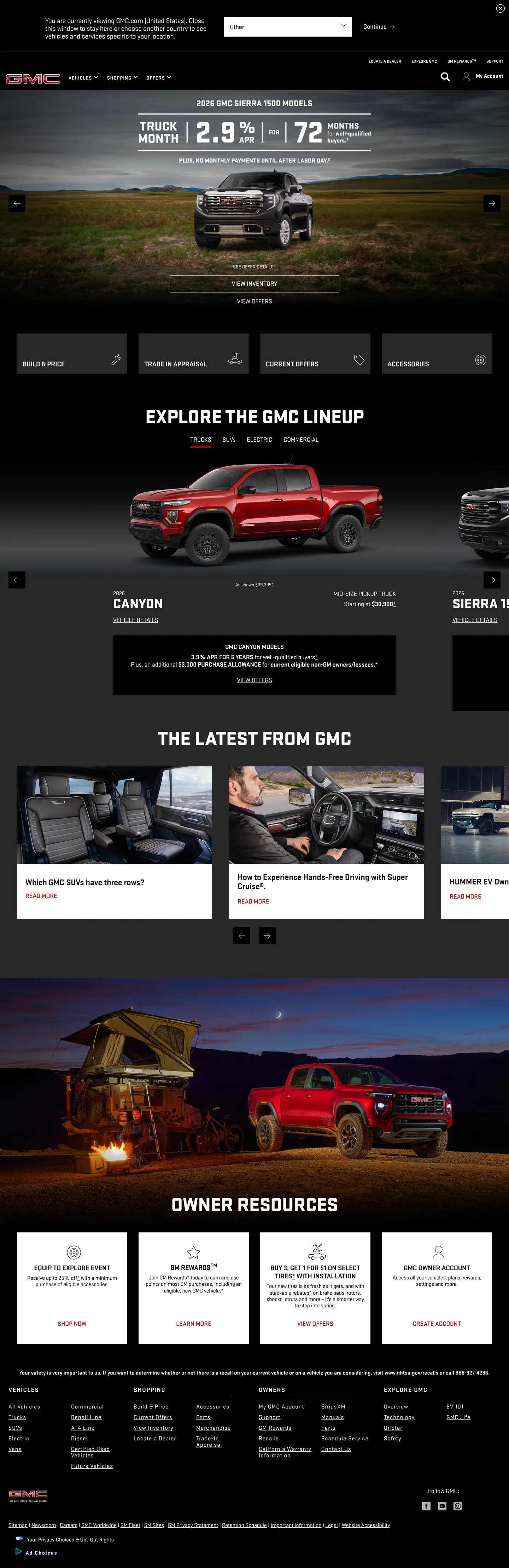
GMC.com opens on a full-bleed truck photograph — a Sierra or Canyon filling the viewport edge to edge — with the GMC badge mark at top left and a crimson-red financing offer bar pinned to the top. There is no decorative hero layer between the brand and the vehicle: the truck IS the background, shot from the three-quarter front angle that every truck buyer recognizes. Below the fold the page drops to near-white for the "Explore the GMC Lineup" section, then returns to dark for the editorial "Latest from GMC" band, then back to near-white for Owner Resources. The alternation is structural, not atmospheric — dark surfaces belong to brand moments, light surfaces belong to information density.
The crimson red that signals GMC's identity does something unusual: it almost never fills a surface. Across 319 total occurrences in the captured page, 158 are borders and 161 are text links — the red is a contour color and a link accent, not a canvas. Where Jeep uses their red for full CTA fills and Ford uses a blue for hero bands, GMC keeps its voltage entirely in outlines and underlines. The Stratum typeface — a condensed geometric with hard terminals — reinforces the working posture; at weight 900 and -0.56px tracking the "EXPLORE THE GMC LINEUP" hero headline reads like a placard bolted to a vehicle rather than a marketing invitation.
Feed this file to an AI coding tool and it will reproduce GMC's specific moves: near-black canvas, crimson red reserved exclusively for link and border accents, Stratum at maximum weight for display moments, and vehicle photography carrying the decorative load. The approach bets everything on the product's visual appeal; there is no safety net of branded illustration or gradient if the photography fails. That gamble pays off in the truck segment precisely because the hardware is built to be photographed.
What makes it distinct
5
- Red as border voltagecrimson appears 158 times as a border and 161 times as text, never as a background fill; the surface always stays dark
- Stratum weight 900 at 56pxthe display headline runs at maximum condensed weight with -0.56px tracking, harder than any competitor in the truck segment
- Photography-only decorationno hero gradients, no brand illustrations; truck and SUV photography carries every above-fold visual job
- Near-black dual canvascharcoal ink-black for hero and footer, near-white for the explore lineup section; the page alternates between dark truck-yard and light editorial
- GB spacing systema named custom-property spacing scale (--gb-spacing-8 through --gb-spacing-240) drives all internal component rhythm
gmc.com
Live at gmc.com
A snapshot of the brand in production. Scroll the frame to see the whole page.
Colors
6 colors
GMC's system runs on #cc0000 as its primary voltage, used in 3 of 15 components. Type is set in Stratum across 11 tokens from 14px to 56px, weights 400–900. Shape language is sharp — components average 0px corner radius, favoring crisp rectangles.
Brand & Accent
Sparing, CTA-only voltage · 1
Surface
Page and card backgrounds · 2
Text
Headlines, body, captions · 2
Borders & Hairlines
Dividers, outlines, rules · 1
Typography
11 type tokens
Set in Stratum across 11 tokens, from 14px to 56px, weights 400–900. Shown in its own stack: where the font isn't installed, the fallback the file names stands in.
- display-xl56px · weight 900 · lh 56px · tracking -0.56pxThe quick brown fox jumps over the lazy dog
- display-md40px · weight 900 · lh 40px · tracking -0.4pxThe quick brown fox jumps over the lazy dog
- heading-lg24px · weight 700 · lh 26.88px · tracking -0.24pxThe quick brown fox jumps over the lazy dog
- heading-md20px · weight 700 · lh 22.4px · tracking -0.2pxThe quick brown fox jumps over the lazy dog
- body-lg20px · weight 400 · lh 22px · tracking -0.16pxThe quick brown fox jumps over the lazy dog
- body-md18px · weight 400 · lh 20.16px · tracking -0.18pxThe quick brown fox jumps over the lazy dog
- body-md-bold18px · weight 700 · lh 20.16px · tracking -0.18pxThe quick brown fox jumps over the lazy dog
- body-sm16px · weight 400 · lh 17.92px · tracking -0.16pxThe quick brown fox jumps over the lazy dog
- label-md18px · weight 500 · lh 21.6pxThe quick brown fox jumps over the lazy dog
- caption14px · weight 400 · lh 15.68px · tracking -0.14pxThe quick brown fox jumps over the lazy dog
- button-md14px · weight 400 · lh normalThe quick brown fox jumps over the lazy dog
Layout
Radii and spacing
1 corner radii and 9 spacing values. Shape language: sharp.
Radii
- none0px
Spacing
- xs4px
- sm8px
- md12px
- base16px
- lg24px
- xl32px
- 2xl48px
- 3xl64px
- 4xl96px
Components
15 components
Each rendered from its tokens (color, type, radius, padding) on GMC's own canvas.
- Button Primarybutton-primaryButton Primary
- Button Secondarybutton-secondaryButton Secondary
- Top Navtop-navTop Nav
- Nav Linknav-linkNav Link
- Hero Headinghero-headingHero Heading
- Section Headingsection-headingSection Heading
- Subsection Headingsubsection-headingSubsection Heading
- Body Paragraphbody-paragraphBody Paragraph
- Body Paragraph Inkbody-paragraph-inkBody Paragraph Ink
- CardcardCard
- Card Darkcard-darkCard Dark
- Financing Barfinancing-barFinancing Bar
- Hero Sectionhero-sectionHero Section
- Type here…text-inputText Input
- FooterfooterFooter
In use
The system, in use
GMC's tokens on the kind of product it builds.
Build something people actually use.
A short paragraph of marketing copy that previews how the brand's display tier and body tier read together. Two sentences is usually enough.
FAQ
GMC design system FAQ
Common questions about GMC's tokens, components, and how to use this DESIGN.md in your project.
Read next
Related reading
Specs, directories, and component libraries that pair with this design system.
- Browse all design systemsThe full directory of DESIGN.md files on shadcn.io, with live mockups for each.shadcn.io
- GMC — official siteGMC's public marketing site — the source of truth for the live tokens captured in this file.gmc.com (opens in a new tab)
- The DESIGN.md specificationGoogle Labs' open spec for machine-readable design system files — the format this page is built on.github.com (opens in a new tab)
Use it
Use GMC in your project
One machine-readable file. Drop it into Claude, Cursor, or any AI tool that reads DESIGN.md.
Download the DESIGN.md
One machine-readable file: every color, type, radius, spacing, and component token of GMC.
Feed it to your AI tool
Drop it into Claude, Cursor, or GitHub Copilot. The agent writes React components and Tailwind classes that match GMC's visual language.
Reference the tokens directly
Or paste the values into your Tailwind config, CSS variables, or component library: every color, size and radius is a quoted, ready-to-copy value.
Read the full DESIGN.md: overview, rationale, do’s and don’ts
Overview
GMC's marketing site bets entirely on the product. Industrial-contour restraint. The hero is a full-bleed truck photograph — no gradient overlay, no brand illustration, no decorative chrome — and the crimson red that marks GMC's identity appears in 319 locations on the page without once filling a surface. Where Ford uses a blue hero band and Jeep fills CTAs with their Wrangler red, GMC keeps crimson strictly in the border and text registers: it is an edge-marking color, not a canvas color. Stratum at weight 900 — the heaviest condensed geometric in the extracted typography — carries the entire display tier from the "EXPLORE THE GMC LINEUP" hero h2 down to the "SIERRA" and "CANYON" model labels.
Key Characteristics:
- Near-black charcoal canvas (
{colors.ink}— #222222) carries the hero, navigation, and footer; near-white{colors.canvas}(#ffffff) handles the lineup and editorial sections below the fold. - Crimson red (
{colors.primary}— #cc0000): 161 text occurrences, 158 border occurrences, zero background fills — used as link and border voltage only. - Stratum condensed geometric at weight 900 for all display moments; weight 400 for body; no intermediate display weight exists.
- Strictly rectilinear — zero captured border radii across the entire marketing surface; every card, button, and hero tile is sharp-cornered.
- Named GB spacing custom-property system (--gb-spacing-8 through --gb-spacing-240) with 8px base unit.
- Vehicle photography is the only decorative layer above and below the fold — no hero gradients, no brand-colored background fills.
- Financing figures (APR, months, price) set in bold Stratum render as a text-based data display rather than a styled promotional graphic.
- Footer returns to the charcoal canvas with the GMC badge mark and category link columns in caption-size Stratum.
Colors
Brand
- Crimson Red (
{colors.primary}— #cc0000): frequency 319. Used as text (161), border (158). Zero background fills. The GMC voltage — runs as link accents, active nav-state indicators, financing bar text, and card border marks. Never fills a surface; always marks an edge or activates a link.
Surface
- Ink (
{colors.ink}— #222222): frequency 515. Used as text (253), border (253), background (9). The primary dark canvas — hero, top nav, footer, editorial band. Merges with a nearby charcoal variant in the extraction; effectively one dark-canvas tone throughout. - Ink Deep (
{colors.ink-deep}— #060505): frequency 63. Used as text (32), border (31). A near-pure-black variant that appears on deeply shadowed card elements and active nav states. - Canvas (
{colors.canvas}— #ffffff): frequency 301. Used as text (144), border (143), background (14). The light surface for the lineup section and owner resources band. Pure white. - Canvas Dark (
{colors.canvas-dark}— #000000): frequency 23. Used as background (17). The deepest dark — appears on the hero photograph overlay and certain full-bleed section backgrounds.
Hairline
- Hairline (
{colors.hairline}— #ebebeb): frequency 1. The sole captured light-mode border tone. Used sparingly — the system relies on the ink/canvas contrast for most surface separation rather than drawn hairlines.
Typography
Font Family
The system runs Stratum (from Font Bureau) across every tier — display, heading, body, button, nav, and caption all use the same condensed geometric. Fallbacks walk to Arial, sans-serif. There is no second typeface voice. The entire system is mono-family, and the weight range runs from 400 (body, caption) to 900 (display) — a five-step weight spread that does the work a multi-family pairing would do elsewhere.
Hierarchy
| Token | Size | Weight | Line Height | Use |
|---|---|---|---|---|
{typography.display-xl} | 56px | 900 | 56px | Hero h2 ("EXPLORE THE GMC LINEUP") |
{typography.display-md} | 40px | 900 | 40px | Section h3 labels ("SIERRA", "CANYON", "HUMMER EV") |
{typography.heading-lg} | 24px | 700 | 26.88px | Sub-section titles in editorial band |
{typography.heading-md} | 20px | 700 | 22.4px | Card titles and financing data labels |
{typography.body-lg} | 20px | 400 | 22px | Lead body paragraph and modal copy |
{typography.body-md} | 18px | 400 | 20.16px | Default running text, nav links |
{typography.body-md-bold} | 18px | 700 | 20.16px | Financing bar primary figures, call-out values |
{typography.body-sm} | 16px | 400 | 17.92px | Caption-level body copy, card sub-labels |
{typography.label-md} | 18px | 500 | 21.6px | CTA link labels, active nav state |
{typography.caption} | 14px | 400 | 15.68px | Fine-print, disclaimer text, footer sub-labels |
{typography.button-md} | 14px | 400 | normal | Button labels (secondary actions) |
Principles
Stratum at weight 900 is the loudest move in the system — deliberately condensed and heavy, it reads as industrial stencil rather than advertising display. No separate heading typeface exists; weight alone distinguishes display from body. The -0.56px tracking on the 56px display tier tightens the already-narrow Stratum glyphs into a block-letter density that Jeep's display type (a wider slab) and Toyota's (a lighter sans) don't approach.
Note on Font Substitutes
Stratum is a licensed Font Bureau face. Barlow Condensed at weight 800-900 replicates the narrow proportions and hard terminals at the display sizes. Industry (Google Fonts) is a looser alternative suitable for body sizes. At weight 900 the key metric to preserve is the condensed x-width — avoid substitutes whose normal variant is merely narrow, as the true condensed cut reads very differently at 56px.
Layout
Spacing System
- Base unit: 8px — dominant padding across the extracted component set (22 occurrences at 8px).
- Tokens:
{spacing.xs}4px ·{spacing.sm}8px ·{spacing.md}12px ·{spacing.base}16px ·{spacing.lg}24px ·{spacing.xl}32px ·{spacing.2xl}48px ·{spacing.3xl}64px ·{spacing.4xl}96px. - Named properties: the GB spacing system exposes custom properties from --gb-spacing-0 to --gb-spacing-240; the full scale includes 56px, 72px, 80px, 88px, 104px, and 136px intermediate steps.
- Section padding (vertical): ~96px on the hero and editorial bands.
- Card internal padding:
{spacing.lg}(24px) on the dark editorial cards;{spacing.base}(16px) on the lineup tiles.
Grid & Container
- Max content width: ~1280px on the hero; ~1080px on the lineup grid and editorial band.
- Hero: full-bleed vehicle photography, content pinned to left-center with the financing offer in the upper third.
- Lineup grid: 4-column horizontal scroll at desktop — each tile shows the model photograph, model name at
{typography.display-md}, starting-MSRP price, and a red-link CTA. - Editorial band: 3-column grid of editorial tiles ("The Latest from GMC") with dark backgrounds and link titles in Stratum 18px/400.
- Owner Resources: 5-column icon-and-label grid on white canvas.
Rhythm
The page alternates between dark-canvas brand moments and light-canvas information moments: hero (dark) → lineup (light) → editorial (dark) → news (light) → owner resources (light) → footer (dark). Each band terminates cleanly at the next; there is no atmospheric cross-fade or gradient transition between bands.
Elevation
The GMC marketing surface shows no shadow tier. Depth comes entirely from canvas-color contrast — the charcoal dark bands and the white light bands create a high-contrast alternating structure that defines section boundaries without any drawn elevation. The single exception is vehicle photography, which carries implied depth from studio or location lighting.
- Flat (no shadow): 100% of declared surfaces — cards, nav, hero, footer.
- No blur or glow treatments: the dark-on-light / light-on-dark contrast does all elevation work.
Shapes
The shape language is strictly rectilinear. The extraction returned zero border-radius values from the marketing surface. Every card, hero tile, button, financing bar, nav, and editorial block is sharp-cornered. This is a deliberate truck-segment choice — the rounded-soft treatment that Ford Explorer and Rivian use reads as approachable and consumer-friendly; GMC's flat corners read as tool-and-job.
{rounded.none}0px — the only radius in the system.
Components
button-primary — Crimson {colors.primary} fill, white text, no border-radius, 8x32px padding, 36px height. Used for "Build & Price" and "Shop Now" primary actions throughout the lineup grid.
button-secondary — Transparent fill, crimson text, no border-radius, bottom-border only in crimson. The inline link-style CTA used for "View Details," "Learn More," and editorial article links.
top-nav — Charcoal {colors.ink} surface, white text, no border-radius, 48px height. Houses the GMC badge mark flush left, model nav links (Trucks, SUVs, Crossovers, Vans, EVs, Electric), and the search / account cluster right.
nav-link — Transparent background, white text at {typography.body-md}, 8x16px padding. Active nav state shows crimson underline border.
hero-section — Full-bleed vehicle photography with charcoal {colors.ink} overlay gradient on the left-side text zone. The display h2 and financing offer sit in the overlay zone; the vehicle occupies the right two-thirds of the frame.
hero-heading — White text, {typography.display-xl} (56px / 900), 0 horizontal padding. Set entirely in uppercase by the font's native glyph forms rather than CSS text-transform.
section-heading — Ink-colored text on white canvas, same {typography.display-xl} token, used for "EXPLORE THE GMC LINEUP" and "THE LATEST FROM GMC" headers.
subsection-heading — Ink text at {typography.display-md} (40px / 900) — the model name labels ("SIERRA T1," "CANYON," "HUMMER EV") in the lineup carousel.
body-paragraph — White text on dark canvas, {typography.body-md} (18px / 400). The hero text and editorial body copy.
body-paragraph-ink — Ink text on white canvas, same {typography.body-md}. For lineup card descriptions and owner resource labels.
card — White canvas fill, ink text, no border-radius, 16px padding, hairline border. Used in the owner resources grid and news editorial cards on white bands.
card-dark — Charcoal {colors.ink} fill, white text, no border-radius, 16px padding. The editorial "Latest from GMC" tiles.
financing-bar — Charcoal {colors.ink} background, crimson {colors.primary} text for the offer figures (APR rate, months, conditions). A persistent strip that sits between the hero and the vehicle image.
text-input — White canvas fill, ink text and border, no border-radius, 8x16px padding, 40px height. The search bar in the top nav.
footer — Charcoal {colors.ink} canvas, white caption text, 48x24px padding. Houses GMC badge mark, category link columns (Vehicles, Electric Vehicles, Shopping Tools, Owner Resources), and social icon row.
Do's and Don'ts
Do keep crimson reserved for text links and border accents only. The system's discipline is that {colors.primary} never fills a background surface — it marks edges and activates links. Filling a card or section with crimson would import the Jeep/Ford "CTA fill" convention that GMC deliberately avoids.
Do use weight 900 Stratum for any display moment. The condensed heavy weight at 56px is the typographic identity of the brand; lighter weights at display sizes look borrowed from a different vehicle category.
Do alternate dark-canvas and light-canvas bands to create structural rhythm. The page's section logic is charcoal for brand, white for information — mixing both on the same band breaks the structural signal.
Do use full-bleed vehicle photography as the hero visual. The brand's decorative strategy is entirely photographic; introducing illustrated icons or brand-colored shapes above the fold would undermine the "truck-as-hero" proposition.
Don't add border radius to buttons or cards. The strictly rectilinear geometry is the shape identity of the brand — {rounded.none} 0px is not an oversight but a decision. Any rounded element reads as borrowed from Toyota, Ford, or Rivian.
Don't use {colors.primary} (#cc0000) as a background fill for sections or CTA buttons. The 158 border occurrences and 161 text occurrences exist precisely because the brand holds crimson away from fills; a crimson-filled hero band would read as an emergency alert, not as a truck brand.
Don't introduce a second typeface family. Stratum carries every tier — display, body, button, and caption. Pairing it with a secondary serif or humanist sans dilutes the industrial mono-family identity.
Don't use soft radius values (8px, 12px, 16px) anywhere in the system. The zero-radius shape language is load-bearing; the moment a card or button gets rounded corners the brand reads as consumer-soft rather than trade-grade.
Known Gaps
- Button hover states: no hover, active, or focus state information is captured from the marketing surface; the crimson CTA button's hover behavior is not represented here.
- Form validation: the text input carries resting state only; error, success, and disabled variants are not exposed in the captured marketing surface.
- Light mode / dark mode toggle: the brand does not appear to expose a mode toggle; the two-canvas system (charcoal and white) is structural, not a theme switch.
- Mobile responsive tokens: the CSS variable spacing system (--gb-spacing-*) does not expose breakpoint-specific overrides in the captured surface; mobile type sizing and padding are not documented.
- Configurator surface: the Build & Price configurator at gmc.com/build likely carries a richer interactive token system (color swatches, option selectors, 3D viewer controls) that is not represented here.
- EV-specific palette: the Hummer EV and Sierra EV listings may carry additional badge-color and accent tokens specific to the electric lineup.
Automotive
More systems like this
More DESIGN.md files in Automotive.
Pricing
Build it with Pro
The DESIGN.md files are free. Pro adds 6,000+ blocks, premium templates and the MCP server, so your AI editor builds in your system for you.
4.9/5 out of 5 · 150+ reviewsfrom 150+ founders and developers.
Billing
Billed once a year in USD. Cancel anytime.
- How many people can use the license.
- Client work, SaaS products and anything you charge for.
- Production-ready React sections: hero, pricing, features, dashboards and more.
- Complete multi-page sites you can ship as they are.
- React icons from every major library, installable with one command.
- Presets that restyle every block, in light and dark.
- Lets your AI editor search, preview and install blocks for you.
- Priority requests are answered first.
Individual
For personal projects & open source
$32instead of $49/mo
$389 billed yearly
- Seats: 1 seat
- Commercial use: Personal & open source only
- Pro blocks: 6,000+ blocks
- Templates: All 14 templates
- React icons: 294k+ icons
- Themes: All 59 themes
- MCP server: Basic usage
- Support: Standard
Team
Most popularFor freelancers, agencies & startups
$66instead of $99/mo
$789 billed yearly · ≈ $13/dev/mo
- Seats: Up to 5 seats
- Commercial use: Included
- Pro blocks: 6,000+ blocks
- Templates: All 14 templates
- React icons: 294k+ icons
- Themes: All 59 themes
- MCP server: High usage
- Support: Priority
Organization
For companies with larger teams
$132instead of $199/mo
$1,589 billed yearly
- Seats: Unlimited seats
- Commercial use: Included
- Pro blocks: 6,000+ blocks
- Templates: All 14 templates
- React icons: 294k+ icons
- Themes: All 59 themes
- MCP server: Unlimited usage
- Support: Priority
Billed once a year in USD. Cancel anytime.
Individual
For personal projects & open source
$32instead of $49/mo
$389 billed yearly
- How many people can use the license.Seats: 1 seat
- Client work, SaaS products and anything you charge for.Commercial use: Personal & open source only
- Production-ready React sections: hero, pricing, features, dashboards and more.Pro blocks: 6,000+ blocks
- Complete multi-page sites you can ship as they are.Templates: All 14 templates
- React icons from every major library, installable with one command.React icons: 294k+ icons
- Presets that restyle every block, in light and dark.Themes: All 59 themes
- Lets your AI editor search, preview and install blocks for you.MCP server: Basic usage
- Priority requests are answered first.Support: Standard
Team
Most popularFor freelancers, agencies & startups
$66instead of $99/mo
$789 billed yearly · ≈ $13/dev/mo
Everything in Individual, plus
- How many people can use the license.Seats: Up to 5 seats
- Client work, SaaS products and anything you charge for.Commercial use: Included
- Lets your AI editor search, preview and install blocks for you.MCP server: High usage
- Priority requests are answered first.Support: Priority
Organization
For companies with larger teams
$132instead of $199/mo
$1,589 billed yearly
Everything in Team, plus
- How many people can use the license.Seats: Unlimited seats
- Lets your AI editor search, preview and install blocks for you.MCP server: Unlimited usage
- Secure checkout via Stripe
- Code lives in your repo
- Keep what you've shipped if you cancel
- License terms
Your system, built for you
Every block, template and icon, installed by your AI agent in your design system. The DESIGN.md files stay free.