Genesis Design System
Genesis (Hyundai's luxury arm) design system as a DESIGN.md file. Bespoke type duo, weight-400 60px display, amber accent at low frequency, alternating dark-light canvas bands. For React, Next.js, and AI tools.
Add shadcn.io to your AI agent. · Pro It installs blocks, icons and templates in your design system from a prompt, with Pro.
Set up MCP- Primary
- #ff6b00
- Typeface
- genesis-head-office-light
- Shape
- Sharp
- Base radius
- 5px
- Colors
- 13
- Type tokens
- 11
- Components
- 16
- Spacing values
- 7
About
About Genesis DESIGN.md
Curated by Dov Azencot · Updated May 19, 2026 · Source genesis.com (opens in a new tab)
Genesis does something no other luxury automotive brand on the web commits to fully: its display headline at 60px runs at weight 400. Not 700, not 600, not even 500. The genesis-head-office-light family is doing exactly what its name says — heading-light — and the result is a page that reads as more editorial magazine than automotive catalog. BMW's homepage runs its display at weight 700. Land Rover's bold custom font runs at 700. Genesis holds weight 400 at 60px and lets negative letter-spacing (-1.5px) do the work of mass.
The DESIGN.md file packages this system for React tooling. Inside: a 12-token color palette that is almost entirely black and white — near-black at #111111 for hero-section surfaces, pure white (#ffffff) for model-grid sections, silver-gray (#bbbbbb) for UI lines and secondary text, and a single amber accent (#ff6b00) appearing just 4 times across the entire page. Two bespoke type families — genesis-head-office-light for the heading tier (headings from 20px to 60px, always at weight 400) and genesis-text-office for body (14–18px at weight 400). All rectangular surfaces use 0px radius; pagination dots and icon buttons use 100% or 50% radius for fully circular shapes. No middle radius tier exists.
Feed this file to Claude or Cursor and it reproduces Genesis's specific choices: dual bespoke families with strict role separation, 60px display at weight 400 with tight negative tracking, alternating near-black and white canvas bands rather than a single-tone page, and an amber accent so scarce it functions more as a system reserve than a visible presence. The typographic restraint — especially the weight-400 choice at large display sizes — is the one move worth studying closely: it communicates that the brand has enough confidence in its letterforms to let them stand without the mass that weight boost provides.
What makes it distinct
5
- Weight-400 at 60px displaygenesis-head-office-light renders the hero at 60px with no weight boost, lighter than Jaguar, Land Rover, or any other automotive brand captured here
- Two bespoke familiesgenesis-head-office-light for all headings, genesis-text-office for all body; the split is strict with no cross-usage
- Canvas alternationhero and feature modules use near-black (#111111), while model grids and editorial sections use pure white (#ffffff)
- Amber at minimum frequency#ff6b00 appears only 4 times in the page, all as text or border, never as a fill — the rarest accent of any brand here
- Binary radiuseither 0px on all rectangular surfaces or 100% / 50% fully circular on pagination and icon elements
genesis.com
Live at genesis.com
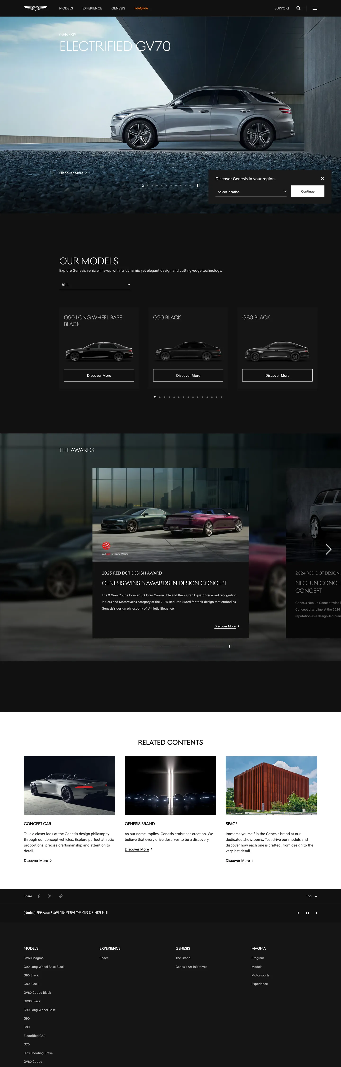
A snapshot of the brand in production. Scroll the frame to see the whole page.
Colors
13 colors
Genesis's system anchors on #ff6b00 (accent) as its primary color. Type is set in genesis-head-office-light across 11 tokens from 14px to 60px, weights 400–400. Shape language is sharp — components average 1px corner radius, favoring crisp rectangles.
Brand & Accent
Sparing, CTA-only voltage · 1
Surface
Page and card backgrounds · 6
Text
Headlines, body, captions · 3
Borders & Hairlines
Dividers, outlines, rules · 3
Typography
11 type tokens
Set in genesis-head-office-light across 11 tokens, from 14px to 60px, weights 400–400. Shown in its own stack: where the font isn't installed, the fallback the file names stands in.
- display-xl60px · weight 400 · lh 64px · tracking -1.5pxThe quick brown fox jumps over the lazy dog
- display-lg42px · weight 400 · lh 44px · tracking -0.798pxThe quick brown fox jumps over the lazy dog
- display-md26px · weight 400 · lh 32px · tracking -0.65pxThe quick brown fox jumps over the lazy dog
- heading-md24px · weight 400 · lh 28px · tracking -0.6pxThe quick brown fox jumps over the lazy dog
- heading-sm20px · weight 400 · lh 21px · tracking -0.5pxThe quick brown fox jumps over the lazy dog
- section-title18px · weight 400 · lh 20px · tracking -0.45pxThe quick brown fox jumps over the lazy dog
- body-lg18px · weight 400 · lh 24pxThe quick brown fox jumps over the lazy dog
- body-md16px · weight 400 · lh 24pxThe quick brown fox jumps over the lazy dog
- body-sm14px · weight 400 · lh 22pxThe quick brown fox jumps over the lazy dog
- label-md14px · weight 400 · lh 16pxThe quick brown fox jumps over the lazy dog
- nav-link14px · weight 400 · lh 22pxThe quick brown fox jumps over the lazy dog
Layout
Radii and spacing
4 corner radii and 7 spacing values. Shape language: sharp.
Radii
- none0px
- full100%
- circle50%
- sm5px
Spacing
- xs1px
- sm4px
- md16px
- lg20px
- xl21px
- 2xl40px
- 3xl100px
Components
16 components
Each rendered from its tokens (color, type, radius, padding) on Genesis's own canvas.
- Button Primarybutton-primaryButton Primary
- Button Secondarybutton-secondaryButton Secondary
- Top Navtop-navTop Nav
- Nav Linknav-linkNav Link
- Hero Headinghero-headingHero Heading
- Body Paragraphbody-paragraphBody Paragraph
- CardcardCard
- Card Lightcard-lightCard Light
- Section Headingsection-headingSection Heading
- Type here…text-inputText Input
- Pagination Dotpagination-dotPagination Dot
- Pagination Dot Activepagination-dot-activePagination Dot Active
- Model Cardmodel-cardModel Card
- Feature Panelfeature-panelFeature Panel
- FooterfooterFooter
- Swiper Navswiper-navSwiper Nav
In use
The system, in use
Genesis's tokens on the kind of product it builds.
Build something people actually use.
A short paragraph of marketing copy that previews how the brand's display tier and body tier read together. Two sentences is usually enough.
FAQ
Genesis design system FAQ
Common questions about Genesis's tokens, components, and how to use this DESIGN.md in your project.
Read next
Related reading
Specs, directories, and component libraries that pair with this design system.
- Browse all design systemsThe full directory of DESIGN.md files on shadcn.io, with live mockups for each.shadcn.io
- Genesis — official siteGenesis's public marketing site — the source of truth for the live tokens captured in this file.genesis.com (opens in a new tab)
- The DESIGN.md specificationGoogle Labs' open spec for machine-readable design system files — the format this page is built on.github.com (opens in a new tab)
Use it
Use Genesis in your project
One machine-readable file. Drop it into Claude, Cursor, or any AI tool that reads DESIGN.md.
Download the DESIGN.md
One machine-readable file: every color, type, radius, spacing, and component token of Genesis.
Feed it to your AI tool
Drop it into Claude, Cursor, or GitHub Copilot. The agent writes React components and Tailwind classes that match Genesis's visual language.
Reference the tokens directly
Or paste the values into your Tailwind config, CSS variables, or component library: every color, size and radius is a quoted, ready-to-copy value.
Read the full DESIGN.md: overview, rationale, do’s and don’ts
Overview
Genesis's homepage is a lesson in typographic confidence without weight. Light as Authority. The hero heading renders genesis-head-office-light at 60px in weight 400 — no bold, no semibold, no typographic mass beyond the 60px size itself, with -1.5px negative tracking pulling the letterforms together. Where BMW runs its display at 700, Land Rover at 700, and Jaguar at 600, Genesis holds at 400 and lets the custom letterform geometry carry the identity. The approach resembles editorial fashion typography more than automotive advertising.
The page alternates between near-black cinema sections ({colors.surface-1} — #111111) for atmospheric vehicle photography and pure white editorial sections ({colors.canvas-light} — #ffffff) for model specifications and comparison. Two bespoke families — genesis-head-office-light for headings, genesis-text-office for body — divide the page with strict role separation: a heading never appears in the text family and vice versa. A single amber accent ({colors.accent} — #ff6b00) appears just 4 times across the entire page, functioning as a system reserve rather than a visible brand voltage.
Key Characteristics:
- Weight-400 display at 60px —
{typography.display-xl}at genesis-head-office-light weight 400, the lightest display weight of any luxury automotive brand captured here. - Two bespoke families with strict role separation — headings always in genesis-head-office-light, body always in genesis-text-office, zero cross-usage.
- Dark-light alternation — near-black
{colors.surface-1}(#111111) for hero/cinema sections, pure white{colors.canvas-light}for grid/editorial sections. - Amber accent (
{colors.accent}— #ff6b00) at 4 total occurrences, lowest of any accent color in the directory — a touch of warmth, not a voltage. - Binary radius — either
{rounded.none}0px on rectangular surfaces or{rounded.full}/{rounded.circle}on pagination dots and icon buttons. - Silver-gray
{colors.ink-secondary}(#bbbbbb) for secondary UI lines and borders — a three-step text ladder (white → silver → dark) rather than a two-step. - Negative letter-spacing across the entire heading ladder (-0.45px at 18px through -1.5px at 60px) — the typographic substitute for weight as the primary differentiation tool.
Colors
Surface
- Canvas (
{colors.canvas}— #000000): frequency 624. Used as text (314), border (310). The dominant ink color used on white sections — pure black text on white backgrounds throughout the model-grid and editorial bands. - Surface-1 (
{colors.surface-1}— #111111): frequency 105. Used as background (67), text (19), border (19). The near-black canvas for dark cinema sections — hero, feature-film panels, footer. Warmer than pure black, allowing vehicle photography to register shadow detail. - Surface-2 (
{colors.surface-2}— #1a1a1a): frequency 2. Background only — a slightly lighter near-black for inset panel surfaces within dark sections. - Surface-Dark (
{colors.surface-dark}— #262626): frequency 6. Used as text (3), border (3). A dark gray appearing on mid-section text elements in dark contexts. - Surface-3 (
{colors.surface-3}— #333333): frequency 1. Background only — a mid-dark surface in specific panel contexts.
Text
- Ink (
{colors.ink}— #ffffff): frequency 864. Used as text (431), border (407), background (26). The dominant text color on dark sections and the system's white border tone. Pure white at maximum frequency — the system leans entirely on it for all dark-surface text. - Ink Muted (
{colors.ink-muted}— #cccccc): frequency 24. Used as text (12), border (12). The body paragraph tone on dark sections — a mid-silver that reduces contrast slightly from the full-white heading tier. - Ink Secondary (
{colors.ink-secondary}— #bbbbbb): frequency 110. Used as text (55), border (55). The UI divider and secondary label color — a slightly darker silver than the muted body text, carrying the majority of horizontal rule work.
Hairline
- Hairline (
{colors.hairline}— #000000): frequency high, as border. On white sections, pure black borders carry card outlines and dividers. - Hairline Light (
{colors.hairline-light}— #cccccc): same hex as ink-muted — also appears as border on light sections. The pagination inactive dot color. - Hairline Mid (
{colors.hairline-mid}— #4d4d4d): frequency 1 as border. An intermediate rule tone.
Accent
- Accent (
{colors.accent}— #ff6b00): frequency 4. Used as text (2), border (2). An amber-orange that appears at minimum frequency — link hover or active-state indicator in specific navigation contexts. Never as a background fill. The rarest accent in the directory.
Typography
Font Families
The system runs two bespoke families in strict division: genesis-head-office-light (also appearing as genesis-head-office-light and genesis-Head-office for a regular-weight variant) for all headings from 18px to 60px, and genesis-text-office for all body, navigation, label, and caption surfaces. A third variant genesis-Head-office (note the mixed capitalization) appears at 15–18px for section-title contexts that fall between heading and body.
The strict family split is the most disciplined typographic separation in the automotive category captured here. No genesis-text-office appears at display size; no genesis-head-office-light appears in navigation or body paragraphs. The families have entirely separate roles.
Hierarchy
| Token | Size | Weight | Line Height | Letter Spacing | Use |
|---|---|---|---|---|---|
{typography.display-xl} | 60px | 400 | 64px | -1.5px | Hero h2 (vehicle names, campaign headlines) |
{typography.display-lg} | 42px | 400 | 44px | -0.798px | Secondary display headings |
{typography.display-md} | 26px | 400 | 32px | -0.65px | Sub-section display headings |
{typography.heading-md} | 24px | 400 | 28px | -0.6px | Section headings like "OUR MODELS" |
{typography.heading-sm} | 20px | 400 | 21px | -0.5px | Feature panel headings |
{typography.section-title} | 18px | 400 | 20px | -0.45px | Section category labels (uppercase) |
{typography.body-lg} | 18px | 400 | 24px | 0 | Lead paragraph body |
{typography.body-md} | 16px | 400 | 24px | 0 | Default body text |
{typography.body-sm} | 14px | 400 | 22px | 0 | Caption and secondary body |
{typography.label-md} | 14px | 400 | 16px | 0 | UI labels, button labels |
{typography.nav-link} | 14px | 400 | 22px | 0 | Navigation links |
Principles
The entire type system runs at weight 400 — across every heading size from 18px to 60px, every body size from 14px to 18px, and every label. Weight variation does not exist in this system as a hierarchy signal; only size and letter-spacing carry hierarchy. The negative letter-spacing ladder is crucial: -1.5px at 60px (approximately -0.025em), tightening progressively down to -0.45px at 18px. This tightening is what makes the display headings feel authoritative at weight 400 — the letterforms are held together by tracking, not by stroke width.
Note on Font Substitutes
genesis-head-office-light is proprietary. The closest open-source substitute at display sizes is Cormorant Garamond Light (weight 300) or Libre Baskerville with reduced weight — though these are serifs. For a sans-serif substitute closer in construction, Lexend at weight 300 with -0.04em tracking applied at display sizes approximates the airy character. For genesis-text-office, Inter weight 400 is the closest general substitute; apply letter-spacing: normal explicitly as the system uses no tracking on body text.
Layout
Spacing System
- Base module: 16px (appears as the recurring dominant gap value at 10 occurrences).
- Tokens:
{spacing.xs}1px ·{spacing.sm}4px ·{spacing.md}16px ·{spacing.lg}20px ·{spacing.xl}21px ·{spacing.2xl}40px ·{spacing.3xl}100px. - Horizontal page padding: 40px on both left and right edges — consistent across nav, hero, model grid, and footer.
- Card internal padding:
29px 20px 39px— asymmetric vertical (29px top, 39px bottom) creating a weighted rhythm in model-card rows. - Hero text offset: approximately 112px top padding before hero text begins, placing the heading in the lower third of a full-bleed image.
Grid & Container
- Full-bleed hero: the vehicle photography fills 100vw with text overlaid at the left.
- Model grid: 3-column grid on desktop, each card containing a silhouette image, model name (heading-sm), pricing, and two CTA buttons.
- Feature panels: full-width alternating dark-light bands with a 2-column text-plus-image layout inside.
- "Related Contents" grid: 3-column media card grid on white canvas with model photography thumbnails.
Rhythm
The page alternates deliberately between dark cinema bands and light editorial bands. The opening hero is dark; the model grid is white; the feature film section is dark; the editorial "Related Contents" section is white; the footer is dark. No two adjacent bands share the same canvas tone. This alternation is the page's structural device — it creates a rhythm of mood shifts rather than a uniform editorial descent.
Elevation
The system carries a minimal shadow stance. The dark sections use tonal contrast alone to lift UI elements — a near-black card on a near-black surface reads as a distinct layer through its border, not through shadow. On white sections, cards use pure black hairline borders ({colors.hairline} — #000000) with no shadow. Pagination controls float with no elevation treatment. The only shadow-adjacent element is the full-screen swiper's navigation button.
Shapes
The radius philosophy is binary:
{rounded.none}0px — all rectangular surfaces: buttons, cards, model cards, inputs, form containers.{rounded.full}100% and{rounded.circle}50% — pagination dots and circular icon buttons (the swiper navigation arrows).{rounded.sm}5px — appears once on the text input component; the only soft-radius element in the system.
No medium radius tier exists. The system skips the 4–16px range entirely and moves from zero to full circle. Rectangular elements are absolutely sharp; circular elements are absolutely round.
Components
button-primary — White {colors.ink} fill (on dark sections), near-black text, genesis-text-office 16px / weight 400, 0px radius, 16px 20px padding. On white sections, the fill inverts to near-black.
button-secondary — Transparent fill, white or black text depending on section canvas, hairline border, 0px radius, same dimensions.
top-nav — Near-black {colors.surface-1} surface, white text, genesis-text-office 14px / weight 400, 73px height, 40px horizontal padding. Houses the winged emblem logo, model navigation links, and utility links.
nav-link — Transparent, white text, genesis-text-office 14px / weight 400, 0px 15px 0px 0px padding.
hero-heading — White text, genesis-head-office-light 60px / weight 400 / -1.5px letter-spacing. The vehicle name headline sitting over full-bleed photography.
body-paragraph — Silver {colors.ink-muted} (#cccccc) text on dark sections, genesis-text-office 14px / weight 400. The descriptive paragraph beneath headings.
card — Near-black {colors.surface-1} fill, white text, genesis-text-office 14px, 0px radius, 29px 20px 39px padding, pure black border.
card-light — Pure white fill, near-black text, same genesis-text-office, 0px radius, same padding, pure black border.
model-card — Pure white canvas, near-black text, vehicle silhouette image, heading-sm (20px) model name, pricing, two buttons. The model-grid row element.
section-heading — Near-black text on white, genesis-head-office-light 26px / weight 400 / -0.65px tracking. "OUR MODELS," "RELATED CONTENTS," and similar section headers on white bands.
feature-panel — Near-black fill, white text, full-width atmospheric film panel with text block at right or left.
pagination-dot — Silver {colors.hairline-light} fill, fully circular at {rounded.full} 100%, 4px 1px padding. The inactive carousel position indicator.
pagination-dot-active — White {colors.ink} fill, same circular treatment. Active carousel position.
text-input — White fill, near-black text, genesis-text-office 16px, {rounded.sm} 5px radius, 16px padding, silver hairline border. The only element in the system with a non-zero rectangular radius.
swiper-nav — Transparent fill, white arrow, fully circular {rounded.circle} 50%, 6px padding. The slide-left / slide-right carousel button.
footer — Near-black {colors.surface-1} fill, silver {colors.ink-muted} text, genesis-text-office 14px, 40px horizontal padding. Multi-column link array with the winged emblem.
Do's and Don'ts
Do run all heading surfaces at weight 400. The system has no weight variation — every tier from 18px section titles to 60px display headings uses genesis-head-office-light at 400. Bumping the hero to 600 or 700 would immediately convert the editorial gesture into conventional automotive advertising.
Do apply negative letter-spacing across the full heading ladder. At 60px, -1.5px (approximately -0.025em) is what holds the weight-400 display together visually. At smaller heading sizes, scale the tracking proportionally down to -0.45px at 18px. Without tracking, the weight-400 setting reads as an oversight rather than a choice.
Do keep {colors.accent} (#ff6b00) at maximum 4–5 occurrences per page. The amber orange is a system reserve, not a voltage. Appearing on more than 5 elements per page — especially as a fill — would convert it from a distinguishing touch into a competing chromatic voice.
Do alternate dark and white canvas bands with no two adjacent sections sharing the same tone. The rhythm — dark hero, white grid, dark feature, white editorial — is the page's structural identity. Breaking the alternation by running two white or two dark sections consecutively collapses the cinematic quality.
Don't use genesis-text-office at display heading sizes. The family split is strict: headings are always genesis-head-office-light, body is always genesis-text-office. Mixing the two at overlapping sizes destroys the typographic logic that makes the system readable without weight contrast.
Don't introduce a medium border-radius (4–16px) on card or button surfaces. The system is binary — 0px or full circle. Adding 8px to card corners would import a standard SaaS card aesthetic into a system whose severity is part of the brand statement.
Don't render the amber accent ({colors.accent} — #ff6b00) as a button fill or hero highlight. It appears 4 times in the full page at text and border usage only. Using it as a 44px button fill or as a section heading color would overweight it by approximately 10×.
Don't reduce the hero's 40px horizontal page padding. The system maintains a consistent 40px left-right inset on both the navigation and the hero copy block — collapsing this to 20px or 16px would remove the generous breathing room that signals luxury over efficiency.
Known Gaps
- Dark-mode completeness: the system uses two canvas tones (near-black and pure white) in alternation, but there is no documented light-mode-only variant — the captured page mixes both within the same layout.
- Configurator and spec surfaces: the captured homepage does not include the Genesis vehicle configurator, where color swatches, trim selectors, and 360° viewer components would require additional tokens.
- Form input error and success states:
{component.text-input}captures the resting state only; validation, error, and focus states are not represented. - Hover states: no hover or active state transitions are visible in the static extraction. CSS transitions likely exist given the page's swiper and animated scroll behaviors.
- Animation system: the homepage is heavily animated (hero carousel, scroll-triggered reveals, parallax on vehicle photography) but no easing, duration, or stagger values are captured in the static CSS extraction.
- Dealer-locator and account surfaces: the
/en/worldwide/dealer-locatorand account-management pages carry additional form and map components not present in the marketing homepage. - Winged-emblem logo in dark context: the emblem SVG colors in dark vs. light section contexts are not captured as distinct tokens.
Automotive
More systems like this
More DESIGN.md files in Automotive.
Pricing
Build it with Pro
The DESIGN.md files are free. Pro adds 6,000+ blocks, premium templates and the MCP server, so your AI editor builds in your system for you.
4.9/5 out of 5 · 150+ reviewsfrom 150+ founders and developers.
Billing
Billed once a year in USD. Cancel anytime.
- How many people can use the license.
- Client work, SaaS products and anything you charge for.
- Production-ready React sections: hero, pricing, features, dashboards and more.
- Complete multi-page sites you can ship as they are.
- React icons from every major library, installable with one command.
- Presets that restyle every block, in light and dark.
- Lets your AI editor search, preview and install blocks for you.
- Priority requests are answered first.
Individual
For personal projects & open source
$32instead of $49/mo
$389 billed yearly
- Seats: 1 seat
- Commercial use: Personal & open source only
- Pro blocks: 6,000+ blocks
- Templates: All 14 templates
- React icons: 294k+ icons
- Themes: All 59 themes
- MCP server: Basic usage
- Support: Standard
Team
Most popularFor freelancers, agencies & startups
$66instead of $99/mo
$789 billed yearly · ≈ $13/dev/mo
- Seats: Up to 5 seats
- Commercial use: Included
- Pro blocks: 6,000+ blocks
- Templates: All 14 templates
- React icons: 294k+ icons
- Themes: All 59 themes
- MCP server: High usage
- Support: Priority
Organization
For companies with larger teams
$132instead of $199/mo
$1,589 billed yearly
- Seats: Unlimited seats
- Commercial use: Included
- Pro blocks: 6,000+ blocks
- Templates: All 14 templates
- React icons: 294k+ icons
- Themes: All 59 themes
- MCP server: Unlimited usage
- Support: Priority
Billed once a year in USD. Cancel anytime.
Individual
For personal projects & open source
$32instead of $49/mo
$389 billed yearly
- How many people can use the license.Seats: 1 seat
- Client work, SaaS products and anything you charge for.Commercial use: Personal & open source only
- Production-ready React sections: hero, pricing, features, dashboards and more.Pro blocks: 6,000+ blocks
- Complete multi-page sites you can ship as they are.Templates: All 14 templates
- React icons from every major library, installable with one command.React icons: 294k+ icons
- Presets that restyle every block, in light and dark.Themes: All 59 themes
- Lets your AI editor search, preview and install blocks for you.MCP server: Basic usage
- Priority requests are answered first.Support: Standard
Team
Most popularFor freelancers, agencies & startups
$66instead of $99/mo
$789 billed yearly · ≈ $13/dev/mo
Everything in Individual, plus
- How many people can use the license.Seats: Up to 5 seats
- Client work, SaaS products and anything you charge for.Commercial use: Included
- Lets your AI editor search, preview and install blocks for you.MCP server: High usage
- Priority requests are answered first.Support: Priority
Organization
For companies with larger teams
$132instead of $199/mo
$1,589 billed yearly
Everything in Team, plus
- How many people can use the license.Seats: Unlimited seats
- Lets your AI editor search, preview and install blocks for you.MCP server: Unlimited usage
- Secure checkout via Stripe
- Code lives in your repo
- Keep what you've shipped if you cancel
- License terms
Your system, built for you
Every block, template and icon, installed by your AI agent in your design system. The DESIGN.md files stay free.