Chevrolet Design System
Chevrolet's marketing design system as a DESIGN.md file. Brushed gold #cd9834 on charcoal black, ChevySansBlack hero display at 64px, ChevySans body, 10 colors, 13 typography tokens, 18 components. For React and AI tools.
Add shadcn.io to your AI agent. · Pro It installs blocks, icons and templates in your design system from a prompt, with Pro.
Set up MCP- Primary
- #cd9834
- Typeface
- ChevySans
- Shape
- Soft
- Base radius
- 8px
- Colors
- 10
- Type tokens
- 13
- Components
- 18
- Spacing values
- 10
About
About Chevrolet DESIGN.md
Curated by Dov Azencot · Updated May 19, 2026 · Source chevrolet.com (opens in a new tab)
Chevrolet's marketing site is built on a two-tier weight system within a single type family: ChevySans at 500–700 for everything readable, ChevySansBlack at 900 for everything declarative. The jump from semibold body to ultra-black hero headline is larger than any weight ladder in the food, tech, or hospitality categories — ChevySansBlack at 64px weight 900 has the optical density of a cast-metal stamp. Where Toyota runs a single typeface at conservative weights and Ford uses a condensed face for announcements, Chevrolet achieves its authority through weight compression at a single size rather than through condensation or a separate display family. The hero headline "SUVs YOU CAN COUNT ON" takes up two-thirds of the viewport by mass alone.
The DESIGN.md file packages the system into a machine-readable spec for React and AI tools. Inside: 10 colors tokens built from a near-monochrome base (charcoal-black #222222 and graphite-gray #333333 carry 1028 of the 1480+ extracted occurrences) lit by brushed gold (#cd9834) at 196 appearances, corporate cobalt blue (#0077d9) at 72, and pure white at 149. Thirteen typography tokens span ChevySans and ChevySansBlack from 12px caption to 64px hero. Five radius tokens from 4px card rounding to 48px pill CTAs. A 17-step spacing scale sourced from the `--gb-spacing-*` CSS custom property family. Eighteen component definitions covering the full-bleed hero, the brushed-gold vehicle-card, the pill CTA button, the dealer-search input, and the promotional offer strip.
Feed this file to Claude or Cursor and it will reproduce Chevrolet's specific moves: charcoal-black canvas sections framing full-bleed photography, ChevySansBlack at 64px / 900 for hero announcements, brushed gold (#cd9834) on nav underlines and price callouts rather than as a CTA fill, corporate blue for links and interactive affordances, and pill geometry graduating to near-full-pill (48px) for the most prominent CTAs. The system is an instructive study in how an American auto brand uses heavy typographic weight rather than chromatic drama as its primary confidence signal.
What makes it distinct
5
- Brushed gold as structural voltage#cd9834 appears 196 times as text and border, carrying nav underlines, price callouts, and decorative elements; it is not a CTA accent but a pervasive tone
- Two-weight type system in one familyChevySans at 500–700 for body and subheads, ChevySansBlack at 900 for hero and promotional headlines; the jump from semibold to ultra-black is the brand's emphasis register
- Photography-first canvasdark charcoal (#222222) surfaces exist to frame full-bleed vehicle photography rather than as aesthetic choices in isolation
- Named CSS spacing scale`--gb-spacing-8` through `--gb-spacing-240` are the exact custom properties powering the layout; the naming convention reveals a Global Business design system underpinning shared across GM brands
- Pill-dominant CTA geometryborder-radius at 20px (pill-adjacent) and 48px (full pill) on CTAs; the rounder the surface the more primary the action
chevrolet.com
Live at chevrolet.com
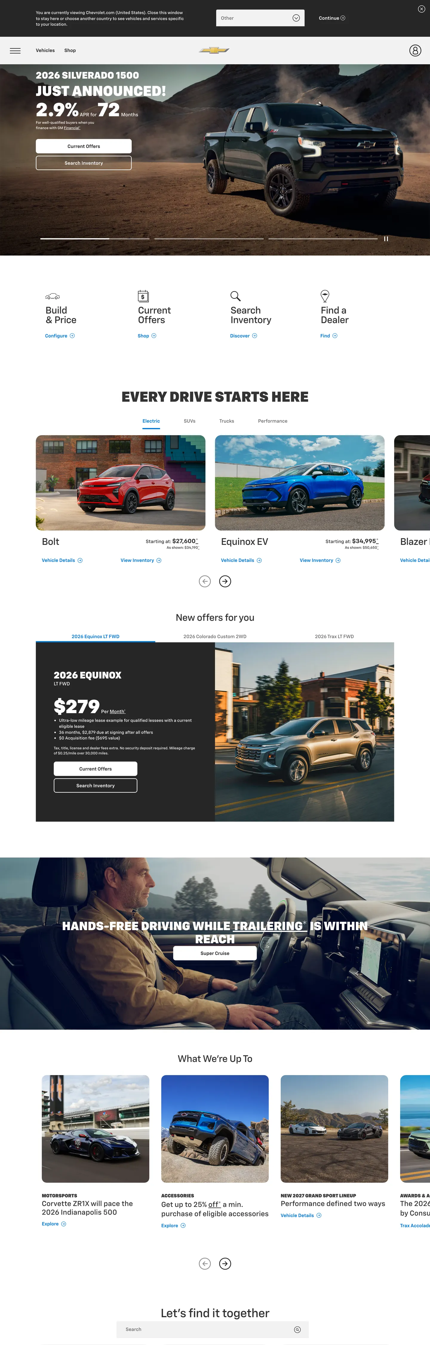
A snapshot of the brand in production. Scroll the frame to see the whole page.
Colors
10 colors
Chevrolet's system anchors on #cd9834 (primary) as its primary color. Type is set in ChevySans across 13 tokens from 12px to 64px, weights 500–900. Shape language is soft — components average 16px corner radius, with no sharp interactive edges.
Brand & Accent
Sparing, CTA-only voltage · 1
Surface
Page and card backgrounds · 3
Text
Headlines, body, captions · 5
Other
Specialty colors · 1
Typography
13 type tokens
Set in ChevySans across 13 tokens, from 12px to 64px, weights 500–900. Shown in its own stack: where the font isn't installed, the fallback the file names stands in.
- display-xl64px · weight 900 · lh 51pxThe quick brown fox jumps over the lazy dog
- display-lg48px · weight 900 · lh 38pxThe quick brown fox jumps over the lazy dog
- display-md40px · weight 900 · lh 32pxThe quick brown fox jumps over the lazy dog
- heading-lg32px · weight 900 · lh 26pxThe quick brown fox jumps over the lazy dog
- heading-md32px · weight 500 · lh 32px · tracking -0.64pxThe quick brown fox jumps over the lazy dog
- subhead-lg24px · weight 500 · lh 29pxThe quick brown fox jumps over the lazy dog
- subhead-md20px · weight 700 · lh 28pxThe quick brown fox jumps over the lazy dog
- body-lg16px · weight 600 · lh 22pxThe quick brown fox jumps over the lazy dog
- body-md16px · weight 500 · lh 22pxThe quick brown fox jumps over the lazy dog
- body-sm14px · weight 500 · lh 20pxThe quick brown fox jumps over the lazy dog
- label-md12px · weight 500 · lh 17pxThe quick brown fox jumps over the lazy dog
- button-md16px · weight 600 · lh 20pxThe quick brown fox jumps over the lazy dog
- caption12px · weight 500 · lh 17pxThe quick brown fox jumps over the lazy dog
Layout
Radii and spacing
6 corner radii and 10 spacing values. Shape language: soft.
Radii
- none0px
- sm4px
- md8px
- lg16px
- xl20px
- pill48px
Spacing
- xs4px
- sm8px
- base16px
- md20px
- lg24px
- xl32px
- 2xl48px
- 3xl64px
- 4xl80px
- 5xl96px
Components
18 components
Each rendered from its tokens (color, type, radius, padding) on Chevrolet's own canvas.
- Button Primarybutton-primaryButton Primary
- Button Primary Hoverbutton-primary-hoverButton Primary Hover
- Button Secondarybutton-secondaryButton Secondary
- Button Cta Pillbutton-cta-pillButton Cta Pill
- Top Navtop-navTop Nav
- Nav Linknav-linkNav Link
- Hero Headinghero-headingHero Heading
- Hero Sectionhero-sectionHero Section
- Section Headingsection-headingSection Heading
- Body Paragraphbody-paragraphBody Paragraph
- Vehicle Cardvehicle-cardVehicle Card
- Offer Cardoffer-cardOffer Card
- Price Displayprice-displayPrice Display
- Type here…text-inputText Input
- CardcardCard
- Feature Labelfeature-labelFeature Label
- FooterfooterFooter
- Promo Bannerpromo-bannerPromo Banner
In use
The system, in use
Chevrolet's tokens on the kind of product it builds.
Build something people actually use.
A short paragraph of marketing copy that previews how the brand's display tier and body tier read together. Two sentences is usually enough.
FAQ
Chevrolet design system FAQ
Common questions about Chevrolet's tokens, components, and how to use this DESIGN.md in your project.
Read next
Related reading
Specs, directories, and component libraries that pair with this design system.
- Browse all design systemsThe full directory of DESIGN.md files on shadcn.io, with live mockups for each.shadcn.io
- Chevrolet — official siteChevrolet's public marketing site — the source of truth for the live tokens captured in this file.chevrolet.com (opens in a new tab)
- The DESIGN.md specificationGoogle Labs' open spec for machine-readable design system files — the format this page is built on.github.com (opens in a new tab)
Use it
Use Chevrolet in your project
One machine-readable file. Drop it into Claude, Cursor, or any AI tool that reads DESIGN.md.
Download the DESIGN.md
One machine-readable file: every color, type, radius, spacing, and component token of Chevrolet.
Feed it to your AI tool
Drop it into Claude, Cursor, or GitHub Copilot. The agent writes React components and Tailwind classes that match Chevrolet's visual language.
Reference the tokens directly
Or paste the values into your Tailwind config, CSS variables, or component library: every color, size and radius is a quoted, ready-to-copy value.
Read the full DESIGN.md: overview, rationale, do’s and don’ts
Overview
Chevrolet's marketing site declares authority through typographic weight rather than chromatic drama. Weight as brand voice. ChevySansBlack at weight 900 — the ultra-black cut of the proprietary ChevySans family — carries every hero headline, every vehicle announcement, and every promotional price display at 32–64px. The jump from ChevySans 500 (body) to ChevySansBlack 900 (headline) is larger than any weight ladder in the consumer brand directory; the system has no intermediate 600–800 display step. Where Toyota applies a single conservative typeface across all scales, and where Ford uses condensed faces to compress announcements, Chevrolet achieves authority through raw weight at the single hero font size.
The brushed gold (#cd9834) is the brand's structural accent — not a CTA fill, not a hero background, but a pervasive decorative tone. Gold as decoration, blue as interaction: gold (#cd9834) appears 196 times across nav underlines, the bowtie emblem, price-callout supporting elements, and rule lines; cobalt blue (#0077d9) carries link text and interactive affordances at 72 occurrences. Unlike brands that hold their accent color for CTAs, Chevrolet distributes the gold broadly, which means it reads more like a surface property than a signal — the gold tones the environment, the charcoal-black-and-white performs the actions.
Key Characteristics:
- ChevySansBlack at 900 weight for hero and promotional headlines — 64px for the above-fold banner, 48px for offer announcements, 32–40px for secondary display.
- ChevySans at 500–700 for all body, nav, and subhead copy — the same family covering the full reading spectrum below headline scale.
- Charcoal-black (
{colors.ink}— #222222) and graphite-gray ({colors.ink-dark}— #333333) account for 1028 of 1480+ measured occurrences; the canvas is dark-neutral, not white. - Brushed gold (
{colors.primary}— #cd9834) at 196 occurrences — pervasive decorative accent, never a CTA fill. - Cobalt blue (
{colors.secondary}— #0077d9) at 72 occurrences — the interactive link and secondary-action color. - Light-gray surfaces (
{colors.surface-1}— #f2f2f2 and{colors.surface-2}— #e6e6e6) carry vehicle card backgrounds and section alternation. - Named CSS spacing ladder (
--gb-spacing-*) spanning 4px to 240px — a Global Business design system shared across GM brands. - Pill-adjacent radius at 20px for primary CTAs, full pill at 48px for the most prominent actions.
Colors
Brand
- Brushed Gold (
{colors.primary}— #cd9834): frequency 196. Used as text (98), border (98). The Chevrolet bowtie emblem and every decorative accent in the system. Not a button fill; it carries the nav bowtie logo, underlines, price-annotation elements, and decorative dividers throughout the page. The most-used chromatic element by far. - Cobalt Blue (
{colors.secondary}— #0077d9): frequency 72. Used as text (36), border (36). The interactive link tone — carries every 'View details,' 'Compare,' and body-copy link on the page. Wired as a hard-coded value rather than a CSS custom property on this surface.
Text
- Ink (
{colors.ink}— #222222): frequency 544. Used as text (270), border (270), background (4). The dominant charcoal-black — the primary text color for every heading, body, and nav element below the hero photography. The extraction'smergedFromarray consolidates two near-identical charcoals into this single token. - Ink Dark (
{colors.ink-dark}— #333333): frequency 484. Used as text (242), border (242). The graphite-gray secondary — shares almost equal frequency with ink at body scale. A slightly lighter charcoal for secondary and supporting text. - Ink Muted (
{colors.ink-muted}— #666666): frequency 12. Used as text (6), border (6). Mid-gray for caption-level annotations, regulatory fine print, and supplementary labels. - Ink Faint (
{colors.ink-faint}— #8c8c8c): frequency 2. Light gray for the finest body text — legal disclaimers and MSRP footnotes (rendered in ChevySans 12px / 500).
Surface
- Canvas (
{colors.canvas}— #ffffff): frequency 149. Used as text (68), background (13), border (68). Pure white — the primary card fill and the text color on dark hero surfaces. - Surface 1 (
{colors.surface-1}— #f2f2f2): frequency 6, background only. Light gray used for vehicle card backgrounds and section fills that need a subtle departure from white. - Surface 2 (
{colors.surface-2}— #e6e6e6): frequency 6, background only. A slightly darker gray used for card borders and active-state backgrounds on vehicle-selector tabs. - Ink Black (
{colors.ink-black}— #000000): frequency 6. Pure black for the darkest shadow and occasional deep text moments — distinct from the softer charcoal ink.
Typography
Font Families
The system runs two weights of the same proprietary family: ChevySans at weights 500, 600, and 700 for body, label, button, and nav text, and ChevySansBlack at weight 900 for every headline and display tier. Both use Arial, sans-serif as fallback. The family covers the full typographic range without a second design family — differentiation comes from the extreme weight jump at headline scale, not from a display-vs-body family split.
This single-family, dual-weight model is ChevySans's most unusual structural feature. The brand runs 19 distinct typography signatures in the extraction; 15 of them are variations of ChevySans / ChevySansBlack across sizes, and 4 use ChevySansBlack at 900 weight for the heaviest display moments. There is no light or thin variant — the minimum weight in the system is 500.
Hierarchy
| Token | Size | Weight | Family | Line Height | Use |
|---|---|---|---|---|---|
{typography.display-xl} | 64px | 900 | ChevySansBlack | 51px | Hero h2 ("SUVs YOU CAN COUNT ON") |
{typography.display-lg} | 48px | 900 | ChevySansBlack | 38px | Offer section headlines |
{typography.display-md} | 40px | 900 | ChevySansBlack | 32px | Feature announcements |
{typography.heading-lg} | 32px | 900 | ChevySansBlack | 26px | Promotional sub-headlines |
{typography.heading-md} | 32px | 500 | ChevySans | 32px | Section heading ("EVERY DRIVE STARTS HERE") |
{typography.subhead-lg} | 24px | 500 | ChevySans | 29px | Vehicle name subheads |
{typography.subhead-md} | 20px | 700 | ChevySans | 28px | Offer label headers |
{typography.body-lg} | 16px | 600 | ChevySans | 22px | Primary body copy and card headers |
{typography.body-md} | 16px | 500 | ChevySans | 22px | Standard body and nav links |
{typography.body-sm} | 14px | 500 | ChevySans | 20px | Supporting labels and list items |
{typography.label-md} | 12px | 500 | ChevySans | 17px | Small metadata labels and fine print |
{typography.button-md} | 16px | 600 | ChevySans | 20px | CTA button labels |
{typography.caption} | 12px | 500 | ChevySans | 17px | Disclaimers, legal footnotes |
Principles
The weight gap between {typography.body-md} (ChevySans 500) and {typography.display-xl} (ChevySansBlack 900) is the system's signature. There is no 600–800 display step — a heading either stays in the readable register (500–700) or tips into the announcement register (900). Display weight at 64px / 900 with tight 51px line-height (0.8 ratio) creates a condensed, stamp-like appearance without using a condensed typeface. The tight line-height on the hero heading means stacked two-line headlines have nearly no inter-line gap.
Note on Font Substitutes
ChevySans and ChevySansBlack are proprietary GM brand typefaces, not publicly available. Anton or Bebas Neue approximate ChevySansBlack 900 at 64px for headline use in open-source projects; the condensed geometry differs but the optical weight is comparable. For ChevySans at 500–600 body sizes, DM Sans or IBM Plex Sans transfer well. Maintain the extreme weight gap: do not introduce a 700-weight display step between body and headline — the gap is the brand signal.
Layout
Spacing System
- Base unit: 8px — 30 occurrences in the captured surface.
- Tokens:
{spacing.xs}4px ·{spacing.sm}8px ·{spacing.base}16px ·{spacing.md}20px ·{spacing.lg}24px ·{spacing.xl}32px ·{spacing.2xl}48px ·{spacing.3xl}64px ·{spacing.4xl}80px ·{spacing.5xl}96px. - CSS custom property source:
--gb-spacing-8through--gb-spacing-240— the Global Business design system token names from the:rootdeclarations. These are exactly the values powering section padding and layout rhythm. - Hero horizontal padding: 0×100px on the full-bleed hero section and footer.
- Vehicle card padding: 12×32px on the vehicle-card grid items.
- Promo banner height: 48px for the APR announcement strip at the page top.
Grid & Container
- Max content width: approximately 1280–1400px on vehicle card grids and promotional strips.
- Hero: full-bleed dark photography with the headline and CTA stack overlaid at centered max-width.
- Vehicle-selector grid: horizontally scrollable card row for model categories (Bolt, Equinox EV, Silverado, etc.) with left/right navigation arrows.
- Offer cards: a 2-column grid pairing the current offer rate (2.9% APR / 72 months) with the vehicle imagery at full bleed.
- Feature tiles: responsive grid of editorial photography sections below the vehicle selector.
Rhythm
The page alternates between dark photography-framed hero bands and light-surface card sections. The APR promo banner strip (48px, dark fill) anchors the top; the main hero follows full-bleed; then the page opens to white and light-gray for the vehicle selector and offer card grid. The dark canvas re-enters for the "Hands-Free Driving" feature section before the footer. The alternation is not visual decoration — each dark section frames a new photography hero.
Elevation
The system runs a surface-contrast elevation model with no meaningful shadow tier. The captured surface (2444 elements scanned) shows zero shadow occurrences in the extracted color data. Depth comes from:
- Photography contrast: vehicle images photographed against outdoor environments on dark or neutral backgrounds read as the primary elevated surface.
- Surface tones:
{colors.surface-1}(#f2f2f2) for vehicle card backgrounds lifted off the white page canvas;{colors.surface-2}(#e6e6e6) for borders and active-state tabs. - Radius-as-elevation signal: pill-radius CTAs at 48px read as the most "elevated" interactive elements by virtue of their curvature versus the square or lightly-rounded surrounding surface.
Shapes
The radius scale follows a functional gradient: smaller radius for content surfaces, larger for interactive surfaces, pill for the most prominent actions.
{rounded.none}0px — hero section, full-bleed photography bands, promo banner strip.{rounded.sm}4px — text input field (dealer search, zip-code entry).{rounded.md}8px — standard card containers, vehicle card grid items. Most frequent radius in the captured surface (15 occurrences).{rounded.lg}16px — offer cards and larger content modules (8 occurrences).{rounded.xl}20px — primary CTA button "Continue" and modal-style action containers (12 occurrences).{rounded.pill}48px — the most prominent CTA buttons, dealer-select actions, and pill-badge elements (6 occurrences).
The scale reads as: the more a surface asks you to act, the rounder it gets.
Components
button-primary — Charcoal-black {colors.ink} fill, white text, ChevySans bold label, 20px radius, 14×32px padding, 56px height. "Continue" is the canonical extraction instance; on the live homepage "Shop Now" and "Get Offers" use the same treatment.
button-primary-hover — Flips to the slightly darker graphite {colors.ink-dark} (#333333). The visual change is subtle — one step darker in the charcoal range.
button-secondary — White {colors.canvas} fill, charcoal text, charcoal border, pill radius (48px), same 14×32px / 56px sizing. Used for "Build & Price" and secondary vehicle-action CTAs.
button-cta-pill — Charcoal-black fill with the maximum 48px pill radius. The highest-prominence CTA shape — "Shop Silverado" or "View All Offers" style actions.
top-nav — White {colors.canvas} surface, 56px height, 0×20px padding. Chevrolet bowtie wordmark flush left in gold; search icon flush right. No product sub-nav in the captured surface — the primary nav is iconographic rather than text-link based.
nav-link — Transparent background, charcoal ink at {typography.body-md}, 14px vertical padding, 0 horizontal. Used for interior navigation links beneath the primary nav bar.
hero-heading — Transparent background on a full-bleed photography section, white text in {typography.display-xl} (ChevySansBlack, 64px / 900). The hero headline renders in all-caps in the captured example.
hero-section — Charcoal-black fill framing full-bleed photography, 0×100px padding, no radius. The photography either fills the section as a background-image or sits as a foreground figure centered in the dark canvas.
section-heading — Transparent background, charcoal ink in {typography.heading-md} (ChevySans 32px / 500). Used for "EVERY DRIVE STARTS HERE" and similar section titles.
body-paragraph — Faint gray {colors.ink-faint} (#8c8c8c) text in {typography.caption} (12px / 500). The legal disclaimer and MSRP footnote style.
vehicle-card — Light-gray {colors.surface-1} fill, charcoal text, 8px radius, 12×32px padding. The horizontally-scrollable vehicle model cards (Bolt, Equinox EV, Silverado, etc.).
offer-card — White fill with light-gray border, charcoal text in {typography.body-lg}, 16px radius, 0×0px 20px bottom padding. Offer cards carrying APR rates, month terms, and the "Learn more" link.
price-display — Transparent background, charcoal text in {typography.display-md} (ChevySansBlack 40px / 900). Price announcements like "2.9% APR for 72 Months."
text-input — Light-gray {colors.surface-1} fill, charcoal text, 4px radius, left-padded 30px for icon, 56px height. The dealer-search / ZIP-code input on the "Find a Dealer" module.
card — White fill, light-gray border, 16px radius, 12×32px padding. The general content card used in the feature section grid.
feature-label — Transparent background, charcoal text in {typography.label-md} (12px / 500). Category labels above vehicle cards ("Build & Price," "Current Offers," "Search Inventory," "Find a Dealer").
footer — Charcoal-black {colors.ink} fill, white text in {typography.caption}, 20×100px padding. Legal copy, brand links, and fine-print disclaimers in the dark-canvas footer.
promo-banner — Charcoal-black fill, white text in {typography.body-md}, 48px height, no radius. The APR-announcement strip running across the top of the page above the hero.
Do's and Don'ts
Do use ChevySansBlack at 900 weight for any headline or announcement headline. The weight gap between body (500) and display (900) is the system's confidence signal — a 700-weight display step would collapse the gap and flatten the hierarchy.
Do use brushed gold ({colors.primary} — #cd9834) as a decoration and emblem tone, not as a CTA fill. On a CTA button, gold reads as luxury (Cadillac, Genesis) rather than mass-market Chevrolet; the CTA fill is always charcoal-black.
Do use cobalt blue ({colors.secondary} — #0077d9) for all interactive link text and secondary button borders. The gold-vs-blue division is clear: gold annotates, blue interacts.
Do maintain full-bleed photography in every dark-canvas hero section. The charcoal-black {colors.ink} surface reads as intentional framing only when a vehicle photograph fills it; an empty dark canvas reads as an unfinished hero.
Don't apply {colors.primary} (#cd9834) to button fills or CTA backgrounds. It has 196 occurrences in the system and all of them are text and border roles — a gold CTA button violates the brand's democratic positioning.
Don't use {rounded.none} on CTA buttons. Square-corner buttons exist only in the hero photography overlay context and the full-bleed promo banner; interactive buttons always carry at least {rounded.xl} 20px radius.
Don't introduce a body weight below 500. ChevySans has no light or thin variant in this system; text at weight 400 would look like a fallback rendering of Arial rather than the brand typeface.
Don't use {colors.surface-2} (#e6e6e6) as a text color. It is a background-only token (6 occurrences, all background); used as text it would be illegible at small sizes against white surfaces.
Known Gaps
- Model-detail and configurator pages: the captured surface is the chevrolet.com homepage. The Build & Price configurator, model-detail pages (trim selectors, color swatches, feature accordions), and the dealer-inventory search results carry a richer component set not represented here.
- Hover and focus states: documented for
{component.button-primary-hover}only; focus rings, active press states, and disabled-button treatment (common in configurator forms) are not captured. - The bowtie emblem color: the gold bowtie logo is an SVG with a specific fill matching
{colors.primary}— but the exact gradient or multi-color interior of the logo is not captured as a flat hex; it is treated here as the{colors.primary}gold approximation. - Dark mode: the captured surface is light-white and dark-photography alternating; no explicit dark-mode CSS declaration is present.
- Mobile layout: the captured viewport is desktop-width (1280px). The vehicle-card row collapses to a single-card swipe carousel and the hero typography scales down significantly; mobile type tokens are not represented.
- Animation and transitions: vehicle-card scroll animations, hero crossfade transitions, and the APR banner ticker are live behaviors not captured in the static token spec.
Automotive
More systems like this
More DESIGN.md files in Automotive.
Pricing
Build it with Pro
The DESIGN.md files are free. Pro adds 6,000+ blocks, premium templates and the MCP server, so your AI editor builds in your system for you.
4.9/5 out of 5 · 150+ reviewsfrom 150+ founders and developers.
Billing
Billed once a year in USD. Cancel anytime.
- How many people can use the license.
- Client work, SaaS products and anything you charge for.
- Production-ready React sections: hero, pricing, features, dashboards and more.
- Complete multi-page sites you can ship as they are.
- React icons from every major library, installable with one command.
- Presets that restyle every block, in light and dark.
- Lets your AI editor search, preview and install blocks for you.
- Priority requests are answered first.
Individual
For personal projects & open source
$32instead of $49/mo
$389 billed yearly
- Seats: 1 seat
- Commercial use: Personal & open source only
- Pro blocks: 6,000+ blocks
- Templates: All 14 templates
- React icons: 294k+ icons
- Themes: All 59 themes
- MCP server: Basic usage
- Support: Standard
Team
Most popularFor freelancers, agencies & startups
$66instead of $99/mo
$789 billed yearly · ≈ $13/dev/mo
- Seats: Up to 5 seats
- Commercial use: Included
- Pro blocks: 6,000+ blocks
- Templates: All 14 templates
- React icons: 294k+ icons
- Themes: All 59 themes
- MCP server: High usage
- Support: Priority
Organization
For companies with larger teams
$132instead of $199/mo
$1,589 billed yearly
- Seats: Unlimited seats
- Commercial use: Included
- Pro blocks: 6,000+ blocks
- Templates: All 14 templates
- React icons: 294k+ icons
- Themes: All 59 themes
- MCP server: Unlimited usage
- Support: Priority
Billed once a year in USD. Cancel anytime.
Individual
For personal projects & open source
$32instead of $49/mo
$389 billed yearly
- How many people can use the license.Seats: 1 seat
- Client work, SaaS products and anything you charge for.Commercial use: Personal & open source only
- Production-ready React sections: hero, pricing, features, dashboards and more.Pro blocks: 6,000+ blocks
- Complete multi-page sites you can ship as they are.Templates: All 14 templates
- React icons from every major library, installable with one command.React icons: 294k+ icons
- Presets that restyle every block, in light and dark.Themes: All 59 themes
- Lets your AI editor search, preview and install blocks for you.MCP server: Basic usage
- Priority requests are answered first.Support: Standard
Team
Most popularFor freelancers, agencies & startups
$66instead of $99/mo
$789 billed yearly · ≈ $13/dev/mo
Everything in Individual, plus
- How many people can use the license.Seats: Up to 5 seats
- Client work, SaaS products and anything you charge for.Commercial use: Included
- Lets your AI editor search, preview and install blocks for you.MCP server: High usage
- Priority requests are answered first.Support: Priority
Organization
For companies with larger teams
$132instead of $199/mo
$1,589 billed yearly
Everything in Team, plus
- How many people can use the license.Seats: Unlimited seats
- Lets your AI editor search, preview and install blocks for you.MCP server: Unlimited usage
- Secure checkout via Stripe
- Code lives in your repo
- Keep what you've shipped if you cancel
- License terms
Your system, built for you
Every block, template and icon, installed by your AI agent in your design system. The DESIGN.md files stay free.