shadcn.io is not affiliated with official shadcn/ui
A grid of thin lines where the cell under the pointer lights up and fades out over a second, leaving a short trail as you move. Lines and cells near the pointer glow softly too, and a faint glow sits in the middle at rest. The grid is one CSS background and the trail reuses 24 cells, so a full-page grid costs the same as a small one, and nothing runs while the pointer rests.
Use it behind a hero, a dashboard or a sign-in page that should feel alive under the pointer. For the same grid without motion, use Grid Pattern; for dots with a pointer glow, Dot Pattern. The same trail on a honeycomb is Hexagon, and on a tilted grid with pastel colours, Boxes. For light racing along a grid on its own, use Laser Grid; for cells that blink on their own, Flickering Grid.
Installation
Usage
import {
  InteractiveGridPattern,
} from "@/components/ui/interactive-grid-pattern";
Interactive Grid Pattern is a container: give it a size and put your content inside. The grid sits behind the content, and the pointer lights cells under the content too.
<InteractiveGridPattern className="flex min-h-[420px] items-center justify-center">
  <h1 className="text-5xl font-semibold">Build on a steady grid</h1>
</InteractiveGridPattern>
For a backdrop behind the whole page, leave it empty and fix it under everything else:
<InteractiveGridPattern className="fixed inset-0 -z-10" />Demos
Card
cellSize={32} makes a tighter grid in a small card, and fade="none" keeps it edge to edge. fade also takes top, bottom, and radial, the default, which fades the grid toward every edge.
Color
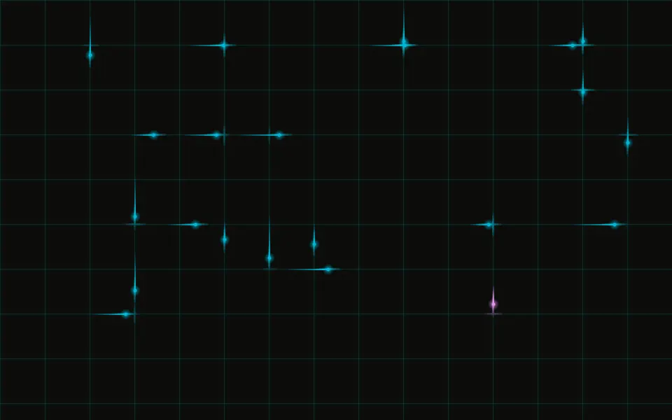
glowColor is the colour of lit cells and of the light around the pointer, and lineColor the lines' colour, both any CSS colour. Here shadcn.io's original cyan with duration={2000}, so cells take two seconds to fade and the trail runs longer, on a scene that stays dark in both themes.
Accessibility
The grid is decoration: it's hidden from screen readers and never takes a click, so links and buttons on top keep working. Keep text on top in your foreground colour: a lit cell under muted text lowers its contrast for a moment. Nothing loops. Each lit cell rises over at least 100 ms instead of flashing on, its brightness is capped (15% of the glow colour in light mode, 30% in dark), and it only lights where the pointer goes. With reduced motion the trail is off: the grid stays still and only the soft light follows the pointer, without gliding after it. On touch screens a tap lights the cell under the finger, and scrolling lights nothing.
FAQ
How does the trailing glow work?
Each time the pointer enters a new cell, the next of 24 reusable cells moves there and replays its fade, so a quick swipe leaves a trail. duration sets how long a cell takes to fade, in milliseconds: 1000 by default, at least 700.
How do I change the cell size?
Set cellSize in pixels (default 50). The same value draws the lines and finds the cell under the pointer, so lit cells always line up with the grid.
Does it still react with content on top?
Yes. Pointer events from your content reach the background, so cells light up under your text and buttons, and those stay clickable.
Can I change the colours?
glowColor and lineColor take any CSS colour, including theme variables. By default they're your theme's --primary and --border, so the grid follows light and dark and your brand colour.
What's the soft light around the pointer?
A gradient that follows the pointer under a mask of the grid's own lines, so nearby lines light up fully and cells faintly. proximity sets how far it reaches, in pixels (default 120).
API Reference
InteractiveGridPattern
<div> data-slot="interactive-grid-pattern"
cellSize?number
The side of one square cell, in pixels. @default 50.
- Default
50
duration?number
How long a lit cell takes to fade out, in milliseconds. At least 700, so a cell always rises over 100 ms or more instead of flashing on.
- Default
1000
fade?"none" | "radial" | "top" | "bottom"
Where the grid fades out: toward every edge from the centre
(radial), toward the top, the bottom, or nowhere. It's a mask, so
the grid fades into whatever is behind it.
- Type
"none" | "radial" | "top" | "bottom"- Default
"radial"
glowColor?string
The colour of lit cells and of the light around the pointer, any CSS colour.
- Default
"var(--primary)"
lineColor?string
The lines' colour, any CSS colour. @default "var(--border)".
proximity?number
How far the light around the pointer reaches, in pixels. @default 120.
render?ReactElement | ((props: object, state: object) => ReactElement)
Replace the host element or compose it with another component.
- Type
ReactElement | ((props: object, state: object) => ReactElement)
className?string
Merged with the part's classes.
--interactive-grid-pattern-durationstring
How long a lit cell fades (1000ms, at least 700ms).
--interactive-grid-pattern-glowstring
The light's colour (var(--primary)).
--interactive-grid-pattern-linestring
The lines' colour (var(--border)).
--interactive-grid-pattern-proximitystring
How far the soft light reaches (120px).
Related

Grid Pattern
GridsThe same grid, static

Dot Pattern
GridsDots with a pointer glow
- Pro

Hexagon Background
GridsThe same trail on a honeycomb
- Pro
Boxes Background
GridsAn isometric grid with a pastel trail
- Pro
Light racing along a grid on its own
- Pro
Cells that blink on their own