shadcn.io is not affiliated with official shadcn/ui
Grid Pattern draws a grid of thin lines behind whatever you put inside it, like graph paper. One SVG pattern fills the box at any size and stays sharp at any zoom. You can fill cells with squares, dash the lines with strokeDasharray, and fade the grid toward the edges with fade. Nothing moves and nothing runs in the browser: it renders to plain markup on the server.
Use it when a page needs structure without motion: a hero, a card header, a canvas or editor backdrop. For dots instead of lines, use Dot Pattern; for cells that light up under the pointer, Interactive Grid Pattern; for a grid in perspective scrolling toward a horizon, Retro Grid.
Installation
Usage
import { GridPattern } from "@/components/ui/grid-pattern";Grid Pattern is a container: give it a size and put your content inside. The grid sits behind the content, and the box clips it.
<GridPattern className="flex min-h-[420px] items-center justify-center" fade="radial">
  <h1 className="text-5xl font-semibold">Plan it on paper first</h1>
</GridPattern>
For a backdrop behind the whole page, leave it empty and fix it under everything else:
<GridPattern className="fixed inset-0 -z-10" fade="radial" />Demos
Squares
squares fills cells by [column, row], counted from the top-left cell, here in a card-sized box that fades out toward its bottom edge with fade="bottom". squareColor sets their colour.
Dashed lines
strokeDasharray dashes the lines in SVG's dash syntax, here "4 2" on a tighter grid (cellSize={24}), tinted with lineColor.
Accessibility
The grid is decoration: it's hidden from screen readers and lets every click through to the content. It never moves, so there's nothing to reduce and nothing that flashes. The lines use your theme's border colour, faint enough that text on top stays readable; keep that text in the foreground colour. The fade options are masks, so the grid fades into whatever is behind it, in light and dark.
FAQ
How do I make the grid denser or sparser?
Set cellSize, the side of one cell in pixels: 16 to 24 for a dense grid, 64 and up for a sparse one. The default is 40.
Can I highlight specific cells?
Pass squares={[[0, 0], [2, 1]]}: each pair is [column, row], counted from the top-left cell. They fill exactly between the lines, in squareColor (your theme's muted colour by default).
How do I get dashed or dotted lines?
Use strokeDasharray in SVG's dash syntax: "4 4" for dashes, "1 3" for dots. The dashes start over in every cell, so pick a dash and gap that add up to a divisor of cellSize (8 on the default 40) for an even rhythm across cells.
How do I fade the edges?
fade="radial" fades toward every edge from the centre, and "top" or "bottom" toward that edge. It's a mask on the grid, so it fades into any background, in light and dark.
How do I change the colours?
lineColor and squareColor take any CSS colour, such as color-mix(in oklab, var(--primary) 30%, transparent). By default the lines use your theme's --border and the squares its --muted, so they follow light and dark. You can also set --grid-pattern-line and --grid-pattern-square from your own CSS.
API Reference
GridPattern
<div> data-slot="grid-pattern"
cellSize?number
The side of one square cell, in pixels. @default 40.
- Default
40
fade?"none" | "radial" | "top" | "bottom"
Where the grid fades out: toward every edge from the centre
(radial), toward the top, or toward the bottom. It's a mask, so the
grid fades into whatever is behind it.
- Type
"none" | "radial" | "top" | "bottom"- Default
"none"
lineColor?string
The lines' colour, any CSS colour. @default "var(--border)".
squareColor?string
The filled cells' colour, any CSS colour. @default "var(--muted)".
squares?[number, number][]
Cells to fill, each [column, row] counted from the top-left cell, [0, 0].
strokeDasharray?string
The lines' dashes, in SVG's dash syntax: "4 4" for dashes, "1 3"
for dots. Solid when left out.
render?ReactElement | ((props: object, state: object) => ReactElement)
Replace the host element or compose it with another component.
- Type
ReactElement | ((props: object, state: object) => ReactElement)
className?string
Merged with the part's classes.
--grid-pattern-linestring
The lines' colour (var(--border)).
--grid-pattern-squarestring
The filled cells' colour (var(--muted)).
Related

Dot Pattern
GridsThe same backdrop with dots, plus a pointer glow
- Pro

This grid with cells that light up under the pointer
- Pro
Cells that blink on their own
- Pro
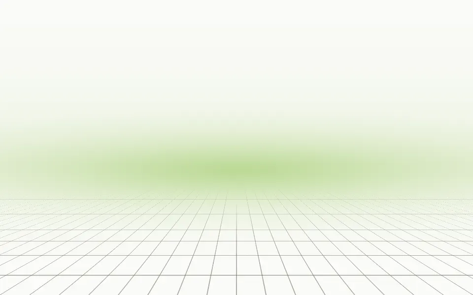
The grid in perspective, scrolling toward a horizon
- Pro

Blueprint Background
GridsA grid with technical drawings tracing in
- Pro

Hexagon Background
GridsA honeycomb instead of squares