shadcn.io is not affiliated with official shadcn/ui
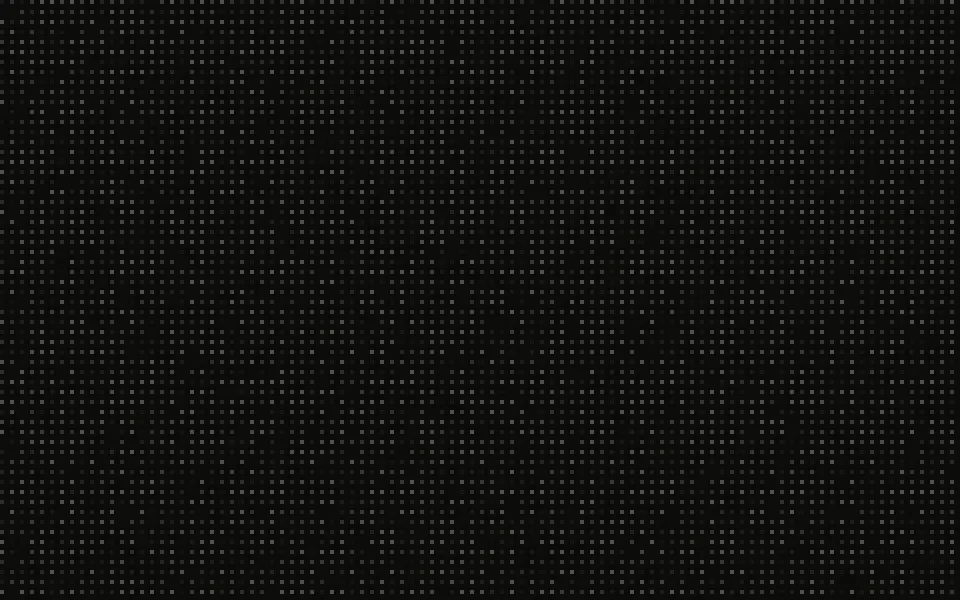
A grid of small dots behind your content. Dots near the pointer light up in your primary colour and grow, and a slow diagonal wave brightens them in turn, so the page never looks frozen. The dots are a CSS mask and the light is a soft gradient moved underneath it, so moving the pointer costs almost nothing: there's no canvas and no frame loop.
Use it behind a hero or a landing section that should react to the pointer without pulling focus from the headline. For lines instead of dots, use Grid Pattern; for grid cells that light up under the pointer, Interactive Grid Pattern; for dots joined by lines that the pointer pushes aside, Constellation. Dots that blink on their own are Flickering Grid, dots that drift are Particles, and dots whose size pulses are Halftone.
Installation
Usage
import { DotPattern } from "@/components/ui/dot-pattern";<DotPattern className="min-h-[420px]">
<h1 className="text-4xl font-semibold">Every component, one install away</h1>
</DotPattern>Dot Pattern is a container: what you put in it renders on top, and the dots sit behind it. Size it with className like any div; for a full-page backdrop, give it className="fixed inset-0".
Demos
Static
interactive={false} leaves out the pointer light and speed={0} the wave, for a quiet texture: here a card-sized box, faded toward its bottom edge with fade="bottom". fade also takes top, none, and radial, the default, which fades the dots toward every edge.
Color
glowColor is the colour dots near the pointer turn and dotColor the dots' own, both any CSS colour; gap and dotSize set the grid, and proximity how far from the pointer dots light up, in pixels. Here shadcn.io's original cyan, a tighter grid and a wider light, on a scene that stays dark in both themes.
Accessibility
The dots are decoration: hidden from screen readers, and they never take a click, so links and buttons on top keep working. Keep text on top in your foreground colour; the dots are faint and the lit ones small, so a headline stays readable over them, and for body text a fade keeps them away from it. Nothing flashes. With reduced motion the wave stops where it is, leaving a still grid of dots, and the light still follows the pointer, without gliding after it. Touch doesn't light the dots, so scrolling on a phone stays smooth.
FAQ
How does the glow follow my cursor?
Each pointer move writes two CSS variables, and a soft gradient behind a mask of larger dots moves there, so only the dots near it light up and grow. A CSS transition eases it after the pointer. There's no canvas, no frame loop, and nothing re-renders as the pointer moves.
What happens when the pointer leaves?
The light fades out where it was, and comes back where the pointer comes in next, without gliding over from where it left.
How do I turn off the wave or the glow?
speed={0} removes the wave; interactive={false} removes the glow and keeps the dots. With both, it's a still dot grid.
How do I change density and colours?
dotSize and gap set the grid, in pixels; dotColor and glowColor take any CSS colour and default to your theme's muted foreground and primary colours, so the light follows your brand. intensity sets how bright the light gets.
API Reference
DotPattern
<div> data-slot="dot-pattern"
dotColor?string
The dots' colour, any CSS colour.
- Default
45% of `--muted-foreground`
dotSize?number
Each dot's diameter, in pixels. @default 2.
fade?"none" | "radial" | "top" | "bottom"
Where the dots fade out: toward the edges, the top, the bottom, or nowhere.
- Type
"none" | "radial" | "top" | "bottom"- Default
"radial"
gap?number
The space between two dots, in pixels. @default 24.
glowColor?string
The colour dots near the pointer turn, any CSS colour.
- Default
`var(--primary)`
intensity?"subtle" | "medium" | "strong"
How brightly dots near the pointer light up. @default "medium".
- Type
"subtle" | "medium" | "strong"
interactive?boolean
Whether dots near the pointer light up. @default true.
- Default
true
proximity?number
How far from the pointer dots light up, in pixels. @default 120.
speed?number
How fast the wave crosses the dots: 1 is one pass every 12 seconds, 2 twice as fast. 0 turns the wave off.
- Default
1
render?ReactElement | ((props: object, state: object) => ReactElement)
Replace the host element or compose it with another component.
- Type
ReactElement | ((props: object, state: object) => ReactElement)
className?string
Merged with the part's classes.
--dot-pattern-colorstring
The dots' colour (45% of --muted-foreground).
--dot-pattern-durationstring
One wave pass (12s).
--dot-pattern-gapstring
The space between two dots (24px).
--dot-pattern-glowstring
The colour dots near the pointer turn (--primary).
--dot-pattern-proximitystring
How far from the pointer dots light up (120px).
--dot-pattern-sizestring
Each dot's diameter (2px).
--dot-pattern-strengthstring
The light's opacity at the pointer (0.8).
Related
Grid Pattern
GridsLines instead of dots, fully static
- Pro
Grid cells that light up under the pointer
- Pro
Halftone Background
TextureDots whose size pulses with a brightness field
- Pro
Constellation Background
ParticlesDrifting dots joined by lines, pushed by the pointer
- Pro
Cells that blink without a pointer
Particles
ParticlesDots that drift and react to the pointer