shadcn.io is not affiliated with official shadcn/ui
Logos or cards leave one edge and come back on the other, with no next button.
Use it on a marketing page when the motion is decoration and the items can repeat. If someone should stop on a specific slide, use a Carousel. In Solid, Ark UI runs the loop, holds it while someone points at it or tabs into it, and keeps it still for people who ask for reduced motion.
Installation
Anatomy
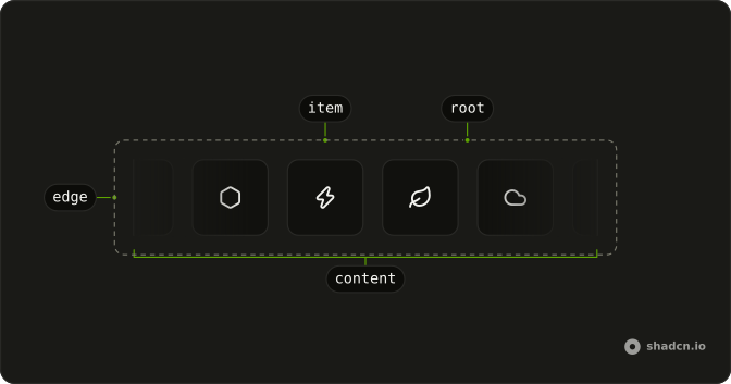
Marquee
├── MarqueeContent
│   └── MarqueeViewport
├── MarqueeEdge
└── MarqueeItem
Usage
import { AppleIcon } from "@/components/icons/apple";
import { ChatGptIcon } from "@/components/icons/chat-gpt";
import { ClaudeIcon } from "@/components/icons/claude";
import { GoogleIcon } from "@/components/icons/google";
import { NextIcon } from "@/components/icons/next";
import { ReactIcon } from "@/components/icons/react";
import { ViteIcon } from "@/components/icons/vite";
import { VueIcon } from "@/components/icons/vue";
import { Card, CardContent } from "@/components/ui/card";
import {
  Marquee, MarqueeContent, MarqueeItem,
} from "@/components/ui/marquee";
const MarqueeDemo = () => (
<Marquee>
<MarqueeContent>
{items.map((Icon, index) => (
<MarqueeItem key={index}>
<Card class="[--space:--spacing(8)]">
<CardContent>
<Icon class="size-10" />
</CardContent>
</Card>
</MarqueeItem>
))}
</MarqueeContent>
</Marquee>
);
const items = [
GoogleIcon,
AppleIcon,
NextIcon,
ChatGptIcon,
ClaudeIcon,
ViteIcon,
VueIcon,
ReactIcon,
];Accessibility
The loop holds while the pointer is over it or focus is inside it, and runs again once both have left; pauseOnInteraction is on by default. With reduced motion on, nothing moves: the items stay in place, the edge fades go, and a row longer than the frame scrolls instead. The copies that make the loop are hidden from screen readers and inert, so each item is read and tabbed to once.
- End
- Go to the end.
Demos
Autofill
A short logo list leaves a gap before the loop comes around, so autoFill copies items until the track is full. This row also runs at a speed of 100, twice the default of 50 pixels a second, which is a lot for words and reasonable for logos. Use autofill whenever the set is shorter than the frame, or the seam shows.
Custom Speed
speed counts pixels per second, defaulting to 50. This row uses 10, slow enough that a name could be read, which is what you want for words and too sleepy for a logo wall. Set it on Marquee, not on each card, and leave the gap alone, because spacing is a different prop.
Fade
The ends fade out unless showEdges is off. The first row clips logos hard at the frame, and the second keeps the fade while reverse runs them the other way, so the soft edge is easier to see against the motion. The fade is a mask on the marquee itself, not a band of colour, so it dissolves into whatever is behind: the page, a card, a tinted band or a photo.
Orientation Horizontal
Sideways travel is the default. Setting orientation to horizontal only makes that obvious, which helps when a vertical strip is on the same page or the value is controlled. The cards move in a row and the height follows them. A page with one logo bar can omit the prop and get this direction anyway.
Orientation Vertical
orientation set to vertical stacks the cards and moves them up. The column is narrow and height-capped, because a vertical loop with no limit has nowhere to scroll, which suits a sidebar better than a hero. The edge fade stays at the top and bottom unless you turn it off.
Pause On Hover
pauseOnInteraction is on by default, and this demo sets it only to show the prop: the loop holds while the pointer is over the strip or focus is inside, then resumes on the way out. Keep it on when a logo is a link or a name has to be read, because a moving target is a poor place to click. Turn it off only when something else can stop the strip, such as a button that sets paused.
Reverse
reverse sends the cards the other way, which is how a second strip under a forward one reads as two bands instead of one belt. Speed and the original order of the items stay as they are. Use the flip for that paired layout, or when the motion should follow the reading direction, without inventing a negative duration yourself.
Spacing
spacing is a CSS length for the gap between cards and between the copies that form the loop. The default is 16px, and this row uses 40px; hover it to hold the loop and look at the gap instead of watching it fly past. Widen it when logos feel stuck together, and do not fake the distance with a gap class on the item.
FAQ
How do I change the speed of a Marquee?
Set speed to pixels per second, with a default of 50, and use a lower number for a slower loop as the custom speed demo does. spacing is the gap between copies and defaults to 16px on this component, while reverse flips the travel direction. Both props belong on Marquee, not on each item.
How do I pause a Marquee on hover in Solid?
It pauses by default: pauseOnInteraction is true, so hovering the marquee or moving focus into it pauses the loop, and leaving resumes it. Set it to false to keep the loop running, or pass paused when you want to control it yourself. onPauseChange receives details.paused whenever that state flips.
How do I make a vertical Marquee?
Set orientation to vertical so the root's data-orientation switches the loop from horizontal to vertical, or leave the default horizontal. showEdges defaults to true and fades the two ends (the top and bottom when vertical) with a mask, and setting it to false removes those fades.
Does a Marquee loop forever?
Yes, until you set loopCount. The default 0 means infinite. A number above 0 stops after that many loops, and onComplete runs only for those finite loops. autoFill duplicates the items until they fill the container, which avoids a gap when the list is shorter than the frame.
Is a Marquee accessible from the keyboard?
Yes. Tabbing to a link inside it pauses the loop until focus leaves, as hovering does. The copies that make the loop are hidden from screen readers and inert, so each item is read and reached once. With reduced motion on, nothing moves, and a row longer than the frame scrolls instead. Still treat the motion as decoration, and do not put information only in a marquee.
Should I use a Marquee or a Carousel?
Use a Marquee for an automatic loop of logos or other repeated items that nobody has to step through. Use a Carousel when people should move one item at a time and the position should stay put. A marquee does not expose a next button. Pause it if the content must be read.
How do I style a Marquee with Ark UI?
Edit the marquee file under components/ui, where duration, spacing, delay, and loop count are the custom properties --marquee-duration, --marquee-spacing, --marquee-delay, and --marquee-loop-count. The root sets data-paused, data-orientation and data-pause-on-interaction, and content sets data-reverse while reverse is on. The edge fade is a mask on the root (mask-x-from-75%, or mask-y-from-75% when vertical), so it needs no colour to match the surface behind it; MarqueeEdge, still exported, paints a band from the background colour if you want a fade in a colour of your own.
How do I install Marquee in Solid?
Run the command in the Installation section on this page. It adds Marquee, MarqueeContent, and MarqueeItem to your ui folder, which is enough for a looping row. Import those parts from that folder and put one item per entry inside the content. The command uses the shadcn CLI.
API Reference
Marquee
<div> data-slot="marquee"
autoFill?boolean
Whether to automatically duplicate content to fill the container.
- Default
false
defaultPaused?boolean
Whether the marquee is paused by default.
- Default
false
delay?number
The delay before the animation starts (in seconds).
- Default
0
dir?"ltr" | "rtl"
The document's text/writing direction.
- Type
"ltr" | "rtl"- Default
"ltr"
id?string
The unique identifier of the machine.
ids?object
The ids of the elements in the marquee. Useful for composition.
- Type
{ root?: string; viewport?: string; content?: (index: number) → string }
loopCount?number
The number of times to loop the animation (0 = infinite).
- Default
0
onComplete?() → void
Function called when the marquee completes all loops and stops. Only fires for finite loops (loopCount > 0).
- Returns
void
onLoopComplete?() → void
Function called when the marquee completes one loop iteration.
- Returns
void
onPauseChange?(details: PauseStatusDetails) → void
Function called when the pause status changes.
- Type
(details: PauseStatusDetails) → void- Parameters
details– { paused: boolean }- Returns
void
orientation?"horizontal" | "vertical"
Scrolls side to side (horizontal) or up and down (vertical).
- Type
"horizontal" | "vertical"- Default
"horizontal"
paused?boolean
Whether the marquee is paused.
pauseOnInteraction?boolean
Whether to pause the marquee on user interaction (hover, focus). Ark default: false.
- Default
true
reverse?boolean
Whether to reverse the animation direction.
- Default
false
showEdges?boolean
Whether the ends fade out. The fade is a mask, so it fades into whatever is behind the marquee (a card, a tinted band, an image).
- Default
true
spacing?string
The spacing between marquee items. Ark default: 1rem.
- Default
"16px"
speed?number
The speed of the marquee animation in pixels per second.
- Default
50
translations?object
The localized messages to use.
- Type
{ root?: string }
asChild?(props: ParentProps) => JSX.Element
Render your own element: a function that gets the part's props to spread on it.
- Type
(props: ParentProps) => JSX.Element
class?string
Merged with the part's classes.
data-orientation?string
The orientation of the marquee.
data-pause-on-interaction?string
Present when pauseOnInteraction is true.
data-paused?string
Present when paused.
data-state"paused" | "idle"
"paused" or "idle".
- Type
"paused" | "idle"
--marquee-delaystring
The marquee delay value for the Root.
--marquee-durationstring
The marquee duration value for the Root.
--marquee-loop-countstring
The marquee loop count value for the Root.
--marquee-spacingstring
The marquee spacing value for the Root.
--marquee-translatestring
The marquee translate value for the Root.
MarqueeViewport
<div> data-slot="marquee-viewport"
asChild?(props: ParentProps) => JSX.Element
Render your own element: a function that gets the part's props to spread on it.
- Type
(props: ParentProps) => JSX.Element
data-orientation"horizontal" | "vertical"
The orientation of the viewport.
- Type
"horizontal" | "vertical"
data-side"top" | "right" | "bottom" | "left"
The side of the trigger that the viewport is positioned on.
- Type
"top" | "right" | "bottom" | "left"
--marquee-delaystringMarqueeContent
<div> data-slot="marquee-content"
asChild?(props: ParentProps) => JSX.Element
Render your own element: a function that gets the part's props to spread on it.
- Type
(props: ParentProps) => JSX.Element
class?string
Merged with the part's classes.
data-clone?string
Present when clone is true.
data-indexstring
The index of the item.
data-orientation"horizontal" | "vertical"
The orientation of the content.
- Type
"horizontal" | "vertical"
data-reversestringdata-side"top" | "right" | "bottom" | "left"
The side of the trigger that the content is positioned on.
- Type
"top" | "right" | "bottom" | "left"
--marquee-delaystringMarqueeEdge
<div> data-slot="marquee-edge"
side"start" | "end" | "top" | "bottom"
The side where the edge gradient should appear.
- Type
"start" | "end" | "top" | "bottom"
asChild?(props: ParentProps) => JSX.Element
Render your own element: a function that gets the part's props to spread on it.
- Type
(props: ParentProps) => JSX.Element
class?string
Merged with the part's classes.
data-orientation"horizontal" | "vertical"
The orientation of the edge.
- Type
"horizontal" | "vertical"
data-side"top" | "right" | "bottom" | "left"
The side of the trigger that the edge is positioned on.
- Type
"top" | "right" | "bottom" | "left"
MarqueeItem
<div> data-slot="marquee-item"
asChild?(props: ParentProps) => JSX.Element
Render your own element: a function that gets the part's props to spread on it.
- Type
(props: ParentProps) => JSX.Element
class?string
Merged with the part's classes.