shadcn.io is not affiliated with official shadcn/ui
It copies a string and shows a check once the write succeeds.
Use it for a link, a token, or a command someone would otherwise retype. A plain Button is enough if you would rather call the clipboard yourself and design the feedback. In React, Ark UI holds the copied state for a few seconds after a successful write.
Installation
Anatomy
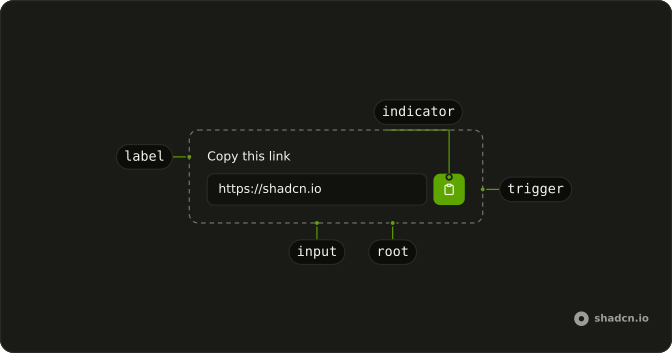
Clipboard
├── ClipboardControl
├── ClipboardTrigger
├── ClipboardIndicator
├── ClipboardInput
└── ClipboardLabel
Usage
import {
  Clipboard, ClipboardIndicator, ClipboardInput, ClipboardTrigger,
} from "@/components/ui/clipboard";
import {
  InputGroup, InputGroupAddon, InputGroupButton, InputGroupInput,
} from "@/components/ui/input-group";<div className="w-full max-w-sm">
<Clipboard value="https://example.com">
<InputGroup>
<ClipboardInput asChild>
<InputGroupInput />
</ClipboardInput>
<InputGroupAddon align="inline-end">
<ClipboardTrigger asChild>
<InputGroupButton size="icon-xs">
<ClipboardIndicator />
</InputGroupButton>
</ClipboardTrigger>
</InputGroupAddon>
</InputGroup>
</Clipboard>
</div>Accessibility
- Enter
- Activate the focused control.
- Space
- Activate the focused control.
Demos
Context
ClipboardContext lets the button read copied and call copy without the stock trigger. The label can say Copy and switch to Copied on its own, which is what you want when an icon swap is the wrong feedback. The string still lives on the root as value. Skip the input when people do not need to see or edit the text before it is copied.
Controlled
Keep value in your own state when something outside the field changes the string that will be copied. A secondary button here rewrites the URL to a docs path, and the input follows because the root is controlled. Wire the value-change handler if the field itself stays editable. A constant value is enough when the text never changes.
Copy Status
The status callback fires once the copy has landed, which is the moment for a toast or a counter rather than another icon. This button increments a count beside ClipboardValue, and the indicator still swaps to a check on its own. Use the callback when the product has to record the copy or name what was copied. Do not use it to rebuild the icon swap.
Custom Timeout
timeout is the copied-state duration in milliseconds, and the default is three seconds. This field sets 5000 so the check lingers on a URL someone might glance away from. Lengthen it when the confirmation is a small icon at the end of a long field. Shorten it when people copy several values in a row, or a leftover check will point at the wrong one.
Different Icon
ClipboardIndicator shows one icon at rest and another after the copy. The resting icon is its content, and copied supplies the sparkles that replace a single sparkle once the write succeeds. Bring your own pair when a clipboard glyph clashes with the product, or when a check already means something else. Hide both from assistive tech if the button has a name, and leave the timing to timeout.
Icon Only
An icon button is the right trigger when the string is already visible, or when the row has no room for the word Copy. ClipboardIndicator draws the clipboard glyph and swaps in a check while the copied state lasts. Give the button an accessible name, because the icon is not text. Use the icon in a toolbar, and a labeled button when the control sits by itself.
Root Provider
useClipboard owns the state, and ClipboardRootProvider shares it with the input and the in-field trigger. A second button outside that tree calls copy, and a line on the page prints whether copied is set. Use the provider when the control that copies cannot live inside Clipboard, such as a toolbar far from the field. If the button can sit inside the root, skip the hook.
Value Text
ClipboardValue prints the string with no field chrome, and the icon button beside it copies that same value. Use the plain text in a docs line, a token list, or anywhere a bordered input would be too heavy. Use ClipboardInput when someone should select the text or edit it before copying. The indicator still swaps to a check, so you do not add a second confirmation.
With Label
ClipboardLabel names the control, here Copy this link, and sits above the grouped input. That name is what assistive tech gets, instead of an unlabeled icon at the end of the field. Add it when the clipboard is not already inside a labeled field, and when the placeholder is a poor name. Skip it when a heading directly above already says what will be copied.
FAQ
How long does the Clipboard stay in the copied state?
Three seconds by default. Set timeout, in milliseconds, on Clipboard to change it, as in the Custom Timeout demo.
How do I know when the Clipboard copied the text?
Use onStatusChange: it's called with { copied: true } once the text is copied, which is where you show a toast or log the event. The Copy Status demo counts each copy.
How do I copy from a button outside the Clipboard?
Create the state with useClipboard and pass it to ClipboardRootProvider, then call its copy() from anywhere on the page, as the Root Provider demo shows.
How do I change the Clipboard copy icon?
Pass the icon to show before copying as the children of ClipboardIndicator, and the one to show after as its copied prop.
The Different Icon demo uses sparkles.
API Reference
Clipboard
<div> data-slot="clipboard"
value?string
The controlled value of the clipboard.
defaultValue?string
The initial value to be copied to the clipboard when rendered. Use when you don't need to control the value of the clipboard.
onValueChange?(details: ValueChangeDetails) → void
The function to be called when the value changes.
- Type
(details: ValueChangeDetails) → void- Parameters
details– { value: string }- Returns
void
id?string
The unique identifier of the machine.
ids?object
The ids of the elements in the clipboard. Useful for composition.
- Type
{ root?: string; input?: string; label?: string }
onStatusChange?(details: CopyStatusDetails) → void
The function to be called when the value is copied to the clipboard.
- Type
(details: CopyStatusDetails) → void- Parameters
details– { copied: boolean }- Returns
void
rootClassName?string
Class names on the root. className is applied to the baked control.
timeout?number
The timeout for the copy operation.
- Default
3000
translations?object
Specifies the localized strings that identifies the accessibility elements and their states.
- Type
{ triggerLabel?: (copied: boolean) → string }
asChild?boolean
Use the provided child element as the default rendered element, combining their props and behavior.
className?string
Merged with the part's classes.
data-copied?string
Present when copied state is true.
ClipboardControl
<div> data-slot="clipboard-control"
asChild?boolean
Use the provided child element as the default rendered element, combining their props and behavior.
data-copied?string
Present when copied state is true.
ClipboardTrigger
<button> data-slot="clipboard-trigger"
asChild?boolean
Use the provided child element as the default rendered element, combining their props and behavior.
data-copied?string
Present when copied state is true.
ClipboardIndicator
<div> data-slot="clipboard-indicator"
copied?ReactNode
What it shows once the value is copied; its children show before.
- Default
<CheckIcon aria-hidden="true" />
asChild?boolean
Use the provided child element as the default rendered element, combining their props and behavior.
className?string
Merged with the part's classes.
ClipboardInput
<input>
asChild?boolean
Use the provided child element as the default rendered element, combining their props and behavior.
className?string
Merged with the part's classes.
data-copied?string
Present when copied state is true.
data-readonly"true"
Present when read-only.
- Default
"true"
ClipboardLabel
<label> data-slot="clipboard-label"
asChild?boolean
Use the provided child element as the default rendered element, combining their props and behavior.
className?string
Merged with the part's classes.
data-copied?string
Present when copied state is true.
ClipboardValue
<span> data-slot="clipboard-value"
size?"xs" | "sm" | "md" | "lg" | "xl"
The size.
- Type
"xs" | "sm" | "md" | "lg" | "xl"- Default
"md"
asChild?boolean
Use the provided child element as the default rendered element, combining their props and behavior.
className?string
Merged with the part's classes.
ClipboardRootProvider
<div> data-slot="clipboard"
valueUseClipboardReturn
What useClipboard() returns: the state and API, made outside the component to control it.
rootClassName?string
Class names on the root. className is applied to the baked control.
asChild?boolean
Use the provided child element as the default rendered element, combining their props and behavior.
className?string
Merged with the part's classes.
data-copied?string
Present when copied is true.
useClipboard
value?string
The controlled value of the clipboard.
defaultValue?string
The initial value to be copied to the clipboard when rendered. Use when you don't need to control the value of the clipboard.
onValueChange?(details: ValueChangeDetails) → void
The function to be called when the value changes.
- Type
(details: ValueChangeDetails) → void- Parameters
details– { value: string }- Returns
void
id?string
The unique identifier of the machine.
ids?object
The ids of the elements in the clipboard. Useful for composition.
- Type
{ root?: string; input?: string; label?: string }
onStatusChange?(details: CopyStatusDetails) → void
The function to be called when the value is copied to the clipboard.
- Type
(details: CopyStatusDetails) → void- Parameters
details– { copied: boolean }- Returns
void
timeout?number
The timeout for the copy operation.
- Default
3000
translations?object
Specifies the localized strings that identifies the accessibility elements and their states.
- Type
{ triggerLabel?: (copied: boolean) → string }
ClipboardContext
copiedboolean
Whether the value has been copied to the clipboard.
copyVoidFunction
Copy the value to the clipboard.
setValue(value: string) → void
Set the value to be copied to the clipboard.
- Parameters
value– string- Returns
void
valuestring
The value to be copied to the clipboard.