Shadcn Table of Contents for React and Tailwind
Highlights the heading in view on docs and long pages.
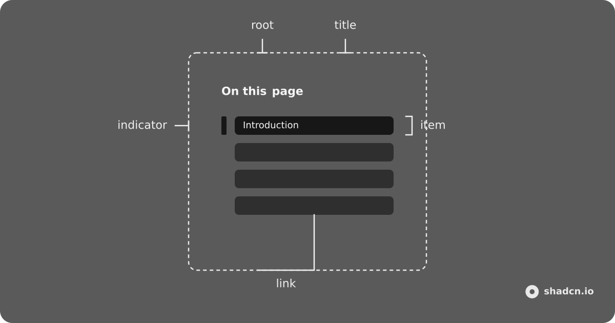
Installation
bunx --bun shadcn@latest add https://kit.dev/r/toc.jsonpnpm dlx shadcn@latest add https://kit.dev/r/toc.jsonnpx shadcn@latest add https://kit.dev/r/toc.jsonyarn shadcn@latest add https://kit.dev/r/toc.jsonInstall the following dependencies:
bun add @ark-ui/reactpnpm add @ark-ui/reactnpm install @ark-ui/reactyarn add @ark-ui/reactCopy and paste the following code into your project.
"use client";

import {
  Toc as ArkToc,
  useToc as useArkToc,
  useTocContext as useArkTocContext,
} from "@ark-ui/react/toc";
import { CircleArrowUpIcon } from "lucide-react";
import type React from "react";
import { useEffect, useRef, useState } from "react";
import { cn } from "@/lib/utils";

export type {
  TocActiveChangeDetails,
  TocItemData,
} from "@ark-ui/react/toc";

export const useToc = useArkToc;
export const useTocContext = useArkTocContext;
export const TocContext = ArkToc.Context;

const DEFAULT_TOP_OFFSET = 180;
const TOP_PX = 48;
const BOTTOM_PX = 48;

const getScroller = (from: Element | null) => {
  const root = from?.closest("[data-slot=toc]");
  return root?.querySelector<HTMLElement>("[data-slot=toc-content]") ?? null;
};

const readTop = (scroller: HTMLElement | null) =>
  scroller ? scroller.scrollTop : window.scrollY;

const scrollToY = (
  scroller: HTMLElement | null,
  top: number,
  behavior: ScrollBehavior
) => {
  if (scroller) {
    scroller.scrollTo({ behavior, top });
    return;
  }
  window.scrollTo({ behavior, top });
};

const scrollMetrics = (scroller: HTMLElement | null) => {
  if (scroller) {
    return {
      left: scroller.scrollHeight - scroller.scrollTop - scroller.clientHeight,
      overflow: scroller.scrollHeight - scroller.clientHeight,
    };
  }
  const el = document.scrollingElement;
  if (!el) {
    return { left: Number.POSITIVE_INFINITY, overflow: 0 };
  }
  return {
    left: el.scrollHeight - el.scrollTop - el.clientHeight,
    overflow: el.scrollHeight - el.clientHeight,
  };
};

const headingScrollTop = (
  heading: HTMLElement,
  scroller: HTMLElement | null
) => {
  const margin =
    Number.parseFloat(getComputedStyle(heading).scrollMarginTop) || 0;
  if (scroller) {
    const frame = scroller.getBoundingClientRect();
    const rect = heading.getBoundingClientRect();
    return Math.max(0, scroller.scrollTop + (rect.top - frame.top) - margin);
  }
  return Math.max(
    0,
    window.scrollY + heading.getBoundingClientRect().top - margin
  );
};

const isOnlyActive = (activeIds: string[], id: string) =>
  activeIds.length === 1 && activeIds[0] === id;

const pinActiveToEdges = (
  scroller: HTMLElement | null,
  toc: {
    activeIds: string[];
    items: { value: string }[];
    setActiveIds: (ids: string[]) => void;
  }
) => {
  const first = toc.items[0]?.value;
  const last = toc.items.at(-1)?.value;
  if (!(first && last)) {
    return;
  }
  const { left, overflow } = scrollMetrics(scroller);
  if (overflow > BOTTOM_PX && left <= BOTTOM_PX) {
    if (!isOnlyActive(toc.activeIds, last)) {
      toc.setActiveIds([last]);
    }
    return;
  }
  if (readTop(scroller) <= TOP_PX && !isOnlyActive(toc.activeIds, first)) {
    toc.setActiveIds([first]);
  }
};

const tocRootClassName = cn(
  "group/toc",
  "relative flex w-full items-start gap-8"
);

const pushHash = (value: string) => {
  const hash = `#${value}`;
  if (window.location.hash === hash) {
    return;
  }
  const oldURL = window.location.href;
  window.history.pushState(null, "", hash);
  window.dispatchEvent(
    new HashChangeEvent("hashchange", {
      newURL: window.location.href,
      oldURL,
    })
  );
};

const clearHash = () => {
  if (!window.location.hash) {
    return;
  }
  const oldURL = window.location.href;
  window.history.pushState(
    null,
    "",
    `${window.location.pathname}${window.location.search}`
  );
  window.dispatchEvent(
    new HashChangeEvent("hashchange", {
      newURL: window.location.href,
      oldURL,
    })
  );
};

const readLocationHash = () => {
  try {
    return decodeURIComponent(window.location.hash.slice(1));
  } catch {
    return window.location.hash.slice(1);
  }
};

const TocEdgePin = () => {
  const toc = useTocContext();
  const tocRef = useRef(toc);
  tocRef.current = toc;
  const itemsKey = toc.items.map((item) => item.value).join();
  const activeKey = toc.activeIds.join();
  const ref = useRef<HTMLSpanElement>(null);

  useEffect(() => {
    if (!itemsKey) {
      return;
    }
    const scroller = getScroller(ref.current);
    const target: EventTarget = scroller ?? window;
    let frame = 0;

    const pin = () => pinActiveToEdges(scroller, tocRef.current);

    const onScroll = () => {
      cancelAnimationFrame(frame);
      frame = requestAnimationFrame(pin);
    };

    pin();
    target.addEventListener("scroll", onScroll, { passive: true });
    window.addEventListener("resize", onScroll);
    return () => {
      cancelAnimationFrame(frame);
      target.removeEventListener("scroll", onScroll);
      window.removeEventListener("resize", onScroll);
    };
  }, [itemsKey]);

  useEffect(() => {
    if (!itemsKey) {
      return;
    }
    const first = tocRef.current.items[0]?.value;
    const last = tocRef.current.items.at(-1)?.value;
    if (activeKey === first || activeKey === last) {
      return;
    }
    pinActiveToEdges(getScroller(ref.current), tocRef.current);
  }, [activeKey, itemsKey]);

  return (
    <span
      aria-hidden="true"
      className="hidden"
      data-slot="toc-edge-pin"
      ref={ref}
    />
  );
};

export const Toc = (props: React.ComponentProps<typeof ArkToc.Root>) => {
  const { children, className, ...rest } = props;

  return (
    <ArkToc.Root
      className={cn(tocRootClassName, className)}
      data-slot="toc"
      {...rest}
    >
      {children}
      <TocEdgePin />
    </ArkToc.Root>
  );
};

export const TocRootProvider = (
  props: React.ComponentProps<typeof ArkToc.RootProvider>
) => {
  const { children, className, ...rest } = props;

  return (
    <ArkToc.RootProvider
      className={cn(tocRootClassName, className)}
      data-slot="toc"
      {...rest}
    >
      {children}
      <TocEdgePin />
    </ArkToc.RootProvider>
  );
};

export const TocContent = (
  props: React.ComponentProps<typeof ArkToc.Content>
) => {
  const { className, ref, ...rest } = props;

  return (
    <ArkToc.Content
      className={cn(
        "min-h-0 min-w-0 flex-1",
        "overflow-y-auto overscroll-contain",
        "scrollbar-thin scrollbar-track-transparent scrollbar-thumb-foreground/20",
        className
      )}
      data-slot="toc-content"
      {...rest}
      ref={ref}
    />
  );
};

export const TocNav = (
  props: React.ComponentProps<typeof ArkToc.Nav> & { scrollToTop?: boolean }
) => {
  const { children, className, scrollToTop = false, ...rest } = props;

  return (
    <ArkToc.Nav
      className={cn(
        "sticky top-0",
        "flex w-48 shrink-0 flex-col gap-3 self-start",
        "min-h-0 overflow-visible",
        "data-[placement=left]:order-first",
        className
      )}
      data-slot="toc-nav"
      {...rest}
    >
      {children}
      {scrollToTop ? <TocScrollToTop /> : null}
    </ArkToc.Nav>
  );
};

export const TocTitle = (props: React.ComponentProps<typeof ArkToc.Title>) => {
  const { className, ...rest } = props;

  return (
    <ArkToc.Title
      className={cn(
        "px-2",
        "font-medium text-muted-foreground text-xs tracking-wide",
        className
      )}
      data-slot="toc-title"
      {...rest}
    />
  );
};

export const TocList = (props: React.ComponentProps<typeof ArkToc.List>) => {
  const { className, ...rest } = props;

  return (
    <ArkToc.List
      className={cn(
        "relative m-0 list-none p-0",
        "before:absolute before:inset-s-0 before:inset-y-0 before:w-px before:bg-border",
        className
      )}
      data-slot="toc-list"
      {...rest}
    />
  );
};

export const TocItem = (props: React.ComponentProps<typeof ArkToc.Item>) => {
  const { className, ...rest } = props;

  return (
    <ArkToc.Item
      className={cn(
        "data-[depth=3]:ps-3",
        "data-[depth=4]:ps-5.5",
        "data-[depth=5]:ps-8",
        className
      )}
      data-slot="toc-item"
      {...rest}
    />
  );
};

export const TocLink = (props: React.ComponentProps<typeof ArkToc.Link>) => {
  const { className, onClick, ...rest } = props;

  const handleClick = (event: React.MouseEvent<HTMLAnchorElement>) => {
    onClick?.(event);
    if (event.defaultPrevented) {
      return;
    }
    if (event.button !== 0) {
      return;
    }
    if (event.metaKey || event.ctrlKey || event.shiftKey || event.altKey) {
      return;
    }
    const href = event.currentTarget.getAttribute("href");
    if (!href?.startsWith("#")) {
      return;
    }
    let value: string;
    try {
      value = decodeURIComponent(href.slice(1));
    } catch {
      return;
    }
    if (!value) {
      return;
    }
    event.preventDefault();
    const heading = document.getElementById(value);
    const scroller = getScroller(event.currentTarget);
    if (!scroller) {
      pushHash(value);
    }
    if (!heading) {
      return;
    }
    scrollToY(scroller, headingScrollTop(heading, scroller), "instant");
  };

  return (
    <ArkToc.Link
      className={cn(
        "relative block",
        "rounded-md px-2 py-1",
        "text-muted-foreground text-sm leading-5 no-underline",
        "transition-colors duration-150 ease-[cubic-bezier(0.2,0,0,1)]",
        "hover:text-foreground",
        "data-active:font-medium data-active:text-foreground",
        "outline-none focus-visible:ring-[3px] focus-visible:ring-ring/32",
        "motion-reduce:transition-none!",
        className
      )}
      data-slot="toc-link"
      {...rest}
      onClick={handleClick}
    />
  );
};

export const TocIndicator = (
  props: React.ComponentProps<typeof ArkToc.Indicator>
) => {
  const { className, ...rest } = props;

  return (
    <ArkToc.Indicator
      className={cn(
        "pointer-events-none absolute inset-s-0 w-0.5 rounded-full bg-primary",
        "top-(--top) h-(--height)",
        "transition-[top,height] duration-150 ease-[cubic-bezier(0.2,0,0,1)]",
        "motion-reduce:transition-none!",
        className
      )}
      data-slot="toc-indicator"
      {...rest}
    />
  );
};

export const TocScrollToTop = (
  props: React.ComponentProps<"button"> & { offset?: number }
) => {
  const {
    children,
    className,
    offset = DEFAULT_TOP_OFFSET,
    onClick,
    ...rest
  } = props;
  const toc = useTocContext();
  const ref = useRef<HTMLButtonElement>(null);
  const [visible, setVisible] = useState(false);

  useEffect(() => {
    const scroller = getScroller(ref.current);
    const target: EventTarget = scroller ?? window;
    const update = () => {
      setVisible(readTop(scroller) >= offset);
    };
    update();
    target.addEventListener("scroll", update, { passive: true });
    return () => target.removeEventListener("scroll", update);
  }, [offset]);

  const handleClick = (event: React.MouseEvent<HTMLButtonElement>) => {
    onClick?.(event);
    if (event.defaultPrevented) {
      return;
    }
    const first = toc.items[0]?.value;
    if (first) {
      toc.setActiveIds([first]);
    }
    scrollToY(getScroller(event.currentTarget), 0, "instant");
    const hash = readLocationHash();
    if (hash && toc.items.some((item) => item.value === hash)) {
      clearHash();
    }
  };

  return (
    <button
      className={cn(
        "relative inline-flex items-center gap-2 self-start",
        "rounded-md py-1 text-muted-foreground text-sm leading-5",
        "transition-colors duration-150 ease-[cubic-bezier(0.2,0,0,1)]",
        "hover:text-foreground",
        "outline-none focus-visible:ring-[3px] focus-visible:ring-ring/32",
        "motion-reduce:transition-none!",
        !visible && "hidden",
        className
      )}
      data-slot="toc-scroll-to-top"
      onClick={handleClick}
      ref={ref}
      type="button"
      {...rest}
    >
      {children ?? (
        <>
          <CircleArrowUpIcon aria-hidden="true" className="size-4" />
          Scroll to top
        </>
      )}
    </button>
  );
};Update the import paths to match your project setup.
Anatomy
Toc
├── TocContext
├── TocContent
└── TocNav
    ├── TocTitle
    ├── TocList
    │   ├── TocIndicator
    │   └── TocItem
    │       └── TocLink
    └── TocScrollToTop
Usage
import {
  Toc,
  TocContent,
  TocIndicator,
  TocItem,
  TocLink,
  TocList,
  TocNav,
  TocScrollToTop,
  TocTitle,
} from "@/components/ui/toc"<Toc items={items} scrollEl={() => contentRef.current}>
<TocContent ref={contentRef}>
<h2 id="introduction">Introduction</h2>
</TocContent>
<TocNav scrollToTop>
<TocTitle>On this page</TocTitle>
<TocList>
<TocIndicator />
{items.map((item) => (
<TocItem item={item} key={item.value}>
<TocLink href={`#${item.value}`}>{item.label}</TocLink>
</TocItem>
))}
</TocList>
</TocNav>
</Toc>Guides
Items
Every entry needs value, the id of the heading element, and depth, the heading level.
const items = [
  { value: "introduction", depth: 2 },
  { value: "installation", depth: 2 },
  { value: "peer-dependencies", depth: 3 },
]
value must match the heading's id exactly. The component resolves it with getElementById to track visibility, and TocLink targets it with href="#introduction". An item whose id is missing renders but never activates.
Ids are global to the page, so prefix them when a page holds more than one TOC.
Extra properties are fine, a label for link text being the common one. TocItemData covers only value and depth, so extend it rather than annotating with it directly:
import type { TocItemData } from "@/components/ui/toc"

interface Item extends TocItemData {
  label: string
}
Pass headings to items, and point scrollEl at the scrollable container so the TOC knows what to track.
Nested Headings
Read depth in your own markup to indent sub-headings. Nothing is indented for you beyond the default data-depth padding on TocItem.
Root Provider
Use useToc with TocRootProvider to reach activeIds from outside the tree, so other parts of your UI can follow the reading position.
Examples
With Collapsible
Wrap the navigation in a Collapsible to let users hide it. TocContext exposes activeItems, here driving a Circular Progress ring.
With Hover
Expand the navigation on onMouseEnter and collapse it on onMouseLeave.
Hover does not exist on touch screens. Pair this with a pin button or a disclosure control so the navigation stays reachable on mobile.
With Indicator
Add TocIndicator inside TocList for a marker that slides to the active item.
With Rail
Each link draws its own SVG rail, offset by depth. Neighbouring items at different depths connect with a cubic turn. The active link colors its stroke.
With Select
Jump with a Native Select driven by TocContext. Useful on small viewports in place of TocNav.
With Tree View
Pair Toc with Tree View for hierarchical navigation. Folders only expand or collapse — they do not jump the page. Leaf rows jump to the heading, and the tree's selected item is the indicator. onActiveChange opens the branch that holds the heading in view.
API Reference
shadcn.io wraps Ark UI Toc. asChild merges props onto a single child element.
Toc
Root. Renders a div.
| Prop | Type | Default | Description |
|---|---|---|---|
items | TocItemData[] | required | Headings to track. Each item needs value (the heading id) and depth. |
asChild | boolean | false | Render the child element instead of a div. |
className | string | - | Class names on the root. |
activeIds | string[] | - | Controlled active heading ids. |
autoScroll | boolean | true | Scroll the TOC so the first active item stays in view. |
defaultActiveIds | string[] | - | Uncontrolled active heading ids. |
dir | "ltr" | "rtl" | - | Text direction. Usually inherited from LocaleProvider. |
id | string | - | Unique id for the toc machine. |
ids | Partial<{ root: string; title: string; list: string; item: (value: string) => string; link: (value: string) => string; indicator: string }> | - | Element ids for composition. |
onActiveChange | (details: TocActiveChangeDetails) => void | - | Called when visible headings change. TocActiveChangeDetails is { activeIds: string[]; activeItems: TocItemData[] }. |
rootMargin | string | "-20px 0px -40% 0px" | IntersectionObserver root margin. |
scrollBehavior | ScrollBehavior | "smooth" | Used for auto-scroll and scrollTo. |
scrollEl | () => HTMLElement | null | - | Scroll container to observe. Defaults to the document. |
threshold | number | number[] | 0 | IntersectionObserver threshold. |
| Attribute | Description |
|---|---|
data-slot | toc |
data-scope | toc |
data-part | root |
| CSS variable | Description |
|---|---|
--top | Active item offset from the list. Used by TocIndicator. |
--height | Active item height. Used by TocIndicator. |
--left | Active item inline offset from the list. |
--width | Active item width. |
TocContent
Scrollable article that holds the headings. Renders an article. Point scrollEl at this node in demos.
| Prop | Type | Default | Description |
|---|---|---|---|
asChild | boolean | false | Merge onto a single child element. |
className | string | - | Class names on the article. |
| Attribute | Description |
|---|---|
data-slot | toc-content |
TocNav
Sticky navigation column. Renders a nav.
| Prop | Type | Default | Description |
|---|---|---|---|
asChild | boolean | false | Merge onto a single child element. |
className | string | - | Class names on the nav. |
placement | "left" | "right" | - | Sets data-placement. left moves the nav before the content in flex order. |
scrollToTop | boolean | false | Render TocScrollToTop after the nav children. |
| Attribute | Description |
|---|---|
data-slot | toc-nav |
data-placement | "left" or "right" when set |
TocTitle
Label for the nav. Renders an h2. Referenced by aria-labelledby on the root.
| Prop | Type | Default | Description |
|---|---|---|---|
asChild | boolean | false | Merge onto a single child element. |
className | string | - | Class names on the title. |
| Attribute | Description |
|---|---|
data-slot | toc-title |
data-scope | toc |
data-part | title |
TocList
List of heading links. Renders a ul. Keep TocIndicator inside this list.
| Prop | Type | Default | Description |
|---|---|---|---|
asChild | boolean | false | Merge onto a single child element. |
className | string | - | Class names on the list. |
| Attribute | Description |
|---|---|
data-slot | toc-list |
data-scope | toc |
data-part | list |
TocItem
One heading row. Renders an li.
| Prop | Type | Default | Description |
|---|---|---|---|
item | TocItemData | required | The heading this row represents. |
asChild | boolean | false | Merge onto a single child element. |
className | string | - | Class names on the item. |
| Attribute | Description |
|---|---|
data-slot | toc-item |
data-scope | toc |
data-part | item |
data-value | Heading id |
data-depth | Heading level |
data-active | Present when this heading is in view |
data-first | Present on the first active item |
data-last | Present on the last active item |
| CSS variable | Description |
|---|---|
--depth | Heading level. Use for custom indentation. |
TocLink
Link to a heading. Renders an a. Reads the parent TocItem. Set href to # plus item.value.
| Prop | Type | Default | Description |
|---|---|---|---|
asChild | boolean | false | Merge onto a single child element. |
className | string | - | Class names on the link. |
| Attribute | Description |
|---|---|
data-slot | toc-link |
data-scope | toc |
data-part | link |
data-value | Heading id |
data-active | Present when this heading is in view |
aria-current | "location" when active |
TocIndicator
Marker that tracks the active item. Renders a div. Place it inside TocList.
| Prop | Type | Default | Description |
|---|---|---|---|
asChild | boolean | false | Merge onto a single child element. |
className | string | - | Class names on the indicator. |
| Attribute | Description |
|---|---|
data-slot | toc-indicator |
data-scope | toc |
data-part | indicator |
TocScrollToTop
Button that appears after the reader has scrolled. Clicking it scrolls the tracked container to the top and activates the first heading.
Use scrollToTop on TocNav, or render TocScrollToTop yourself to change the label.
| Prop | Type | Default | Description |
|---|---|---|---|
className | string | - | Class names on the button. |
offset | number | 180 | Scroll distance in pixels before the button shows. |
| Attribute | Description |
|---|---|
data-slot | toc-scroll-to-top |
TocRootProvider
Root alternative that takes the API from useToc. Renders a div.
| Prop | Type | Default | Description |
|---|---|---|---|
value | UseTocReturn | required | Return value of useToc(). |
asChild | boolean | false | Render the child element instead of a div. |
className | string | - | Class names on the root. |
Pass items, scrollEl, and the other machine options to useToc(), not to TocRootProvider.
| Attribute | Description |
|---|---|
data-slot | toc |
data-scope | toc |
data-part | root |
useToc
Creates the toc API for TocRootProvider. Accepts the same options as Toc except asChild and className.
const toc = useToc({
  items,
  scrollEl: () => contentRef.current,
})
TocContext / useTocContext
Render-prop or hook access to toc state. Use inside Toc or TocRootProvider.
| Property | Type | Description |
|---|---|---|
activeIds | string[] | Ids of headings currently in view. |
activeItems | TocItemData[] | Active items. |
items | TocItemData[] | Resolved items list. |
scrollTo | (value: string, details?: { behavior?: ScrollBehavior }) => void | Scroll the tracked container to a heading. |
setActiveIds | (value: string[]) => void | Set active heading ids. |
getItemState | (props: { item: TocItemData }) => ItemState | State for one item (active, first, last, depth). |
getLinkProps | (props: { item: TocItemData }) => HTMLProps | Props for a custom heading link. |
TocContext children: (context) => ReactNode.
Accessibility
The root is labelled by TocTitle. Active links set aria-current="location".
Keyboard support
| Key | Description |
|---|---|
Tab | Move focus to the next link. |
Shift + Tab | Move focus to the previous link. |
Enter | Activate the focused link and scroll to that heading. |