Shadcn Action Bar for React and Tailwind
Display an action bar for selected items.
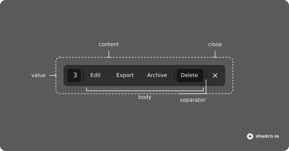
Installation
bunx --bun shadcn@latest add https://kit.dev/r/action-bar.jsonpnpm dlx shadcn@latest add https://kit.dev/r/action-bar.jsonnpx shadcn@latest add https://kit.dev/r/action-bar.jsonyarn shadcn@latest add https://kit.dev/r/action-bar.json<Step>This component depends on Badge, and Separator. Install them first if you haven't already.</Step>
Install the following dependencies:
bun add @ark-ui/react tailwind-variantspnpm add @ark-ui/react tailwind-variantsnpm install @ark-ui/react tailwind-variantsyarn add @ark-ui/react tailwind-variantsCopy and paste the following code into your project.
"use client";

import { Portal } from "@ark-ui/react/portal";
import { ark } from "@ark-ui/react/factory";
import { Presence } from "@ark-ui/react/presence";
import React from "react";
import { tv } from "tailwind-variants";
import { cn } from "@/lib/utils";
import { Badge } from "@/components/ui/badge";
import { Separator } from "@/components/ui/separator";

interface ActionBarPositioning {
  /**
   * The gutter from the edge in pixels.
   *
   * @default '16px'
   */
  gutter?: string;
  /**
   * The placement of the action bar.
   *
   * @default "bottom"
   */
  placement?: "bottom" | "bottom-start" | "bottom-end";
}

interface ActionBarContextValue {
  /**
   * The open state of the action bar
   */
  isOpen?: boolean;
  /**
   * Whether to lazy mount the action bar
   */
  lazyMount?: boolean;
  /**
   * The function to call when the action bar is closed
   */
  onClose?: () => void;
  /**
   * The function to call when the action bar is opened
   */
  onOpen?: () => void;
  /**
   * The positioning of the action bar.
   */
  positioning: ActionBarPositioning;
  /**
   * The function to call when the action bar is mounted
   */
  unmountOnExit?: boolean;
}

const ActionBarContext = React.createContext({} as ActionBarContextValue);

export interface ActionBarProps
  extends Pick<ActionBarContextValue, "lazyMount" | "unmountOnExit"> {
  /**
   * Whether to close the action bar when the Escape key is pressed.
   *
   * @default true
   */
  closeOnEscape?: boolean;
  /**
   * The default open state of the action bar.
   */
  defaultOpen?: boolean;
  /**
   * The function to call when the open state of the action bar changes.
   */
  onOpenChange?: (open: boolean) => void;
  /**
   * The open state of the action bar.
   */
  open?: boolean;
  /**
   * Placement and gutter of the action bar.
   */
  positioning?: ActionBarContextValue["positioning"];
}

const defaultPositioning = { placement: "bottom", gutter: "16px" } as const;

export const ActionBar = (props: React.PropsWithChildren<ActionBarProps>) => {
  const {
    open,
    defaultOpen = false,
    closeOnEscape = true,
    positioning,
    lazyMount = true,
    unmountOnExit = true,
    onOpenChange,
    ...rest
  } = props;

  const [internalOpen, setInternalOpen] = React.useState(defaultOpen);

  const isControlled = open !== undefined;
  const isOpen = isControlled ? open : internalOpen;

  const handleClose = React.useCallback(() => {
    if (!isControlled) {
      setInternalOpen(false);
    }

    onOpenChange?.(false);
  }, [isControlled, onOpenChange]);

  const handleOpen = React.useCallback(() => {
    if (!isControlled) {
      setInternalOpen(true);
    }

    onOpenChange?.(true);
  }, [isControlled, onOpenChange]);

  React.useEffect(() => {
    if (!isOpen) {
      return;
    }

    if (!closeOnEscape) {
      return;
    }

    const handleKeyDown = (event: KeyboardEvent) => {
      if (event.key !== "Escape") {
        return;
      }

      if (event.defaultPrevented) {
        return;
      }

      event.preventDefault();
      handleClose();
    };

    window.addEventListener("keydown", handleKeyDown);

    return () => window.removeEventListener("keydown", handleKeyDown);
  }, [closeOnEscape, handleClose, isOpen]);

  const context = React.useMemo(
    () => ({
      onClose: handleClose,
      onOpen: handleOpen,
      isOpen,
      positioning: { ...defaultPositioning, ...positioning },
      lazyMount,
      unmountOnExit,
    }),
    [handleClose, handleOpen, isOpen, lazyMount, unmountOnExit, positioning]
  );

  return <ActionBarContext.Provider value={context} {...rest} />;
};

export interface ActionBarTriggerProps
  extends React.ComponentProps<typeof ark.button> {}

export const ActionBarTrigger = (props: ActionBarTriggerProps) => {
  const { onClick, ...rest } = props;

  const { onOpen, isOpen } = _useActionBar();

  const handleClick = (event: React.MouseEvent<HTMLButtonElement>) => {
    onOpen?.();
    onClick?.(event);
  };

  return (
    <ark.button
      aria-expanded={isOpen}
      data-slot="action-bar-trigger"
      data-state={isOpen ? "open" : "closed"}
      onClick={handleClick}
      type="button"
      {...rest}
    />
  );
};

const actionBarPositionerVariants = tv({
  base: [
    "fixed inset-x-0 bottom-0 z-50",
    "flex",
    "px-4 pb-[calc(var(--gutter)+env(safe-area-inset-bottom,0))]",
    "pointer-events-none",
    "data-[state=closed]:animate-out data-[state=open]:animate-in",
    "data-[state=closed]:fade-out-0 data-[state=open]:fade-in-0",
    "data-[state=open]:slide-in-from-bottom-2 data-[state=closed]:slide-out-to-bottom-2",
    "motion-reduce:animate-none!",
  ],
  variants: {
    placement: {
      bottom: "justify-center",
      "bottom-end": "justify-end",
      "bottom-start": "justify-start",
    },
  },
  defaultVariants: {
    placement: "bottom",
  },
});

export interface ActionBarContentProps
  extends React.ComponentProps<typeof ark.div> {}

export const ActionBarContent = (props: ActionBarContentProps) => {
  const { "aria-labelledby": ariaLabelledby, className, ...rest } = props;

  const { isOpen, lazyMount, unmountOnExit, positioning } = _useActionBar();

  const placement = positioning.placement;
  const gutter = positioning.gutter;

  return (
    <Portal>
      <Presence
        asChild
        lazyMount={lazyMount}
        present={isOpen}
        unmountOnExit={unmountOnExit}
      >
        <ark.div
          className={cn(actionBarPositionerVariants({ placement }))}
          data-placement={placement}
          data-slot="action-bar-positioner"
          style={{ "--gutter": gutter } as React.CSSProperties}
        >
          <ark.div
            aria-labelledby={ariaLabelledby}
            className={cn(
              "[--space:--spacing(2)]",
              "flex w-fit items-center gap-1",
              "rounded-xl border shadow-lg/5",
              "px-[calc(var(--space)+2px)] py-(--space)",
              "bg-popover",
              "text-popover-foreground",
              "pointer-events-auto",
              className
            )}
            data-slot="action-bar-content"
            role="toolbar"
            {...rest}
          />
        </ark.div>
      </Presence>
    </Portal>
  );
};

export interface ActionBarSeparatorProps
  extends React.ComponentProps<typeof Separator> {}

export const ActionBarSeparator = (props: ActionBarSeparatorProps) => {
  const { className, ...rest } = props;

  return (
    <Separator
      className={cn("mx-1 h-1/2", className)}
      data-slot="action-bar-separator"
      orientation="vertical"
      {...rest}
    />
  );
};

export interface ActionBarCloseProps
  extends React.ComponentProps<typeof ark.button> {}

export const ActionBarClose = (props: ActionBarCloseProps) => {
  const { className, onClick, ...rest } = props;

  const { onClose, isOpen } = _useActionBar();

  const handleClick = (event: React.MouseEvent<HTMLButtonElement>) => {
    onClose?.();
    onClick?.(event);
  };

  return (
    <ark.button
      aria-label="Close"
      className={cn(
        "opacity-64 transition-opacity",
        "hover:opacity-100",
        "motion-reduce:transition-none!",
        className
      )}
      data-slot="action-bar-close"
      data-state={isOpen ? "open" : "closed"}
      onClick={handleClick}
      type="button"
      {...rest}
    />
  );
};

export interface ActionBarValueProps
  extends React.ComponentProps<typeof Badge> {
  /**
   * The number of items selected
   */
  count: number;
  /**
   * The label of the selection trigger
   */
  label?: string;
}

export const ActionBarValue = (props: ActionBarValueProps) => {
  const { label, count = 0, className, children, ...rest } = props;

  return (
    <Badge
      className={cn("shrink-0 font-medium text-sm tabular-nums", className)}
      data-slot="action-bar-value"
      variant="secondary"
      {...rest}
    >
      {children ?? label ?? count}
    </Badge>
  );
};

export const ActionBarBody = (props: React.ComponentProps<typeof ark.div>) => {
  const { className, ...rest } = props;

  return (
    <ark.div
      className={cn(
        "flex items-center gap-1",
        "**:data-[slot=action-bar-separator]:h-2",
        className
      )}
      data-slot="action-bar-body"
      {...rest}
    />
  );
};

const _useActionBar = () => {
  const context = React.useContext(ActionBarContext);

  if (!context) {
    throw new Error("useActionBar must be used within a ActionBarProvider.");
  }

  return context;
};Update the import paths to match your project setup.
Anatomy
ActionBar is a React context provider. It does not render a DOM node.
ActionBar
├── ActionBarTrigger
└── ActionBarContent (portaled)
    ├── ActionBarValue
    ├── ActionBarSeparator
    ├── ActionBarBody
    │   └── actions (Button, Menu, …)
    ├── ActionBarSeparator
    └── ActionBarClose
Usage
import {
  ArchiveIcon,
  DownloadIcon,
  PencilIcon,
  Trash2Icon,
  XIcon,
} from "lucide-react";
import {
  ActionBar,
  ActionBarBody,
  ActionBarClose,
  ActionBarContent,
  ActionBarSeparator,
  ActionBarTrigger,
  ActionBarValue,
} from "@/components/ui/action-bar";
import { Button } from "@/components/ui/button";<ActionBar>
<ActionBarTrigger asChild>
<Button variant="outline">Open</Button>
</ActionBarTrigger>
<ActionBarContent>
<ActionBarValue count={3} />
<ActionBarSeparator />
<ActionBarBody>
<Button variant="ghost">
<PencilIcon />
<span className="max-sm:sr-only">Edit</span>
</Button>
<ActionBarSeparator />
<Button variant="destructive">
<Trash2Icon />
<span className="max-sm:sr-only">Delete</span>
</Button>
</ActionBarBody>
<ActionBarSeparator />
<ActionBarClose asChild>
<Button size="icon-md" variant="ghost">
<XIcon />
</Button>
</ActionBarClose>
</ActionBarContent>
</ActionBar>Controlled
Use open and onOpenChange to control visibility. ActionBarTrigger only opens the bar; close it with ActionBarClose, Escape, or by setting open to false.
Examples
Positioning
Use the positioning.placement prop to position the action bar.
Gutter
Use positioning.gutter to control the distance from the bottom edge.
Close Trigger
With Dialog
With Menu
Table
Custom Spacing
The [--space:--spacing("value")] on ActionBarContent controls the internal spacing.
Default spacing is --spacing(2).
You can use breakpoint utilities to change the internal spacing at different screen sizes.
md:[--space:--spacing(6)] lg:[--space:--spacing(8)]API Reference
asChild merges props onto a single child element.
ActionBar
Root provider. Renders no DOM node. Holds open state and positioning.
| Prop | Type | Default | Description |
|---|---|---|---|
open | boolean | - | Controlled open state. |
defaultOpen | boolean | false | Uncontrolled initial open state. |
onOpenChange | (open: boolean) => void | - | Called when the bar opens (true) or closes (false). |
closeOnEscape | boolean | true | Close when Escape is pressed. Ignored if the event is already defaultPrevented. |
lazyMount | boolean | true | Mount content only after the bar first opens. |
unmountOnExit | boolean | true | Unmount content after the exit animation. |
positioning | ActionBarPositioning | { placement: "bottom", gutter: "16px" } | Placement and offset from the viewport edge. |
children | ReactNode | - | Trigger, content, and other descendants. |
positioning
| Prop | Type | Default | Description |
|---|---|---|---|
placement | "bottom" | "bottom-start" | "bottom-end" | "bottom" | Horizontal alignment along the bottom edge. |
gutter | string | "16px" | Distance from the bottom edge. Plus env(safe-area-inset-bottom). |
ActionBarTrigger
Button that opens the action bar. It does not toggle closed. Renders a button.
| Prop | Type | Default | Description |
|---|---|---|---|
asChild | boolean | false | Merge onto a single child (usually a Button). |
className | string | - | Class names on the trigger. |
onClick | MouseEventHandler | - | Called after the bar opens. |
| Attribute | Description |
|---|---|
data-slot | action-bar-trigger |
data-state | "open" or "closed" |
aria-expanded | true when the bar is open |
ActionBarContent
Portaled toolbar. Renders a positioner plus a role="toolbar" panel. Give it an accessible name with aria-label or aria-labelledby.
| Prop | Type | Default | Description |
|---|---|---|---|
aria-label | string | - | Accessible name for the toolbar. |
aria-labelledby | string | - | Id of a visible label for the toolbar. |
asChild | boolean | false | Merge onto a single child of the toolbar panel. |
className | string | - | Class names on the toolbar panel (not the positioner). |
| Attribute | Description |
|---|---|
data-slot | action-bar-content on the panel; action-bar-positioner on the fixed wrapper |
data-placement | "bottom", "bottom-start", or "bottom-end" (positioner) |
data-state | "open" or "closed" (positioner, from Presence) |
role | toolbar |
| CSS variable | Default | Description |
|---|---|---|
--space | --spacing(2) | Internal padding of the toolbar. Set on className, e.g. [--space:--spacing(3)]. |
--gutter | positioning.gutter (16px) | Offset from the bottom edge, including the safe-area inset. |
ActionBarValue
Selection count badge. Renders a Badge (variant="secondary"). Display order: children, then label, then count.
| Prop | Type | Default | Description |
|---|---|---|---|
count | number | required | Number of selected items. Also used as the fallback label. |
label | string | - | Text shown instead of count when children is omitted. |
children | ReactNode | - | Custom content. Overrides label and count. |
variant | Badge variant | "secondary" | Badge appearance. |
asChild | boolean | false | Merge onto a single child. |
className | string | - | Class names on the badge. |
| Attribute | Description |
|---|---|
data-slot | action-bar-value |
ActionBarSeparator
Vertical rule between groups. Renders a Separator with orientation="vertical".
| Prop | Type | Default | Description |
|---|---|---|---|
orientation | "horizontal" | "vertical" | "vertical" | Forced to vertical by the action bar unless you override it. |
asChild | boolean | false | Merge onto a single child. |
className | string | - | Class names on the separator. |
| Attribute | Description |
|---|---|
data-slot | action-bar-separator |
ActionBarBody
Flex row for primary actions.
| Prop | Type | Default | Description |
|---|---|---|---|
asChild | boolean | false | Merge onto a single child. |
className | string | - | Class names on the body. |
| Attribute | Description |
|---|---|
data-slot | action-bar-body |
ActionBarClose
Button that closes the action bar. Renders a button.
| Prop | Type | Default | Description |
|---|---|---|---|
asChild | boolean | false | Merge onto a single child (usually an icon Button). |
aria-label | string | "Close" | Accessible name. Override when the child already has visible text. |
className | string | - | Class names on the close button. |
onClick | MouseEventHandler | - | Called after the bar closes. |
| Attribute | Description |
|---|---|
data-slot | action-bar-close |
data-state | "open" or "closed" |
Accessibility
ActionBarContent is a role="toolbar". Provide an accessible name with aria-label or aria-labelledby. Icon-only close controls should keep an aria-label (the default is "Close").
Keyboard support
| Key | Description |
|---|---|
Escape | Close the action bar when closeOnEscape is true (default). |
Tab | Move focus to the next control in the toolbar. |
Shift + Tab | Move focus to the previous control. |