Shadcn Accordion for React and Tailwind
Open one panel or many. For FAQs, settings, and other disclosure UI.
Preview
Our flagship product combines cutting-edge technology with sleek design. Built with premium materials, it offers unparalleled performance and reliability.
Key features include advanced processing capabilities, and an intuitive user interface designed for both beginners and experts.
We offer worldwide shipping through trusted courier partners. Standard delivery takes 3-5 business days, while express shipping ensures delivery within 1-2 business days.
All orders are carefully packaged and fully insured. Track your shipment in real-time through our dedicated tracking portal.
We stand behind our products with a comprehensive 30-day return policy. If you're not completely satisfied, simply return the item in its original condition.
Our hassle-free return process includes free return shipping and full refunds processed within 48 hours of receiving the returned item.
Installation
bunx --bun shadcn@latest add https://kit.dev/r/accordion.jsonpnpm dlx shadcn@latest add https://kit.dev/r/accordion.jsonnpx shadcn@latest add https://kit.dev/r/accordion.jsonyarn shadcn@latest add https://kit.dev/r/accordion.jsonInstall the following dependencies:
bun add @ark-ui/react lucide-reactpnpm add @ark-ui/react lucide-reactnpm install @ark-ui/react lucide-reactyarn add @ark-ui/react lucide-reactAdd the following animations to your globals.css.
@theme inline {
  --animate-slide-up: slideUp 0.2s ease-out;
  --animate-slide-down: slideDown 0.2s ease-out;
  --animate-slide-in: slideIn 0.2s ease-out;
  --animate-slide-out: slideOut 0.2s ease-out;

  @keyframes slideUp {
    from { height: var(--height); }
    to { height: 0; }
  }
  @keyframes slideDown {
    from { height: 0; }
    to { height: var(--height); }
  }
  @keyframes slideIn {
    from { width: 0; }
    to { width: var(--width); }
  }
  @keyframes slideOut {
    from { width: var(--width); }
    to { width: 0; }
  }
}

@keyframes accordion-fade-in {
  from { opacity: 0; }
  to { opacity: 1; }
}
@keyframes accordion-fade-out {
  from { opacity: 1; }
  to { opacity: 0; }
}

[data-slot="accordion-content"][data-state="open"],
[data-slot="accordion-content"][data-state="closed"] {
  animation-duration: 200ms;
  animation-timing-function: ease-out;
}
[data-slot="accordion"][data-motion] [data-slot="accordion-content"][data-state="open"]:not([data-orientation="horizontal"]) {
  animation-name: slideDown, accordion-fade-in;
}
[data-slot="accordion-content"][data-state="closed"]:not([data-orientation="horizontal"]) {
  animation-name: slideUp, accordion-fade-out;
}
[data-slot="accordion"][data-motion] [data-slot="accordion-content"][data-state="open"][data-orientation="horizontal"] {
  animation-name: slideIn, accordion-fade-in;
  will-change: width;
}
[data-slot="accordion-content"][data-state="closed"][data-orientation="horizontal"] {
  animation-name: slideOut, accordion-fade-out;
  will-change: width;
}
Copy and paste the following code into your project.
"use client";

import {
  Accordion as ArkAccordion,
  useAccordion as useArkAccordion,
  useAccordionContext as useArkAccordionContext,
  useAccordionItemContext as useArkAccordionItemContext,
} from "@ark-ui/react/accordion";
import { ChevronDownIcon } from "lucide-react";
import type React from "react";
import { useCallback, useState } from "react";
import { cn } from "@/lib/utils";

export const useAccordion = useArkAccordion;
export const useAccordionContext = useArkAccordionContext;
export const useAccordionItemContext = useArkAccordionItemContext;

export const AccordionContext = ArkAccordion.Context;
export const AccordionItemContext = ArkAccordion.ItemContext;

const accordionRootClassName = cn(
  "group/accordion",
  "data-[orientation=horizontal]:flex data-[orientation=horizontal]:h-80 data-[orientation=horizontal]:max-h-[calc(100vh-8rem)] data-[orientation=horizontal]:flex-row"
);

export const Accordion = (
  props: React.ComponentProps<typeof ArkAccordion.Root>
) => {
  const {
    orientation,
    collapsible = true,
    lazyMount,
    unmountOnExit,
    className,
    onValueChange,
    ...rest
  } = props;
  const isHorizontal = orientation === "horizontal";
  const [motion, setMotion] = useState(false);
  const handleValueChange = useCallback(
    (details: Parameters<NonNullable<typeof onValueChange>>[0]) => {
      setMotion(true);
      onValueChange?.(details);
    },
    [onValueChange]
  );

  return (
    <ArkAccordion.Root
      {...rest}
      className={cn(accordionRootClassName, className)}
      collapsible={collapsible}
      data-motion={motion ? "" : undefined}
      data-slot="accordion"
      lazyMount={lazyMount ?? !isHorizontal}
      onValueChange={handleValueChange}
      orientation={orientation}
      unmountOnExit={unmountOnExit ?? !isHorizontal}
    />
  );
};

export const AccordionRootProvider = (
  props: React.ComponentProps<typeof ArkAccordion.RootProvider>
) => {
  const { className, ...rest } = props;

  return (
    <ArkAccordion.RootProvider
      className={cn(accordionRootClassName, className)}
      data-slot="accordion"
      {...rest}
    />
  );
};

export const AccordionItem = (
  props: React.ComponentProps<typeof ArkAccordion.Item>
) => {
  const { className, ...rest } = props;

  return (
    <ArkAccordion.Item
      className={cn(
        "border-b last:border-b-0 [overflow-anchor:none]",
        "data-[orientation=horizontal]:flex data-[orientation=horizontal]:border-b-0 data-[orientation=horizontal]:border-e",
        className
      )}
      data-slot="accordion-item"
      {...rest}
    />
  );
};

export const AccordionTrigger = (
  props: React.ComponentProps<typeof ArkAccordion.ItemTrigger>
) => {
  const { className, children, ...rest } = props;

  return (
    <ArkAccordion.ItemTrigger
      className={cn(
        "flex items-center justify-between gap-3",
        "px-2",
        "text-start font-medium text-sm",
        "rounded-md border border-transparent bg-transparent",
        "outline-none",
        "disabled:pointer-events-none disabled:opacity-64 disabled:grayscale",
        "focus-visible:border-primary focus-visible:ring-[3px] focus-visible:ring-ring/32",
        "[&_[data-state=open]>svg]:rotate-180",
        "data-[orientation=vertical]:w-full data-[orientation=vertical]:min-h-10 data-[orientation=vertical]:py-4",
        "data-[orientation=horizontal]:h-full data-[orientation=horizontal]:min-w-10 data-[orientation=horizontal]:[writing-mode:sideways-lr]",
        className
      )}
      data-slot="accordion-trigger"
      {...rest}
    >
      {children}

      <ArkAccordion.ItemIndicator
        className="inline-flex items-center justify-center data-[orientation=horizontal]:hidden"
        data-slot="accordion-indicator"
      >
        <ChevronDownIcon
          className={cn(
            "size-4",
            "shrink-0",
            "text-muted-foreground",
            "pointer-events-none",
            "transition-transform duration-200",
            "motion-reduce:transition-none!"
          )}
        />
      </ArkAccordion.ItemIndicator>
    </ArkAccordion.ItemTrigger>
  );
};

export const AccordionContent = (
  props: React.ComponentProps<typeof ArkAccordion.ItemContent>
) => {
  const { className, children, ...rest } = props;

  return (
    <ArkAccordion.ItemContent
      className={cn("overflow-hidden rounded-lg text-sm", className)}
      data-slot="accordion-content"
      {...rest}
    >
      <div
        className={cn(
          "pt-0 pb-4",
          "group-data-[orientation=horizontal]/accordion:flex",
          "group-data-[orientation=horizontal]/accordion:size-full",
          "group-data-[orientation=horizontal]/accordion:items-center",
          "group-data-[orientation=horizontal]/accordion:justify-center",
          "group-data-[orientation=horizontal]/accordion:bg-muted",
          "group-data-[orientation=horizontal]/accordion:p-5",
          "group-data-[orientation=horizontal]/accordion:text-center"
        )}
      >
        {children}
      </div>
    </ArkAccordion.ItemContent>
  );
};Update the import paths to match your project setup.
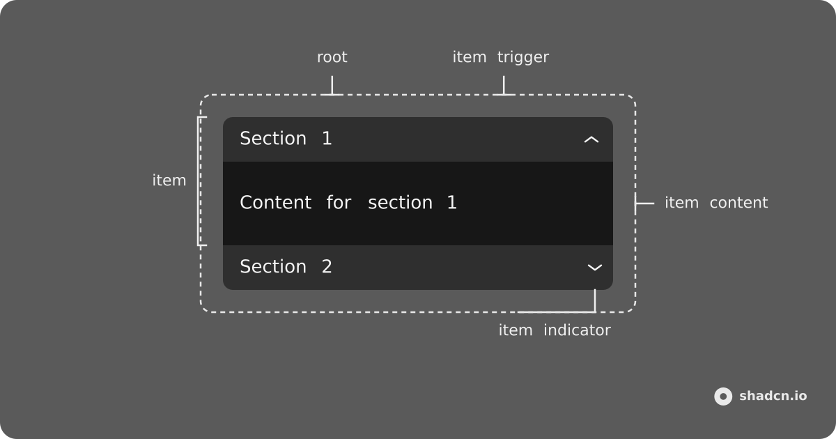
Anatomy
Usage
import {
  Accordion,
  AccordionItem,
  AccordionTrigger,
  AccordionContent
} from "@/components/ui/accordion";<Accordion>
<AccordionItem value="item-1">
<AccordionTrigger>
Is it accessible?
</AccordionTrigger>
<AccordionContent>
Yes. It adheres to the WAI-ARIA design pattern.
</AccordionContent>
</AccordionItem>
</Accordion>Demos
Multiple
Use multiple to keep more than one item open.
Horizontal
Use orientation="horizontal" for a row of vertical triggers. Open items expand sideways using --width.
Disabled
Pass disabled on an item to take it out of the keyboard flow.
Card
Wrap the accordion in a Card for a settings or FAQ block.
Controlled
Drive the open items with value and onValueChange.
API Reference
shadcn.io wraps Ark UI Accordion. Defaults below are shadcn.io values — they differ from Ark for collapsible (true here, false in Ark) and for lazyMount / unmountOnExit (on for vertical, off for horizontal).
Every part accepts className and asChild. asChild merges props onto a single child element instead of rendering the default tag.
Accordion
Root. Renders a div.
AccordionItem
Single item. Renders a div.
AccordionTrigger
Button that expands or collapses its item. Renders a button and includes the chevron indicator (hidden when orientation="horizontal"). No props beyond className and asChild.
AccordionContent
Collapsible panel. Renders a div. No props beyond className and asChild.
| CSS variable | Description |
|---|---|
--height | Measured content height. Used by the vertical open/close animation. |
--width | Measured content width. Used by the horizontal open/close animation. |
AccordionRootProvider
Root alternative that takes the API from useAccordion. Renders a div. Pass collapsible, orientation, multiple, and the other machine options to useAccordion(), not to AccordionRootProvider.
useAccordion
Creates the accordion API for AccordionRootProvider. Accepts the same options as Accordion except asChild and className.
const accordion = useAccordion({
  collapsible: true,
  defaultValue: ["item-1"],
  multiple: true,
});
AccordionContext / useAccordionContext
Render-prop or hook access to accordion state. Use inside Accordion or AccordionRootProvider. AccordionContext children: (context) => ReactNode.
AccordionItemContext / useAccordionItemContext
Render-prop or hook access to one item. Use inside AccordionItem. AccordionItemContext children: (context) => ReactNode.
Data attributes
Every part sets data-scope="accordion" and data-orientation ("horizontal" or "vertical"). Item-level parts (item, trigger, content, indicator) also set data-state ("open" or "closed"), data-disabled when disabled, and data-focus when the trigger is focused.
| Part | data-slot | data-part |
|---|---|---|
Accordion / AccordionRootProvider | accordion | root |
AccordionItem | accordion-item | item |
AccordionTrigger | accordion-trigger | item-trigger |
AccordionContent | accordion-content | item-content |
| Indicator (built into the trigger) | accordion-indicator | item-indicator |
AccordionTrigger also sets data-controls with the id of its content panel.
Accessibility
Complies with the Accordion WAI-ARIA design pattern.
Keyboard support
| Key | Description |
|---|---|
Space | When focus is on a collapsed trigger, expand the item. |
Enter | When focus is on a collapsed trigger, expand the item. |
Tab | Move focus to the next focusable element. |
Shift + Tab | Move focus to the previous focusable element. |
ArrowDown | Move focus to the next trigger (vertical). |
ArrowUp | Move focus to the previous trigger (vertical). |
ArrowRight | Move focus to the next trigger (horizontal). |
ArrowLeft | Move focus to the previous trigger (horizontal). |
Home | Move focus to the first trigger. |
End | Move focus to the last trigger. |