shadcn.io is not affiliated with official shadcn/ui
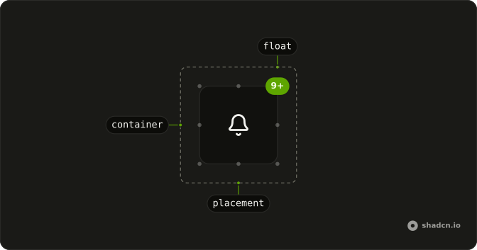
A small marker, usually a count, fixed to the edge of the control it belongs to.
Use it when that marker should stay on the control instead of opening on hover. A sentence that appears only on hover belongs in a Tooltip. In Solid, Ark UI only places the child, so the parent needs relative or the marker can jump to an ancestor.
Installation
Anatomy
Usage
import { BellIcon } from "lucide-solid";
import { Badge } from "@/components/ui/badge";
import { Button } from "@/components/ui/button";
import { Float } from "@/components/ui/float";<div class="relative">
<Button size="icon-lg" variant="outline">
<BellIcon />
</Button>
<Float>
<Badge pill size="sm" variant="default">
9+
</Badge>
</Float>
</div>Accessibility
- Enter
- Activate the focused control.
- Space
- Activate the focused control.
Demos
Placement
placement picks one of nine anchors: top, middle, or bottom, crossed with start, center, or end. The default, top-end, is the usual corner for a count in both directions. Start and end follow the inline axis, so there is no separate left and right. The child hangs about halfway outside the box, there is no offset prop, and two markers on one placement share a point.
FAQ
How do I choose where a Float sits in Solid?
Set placement. The default is top-end. The nine values pair top, middle, or bottom with start, center, or end. The root sets data-placement to the same value. The Placement demo shows all nine. Start and end refer to the inline edges of the parent. There is no separate offset prop. The placement hangs the child about halfway outside the box.
Why is my Float in the wrong place?
Float is absolutely positioned. The parent needs its own position, usually relative, as the usage wraps the button. Without that, the float anchors to some farther positioned ancestor. It uses z-10, so a later sibling with a higher stack can still cover it. Pass a class if you need to pull it back inside the parent.
Can people activate what is inside a Float?
Yes. The root uses pointer-events-auto, so a badge or button that hangs outside the parent still receives the click. Float itself is not a button. If the child is a control, that control keeps Enter and Space, which is what the Accessibility section describes. A count that is not a control should not be given a click handler on the float.
How do I restyle a Float?
Edit components/ui/float. Each placement sets the inset and the translation that hangs the child outside the parent. Override that with a class if you want it fully inside the box, or to change z-10. The part is a div with data-slot float and data-placement. Decorative icons inside the badge should be hidden from assistive tech.
Can one parent have more than one Float?
Yes. Render one Float per corner, each with its own placement. They do not avoid each other. Two floats with the same placement occupy the same point. The parent is still the positioning context for every one of them. Give each a different placement when they should be read as separate markers.
API Reference
Float
<div> data-slot="float"
placement?"bottom-center" | "bottom-end" | "bottom-start" | "middle-center" | "middle-end" | "middle-start" | "top-center" | "top-end" | "top-start"
The corner or edge it floats at, such as top-end.
- Type
"bottom-center" | "bottom-end" | "bottom-start" | "middle-center" | "middle-end" | "middle-start" | "top-center" | "top-end" | "top-start"- Default
"top-end"
asChild?(props: ParentProps) => JSX.Element
Render your own element: a function that gets the part's props to spread on it.
- Type
(props: ParentProps) => JSX.Element
class?string
Merged with the part's classes.
data-placement?string
Mirrors placement.
With other components
Badge
FeedbackA count on a corner
Avatar
MediaThe anchor
Button
ButtonsAn action on the edge
Tooltip
OverlaysName the floating mark
Card
LayoutThe surface it sits on
Marker
MediaA pin on the content
Related
Hover Card
OverlaysA preview on hover
Popover
OverlaysA layer on click
Dropdown Menu
MenusA menu from the anchor
Frame
LayoutA box around the content
Item
LayoutA row with a corner mark
Aspect Ratio
LayoutThe box the float sits on