shadcn.io is not affiliated with official shadcn/ui
Month, day, and year are separate parts you type. A nonsense date is harder to enter than in one free-text box.
Use it when the date is already known and a popup would get in the way, like a card expiry at checkout. To see the days and choose one, use a Date Picker. In Solid, Ark UI steps the focused part with the arrow keys.
Installation
Anatomy
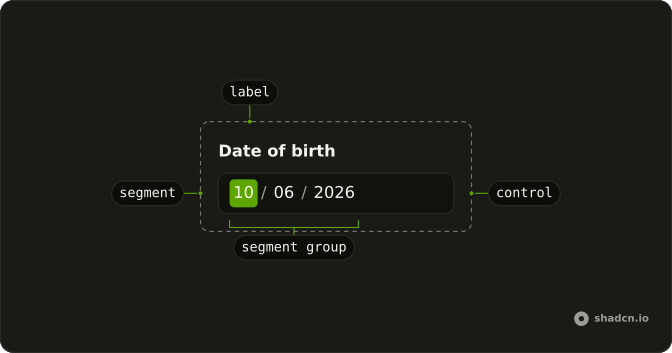
DateInput
└── DateInputLabel
    ├── DateInputControl
    ├── DateInputSegmentGroup
    ├── DateInputSegment
    └── DateInputHiddenInput
Usage
import { DateInput } from "@/components/ui/date-input";const Example = () => <DateInput class="w-full max-w-64" />;Accessibility
- Arrow Left
- Move left.
- Arrow Right
- Move right.
- Arrow Up
- Move up.
- Arrow Down
- Move down.
- Page Up
- Jump backward.
- Page Down
- Jump forward.
- Backspace
- Delete backward.
- Delete
- Delete backward.
- Home
- Go to the start.
- End
- Go to the end.
Demos
Context
DateInputContext sits inside the field and reads it back, which is what you want when a line under the segments should echo the current text without a second copy of the state. It exposes the input, including valueAsString, and the line prints that or the word None while the field is empty. Keep readouts that belong to the field here, and keep page-level state in the parent.
Controlled
Hold the date in state and pass it back as value, then write the next array into that state whenever the segments change. A line under the field prints the selected date, or none while it is empty. The array has one entry for a single date. Skip the state when nothing else on the page has to react to the field.
Custom Separator
A range needs something between the start date and the end date. separator replaces the default dash with whatever you pass, here an arrow icon marked hidden because the two dates already explain the span. Use a custom mark when the gap should read as from and to, not as another piece of punctuation. The dates themselves are unchanged.
Default Value
defaultValue fills the segments on the first render and then lets the field keep its own state. This one starts from 2024-04-04, parsed into a date value so the month, day, and year land in the right parts for the locale. Use it when the page already knows a date and the parent does not need every keystroke. A later edit stays inside the field.
Disabled
disabled blocks typing, arrow steps, and focus, and the segments fade so the lock is visible. Use it when a date is shown but cannot be changed yet, such as a return date that waits on a one-way trip. It locks the whole field, not a single segment. Say why nearby if the label does not make the reason obvious.
Granularity
granularity sets how small the last segment is. minute adds hour and minute after the calendar date, which is the right cut for a meeting start. hour stops at the hour, and second adds a seconds segment on the end. Leave it unset for a birthday or any value where a time would just be extra fields to tab through.
Invalid
invalid marks the field as failed and leaves the typed value in place, so the person can correct it. Set it after submit when the date is missing, incomplete, or rejected by the form, and put an error message next to it so color is not the only clue. The segments stay editable. That is the difference from disabled and from readOnly.
Leading Zeros
shouldForceLeadingZeros set to false lets a single-digit month or day show as 4 rather than 04. Turn it off when the design or the locale prefers unpadded numbers, and leave the default when a column of dates should line up. Typing works the same either way. Only the display of the short numbers changes.
Min Max
min and max keep the field inside a window, here every day of 2024. A date outside that window marks the input invalid by itself, which suits a season, a tax year, or a campaign that must not spill over. Pass date values, not formatted strings. Other holes, such as weekends, need a separate check for unavailable dates.
Range
selectionMode set to range shows a start date and an end date in one field, with a separator between them. The value is then an array of those two dates, in order. Use it for a hotel stay or a billing period the person can type without opening two calendars. A single date is still the default, so set this only when the span is the point.
Read Only
readOnly keeps 2024-04-04 visible and focusable while refusing edits. Use it for a confirmed booking or a date copied from another record, where the person may still need to read each segment. disabled would also drop the field from the tab order and fade it. The value is set up front so there is something to read.
Root Provider
useDateInput owns the field, and DateInputRootProvider renders the segments from that same object. A button outside the field calls focus on the hook, so the first segment takes focus without a ref of your own. Use the provider when a toolbar, a shortcut, or another control has to drive the input. For a plain field, the root component is enough.
Size Lg
size set to lg raises the height and the type so the date can be the main control on a page, such as the check-in on a booking form. Segments, separators, and the focus ring scale together, so you do not restyle each part. Use the large size when the default height would look lost. Skip it on a dense form where every field should match.
Size Md
size set to md is the default height, shown on its own so you can compare it with the small and large fields. It lines up with a normal text input, which is what you want when the date sits beside a name or an email. Set it explicitly if a wrapper might pass another size. Otherwise you are already looking at the default.
Size Sm
size set to sm shortens the field for a tight row: a filter bar, a table toolbar, or a dialog that already has several controls. The segments stay tappable, just with less padding and smaller type. Use it when the date is one detail among many, not the thing the page is about. Pair it with other small inputs so the row does not wobble.
Time Only
A formatter that asks only for hour and minute drops the calendar segments, so the field is a time of day. granularity is minute, and hourCycle is 12, which adds the day-period segment instead of a 24-hour clock. Use this for an alarm or a shift start where the date lives somewhere else. A meeting that needs both should keep the date segments and only add the time.
With Clear Button
showClear adds a button that empties the field. It starts from 2024-04-04 in state, because a clear button on an empty uncontrolled field has nothing to show. The click writes an empty array back through the same path as typing. Use it when people often need to wipe a date and start over, such as an optional deadline.
With Field
Wrap the input in Field when it needs a real label and a hint, here Date of birth plus a note to use the local format. FieldLabel names the control, and FieldHelper sits under the segments, which is the right place for format help that is not an error. The input itself is unchanged. Add invalid on the field when the date fails validation.
FAQ
Should I use a Date Input or a Date Picker?
Use a Date Input when people already know the date, like a birthday or an expiry date, and typing is faster than browsing a calendar. Use a Date Picker when they need to see the days of the month, for example to book a date.
How do I get the value of a Date Input in Solid?
Read it in onValueChange, which receives { value }: an array of date values, with one date, or two in range mode. Pass that array back as value to control the input, as in the Controlled demo. Each date's toString() gives an ISO string like 2024-05-17.
How do I set a minimum and maximum date on a Date Input?
Pass min and max as date values, created with parseDate("2024-01-01") from Ark UI's date picker package, as in the Min Max demo. To rule out other dates, like weekends, pass isDateUnavailable: a matching date marks the input invalid on its own.
How do I add time to a Date Input?
Set granularity to hour, minute or second to add those segments after the date. To show only a time, pass a formatter with just the time parts, as in the Time Only demo, and use hourCycle to force a 12 or 24 hour clock.
Can a Date Input take a date range?
Yes. Set selectionMode to range to show a start and an end date in one field, with separator between them, as in the Range demo. The value is then an array of the two dates.
How do I change the Date Input format for another locale?
Set locale, like en-GB or de-DE: the segment order, the separators and the placeholders follow it. shouldForceLeadingZeros controls whether months and days show as 05 or 5, as in the Leading Zeros demo.
How does the Date Input work with the keyboard?
Each part of the date is its own segment: type digits to fill it, use the up and down arrows to step its value, and the left and right arrows or Tab to move between segments. Screen readers announce each segment by name, like month or year.
Does the Date Input submit with a form?
Yes. Give it a name and it submits the date through a hidden input, as text in the input's format. Set invalid, disabled, readOnly or required for those states, or wrap it in a Field for a label and an error, as in the With Field demo.
API Reference
DateInput
<div> data-slot="date-input"
value?DateValue[]
The controlled selected date(s).
defaultValue?DateValue[]
The initial selected date(s) when rendered. Use when you don't need to control the selected date(s).
onValueChange?(details: ValueChangeDetails) → void
Function called when the value changes.
- Type
(details: ValueChangeDetails) → void- Parameters
details– { value: DateValue[]; valueAsString: string[] }- Returns
void
allSegments?{ -readonly [K in keyof typeof EDITABLE_SEGMENTS]?: boolean
The computed segments map for the formatter.
- Type
{ -readonly [K in keyof typeof EDITABLE_SEGMENTS]?: boolean
createCalendar?(identifier: CalendarIdentifier) → Calendar
A function that creates a calendar object for a given calendar identifier. Use this to support non-Gregorian calendars (e.g., Persian, Islamic, Buddhist). import { createCalendar } from "@internationalized/date" { locale: "fa-IR", createCalendar }
- Type
(identifier: CalendarIdentifier) → Calendar- Parameters
identifier– CalendarIdentifier- Returns
Calendar
defaultPlaceholderValue?CalendarDate | CalendarDateTime | ZonedDateTime
The initial placeholder date when rendered.
- Type
CalendarDate | CalendarDateTime | ZonedDateTime
dir?"ltr" | "rtl"
The document's text/writing direction.
- Type
"ltr" | "rtl"- Default
"ltr"
disabled?boolean
Whether the date input is disabled.
form?string
The form attribute of the hidden input element.
format?(date: DateValue, details: FormatDateDetails) → string
The format function for converting a DateValue to a string.
- Type
(date: DateValue, details: FormatDateDetails) → string- Parameters
date– DateValuedetails– { locale: string; timeZone: string }- Returns
string
formatter?DateFormatter
The date formatter to use.
granularity?"day" | "hour" | "minute" | "second"
Determines the smallest unit that is displayed in the date input.
- Type
"day" | "hour" | "minute" | "second"- Default
"day"
hideTimeZone?boolean
Whether to hide the time zone segment when the value is a ZonedDateTime.
Has no effect for values without a time zone.
- Default
false
hourCycle?12 | 24
Whether to use 12-hour or 24-hour time format. By default, this is determined by the locale.
- Type
12 | 24
id?string
The unique identifier of the machine.
ids?object
The ids of the elements in the date input. Useful for composition.
- Type
{ root?: string; label?: (index: number) → string; control?: string; segmentGroup?: (index: number) → string; hiddenInput?: (index: number) → string }
invalid?boolean
Whether the date input is invalid.
isDateUnavailable?(date: DateValue, locale: string) → boolean
Returns whether a date is unavailable. When a committed date matches, the input is marked as invalid.
- Type
(date: DateValue, locale: string) → boolean- Parameters
date– DateValuelocale– string- Returns
boolean
locale?string
The locale (BCP 47 language tag) to use when formatting the date.
- Default
"en-US"
max?CalendarDate | CalendarDateTime | ZonedDateTime
The maximum date that can be selected.
- Type
CalendarDate | CalendarDateTime | ZonedDateTime
min?CalendarDate | CalendarDateTime | ZonedDateTime
The minimum date that can be selected.
- Type
CalendarDate | CalendarDateTime | ZonedDateTime
name?string
The name attribute of the input element.
onFocusChange?(details: FocusChangeDetails) → void
A function called when the date input gains or loses focus.
- Type
(details: FocusChangeDetails) → void- Parameters
details– { focused: boolean }- Returns
void
onPlaceholderChange?(details: PlaceholderChangeDetails) → void
A function called when the placeholder value changes.
- Type
(details: PlaceholderChangeDetails) → void- Parameters
details– { placeholderValue: DateValue }- Returns
void
placeholderValue?CalendarDate | CalendarDateTime | ZonedDateTime
The controlled placeholder date.
- Type
CalendarDate | CalendarDateTime | ZonedDateTime
readOnly?boolean
Whether the date input is read-only.
required?boolean
Whether the date input is required.
selectionMode?"single" | "range"
The selection mode. Must match the machine option.
- Type
"single" | "range"- Default
"single"
separator?string | JSX.Element
The separator to show between the date input fields in range mode.
- Type
string | JSX.Element- Default
"-"
shouldForceLeadingZeros?boolean
Whether to always show leading zeros in month, day, and hour fields.
When false, formatting follows the locale default (e.g. "1" instead of "01"). Ark default: false.
- Default
true
showClear?boolean
Whether to show the clear button.
- Default
false
size?InputProps["size"]
The size of the control.
- Default
"md"
timeZone?string
The time zone to use.
- Default
"UTC"
translations?object
The localized messages to use.
- Type
{ placeholder?: (locale: string) → Record<EditableSegmentType, string> }
asChild?(props: ParentProps) => JSX.Element
Render your own element: a function that gets the part's props to spread on it.
- Type
(props: ParentProps) => JSX.Element
class?string
Merged with the part's classes.
data-disabled?string
Present when disabled.
data-invalid?string
Present when invalid.
data-readonly?string
Present when read-only.
data-size?string
Mirrors size.
DateInputLabel
<label> data-slot="date-input-label"
asChild?(props: ParentProps) => JSX.Element
Render your own element: a function that gets the part's props to spread on it.
- Type
(props: ParentProps) => JSX.Element
class?string
Merged with the part's classes.
data-disabled?string
Present when disabled.
data-invalid?string
Present when invalid.
data-readonly?string
Present when read-only.
DateInputControl
<div> data-slot="date-input-control"
asChild?(props: ParentProps) => JSX.Element
Render your own element: a function that gets the part's props to spread on it.
- Type
(props: ParentProps) => JSX.Element
data-disabled?string
Present when disabled.
data-focus?string
Present when focused.
data-invalid?string
Present when invalid.
data-readonly?string
Present when read-only.
DateInputSegmentGroup
<div> data-slot="date-input-segment-group"
index?number
The segment group's position in its list.
asChild?(props: ParentProps) => JSX.Element
Render your own element: a function that gets the part's props to spread on it.
- Type
(props: ParentProps) => JSX.Element
data-disabled?string
Present when disabled.
data-focus?string
Present when focused.
data-invalid?string
Present when invalid.
data-readonly?string
Present when read-only.
DateInputSegment
<span> data-slot="date-input-segment"
segmentobject
The segment it renders, one of the segment group's segments.
- Type
{ type: SegmentType; text: string; value?: number; minValue?: number; maxValue?: number; isPlaceholder: boolean; placeholder: string; isEditable: boolean }
asChild?(props: ParentProps) => JSX.Element
Render your own element: a function that gets the part's props to spread on it.
- Type
(props: ParentProps) => JSX.Element
data-disabled""
Present when disabled.
- Default
""
data-editable?string
Present when editable.
data-placeholder-shown?string
Present when placeholder is shown.
data-readonly""
Present when read-only.
- Default
""
data-typestring
The type of the item.
data-valuestring
The value of the item.
DateInputHiddenInput
<input>
index?number
The hidden input's position in its list.
name?string
The name it submits with its form.
asChild?(props: ParentProps) => JSX.Element
Render your own element: a function that gets the part's props to spread on it.
- Type
(props: ParentProps) => JSX.Element
DateInputRootProvider
<div> data-slot="date-input"
valueReturnType<typeof useDateInput>
What useDateInput() returns: the state and API, made outside the component to control it.
- Type
ReturnType<typeof useDateInput>
selectionMode?"single" | "range"
The selection mode. Must match the machine option.
- Type
"single" | "range"- Default
"single"
separator?string | JSX.Element
The separator to show between the date input fields in range mode.
- Type
string | JSX.Element- Default
"-"
showClear?boolean
Whether to show the clear button.
- Default
false
size?InputProps["size"]
The size of the control.
- Default
"md"
asChild?(props: ParentProps) => JSX.Element
Render your own element: a function that gets the part's props to spread on it.
- Type
(props: ParentProps) => JSX.Element
class?string
Merged with the part's classes.
data-disabled?string
Present when disabled is true.
data-invalid?string
Present when invalid is true.
data-readonly?string
Present when readOnly is true.
data-size?string
Mirrors size.
useDateInput
value?DateValue[]
The controlled selected date(s).
defaultValue?DateValue[]
The initial selected date(s) when rendered. Use when you don't need to control the selected date(s).
onValueChange?(details: ValueChangeDetails) → void
Function called when the value changes.
- Type
(details: ValueChangeDetails) → void- Parameters
details– { value: DateValue[]; valueAsString: string[] }- Returns
void
allSegments?{ -readonly [K in keyof typeof EDITABLE_SEGMENTS]?: boolean
The computed segments map for the formatter.
- Type
{ -readonly [K in keyof typeof EDITABLE_SEGMENTS]?: boolean
createCalendar?(identifier: CalendarIdentifier) → Calendar
A function that creates a calendar object for a given calendar identifier. Use this to support non-Gregorian calendars (e.g., Persian, Islamic, Buddhist). import { createCalendar } from "@internationalized/date" { locale: "fa-IR", createCalendar }
- Type
(identifier: CalendarIdentifier) → Calendar- Parameters
identifier– CalendarIdentifier- Returns
Calendar
defaultPlaceholderValue?CalendarDate | CalendarDateTime | ZonedDateTime
The initial placeholder date when rendered.
- Type
CalendarDate | CalendarDateTime | ZonedDateTime
dir?"ltr" | "rtl"
The document's text/writing direction.
- Type
"ltr" | "rtl"- Default
"ltr"
disabled?boolean
Whether the date input is disabled.
form?string
The form attribute of the hidden input element.
format?(date: DateValue, details: FormatDateDetails) → string
The format function for converting a DateValue to a string.
- Type
(date: DateValue, details: FormatDateDetails) → string- Parameters
date– DateValuedetails– { locale: string; timeZone: string }- Returns
string
formatter?DateFormatter
The date formatter to use.
granularity?"day" | "hour" | "minute" | "second"
Determines the smallest unit that is displayed in the date input.
- Type
"day" | "hour" | "minute" | "second"- Default
"day"
hideTimeZone?boolean
Whether to hide the time zone segment when the value is a ZonedDateTime.
Has no effect for values without a time zone.
- Default
false
hourCycle?12 | 24
Whether to use 12-hour or 24-hour time format. By default, this is determined by the locale.
- Type
12 | 24
id?string
The unique identifier of the machine.
ids?object
The ids of the elements in the date input. Useful for composition.
- Type
{ root?: string; label?: (index: number) → string; control?: string; segmentGroup?: (index: number) → string; hiddenInput?: (index: number) → string }
invalid?boolean
Whether the date input is invalid.
isDateUnavailable?(date: DateValue, locale: string) → boolean
Returns whether a date is unavailable. When a committed date matches, the input is marked as invalid.
- Type
(date: DateValue, locale: string) → boolean- Parameters
date– DateValuelocale– string- Returns
boolean
locale?string
The locale (BCP 47 language tag) to use when formatting the date.
- Default
"en-US"
max?CalendarDate | CalendarDateTime | ZonedDateTime
The maximum date that can be selected.
- Type
CalendarDate | CalendarDateTime | ZonedDateTime
min?CalendarDate | CalendarDateTime | ZonedDateTime
The minimum date that can be selected.
- Type
CalendarDate | CalendarDateTime | ZonedDateTime
name?string
The name attribute of the input element.
onFocusChange?(details: FocusChangeDetails) → void
A function called when the date input gains or loses focus.
- Type
(details: FocusChangeDetails) → void- Parameters
details– { focused: boolean }- Returns
void
onPlaceholderChange?(details: PlaceholderChangeDetails) → void
A function called when the placeholder value changes.
- Type
(details: PlaceholderChangeDetails) → void- Parameters
details– { placeholderValue: DateValue }- Returns
void
placeholderValue?CalendarDate | CalendarDateTime | ZonedDateTime
The controlled placeholder date.
- Type
CalendarDate | CalendarDateTime | ZonedDateTime
readOnly?boolean
Whether the date input is read-only.
required?boolean
Whether the date input is required.
selectionMode?"single" | "range"
The selection mode of the date input.
- single - only one date can be entered
- range - a range of dates can be entered (start and end)
- Type
"single" | "range"- Default
"single"
shouldForceLeadingZeros?boolean
Whether to always show leading zeros in month, day, and hour fields. When false, formatting follows the locale default (e.g. "1" instead of "01").
- Default
false
timeZone?string
The time zone to use.
- Default
"UTC"
translations?object
The localized messages to use.
- Type
{ placeholder?: (locale: string) → Record<EditableSegmentType, string> }
DateInputContext
With other components
Field
InputsLabel and error
Label
InputsName the date
Calendar
DatesPick instead of type
Button
ButtonsOpen the calendar
Input Group
InputsDate beside an action
Tooltip
OverlaysThe expected format
Related
Date Picker
DatesA field that opens a month
Input
InputsPlain text
Number Input
InputsOne number
Input OTP
InputsFixed slots
Popover
OverlaysThe month in a layer
Dialog
OverlaysThe calendar in a modal