shadcn.io is not affiliated with official shadcn/ui
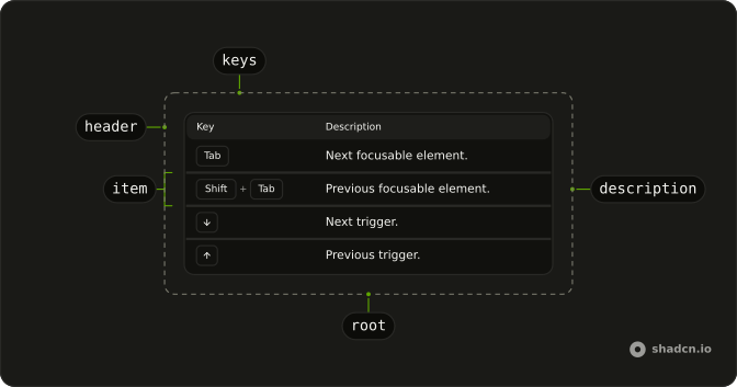
Key caps in the first column and a short description in the second. The header stays Key and Description.
Use it in docs when several shortcuts need a row each. One key mentioned in passing is a Kbd, not a table. In React, Ark UI keeps the caps left to right on a right-to-left page, so a chord does not flip.
Installation
Anatomy
Usage
import {
  KeyboardTable, KeyboardTableItem,
} from "@/components/ui/keyboard-table";<KeyboardTable className="w-full max-w-lg">
<KeyboardTableItem keys="Tab">Next focusable element.</KeyboardTableItem>
<KeyboardTableItem keys="Shift + Tab">
Previous focusable element.
</KeyboardTableItem>
<KeyboardTableItem keys="ArrowDown">Next trigger.</KeyboardTableItem>
<KeyboardTableItem keys="ArrowUp">Previous trigger.</KeyboardTableItem>
</KeyboardTable>Demos
Combo
keys as an array draws one cap per entry, so command-K and command-shift-P stay intact, including a symbol with no plus in it. A string such as Shift + Tab is split on each plus, so that form needs no array. Use the array when a label must not be parsed. Plus signs between caps are visual, and the row name joins the keys with plus.
Size Compact
size set to compact tightens the header and the rows. The shortcuts are the same Tab and arrow set as the hero. Use compact in a narrow docs column, where the default padding feels like a full-page table squeezed into a rail. Leave the default size when this list is the main content and the keys should be easy to read at a glance.
Variant Default
kbdVariant set to default drops the border around each cap. The table itself defaults to outline, which is what the hero uses, and the outline is easier to read as a key. Use the borderless caps when the table already sits on a ruled surface and another box on every key is noise. This file mixes a split string with an array so both shapes are visible without the outline.
FAQ
How do I write a key combination in a Keyboard Table?
A string in keys is split on each plus, so Shift + Tab renders two keycaps. Pass an array when a label must stay whole, as the Combo demo does for a command key beside K. Plus signs drawn between caps are hidden from assistive tech, and the group label reads the keys joined by plus.
How do I change the Keyboard Table size?
Set size to compact for shorter rows, or leave the default size. Keycaps use the outline style unless kbdVariant is default, which drops the key border. Both props belong on KeyboardTable. Each row reads them from context, so you do not repeat them on KeyboardTableItem.
Can I rename the Keyboard Table columns?
No. The header is fixed as Key and Description, and each KeyboardTableItem puts the shortcut in the first cell and its children in the second. Edit KeyboardTableHeader in the component file under components/ui if those labels should change. The table's accessible name is Keyboard shortcuts.
Why do Keyboard Table shortcuts stay left to right in React?
The key group sets direction to ltr, so a shortcut does not reverse when the page is right to left. The description column still follows the surrounding text direction. Command, shift, and the letter stay in the order a physical keyboard shows them.
Should I use a Keyboard Table or Kbd?
Use a Keyboard Table for a list of shortcuts that each need a description, such as an accessibility section. Use Kbd for one keycap inside a sentence or beside a menu command. The table is not a control, and it does not listen for the keys it shows.
How do I style a Keyboard Table with Ark UI?
Edit the keyboard table file under components/ui. The root sets data-size to default or compact, and compact rows use that attribute to tighten padding. Keycaps use the muted background so they follow the theme. Keep those semantic tokens if you change the colors, rather than a raw palette.
How do I install Keyboard Table in React?
Run the command in the Installation section on this page. It adds Keyboard Table and KeyboardTableItem to your ui folder, with the keycaps included, so you do not install a separate key package. Import both parts from that folder. The command uses the shadcn CLI.
API Reference
KeyboardTable
<div>
kbdVariant?KbdVariant
Kbd variant for every row. Outline reads as keycaps.
- Default
"outline"
size?"default" | "compact"
Row density.
- Type
"default" | "compact"- Default
"default"
asChild?boolean
Use the provided child element as the default rendered element, combining their props and behavior.
className?string
Merged with the part's classes.
KeyboardTableItem
data-slot="keyboard-table-item"
keysstring | string[]
Shortcut. A string is split on + ("Shift + Tab" → Shift, Tab).
Pass an array to skip splitting.
- Type
string | string[]
children?React.ReactNode
Description of the shortcut.
asChild?boolean
Use the provided child element as the default rendered element, combining their props and behavior.
className?string
Merged with the part's classes.
With other components
Kbd
TypographyOne key in a row
Type Table
DocsProps in the same shape
Table of Contents
NavigationJump to a key
Prose
TypographyThe sentence around the table
Accordion
DisclosureHide a long list
Card
LayoutThe table on a surface