Coursera Design System
Coursera's design system as a DESIGN.md file. Voltage Blue #0056d2 CTA, navy #002761 callout, Source Sans Pro, 18 components. For React, Next.js, and AI tools.
Add shadcn.io to your AI agent. · Pro It installs blocks, icons and templates in your design system from a prompt, with Pro.
Set up MCP- Primary
- #0056d2
- Typeface
- Source Sans Pro
- Shape
- Mixed
- Base radius
- 8px
- Colors
- 19
- Type tokens
- 11
- Components
- 18
- Spacing values
- 10
About
About Coursera DESIGN.md
Curated by Dov Azencot · Updated May 13, 2026 · Source coursera.org (opens in a new tab)
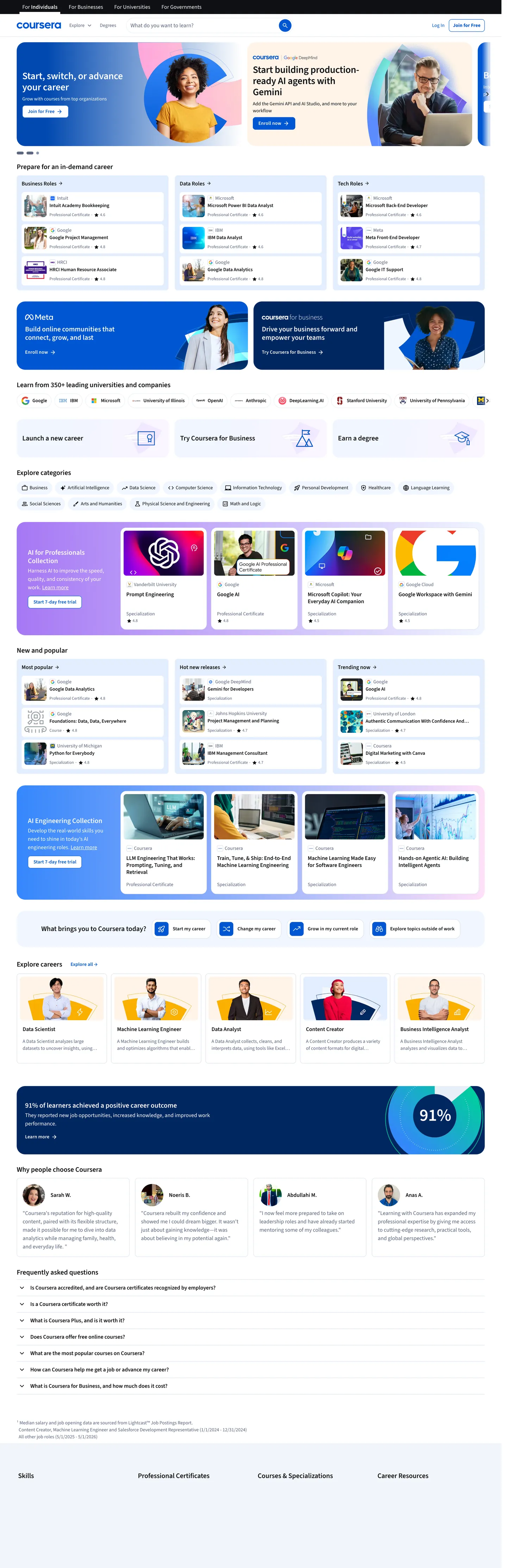
Coursera's marketing surface reads as a course catalog rendered with enterprise-SaaS rigor. The canvas is white edge-to-edge; the hero is a side-by-side pair — a deep navy ("#002761") personal-pitch card on the left carrying "Start, switch, or advance your career" in Source Sans Pro at 28px / weight 600 / -0.28px tracking, and a white card on the right with three "Top courses" tiles. Every primary CTA — "Enroll now", "Join for Free" — fills with voltage blue ("#0056d2") at 8px radius, 36px height, and an uppercase-tracked label at 14px / weight 600 / 0.14px letter-spacing. The body voice drops to mid-gray ("#5b6780") for category descriptions and to near-black ("#0f1114") for course titles and the dense legal copy at the page foot.
This page packages the captured surface into one DESIGN.md file built on the Google Labs spec. Inside: 19 colors tokens covering voltage blue and its pressed step, the navy callout family, white canvas plus a four-step neutral ladder, the pastel category-pill tint, three callout-band accents (purple, yellow, pink), and the success / warning / error feedback trio drawn from the 381 :root custom properties; 11 typography tokens splitting Source Sans Pro into display, h2, h3, body, action-primary, action-secondary, body-tertiary, nav, label, caption, and input roles; 7 corner radii anchored at 8px button-radius, 2px chip border, 16px card, and the 50px "max" capsule from "--cds-border-radius-max"; 10 spacing values built on the brand's 8px / 12px / 16px / 24px / 32px / 48px / 64px / 80px / 112px scale ("--cds-spacing-*"); and 18 components covering the voltage CTA, secondary button, top nav, search input, course-tile card, category-pill row, navy callout band, pastel skill chip, testimonial stat panel, and the FAQ accordion row.
A working React developer feeds this file to Claude, Cursor, or Copilot and reproduces Coursera's specific dialect — rectangular voltage-blue CTA on white, navy callout cards flanking a course-tile column, 50px pill chips for skill filters, Source Sans Pro at weight 600 for every display — instead of a generic shadcn theme. Reference the tokens inside Tailwind config or as CSS variables. Where most education brands hedge between approachable pastels and corporate-LMS gravitas, Coursera commits to a single saturated mid-blue and a navy callout band — confidence by chromatic discipline rather than illustration warmth.
What makes it distinct
5
- Voltage blue anchor#0056d2 carries every primary CTA and link, paired with #0048b0 for the pressed state
- Navy callout band#002761 owns the hero card and the 91% testimonial stat panel, never used on body text
- Single-typeface dialectSource Sans Pro spans display, body, and action at weight 400 / 600 / 700, no second family
- Rectangular 8px primary CTACoursera holds buttons at --cds-border-radius-100 while running 50px pill chips for category filters
- Five-step neutral spine#0f1114, #5b6780, #dae1ed, #e8eef7, #ffffff carry every structural surface and hairline
coursera.org
Live at coursera.org
A snapshot of the brand in production. Scroll the frame to see the whole page.
Colors
19 colors
Coursera's system runs on #0056d2 as its primary voltage, used in 3 of 18 components. Type is set in Source Sans Pro across 11 tokens from 12px to 28px, weights 400–700. Shape language is mixed across 18 components, blending pills, soft rounds, and squarer corners.
Brand & Accent
Sparing, CTA-only voltage · 7
Surface
Page and card backgrounds · 2
Text
Headlines, body, captions · 4
Borders & Hairlines
Dividers, outlines, rules · 1
Semantic
Status, errors, success, links · 1
Other
Specialty colors · 4
Typography
11 type tokens
Set in Source Sans Pro across 11 tokens, from 12px to 28px, weights 400–700. Shown in its own stack: where the font isn't installed, the fallback the file names stands in.
- display-md28px · weight 600 · lh 1.14 · tracking -0.28pxThe quick brown fox jumps over the lazy dog
- heading-md20px · weight 600 · lh 1.4 · tracking -0.1pxThe quick brown fox jumps over the lazy dog
- heading-sm16px · weight 600 · lh 1.25 · tracking -0.048pxThe quick brown fox jumps over the lazy dog
- subtitle-md14px · weight 600 · lh 1.29 · tracking -0.042pxThe quick brown fox jumps over the lazy dog
- body-md16px · weight 400 · lh 1.5The quick brown fox jumps over the lazy dog
- body-sm14px · weight 400 · lh 1.43The quick brown fox jumps over the lazy dog
- body-xs12px · weight 400 · lh 1.5The quick brown fox jumps over the lazy dog
- action-primary14px · weight 600 · lh 1.43 · tracking 0.14pxThe quick brown fox jumps over the lazy dog
- action-strong14px · weight 700 · lh 1.43 · tracking 0.14pxThe quick brown fox jumps over the lazy dog
- nav-link16px · weight 600 · lh 2.5The quick brown fox jumps over the lazy dog
- caption12px · weight 400 · lh 1The quick brown fox jumps over the lazy dog
Layout
Radii and spacing
7 corner radii and 10 spacing values. Shape language: mixed.
Radii
- none0px
- xs2px
- sm4px
- md8px
- lg16px
- xl24px
- full50px
Spacing
- xxs2px
- xs4px
- sm8px
- md12px
- base16px
- lg24px
- xl32px
- xxl48px
- section64px
- hero80px
Components
18 components
Each rendered from its tokens (color, type, radius, padding) on Coursera's own canvas.
- Button Primarybutton-primaryButton Primary
- Button Primary Hoverbutton-primary-hoverButton Primary Hover
- Button Secondarybutton-secondaryButton Secondary
- Button On Navybutton-on-navyButton On Navy
- Link Inlinelink-inlineLink Inline
- Top Navtop-navTop Nav
- Nav Linknav-linkNav Link
- Type here…text-inputText Input
- Type here…text-input-focusedText Input Focused
- Callout Card Navycallout-card-navyCallout Card Navy
- Course Tile Cardcourse-tile-cardCourse Tile Card
- Category Pillcategory-pillCategory Pill
- Category Pill Tintedcategory-pill-tintedCategory Pill Tinted
- Skill Chipskill-chipSkill Chip
- Testimonial Stat Bandtestimonial-stat-bandTestimonial Stat Band
- Faq Rowfaq-rowFaq Row
- Partner Logo Tilepartner-logo-tilePartner Logo Tile
- Hairline Dividerhairline-dividerHairline Divider
In use
The system, in use
Coursera's tokens on the kind of product it builds.
Build something people actually use.
A short paragraph of marketing copy that previews how the brand's display tier and body tier read together. Two sentences is usually enough.
FAQ
Coursera design system FAQ
Common questions about Coursera's tokens, components, and how to use this DESIGN.md in your project.
Read next
Related reading
Specs, directories, and component libraries that pair with this design system.
- Browse all design systemsThe full directory of DESIGN.md files on shadcn.io, with live mockups for each.shadcn.io
- Coursera — official siteThe online learning marketplace whose marketing surface this DESIGN.md captures.coursera.org (opens in a new tab)
- The DESIGN.md specificationGoogle Labs' open spec for machine-readable design system files — the format this page is built on.github.com (opens in a new tab)
Use it
Use Coursera in your project
One machine-readable file. Drop it into Claude, Cursor, or any AI tool that reads DESIGN.md.
Download the DESIGN.md
One machine-readable file: every color, type, radius, spacing, and component token of Coursera.
Feed it to your AI tool
Drop it into Claude, Cursor, or GitHub Copilot. The agent writes React components and Tailwind classes that match Coursera's visual language.
Reference the tokens directly
Or paste the values into your Tailwind config, CSS variables, or component library: every color, size and radius is a quoted, ready-to-copy value.
Read the full DESIGN.md: overview, rationale, do’s and don’ts
Overview
Coursera's marketing chrome resolves one productive tension: a learning marketplace serious enough to enroll degree-seekers but approachable enough to convert casual browsers, rendered with a single voltage blue ({colors.primary} — #0056d2) and one typeface (Source Sans Pro). The canvas is white edge-to-edge with no gradient mesh and no atmospheric photography; the hero splits horizontally into a deep navy ({colors.callout-navy} — #002761) "Start, switch, or advance your career" callout card on the left and a white "Top courses" tile-stack on the right. Display headlines sit at 28px / weight 600 / -0.28px letter-spacing inside the navy card; section h2s drop to 20px / weight 600 / -0.06px tracking on the white panels below.
Voltage scarcity: where most learning-platform brands recruit two or three saturated accents to differentiate course categories, Coursera holds one blue (#0056d2) for every primary action and one navy (#002761) for every brand-band moment. The pastel category-pill row at mid-page introduces low-saturation tints — #f0f6ff blue, #fff4e8 warning-cream, #ffe0f9 pink-soft, #a678f5 purple — but these scope strictly to the filter row and the marketing illustration cards; they never carry actions or display type. The discipline keeps the page legible at scale: 14–16 course tiles, 12 category pills, 6 testimonial portraits, and three CTAs share a viewport without chromatic competition.
Unlike the convention of softening enterprise learning with serif gravitas or cartoon mascots, Coursera commits to a humanist sans (Source Sans Pro) at weights 400 and 600 across every text role — display, h2, body, action, label. There is no second typeface on the captured surface, no italic flourish, and no display-only display face. The voice reads as workspace-grade reliability rather than warmth — the brand trusts the catalog density and the partner logos (Google, IBM, Meta, Adobe) to carry credibility instead of typographic posture.
Key Characteristics:
- Voltage blue CTA (
{colors.primary}—#0056d2) at 8px radius / 36px height — rectangular, not pill, with a 14px Source Sans Pro 600 label at 0.14px letter-spacing - Navy callout band (
{colors.callout-navy}—#002761) reserved for the hero pitch card and the bottom-of-page 91% testimonial stat panel — never used on body text - Single-typeface dialect — Source Sans Pro across display, body, action, label; no second family on the captured surface
- White canvas (
{colors.canvas}—#ffffff) edge-to-edge with a four-step gray ladder (#0f1114,#5b6780,#dae1ed,#e8eef7) — the surface tint#e8eef7carries category chips and form-row backgrounds - 8px button radius (
--cds-border-radius-100) paired with 50px capsule chips (--cds-border-radius-max) — the role-split between rectangle commit-actions and pill filter-actions - 48px input height with 16px Source Sans Pro 400 / 24px line-height — generous tap targets for the dominant search-autocomplete bar
- 8px / 12px / 16px / 24px / 48px spacing scale via
--cds-spacing-*— section gutters at 48px keep the dense course-tile grid breathing
Colors
The palette splits into four layers: one saturated voltage blue and its pressed step, a navy callout family that owns the hero and stat bands, a four-step structural gray ladder for ink and hairlines, and a small accent set (purple, pink-soft, blue-info, warning-cream) reserved for marketing illustration cards. Every hex was extracted from the 381 :root custom properties on www.coursera.org and validated against the rendered color count from 2,369 scanned elements.
- Voltage blue (
#0056d2) — frequency 137. Used as text (61), border (61), background (8), shadow (7). The brand voltage, scoped to every primary CTA fill, every link inside body copy, the small enrollment-count icon under each course tile, and--cds-color-interactive-primary/--cds-color-blue-700/--cds-color-callouts-background-primary. The 8 background occurrences are the button fill itself; the 61 text + 61 border occurrences carry the link state. - Voltage pressed (
#0048b0) — derived from--cds-color-interactive-primary-hoverand--cds-color-blue-800. Used as: hover and active states on every primary CTA; never sits as a standalone surface. The OKLCH step drops the lightness from 0.493 to 0.435 — a subtle press cue rather than a hue shift. - Voltage soft (
#e3eeff) — derived from--cds-color-blue-50and--cds-color-emphasis-primary-background-weak. Used as: hover-row tint on the secondary nav, the "Try Coursera Plus" callout-card-secondary background, and the language-switcher selected state. - Voltage xsoft (
#f0f6ff) — derived from--cds-color-blue-25and--cds-color-interactive-background-primary-hover-weak. Used as: the lightest blue tint, scoped to category-pill backgrounds and the focused-input invert state via--cds-color-interactive-stroke-primary-focus-invert. - Callout navy (
#002761) — frequency 2. Used as background (2). Reserved for the navy hero callout card and the bottom-of-page 91% testimonial stat band — the two structural navy moments that bracket the marketing flow. Carried by--cds-color-blue-950,--cds-color-emphasis-primary-background-xxstrong, and--cds-color-callouts-background-primary-strong. - Callout navy mid (
#003b8f) — derived from--cds-color-blue-900and--cds-color-callouts-tertiary. Used as: the mid-step in the navy ladder, scoped to the navy-card secondary heading inside the hero pitch panel. - Callout blue bright (
#3587fc) — frequency 1. Used as gradient (1). The lightest brand-layer blue, carried by--cds-color-blue-500and--cds-color-emphasis-primary-background-default— used inside the navy callout card's gradient lift on the hero card top edge. - Ink (
#0f1114) — frequency 2157. Used as text (1110), border (1046), background (1). The most-common color in the extraction, declared as--cds-color-grey-975and--cds-color-emphasis-neutral-background-xxstrong. Carries every course title, every nav link, every form label, every dense FAQ-row paragraph. - Ink soft (
#1e2229) — derived from--cds-color-grey-950. Used as: the slightly lifted near-black variant, scoped to elevated card text and the dark-mode invert variant. - Body muted (
#5b6780) — frequency 186. Used as text (92), border (92), background (2). The mid-gray (--cds-color-grey-600,--cds-color-emphasis-neutral-content-default) that carries every secondary paragraph, the partner-logo caption text, and the inactive nav link. - Body mid (
#8495b0) — derived from--cds-color-grey-400and--cds-color-neutral-stroke-primary. Used as: the inactive interactive stroke color and the disabled-form-row text — one step lighter thanbody-muted. - Hairline (
#dae1ed) — frequency 47. Used as border (47). The 1px structural divider (--cds-color-grey-100,--cds-color-neutral-stroke-primary-weak) — every section break, course-tile-card border, and FAQ-row separator is this color. - Surface tint (
#e8eef7) — frequency 74. Used as background (39), border (27), gradient (4), text (4). The pastel-blue chip background (--cds-color-grey-50,--cds-color-interactive-background-secondary-pressed-weak) — carries the category-pill tinted variant and the form-row hover state. - Canvas white (
#ffffff) — frequency 508. Used as text (229), border (213), background (60), gradient (6). The dominant canvas (--cds-color-neutral-background-primary); the 229 text occurrences are inside the navy callout card and the testimonial stat band. - Warning soft (
#fff4e8) — frequency 5. Used as background (5). The cream tint carried by--cds-color-yellow-25and--cds-color-emphasis-tertiary-background-xweak— scoped to one illustration card in the "Browse popular categories" row. - Accent purple (
#a678f5) — frequency 1. Used as gradient (1). The purple-400 step (--cds-color-purple-400,--cds-color-emphasis-quaternary-background-default) — appears as a gradient stop inside one of the brand-illustration cards mid-page. - Accent pink soft (
#ffe0f9) — frequency 1. Used as gradient (1). The pink-50 tint (--cds-color-pink-50) — scoped to one marketing-illustration card. - Accent blue info (
#b0e5fb) — derived from--cds-color-callouts-tertiary-invert. Used as: the only declared color whose value is a literal hex rather than alight-dark()pair — the callouts-tertiary-invert tint used inside informational chip illustrations. - Black (
#000000) — frequency 2. Used as text (1), border (1). The pure-black token (--cds-color-white-0in dark mode,--cds-color-neutral-primaryin dark mode) — appears twice on the captured surface, scoped to one icon stroke.
The 381 :root properties extend this with full feedback (#276a1a success, #a32e00 warning, #d30a28 error) and emphasis ladders (purple, pink, yellow, green from -25 through -975), but the captured marketing surface uses the nineteen tokens above as its working palette.
Typography
Coursera runs one declared face — Source Sans Pro — across every text role on the captured surface. The CSS variable --cds-font-family-source-sans-pro resolves to "Source Sans Pro, Arial, sans-serif", and the same string carries --cds-font-family-body, --cds-font-family-title, and --cds-font-family-display. A second family — --cds-font-family-boutros-coursera: "Boutros Coursera, Tahoma, sans-serif" — is declared for Arabic locales but not used on the English-default marketing surface this page captures.
Display-md sits at 28px / weight 600 / -0.28px letter-spacing / 32px line-height on the navy hero callout heading "Start, switch, or advance your career" (extraction count 3, observed on <h2>). Heading-md drops to 20px / weight 600 / -0.06px tracking on the white section h2s "What are you looking to learn?", "Browse popular categories", "Why people choose Coursera" (count 16+7, observed on <h2> and <a>). Subtitle-md at 14px / weight 600 / -0.042px tracking carries the course-tile-card title row (count 28).
Body-md runs at 16px / weight 400 / 24px line-height for the longest paragraphs and primary input text (count 11). Body-sm at 14px / weight 400 / 20px line-height is the workhorse (count 127) — the most-frequent typography signature in the extraction by a 4x margin; it carries every secondary paragraph, every category description, and every nav-row sub-label. Body-xs at 12px / weight 400 / 18px line-height appears on the dense legal copy and timestamp captions (count 18).
Action-primary at 14px / weight 600 / 0.14px letter-spacing is the CTA label — extraction count 13, observed on <span> and <p> inside button rows. Action-strong lifts the weight to 700 with the same 0.14px tracking for the higher-emphasis "Get started for free" panel buttons (count 1). Nav-link at 16px / weight 600 / 40px line-height carries the top-nav row "For Individuals", "For Businesses", "For Universities" labels (extraction count for the 0.06px 600-weight 16px signature: 30). Caption at 12px / weight 400 / 12px line-height runs the smallest UI text (count 21).
Weight strategy: the system runs weights 400, 600, and a single 700 emphasis state. There is no weight 300 display, no weight 500 mid-step, and no weight 800 / 900. The three-weight discipline keeps the single typeface from drifting between roles — display reads as 600, body as 400, the rare emphasis stamp as 700.
Layout
Sections stack at {spacing.xxl} (48px) to {spacing.section} (64px) gutters with the white canvas running continuously between them. The captured 4451px scroll shows nine primary blocks: top nav row, hero (navy callout card + white course-tile column at 50/50 split), partner-logo strip, "What are you looking to learn?" search-and-category row, "Browse popular categories" pastel-card row, "New on Coursera" course-tile grid, "Master in-demand skills" 4-tile illustrated section, "Why people choose Coursera" 4-portrait testimonial row, the navy 91% stat band, and the footer-FAQ accordion.
Content sits in a ~1280px max-width column with 0px 48px page-gutter padding (the second-most-frequent spacing value, count 13). The hero splits 50/50 — navy card left, course tiles right — using the 16px card radius (--cds-border-radius-200) on both. The course-tile grid runs 3 columns desktop at {spacing.base} (16px) gutter; the category-pill row wraps at {rounded.full} (50px capsule) with 8–12 chips per visual band. The testimonial stat band ("91% of learners report career benefits") is the only full-width navy rectangle — 100% canvas-width, ~200px tall, with the stat number left-aligned and the four testimonial portraits floating right.
Elevation & Depth
Coursera's depth vocabulary is conservative. The site declares a three-level elevation scale via CSS variables: --cds-elevation-level1 (0px 0px 4px 0px rgb(15 17 20 / 10%), 0px 2px 12px 2px rgb(15 17 20 / 10%)), --cds-elevation-level2 (12px blur + 4px y-offset), and --cds-elevation-level3 (12px blur + 6px y-offset). The shadow color is rgb(15 17 20 / 10%) — a low-opacity tint of the ink color rather than a saturated brand shadow.
Course-tile cards sit flat on the white canvas at the rendered viewport with a 1px hairline border at {colors.hairline} (#dae1ed) rather than a drop shadow — border-as-elevation: the system prefers the 1px stroke to a 4–12px blur, keeping the dense 3-column grid visually tight. Drop shadows appear only on floating elements (dropdown menus, hover-state tooltips) where the elevation needs to read against an arbitrary background. The navy callout card and the testimonial stat band carry no shadow at all — they sit as flat rectangles on the white canvas.
Shapes
The radius vocabulary is anchored by --cds-border-radius-100: 8px (count 93 — the dominant value) and the role-split between rectangle action buttons and capsule filter chips. Primary CTAs, secondary buttons, text inputs, partner-logo tiles, and the small course-tile-card chevron icons all round at 8px. Course tiles and the navy callout card round at 16px (--cds-border-radius-200, count 23). Feature sections and the larger illustration cards reach 24px (--cds-border-radius-300, count 11).
The two extremes carry semantic weight. At the small end, 2px (--cds-border-radius-25, count 26) is reserved for inline skill chips and the small dropdown chevron containers — almost rectangular. At the large end, 50px (--cds-border-radius-max, count 22) is the capsule used for category-filter pills — fully rounded. There is no 12px option in the captured radii — the system jumps directly from 8px to 16px to 24px, mirroring the spacing scale's 8 / 16 / 24 / 32 step.
Components
button-primary— voltage-blue fill ({colors.primary}), white action-primary label ({typography.action-primary}), 8px radius ({rounded.md}), 36px height with8px 16pxpadding. The defining action element on every "Enroll now", "Join for Free", "Start 7-day free trial".button-primary-hover— voltage-pressed fill ({colors.primary-pressed}); same geometry as the base button.button-secondary— white fill, ink-black label, 1px ink-black border. Used for "Sign In", "Get started" alternatives, and the navy-card secondary action when paired with the primary blue.button-on-navy— voltage-blue fill on the navy callout card; the only place a saturated blue button sits on a saturated navy surface, by deliberate contrast.link-inline— voltage-blue text inside body copy, weight 400 / 14px / no underline by default but underlined via--cds-text-decoration-link: underlineon hover.top-nav— white 76px-tall bar with a 1px hairline bottom border, carrying the Coursera wordmark left and the For Individuals / For Businesses / For Universities row right.nav-link— 16px / weight 600 / 40px line-height label, ink-black text on transparent. Hover shifts to voltage-blue.text-input+text-input-focused— 48px-tall white input at 8px radius with a 1px ink-black border; focus swaps to a 2px voltage-blue border via--cds-color-interactive-stroke-primary-focus: #6923dereskinned for the search bar to{colors.primary}. The dominant search-autocomplete bar carries this geometry at 394px width on desktop.callout-card-navy— the hero card with{colors.callout-navy}(#002761) fill, white display-md heading, white body-md paragraph, voltage-blue primary CTA inside. 16px radius, 32px padding.course-tile-card— white fill with 1px hairline border, 16px radius, 16px padding. Carries the course thumbnail, the partner-logo strip ("Google", "IBM", "Meta"), the course title in subtitle-md, the body-sm summary, and the small voltage-blue enrollment-count icon at footer.category-pill+category-pill-tinted— 50px-capsule chip at{rounded.full}with 8px / 16px padding. The base is white with hairline border; the tinted variant fills with{colors.surface-tint}(#e8eef7) and removes the border.skill-chip— the small inline chip at 2px radius ({rounded.xs}) with surface-tint fill and callout-navy text — used inside course-tile cards to tag specific skills ("Python", "Data Analysis").testimonial-stat-band— the navy bottom-of-page stat panel with{colors.callout-navy}fill, white body-md text, and a large "91%" numeral. 16px radius,48px 32pxpadding.faq-row— the bottom-of-page accordion row with 1px hairline bottom border, body-md text, 16px vertical padding. The expand-chevron sits 2px-radius on the right.partner-logo-tile— the white square logo container in the partner-logo strip, 8px radius, 16px padding, 1px hairline border.hairline-divider— 1px{colors.hairline}(#dae1ed) line; the structural separator between every section.
Do's and Don'ts
Do use #0056d2 for primary CTAs and inline links only — never for body text, large surface fills, or section backgrounds. The brand reserves the voltage blue for action signal; treating it as a generic accent dilutes the wordmark voltage.
Do keep button labels at 0.14px letter-spacing — the slight positive tracking on Source Sans Pro at 14px / weight 600 is the brand's UI-confidence cue. Default zero tracking reads as a different system.
Do pair the navy callout card (#002761) with a voltage-blue CTA (#0056d2) inside the same surface — the two-blue layering is the brand's hero signature. A white or gray button inside the navy card breaks the chromatic rhythm.
Do keep primary buttons at 8px radius and skill / category chips at 50px capsule — the role-split between rectangle action and pill filter is the system's geometric move.
Don't use #dae1ed as a body fill or large surface — it's a border-only token (frequency 47, all border, zero bg, zero text). For light surfaces use {colors.surface-tint} (#e8eef7) at 74 occurrences or {colors.canvas} (#ffffff) at 508.
Don't introduce a second typeface on the English-locale surface — the system is mono-family by design. The declared --cds-font-family-boutros-coursera is reserved for Arabic-locale display only; pairing a serif headline with Source Sans Pro body breaks the single-family discipline.
Don't lean on the pastel callout-band tints (#fff4e8, #ffe0f9, #a678f5) for primary CTAs or body text — each appears in 1–5 occurrences total, all scoped to one illustration card or one gradient stop. Treating them as a general accent palette overstates the brand's chromatic surface area.
Don't add a drop shadow to course-tile cards — the system prefers a 1px hairline border ({colors.hairline}) as the elevation cue. Drop shadows appear only on floating menus and tooltips that need to read against an arbitrary background; flat-card-with-hairline is the marketing-surface convention.
Don't use weight 500 in Source Sans Pro — the system runs a strict 400 / 600 / 700 trio. Intermediate weights read as a different family and break the three-weight discipline.
Known Gaps
- Authenticated app chrome not captured — the in-course player, the assignment-submission flow, the certificate dashboard, and the Coursera Plus subscription surfaces are out of scope. This document captures the marketing surface at
coursera.orgfor an anonymous visitor. - Dark mode tokens declared but not rendered — the 381
:rootproperties includelight-dark()pairs for nearly every color, hinting at a dark theme that the marketing surface does not currently render. The dark variants are declared but not extracted as a coherent surface ladder. - Boutros Coursera Arabic family not characterized — the second declared typeface family is acknowledged in tokens but its sizes, weights, and role mapping aren't captured because the captured locale is English.
- Motion and transition timings out of scope — Coursera declares
--labs-duration-fast: 150ms,--labs-duration-normal: 300ms,--labs-duration-slow: 500msand an--labs-easing-standard: ease-in-out, but the per-component animation choreography isn't extracted here. - Form validation states beyond focus — the input system captured covers default and focused-border states; success, warning, and error border treatments are inferred from the feedback color tokens (
--cds-color-feedback-success,--cds-color-feedback-warning,--cds-color-feedback-error) but not directly extracted. - Pastel illustration-card mapping is observation-based — which feature card uses warning-cream versus pink-soft versus accent-blue-info is inferred from the captured screenshot rather than a documented brand library.
Education & Learning
More systems like this
More DESIGN.md files in Education & Learning.
Pricing
Build it with Pro
The DESIGN.md files are free. Pro adds 6,000+ blocks, premium templates and the MCP server, so your AI editor builds in your system for you.
4.9/5 out of 5 · 150+ reviewsfrom 150+ founders and developers.
Billing
Billed once a year in USD. Cancel anytime.
- How many people can use the license.
- Client work, SaaS products and anything you charge for.
- Production-ready React sections: hero, pricing, features, dashboards and more.
- Complete multi-page sites you can ship as they are.
- React icons from every major library, installable with one command.
- Presets that restyle every block, in light and dark.
- Lets your AI editor search, preview and install blocks for you.
- Priority requests are answered first.
Individual
For personal projects & open source
$32instead of $49/mo
$389 billed yearly
- Seats: 1 seat
- Commercial use: Personal & open source only
- Pro blocks: 6,000+ blocks
- Templates: All 14 templates
- React icons: 294k+ icons
- Themes: All 59 themes
- MCP server: Basic usage
- Support: Standard
Team
Most popularFor freelancers, agencies & startups
$66instead of $99/mo
$789 billed yearly · ≈ $13/dev/mo
- Seats: Up to 5 seats
- Commercial use: Included
- Pro blocks: 6,000+ blocks
- Templates: All 14 templates
- React icons: 294k+ icons
- Themes: All 59 themes
- MCP server: High usage
- Support: Priority
Organization
For companies with larger teams
$132instead of $199/mo
$1,589 billed yearly
- Seats: Unlimited seats
- Commercial use: Included
- Pro blocks: 6,000+ blocks
- Templates: All 14 templates
- React icons: 294k+ icons
- Themes: All 59 themes
- MCP server: Unlimited usage
- Support: Priority
Billed once a year in USD. Cancel anytime.
Individual
For personal projects & open source
$32instead of $49/mo
$389 billed yearly
- How many people can use the license.Seats: 1 seat
- Client work, SaaS products and anything you charge for.Commercial use: Personal & open source only
- Production-ready React sections: hero, pricing, features, dashboards and more.Pro blocks: 6,000+ blocks
- Complete multi-page sites you can ship as they are.Templates: All 14 templates
- React icons from every major library, installable with one command.React icons: 294k+ icons
- Presets that restyle every block, in light and dark.Themes: All 59 themes
- Lets your AI editor search, preview and install blocks for you.MCP server: Basic usage
- Priority requests are answered first.Support: Standard
Team
Most popularFor freelancers, agencies & startups
$66instead of $99/mo
$789 billed yearly · ≈ $13/dev/mo
Everything in Individual, plus
- How many people can use the license.Seats: Up to 5 seats
- Client work, SaaS products and anything you charge for.Commercial use: Included
- Lets your AI editor search, preview and install blocks for you.MCP server: High usage
- Priority requests are answered first.Support: Priority
Organization
For companies with larger teams
$132instead of $199/mo
$1,589 billed yearly
Everything in Team, plus
- How many people can use the license.Seats: Unlimited seats
- Lets your AI editor search, preview and install blocks for you.MCP server: Unlimited usage
- Secure checkout via Stripe
- Code lives in your repo
- Keep what you've shipped if you cancel
- License terms
Your system, built for you
Every block, template and icon, installed by your AI agent in your design system. The DESIGN.md files stay free.