shadcn.io is not affiliated with official shadcn/ui
Framework
UI library
Radix UI does not include this primitive, so this page uses the Ark UI component. The visuals match the Ark UI version.
Installation
bunx --bun shadcn@latest add https://kit.dev/r/radix/action-bar.jsonAnatomy
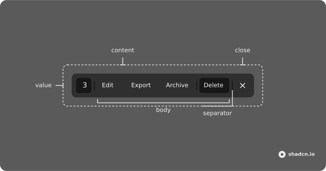
Usage
import {
  ArchiveIcon,
  DownloadIcon,
  PencilIcon,
  Trash2Icon,
  XIcon,
} from "lucide-react";
import {
  ActionBar,
  ActionBarBody,
  ActionBarClose,
  ActionBarContent,
  ActionBarSeparator,
  ActionBarTrigger,
  ActionBarValue,
} from "@/components/ui/action-bar";
import { Button } from "@/components/ui/button";<ActionBar>
<ActionBarTrigger asChild>
<Button variant="outline">Open</Button>
</ActionBarTrigger>
<ActionBarContent aria-label="Bulk actions">
<ActionBarValue count={3} />
<ActionBarSeparator />
<ActionBarBody>
<Button variant="ghost">
<PencilIcon />
<span className="max-sm:sr-only">Edit</span>
</Button>
<Button variant="ghost">
<DownloadIcon />
<span className="max-sm:sr-only">Export</span>
</Button>
<Button variant="ghost">
<ArchiveIcon />
<span className="max-sm:sr-only">Archive</span>
</Button>
<ActionBarSeparator />
<Button variant="destructive">
<Trash2Icon />
<span className="max-sm:sr-only">Delete</span>
</Button>
</ActionBarBody>
<ActionBarSeparator />
<ActionBarClose asChild>
<Button size="icon-md" variant="ghost">
<XIcon />
</Button>
</ActionBarClose>
</ActionBarContent>
</ActionBar>Accessibility
| Key | Description |
|---|---|
Enter | Activate the focused control. |
Space | Activate the focused control. |
Demos
Close Trigger
Controlled
Custom Spacing
Dialog
Gutter
Menu
Positioning
Table
API Reference
ActionBar
PropType
ActionBarTrigger
button
PropType
AttributeType
CSS variableType
--gutterstringActionBarContent
div
PropType
AttributeType
CSS variableType
--spacestringActionBarSeparator
PropType
AttributeType
ActionBarClose
button
PropType
AttributeType
ActionBarValue
PropType
AttributeType
ActionBarBody
div
PropType
AttributeType