shadcn.io is not affiliated with official shadcn/ui
Thin lines in the border color outline a box, a column or a grid cell. They can run past the corners, bleed to the page's edges, fade in from nothing, add an inner pair of lines with a hatched or dotted gutter, and carry a plus, a dot or a square where they cross.
Use Guides to give a page structure without cards: one column that runs through every section of the page, and inside each section its own pattern of bands, cells or frames. It is decoration only. In React it is plain markup that works the same with Base UI, hidden from assistive technology, and it never takes a click.
Installation
Anatomy
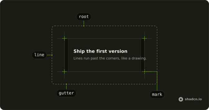
Usage
import { Guides } from "@/components/ui/guides";<div className="relative p-8">
<Guides extend="md" marks="corners" />
<h3>Ship the first version</h3>
</div>Guides fills the nearest positioned ancestor, so give the box it outlines relative. Put it first inside the box: content after it that has a position and a background paints over its lines.
Stacking sections
A page is a stack of sections, so the lines come in two layers.
The spine is the same in every section. Each section uses one page column and draws only its top rule:
<section className="relative overflow-x-clip px-4 sm:px-6">
  <div className="relative mx-auto w-full max-w-6xl py-16 md:py-24">
    <Guides bleed marks="top" rules="top" />
    {/* the section's own pattern */}
  </div>
</section>
The side lines of every section sit at the same place, so they join into one pair from the top of the page to the bottom. Each boundary is drawn once, by the section below it.
The interior is different in every section: bands that cut through inner lines, hatched gutters, cells, a framed figure. That keeps a page of sections from looking like one section repeated.
Keep extend and fade off the spine, since they would cross into the neighbouring sections. A hero that opens the page may fade its spine in from the top.
Demos
Spine
Two stacked sections share one column. Their side lines join into one pair, and each draws only the rule above it with a mark on each crossing, so the boundary between them is a single line.
Bands
inner="dashed" adds a second pair of lines inside the sides, inset="lg" from them. Each list is a band with relative and its own background, so it covers the inner lines as it crosses them and its borders run from side to side. Use this for FAQs, changelogs and long lists.
Gutter
gutter="hatch" fills the band between the sides and the inner lines with diagonal hatching; gutter="dots" fills it with a dot grid. Here it frames a call to action.
Cells
Each cell draws its own lines 1rem past its corners and a mark on its top-start corner. With a gap between the cells, the overshooting lines meet and the grid reads as one drawing. Use this for features, stats or testimonials instead of separate cards.
Mark shapes
markShape draws a plus, a dot or a small square on each crossing. The square is filled with the background, so it sits on the lines rather than under them.
Framed figure
A dashed frame with square marks holds an illustration, inside a solid frame whose lines run past its corners.
RTL
dir is rtl on the box. The lines, the inner lines and the marks are placed with logical sides, so marks="start" moves to the top-right corner and every mark stays centred on its crossing.
FAQ
Why don't my guides line up with the box?
Guides is an absolute layer that fills its nearest positioned ancestor. Give the box you want outlined relative, and put Guides inside it. If an ancestor further up is the one with relative, the lines follow that one instead. The side lines and rules sit just outside the box's edges, so they never cover its padding.
How do I stack sections without doubling the lines?
Give every section the same column (px-4 sm:px-6 on the section, mx-auto w-full max-w-6xl on the column, the vertical padding on the column) and <Guides bleed marks="top" rules="top" /> inside it, as the Spine demo does. The side lines then sit at the same place in every section and join, and each boundary is drawn once, by the section below it. Keep extend off these lines, or they cross into the neighbours.
How do I make the rules run to the edges of the page?
Pass bleed. The rules then run far past the sides, and the nearest ancestor that clips stops them. Give the section overflow-x-clip, so the rules end at its edges and the page never scrolls sideways. overflow-x-clip doesn't create a scroll container, so sticky children keep working.
How do I make a band cut through the inner lines?
Draw the inner lines with inner="solid" or inner="dashed", then give the band relative and a background such as bg-background. Guides comes first in the box, so a positioned band after it paints over its lines, as the Bands demo shows. Give the band border-y and its borders run from side to side.
Do screen readers announce Guides?
No. The layer is aria-hidden and pointer-events-none, so it's skipped by assistive technology and never takes a click or a hover from what's under it. It carries no meaning of its own: headings, lists and landmarks still do that.
What color are the lines, and how do I change it?
The lines and gutters take the theme's border color and the marks take muted-foreground, so they follow every preset, light and dark. To change one use, set a color on the parts from className with an arbitrary variant, for example *:data-[slot=guides-line]:border-primary/40. To change them everywhere, edit the Guides file in your ui folder.
How do I install Guides in React?
Run the command in the Installation section above. It adds one file to your ui folder and no behavior library, since Guides is only markup and Tailwind classes. It expects the usual shadcn base layer that gives every border the border color.
The command uses the shadcn CLI.
API Reference
Guides
<div> data-slot="guides"
bleed?boolean
Lets the rules run past the sides to the edges of the nearest ancestor
that clips (give the section overflow-x-clip).
- Default
false
extend?"none" | "sm" | "md" | "lg"
How far the lines run past the corners: none, 0.5rem, 1rem or 3.5rem.
- Type
"none" | "sm" | "md" | "lg"- Default
"none"
fade?"none" | "top" | "bottom" | "both"
Fades the side lines (and the inner lines and gutters) in from nothing at their top, their bottom or both ends.
- Type
"none" | "top" | "bottom" | "both"- Default
"none"
gutter?"none" | "hatch" | "dots"
Fills the band between the sides and the inner lines: diagonal hatching or a dot grid.
- Type
"none" | "hatch" | "dots"- Default
"none"
inner?"none" | "solid" | "dashed"
A second pair of side lines, inset from the sides by inset.
- Type
"none" | "solid" | "dashed"- Default
"none"
inset?"sm" | "md" | "lg"
How far the inner lines (and the gutters) sit from the sides: 0.75rem,
1rem then 2rem from sm, or 1.5rem then 3rem from sm.
- Type
"sm" | "md" | "lg"- Default
"md"
marks?"none" | "start" | "top" | "bottom" | "corners"
Marks on the corners: none, the top-start corner, the two top corners, the two bottom corners, or all four.
- Type
"none" | "start" | "top" | "bottom" | "corners"- Default
"none"
markShape?"plus" | "dot" | "square"
The marks' shape: a plus, a dot, or a small square.
- Type
"plus" | "dot" | "square"- Default
"plus"
rules?"both" | "top" | "bottom" | "none"
Which horizontal edges get a line. A section in a stack of sections
draws only its top rule, so two sections never double a line.
- Type
"both" | "top" | "bottom" | "none"- Default
"both"
sides?boolean
Draws the two side lines.
- Default
true
variant?"solid" | "dashed"
The outer lines' style.
- Type
"solid" | "dashed"- Default
"solid"
render?ReactElement | ((props: object, state: object) => ReactElement)
Replace the host element or compose it with another component.
- Type
ReactElement | ((props: object, state: object) => ReactElement)
className?string
Merged with the part's classes.
--guides-insetstring