shadcn.io is not affiliated with official shadcn/ui
The field starts as dots. A button at the end shows the characters, then hides them again.
Use it for a secret the person types, like sign-in or a password reset. When the text is not sensitive, a plain Input is enough. In React, React Aria already includes that button, so you don't add a separate checkbox.
Installation
Anatomy
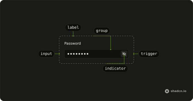
PasswordInput
├── PasswordInputInput
├── PasswordInputLabel
├── PasswordInputGroup
├── PasswordInputIndicator
└── PasswordInputTrigger
Usage
import {
  PasswordInput, PasswordInputGroup, PasswordInputInput,
  PasswordInputTrigger,
} from "@/components/ui/password-input";<PasswordInput className="w-full max-w-64">
<PasswordInputGroup>
<PasswordInputInput placeholder="Enter password" />
<PasswordInputTrigger />
</PasswordInputGroup>
</PasswordInput>Accessibility
- Enter
- Activate the focused control.
- Space
- Activate the focused control.
Demos
Auto Hide
Revealing the password starts a three-second timer, and the field masks itself again even if the button is never pressed a second time. Hold the visibility flag so the timer can force it closed. That suits a shared screen or a signup where a revealed secret should not linger. Leave visibility alone when the person should decide how long it stays readable.
Autocomplete
autoComplete tells the browser which secret this field is. current-password is sign-in, so a manager can fill a saved password. new-password is create or reset, so the browser offers to generate one. Set both on a page that asks for the current password and a replacement, and omit the attribute only when you truly want managers to stay away.
Controlled
The parent stores the string, and the caption under the field counts characters as they are typed. Hold the value when a strength hint, a match against the confirmation field, or the submit button depends on it. If you only need the password when the form submits, leave the input uncontrolled and read it from the form data.
Controlled Visibility
The show button is no longer the only thing that can change the mask, because the parent owns the visible state. The field here just stores that boolean. You want this when a timer, a form reset, or another control must force the password covered or shown. The auto-hide variant is the same arrangement with a three-second timeout added.
Custom Indicator
The eye is replaced by a lock while the password is hidden and an unlock while it is shown, through PasswordInputIndicator. The fallback is the hidden state. Swap the pair when the product already has its own visibility metaphor, and mark the icons as decorative so they are not announced on their own. The masking behavior does not change.
Disabled
A stored password stays in the field, and neither the input nor the reveal button accepts a click, because disabled is set on the field and the password input. The caption says the field is disabled, so the reason is not only a faded border. Use this when the secret cannot be changed here. A failed rule belongs in the invalid state.
Field
The label reads Password, the input is masked, and a line under it says the value must be at least 8 characters. Put the rule where people can read it before they submit, not only after a failure. Wrap the control in a field whenever the secret needs a name and a constraint. The bare input is enough when the surrounding layout already labels it.
Invalid
invalid on the field and on the password input marks a secret that failed a check, and the text underneath says to enter a valid password. Color alone is not the message, so keep the reason in words. Show it after submit, or live once the value is long enough to judge. Disabled is the other case: the person is not allowed to edit.
Size Lg
size lg makes the field tall enough to be the main control on a reset page or a standalone signup. Match the other controls on that page, or the reveal button and the field will look like they came from different forms. It is too much height for a dialog that already stacks several fields.
Size Md
size md is the default, and it lines up with ordinary text fields in a settings form. It is set here on purpose so the medium field can sit next to the small and large ones. Pass it when you want the size to be explicit. You can omit it and get the same height.
Size Sm
size sm shortens the field for a tight row: a dialog, a sidebar, or a line of small buttons. The reveal control shrinks with the input. Use it only when the fields around it are small too. A short password field next to a large email field looks like an accident.
FAQ
How do I control whether the Password Input shows the password in React?
Pass visible and onVisibilityChange on PasswordInput; the callback gets { visible }.
defaultVisible starts it shown without controlling it. The Controlled Visibility demo above shows the controlled version.
How do I get the value of the Password Input in React?
PasswordInputInput is a regular text input, so you read it the way you read any input.
Pass value and onChange, as in the Controlled demo.
In a form, give it a name and read it from the submitted data instead.
How do I make password managers fill the Password Input?
Set autoComplete on PasswordInput: current-password, the default, for a sign-in form, and new-password for sign-up or a reset, so browsers offer to save or generate one. The Autocomplete demo above shows both.
Can the Password Input hide the password again after a few seconds?
Yes. Control visible and start a timer when it turns on, then set it back to hidden when the timer ends. The Auto Hide demo above does that, so a shown password doesn't stay on screen.
How do I change the show and hide icons of the Password Input?
Give PasswordInputIndicator your icons: its children show while the password is visible, and fallback shows while it's hidden. Mark both aria-hidden, since the toggle button already has a label. The Custom Indicator demo uses a lock and an unlock icon.
How do I use the React Aria Password Input in a form?
Give PasswordInputInput a name so it submits with the form, and wrap it in Field for a label, a description and an error message, as in the Field demo. Set invalid on PasswordInput to show the error state.
API Reference
PasswordInput
autoComplete?string
The autocomplete attribute for the password input.
- Default
"current-password"
defaultValue?string
The value it starts with, when you don't control value.
defaultVisible?boolean
The default visibility of the password input.
- Default
false
disabled?boolean
Whether it's disabled.
- Default
false
invalid?boolean
Whether it's invalid.
- Default
false
onVisibilityChange?(details: { visible: boolean }) → void
Function called when the visibility changes.
- Type
(details: { visible: boolean }) → void- Parameters
details– { visible: boolean }- Returns
void
size?"sm" | "md" | "lg"
The size.
- Type
"sm" | "md" | "lg"- Default
"md"
visible?boolean
Whether the password input is visible.
className?string
Merged with the part's classes.
PasswordInputGroup
data-slot="password-input-control"
children?ChildrenOrFunction<T>
The children of the component. A function may be provided to alter the children based on component state.
- Type
ChildrenOrFunction<T>
isDisabled?boolean
Whether the group is disabled.
isInvalid?boolean
Whether the group is invalid.
isReadOnly?boolean
Whether the group is read only.
role?"group" | "region" | "presentation"
An accessibility role for the group. By default, this is set to group.
Use region when the contents of the group is important enough to be
included in the page table of contents. Use presentation if the group
is visual only and does not represent a semantic grouping of controls.
- Type
"group" | "region" | "presentation"- Default
"group"
slot?string | null
A slot name for the component. Slots allow the component to receive props from a parent
component. An explicit null value indicates that the local props completely override all
props received from a parent.
- Type
string | null- Default
password-input-control
style?StyleOrFunction<T>
The inline [style](https://developer.mozilla.org/en-US/docs/Web/API/HTMLElement/style) for the element. A function may be provided to compute the style based on component state.
- Type
StyleOrFunction<T>
render?DOMRenderFunction<E, T>
Overrides the default DOM element with a custom render function.
This allows rendering existing components with built-in styles and behaviors
such as router links, animation libraries, and pre-styled components.
Requirements:
- You must render the expected element type (e.g. if <button> is expected, you cannot render an
<a>).
- Only a single root DOM element can be rendered (no fragments).
- You must pass through props and ref to the underlying DOM element, merging with your own prop
as appropriate.
- Type
DOMRenderFunction<E, T>
className?string
Merged with the part's classes.
data-disabled?stringdata-invalid?stringPasswordInputInput
data-slot="password-input-input"
children?ReactNode
The children of the component.
enterKeyHint?"enter" | "done" | "go" | "next" | "previous" | "search" | "send"
An enumerated attribute that defines what action label or icon to preset for the enter key on virtual keyboards. See [MDN](https://developer.mozilla.org/en-US/docs/Web/HTML/Global_attributes/enterkeyhint).
- Type
"enter" | "done" | "go" | "next" | "previous" | "search" | "send"
style?object
The inline [style](https://developer.mozilla.org/en-US/docs/Web/API/HTMLElement/style) for the element.
- Type
{ prop?: string]: string | number }
className?string
The CSS [className](https://developer.mozilla.org/en-US/docs/Web/API/Element/className) for the element.
PasswordInputTrigger
data-slot="password-input-visibility-trigger"
children?ReactNode
The content to display in the button.
clickEffect?boolean
Apply a click effect to the button.
- Default
true
download?LinkPrimitiveProps["download"]
With href, downloads the linked file instead of opening it.
href?string
When set, the button renders as a link.
isDisabled?boolean
Whether the button is disabled.
isLoading?boolean
Show a loading indicator.
- Default
false
pill?boolean
Fully rounded corners.
- Default
false
rel?string
With href, the link's relationship to the page (noreferrer, …).
size?"icon-sm" | "icon-xs" | "sm" | "xs"
The size.
- Type
"icon-sm" | "icon-xs" | "sm" | "xs"- Default
"xs"
target?string
With href, where the linked page opens (_blank, …).
type?"button" | "submit" | "reset"
The button's type: button by default, so it never submits its form.
- Type
"button" | "submit" | "reset"
variant?"default" | "destructive" | "ghost" | "link" | "outline" | "secondary"
The visual style.
- Type
"default" | "destructive" | "ghost" | "link" | "outline" | "secondary"- Default
"default"
className?string
Merged with the part's classes.
PasswordInputIndicator
<span> data-slot="password-input-indicator"
fallback?ReactNode
The fallback content to display when the password is not visible.
className?string
Merged with the part's classes.