shadcn.io is not affiliated with official shadcn/ui
React Aria does not include this primitive, so this page uses the Ark UI component. The visuals match the Ark UI version.
The button shows the day, range, or time you picked. The calendar stays closed until you open it.
Use it when a typed date would be too easy to get wrong. If the month should stay on the page, use a Calendar instead. In React, React Aria builds the popup as a trigger plus a grid.
Installation
Anatomy
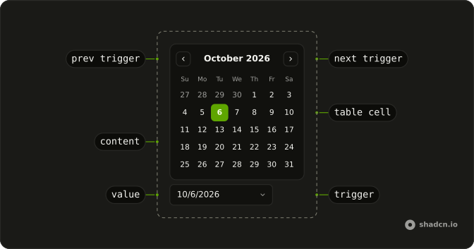
DatePickerRoot
├── DatePickerClearTrigger
├── DatePickerContent
│   └── DatePickerPositioner
├── DatePickerLabel
├── DatePickerMonthSelect
├── DatePickerNextTrigger
├── DatePickerPresetTrigger
├── DatePickerPrevTrigger
├── DatePickerRangeText
├── DatePickerTable
│   ├── DatePickerTableBody
│   ├── DatePickerTableCell
│   │   └── DatePickerTableCellTrigger
│   ├── DatePickerTableHead
│   ├── DatePickerTableHeader
│   └── DatePickerTableRow
├── DatePickerView
│   ├── DatePickerViewControl
│   └── DatePickerViewTrigger
└── DatePickerYearSelect
Usage
import { ChevronDownIcon } from "lucide-react";
import { Button } from "@/components/ui/button";
import {
  DatePicker, DatePickerContent, DatePickerNextTrigger,
  DatePickerPrevTrigger, DatePickerTable, DatePickerTableDays,
  DatePickerTrigger, DatePickerValue, DatePickerViewControl,
  DatePickerViewDate, DatePickerWeekDays,
} from "@/components/ui/date-picker";<DatePicker>
<DatePickerTrigger asChild>
<Button
className="w-[212px] justify-between font-normal"
variant="outline"
>
<DatePickerValue placeholder="Pick a date" />
<ChevronDownIcon aria-hidden="true" data-icon="inline-end" />
</Button>
</DatePickerTrigger>
<DatePickerContent>
<DatePickerViewControl>
<DatePickerPrevTrigger />
<DatePickerViewDate />
<DatePickerNextTrigger />
</DatePickerViewControl>
<DatePickerTable>
<DatePickerWeekDays />
<DatePickerTableDays />
</DatePickerTable>
</DatePickerContent>
</DatePicker>Accessibility
- Enter
- Activate the focused control.
- Space
- Activate the focused control.
Demos
Basic
A Date label sits above a button that reads Pick a date until a day is chosen. The popup is a single month with previous and next controls. Use this in a form where the label lives outside the trigger. The picker at the top of the page is the same one without that label, and with a chevron on the button.
Range
selectionMode is range and numOfMonths is 2, so two months sit side by side. The first click sets the start and the second sets the end. The button shows both dates with a hyphen between them. The field is seeded with a twenty-day span so a selection is visible before anyone clicks.
Dob
Date of birth, with month and year selects in the header so a distant year is one choice instead of a long walk through months. open and value are controlled, and picking a day closes the popup. Use the selects when the likely year is far from today. Next-month alone is a poor control for a birthday.
Input
The trigger is a DatePickerInput rather than a button, labeled Subscription Date, with a default of June 1, 2025. People can type the day or open the month grid from the field. Use this when typing is faster than hunting through months, and you still want a real date rather than free text. The label sits above the field like any other form control.
Time
A date button and a DatePickerTimer share a row. The timer starts at 10:30:00, and the date popup adds month and year selects, then closes once a day is chosen. The two values stay separate until you combine them on save. Use the pair for an appointment, or Date Input when you only need a time.
Natural Language
The field is prefilled with In 2 days, and also accepts today, tomorrow, next week, and a count of days out. A phrase it understands updates the stored date as you type. Arrow down, or the calendar icon, opens the grid, and choosing a day writes the formatted date back. Use it when people think in phrases but you still store a real day.
Rtl
dir is rtl and locale is ar, so the placeholder, the weekday names, and the month grid follow Arabic. Previous and next still change the month, along the reading direction. Use this to check a localized picker, not as a stand-in for setting direction on the whole document. The closed button keeps the width of the first picker.
FAQ
How do I get the selected date from the Date Picker in React?
Read it in onValueChange, which receives { value, valueAsString }: value is an array of date values and valueAsString the same dates formatted for display. Each date's toString() gives an ISO string like 2024-05-17. Pass the array back as value to control the picker.
How do I select a date range with the Date Picker?
Set selectionMode to range: the first click sets the start, the second the end, and the value holds both dates. Set numOfMonths to 2 to show two months side by side, as in the Range demo. For several separate dates, use multiple.
How do I disable past dates or weekends in the Date Picker?
Pass min and max as date values, like today(getLocalTimeZone()) from @internationalized/date, to block everything outside that range. For other dates, like weekends or booked days, pass isDateUnavailable, which receives each date and returns true for the ones to disable.
How do I make a birthday Date Picker that jumps to a year?
Add month and year selects to the calendar header, so people pick 1984 in one step instead of clicking back through years, as in the Dob demo. Set max to today so future dates can't be chosen.
Can users type a date in the Date Picker instead of clicking?
Yes. Use a DatePickerInput as the trigger: people type the date and the calendar opens on demand, as in the Input demo. The Natural Language demo goes further and turns text like "tomorrow" or "in 3 days" into a date.
How do I pick a date and a time with the Date Picker?
Put a DatePickerTimer under the calendar in DatePickerContent for the time, and combine it with the picked date when you save, as in the Time demo. For a time on its own, a Date Input with time segments is simpler.
API Reference
DatePicker
<div> data-slot="date-picker"
open?boolean
The controlled open state of the date picker.
defaultOpen?boolean
The initial open state of the date picker when rendered. Use when you don't need to control the open state of the date picker.
onOpenChange?(details: OpenChangeDetails) → void
Function called when the calendar opens or closes.
- Type
(details: OpenChangeDetails) → void- Parameters
details– { open: boolean; value: DateValue[] }- Returns
void
value?DateValue[]
The controlled selected date(s).
defaultValue?DateValue[]
The initial selected date(s) when rendered. Use when you don't need to control the selected date(s) of the date picker.
onValueChange?(details: ValueChangeDetails) → void
Function called when the value changes.
- Type
(details: ValueChangeDetails) → void- Parameters
details– { value: DateValue[]; valueAsString: string[]; view: DateView }- Returns
void
view?"day" | "month" | "year"
The view of the calendar.
- Type
"day" | "month" | "year"
defaultView?"day" | "month" | "year"
The default view of the calendar.
- Type
"day" | "month" | "year"- Default
"day"
onViewChange?(details: ViewChangeDetails) → void
Function called when the view changes.
- Type
(details: ViewChangeDetails) → void- Parameters
details– { view: DateView }- Returns
void
closeOnSelect?boolean
Whether the calendar should close after the date selection is complete.
This is ignored when the selection mode is multiple.
- Default
true
createCalendar?(identifier: CalendarIdentifier) → Calendar
A function that creates a Calendar object for a given calendar identifier. Enables non-Gregorian calendar support (Persian, Buddhist, Islamic, etc.) without bundling all calendars by default. import { createCalendar } from "@internationalized/date" { locale: "fa-IR", createCalendar }
- Type
(identifier: CalendarIdentifier) → Calendar- Parameters
identifier– CalendarIdentifier- Returns
Calendar
defaultFocusedValue?CalendarDate | CalendarDateTime | ZonedDateTime
The initial focused date when rendered. Use when you don't need to control the focused date of the date picker.
- Type
CalendarDate | CalendarDateTime | ZonedDateTime
dir?"ltr" | "rtl"
The document's text/writing direction.
- Type
"ltr" | "rtl"- Default
"ltr"
disabled?boolean
Whether the calendar is disabled.
fixedWeeks?boolean
Whether the calendar should have a fixed number of weeks. This renders the calendar with 6 weeks instead of 5 or 6.
focusedValue?CalendarDate | CalendarDateTime | ZonedDateTime
The controlled focused date.
- Type
CalendarDate | CalendarDateTime | ZonedDateTime
format?(date: DateValue, details: LocaleDetails) → string
The format of the date to display in the input.
- Type
(date: DateValue, details: LocaleDetails) → string- Parameters
date– DateValuedetails– { locale: string; timeZone: string }- Returns
string
hideMode?"display-none" | "activity"
How to hide content when mounted but not present.
- display-none: HTML hidden attribute. Effects stay alive.
- activity: React 19 <Activity mode="hidden">. Effects pause. Requires React 19+.
- Type
"display-none" | "activity"- Default
"display-none"
id?string
The unique identifier of the machine.
ids?object
The ids of the elements in the date picker. Useful for composition.
- Type
{ root?: string; label?: (index: number) → string; table?: (id: string) → string; tableHeader?: (id: string) → string; tableBody?: (id: string) → string; tableRow?: (id: string) → string; content?: string; cellTrigger?: (id: string) → string; prevTrigger?: (view: DateView) → string; nextTrigger?: (view: DateView) → string; viewTrigger?: (view: DateView) → string; clearTrigger?: string; control?: string; input?: (index: number) → string; trigger?: string; monthSelect?: string; yearSelect?: string; positioner?: string }
inline?boolean
Whether to render the date picker inline.
- Default
false
invalid?boolean
Whether the date picker is invalid.
isDateUnavailable?(date: DateValue, locale: string) → boolean
Returns whether a date of the calendar is available.
- Type
(date: DateValue, locale: string) → boolean- Parameters
date– DateValuelocale– string- Returns
boolean
lazyMount?boolean
Whether to enable lazy mounting. Ark default: false.
- Default
true
locale?string
The locale (BCP 47 language tag) to use when formatting the date.
- Default
"en-US"
max?CalendarDate | CalendarDateTime | ZonedDateTime
The maximum date that can be selected.
- Type
CalendarDate | CalendarDateTime | ZonedDateTime
maxSelectedDates?number
The maximum number of dates that can be selected.
This is only applicable when selectionMode is multiple.
maxView?"day" | "month" | "year"
The maximum view of the calendar.
- Type
"day" | "month" | "year"- Default
"year"
min?CalendarDate | CalendarDateTime | ZonedDateTime
The minimum date that can be selected.
- Type
CalendarDate | CalendarDateTime | ZonedDateTime
minView?"day" | "month" | "year"
The minimum view of the calendar.
- Type
"day" | "month" | "year"- Default
"day"
name?string
The name attribute of the input element.
numOfMonths?number
The number of months to display.
onFocusChange?(details: FocusChangeDetails) → void
Function called when the focused date changes.
- Type
(details: FocusChangeDetails) → void- Parameters
details– { focusedValue: DateValue; view: DateView }- Returns
void
onVisibleRangeChange?(details: VisibleRangeChangeDetails) → void
Function called when the visible range changes.
- Type
(details: VisibleRangeChangeDetails) → void- Parameters
details– { view: DateView; visibleRange: { start: DateValue; end: DateValue; } }- Returns
void
openOnClick?boolean
Whether to open the calendar when the input is clicked.
- Default
false
outsideDaySelectable?boolean
Whether day outside the visible range can be selected.
- Default
false
parse?(value: string, details: LocaleDetails) → DateValue
Function to parse the date from the input back to a DateValue.
- Type
(value: string, details: LocaleDetails) → DateValue- Parameters
value– stringdetails– { locale: string; timeZone: string }- Returns
DateValue
placeholder?string
The placeholder text to display in the input.
positioning?object
The user provided options used to position the date picker content.
- Type
{ restoreStyles?: boolean; applyStyles?: boolean; hideWhenDetached?: boolean; strategy?: "absolute" | "fixed"; placement?: Placement; offset?: { mainAxis?: number; crossAxis?: number; }; gutter?: number; shift?: number; overflowPadding?: number; arrowPadding?: number; flip?: boolean | Placement[]; slide?: boolean; overlap?: boolean; sameWidth?: boolean; fitViewport?: boolean; sizeMiddleware?: boolean; boundary?: (() → Boundary) | Boundary | "clipping-ancestors"; listeners?: boolean | AutoUpdateOptions; onComplete?: (data: ComputePositionReturn) → void; onPositioned?: ((data: { placed: boolean; }) → void); getAnchorElement?: () → HTMLElement | VirtualElement | null; getAnchorRect?: (element: HTMLElement | VirtualElement | null) → AnchorRect | null; updatePosition?: ((data: { updatePosition: () → Promise<void>; floatingElement: HTMLElement | null; }) → void | Promise<void>) }- Default
{ placement: "top" }
readOnly?boolean
Whether the calendar is read-only.
required?boolean
Whether the date picker is required.
selectionMode?"single" | "multiple" | "range"
The selection mode of the calendar.
- single - only one date can be selected
- multiple - multiple dates can be selected
- range - a range of dates can be selected
- Type
"single" | "multiple" | "range"- Default
"single"
showWeekNumbers?boolean
Whether to show the week number column in the day view.
skipAnimationOnMount?boolean
Whether to allow the initial presence animation.
- Default
false
startOfWeek?number
The first day of the week.
0 - Sunday
1 - Monday
2 - Tuesday
3 - Wednesday
4 - Thursday
5 - Friday
6 - Saturday
timeZone?string
The time zone to use.
- Default
"UTC"
translations?object
The localized messages to use.
- Type
{ dayCell?: (state: DayTableCellState) → string; nextTrigger?: (view: DateView) → string; monthSelect?: string; yearSelect?: string; viewTrigger?: (view: DateView, nextView: DateView) → string; prevTrigger?: (view: DateView) → string; presetTrigger?: (value: string[]) → string; clearTrigger?: string; trigger?: (open: boolean) → string; content?: string; placeholder?: ((locale: string) → { year: string; month: string; day: string; }); weekColumnHeader?: string; weekNumberCell?: (weekNumber: number) → string }
unmountOnExit?boolean
Whether to unmount on exit. Ark default: false.
- Default
true
asChild?boolean
Use the provided child element as the default rendered element, combining their props and behavior.
className?string
Merged with the part's classes.
data-disabled?string
Present when disabled.
data-empty?string
Present when the content is empty.
data-readonly?string
Present when read-only.
data-state"open" | "closed"
"open" or "closed".
- Type
"open" | "closed"
DatePickerClearTrigger
<button> data-slot="calendar-clear-trigger"
asChild?boolean
Use the provided child element as the default rendered element, combining their props and behavior.
DatePickerContent
<div> data-slot="date-picker-content"
asChild?boolean
Use the provided child element as the default rendered element, combining their props and behavior.
className?string
Merged with the part's classes.
data-has-nested?string
Present when another popover is nested inside it.
data-inline?string
Present when the content is inline.
data-nested?string
Present when it's nested inside another popover.
data-placementstring
The placement of the content.
data-side"top" | "right" | "bottom" | "left"
The side of the trigger that the content is positioned on.
- Type
"top" | "right" | "bottom" | "left"
data-state"open" | "closed"
"open" or "closed".
- Type
"open" | "closed"
--layer-indexstring
The index of the dismissable in the layer stack.
--nested-layer-countstring
The number of nested date-pickers.
--transform-originstring
Where the content scales from, on its trigger's side.
DatePickerControl
<div> data-slot="date-picker-control"
asChild?boolean
Use the provided child element as the default rendered element, combining their props and behavior.
data-disabled?string
Present when disabled.
data-invalid?string
Present when invalid.
data-placeholder-shown?string
Present when placeholder is shown.
DatePickerInput
<input> data-slot="date-picker-input"
fixOnBlur?boolean
Whether to fix the input value on blur.
- Default
true
index?number
The index of the input to focus.
size?DatePickerInputSize
The size of the input.
- Default
"md"
asChild?boolean
Use the provided child element as the default rendered element, combining their props and behavior.
className?string
Merged with the part's classes.
data-index?string
The index of the item.
data-invalid?string
Present when invalid.
data-placeholder-shown?string
Present when placeholder is shown.
data-state"open" | "closed"
"open" or "closed".
- Type
"open" | "closed"
DatePickerLabel
<label> data-slot="calendar-label"
asChild?boolean
Use the provided child element as the default rendered element, combining their props and behavior.
className?string
Merged with the part's classes.
data-disabled?string
Present when disabled.
data-index?string
The index of the item.
data-invalid?string
Present when invalid.
data-readonly?string
Present when read-only.
data-state"open" | "closed"
"open" or "closed".
- Type
"open" | "closed"
DatePickerMonthSelect
<div> data-slot="calendar-month-select-wrapper"
asChild?boolean
Use the provided child element as the default rendered element, combining their props and behavior.
className?string
Merged with the part's classes.
DatePickerNextTrigger
<button> data-slot="calendar-next-trigger"
asChild?boolean
Use the provided child element as the default rendered element, combining their props and behavior.
className?string
Merged with the part's classes.
data-disabled?string
Present when disabled.
DatePickerPositioner
<div> data-slot="date-picker-positioner"
asChild?boolean
Use the provided child element as the default rendered element, combining their props and behavior.
data-has-nested?string
Present when the positioner has nested date pickers.
data-nested?string
Present when the positioner is nested within another date picker.
--available-heightstring
The available height in viewport.
--available-widthstring
The available width in viewport.
--reference-heightstring
The height of the root.
--reference-widthstring
The width of the reference element.
--transform-originstring
The transform origin for animations.
--xstring
The x position for transform.
--ystring
The y position for transform.
--z-indexstring
The z-index value.
DatePickerPresetTrigger
<button> data-slot="date-picker-preset-trigger"
valueDateValue[] | DateRangePreset
The preset trigger's value.
- Type
DateValue[] | DateRangePreset
asChild?boolean
Use the provided child element as the default rendered element, combining their props and behavior.
DatePickerPrevTrigger
<button> data-slot="calendar-prev-trigger"
asChild?boolean
Use the provided child element as the default rendered element, combining their props and behavior.
className?string
Merged with the part's classes.
data-disabled?string
Present when disabled.
DatePickerViewDate
<div> data-slot="calendar-range-text"
asChild?boolean
Use the provided child element as the default rendered element, combining their props and behavior.
className?string
Merged with the part's classes.
DatePickerTable
<table> data-slot="calendar-table"
columns?number
How many cells each row holds, for months and years.
asChild?boolean
Use the provided child element as the default rendered element, combining their props and behavior.
className?string
Merged with the part's classes.
data-columns?stringdata-view?string
The view of the table.
DatePickerTableYears
<tbody>
columns?number
How many years each row holds.
- Default
4
asChild?boolean
Use the provided child element as the default rendered element, combining their props and behavior.
data-disabled?string
Present when disabled.
data-view?string
The view of the tablebody.
DatePickerTableCell
<td> data-slot="calendar-table-cell"
childrenReactNode
The contents of the cell.
colSpan?number
Indicates how many columns the data cell spans.
textValue?string
A string representation of the cell's contents, used for features like typeahead.
asChild?boolean
Use the provided child element as the default rendered element, combining their props and behavior.
className?string
Merged with the part's classes.
--cell-radiusstring--cell-sizestringDatePickerTableCellTrigger
<div> data-slot="calendar-table-cell-trigger"
asChild?boolean
Use the provided child element as the default rendered element, combining their props and behavior.
--cell-radiusstring--cell-sizestringDatePickerWeekDays
<thead>
format?"narrow" | "short" | "long"
Weekday label width. short is two letters (Su), matching the other
calendar bases.
- Type
"narrow" | "short" | "long"- Default
"short"
asChild?boolean
Use the provided child element as the default rendered element, combining their props and behavior.
data-disabled?string
Present when disabled.
data-view?string
The view of the tablehead.
DatePickerTableHeader
<th> data-slot="calendar-table-header"
asChild?boolean
Use the provided child element as the default rendered element, combining their props and behavior.
className?string
Merged with the part's classes.
data-disabled?string
Present when disabled.
data-view?string
The view of the tableheader.
--cell-radiusstring--cell-sizestringDatePickerTableRow
<tr> data-slot="calendar-table-row"
asChild?boolean
Use the provided child element as the default rendered element, combining their props and behavior.
className?string
Merged with the part's classes.
data-disabled?string
Present when disabled.
data-view?string
The view of the tablerow.
DatePickerTrigger
<button> data-slot="date-picker-trigger"
asChild?boolean
Use the provided child element as the default rendered element, combining their props and behavior.
className?string
Merged with the part's classes.
data-placeholder-shown?string
Present when placeholder is shown.
data-placementstring
The placement of the trigger.
data-side"top" | "right" | "bottom" | "left"
The side of the trigger that the trigger is positioned on.
- Type
"top" | "right" | "bottom" | "left"
data-state"open" | "closed"
"open" or "closed".
- Type
"open" | "closed"
DatePickerView
<div> data-slot="calendar-view"
asChild?boolean
Use the provided child element as the default rendered element, combining their props and behavior.
className?string
Merged with the part's classes.
data-view?string
The view of the view.
DatePickerViewControl
<div> data-slot="calendar-view-control"
asChild?boolean
Use the provided child element as the default rendered element, combining their props and behavior.
className?string
Merged with the part's classes.
data-view?string
The view of the viewcontrol.
DatePickerViewTrigger
<button> data-slot="calendar-view-trigger"
asChild?boolean
Use the provided child element as the default rendered element, combining their props and behavior.
className?string
Merged with the part's classes.
data-disabled?string
Present when disabled.
data-view?string
The view of the viewtrigger.
--cell-radiusstringDatePickerYearSelect
<div> data-slot="calendar-year-select-wrapper"
asChild?boolean
Use the provided child element as the default rendered element, combining their props and behavior.
className?string
Merged with the part's classes.
DatePickerTimer
children?ReactNode
The children of the component.
enterKeyHint?"enter" | "done" | "go" | "next" | "previous" | "search" | "send"
An enumerated attribute that defines what action label or icon to preset for the enter key on virtual keyboards. See [MDN](https://developer.mozilla.org/en-US/docs/Web/HTML/Global_attributes/enterkeyhint).
- Type
"enter" | "done" | "go" | "next" | "previous" | "search" | "send"
style?object
The inline [style](https://developer.mozilla.org/en-US/docs/Web/API/HTMLElement/style) for the element.
- Type
{ prop?: string]: string | number }
className?string
Merged with the part's classes.
data-disabled?string
Present when disabled is true.
data-empty?string
Present when empty is true.
data-readonly?string
Present when readOnly is true.
data-state"open" | "closed"
"open" or "closed".
- Type
"open" | "closed"
DatePickerValue
<span> data-slot="date-picker-value"
children?(props: DatePickerValueTextRenderProps) → React.ReactNode
A function to render each selected date value. When provided, each date in the selection will be rendered using this function.
- Type
(props: DatePickerValueTextRenderProps) → React.ReactNode- Parameters
props– { value: DateValue; index: number; valueAsString: string; remove: () → void }- Returns
React.ReactNode
placeholder?string
Text to display when no date is selected.
separator?string
The separator to use between multiple date values when using default rendering.
- Default
", "
asChild?boolean
Use the provided child element as the default rendered element, combining their props and behavior.
className?string
Merged with the part's classes.
DatePickerTodayTrigger
data-slot="calendar-today-trigger"
children?ReactNode
The content to display in the button.
clickEffect?boolean
Apply a click effect to the button.
- Default
true
download?LinkPrimitiveProps["download"]
With href, downloads the linked file instead of opening it.
href?string
When set, the button renders as a link.
isDisabled?boolean
Whether the button is disabled.
isLoading?boolean
Show a loading indicator.
- Default
false
pill?boolean
Fully rounded corners.
- Default
false
rel?string
With href, the link's relationship to the page (noreferrer, …).
size?"icon-lg" | "icon-md" | "icon-sm" | "icon-xl" | "icon-xs" | "lg" | "md" | "sm" | "xl" | "xs"
Ark default: md.
- Type
"icon-lg" | "icon-md" | "icon-sm" | "icon-xl" | "icon-xs" | "lg" | "md" | "sm" | "xl" | "xs"- Default
"lg"
target?string
With href, where the linked page opens (_blank, …).
variant?"default" | "destructive" | "ghost" | "link" | "outline" | "secondary"
Ark default: default.
- Type
"default" | "destructive" | "ghost" | "link" | "outline" | "secondary"- Default
"outline"
className?string
Merged with the part's classes.
data-disabled?string
Present when disabled is true.
data-empty?string
Present when empty is true.
data-readonly?string
Present when readOnly is true.
data-state"open" | "closed"
"open" or "closed".
- Type
"open" | "closed"
--cell-radiusstring--cell-sizestringDatePickerTableHead
<thead> data-slot="calendar-table-head"
asChild?boolean
Use the provided child element as the default rendered element, combining their props and behavior.
data-disabled?string
Present when disabled.
data-view?string
The view of the tablehead.
DatePickerTableBody
<tbody> data-slot="calendar-table-body"
asChild?boolean
Use the provided child element as the default rendered element, combining their props and behavior.
data-disabled?string
Present when disabled.
data-view?string
The view of the tablebody.
DatePickerWeekNumberHeaderCell
<th> data-slot="calendar-week-number-header-cell"
asChild?boolean
Use the provided child element as the default rendered element, combining their props and behavior.
className?string
Merged with the part's classes.
data-disabled?string
Present when disabled.
data-type?string
The type of the item.
data-view?string
The view of the weeknumberheadercell.
--cell-sizestringDatePickerWeekNumberCell
<td> data-slot="calendar-week-number-cell"
weekDateValue[]
The week's days, the row it numbers.
weekIndexnumber
The week's row in the month, from 0.
asChild?boolean
Use the provided child element as the default rendered element, combining their props and behavior.
className?string
Merged with the part's classes.
data-disabled?string
Present when disabled.
data-type"week-number"
The type of the item.
- Default
"week-number"
data-view"day"
The view of the weeknumbercell.
- Default
"day"
data-week-indexstring
Mirrors weekIndex.
--cell-sizestringDatePickerTableDays
<tbody>
asChild?boolean
Use the provided child element as the default rendered element, combining their props and behavior.
data-disabled?string
Present when disabled.
data-view?string
The view of the tablebody.
DatePickerTableNextMonth
months?number
The number of months to offset.
- Default
1
asChild?boolean
Use the provided child element as the default rendered element, combining their props and behavior.
data-disabled?string
Present when disabled is true.
data-empty?string
Present when empty is true.
data-readonly?string
Present when readOnly is true.
data-state"open" | "closed"
"open" or "closed".
- Type
"open" | "closed"
DatePickerTableMonths
<tbody>
columns?number
How many months each row holds.
- Default
4
format?"short" | "long"
How month names are written: short (Jan) or long (January).
- Type
"short" | "long"- Default
"short"
asChild?boolean
Use the provided child element as the default rendered element, combining their props and behavior.
data-disabled?string
Present when disabled.
data-view?string
The view of the tablebody.
DatePickerRootProvider
<div> data-slot="date-picker"
valueUseDatePickerReturn
What useDatePicker() returns: the state and API, made outside the component to control it.
hideMode?"display-none" | "activity"
How to hide content when mounted but not present.
- display-none: HTML hidden attribute. Effects stay alive.
- activity: React 19 <Activity mode="hidden">. Effects pause. Requires React 19+.
- Type
"display-none" | "activity"- Default
"display-none"
lazyMount?boolean
Whether to enable lazy mounting. Ark default: false.
- Default
true
skipAnimationOnMount?boolean
Whether to allow the initial presence animation.
- Default
false
unmountOnExit?boolean
Whether to unmount on exit. Ark default: false.
- Default
true
asChild?boolean
Use the provided child element as the default rendered element, combining their props and behavior.
className?string
Merged with the part's classes.
data-disabled?string
Present when disabled is true.
data-empty?string
Present when empty is true.
data-readonly?string
Present when readOnly is true.
data-state"open" | "closed"
"open" or "closed".
- Type
"open" | "closed"
useDatePicker
open?boolean
The controlled open state of the date picker.
defaultOpen?boolean
The initial open state of the date picker when rendered. Use when you don't need to control the open state of the date picker.
onOpenChange?(details: OpenChangeDetails) → void
Function called when the calendar opens or closes.
- Type
(details: OpenChangeDetails) → void- Parameters
details– { open: boolean; value: DateValue[] }- Returns
void
value?DateValue[]
The controlled selected date(s).
defaultValue?DateValue[]
The initial selected date(s) when rendered. Use when you don't need to control the selected date(s) of the date picker.
onValueChange?(details: ValueChangeDetails) → void
Function called when the value changes.
- Type
(details: ValueChangeDetails) → void- Parameters
details– { value: DateValue[]; valueAsString: string[]; view: DateView }- Returns
void
view?"day" | "month" | "year"
The view of the calendar.
- Type
"day" | "month" | "year"
defaultView?"day" | "month" | "year"
The default view of the calendar.
- Type
"day" | "month" | "year"- Default
"day"
onViewChange?(details: ViewChangeDetails) → void
Function called when the view changes.
- Type
(details: ViewChangeDetails) → void- Parameters
details– { view: DateView }- Returns
void
closeOnSelect?boolean
Whether the calendar should close after the date selection is complete.
This is ignored when the selection mode is multiple.
- Default
true
createCalendar?(identifier: CalendarIdentifier) → Calendar
A function that creates a Calendar object for a given calendar identifier. Enables non-Gregorian calendar support (Persian, Buddhist, Islamic, etc.) without bundling all calendars by default. import { createCalendar } from "@internationalized/date" { locale: "fa-IR", createCalendar }
- Type
(identifier: CalendarIdentifier) → Calendar- Parameters
identifier– CalendarIdentifier- Returns
Calendar
defaultFocusedValue?CalendarDate | CalendarDateTime | ZonedDateTime
The initial focused date when rendered. Use when you don't need to control the focused date of the date picker.
- Type
CalendarDate | CalendarDateTime | ZonedDateTime
disabled?boolean
Whether the calendar is disabled.
fixedWeeks?boolean
Whether the calendar should have a fixed number of weeks. This renders the calendar with 6 weeks instead of 5 or 6.
focusedValue?CalendarDate | CalendarDateTime | ZonedDateTime
The controlled focused date.
- Type
CalendarDate | CalendarDateTime | ZonedDateTime
format?(date: DateValue, details: LocaleDetails) → string
The format of the date to display in the input.
- Type
(date: DateValue, details: LocaleDetails) → string- Parameters
date– DateValuedetails– { locale: string; timeZone: string }- Returns
string
id?string
The unique identifier of the machine.
ids?object
The ids of the elements in the date picker. Useful for composition.
- Type
{ root?: string; label?: (index: number) → string; table?: (id: string) → string; tableHeader?: (id: string) → string; tableBody?: (id: string) → string; tableRow?: (id: string) → string; content?: string; cellTrigger?: (id: string) → string; prevTrigger?: (view: DateView) → string; nextTrigger?: (view: DateView) → string; viewTrigger?: (view: DateView) → string; clearTrigger?: string; control?: string; input?: (index: number) → string; trigger?: string; monthSelect?: string; yearSelect?: string; positioner?: string }
inline?boolean
Whether to render the date picker inline.
invalid?boolean
Whether the date picker is invalid.
isDateUnavailable?(date: DateValue, locale: string) → boolean
Returns whether a date of the calendar is available.
- Type
(date: DateValue, locale: string) → boolean- Parameters
date– DateValuelocale– string- Returns
boolean
locale?string
The locale (BCP 47 language tag) to use when formatting the date.
- Default
"en-US"
max?CalendarDate | CalendarDateTime | ZonedDateTime
The maximum date that can be selected.
- Type
CalendarDate | CalendarDateTime | ZonedDateTime
maxSelectedDates?number
The maximum number of dates that can be selected.
This is only applicable when selectionMode is multiple.
maxView?"day" | "month" | "year"
The maximum view of the calendar.
- Type
"day" | "month" | "year"- Default
"year"
min?CalendarDate | CalendarDateTime | ZonedDateTime
The minimum date that can be selected.
- Type
CalendarDate | CalendarDateTime | ZonedDateTime
minView?"day" | "month" | "year"
The minimum view of the calendar.
- Type
"day" | "month" | "year"- Default
"day"
name?string
The name attribute of the input element.
numOfMonths?number
The number of months to display.
onFocusChange?(details: FocusChangeDetails) → void
Function called when the focused date changes.
- Type
(details: FocusChangeDetails) → void- Parameters
details– { focusedValue: DateValue; view: DateView }- Returns
void
onVisibleRangeChange?(details: VisibleRangeChangeDetails) → void
Function called when the visible range changes.
- Type
(details: VisibleRangeChangeDetails) → void- Parameters
details– { view: DateView; visibleRange: { start: DateValue; end: DateValue; } }- Returns
void
openOnClick?boolean
Whether to open the calendar when the input is clicked.
- Default
false
outsideDaySelectable?boolean
Whether day outside the visible range can be selected.
- Default
false
parse?(value: string, details: LocaleDetails) → DateValue
Function to parse the date from the input back to a DateValue.
- Type
(value: string, details: LocaleDetails) → DateValue- Parameters
value– stringdetails– { locale: string; timeZone: string }- Returns
DateValue
placeholder?string
The placeholder text to display in the input.
positioning?object
The user provided options used to position the date picker content.
- Type
{ restoreStyles?: boolean; applyStyles?: boolean; hideWhenDetached?: boolean; strategy?: "absolute" | "fixed"; placement?: Placement; offset?: { mainAxis?: number; crossAxis?: number; }; gutter?: number; shift?: number; overflowPadding?: number; arrowPadding?: number; flip?: boolean | Placement[]; slide?: boolean; overlap?: boolean; sameWidth?: boolean; fitViewport?: boolean; sizeMiddleware?: boolean; boundary?: (() → Boundary) | Boundary | "clipping-ancestors"; listeners?: boolean | AutoUpdateOptions; onComplete?: (data: ComputePositionReturn) → void; onPositioned?: ((data: { placed: boolean; }) → void); getAnchorElement?: () → HTMLElement | VirtualElement | null; getAnchorRect?: (element: HTMLElement | VirtualElement | null) → AnchorRect | null; updatePosition?: ((data: { updatePosition: () → Promise<void>; floatingElement: HTMLElement | null; }) → void | Promise<void>) }
readOnly?boolean
Whether the calendar is read-only.
required?boolean
Whether the date picker is required.
selectionMode?"single" | "multiple" | "range"
The selection mode of the calendar.
- single - only one date can be selected
- multiple - multiple dates can be selected
- range - a range of dates can be selected
- Type
"single" | "multiple" | "range"- Default
"single"
showWeekNumbers?boolean
Whether to show the week number column in the day view.
startOfWeek?number
The first day of the week.
0 - Sunday
1 - Monday
2 - Tuesday
3 - Wednesday
4 - Thursday
5 - Friday
6 - Saturday
timeZone?string
The time zone to use.
- Default
"UTC"
translations?object
The localized messages to use.
- Type
{ dayCell?: (state: DayTableCellState) → string; nextTrigger?: (view: DateView) → string; monthSelect?: string; yearSelect?: string; viewTrigger?: (view: DateView, nextView: DateView) → string; prevTrigger?: (view: DateView) → string; presetTrigger?: (value: string[]) → string; clearTrigger?: string; trigger?: (open: boolean) → string; content?: string; placeholder?: ((locale: string) → { year: string; month: string; day: string; }); weekColumnHeader?: string; weekNumberCell?: (weekNumber: number) → string }
With other components
Calendar
DatesGrid inside the panel
Popover
OverlaysFloats next to the trigger
Button
ButtonsShows the picked date
Field
InputsLabel stacked on the trigger
Input
InputsType instead of click
Input Group
InputsCalendar icon on the field
Related
Label
InputsName without Field
Dialog
OverlaysDate inside a modal
Sheet
OverlaysPicker on a phone
Combobox
SelectionSearch instead of a grid
Date Input
DatesSegments, no popup
Number Input
InputsType one part of the date