shadcn.io is not affiliated with official shadcn/ui
Shadcn Accordion for React
Open one panel or many. For FAQs, settings, and other disclosure UI.
Installation
bunx --bun shadcn@latest add https://kit.dev/r/aria/accordion.jsonnpx shadcn@latest add https://kit.dev/r/aria/accordion.jsonpnpm dlx shadcn@latest add https://kit.dev/r/aria/accordion.jsonyarn shadcn@latest add https://kit.dev/r/aria/accordion.jsonInstall the following dependencies:
bun add react-aria-components lucide-reactnpm install react-aria-components lucide-reactpnpm add react-aria-components lucide-reactyarn add react-aria-components lucide-reactCopy and paste the following code into your project.
"use client";

import { ChevronDownIcon, ChevronUpIcon } from "lucide-react";
import type React from "react";
import {
  Button,
  type ButtonProps,
  Disclosure,
  DisclosureGroup,
  type DisclosureGroupProps,
  DisclosurePanel,
  type DisclosurePanelProps,
  type DisclosureProps,
  Heading,
} from "react-aria-components";
import { cn } from "@/lib/utils";

const accordionRootClassName = cn(Update the import paths to match your project setup.
Anatomy
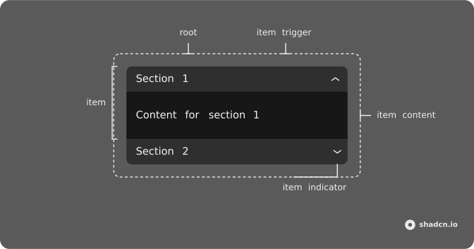
Usage
import {
  Accordion,
  AccordionContent,
  AccordionItem,
  AccordionTrigger,
} from "@/components/ui/accordion";<Accordion className="w-full max-w-sm" defaultValue={["shipping"]}>
<AccordionItem value="shipping">
<AccordionTrigger>What are your shipping options?</AccordionTrigger>
<AccordionContent>
We offer standard (5-7 days), express (2-3 days), and overnight
shipping. Free shipping on international orders.
</AccordionContent>
</AccordionItem>
<AccordionItem value="returns">
<AccordionTrigger>What is your return policy?</AccordionTrigger>
<AccordionContent>
Returns accepted within 30 days. Items must be unused and in original
packaging. Refunds processed within 5-7 business days.
</AccordionContent>
</AccordionItem>
<AccordionItem value="support">
<AccordionTrigger>How can I contact customer support?</AccordionTrigger>
<AccordionContent>
Reach us via email, live chat, or phone. We respond within 24 hours
during business days.
</AccordionContent>
</AccordionItem>
</Accordion>Accessibility
| Key | Description |
|---|---|
Enter | Activate the focused control. |
Space | Activate the focused control. |
ArrowDown | Move to the next item when orientation is "vertical". |
ArrowUp | Move to the previous item when orientation is "vertical". |
ArrowRight | Move to the next item. |
ArrowLeft | Move to the previous item. |
Home | Move to the first item. |
End | Move to the last item. |
Demos
Basic
A basic accordion that shows one item at a time. The first item is open by default.
Multiple
Use the multiple prop to allow multiple items to be open at the same time.
Disabled
Use the disabled prop on AccordionItem to disable individual items.
Borders
Add border to the Accordion and border-b last:border-b-0 to the AccordionItem to add borders to the items.
Card
Wrap the Accordion in a Card component.
RTL
Right-to-left accordion. See the RTL configuration guide for document direction.
API Reference
Accordion
PropType
AttributeType
AccordionItem
PropType
AttributeType
AccordionTrigger
PropType
AttributeType
AccordionContent
PropType
AttributeType