Base UI
Unstyled UI components for building accessible web apps and design systems
Add shadcn.io to your AI agent. · Pro It installs blocks, icons and premium templates from a prompt, with Pro.
Set up MCP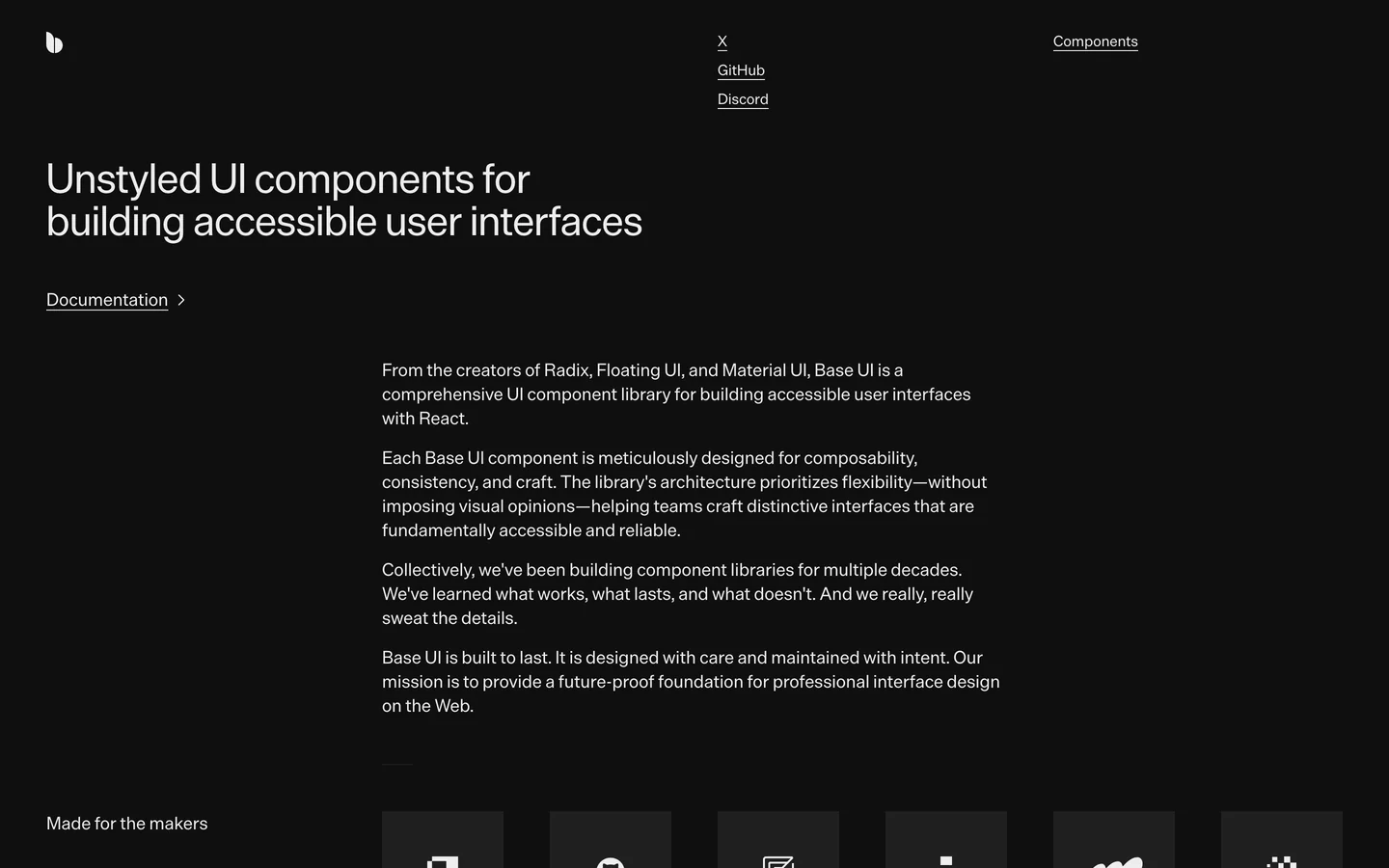
- Category
- Libraries & Components
- Added
- License
- MIT
- Maker
- mui
Live preview
Live Preview
Base UI, live: the site itself, not a screenshot.
base-ui.com
Open in a new tab (opens in a new tab)Loading preview…
About
About Base UI
Base UI is a library of unstyled React components for building accessible user interfaces. It provides a future-proof foundation for professional interface design on the Web.
Base UI is an unstyled UI component library for building accessible user interfaces with React. It ships about 30 components (dialog, dropdown menu, tooltip, focus trap, slider, popover, and more) that handle keyboard navigation, ARIA roles, and focus management while leaving the visuals to you. Components compose with your own CSS so you can adopt them piecemeal without inheriting a design system. The library is built by maintainers from Radix UI, Floating UI, and Material UI. It pairs with React 18+, Next.js, and any modern bundler. It is MIT licensed. Install with `npm install @base-ui-components/react`.
Base UI features
6 features
- Unstyled React components
- Accessible by design
- Composable and customizable
- Keyboard navigation and ARIA roles
- Works with Tailwind, CSS Modules, and more
- MIT licensed
Install Base UI
1 command
Terminal
$ npm install @base-ui-components/reactWhat you can build with Base UI
4 use cases
- Building accessible web applications
- Creating design systems
- Internal admin dashboards
- Marketing site forms
Links
2 links
FAQ
Frequently asked questions
Common questions about Base UI.
Libraries & Components
Similar to Base UI
More libraries & components from the directory, newest first.
 Chamaac UIA premium collection of high-performance shader components, interactive backgrounds, and modern UI elements for React applications
 8StarLabs UIComponent library for niche, high-utility UI elements
 unlumen UIBeautifully Designed React Components
 MCP.DirectoryThe largest directory of MCP servers and agent skills. One-click install for Cursor, VS Code, Claude Desktop, Claude Code, Codex, and ChatGPT.
Pricing
Ship it with Pro
The directory is free. Pro adds 6,000+ blocks, 14 premium templates and the MCP server, so your AI editor installs them for you.
4.9/5 out of 5 · 150+ reviewsfrom 150+ founders and developers.
Billing
Billed once a year in USD. Cancel anytime.
- How many people can use the license.
- Client work, SaaS products and anything you charge for.
- Production-ready React sections: hero, pricing, features, dashboards and more.
- Complete multi-page sites you can ship as they are.
- React icons from every major library, installable with one command.
- Presets that restyle every block, in light and dark.
- Lets your AI editor search, preview and install blocks for you.
- Priority requests are answered first.
Individual
For personal projects & open source
$32instead of $49/mo
$389 billed yearly
- Seats: 1 seat
- Commercial use: Personal & open source only
- Pro blocks: 6,000+ blocks
- Templates: All 14 templates
- React icons: 294k+ icons
- Themes: All 59 themes
- MCP server: Basic usage
- Support: Standard
Team
Most popularFor freelancers, agencies & startups
$66instead of $99/mo
$789 billed yearly · ≈ $13/dev/mo
- Seats: Up to 5 seats
- Commercial use: Included
- Pro blocks: 6,000+ blocks
- Templates: All 14 templates
- React icons: 294k+ icons
- Themes: All 59 themes
- MCP server: High usage
- Support: Priority
Organization
For companies with larger teams
$132instead of $199/mo
$1,589 billed yearly
- Seats: Unlimited seats
- Commercial use: Included
- Pro blocks: 6,000+ blocks
- Templates: All 14 templates
- React icons: 294k+ icons
- Themes: All 59 themes
- MCP server: Unlimited usage
- Support: Priority
Billed once a year in USD. Cancel anytime.
Individual
For personal projects & open source
$32instead of $49/mo
$389 billed yearly
- How many people can use the license.Seats: 1 seat
- Client work, SaaS products and anything you charge for.Commercial use: Personal & open source only
- Production-ready React sections: hero, pricing, features, dashboards and more.Pro blocks: 6,000+ blocks
- Complete multi-page sites you can ship as they are.Templates: All 14 templates
- React icons from every major library, installable with one command.React icons: 294k+ icons
- Presets that restyle every block, in light and dark.Themes: All 59 themes
- Lets your AI editor search, preview and install blocks for you.MCP server: Basic usage
- Priority requests are answered first.Support: Standard
Team
Most popularFor freelancers, agencies & startups
$66instead of $99/mo
$789 billed yearly · ≈ $13/dev/mo
Everything in Individual, plus
- How many people can use the license.Seats: Up to 5 seats
- Client work, SaaS products and anything you charge for.Commercial use: Included
- Lets your AI editor search, preview and install blocks for you.MCP server: High usage
- Priority requests are answered first.Support: Priority
Organization
For companies with larger teams
$132instead of $199/mo
$1,589 billed yearly
Everything in Team, plus
- How many people can use the license.Seats: Unlimited seats
- Lets your AI editor search, preview and install blocks for you.MCP server: Unlimited usage
- Secure checkout via Stripe
- Code lives in your repo
- Keep what you've shipped if you cancel
- License terms
Found your stack? Ship it.
6,000+ blocks, premium templates and MCP in every Pro plan. The directory stays free.